10,000 search results
(0.017 seconds)
- Kigara by Anatoletype,
$16.00Kigara was Elena’s first attempt at designing a text typeface. The result is not exactly a conventional book face. Strongly influenced by handwriting, Kigara is best suited for short texts set at medium to large sizes. However, its open letter shapes and subtle serifs make it a very readable face in smaller sizes as well. Kigara will also make headlines as a modest, light-hearted display typeface. Kigara is named after an African mushroom - hence the mushroom vignettes and African ornaments in the OpenType version and the ‘B’ set. Both the sets also include small caps, alternate figures, special ligatures and other expert glyphs. - Artios Pro by DBSV,
$70.00 There are a lot of narrow passages... like the Straits of Gibraltar, Hormuz, of Malacca, of Thermopylae, the Dardanelles, the Dervenakion, Magellan, Rentina of Naruto, Kerch etc. I tried to pass into mine closely with the name «Artios Pro". Walking on the same considerations as the previous series (Khamai/Aeolus/Corset) I tried to give some sense of diversity for narrow passages of the letters. These twelve style are the result. And here, the "Rail" engage with "Semi Bold" in the same way as the previous series. This series is composed and includes 12 fonts with 625 glyphs each, with true italics and supports Latin, Greek and Cyrillic.
 - Output Volume by Hanoded,
$15.00 I recently bought a small, portable speaker. I can now listen to music when I am making fonts! Output Volume is a name I came up with after reading the quick start guide that came with the speaker. Output Volume is a 100% handmade display font - it was based on a protest sign, but after a few glyphs it started to morph into something unique. I created 2 sets of contextual alternates (including the most used accented glyphs), that will cycle as you type. I also added some discretionary ligatures, to get an even more random effect. Output Volume comes with a vast array of accented letters, including Vietnamese.
 - Keyden Drop Caps JNL by Jeff Levine,
$29.00 A set of slab serif framed capitals is displayed in the 1906 edition of the Keystone Type Foundry specimen book as “John Alden Initials”. Digitally redrawn as Keyden Drop Caps JNL, regular and reverse versions are available in one font file. Upper case keys contain the regular version, lower case keys have the reverse version. Blanks frames for each are on the parenthesis keys. The font’s name is a hybrid of both ‘Keystone’ and ‘Alden’. These vintage letters can easily be used as drop caps, monogram initials or for short novelty titles or headlines. Choose from either regular or oblique for your next print project.
 - Sliced by ArtyType,
$29.00 The name of this robust typeface is adopted quite literally from the slice taken out of certain characters. The same sliced angle is also applied to many of the terminals, creating a clean-cut styling throughout the family. Tilted versions emphasise the descriptive name further, with an implied cutting stance. Wider versions go even further still, taking on a more thrusting, squat dynamic compared to the condensed styles. The standard Sliced family is complemented by Sliced Open, a lighter, more open set which extends the versatility and design flexibility of the typeface and comprises a total of 14 font styles, all with extended European character sets.
 - P22 Victorian Gothic by P22 Type Foundry,
$24.95 P22 Victorian is a font set created in conjunction with the Albright-Knox Art Gallery's exhibition of Victorian-era French artist James Tissot. The fonts developed for the P22 Victorian set are based on historic typefaces dating from the late 19th century. Victorian Gothic was based on a type style called ‘Atlanta’, a simple, expanded width, quirky, yet elegant face similar to ‘Copperplate’. Victorian Swash was inspired by the willowy, delicate face ‘Columbian’, which has also been known in recent years as ‘Glorietta’. The P22 version includes ‘snap-on’ flourishes based on the original 'Columbian' ornamental embellishment designs. Victorian Ornaments features over 150 decorative embellishments.
 - Van Dijck by Monotype,
$29.99 The seventeenth century Dutch old faces have a distinct character of their own, and were the source for eighteenth century English type designs, such as Caslon. Christoffel van Dijck was one of the great Dutch typefounders, although this face, which bears his name, may not have been cut by him, it is nevertheless representative of the best designs from that period. The Van Dijck italic, for which original punches survive, is almost certainly the work of van Dijck. Drawn at Monotype under the supervision of Jan van Krimpen. The Van Dijck font is a graceful typeface, best used for setting books, quality magazines and articles.
 - Rukyltronic by Typodermic,
$11.95 Welcome to Rukyltronic—a synthetic bitmap font that brings a unique and intriguing twist to your designs. Inspired by the eccentric computer fonts from the 1980s science fiction computer games, Rukyltronic boasts an array of interesting effects that will add a touch of nostalgia to your creations. With its variable gaps, Rukyltronic is the perfect choice for anyone looking to create an authentic pixel font look. The kerning is limited to full pixel increments, allowing you to achieve an authentic low resolution look and feel in your designs. Whether you’re working on a retro video game, a sci-fi movie poster, or a digital art piece, Rukyltronic is the font you need to bring that vintage 80s computer feel to life. Its unique style and limited kerning create a humble yet striking appearance that is sure to catch the eye of your audience. So what are you waiting for? Give Rukyltronic a try today and let your designs stand out! Most Latin-based European writing systems are supported, including the following languages. Afaan Oromo, Afar, Afrikaans, Albanian, Alsatian, Aromanian, Aymara, Bashkir (Latin), Basque, Belarusian (Latin), Bemba, Bikol, Bosnian, Breton, Cape Verdean, Creole, Catalan, Cebuano, Chamorro, Chavacano, Chichewa, Crimean Tatar (Latin), Croatian, Czech, Danish, Dawan, Dholuo, Dutch, English, Estonian, Faroese, Fijian, Filipino, Finnish, French, Frisian, Friulian, Gagauz (Latin), Galician, Ganda, Genoese, German, Greenlandic, Guadeloupean Creole, Haitian Creole, Hawaiian, Hiligaynon, Hungarian, Icelandic, Ilocano, Indonesian, Irish, Italian, Jamaican, Kaqchikel, Karakalpak (Latin), Kashubian, Kikongo, Kinyarwanda, Kirundi, Kurdish (Latin), Latvian, Lithuanian, Lombard, Low Saxon, Luxembourgish, Maasai, Makhuwa, Malay, Maltese, Māori, Moldovan, Montenegrin, Ndebele, Neapolitan, Norwegian, Novial, Occitan, Ossetian (Latin), Papiamento, Piedmontese, Polish, Portuguese, Quechua, Rarotongan, Romanian, Romansh, Sami, Sango, Saramaccan, Sardinian, Scottish Gaelic, Serbian (Latin), Shona, Sicilian, Silesian, Slovak, Slovenian, Somali, Sorbian, Sotho, Spanish, Swahili, Swazi, Swedish, Tagalog, Tahitian, Tetum, Tongan, Tshiluba, Tsonga, Tswana, Tumbuka, Turkish, Turkmen (Latin), Tuvaluan, Uzbek (Latin), Venetian, Vepsian, Võro, Walloon, Waray-Waray, Wayuu, Welsh, Wolof, Xhosa, Yapese, Zapotec Zulu and Zuni.
 - Metrolox - Unknown license

- Kruger by Keristyper Studio,
$14.00 Kruger is a Horror font ready to be splattered on your design projects. Inspired by horror movies. This font is good for logo design, Social media, Movie Titles, Books Titles, short text even long text letters, and good for your secondary text font with sans or serif. Featured: Standard Uppercase & Lowercase Numeral & Punctuation Multilingual : ä ö ü Ä Ö Ü ß ¿ ¡ Alternate & Ligature PUA encoded We recommend programs that support the OpenType feature and the Glyphs panel such as Adobe applications or Corel Draw. so you can use all the variations of the glyphs. Hope you enjoy our fonts!
 - Manhattan Midnight by Scholtz Fonts,
$19.95 Manhattan Midnight owes its style to Art Deco fonts of the early 20th century. It has the opulence of New York City in the 20s and 30s, the glitter of city lights, the glamour of movie stars, the razzmatazz of Manhattan in the bad old days. You can use Manhattan Midnight for all advertising with an art deco flavor, for music media needing a bluesy, retro look, for movie posters reminiscent of the era, and so many more applications. The font has all the features usually included in a fully professional font. Language support includes all European character sets.
 - Eutemia I - Unknown license

- Christmas Pattern by Mauve Type,
$29.00 The same procedure as every year? Again Christmas cards and greetings need to be designed... Sick of the usual Christmas imagery? Finally here is the ultimate typographical solution: 4 Christmas Pattern Fonts for display use. Playfull yet straight, Christmassy yet aesthetically pleasing. Pattern is the new sexy! Practical details: - Use in great display sizes only. The bigger – the better! - Fonts gain kind of "transparency" through the patterns – handy for use on top of images. - Characterset is caps only and supports Central, Eastern and Western European languages. - Entertaining 2 min movie explaining the basic concept and making of the Pattern Fonts. - Combine with "non-Christmassy" Pattern Fonts from the Pattern family. - Also available: a blank version in light, regular and bold.
 - Telone by Twinletter,
$12.00 Introducing Telone font, is a san serif font that has a characteristic character that is relaxed, nice and comfortable to read, has a serious and relaxed background, making this font very flexible to answer your various needs in creative and other fields. This font brings out an exotic and fantastic impression in its application in various media designs for you. This font is perfect for games, sporting events, branding, banners, posters, movie titles, book titles, quotes, clothing, logotypes, and more. of course, your various design projects will be perfect and extraordinary if you use this font because this font is equipped with a complimentary font family, both for titles and subtitles and sentence text. start using our fonts for your amazing projects.
 - Garvo by BeJota,
$25.00 Garvo is based on old Hollywood movie posters, vintage film credit designs and pays homage to Herb Lubalin's Serif Gothic font & lettering. This is why Garvo is named after the acclaimed international actress Greta Garbo. The Garvo family comes in 6 weights (from Thin to Black) and includes 2 different subfamilies: Garvo and Garvo Poster. Garvo is perfect for short readable texts, such as advertising and packaging designs, while Garvo Poster brings a wide range of contextual alternatives which makes it perfect for high impact pieces. Both styles increase the overall family flavor with discretionary ligatures, small caps figures. The 12 styles of Garvo are perfectly well suited for branding projects, album covers, audiovisual related designs, magazines and layouts, among other uses.
 - Orewa Japanese Style by Twinletter,
$15.00 Orewa, our newest font, is now available. In every form of the letter, we design typefaces with great attention. So that this font, which we named Orewa, is realized, which is neat and elegant, easy to read, grasp, and recall at a glance, this font is extremely suited for those of you who have a high level of creativity. Always maintain a fresh and unique appearance. Logotypes, food banners, branding, brochure, posters, movie titles, book titles, quotes, and more may all benefit from this font. Of course, using this font in your various design projects will make them excellent and outstanding; many viewers are drawn to the striking and unusual graphic display. Start utilizing this typeface in your projects to make them stand out.
 - Black Foroth by Twinletter,
$15.00 Black Foroth is a san serif font with an elegant yet fun relaxed appearance. It differs from other san-serif fonts in its application because it was created by combining serious and relaxed themes, resulting in a font that can give the impression of seriousness while remaining convenient. Use it in your creative projects to get a unique look and feel. This font is perfect for games, sporting events, branding, banners, posters, movie titles, book titles, quotes, logotypes, and more. of course, your various design projects will be perfect and extraordinary if you use this font because this font is equipped with a complimentary font family, both for titles and subtitles and sentence text, start using our fonts for your amazing projects.
 - Sparko by Locomotype,
$19.00 Sparko is a display sans serif typeface with a distinctive geometric shape. Lowercase have a small x-height and tall ascenders make the font look great in titles and short paragraphs. While capital letters has a unique character that reminds us of the old typographic style but has been modernized. But don't worry, alternative caps are already prepared in case you want a different look in your creations. This font is available in 7 weights, from Thin to Black. In addition to standard characters that support multi-language, it also provides stylistic sets for more exploration in your design projects. Sparko is suitable for big headlines, promotional posters, movie titles, games, logotypes, packaging designs, aesthetic typography, personal quotes and more.
 - Poppin by Kustomtype,
$20.00 Poppin is a playful font-type that you can comfortably use in all kinds of styles, from modern to old school. A combination of a few names on an old movie poster is what triggered the creation of this font type. Because it had such a strong rock and roll character, I decided to dedicate a font-type to it. The Poppin font is completely hand-drawn and then digitized. It results in being an extremely user-friendly, complete and modern font that you can use in all your graphic applications. Poppin is a font from the subculture that has been updated to a hip and classy font, ideal for eye-catching designs. Poppin comes in 4 styles, regular, bold , round & bold round. Poppin makes everyone smile!
 - Dino Jumps by Twinletter,
$15.00 Dino Jumps is a fun typeface that is attractive, gorgeous, and funny. It is designed for those who are attractive, handsome, and creative. Use this typeface in all of your designs to express your extraordinary projects with presentations that can attract visitors due to the beauty of visual displays. This typeface can be used for a variety of themes and issues in your project. This font is perfect for games, sporting events, branding, banners, posters, movie titles, book titles, quotes, logotypes, and more. of course, your various design projects will be perfect and extraordinary if you use this font because this font is equipped with a complimentary font family, both for titles and subtitles and sentence text, start using our fonts for your amazing projects.
 - Good Castyll by Twinletter,
$15.00 Good Castyll is our newest display font, and it has a laid-back, unique feel to it. It was created with a genuine hand touch, so it seems natural when viewed. This font is ideal for adding a touch of class to your creative work. Start creating fantastic projects with this font, and you’ll notice a distinct difference in the way it’s used. This font is perfect for games, sporting events, branding, banners, posters, movie titles, book titles, quotes, logotypes, and more. of course, your various design projects will be perfect and extraordinary if you use this font because this font is equipped with a complimentary font family, both for titles and subtitles and sentence text, start using our fonts for your amazing projects.
 - Weroth by Twinletter,
$15.00 Weroth is a lovely, eye-catching display typeface that will keep onlookers looking at your work. This font is a lot of fun; you can use it for informal or formal occasions, and it’s still adaptable. This font is still great for perfecting any creative project, whether it’s a child, teenager, or adult theme. Don’t wait, start utilizing this font immediately. This font is perfect for games, sporting events, branding, banners, posters, movie titles, book titles, quotes, logotypes, and more. of course, your various design projects will be perfect and extraordinary if you use this font because this font is equipped with a complimentary font family, both for titles and subtitles and sentence text, start using our fonts for your amazing projects.
 - Allay by Twinletter,
$15.00 Allay is a display font with a distinctive and appealing shape that may be used in a wide range of creative design projects. Each letter shape is created using a variety of combinations that provide a one-of-a-kind, innovative, entertaining, and unmistakably aesthetic impression when used. This typeface also comes with typical ligatures and can be used in other languages. This font is perfect for games, sporting events, branding, banners, posters, movie titles, book titles, quotes, logotypes, and more. of course, your various design projects will be perfect and extraordinary if you use this font because this font is equipped with a complimentary font family, both for titles and subtitles and sentence text, start using our fonts for your amazing projects.
 - Hypercreepos by Bisou,
$15.00 Hypercreepos is a sweet and creepy hyper-bold font inspired by the horror comic books of the 60s. Handmade in La Chaux-de-Fonds (Switzerland) on lined A4 papers, the letter's shape is conscientiously designed to give a punchos impact on the reader. The unique and vibrant contours are drawn on an improvised backlit table inherited from Bisou's mother. Definitely contemporary, the overall feeling given off by Hypercreepos is profound and human, evoking the graphite smell of the comic's workshops. Exclusively made for titles, this impactos font will suite with delight the text of posters, signs of comics bookstore, gaming bar, horror movie theater or film festival. That said, the designer is not responsible for the use of Hypercreepos and wish it will serve beyond all expectation.
 - Aabak by Polimateria,
$39.00 Aabak is a sumptuous modern typeface family. The high contrast, super elegant, didone like shapes were infused with a little fluidity from 60’s psychedelic lettering, the results is a contemporary face that screams freshness. It is ideal for branding, advertising, headlines, posters, movie titles, and much more! This design deliberately sabotages a lot of white space to have that compressed punchy look. The tear drop terminals and the melting serifs create a surprisingly superb combo. Sharp joints were smoothen to convey a warm and subtle feeling. Aabak comprises a total of 18 styles, 6 weights in 3 different cuts: Upright, Italic and Swash. The Swash styles have also a terminal forms feature that gives that extra lush feel. Have fun playing with it!
 - Cal Roman Modern by Posterizer KG,
$19.00 Cal Roman Modern is one more font from PKG “Cal” (Calligraphic) group. This time for calligraphic sketches we used a wide brush instead of the iron pen. Instead of minuscule letters, there are Small Caps (which are the same weight as capitals). Because there is no difference in the stroke thickness of capital letters and lowercase capital letters the difference in height is only one pen width, because of that, it is possible to use small capitals together with capital letters without noticing a difference in the thickness of the letters. Cal Roman Modern font is rhythmic, informal elegant, bright and light. As such, this font is widely used in the typographic creation of shorter text forms: magazine, catalogs and book titles, logos, posters, movie spots, banners...
 - Thertole by Twinletter,
$16.00 Thertole is a dramatic display font with a strong background. Because of its rock-inspired design, this typeface is dashing and bold for individuals who dare to be distinctive. If you use this font for a variety of outdoor events, you will get an exquisite and unique look. Standard ligatures, character choices, and international language support are also included in this typeface. This font is perfect for games, sporting events, branding, banners, posters, movie titles, book titles, quotes, and more. of course, your various design projects will be perfect and extraordinary if you use this font because this font is equipped with a complimentary font family, both for titles and subtitles and sentence text, start using our fonts for your amazing projects.
 - Delugional by Roland Hüse Design,
$24.00 Delugional is an Atlantis theme typeface, it's character set is an imaginary alphabet inspired by Greek style scripts mixed with Classic Latin. This font is a display font family of two weights, Regular and Bold. It can be used for various creative/mythological and fantasy theme projects from book covers to games or movie titles. There are some OpenType features such as Stylistic Alternates and Discretionary Ligatures along with some extra symbols like sun, moon, snake and the stylised map of Atlantis in place of stylistic set 02 of uppercase "O". I have also created a font presentation video you can view it on youtube here: https://youtu.be/f7bKdoffWnI I hope you enjoy this one as much as I did while creating, Good luck with your project!
 - Dollan by Twinletter,
$14.00 Dollan, our newest whimsical typeface, is now available. This font is worth implementing in your remarkable projects since it is a distinctive and eye-catching display font that is dynamically crafted to bring out the originality in each letter. This typeface has a cheerful, unique, energetic, and unique vibe to it, and it will give your creative work a unique look as well. This font is perfect for games, sporting events, branding, banners, posters, movie titles, book titles, quotes, logotypes, and more. of course, your various design projects will be perfect and extraordinary if you use this font because this font is equipped with a complimentary font family, both for titles and subtitles and sentence text, start using our fonts for your amazing projects.
 - Bestlady by Dhan Studio,
$19.00 Bestlady is a romantic textured brush font suitable perfectly for invitations, brand projects, logos, greeting cards, news, product packaging, posters blogs, everything including personal charm etc. This font is alternates all lowercase,also have equipped with 69 ligatures unique and beautiful: zz yy ww vv uu tt tl th st ss sh rr qq pp oz oy ow ov ou ot os or op oo on om ol ok oj oi og of od oc ob nt nn nl ng mm lt ll lh kk is ii id hh gg ff et el ee cl ck ch cc bl bb aw at ap an am al ah af ab aa
 - Liaisons by The Ampersand Forest,
$35.00 A Belle Époque humanist serif in two styles: crisp, high-contrast Haut-Monde and soft, low-contrast Demimonde… When you design a lot of display pieces, you’re often in need of tall, slim type. Liaisons provides that, in a distinct fin-de-siècle style inspired by the great posters of the Gilded Age from Sweden, Denmark, France, and Scotland. (The ampersand alone is a bit of a love letter to Charles Rennie Mackintosh!) Both styles use the same slim skeleton, and are named after the stratum of society where one might find… a “dancing partner.” HAUT-MONDE is a high contrast face of the sort that says “High Society.” Elegant and sleek, it speaks to the refinement of the moneyed classes of a bygone era. Great for high-end products, too! DEMIMONDE is soft and low-contrast — more reminiscent of hand-lettering on Art Nouveau/Jugendstil/Wiener Werkstätte advertisements and posters. A comfortably chic display face all around! Both typefaces feature full Western and Eastern Latin character sets, as well as full Cyrillic/Slavic ones. And, perhaps best of all, both typefaces feature capitals with high, middle, and low waists, so you can change up the look as you see fit! Part of The Ampersand Forest's Sondheim Series
 - Nautilus Text by Linotype,
$29.99Hellmut G. Bomm first released his Linotype Nautilus typeface in 1999. Ten years later, he updated and expanded the design. Now users have two additional families at their disposal: Nautilus Text and Nautilus Monoline. Nautilus Text bears more similarities to the original Linotype Nautilus. The letters shows a high degree of contrast in their stroke modulation. Bomm's intention was to create a clear, highly legible face. While the even strokes of most sans serif types eventually tire the eyes in long texts, the marked stroke contrast of Nautilus Text lends the face its legibility. The characters were drawn with a broad tipped pen. Like serif typefaces, the forms of Nautilus Text display a variety of elements. Its characters are narrow, with relatively large spaces between them. This helps create an overall open appearance, and allows a large quantity of text to fit into a small space. Nautilus Monoline's letters share the same overall proportions as Nautilus Text's. But as their name implies, they are monolinear. Their strokes do not have the calligraphic modulation that Nautilus Text features. This allows them to set another sort of headline, making Nautilus Monoline a refreshing display type choice to pair with body text set in Nautilus Text. - Nautilus Monoline by Linotype,
$29.99Hellmut G. Bomm first released his Linotype Nautilus typeface in 1999. Ten years later, he updated and expanded the design. Now users have two additional families at their disposal: Nautilus Text and Nautilus Monoline. Nautilus Text bears more similarities to the original Linotype Nautilus. The letters shows a high degree of contrast in their stroke modulation. Bomm's intention was to create a clear, highly legible face. While the even strokes of most sans serif types eventually tire the eyes in long texts, the marked stroke contrast of Nautilus Text lends the face its legibility. The characters were drawn with a broad tipped pen. Like serif typefaces, the forms of Nautilus Text display a variety of elements. Its characters are narrow, with relatively large spaces between them. This helps create an overall open appearance, and allows a large quantity of text to fit into a small space. Nautilus Monoline's letters share the same overall proportions as Nautilus Text's. But as their name implies, they are monolinear. Their strokes do not have the calligraphic modulation that Nautilus Text features. This allows them to set another sort of headline, making Nautilus Monoline a refreshing display type choice to pair with body text set in Nautilus Text. - Secret Operation JNL by Jeff Levine,
$29.00 The movie poster for the 1952 bank heist drama “Kansas City Confidential” had its title hand lettered in a condensed serif stencil design. This inspired Secret Operation JNL, which is available in both regular and oblique versions.
 - Richard Samuels by Letterena Studios,
$17.00 A serif modern and classic typeface that his own unique style & modern look. This typeface is perfect for an elegant & luxury logo, book or movie title design, fashion brand, magazine, clothes, lettering, quotes, and so much more.
 - Gerson Rand by Device,
$39.00 A sharp, corporate font with a clean, modern machine-aesthetic. Suitable for forward-looking company brochure headlines, contemporary and futuristic movie posters, logos and more. Incorporates a full international character set and alternate designs for many letters.
 - Bigger Summer Fest by Letterena Studios,
$10.00 Bigger Summer Fest is a bubbly handwritten font with a unique style and modern look. It is perfect for elegant and luxury logos, book or movie titles, fashion brands, magazines, clothes, lettering, quotes, and many more. **Uppercase
 - Groovy Tuesday JNL by Jeff Levine,
$29.00 Hand lettering from the 1965 movie poster for “The Loved One” – a classic 1960s spurred serif design with added curly-tailed terminals was the working model for Groovy Tuesday JNL – available in both regular and oblique versions.
 - Common Rejection by Dumadi,
$18.00 Common Rejection is a modern stylish font that is attractive to any project and can be applied in logos, quotes, travel titles, movie titles, blogs, show event titles, t-shirt designs, tumbler designs, community and company logos.
 - Panther Fighter by Yoga Letter,
$17.00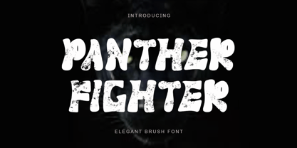 "Panther Fighter" is a modern and elegant brush font. This font is equipped with uppercase, lowercase, numerals, punctuations and multilingual support. It is suitable for logos, movie titles, Halloween, Christmas, business branding, ornaments, mock ups and others.

