6,815 search results
(0.012 seconds)
- Microgramma by URW Type Foundry,
$35.00
- Mariner by Scriptorium,
$24.00 - Shavano by Dan Cotton Lettering,
$12.00
- Mas dAzil Symbol by ParaType,
$25.00
- Second Impression JNL by Jeff Levine,
$29.00 - Occidental Tourist JNL by Jeff Levine,
$29.00 - Akbar - Unknown license

- Feuerfeste - Unknown license

- Boomerang - Unknown license

- MA - Unknown license

- PixL - Unknown license

- PopUps - Unknown license

- Farmhouse by Victory Type,
$20.00 - West Coast Antics NF by Nick's Fonts,
$10.00 - Roman Holiday NF by Nick's Fonts,
$10.00 - Cybernaut by Studio K,
$45.00
- Zhikharev by ParaType,
$30.00 - Cute Dog by Yoga Letter,
$15.00
- Goodbees by ZetDesign,
$15.00
- Gilgamesh by ITC,
$29.99 - Odeon by Scriptorium,
$12.00 - Dyane by Wiescher Design,
$39.50
- Estonia Nouveau Pro by TypeSETit,
$39.95
- Westmore by Solotype,
$19.95 - Amore by ParaType,
$30.00
- Arroyo by Gajana Aslanjan,
$45.00
- Ardenwood by Scriptorium,
$18.00 - Hoxie JNL by Jeff Levine,
$29.00 - P22 Royalist by IHOF,
$39.95
- Dinosaur by Daniel Uzquiano,
$30.00 - MPI Headline Modified by mpressInteractive,
$5.00
- Seleniak by Crestaco,
$19.00
- Express by ParaType,
$30.00
- Crossten by Horizon Type,
$25.00
- Stencilvania JNL by Jeff Levine,
$29.00 - Borowedsoul by Zamjump,
$35.00
- Ghost Skeleton by Yoga Letter,
$15.00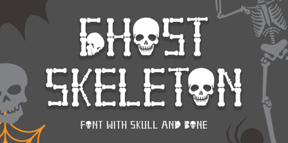
- Just Realize by Kimberly Geswein,
$5.00
- Bindas by WingBuk Studio,
$16.00
- LTC Keystone Ornaments by Lanston Type Co.,
$24.95


