10,000 search results
(0.033 seconds)
- Aracne Condensed by Antipixel,
$15.00 The all-caps Aracne collection features tall, slightly scrawled letterforms, and is available in regular, condensed and ultra condensed styles for maximun functionality. With a spiritted quality and casual character, it will add a personal style to your work. Aracne Condensed was created as an extended version of the font Aracne, a regular full of energy handwritten font, with light and regular styles, including italics. It provides a wide range of possibilities, including the Aracne Soft and Stamp, which offer softer and cleaner edges. Its glyph coverage supports languages such as English, Spanish, French, German, Polish, Czech, among many others. It’s recommended usage is for display titles, and small ammount of text, because of its good legibility and quality of glyphs. Check out her sisters Aracne and Aracne Ultra Condensed!
 - Not My Type by It's me Simon,
$14.00 If you want your design to have that nostalgic typewriter effect, Not my Type would be perfect. It's old-fashioned and retro—letters are worn and grungy like it needs a new ink ribbon. Some of the letters are misaligned—just like a real old typewriter. It is best used at smaller sizes, perfect for logos, headlines, covers and any design where you want that vintage look and feel. Each letter has two alternatives, making three in total. Using the alternative letters, you can make your type layouts look more random, like a real typewriter. You can manually set the alternatives via the glyphs panel in your design software or you can enable them automatically. If you enable contextual alternatives in your design application, the letters will change automatically as you type.
 - Catchy Mager by Sensatype Studio,
$19.00 Catchy Mager is a unique and very elegant font for brand and logo design. Based on our experience as a graphic designer who works for a lot of companies, we often are requested to design a logo in a unique style but with an elegant shape. So, we try to brainstorming and create this font to make the idea is going out. This is perfect for BRANDING and LOGO DESIGN. You will get classy, elegant, and certainly unique logos with this font. To make it look more unique, here we prepared some ligatures: ab ah am an ar ap at cb ch cm cn cr eb eh em en ep er ub uh um un up ur fl fi ff ft ga gi it ai Include Fancy Style on Every Uppercase and Some Lowercase
 - Hattori by Zane Studio,
$15.00 Elegant, graceful and timeless. Hattori is a versatile font with timeless classic appeal, over 50 alternatives & ligatures, multilingual support, (And we think this is our best work so far!) Each letter has been hand-drawn and made with great care. The variety of weights provides a variety of options that will help you find the best typographic character for your project. All 3 weights are perfect for big screen use and high impact headlines. The available binding and style alternatives offer a number of different options that give your logo or business card a unique look. This high-contrast serif typeface has a glyph and offers comprehensive language support. If you have any questions, just send us a message and we'll be happy to help! Stay sweet, Sweetest Stuff
 - Hopfen by Sudtipos,
$39.00 During many years I have been exploring the translation from lettering or calligraphy to type design. Lately I have been designing more big sans and serif families plenty of weight. One of the main things about Hopfen is to bring back the german lettering of Bentele, who also inspired my fonts Semilla and Bowling Script, to a more versatile and useful world. Hopfen has the spirit from the past but with today's flow, it comes in 5 weights, full of swashes, endings and alternates. We imagine it being used from Breweries to book covers, from packaging to movie posters but we prefer to let our costumers to find the better use. When you license the complete Hopfen set we will include the variable version of the set so that you can find the right weight.
 - Gitan Latin by Rosetta,
$60.00 Gitan is a flared sans serif, reminiscent of engraving and stone carving. Sturdy and informal, the design features a moderate contrast that provides durability for text setting. Crisp design details like cuneiform head serifs and deeply cut wedge terminals give Gitan a sculptural appeal – a quality desired for all things display. Gitan’s expressiveness evokes the nuances of forms crafted directly in raw materials. The human touch provides vitality so often absent from purely mechanical designs. Pairing a rhythmic pattern with classic construction makes Gitan shine in text. Its natural look reflects a tangibility that thrives in wooden and rock-solid materials. Gitan’s habitat is at the crossroads of editorial and packaging work, grounded by a feeling of substance, but finished by an artisan’s handicraft. By nature, Gitan is flexible and willing to take risks.
 - Revla Round by Eclectotype,
$40.00 Squeezing yet more life out of the Revla skeleton! This is Revla Round, a child-friendly version of Revla Sans, completely overhauled so there's no chance of cutting yourself on any corners. Every rounded terminal and corner has been painstakingly drawn, rather than using a round-corners filter. OpenType contextual alternates make for text that is lively and bouncy, without the monotony of obviously repeating letterforms. It's shamelessly fun, but pretty serious at the same time. The range of weights can be used to maintain an even colour across different sizes - use lighter weights for bigger sizes and vice versa. OpenType features include automatic fractions, ordinals, contextual alternates, standard and discretionary ligatures, and case-sensitve forms. Obviously, in sharing a common skeleton, it will work well with other members of the ever-growing Revla Superfamily.
 - Golden Night Cyrillic by Ira Dvilyuk,
$17.00 Golden Night Cyrillic is a handwritten script font that will be perfect for branding, logos, social media, labels, packaging design and blog headlines. Golden Night Cyrillic script contains a full set of uppercase and lowercase letters and 32 ligatures - which works automatically to create a more natural handwritten look. The Cyrillic part of the font also contains 18 ligatures for a more natural handwritten look of the typography in your designs. Extensive language support is included. Western European, Central, and South East European too. Multilingual Support for 27 languages: Afrikaans, Albanian, Basque, Bosnian, Catalan, Danish, Dutch, English, Estonian, Faroese, Filipino, Finnish, French, Galician, Indonesian, Irish, Italian, Malay, Norwegian Bokmål, Portuguese, Slovenian, Spanish, Swahili, Swedish, Turkish, Welsh, Zulu And Cyrillic glyphs support for Russian, Belorussian, Bulgarian and Ukrainian languages.
 - Angella White by Din Studio,
$29.00 Looking for a font that’ll make your branding radiate elegance? Something that’s versatile, stylish, and eternal? Get ready to transcend to a world of magic, laughter, and butterflies. Your branding will spark delight and engage everyone who sees it! Introducing Angella White-A Brush Font A beautifully handcrafted font combined with brush style that’ll make your guests sing and elevate your projects! Every stroke, and curve was created to entice happiness and elegance. Use it to create standout headings, promote your online sales, Instagram quotes, and even printed materials like business cards, t-shirts, or invitations. Angella White includes Multilingual Options to make your branding globally acceptable. Features: Standard Ligatures Stylistic Sets Multilingual Support PUA Encoded Numerals and Punctuation Thank you for downloading premium fonts from Din Studio
 - Halloween Pumpkins by Voysla,
$9.00 Hey! Happy Halloween Pumpkins! 🎃🎃🎃 This is a family of colored fonts "Halloween Pumpkins" in four styles (regular, glowing with and without Halloween pumpkins). PLEASE NOTE that in order to work with color fonts, you will need one of the listed applications - Photoshop CC 2017, Illustrator CC 2018, or Procreate 4.3 or later. It is also supported by some web browsers and text editors. You can read more about color fonts at the link - http://www.colorfonts.wtf The font supports Latin letters, all the necessary symbols, numbers and a set of multilingual characters. There are also additional glyphs of various pumpkins, a knife and decorative elements. They are great for Halloween designs. In addition to the color font family, the set includes a monochrome font "Halloween Carved" without Halloween pumpkins in two styles.
 - Tessie Dingies by Ingrimayne Type,
$9.95 A tessellation is a shape that can be used to completely fill the plane--simple examples are isosceles triangles, squares, and hexagons. The TessieDingie fonts contain tessellation shapes that can be used to construct tessellation patterns. The repeating unit, which may contain only one of the shapes or a several of the shapes, is on one key so making patterns is trivial with these fonts. TessieDingieAbstract contains abstract shapes that tessellate. TessieDingiePictures contains shapes that resemble real world objects, such as birds, animals, tools, and vehicles. Make sure the leading is the same as font size or the rows will not line up. Tessellation patterns are eye-catching and visually appealing, which is the reason that they have long been popular in a variety of decorative situations, such as quilting.
 - VLNL Wasabi Turbo by VetteLetters,
$35.00 Wasabi is one of the key ingredients in the Japanese kitchen. Also known as japanese horseradish, it is an extremely spicy condiment made out of the graded root of the Wasabi plant. Its spiciness is different than that of a chili pepper though, more like a hot mustard. The spicy taste shoots right through your nose, but does not last for long. Wasabi is traditionally used in sushi and sashimi dishes, soba noodles, and in a number of Japanese snack foods. Equally sharp and stingy, VLNL Wasabi Turbo was designed by Donald Roos. Despite its japanese outward appearance, the font has its origin in lettering found on a German book. It is hot, and edgy like a samurai sword. Wasabi Turbo will stand out as headline and logo!
 - Dulcet by Dawnland,
$33.00 Dulcet is a hand lettered, rough binding script with high ascenders & low-descenders. It is both elegant and grungy and will work wonders on your invitations or love letters, make beautiful posters, frightening t-shirt designs or logotypes. It is equipped with OpenType features such as common ligatures, double letter ligatures, contextual and stylistic alternates for a varied and hand drawn look. Access alternates by using the glyph panel in Illustrator and InDesign. Dulcet comes with several initial & terminal swashes that can be added to the beginning and/or end of any lowercase letter as well as different swashes for the upper case letters. For initials/beginnings, write _ (underscore) + digit 0 to 9 For terminals/endings, write digit 0 to 9 + _ (underscore) For start swashes, - (hyphen) + digit 0 to 9. Enjoy!
 - Easy Breezy Type by Hipfonts,
$17.00 Introducing Easy Breezy, a font that effortlessly transports you to a bygone era of carefree charm and nostalgic beauty. Inspired by the retro styles of the past, this vintage gem captures the essence of a relaxed and laid-back vibe. Its flowing letterforms and playful curves breathe life into your designs, exuding a sense of whimsy and joy. With Easy Breezy, your projects will radiate a delightful vintage aura, whether you're designing invitations, branding materials, or signage. Let this font whisk you away to a world of sunny days, gentle breezes, and endless possibilities. Embrace the effortless beauty of Easy Breezy and create designs that capture the heart with their timeless appeal. Experience the nostalgia, embrace the freedom, and let your creativity soar with Easy Breezy at your fingertips.
 - Areplos by Storm Type Foundry,
$53.00To design a text typeface "at the top with, at the bottom without" serifs was an idea which crossed my mind at the end of the sixties. I started from the fact that what one reads in the Latin alphabet is mainly the upper half of the letters, where good distinguishableness of the individual signs, and therefore, also good legibility, is aided by serifs. The first tests of the design, by which I checked up whether the basic principle could be used also for the then current technology of setting - for double-sign matrices -, were carried out in 1970. During the first half of the seventies I created first the basic design, then also the slanted Roman and the medium types. These drawings were not very successful. My greatest concern during this initial phase was the upper case A. I had to design it in such a way that the basic principle should be adhered to and the new alphabet, at the same time, should not look too complicated. The necessary prerequisite for a design of a new alphabet for double-sign matrices, i.e. to draw each letter of all the three fonts to the same width, did not agree with this typeface. What came to the greatest harm were the two styles used for emphasis: the italics even more than the medium type. That is why I fundamentally remodelled the basic design in 1980. In the course of this work I tried to forget about the previous technological limitations and to respect only the requirements then placed on typefaces intended for photosetting. As a matter of fact, this was not very difficult; this typeface was from the very beginning conceived in such a way as to have a large x-height of lower-case letters and upper serifs that could be joined without any problems in condensed setting. I gave much more thought to the proportional relations of the individual letters, the continuity of their outer and inner silhouettes, than to the requirements of their production. The greatest number of problems arose in the colour balancing of the individual signs, as it was necessary to achieve that the upper half of each letter should have a visual counterbalance in its lower, simpler half. Specifically, this meant to find the correct shape and degree of thickening of the lower parts of the letters. These had to counterbalance the upper parts of the letters emphasized by serifs, yet they should not look too romantic or decorative, for otherwise the typeface might lose its sober character. Also the shape, length and thickness of the upper serifs had to be resolved differently than in the previous design. In the seventies and at the beginning of the eighties a typeface conceived in this way, let alone one intended for setting of common texts in magazines and books, was to all intents and purposes an experiment with an uncertain end. At this time, before typographic postmodernism, it was not the custom to abandon in such typefaces the clear-cut formal categories, let alone to attempt to combine the serif and sans serif principles in a single design. I had already designed the basic, starting, alphabets of lower case and upper case letters with the intention to derive further styles from them, differing in colour and proportions. These fonts were not to serve merely for emphasis in the context of the basic design, but were to function, especially the bold versions, also as independent display alphabets. At this stage of my work it was, for a change, the upper case L that presented the greatest problem. Its lower left part had to counterbalance the symmetrical two-sided serif in the upper half of the letter. The ITC Company submitted this design to text tests, which, in their view, were successful. The director of this company Aaron Burns then invited me to add further styles, in order to create an entire, extensive typeface family. At that time, without the possibility to use a computer and given my other considerable workload, this was a task I could not manage. I tried to come back to this, by then already very large project, several times, but every time some other, at the moment very urgent, work diverted me from it. At the beginning of the nineties several alphabets appeared which were based on the same principle. It seemed to me that to continue working on my semi-finished designs was pointless. They were, therefore, abandoned until the spring of 2005, when František Štorm digitalized the basic design. František gave the typeface the working title Areplos and this name stuck. Then he made me add small capitals and the entire bold type, inducing me at the same time to consider what to do with the italics in order that they might be at least a little italic in character, and not merely slanted Roman alphabets, as was my original intention. In the course of the subsequent summer holidays, when the weather was bad, we met in his little cottage in South Bohemia, between two ponds, and resuscitated this more than twenty-five-years-old typeface. It was like this: We were drinking good tea, František worked on the computer, added accents and some remaining signs, inclined and interpolated, while I was looking over his shoulder. There is hardly any typeface that originated in a more harmonious setting. Solpera, summer 2005 I first encountered this typeface at the exhibition of Contemporary Czech Type Design in 1982. It was there, in the Portheim Summer Palace in Prague, that I, at the age of sixteen, decided to become a typographer. Having no knowledge about the technologies, the rules of construction of an alphabet or about cultural connections, I perceived Jan Solpera's typeface as the acme of excellence. Now, many years after, replete with experience of revitalization of typefaces of both living and deceased Czech type designers, I am able to compare their differing approaches. Jan Solpera put up a fight against the digital technology and exerted creative pressure to counteract my rather loose approach. Jan prepared dozens of fresh pencil drawings on thin sketching paper in which he elaborated in detail all the style-creating elements of the alphabet. I can say with full responsibility that I have never worked on anything as meticulous as the design of the Areplos typeface. I did not invent this name; it is the name of Jan Solpera's miniature publishing house, in which he issued for example an enchanting series of memoirs of a certain shopkeeper of Jindrichuv Hradec. The idea that the publishing house and the typeface might have the same name crossed my mind instinctively as a symbol of the original designation of Areplos - to serve for text setting. What you can see here originated in Trebon and in a cottage outside the village of Domanín - I even wanted to rename my firm to The Trebon Type Foundry. When mists enfold the pond and gloom pervades one's soul, the so-called typographic weather sets in - the time to sit, peer at the monitor and click the mouse, as also our students who were present would attest. Areplos is reminiscent of the essential inspirational period of a whole generation of Czech type designers - of the seventies and eighties, which were, however, at the same time the incubation period of my generation. I believe that this typeface will be received favourably, for it represents the better aspect of the eighties. Today, at the time when the infection by ITC typefaces has not been quite cured yet, it does absolutely no harm to remind ourselves of the high quality and timeless typefaces designed then in this country.In technical terms, this family consists of two times four OpenType designs, with five types of figures, ligatures and small capitals as well as an extensive assortment of both eastern and western diacritics. I can see as a basic text typeface of smaller periodicals and informative job-prints, a typeface usable for posters and programmes of various events, but also for corporate identity. Štorm, summer 2005 - Monarda by Monotype,
$29.99 Monarda™ is Terrance Weinzierl’s take on the loud and splashy brush scripts of the 1950s. It’s energetic, playful, and equally at home in hardcopy headlines as it is in interactive banners. In addition to the basic alphabet, OpenType® fonts of Monarda are also awash in super-sized swash caps, contextual alternate characters and ligatures. Pair Monarda with a mid-century structural sans like Trade Gothic® or a sturdy slab serif like Egyptian Slate™ to create typographic counterpoint that’s confident, compelling and memorable! Named for a riotous bright red flower that attracts butterflies and humming birds, Monarda is a rare combination of flamboyance and effortless beauty. Weinzierl describes it as “casual yet precise: a stiff denim jacket or perfectly white sneakers at a formal event.” Monarda clearly stands out – and always fits in. Well, almost always. Drawn for print, the design’s robust x-height, open counters and wide apertures also make Monarda screen-friendly. Monarda can be perfect for a wide variety of food and lifestyle applications as well as travel, stationery and packaging projects. Advertising campaigns and product branding are also well within its reach. Monarda works best when used large – but economically. Two or three words are its sweet spot. Think: product name, print headline or the lettering on the side of a truck. It could easily become your go-to design for projects that call for a script with a bright personality and fearless demeanor. The excellence of Weinzierl’s work has been recognized by the Type Directors Club and Print Magazine. When not working on creating new typefaces, he augments his professional practice through calligraphy, lettering, and letterpress printing. Monarda is another winner from Weinzierl’s creative mind and talented hand.
 - ITC Bolthole by ITC,
$29.99I fell in love at the age of twelve in Wales, recalls Bernard Philpot. "My father brought me to a small graveyard in the Welsh hills to show me two headstones carved by the great Eric Gill. I instantly fell in love with the beauty of the carving and the perfection of the letterforms. I still go back to marvel at these works of art." However, the ITC Bolthole™ design, Philpot's first commercial typographic endeavor, is quite unlike the works of Eric Gill that first captured his heart. Bolthole is a craggy sans serif with a definite grumpy attitude. It's not terribly legible, and, if more than a few words are set in the design, it's not very readable. To round out its cranky personality, Bolthole does not like to be set in small sizes. Like Cheez Whiz® and bullfights, you either love or hate this typeface. But whichever emotion dominates, there is no denying that Bolthole has a personality to be reckoned with - one with ample magnetism to ensure reader attraction. If used to set brief blocks of display copy, the typeface makes a powerful statement. Bolthole was originally designed to complement a whimsical ad for the Royal Society for the Prevention of Cruelty to Animals. As Philpot recalls, "although the ad didn't win any awards, the type attracted some very positive comments for its original look and feel." Philpot studied graphic design and typography at the London School of Printing, and soon after graduation found himself working in a large advertising agency in London. According to Philpot, "After designing type for everything from packaging to ads, I thought it time to convert one of my designs into a complete font - and Bolthole was born." ITC Bolthole could very well be the Shrek™ of typeface design - which might not be such a bad thing." - Subway Hunter by Variatype,
$24.00 Waltowns is a dynamic and expressive typeface that captures the essence of street art with its bold and energetic design. The letters are characterized by organic shapes, reminiscent of marker strokes on urban surfaces. The font exudes a raw and brave vibe, reflecting the spirit of graffiti culture. The font includes a diverse set of characters, allowing for creative and eye-catching compositions. Whether you’re designing posters, album covers, or any other graphic project, Waltowns inject a sense of urban attitude and artistic edge. Its versatility makes it suitable for a wide range of applications, making your designs stand out in the crowd. Waltowns is not just a font; it’s a statement. It represents expression, the vibrancy of the streets, and the bold creativity that defines graffiti art. Use Waltowns to bring a touch of urban authenticity to your design projects and let your creativity run wild on the walls of the digital world. FONT FEATURES Additional Accents 68 Languages Kerning SOFTWARE RECOMMENDATION Adobe Photoshop CC 2020 or later Adobe Illustrator CC 2020 or later
 - Snobbish by Create Big Supply,
$15.00 Designed with an organic brush style, this font adds a touch of uniqueness to your projects. Although Snobbish is an all-uppercase font, its distinctive character sets it apart, allowing you to explore endless possibilities. With Snobbish, you have access to both uppercase and lowercase letters, numbers, and punctuations, providing flexibility in your designs. Express yourself in various languages, as Snobbish offers multilingual support, enabling you to reach a global audience. This purchase includes TTF, OTF, and WOFF font files, ensuring compatibility across different platforms and software. The font is PUA encoded, allowing easy access to all its features and ensuring a seamless design experience. Character Sets: Snobbish encompasses a wide range of characters, including symbols, accents, and special characters. Let your imagination run wild and create visually stunning compositions that leave a lasting impression. Unleash your creativity with Snobbish and elevate your designs to new heights. Whether you're working on branding, logos, invitations, or any other artistic project, Snobbish is the perfect choice for adding a touch of organic charm.
 - Florabet - Unknown license

- CelticEels - Unknown license

- Stilda Script by Stringlabs Creative Studio,
$25.00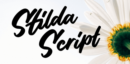 Stilda embodies fun, quirkiness and authenticity. This enchanting script font will turn any creative idea into a true standout.
 - Keraton by Letterara,
$8.00 Keraton is a monoline script with a signature look. It will take any design project to the next level.
 - Hoffelized by Cititype,
$12.00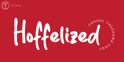 Hoffelized embodies fun, quirkiness and authenticity. This enchanting handwritten font will turn any creative idea into a true standout.
 - DB Teddies by Illustration Ink,
$3.00DoodleBat Teddies is cute and cuddly. These teddie bears will add the fun touch that any creative project needs. - Lugatype by Tkachev,
$- This font family will be the best solution for posters, signage, magazine, product branding, corporate branding, logos and titles.
 - Cambirela by Sea Types,
$15.00 Inspired by Santa Catarina mountains, the shapes of the characters refers to the winding contour of the mountain Cambirela.
 - Love Cake by Rixdesigns,
$14.00 Use this font for your beautiful awesome projects. You will get: Lower Case and Uppercase Letters, Numbers, & Extended Punctuation
 - Victoria by Balpirick,
$15.00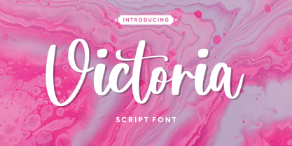 Victoria embodies fun, quirkiness and authenticity. This enchanting handwritten font will turn any creative idea into a true standout.
 - Biscuit Kids by PizzaDude.dk,
$19.00 The other day, a couple of kids at work (I work as a kindergarten teacher!) played this game where they were detectives. Not the usual detective, but someone who worked for cookies and biscuits! They called themselves The Biscuit Kids, and I knew instantly that I had to make a font with that name! My Biscuit Kids font is a playful comic book font, but also suitable for anything that needs a fresh extra spicy attention!
 - Radicals by ITC,
$29.99Calligrapher Margaret Layson works in partnership with Australian typographer Harry Pears, bringing designs such as the wonderful Lindisfarne Nova family to life. They both work on the digital incarnation in a true collaboration. Originally from the UK, Margaret began her professional career as a geophysicist. After arriving in Australia in 1968, she began to work as a freelance calligrapher. Over the years she has maintained an interest in the history of writing, particularly the scripts and decorations in manuscripts. - Woodline by Jeff Levine,
$29.00 Most folks might picture wood type lettering as the fancy styles of the 1880s which so perfectly evoked images of the Old West. Occasionally there is an exception to that rule, as an online image of some vintage wood letters with an Art Deco influence inspired a revival as a digital type face. Wood Lined JNL features a bold alphabet with an engraved line throughout the characters, and is available in both regular and oblique versions.
 - Scratched Brush Script by Pedro Teixeira,
$14.00 Scratched Brush Script with alternate lowercase to customize your work.
 - Thorowgood by Wooden Type Fonts,
$20.00 Thorowgood is designed from an original wood font specimen sheet.
 - Titanic by Red Rooster Collection,
$45.00Based on an early wood type design. An original creation. - Triple Condensed Gothic by Red Rooster Collection,
$45.00Based on an early wood type design. An original creation. - Sign Gothic Bold Condensed by BA Graphics,
$45.00Strong Bold Condensed Gothic great for poster and display work. - Yeoman Gothic by Red Rooster Collection,
$45.00 Based on an early wood type design. An original creation.
 - Gilbert Qualifi by EmbunStudio2018,
$20.00 Hello Everyone have a nice day, let me introduce our new Classy Serif Font called "Gilbert Qualifi" !! Are you ready to make the project more elegant and classy? makes every eye that sees it stunned and silent for a moment This font is part of our dedication to the world of fonts, the work that takes a long time, makes us make this font as our mainstay font Whether you have a client that needs a new chic logo, or you're designing your social media posts. Maybe you're preparing your wedding mood board, stationery, invitations, Gilbert Qualifi font is just perfect for all of that and more. you can check it all on preview !! Enjoy !! and start Creating !! Include Multilingual : ÀÁÂÃÅÄĄĀĂÆÇĆČĎÈÉÊËĘĒĖĚĞÌÍÎÏĪİÐÑŃŇÒÓÔÕÖŌŐOEŔŘØÙÚÛÜŪŮŰŲŚŠŞŁÝŸŻŹÞ àáâãąåäāăæçćčďđèéêëęěēėğıìíîïīðñńňòóôõöoőoeøùúûüūůűŭųþýÿŕřśšşłżźž
 - Peach Daisy (Duplicate) by Nathatype,
$29.00 Ready to make your branding spark? If you need to create a big, bold logo for your business, work on a poster for an event, or whatever your project may be-then this is the perfect font for you. Peach Daisy-A Sans Serif Font Peach Daisy is a new modern sans serif font. This font was carefully crafted and inspired by luxury fashion in the world. It creates a luxurious, rich, exclusive and elegant look in design. It’s thin brush strokes and imperfect baseline give it a fun and stylish. So beautiful on invitation like greeting cards, branding materials, business cards, quotes, posters, lettering and more. Features: Ligatures Alternates Swashes PUA Encoded Numerals and Punctuation Thank you for downloading premium fonts from Natha Studio

