7,266 search results
(0.03 seconds)
- Neo Afrique Pro by Tondi Republk,
$17.00 Neo Afrique sans a neo-futuristic typeface with a modern decorative twist. This typeface design came out of further development and refinement on an original typeface that i created some time ago, Durango Sans. True in nature to it's predecessor, Neo Afrique was also born out of this desire to fuse two different aesthetics, the geometric Neo-Futuristic aesthetic, fused with flourishing decorative forms from Art Nouveau and the later Lubalinesque aesthetics. This typeface will form part of a larger body of work that is meant to be an exploration of Afrikan neo-futurism, using the immense power of visual-linguistic narratives to catalyse new cultural movement and perception.
 - Banco by ITC,
$29.00Banco was the first typeface work of French designer Roger Excoffon and was released in 1952. The strong forms look as though they were rolled out of sheet metal and feature upright, tapering strokes. The slight slant, the varying heights of stroke ends, and the relationships between line and curve give Banco font its sense of liveliness and dynamism. Excoffon did not design a matching lower case alphabet for his capitals, but this was accomplished later by Phill Grimshaw, who also designed the light weight. He deliberately 'underdesigned' the lower case forms, producing a more reserved alphabet based on the design ideas of the original. - Hanseat by profonts,
$41.99 Hanseat is a profonts typeface family by Ralph M. Unger, heavily inspired by Germany’s official DIN 1451 Engschrift. Originally, the German DIN (Deutsches Institut für Normung / German Committee for Industrial Standardization) typefaces were taken as the standard traffic fonts for street signs and house numbers. During the 1980s, the DIN fonts became digitally available for sign making systems, initially again primarily for traffic sign purposes. However, later on, the DIN fonts became also popular in the world of designers and art directors. Hanseat is a modern, contemporary interpretation of the DIN fonts, responding to the ever growing demand for such typeface designs reflecting the spirit of the industrial area.
 - Good Eatin Pro AOE by Astigmatic,
$24.95 A heavy weight - softened sans serif that is not only friendly, but easy on the eyes. Good Eatin was inspired by the title screen from the 1942 Warner Bros. cartoon titled, "Dog Tired". The original all capitals setting had a charming & quiet nature to it, which became even more pronounced when drawn out to include a lowercase set. Later expanded upon to include a Small Caps set, Good Eatin Pro achieves a wider, even more electric appeal. Loaded with personality, Good Eatin Pro is joyful and stands out without being an eyesore, and while being based on vintage lettering it has a contemporary feel.
 - M Elle PRC by Monotype HK,
$523.99 The concept of M Elle comes from M Hei and M Yuen, with a sense of contemporary graphic design, aims to accomplish a refreshing, harmonious balance of softness and toughness. The combination of regular crossbars (橫) and stems (豎), rounded hooks (勾) and angles (折), as well as dots (點), ticks (剔) and downstrokes (撇、捺) that are ended sharply, makes it a classy but contemporary, clean and affectionate typeface. The font family consists of 3 essential weights to cater for different needs. Xbold appears elegant and magnificent, Medium weight is practical and affectionate, while the Light style is especially clear, legible and flexible in use.
 - Forte by Monotype,
$29.99 Forte was designed by the Austrian commercial artist by Carl Reissberger who was trained as a compositor and later taught typography and drawing in Vienna. The idea for the Forte script font came from the study of plants, individual letter forms being inspired by the long stems and furry heads of the reed. Slightly inclined, it gives the impression of having been made with a bold brush or marker, and can therefore be used in work that requires an informal appearance. Forte is a strong design which contrasts well with sans serif faces and classical modern types. Use the Forte font in advertising, flyers and labels.
 - Aurelia by Linotype,
$29.99The design for Aurelia is based on the forms of Jenson, an Old Style typeface developed by Nicolas Jenson in 1470 which still influences type design today. Zapf gave Aurelia a bit of his own personal style and adapted it to the demands of modern technology. The family of typefaces was originally designed for use with the typesetting machines produced by the German company Dr.-Ing Rudolf Hell GmbH which was later merged with Linotype. The name Aurelia is a nod to the Roman emperor Aurelianus (214–275), who built the Via Aurelia in Italy. Aurelia is a robust and classic font, suitable for both text and headlines. - Grok by PintassilgoPrints,
$20.00 Bold as love, Grok is a hand-drawn typeface, assertive but soft. Showy and friendly. It's an all caps font with 2 choices for each letter, accessible via keyboard upper and lower case slots. For that handcrafted look, you know. Turn on the contextual alternates feature to automatically alternate these. Grok originally comes in two cuts: bold and… less-bold :) Later the outline style was added as a gift, a free font. And finally, there's yet a nifty picture font with dozens of dingbats to beautify your words every now and then. Perfectly suited for display uses: packaging, signage, web titlings, editorial design, book covers – and not-only-covers. Grok it?
 - Amaretto by JVB Fonts,
$39.00 AMARETTO, inspired by classic structure of italics, as an original variation of vertical style. Ludovico Arrighi has given us the legacy of classical calligraphic structures that times later lays the foundations of Cancelleresca style and then, the italics as extension of a classic roman serif used in the Renaissance, as main typographic way of expression in Italian printed books. The name Amaretto reminds one of the most representative and delicious liqueur as strong distinctive Italian taste. AMARETTO can be used mainly in titles, long and display texts. Supports East Europe languages. Includes standard and discretionary ligatures, complete small caps, old style numbers, fractions, numerators and denominators and several OpenType features included.
 - Kaligane by ArimaType,
$18.00 Kaligane is a type family designed with passion. A geometric typeface, first designed in a muscular black weight with a high-powered dynamic typographic aesthetic used in various communications, and later developed in a lighter weight where the shape exhibits some vintage-inspired proportions. With these diverse influences, typefaces allow for the use of impressive displays and effective logo designs as well as the use of more subtle editorials in body text - with a natural inclination for effective and powerful advertising. Sports typography typically uses italics for added dynamism and impact, and Kaligane complies by offering a choice of three alternative italic shapes with different slants.
 - Cooper Black by Linotype,
$40.99 Oswald Bruce Cooper designed Cooper Black, an extra bold roman face, based on the forms of his earlier typeface Cooper Old Style, which appeared with Barnhart Brothers & Spindler Type Founders in Chicago. Copper Black was produced by Barnhart in 1922 and acquired in 1924 by the Schriftguß AG in Dresden, where it was later completed with a matching italic. Although Cooper Black appeared in the first third of the 20th century, it still looks contemporary and it can be found on storefronts in almost any city scene. The flowing outer contours create forms that are both strong and soft, making Cooper Black an extremely flexible font.
 - Lunatique Rounded by The Flying Type,
$20.00 Lunatique Rounded is the soft version of Lunatique, a highly decorative font, available in three widths, with extended language coverage as well as alternates for some glyphs. And quite a seventies flair, isn't it? This font is inspired by Lucky typeface, designed in 1972 by André Pless for the Mecanorma permanent type contest. The style was later released as Letter-Press transfer sheets. Transfer sheets... Sounds quite nice, definitely. But hey, these digital ones will be waaaaaay smoother to use, you bet. Packaging, posters, books & album covers, applications are endless. Give them a go and make your text shine! [Amazing illustration on the first graphic by our equally amazing neighbor @pedrocorrea84]
 - Fournier by Monotype,
$29.99 Fournier was made by Monotype in 1924. The design is based on types cut by Pierre Simon Fournier circa 1742, some of the most influential designs of the eighteenth century. Fournier's types were among the earliest of the transitional" style of typeface and were a stepping stone to the more severe "modern" style made popular by Bodoni later in the century. They had more vertical emphasis than the old style types, greater contrast between thick and thin strokes and little or no bracketing on the serifs. Fournier has a light, clean look on the page, provides good economy in text and retains an even colour.
 - 1792 La Marseillaise by GLC,
$42.00 This font, was created -- inspired from the original manuscript of the French revolutionary song “La Marseillaise”, becoming later the French national anthem, composed in one night (1792 April 25th) by the 32 year old French captain, Rouget de Lisle. It is a “Pro” font containing Western (including Celtic) and Northern European, Icelandic, Baltic, Eastern, Central European and Turkish diacritics. The numerous alternates and ligatures make the font look as close as possible to the real historic hand. Using an OTF software, the features allow variations of each character without anything to do but to select contextual alternates and standard ligatures and/or stylistic alternates options.
 - Overseas by Hanoded,
$15.00 I traveled a lot: in the beginning on my own, later as a tour guide. I always used the English word ‘abroad’ to describe a trip to a foreign country, but I noticed that the English, Australians and New Zealanders preferred the word ‘overseas’. I then realised that they all lived on an island, so most of the foreign countries for them were across the sea. I had to think of that when I made this font! Overseas is a brush font with a certain rough elegance to it. I made it using poster paint and a brush. Use if for posters, product packaging and book covers.
 - Wagner Grotesk by Canada Type,
$49.95 This is the elaborate digital version of Edel Grotesque Bold Condensed (also known as Lessing, Reichgrotesk, and Wotan Bold Condensed) a 1914 typeface by Johannes Wagner, which was later adopted by pretty much every European type foundry, exported into the Americas, and used on war propaganda posters on either side of the Atlantic. Bold, condensed, yet clear and legible, Wagner Grotesk is good for cramming information into tight spaces. Extended language support includes Western, Central and Eastern European character sets, as well as Greek, Cyrillic, Baltic, Esperanto, Maltese, Turkish, and Celtic/Welsh languages. Biform letters and small caps make Wagner Grotesk a most versatile and functional headline face.
 - Ristaga Script by Gatype,
$10.00 Ristaga Script is an old-school inspired script typeface that pairs perfectly with bold and tough type. Very awesome for labels & logos. I'm starting to create typefaces to use in a branding project and I think Gibson is the missing font from my Type Collection. Perfect for use in everything from Branding, Web, Packaging, Etc. The Ristaga script features OpenType style alternatives, International binders, and support for most Western Languages included. To enable the OpenType Stylistic alternative, you need a program that supports OpenType features such as Adobe Illustrator CS, Adobe Indesign & CorelDraw X6-X7, Microsoft Word 2010 or later. Thank you very much for viewing and Enjoying it.
 - Coo Coo by chicken,
$23.00 So I made five rather odd characters for a logo for a friend… Then I thought I'd fill a couple of spare hours expanding it to a single alphabet… And some considerable time later I ended up with a whole font with full punctuation, a bunch of alternates, pretty broad international support and some OpenType features to keep things varied… There are elements of Art Deco, Art Nouveau, Lego, circuit boards and Ceefax, Memphis lamps and lab clamps, hieroglyphs, googly eyes and who knows what else… Intricate, insane, highly irregular, but somehow it hangs together… Throw down a few letters nice and big when the fancy takes you…
 - Capistrano BF by Bomparte's Fonts,
$39.00 Capistrano BF is an all-connecting, monolinear handwritten script that exudes much verve and vigor. A number of Automatic Ligatures and Contextual Alternates, for beginning and ending (lowercase) letters are included in the font, along with Stylistic Alternates for uppercase letters A, F, and T. Enable these features in OpenType-savvy programs (such as InDesign CS+, Illustrator CS+ and QuarkXpress 7 and later) to enhance your typography. In line-upon-line settings, Capistrano benefits from generous line spacing. As with most scripts, it is not recommended that word settings be in all uppercase, but rather in settings of initial capitals together with lowercase letters.
 - Qadi by Linotype,
$187.99Qadi is a modern Arabic display face that includes the traditional range of letterforms. These extra bold shapes are striking, graceful, and confidently calligraphic. Produced in the mid 1980s under the design direction of the noted British typographer Walter Tracy, Qadi proved to be a very popular typeface for magazine and newspaper publications. Qadi has been updated to take full advantage of digital technology for accurate diacritical positioning and kerning refinements, ensuring high quality Arabic typesetting. The OpenType font incorporates the Arabic codepage, and supports Arabic and Persian. It also includes both tabular Arabic and Persian numerals, as well as Latin figures and complete punctuation. - Bernhard Signature by Jonahfonts,
$40.00I started to work at the Bernhard Studio in 1952 to 1959 in New York. I helped with some type designs and many other projects, this two tiered signature was added on all of Bernhard’s art that was produced in the past and in his later years. In the 50’s I thought Bernhard’s Gothic face was quite a bit outdated but as you may know it has become one of todays most used faces. His signature is based on his Bernhard Gothic Font. With todays computer technology I have digitized the caps and added lower case glyphs with lower ascenders and other slight changes. - HGBGalaxo Line by HGB fonts,
$23.00 HGB Galaxo is a tribute to Othmar Motter (1927–2010), the Vorarlberg graphic artist and typeface designer, who designed very individual and perfectly crafted typefaces in the 1970's and later. (Motter Ombra, Motter Tectura ...)From a Motter sketch of 5 letters for a logogram, I derived a simplified letterform and developed all the necessary characters. Working on these glyphs and delving deeper into Motter's letterforms, the respect for the accuracy with which he drew his letters (in ink) grew more and more. The spiral resembles the shape of a galaxy, hence the name Galaxo. The font is suitable for retro, poster and logo design.
 - Aeonian by Adorae Types,
$40.00 Aeonian, designed by Emilia Adorno, was mostly inspired by the iconic morphology adopted by the arts of the 1920s. One hundred years later we can still see the resemblance between the wants and the needs of now and then to reach for the sky, to look ahead and enter the future in style. Now as then, we seek the right tools to do so, then once again, we embrace the rational, yet elegant and stylish forms of simplicity, geometry and symmetry. At the same time, there is a strong and growing need for a warmer approach to creating lovemarks. For that, Aeonian’s alternates hold attractive, soft and inviting shapes to an emotional appeal. Aeonian is a combination of all of them. A rational side entwined with an emotional one. Born a geometric sans, Aeonian ended up being a 2 in 1 font with a sans serif set and alternates reaching over 1200 glyphs. The entire family contains 6 weights, from thin to black, with its matching italics. It features a variety of ligatures to be used as connectors, specially for display. It also offers multilingual support, even for certain display ligatures. Later, Aeonian kept growing, with stylistic alternate sets of initial, mid and final glyphs. These are its arms to reach for infinity with a warm heart. The wide range of possibilities that Aeonian offers, makes it the best font for creating vast design systems with a rich visual language.
 - Totemic by Canada Type,
$29.95 Jim Rimmer’s first typeface was originally published in 1970 as a basic film type alphabet through a small, independent type house in central California. Its sources of influence (now calligraphic type standards by Dair, Goudy and Zapf) are ones that remained with Jim for the rest of his career. If you squint at Totemic in just the right way, you can see some recognizable themes Jim would later flesh out and make his own in later works throughout his career as a type designer and printer. Totemic is now available for the first time as a digital font, of the refined and expanded kind now expected from Canada Type. It comes with quite a few standard advanced typography features: Small caps, caps-to-small-caps, automatic fractions and standard ligatures, stylistic alternate sets, six kinds of figures, case-sensitive forms, and extended Latin language support. It also comes with a very unique and unprecedented feature: Variably stackable totem poles. Simply enable the discretionary ligatures feature, type any unique three-digit combination using numbers between 1 and 4, and watch the magic happens. With a name like Totemic, we just couldn't help ourselves. Many thanks to Andrew Steeves of Gaspereau Press for finding Jim’s lost gem in a most unexpected place, and for helping us bring it back to life 45 years after its analog birth. 20% of Totemic’s revenues will be donated to the Canada Type Scholarship Fund, supporting higher typography education in Canada.
 - Vermandois by Magpie Paper Works,
$68.00 Rough yet refined, kinetic and distinctive, the handdrawn Vermandois family mimics original calligraphy with exceptional accuracy. Perfect for correspondence, invitations, unique branding and display, Vermandois' connecting letters, caps and ink blots make a mark. Vermandois regular includes contextual ligatures and double-letter ligatures, alternate caps, preposition & title word glyphs, old style numerals, international support, currencies and fractions. VermandExtra includes 52 coordinating strokes, splashes and splatters.
 - Ratyin by Kavoon,
$14.00 Oxygen Script made with a transparent line texture. Suitable for use in title design such as invitations, signboards, book titles, stationery designs, quotes, branding, logos, greeting cards, packaging designs, posters, and more. Files Include: Punctuation & numbers Splashes Splatters Alternate letters Uppercase letters Multi Language Supported Languages - French, Spanish, English, Catalan, Galician, Basque, Portuguese, Italian, Albanian, Afrikaans, Dutch, German, Danish, Swedish, Norwegian, Finnish, Faroese, Icelandic, Irish and Scottish.
 - Birdland by Gatype,
$14.00 Birdland is a sweet and romantic handwritten font featuring a unique up and down flow. Use it for wall displays, product packaging, wedding invitations, social media post logos, and any project that requires impressive typography. It will add a splash of luxury to any design project you want to make! This font is PUA encoded which means you can access all the amazing glyphs and binders easily!
 - Barelyn by Yumna Type,
$16.00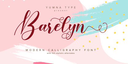 Barelyn is a beautiful and modern script. It brings a beautiful and modern typeface that best used for weddings, branding, logotype, and quotes.: Featured : Ligatures Beautiful Alternates + Swashes PUA Encoded Multilingual Support Numerals and Punctuation Beginning Swash and Ending Swashes (a-z)
 - Marlyna by Yumna Type,
$16.00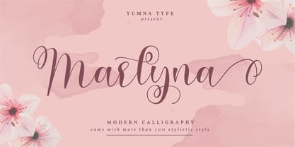 Marlyna is a beautiful and modern script. It brings a beautiful and modern typeface that best used for weddings, branding, logotype, and quotes. Featured : Beautiful Ligatures Beautiful Alternates + Swashes PUA Encoded Multilingual Support Numerals and Punctuation Beginning Swash and Ending Swashes (a-z)
 - Fairytales Script by Dhan Studio,
$25.00 Fairytales Script is a beautiful handmade typeface, organic and dancing baseline with different swashes that can be applied to the beginning and ends of all lowercase. For the separate swashes font, type lowercase a-z for the beginning swashes and end swashes. This fonts can be used for various purposes.such as headings, signature, logos, wedding invitation, t-shirt, letterhead, signage, lable, news, posters, badges etc.
 - ITC Kendo by ITC,
$29.99 ITC Kendo is the work of British designer Phill Grimshaw, suggesting the dash and verve of quick, sketchy calligraphy, complete with splatters of ink. Grimshaw says he worked deliberately against his own habits to create the forms, drawing the letters with slow deliberation" and a pointed pen. He overloaded the pen with ink and drew on rough paper, "applying a lot of pressure at the beginning of a stroke and easing off towards the terminals. Accidental splashes occurred frequently owing to the nib catching the 'tooth' of the paper." Those splashes were refined into features which enhance but do not overwhelm the characters and carefully worked so as not to leave an obvious white strip of unsplattered space between lines and letters. The initial capitals can be used alone or combined with the lowercase alphabet, and the font includes a full set of f-ligatures and some extra ligatures as well as decorative elements."
 - Sibling Goals by Piece of Cake Typework,
$17.00 Hello World, Introducing, Sibling Goals is a beauty duo font suitable for your design project needs, such as; wedding themes, Christmas themes, social media posts, quotes, overlays on images, tagline logos, posters, print needs, website banners, and more. Features A set of uppercase and lowercase glyphs Number, symbol, and punctuation Multilingual Support Some Swashes and Ligatures So Easy to Use Access Swashes by keyboard key parent left ' ( ' to feature beginning swash key plus ' + ' to feature middle swash 1 key equal ' = ' to feature middle swash 2 key paren right ' ) ' to feature ending swash For Example: type (goals) Thank you a million times for downloading and using this font for your projects. Enjoy this font and happy creating!
 - Sparhawk by Albatross,
$19.00 Sparhawk in its obvious form is a 3D layered display font, but it's packed with over 300 swashes, extremely rare in the 3D font world. Every single swash is hand-drawn for extreme organic realism. The lowercase are small caps and the swashes are designed to be used mostly with the lowercase letters (top and drop swashes), but the drop (bottom) swashes also work well with all caps. Sparhawk’s large character set and plethora of alternates makes it perfect for logo type, birthdays, weddings, bands… the list goes on. All features include: 8 Awesome Layer Styles, 15 sets of Stylistic Alternates (over 300+ Individually Drawn Swashes), Double-Letter Ligatures for upper and lowercase, and Contextual Alternates.
 - Burnston by Maculinc,
$16.00 This is a bold font with a simple and unique retro concept. We provide this font in uppercase, lowercase, number, and equipped with punctuation, alternatives and swash. Combine swash to add an interesting impression in every word you want, we provide swash as an alternative available in this font.
 - Backstroke by Eclectotype,
$50.00 Normal and upright italic script fonts line a well-trodden path; left-leaning fonts (or "rightalics" as they're confusingly called), on the other hand, are a rarity. Here at Eclectotype Fonts we don't like to do things too conventionally, so here's Backstroke, a laid back script with a unique voice. With contextual alternates for start and end forms of certain characters, swash versions of L, Q and Z (surely the most used initial caps!), and a handful of stylistic sets, Backstroke is a restrained script. Stylistic sets are: 1. the start forms of i, j, m, n, and p are used always instead of only at word starts. 2. lower case ascenders get a whole lot loopier. 3. alternate versions of G, N and Y. 4. swash L, Q and Z. 5. swaps the default Polish script lslash for a more familiar version While fonts that lean the wrong way may be a bit more difficult to fit into your layouts than boring old regular italics, they will reward you with their individuality. Why not give it a go?
 - Beyond Eternity by Fromletterel,
$14.00 Welcoming to a new script font from letterel "Beyond Eternity" Beyond Eternity is a delicate script font with opentype featured such as ligature, swash and alternates. There are two styles for uppercase, a casual one and alternates one with beginning swash. For lowercase there are both beginning and ending swash to complete your design needs. All characters are coming with PUA encoded, so they are accessible. If you are not common with opentype featured you can use Beyond Eternity Alternates to access Uppercase Alternates and Beyond Eternity Swash to access lowercase swashes with ease. Happy Design
 - Sadio by Abo Daniel,
$21.00 introducing SADIO - the extended signature - This font is created specifically for logotypes. Yes, this font is only suitable for making logos or headline text. This font is not suitable for use in subtitles or main content. It is great for branding, business card, signature, and more. I also created the lowercase swash to completed this product. You can combine the standard character and the swash. It is perfect. Very easy to access the lowercase swash, you only need to add underscore twice after the lowercase characters. For example a_ _ it will be a with swash. Features: Uppercase Lowercase Number & Punctuations Swash PUA encoded
 - Be Bright by Seniors Studio,
$13.00 Be Bright is a sweet elegant handbrushed calligraphy font. It has a varying baseline with separate swashes that can be applied to the beginning and ends of all lowercase letters. Painted on paper, then scanned, vectorized and carefully made into a font. Be Bright includes several ligatures and international support for most western languages. For the separate swashes font, type lowercase a-z for the beginning swashes and end swashes (access to the glyphs panel is not available, just add swashes manually). The font is perfect for branding, logos, greeting cards, wedding stationery, quotes and more.
 - STROKIN by AdultHumanMale,
$15.00 STROKIN is an inky, messy, Omnicase display font. It’s part charcoal part paint strokes, reversed in lighter tones it looks like chalk, add a splash a red and it starts to look like blood. It has over 250 glyphs including all those extra pesky foreign features. OpenType coded, It has various letter pairings that interlock automatically to create a more randomized, bespoke feel to your copy. Hope you like it.
 - Rowboat by Atlantic Fonts,
$26.00 Rowboat is delightful and dependable. Turn on discretionary ligatures and you will find a salty set of interlocking and double letter combinations. Access interlocking ligatures using all caps. Rowboat Pictures contains 26 original Amy Dietrich seaside illustrations from charming ocean animals to nifty nautical gear.... Go ahead and make a splash! Posters feature images from Atlantic Fonts picture fonts including Eeeek Images , Trailmap Pictures, and of course Rowboat Pictures!