10,000 search results
(0.027 seconds)
- Bodine by Balevgraph Studio,
$12.00 Bodine is a bold and geometric looking display font. It can easily be matched to an incredibly large set of projects, so add it to your creative ideas and notice how it makes them stand out! What's Included? Uppercase & Lowercase Numbers & Punctuation Alternate & Ligature Multilingual Support PUA Encoded
 - Ruadson by Letterena Studios,
$10.00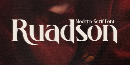 Ruadson is bold and stylish serif font. This typeface is perfect for an elegant & luxury logo, book or movie title design, fashion brand, magazine, clothes, lettering, quotes, and so much more. This font is PUA encoded which means you can access all of the glyphs and swashes with ease.
 - Music Ad Stencil JNL by Jeff Levine,
$29.00 An ad appearing in the January 5, 1952 edition of Billboard Magazine promoted the then-new releases from Capitol Records. The headline copy was set in a bold, condensed sans serif stencil typeface. This inspired Music Ad Stencil JNL, which is available in both regular and oblique versions.
 - Junior Detective JNL by Jeff Levine,
$29.00 A 1930s kids' premium booklet from Post cereals called "Inspector Post's Junior Detective Corps Manual #2" offered up some great hand lettering in an Art Deco sans serif style. Bold, authoritative and perfect for headlines or titling, Junior Detective JNL now recreates this hand lettering in digital form.
 - Bolgate by Arsa Visual,
$9.00 Bolgate is a beautiful caligraphy font. This font works really well for Logos & Apparel Design. It's also great for creating Prints or Merchandise, as you can use the illustrative qualities of the shapes to create an art piece. Product includes: • Stylistic Alternates of Uppercase and Lowercase • Ligatures • Swash
 - Zebraw by Ingrimayne Type,
$6.95 This face was part of a continuing evolution of an almost unreadable typeface. There are two styles, one with stripes and one without. The striped style can be placed in a layer above the unstriped style to give the letters two colors. Zebraw was derived from the typeface Porker.
 - Neo Paralletter by Tural Alisoy,
$34.00 Neo Paralletter is a geometric modern blackletter typeface. Neo Paralletter is a combination the boundaries between old and new, tradition and contemporary, that is an art form combines calligraphy, typography, and graffiti. You can use it as a logo, badge, packaging, headline, poster, t-shirt/apparel and wedding invitation.
 - Wary by Gaslight,
$20.00 Wary is a geometric, contrast sans-serif with an avantgarde touch. Wary was inspired from lettering used in a Russian book from the seventies. Use Wary font in advertising and display typography. Wary received a citation for excellence in type design the in international competition "Modern cyrillic 2014".
 - Mangana Sega by Differentialtype,
$12.00 Mangana Sega is a bold display serif font with a retro design. Mangana Sega is equipped with alternate and ligature, which will add an elegant and luxurious impression to every project you make. Mangana Sega is PUA encode, which mean you can easily access all required alternates and swashes.
 - Freethinker by My Creative Land,
$20.00 Freethinker is an irregular brush script with a hipster look and feel. This brush font benefits from OpenType features such as ligatures (and their alternates), stylistic alternates, design elements. The font can be used in branding, greeting cards design, packaging design, webdesign and publishing. It is fully unicode mapped.
 - Valentina by Slex Studio,
$12.00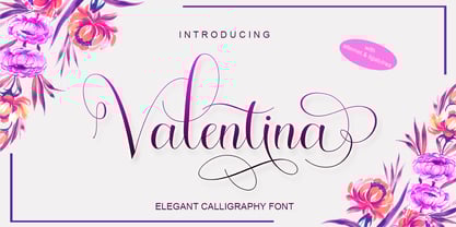 Valentina is an elegant calligraphy font. It looks stunning on wedding invitations, thank you cards, quotes, greeting cards, logos, business cards and every other design which needs a handwritten touch. This font is PUA encoded which means you can access all of the glyphs and swashes with ease!
 - Donau by Renzler Design,
$12.00 The font Donau is named after the german name for the river Danube. It is an art nouveau inspired sans and slab serif typeface, sharing proportions and widths across two weights. It is intended for any kind of display use as well as short amounts of text. Enjoy!
 - Typemonger JNL by Jeff Levine,
$29.00 Typemonger JNL is based on Two Line Sans Serif from the British type specimen book of Vincent Figgins (circa 1860), and is available in both regular and oblique versions. The word ‘monger’ is an old term for a merchant specializing in a certain commodity (such as printing type).
 - Loco by Juraj Chrastina,
$39.00 Loco is an impacting display typeface playing with simple geometric forms perfect for posters, flyers, magazines and everything that needs to look bold, noticeable and up-to-date. Loco was created to perfectly match Ambassador Plus Sans Light. Their combination offers a flexible tool for your creative designs.
 - Metral by The Northern Block,
$19.30 A geometric sans serif with a precise fabricated appearance. Smooth corners are mixed with subtle angles to form a strong, legible typeface ideally suited for a wide range of applications. Details include 6 weights with italics, an extended European character set, manually edited kerning, stylistic alternatives and Opentype features.
 - LU LU by Design by Pascal,
$20.00 A mono-weight, bifurcated serif typeface in all caps. Based off of an old classic French biscuit logo. This distinctive vintage display typeface can also evoke edgier sentiments when set in a moodier context, as well as making for a playful option when set in a soft colour palette.
 - P22 Kane by P22 Type Foundry,
$24.95 Inspired by the Inland Type Foundry's 1901 design "Hearst," (which was a copy of a design by Frederick Goudy... The story behind this font and its naming can be found in the Hand-Picked Links below), this rustic font makes an excellent companion to P22 Arts and Crafts.
 - Qermola by Letterena Studios,
$9.00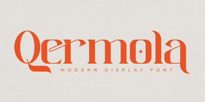 Qermola is a stylish and delicate serif font. It is perfect for an elegant & luxurious logo, book or movie title design, fashion brand, magazine, clothes, lettering, quotes, and so much more. This font is PUA encoded which means you can access all of the glyphs and swashes with ease!
 - Ballast by Thanoestd,
$15.00 Introducing the new "Ballast" font, an natural and unique handwritten font. For those of you who are needing a touch of natural and unique. It’s perfect for stationery, greeting cards, branding and much more! This font is PUA encoded which means you can access all of the great glyphs.
 - Clio Icons by LeType,
$39.00 Clio Icons is designed to give more elegance to your project, the font has 88 icons that can be connected to one another forming marks and backgrounds in an unique and stylish way. The quotation marks were inspired by the famous quotation marks from Computer Arts Brazil magazine.
 - Sales Event JNL by Jeff Levine,
$29.00 Sales Event JNL is an inline sans that was modeled from examples of old wood type. Its casual, cheerful style well suits point-of-sale signage or banners, fun headlines and relaxed themes. The font is available in both the regular inline version and the black (solid) version.
 - Galvantur Grand by Ivangard Studios,
$10.00 Galvantur Grand is an uppercase-only display font, intended to be used for attention demanding titles and headers, or generally any form of text that needs to take center stage. An offshoot of the Galvantur font, Galvantur Grand takes things one step further towards the extreme, to really give your design projects that special flair. Characterized by the double lines and negative space between them, this powerful font can make any form of text stand out strongly. The multiple styles included can further help customize your designs and projects, to get the perfect feeling you're going for. Comes in 7 different styles - Regular, Oblique, Light, Light Oblique, Outlines, Light Outlines and Oblique Outlines. To get an idea of the various styles, please check out the images or use the preview field to type in text. Galvantur Grand supports Latin and Cyrillic based languages. IMPORTANT: This is an uppercase-only font. Typing out lowercase characters will look exactly like typing out uppercase ones. Furthermore, it is recommended that this font is used with bigger sized text.
 - Hawkes by Kimmy Design,
$15.00 Hawkes is an extensive handmade typeface family that comes with a bundle of weights, widths and styles, all designed to work cohesively. Here is a breakdown of the Hawkes family. Hawkes Sans: The primary subfamily is a sans-serif typeface that includes nine fonts: three weights (light, medium and bold) and three widths (narrow, regular and wide). Within this set are an array of stylistic features; including small capitals, character style alternatives, discretionary ligatures and contextual alternatives. See details below for more information on OpenType Features. Hawkes Variable Width Sans: The secondary subfamily is the same base sans-serif fonts but combined in variating widths. Essentially, it takes all three widths of each weight and randomly mixes them together. This creates a funky and creative alternative to the more traditional sans-serif set. The variations are for the uppercase, lowercase, small capitals, ligatures and numbers. Hawkes Script: The last subfamily is the script typeface. It’s a quirky script with variations of its own, including ligatures, swashes and contextual alternatives (again, see below for further details.) The script font works great as a complimentary style to the sans-serif, or on it’s own. FEATURES Alright, let’s get into all the extra goodies this typeface has to offer. Small Capitals: Small caps are short capital letters designed to blend with lowercase text. These aren’t just capital letters just scaled down but designed to fit with the weight of both the lowercase and capitals. With Hawkes, small caps can either sit on the baseline (in line with the base of the capital and lowercase) or to be lifted to match the height of the capital letters by applying the discretionary ligature setting in the OpenType panel. These small capitals have a dot underlining them that sit along the baseline. The feature offers a unique display affect that is great for logos, titles and other headline needs. Discretionary Ligatures: A discretionary ligature is more decorative and unique combination than a standard ligature and can be applied at the users discretion (as the name indicates.) The specific styling for these ligatures varies for different fonts. With Hawkes, they are used as an all capital styling feature, or to lift the small capitals to align with the height of the capitals. In the former setting, both lowercase and uppercase letters are first changed to all capitals, then a specialized set of letter combinations are transitioned so small characters are positioned within a main capital letter. These combinations only happen with main characters that include an applicable stem, such as C F K L R T Y. Some of these combinations include two or three characters. When Small Caps is turned ‘on’, this feature will lift the small caps to the height of the capital letter. For more information, please check out the user guide! Stylistic Alternatives: Stylistic alternates are a secondary form of a character, often used to enhance the look or style of a font. For Hawkes, these alternatives provide a slightly more handmade feel. A - the capital and small capital A will lose its pointed apex and become rounded. Think of it more as an upside-down U than an up-side-down V ;-) Oo, G, Ss, Cc- these characters’ topmost terminal becomes a loop. The O is applied automatically, the G S and C need to be turn on individually. Titling Alternatives: This feature does sort of the opposite of what it intends. Instead of being used for titling purposes, this feature makes the text look better in paragraph text settings. Kk Rr h n m - curved terminals on the are straightened e - the counter stroke also gets straightened from a more looping motion y - the shape of y is changed from a rounded character to a sharper apex (think more like a ‘v’ than ‘u’) Contextual Alternatives: Contextual alternates are glyphs designed to work within context of other adjacent glyphs. With Hawkes Sans, there are three slightly different variations per character. The feature rotates the application of each variation. This helps with organic authenticity, so if you have two e’s next to each other, they won’t look identical (reflecting the natural variations in handwriting and lettering.) With Hawkes Variable width fonts, I have created a contextual pattern that randomizes the widths of each character. So, when the feature is turned ‘on’ in the OpenType panel, the widths would alternate in a pattern such as: Narrow, Wide, Regular, Narrow, Regular Wide, Narrow, etc. It happens automatically so the user doesn’t have to think or worry about getting a random seed. With Hawkes Script, contextual alternates allow strokes to connect properly from one character to the next while maintaining a believable, natural flow. Connecting strokes are present for two letters next to each other but are replaced by a shorter stroke when located at the end of a word or sentence. Some characters have in-strokes when located at the start of a word. When a character is preceded by a capital letter that doesn’t connect, it too needs an in-stroke or altered spacing. This feature is complicated and messy, but luckily you don’t really have to think about it! I’ve done all the coding so all you have to do is turn ‘on’ the feature in the OpenType panel and you are off to the races! I’m just letting you know what’s happening behind the scenes. Swashes: These are just for Hawkes Script and provide tail swashes to the start and ends of letters. There are three different options. You can pick the basic option by turning ‘on’ the swash feature in the OpenType panel, or you can pick using the Glyph panel. Stylistic Sets: This feature work in new versions of Illustrator CC and InDesign CC. You can pick specific styling sets instead of turning on an entire feature. For example, let’s say you want to have a loopy S, but not a loopy C or O, you can just turn on the S in the Style Set. It also helps create the little drop box that pops up when you hover over a character, showing you the alternates associated with that character. This makes it easy to pick and choose specific styles you want in a word or headline. ---------- And there it is folks! That’s all the basic info on Hawkes, I know it’s been a lot and I appreciate you hanging on. If you are like me and need more of a visual reference to accessing all these goodies, I’ve made a user guide to help navigate Hawkes and everything it has to offer. Altogether this extensive family boasts 14 total fonts in a wide array of styles, weights and widths, making it a great addition to any handmade type collection. Enjoy!
 - Steel Grrrder Nutjob by ULGA Type,
$9.00 A single-weight display font, Steel Grrrder Nutjob is an industrial-style stencil with a nut device. It’s best used in short display settings or as an introductory drop cap to grab attention. The capital letters sport an open nut while the lowercase letters feature a solid nut. It’s not the most legible design, but if you’re after a robust display font with an element of nuts, this will do the job perfectly. The Steel Grrrrder extended family also includes a six-weight sans-serif with corresponding italics, a six-weight joining script and a display font, Groove - all designed to work with each other.
 - ATTACK OS by OS CORP,
$25.00 ATTACK OS font version: 1.0 is the first version, including 340 characters, there are 4 types of handwriting that are: Regular; Italic; Bold; Bold Italic. We work with agencies and brands on visual identities and custom type design. Do you need a new font? Or an adjustment of the existing one? We can handle it on a best technological and creative level. New font design We create a concept and drawing of a completely new font to emphasise the character of your brand or project. Modifications to our fonts We adjust one of our retail fonts to your needs. It usually means a small change in design, an extension of the language set or icons. Let’s discuss how we can work together
 - Bumble OS by OS CORP,
$3.00 BUMBLE OS font version: 1.0 is the first version, including 340 characters, there are 3 types of handwriting that are: Regular (Regular); Italic (Italic); Bold (Bold). We work with agencies and brands on visual identities and custom type design. Do you need a new font? Or an adjustment of the existing one? We can handle it on a best technological and creative level. New font design We create a concept and drawing of a completely new font to emphasise the character of your brand or project. Modifications to our fonts We adjust one of our retail fonts to your needs. It usually means a small change in design, an extension of the language set or icons. Let’s discuss how we can work together
 - OakPark by Ingrimayne Type,
$9.00 OakPark is a decorative or display family with an Art-Deco feel. It has high contrast with very thick stems that invite decoration. Eight members of the family have interior decoration and can be used individually or in layers over the regular style and under hollow style to create colorful text displays. These ten members are all-caps, but about half of the letters on the lower-case keys differ in some way from their counterparts on the upper-case keys. There is also a shadowed style and it can be layered with a shadowinside style. Completing the family are a style that has true lower case characters with an accompanying italics, and a style that has small caps on the lower-case keys.
 - Umbero by NaumType,
$25.00 Umbero is an experimental geometric blackletter. Umbero was inspired by modern street art (by artists like Pokras Lampas, RETNA, etc.), gothic script and constructivism. It has an ornate and twitchy structure: you can not find two similar letters. Capital letters have even more complex structure, then lowercase, to the extent that you can even use them as initial letters with a different, more calm font if you want to achieve a medieval stylization in a contemporary way. Get Umbero if you need something extra for your design. Or vice versa use it as a starting point of your work. It’s a perfect choice for the mystic or contemporary logos, headlines, oversize typography, branding, identity, website design, album art, covers, posters, advertising, etc.
 - Emporia Roman by Bean & Morris,
$35.00 SPQR Senatus Populusque Romanus or The Senate and People of Rome as quoted by the likes of Marcus Tullius Cicero or Tully to his friends and Titus Livius otherwise known as Livy. SPQR appeared on battle standards carried by Roman troops and no doubt can still be seen chiseled into stone facades across the old empire of the ancient Romans. This evokes visions of stonemasons delicately inscribing messages that were meant to endure, one which can still be seen on the Trajan column circa 114AD. Emporia Roman is a modern display font that was inspired by the craft of those ancient artisans, with an added lowercase set, some flourished alternates, an oldstyle set of figures and now with a matching Italic.
 - Alcuin by Linotype,
$29.99Gudrun Zapf von Hesse designed the first sketches of Alcuin in 1986. The namesake of this typeface was an advisor of Charlemagne and was responsible for the writing reform of the Carolingian era. Alcuin was born in 735 in England, became an abbot in Tours and died there in 804. It was the idea of Zapf von Hesse to develop a modern text type based on the forms of the Carolingian minuscule. To create a text type that is excellent for a wide variety of applications, typical handwritten elements had to be discarded while still retaining the flow and character of handwriting. Alcuin with its strong calligraphic expression may be used in books, magazines, and also in the area of printed office communication. - Poppin by Kustomtype,
$20.00 Poppin is a playful font-type that you can comfortably use in all kinds of styles, from modern to old school. A combination of a few names on an old movie poster is what triggered the creation of this font type. Because it had such a strong rock and roll character, I decided to dedicate a font-type to it. The Poppin font is completely hand-drawn and then digitized. It results in being an extremely user-friendly, complete and modern font that you can use in all your graphic applications. Poppin is a font from the subculture that has been updated to a hip and classy font, ideal for eye-catching designs. Poppin comes in 4 styles, regular, bold , round & bold round. Poppin makes everyone smile!
 - MFC Patisserie Monogram by Monogram Fonts Co.,
$19.95 The source of inspiration for MFC Patisserie Monogram is a letter set from the book, "Letters and Lettering" by Paul Carlyle & Guy Oring, published in 1938. This elegant decorative style was shown as Capitals & Numerals only, but we've expanded it out to include Capitals, Smallcaps, Numerals, an Ampersand, and ornamental parenthesis, brackets, and braces. MFC Patisserie Monogram can create one, two, or three letter monograms as well as basic headline and titling settings. It is a refined look that is as darling as it is delicate. The numeral set and bullet dividers allow for more detailed and personalized monograms. If you want an even more customized look, you can add any of a handful of brackets, braces, or parenthesis to surround your monograms in a complimenting style.
 - Novante by Arterfak Project,
$28.00 Novante is a luxury display serif, a beautifully smooth and elegant typeface with high contrast of the letterforms that represents glamour and magnificence. Inspired by the luxurious Art Deco and modern minimalist of the design trends. Novante is an All-caps font equipped with lots of stylish ligatures and classy alternates that you can mix and match to get an elegant typographic look. This versatile font can be used for branding, logos, labels, quotes, magazines, cards, or short body text. The fonts features: Uppercase Small-caps Numbers Symbols Punctuations Accents (26 languages) Stylistic alternates Stylistic set 01-04 Discretionary Ligatures I hope you enjoy this elegant font as much as I was excited making it. Ramz. Check out Ranille which is a great pair for Novante.
 - Delugional by Roland Hüse Design,
$24.00 Delugional is an Atlantis theme typeface, it's character set is an imaginary alphabet inspired by Greek style scripts mixed with Classic Latin. This font is a display font family of two weights, Regular and Bold. It can be used for various creative/mythological and fantasy theme projects from book covers to games or movie titles. There are some OpenType features such as Stylistic Alternates and Discretionary Ligatures along with some extra symbols like sun, moon, snake and the stylised map of Atlantis in place of stylistic set 02 of uppercase "O". I have also created a font presentation video you can view it on youtube here: https://youtu.be/f7bKdoffWnI I hope you enjoy this one as much as I did while creating, Good luck with your project!
 - Rotulo Variable by Huy!Fonts,
$195.00 Rotulo Variable is a contrasted sans family which combines the Thick & Thin signpainter's style and some 70s feeling in a huge font family with three axis: Width, Weight and Slant. A visit to an exhibition of Spanish movie posters by Jano was the beginning of Rótulo (Spanish for Sign) project. Classic thick & thin signpainter style was featured in many letterings of those posters, as it was a very common style in 60s and 70s Spanish design. Unfortunately, today very few Contrasted Sans are seen, something that was quite common years ago has fallen into disuse in favor of Helvetic monotony. Rótulo recapture all that personality, with an extense range of weights and widths to be used in striking headlines and short texts.
 - Zenoa by Brenners Template,
$19.00 Zenoa Display Serif Font Family - They are sharp and sensitive, but connected-oriented. That's why they're designed by incorporating hook glyphs into an elegant serif style. Somewhat high contrast between vertical and horizontal, they reveal the strong individuality of each glyph, so you can create creative layouts. The meticulous design stands out so that readability and individuality can be expressed in harmony. And, these are the special excellences of this font family: Stylish Alternates and Ligatures where calligraphic subtlety is artistically connected. These OpenType features are decorative pleasures of using this font family more functionally. Please check first if the app you are using supports these features. They are easy to use in Adobe apps such as Photoshop and Illustrator. Alternates : A, B, C, D, E, F, G, H, J, K, L, M, N, P, Q, R, S, T, U, V, W, X, Y. Standard Ligatures : ff, fi, fl Discretionary ligatures : Am, Ba, Ca, Ch, De, En, Fr, Ge, Ha, In, Lo, Mi, No, Pa, Ro, Sa, Th, Va, Wo, Yo, an, bi, ck, de, ee, gn, ha,ie, lo, mo, no, oo, pr, ro, ss, st, te, um, ve, we, yo. Supported Languages: Western Europe, Central/Eastern Europe, Baltic, Turkish, Romanian
 - Chlorophyll by Alit Design,
$18.00 Introducing "Chlorophyll" - A Sans Serif Font with a Refreshing Natural Elegance Unveil the beauty of nature in your design projects with "Chlorophyll," a stunning sans serif font that combines modern simplicity with the organic charm of leaf illustrations. This elegant typeface is designed to infuse your creations with a sense of natural harmony, making it perfect for a wide range of applications, from branding to packaging and beyond. Key Features: Sans Serif Sophistication: "Chlorophyll" boasts a clean and versatile sans serif style, making it ideal for both display and body text. Its balanced letterforms exude a sense of modern sophistication, ensuring legibility and impact in all your design endeavors. Leafy Delight: With meticulously crafted leaf illustrations integrated into the font's characters, "Chlorophyll" embodies the spirit of the great outdoors. Each letter and symbol subtly incorporates the elegance of leaves, creating a seamless connection to the natural world. Elegance in Simplicity: "Chlorophyll" captures the essence of natural beauty through its simplicity. This font is a testament to the idea that less is more, allowing your content to shine while adding a touch of eco-friendly charm. Versatile Usage: Whether you're designing a logo for an eco-conscious brand, creating invitations for a garden wedding, or crafting a menu for a farm-to-table restaurant, "Chlorophyll" adapts effortlessly to diverse design projects. It's a versatile tool that can evoke a sense of elegance and sustainability in any context. Extensive Character Set: "Chlorophyll" includes an extensive character set, encompassing uppercase and lowercase letters, numerals, punctuation, and a wide range of special characters. This ensures compatibility with multiple languages and enables you to express your message with clarity and grace. Digital and Print Ready: "Chlorophyll" is delivered in multiple formats, making it ready for both digital and print applications. Its high-quality vectors ensure crisp and sharp rendering in any size or medium. Embrace the allure of nature and elevate your design projects with "Chlorophyll." This sans serif font, inspired by the beauty of leaves and the elegance of simplicity, brings a touch of the natural world to your creative endeavors. Elevate your designs, evoke a sense of harmony, and make a lasting impression with "Chlorophyll" today.
 - HAWAIIAN DREAMS PERSONAL USE - Personal use only

- Black Oak - Personal use only

- Drinking - Unknown license


