8,934 search results
(0.03 seconds)
- Brush King by Subectype,
$17.00 Brush King is a supercharged, street-wise brush font bursting with energy, with extra attention to quick strokes and sharp details. This font is perfect for challenging jobs, titles, t-shirts, websites, hoodies, and various print and digital media with energy. Brush King is ideal for logos, apparel, quotes, product packaging, or anything which needs a typographic turbo-boost.
 - Dark Blades by Tadiar,
$19.00 Dark Blades is an authentic gothic vintage font family of 4 fonts created for headers and text. Multilingual support (Latin Extended). Designed for: - Vintage branding (Clothes, Alcohol, Bikes, Games) - Horror - Music branding - Myth: Vampires, Zombie, Halloween, Werevolves, Magic, Fantasy - Medieval style Well use in vintage labels, headers & titles, Posters, Street Signs and other Outdoor, Package Design.
 - Agneya by Seventh Imperium,
$37.00 Agneya is calligraphy script font, inspired by urban street art. Equipped with opentype features. Stylistic alternates, swash and more 600 glyph. It is make easily to create such as Signpainter logo and various purposes. Just open the Opentype Alternates and choose The alternates that fit best, and you can play with your creation to make your unique designs.
 - Fatigue by Typesthetic Studio,
$13.00 Heroic is a bold and playfull handwritten brush font. This font is very unique because sometimes it can look fierce like in modern street art graffiti if with capital letters, but sometimes it can look cute if it is included with the lowercase letters. As a result, this font can matches a wide pool of designs.
 - Bomber Urban by Nirmana Visual,
$22.00 Bomber Urban Inspired by Graffiti Street Art, Bomber Urban is a fun, urban-style display font. This font is suitable for designs like logos, advertising, apparel, jerseys, sportswear, skateboard designs, and more. Take your concepts to the next level with this stunning font! Make your designs stand out with the urban and edgy look of our Graffiti font.
 - McCadden JNL by Jeff Levine,
$29.00 McCadden JNL was inspired by the hand-lettered credits for the George Burns and Gracie Allen Show [1950-1958]. Its casual theme offers a lighthearted approach to titling and display work. The font gets its name from McCadden Productions (the company started by George Burns), which itself was named after a street Burns' brother William once lived on.
 - Just Pixo by Latinotype,
$29.00 Inspired by the streets of Brazil, Just Pixo is a display typeface that mimics pixação, Brazilian graffiti. In his book Pixação: São Paulo Signature, François Chastanet says, “This alphabet, with its vertical inscriptions axis, is to be directly classified in the king-size, monumental category; the systematic use of capitals, meticulously aligned and justified, their extreme verticality, are symptomatic of this architectural dimension”. As such, we designed Just Pixo for monumental type sizes and vertical alignments—a family with seven weights, alternate glyphs, multiple ligatures and is provided as a Variable Font too. Unique decorative serif capitals and lowercase sans serif versions make Just Pixo the perfect option for large displays, strong headlines, urban logos, and contemporary concepts. Despite its controversial use on the streets, this often politically charged style will typeface will take your next project to the next level.
 - LiebeChristmas by LiebeFonts,
$19.90 LiebeChristmas is a hand-crafted collection of Santas, Rudolphs, gifts, treats and more Christmas items in countless variations and sizes. Create pretty Christmas greetings with a personal touch. Surprise your family and friends by printing individual cards for everyone. Decorate your blog or website for the holiday season. More than 100 carefully crafted drawings are included in this single font and can be used in any text or graphics application. How about creating your own wrapping paper with LiebeChristmas patterns? Or how about making Christmas cards in combination with our popular typeface LiebeErika?
 - Wisely by Mili + Wise,
$12.00 Perfect for writing out uplifting quotes for instagram posts, wall art or greeting cards. It will also be there for you if you need to design some charming packaging or branding. Suitable for short and sweet quotes, as well as longer meaningful paragraphs. Designed and kerned with care and love to make using it a breeze. Wisely is packed with lovely features: contextual alternates to give the text this hand-written look you need many stylistic alternates for uppercase and lowercase ligatures multilingual support with accented characters for international designers
 - Winter Break by Supersemarletter,
$10.00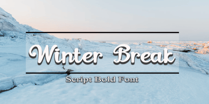 Winter Break is a sweet and flowing handwritten font. It looks stunning on wedding invitations, thank you cards, quotes, greeting cards, logos, business cards and every other design which needs a handwritten touch. Honestly it works perfectly for headlines, logos, posters, packaging, T-shirts and much more. Font Features : • Regular version • Character set A-Z in uppercase and lowercase • Numerals & Punctuation • Accented Characters • Multiple Languages Supported Recommended to use in Adobe Illustrator or Adobe Photoshop with opentype feature. If you have questions, just send me a message and I'm glad to help.
 - Vododeo JNL by Jeff Levine,
$29.00 Vododeo JNL is directly named for the free-form sheet music title lettering from Jack Yellen and Milton Ager's "Vo-Do-De-O". The term itself was a catchphrase made popular during the era known as the "Roaring 20s". Yellen and Ager were responsible for such hits as "Ain't She Sweet" (1927) and "Happy Days Are Here Again" (1930) along with countless others. During his career, Jack Yellen provided lyrics to over 200 songs. As a side note, Yellen was married to a distant cousin of type designer Jeff Levine's late mother.
 - Aima Font Duo by Areatype,
$15.00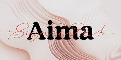 Aima Font Duo A sweet signature font, casual and dynamic with a dancing baseline. Also available Aima Display to help you mix and match it to fit your creative work in harmony. all to add an authentic touch to your designs. perfect for Branding, Logos, Greeting Cards, Wedding Stationery, Quotes etc. Files included: Numerals & Punctuation Stylistic Alternates & Ligatures PUA Encoded Characters Thanks so much for looking, I really hope you enjoy it and please don't hesitate to drop me a message if you have any issues or queries :) Happy using
 - Thistle Balloons by Ditatype,
$29.00 Thistle Balloons is the right script font for natural, casual, personal displays because the letters are in forms of real cursive handwritings connected to each other to create togetherness and continuity nuances. This script font has low letter contrasts to show a more casual, friendlier display and a variety of letter heights. Some letters may look higher than the other ones to make them more interesting and dynamic, and such inconsistent letter sizes can enhance the natural, personal nuances to the font itself. Additionally, it is better to apply this font for big text sizes and you may also enjoy the outstanding features available here. Features: Ligatures Multilingual Supports PUA Encoded Numerals and Punctuations Thistle Balloons fits best for various design projects, such as brandings, quotes, invitations, name cards, greeting cards, printed products, merchandise, social media, etc. Find out more ways to use this font by taking a look at the font preview. Thanks for purchasing our fonts. Hopefully, you have a great time using our font. Feel free to contact us anytime for further information or when you have trouble with the font. Thanks a lot and happy designing.
 - Debugger by Dharma Type,
$9.99 Debugger is a futuristic, sicentific, digital family of next-generation monospaced fonts for developing, programming, coding, and table layout. Some desirable features in monospaced fonts are listed below. 1.Easy to distinguish 2.Easy to identify 3.Easy to read Debugger has very distinguishing letterforms for confusable letters such as Zero&Oh, One&I, and Two&Z. A lot of ingenuity makes this family very distinguishable. Italics have somewhat large inclination angle to be distinguished from their Roman. For the same reason, Italics are slightly lighter than Romans. Italic is not cursive Italic. It is near the slanted Roman. This is an intentional design to identify Italic letters. Cursive is not suitable for programming font. Octagonal and diagonal letterform is good for sci-fi, digital projects. Common elements for each letterform makes harmony and a sense of unity. Debugger supports almost all Latin languages. Try this all-new experiment.
 - Trade Gothic Inline by Linotype,
$29.00 Trade Gothic inline is a quirky display companion for Trade Gothic Next, offering five different voices, and a whole lot of personality. The lighter weights are graceful and elegant, embracing negative space to give the sense that the letters are halfway to disappearing. Designer Lynne Yun has incised the darker weights with a super thin inline that emphasises the heaviness of the letters, and creates a reassuring chunkiness. “If I kept the inlines the same, it created a lot of visual noise,” explains Yun. “I wanted each weight to be different enough, so in the end the weight and width of the letters was increasing and decreasing in size, and the inlines were too. The black is almost like an extra black, because the inline is smaller. It's about trying to have different voices for each weight.” Trade Gothic Inline is available in five weights, from light to black.
 - Tanger Serif by Typolar,
$72.00 Inspired by New Transitional and Egyptian fonts, Tanger Serif has elements of a sturdy work-horse text face and finely detailed headline font. A wide variety of widths and weights support many text sizes. Typically Narrow is used in headlines, Medium in body and Wide in smaller print. Nothing is predefined, though. By combining the right widths with the right weights this traditional approach can easily be challenged. Let’s take an oversized (over 10 pt) body copy for instance. In conjunction with using a bigger size to enhance readability, a narrow and slightly lighter weight will save space and brighten text color. Tanger Serif Narrow is a slim normal rather than a condensed face. As an Open Type “Pro” font each weight includes an expanded character set, small caps, old style figures, tabular figures, ligatures, fractions etc. All these are easily accessible through OpenType features.
 - Virgin by John Moore Type Foundry,
$95.00 Virgin is a hybrid typeface with a Victorian spirit, based on script forms of Romanesque ornamentation. With his rich variety of stylistic forms, ornaments and catchwords, Virgin is a chance to create completely new texts, varied and elegant. About 1100 Glyphs allow users to create words out standard, thanks to its Opentype programming in countless combination of alternates. The variety of styles makes it easy to create texts according to your taste and use because Virgin offer an unlimited combinations of stylistics alternates. Virgin is ideal for humanistic texts, tourist ads, liquor and wine labels, fashion and even for cosmetic purposes. Virgin is presented in solid and inline version, and a basic version for web in lighter weight, also providing a refined collection or ornaments and catch Words. Virgin has been specially designed for logotype, packaging & publishing design project. Virgin evokes the richness of nature in its biodiversity.
 - Capraia by CAST,
$45.00 Capraia is a book typeface, with a heavily quirky look when shown at big sizes, and with an irregular but attractive rhythm at text sizes. Capraia Book and Regular are designed specifically for continuous texts: Book meets a current preference of Italian publishers for lighter faces, while the slightly heavier Regular is intended for the wider international market. True to its vocation for publishing, Capraia has a big x-height, medium contrast and wide bracketed serifs. Furthermore, its slightly flattened curves, some unconventional roman letterforms (a, G, Q) and the 'slanted roman' italics, along with design details such as ball terminals, give to the whole family a very contemporary appeal. Originally the design was intended as a tribute to Caslon's Great Primer but at a certain point the designer was enthralled by Baskerville. Capraia is the unpredicted and original result of that intense experience.
 - PF Bulletin Sans Pro by Parachute,
$79.00 This is a grotesque typeface which was derived from an older more simple version designed back in 2000. Bulletin Sans Pro is distinguished by its selective deep cuts which give this typeface a robust and contemporary look. These cuts become more apparent at larger sizes while they create a more subtle effect at smaller sizes. For intense titles try the black version. When space and legibility for long texts are critical, use the lighter versions. The family consists of 10 fonts—from black to light—including true italics. It supports 20 special OpenType features like small caps, fractions, ordinals, etc. and offers multilingual support for all European languages including Greek and Cyrillic. Finally, every font in this family has been completed with 270 copyright-free symbols, some of which have been proposed by several international organizations for packaging, public areas, environment, transportation, computers, fabric care and urban lifestyle.
 - Ciroya by Twinletter,
$17.00 Welcome to Ciroya, a typeface universe full of passion and fun! Ciroya is the answer if you want a strong, bold, and vivid style for your projects. Ciroya is available in three different styles: regular, outline, and shadow. You can use this to create effects that suit your vision, such as colorful to lighter outlines or shadow effects. But wait, there's more! Ciroya also has a plethora of other ligatures and characters, allowing you to express your creativity and create genuinely unique and spectacular designs. Ciroya, of course, supports several languages, allowing you to engage with audiences worldwide. Make Ciroya your top choice for projects that require a playful, playful look. Let your message be combined with Ciroya's carefree touch and make an unforgettable impression. With Ciroya, every word becomes more vibrant and colorful. Explore your creative potential right away with this fun font!
 - Senpai Coder by Dharma Type,
$9.99 Senpai Coder is a family of typewrighter-style monospaced font for developing, programming, coding, and table layout. Some desirable features in monospaced fonts are listed below. 1.Easy to distinguish 2.Easy to identify 3.Easy to read Senpai Coder has very distinguishing letterforms for confusable letters such as Zero&Oh, One&I, and Two&Z. A lot of ingenuity makes this family very distinguishable. Italics have somewhat large inclination angle to be distinguished from their Roman. For the same reason, Italics are slightly lighter than Romans. Italic is not cursive Italic. It is near the slanted Roman. This is an intentional design to identify Italic letters. Cursive is not suitable for programming font. Typewriter letterform (serif) is good for reading. Common elements for each letterform makes harmony and a sense of unity. Senpai Coder supports almost all Latin languages. Try this all-new experiment.
 - FS Aldrin by Fontsmith,
$80.00 Elegant and round Having harboured a desire for a rounded font within the Fontsmith library for some time, Phil Garnham recognised that FS Emeric offered the perfect skeleton around which to design it. Most new rounded fonts rely on scripts or other in-app automation to form their characters. For all their warmth and approachability, they too often conjure images of jelly sweets and sausages. Not so FS Aldrin, where every curve and transition has been crafted by hand, giving a distinctive look and elegant feel. Design highlights FS Aldrin enjoys wide-open ‘lunar’ counters and soft, tube-like terminals. These improve legibility, especially on backlit signage and screens. The open proportions and circular strokes are juxtaposed against a more serious technical aspect that exists within each counter shape. The lighter weights feel precise and efficient, perfect for notes on blueprints or technical drawings. The heavy weights are equally crafted but more playful by their rotund nature, and are perfect for strong headlines or packaging projects. UI icons A suite of 268 icons complement the typeface beautifully and extend the design language in all directions. They cover a range of commonly used applications and themes ranging from ecommerce to weather, and also serve as a solid starting point for a bespoke brand icon set or UI. In addition, born of FS Aldrin’s astronomical theme and playful nature is a special collection of space-themed icons, including rockets, shuttles and lunar modules (hint: if you type the word BUZZ with ligatures enabled, an astronaut appears). Earth to Buzz Buzz Aldrin was the pilot of Apollo 11’s lunar module, the one that put man on The Moon for the very first time. Early on in the project’s life, FS Aldrin emerged as the ideal hook on which to hang the font’s space helmet (hardly surprising given Phil’s fascination with space travel and astronomy). An approach was made to Buzz’s management to see if he would sanction the association. Not only was the great man himself happy to see his name on a typeface, he also asked to use it in his upcoming keynote talks, book launches and online projects.
 - INDG Actio by Iñigo Uriarte,
$5.00 INDG Actio is the result of a several years long exploration. In it, a minimum amount of shapes are assembled into an alphabet of sci-fi feel. It is my personal Eurostil. Inspired by hope of a brighter future, INDG Actio is a great fit for spatial fantasy material, music gear interfaces or forward-looking tech ventures, as an example. Though designed mainly to be a display font for titles, short texts and logos, it is versatile. Have fun with it and adapt it to the specific needs you may have. INDG Actio is a family consisting of 5 weights of 208 glyphs each, including 12 stylistic alternates.
 - PiS LIETZ Rathoga by PiS,
$38.00 Welcome to the Jet Age! LIETZ Rathoga jumps right out of the covers of vintage Space-Hero comics and onto your flickering cathode ray tube monitor. Fight the evil Zombies of the Stratosphere with sharp serifs! Race the Rocketmen with narrow stroke widths and fast italics! Loaded with Ligatures for more firepower! Team up with Rathoga's brothers and sisters from the LIETZ font family and you will triumph over the hordes of evil! Power on!
 - Cordel Interior by Ana Cordel Interior Font,
$15.00 Cordel Interior family draws inspiration from covers of 'cordel literature’, - small booklets of popular story-poems that played an essential role on the folk-popular cultural life of Brazil. Printed in coarse paper, usually with an woodcut illustration and lettering in the front, these booklets were sold on the streets, in marketplaces and town squares, hung in a cord - therefore the name ‘cordel’.
 - Shootout by Arendxstudio,
$14.00 Shootout - Street Typeface with sharp and beautiful letters that create fonts that are modern, trendy and elegant. Came with opentype features such stylistic alternates, stylistic sets & ligatures good for logotype, poster, badge, book cover, tshirt design, packaging and any more. Features : • Character Set A-Z • Numerals & Punctuations (OpenType Standard) • Accents (Multilingual characters) • Ligature • Alternate There it is! I really hope you enjoy it
 - Barrowboy by Studio K,
$45.00 Barrowboy was inspired by the handwritten sales tickets that are still to be found on market stalls and fruit barrows, and are as familiar as the street cries that accompany them. The signage is mostly confined to numerals, so translating it into a font is pretty much a work of imagination. See also my other fun fonts Bebopalula, Calypso and Pier Arcade.
 - Bellinzo by Zealab Fonts Division,
$9.00 Bellinzo sans serif font is a set of 3 weights and it is good for making creative displays and it has urban / street wear touch. It’s a lovely and unique sans serif font, allowing you to make each word look completely stylish! Bellinzo is the unique typeface for creating elegant headlines, fashion magazine covers, book covers, templates and creative displays and logo designs.
 - Hennepin by Josh Grzybowski,
$24.99 Hennepin derives from a bridge, a street and a county that share the same name in Minneapolis, MN. It is a serif font comprised of three agile weights: regular, light, and extra light. The character set contains typical OpenType features in addition to small caps, and old style numbers, but most importantly, it embraces stylistic alternatives that unite and complete this font.
 - Fearless Queen by Gassstype,
$25.00 Introduce, New Font in Fearless Queen Inspired from old skool graffiti Sketch and street art, we created this Typeface. Drawn in Procreate app, then vectorized and crafted carefully with passion, love and Prides :). Fearless Queen Typeface Suitable for many design project, branding, packaging, logo, wall art, headline, template, banner, poster, and many more projects. These include all caps, punctuation, and numerals.
 - Inferno Dingbats by Just in Type,
$20.00Nobody knows what God looks like but we know that the Devil has a thousand different faces. Samuel Casal sees the demon everywhere. In the streets, the movies, rock music, books, gambling, other things and even in Hell. Devilishly, he captures it all with his magical design. Purchase the font Inferno Dingbats now and take control of the forces of Evil. - Maple Lane by Okaycat,
$29.00 Maple Lane is a refined traditional serif font composed by the Okaycat design team, Natsuko Hayashida & Luke Turvey, in 2014. Bold letterforms contrast with fine seriffed detail at Maple Lane to offer style excellence with fancy embellishment options. This nicely balanced serif is designed to mix and match with the more relaxed and casual version of Maple Lane,
 - Acid Squares by Milan Vuckovic,
$29.00Acid Squares is a casual ornamental (fun) font. It was inspired by squares, the 70’s, the 90′s, street art and Berlin. Due to its limited readability it is recommended to use it in words that are common and uncomplicated or in logo design. As a decorative element it can be used well if the kerning is adjusted by the user. - Concert Series JNL by Jeff Levine,
$29.00 The design of Concert Series JNL is based on hand-lettering for a 1930s-era WPA (Works Progress Administration) poster for the Federal Music Project of New York City’s symphony concerts. Held every Sunday at the Theater of Music [located at 254 West 54th Street], the admission in those Depression-era days was 25 cents and 60 cents, with all seats reserved.
 - Taurus by Fenotype,
$30.00 Save time and effort – choose your type wisely. Use Taurus and you’ll achieve impact without having to resort to cheap tricks. We have done the work for you: just type out words using Taurus and you’ll have a logo for a Wall Street law firm – or for that precious vintage Barolo. Refinement. Sophistication. Seriousness. Sex appeal. Taurus has it all.
 - Brushtter by Rockboys Studio,
$15.00 Brushtter is a modern brushed display font, incredibly adaptable to all sorts of urban or street related designs. It is suitable for any branding, product packaging, invitation, quote, label, poster, logo that you wish to create. PUA encoded = Accessible in the Adobe Illustrator, Adobe Photoshop, Adobe InDesign, even work on Microsoft Word. PUA Encoded Characters - Fully accessible without additional design software.
 - Marins Perdus by Biroakakarati,
$9.00 This font is inspired by graffiti calligraphy, it's only block letters in a modern style and more readable. The name "Marins Perdus" is from a novel by Jean-Claude Izzo "Les Marins Perdus", set in Marseille. The letters of "Marins Perdus" have a light inclination to the left, slim letters in a cool style, perfect for a title or a street event.
 - Scotch by Positype,
$29.00 Clean, crisp, rational, familiar, modern… serifed. Positype Scotch reaches back to history just enough to produce something warm and easy on the eyes. No corners were cut, no quick tricks… this type suite was drawn for specificity: Text, Display, and Deck… ALL in 3 widths that now include Condensed and Compressed. Each unique, each inter-connected, each part of the whole. Scotch Text is offered in 6 weights with matching true italics. Drawn for economy and an easy read, the family is a workhorse for long-passage text settings. 4 sets of numerals, well-proportioned small caps, and a plethora of extras round out each font. Scotch Display is not just a thinner version of Scotch Text wrapped in a higher contrast. Display sports shorter ascenders and descenders, a unique footprint, great contrast, and a more folded, calligraphic italics. Display subtly oozes sophistication and provides an attractive, exhuberant companion to Scotch Text. Scotch Deck rounds out the offering by choosing to be specific to its offering. Deck utlitizes traits and proportions shared between Text and Display, but alters its overall mass to balance out the needs for settings that require subheadlines, callouts and other similar uses. Essentially, something not so high-contrast and not so stress dense that works great for middle-sizes.
 - Cvltre Dope by IKIIKOWRK,
$19.00 Proudly present Cvltre Dope - Funky Brush Font, created by ikiiko. Where bold script meets funky in a stylish letters! This brush font is a rebellious celebration inspired by the vibrant pulse of street culture. Imagine a font that's as daring as your streetwear style – it's not just a font, it's a statement! Cvltre Dope is the wild offspring of graffiti vibes and urban flare, giving your phrases a streetwise edge. This font screams attitude with every stroke, making it the ideal complement for any streetwear business looking to break the stereotype. Bold, funky, and ready to conquer the streets, the font that doesn't just speak; it shouts in style! This font is very suitable for making a streetwear brand, poster, magazine layout, fashion design, quotes, or simply as a stylish text overlay to any background image. What's Included? Uppercase & Lowercase Numbers & Punctuation Ligatures Multilingual Support Works on PC & Mac
 - FS Benjamin by Fontsmith,
$80.00 Stone and steel FS Benjamin is a flared serif typeface designed by Stuart de Rozario. Consisting of 12 styles ranging from Light, Book, Regular, Medium, SemiBold and Bold with Italics it has clear, delicate letterforms, punctuated with brutal chiselled angles. With a pure and crafted feel to the forms the typeface has traditional roots but has been designed to work in a contemporary setting. Archetypal proportions in terms of x-height to cap height and ascender to descender ratio, allow the typeface to feel familiar and be legible in all platforms. Delicate brutalism Inspired by the contrasts of London and named after Big Ben, FS Benjamin was designed by Stuart de Rozario and founder, Jason Smith. Walking around London Jason was inspired by the juxtaposition of the old and the new. Glass and steel architecture can often be found amongst traditional signage and coats of arms seen around the City. These surroundings sparked an idea to create a modern design based on an alphabet that would traditionally be carved from stone. “Much of the typography we see today is so similar. I thought what if we created a typeface with traditional roots but modernised it to sit amongst the punk and noise of the streets of London? Old with new. Business with busyness. This is what London is all about.” Jason Smith