10,000 search results
(0.026 seconds)
- Honey Jar by Typefactory,
$14.00 Honey Jar is a bold and modern display font, carefully handcrafted to become a true favorite. This font will look outstanding in any context, whether it’s being used on busy backgrounds or as a standalone headline, especially on natural farm theme !
 - Rollback by Wildan Type,
$15.00 Rollback- a clean and smooth typeface with a rounded touch at each end of the caracter. looks lighter, more relaxed and humanist. This font has many alternative options and ligatures, perfect for creating designs such as packaging, logos or titles.
 - Tekanan by San Studio,
$10.00 Tekanan Typeface is an experiment and designed by Zainul Faozi. Tekanan Typeface looks futuristic and it's a great choice to use on your designs, such as a shop sign, poster, cover, headline, and more. Designer: Zainul Faozi Publisher: San Studio
 - Vezthisory by Stringlabs Creative Studio,
$25.00 Vezthisory is a Script Font with Handwritten Style. The Vezthisory font made with digital brush pen strokes that making this font look authentic. This font is perfect for fashion brand, wedding invitation, business card, logo brand, signature, and then calligraphy.
 - Frazzle by Paul O'Connell,
$9.95 This roughly hand drawn font was created to give that loose scribbled effect look and to imitate a typically hand written style. Designed and produced by Paul O'Connell of POCT, it is a typeface purely for fun to experiment with.
 - Zahariel by Scriptorium,
$18.00Zahariel is a stylish script font based on samples of turn of the century calligraphy. It has a different, cleaner look in comparison with many of our other script fonts, and features alternate versions of many of the lower case characters. - AZ Grampa by Artist of Design,
$25.00 AZ Grampa font was inspired from old content type on vintage tins. This font utilizes an "old look" to the line work which is designed to have a "worn feel" to it. Ideal for use as content text in you design.
 - Lecture Hall JNL by Jeff Levine,
$29.00 Lecture Hall JNL is a reworking of Dance Hall JNL. By removing the Art Deco flairs and realigning the horizontal strokes in order to create a more traditional design, the font now takes on the look of a classic headline face.
 - Ignorant by Bogstav,
$14.00 Ignorant was actually drawn on a grid. But due to the loose strokes of the pen, Ignorant has a lively look. I was thinking products for kids, packaging, organic products or something alike that needs a slightly rough and handmade font!
 - Straphang by PizzaDude.dk,
$15.00 Straphand is my idea of what you need for your next greeting card, invitation, poster or whatever needs a fresh and lovely brush! Looks awesome, even when written in ALL CAPS! Comes with extended language support and ligatures for double lettering!
 - Magisk Time by Bogstav,
$11.00 This is my roughly handprinted typewrite-ish font. It has all the cool and classic moves of the traditional typewriter look, but with a more rough attitude due to the contextual alternates (which offer 6 different versions of each letter!)
 - Cheat Sheet by Hanoded,
$15.00 Cheat Sheet is a handwritten typeface that looks like, well, handwriting. It is loose, legible and useful and comes with extensive language support. It goes without saying that I have never used a cheat sheet when I was in school… (ahum)…
 - Bakehouse by Vozzy,
$10.00 Introducing a curly label font named "Bakehouse". This family includes three styles - Regular, Light and Thin. Samples you can find on the preview. This font will look great on any retro design like poster, t-shirt, label, logo and more.
 - Matteny Angels by Multype Studio,
$16.00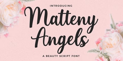 Matteny Angels is a beautiful and flowing script font. It looks stunning on wedding invitations, branding, thank you cards, watermark, fashion, quotes, greeting cards, logos, business cards and every other design which needs a handwritten touch. This font is PUA encoded.
 - Kelly Signature by Ake,
$15.00 Kelly Signature is a unique handwritten font. A little bit quirky, this font looks incredibly adept on a wide variety of contexts! This font is PUA encoded which means you can access all of the glyphs and swashes with ease!
 - Request by Din Studio,
$29.00 Request is a bold and authentic display font. It celebrates abstract shapes in all their eclectic beauty. This font will look truly outstanding in a wide range of contexts. Featured : Accents (Multilingual characters) PUA encoded Numerals and Punctuation (OpenType Standard)
 - Kitra 77 by LightHouse,
$49.00Kitra 77 was one of the studies to Hamuel Nine Five. Though at first glance we can find several similarities, a closer look will reveal a completely different font in color and proportion. Kitra 77 is an OpenType/TTF Unicode font. - Cut Block by Adam Ladd,
$20.00 A hand-drawn typeface that depicts the idea of cutting away pieces of wood. It has a rough, yet modern appearance as it is largely based off the popular Gill Sans (with some modifications). Leaving a graphic and textured look.
 - Margin Notes by The Arborie,
$11.00 Margin Notes font offers a natural handwriting look. It had imperfect, organic curves and off set lines that imitate natural hand written writing. Give this handwriting font a try with note-taking, organization or even a back to school poster.
 - Quick Rest by wearecolt,
$19.00 Quickrest is a tall & quirky type with slight irregularities, Quickrest does not do conformity - each character is entirely individual. A fun looking family with its heart set in the handmade / crafty scene. The Quickrest family features five weights and slanted versions.
 - Thiny Bunny by Sipanji21,
$17.00 hello i'm thiny bunny, a display font with thin characters, cute and funny look. This font is good to use for various graphic designs, such as logos, posters, banners, advertisements, crafting, packaging, stickers, kids, store logos, apparel and other designs.
 - Greatlove by Realtype,
$15.00 Greatlove is a brush script written in natural brushes. Written in quick motion using a rather dry brush pen, looks beautiful and is perfect for designs like, magazines, logos, product packaging, quotes, posters, merchandise, social media greeting cards and more.
 - Churchward Brush by BluHead Studio,
$20.00 BluHead Studio LLC is pleased to announce the release of Churchward Brush by New Zealand typeface designer Joseph Churchward. This showcard brush hand-lettered design looks great for flashy headlines and signage! The Italic is especially fun to work with!
 - Wingate JNL by Jeff Levine,
$29.00The elegance of the 1940s and the Art Deco Era is evident in Wingate JNL from Jeff Levine. Its tall, graceful styling is perfect for invitations, letterheads, announcements or anything that needs the look of yesterday with a sophisticated understatement. - Pentastic by Okaycat,
$24.50 Pentastic is a natural hand printed font designed for the look of written by pen. Clear legible style yet cute and fun. Pentastic features extended characters, containing West European diacritics and ligatures, making it suitable for international environments and publications.
 - Tropica Script by ITC,
$29.00Tropica Script was designed by Vince Whitlock, a casual, lighthearted script typeface. The initial capitals are complemented by a lowercase that connects by overlapping the linking elements on the bottom right of each letter, creating the look of true script. - Demian by ITC,
$29.99Demian is the work of Dutch designer Jan Van Dijk. It is an informal script font whose capitals should serve as initials to the word settings of the lower case letters. Demian has the spontaneous, flowing look of true handwriting. - FM Rossija by FontMeister,
$24.95 'Rossija' is inspired by russian typographic designs. It's bold look makes a perfect font for the use of titles. You can use these fonts to create posters, greeting cards, scrapbooks, CD labels, T-shirts, coffee mugs, digital videos websites and banners.
 - FM Pointifax by FontMeister,
$- The POINTIFAX family is a typographic flashback to computing of the early 1980s. POINTIFAX is based on a matrix of dots and looks like the output on an old computer screen. Each is built out of dots, horizontal and vertical lines.
 - Blantica by 4RM Font,
$35.00 Blantica font is inspired by something harmonious and is made with variations in inktrap with bold font sizes making this font look unique and harmonious. suitable in the use of display fonts and graphic designs such as logos, covers, and others.
 - Lemon Rolls by Illushvara,
$12.00 Lemon Rolls is a cute and casual handwritten font with an incredibly friendly feel. Whether you’re looking for fonts for Instagram or calligraphy scripts for DIY projects, this font will turn any creative idea into a true piece of art!
 - Bitelephant by Kah Khiong Design,
$13.00 Bitelephant is a type of pixel font with Slab Serif. It's unique pipeline characteristic, result a bold & simple font. It's bitmap give a retro game looks, but with a futuristic feel. Suitable for any fun, sci-friction, techno, game & digital theme.
 - Bodoni Unique by Monotype,
$29.99This Bodoni caps only font was an experiment from Dave Farey how tall such a Bodoni could be elongated in its design. It reminds to the look of a fence, but in large sizes it may fit on a narrow window. - Altwien by XTOPH,
$32.00 Altwien is a blackletter display font. Inspired by the old street-signs of Vienna and Salzburg. It’s a clear and simplistic looking condensed typeface. Put Altwien into a contemporary, fresh or modern context and get a completely new and unique style.
 - Nagotire by HafisHidayat,
$20.00Introducing the elegant and fashionable Nagotire handwritten font, which looks like a signature, this font is purposely made with a quirky alternative. Nagotire is suitable for greeting cards, product packaging, news, invitations, posters, blog posters, branding, business cards, logos, etc. - Lango by Letradora,
$10.00 Lango is a hand drawn face, long and lean with an extended character support and good legibility. It has a casual look without being too informal, and is good for scrapbooking, greeting cards, or wherever a handmade touch is needed.
 - Emirose by Ergibi Studio,
$16.00 Emirose consists of 4 weights: Thin, Light, Regular and Bold, all equipped with many ligatures and alternative letters that look cute and classy. They work very well for your work such as logos, brands, packaging, posters, invitations, headlines, posters, and more.
 - Bu Global by Butlerfontforge,
$18.00 While throned before your keys, under your drumming fingers awaits the most astounding standard computer typeface ever devised: BuGlobal. In addition to all the usual alphanumeric characters and symbols, this lone font lets you type more than 400 accented letters appearing in more than 80 English-variant languages worldwide, 70 common math and science symbols, and dozens of other useful characters —more than half a thousand all told— all within the digital parameters of one standard computer typeface, without needing any alternate keyboards or other clumsy digital luggage. Here is a sample: You can add any accent appearing in more than 80 English-variant languages used around the world to any letter appearing in all these languages simply by typing ANY letter then the accent. This includes more than 400 diacritic-laden letters in all —without needing to remember several keystrokes to type any of these letters as a few of them appear in standard computer typefaces. You can type more than 50 math/science symbols that do not appear in standard computer typefaces. These new symbols include several kinds of arrows plus constants, centerlines, dimensions, and graphs and scales that when retyped create continuous scales and graphs. Common symbols such as ballot boxes, rating stars, checkboxes, hearts, fancy fleurons, and similar motifs that do not appear in standard computer typefaces. Dozens of flashy arabesques like ========= [in BuGlobal these equal signs are kerned together so when you type them you create a continuous double line]. In this typeface more than 30 symbols that never appear twice in a row are kerned together so when you continuously type them you create all kinds of flashy arabesques that will make your typing more attractive. No other standard compute typeface allows you to do this. As for Beauty, BuGlobal’s characters are designed according to several axioms of ocular perception until each profile is as iconically simple as Shaker furniture. These axioms make BuGlobal’s letters easier to read compared to other typefaces, and a few of them are: Each letter should look much like the others but for one defining detail. The letters should be as similarly wide as possible. The letters’ midbars should be the same height and thickness. The higher the lowercase letters are compared to capital letters, the more legible and easily readable are their texts. BuGlobal has a typeface user’s guide, titled A Lovely Face, in which a description of each ocular axiom compares BuGlobal with Baskerville, Georgia, Palatino, and other commonly-used standard computer typefaces so you can quickly see why the other typefaces are inferior. You can download a pdf file of this typeface user’s guide, for free, at BuGlobal’s website, butlerfontforge.com, at any time so you can learn all about BuGlobal’s many amazingly new features before possibly buying it. BuGlobal’s plain letters are perfect for texts, its italics are gracefully emphatic, its bolds are ideal for titles and headers, and its arabesques are a fancy way to make your texts look dressy —all of which will add more shimmer to your semantic plumage. One good typeface is more useful than an infinity of poor ones. Robert Bringhurst
 - The Space Age font, crafted by the talented Justin Callaghan, invites us into a realm where retro-futurism and modern design sensibilities converge, creating a visual spectacle that feels both nostal...
- John Sans by Storm Type Foundry,
$49.00 The idea of a brand-new grotesk is certainly rather foolish – there are already lots of these typefaces in the world and, quite simply, nothing is more beautiful than the original Gill. The sans-serif chapter of typography is now closed by hundreds of technically perfect imitations of Syntax and Frutiger, which are, however, for the most part based on the cool din-aesthetics. The only chance, when looking for inspiration, is to go very far... A grotesk does not afford such a variety as a serif typeface, it is dull and can soon tire the eye. This is why books are not set in sans serif faces. A grotesk is, however, always welcome for expressing different degrees of emphasis, for headings, marginal notes, captions, registers, in short for any service accompaniment of a book, including its titlings. We also often come across a text in which we want to distinguish the individual speaking or writing persons by the use of different typefaces. The condition is that such grotesk should blend in perfectly with the proportions, colour and above all with the expression of the basic, serif typeface. In the area of non-fiction typography, what we appreciate in sans-serif typefaces is that they are clamorous in inscriptions and economic in the setting. John Sans is to be a modest servant and at the same time an original loudspeaker; it wishes to inhabit libraries of educated persons and to shout from billboards. A year ago we completed the transcription of the typefaces of John Baskerville, whose heritage still stands out vividly in our memory. Baskerville cleverly incorporated certain constructional elements in the design of the individual letters of his typeface. These elements include above all the alternation of softand sharp stroke endings. The frequency of these endings in the text and their rhythm produce a balanced impression. The anchoring of the letters on the surface varies and they do not look monotonous when they are read. We attempted to use these tricks also in the creation of a sans-serif typeface. Except that, if we wished to create a genuine “Baroque grotesk”, all the decorativeness of the original would have to be repeated, which would result in a parody. On the contrary, to achieve a mere contrast with the soft Baskerville it is sufficient to choose any other hard grotesk and not to take a great deal of time over designing a new one. Between these two extremes, we chose a path starting with the construction of an almost monolinear skeleton, to which the elements of Baskerville were carefully attached. After many tests of the text, however, some of the flourishes had to be removed again. Anything that is superfluous or ornamental is against the substance of a grotesk typeface. The monolinear character can be impinged upon in those places where any consistency would become a burden. The fine shading and softening is for the benefit of both legibility and aesthetics. The more marked incisions of all crotches are a characteristic feature of this typeface, especially in the bold designs. The colour of the Text, Medium and Bold designs is commensurate with their serif counterparts. The White and X-Black designs already exceed the framework of book graphics and are suitable for use in advertisements and magazines. The original concept of the italics copying faithfully Baskerville’s morphology turned out to be a blind alley. This design would restrict the independent use of the grotesk typeface. We, therefore, began to model the new italics only after the completion of the upright designs. The features which these new italics and Baskerville have in common are the angle of the slope and the softened sloped strokes of the lower case letters. There are also certain reminiscences in the details (K, k). More complicated are the signs & and @, in the case of which regard is paid to distinguishing, in the design, the upright, sloped @ small caps forms. The one-storey lower-case g and the absence of a descender in the lower-case f contributes to the open and simple expression of the design. Also the inclusion of non-aligning figures in the basic designs and of aligning figures in small caps serves the purpose of harmonization of the sans-serif families with the serif families. Non-aligning figures link up better with lower-case letters in the text. If John Sans looks like many other modern typefaces, it is just as well. It certainly is not to the detriment of a Latin typeface as a means of communication, if different typographers in different places of the world arrive in different ways at a similar result.