10,000 search results
(0.024 seconds)
- ITC Aram by ITC,
$29.99Jana Nikolic was finishing her degree program at the Faculty of Applied Arts, in Belgrade, with a final project that would combine her two majors: type and book design. Three stories from William Saroyan's My Name Is Aram would provide the text for the book, to be set in a typeface that Nikolic would design. Nikolic knew something special was happening the moment she put pen to paper. The letters just emerged," she recalls. "I started to explore a few new pens and found one I loved. I was able to make its tip bend with pressure." Like the family Saroyan writes about, the design flowing from Nikolic's pen would be simple but a little quirky. "When there were a whole bunch of little black letters around me," continues Nikolic, "I saw that this was going to be a very interesting typeface family." Nikolic drew Latin and Cyrillic letters, lowercase and capital letters, wide letters and narrow letters. She was surprised at how quickly and easily the design came. "There were no badly written letters," she says. "I hardly had to rework them and they fit together remarkably well." ITC Aram's standard character complement consists of one set of lowercase letters and two sets of capitals: one narrow and the other wide. The wide caps can be used with the standard lowercase, or mixed with the narrow caps for a variation on "cap and small cap" copy. The ITC Aram create the opportunity to mix and combine the letters into playful typographic expressions. Words and sentences that twinkle; text that seems light and alive - one runs the risk of creating work that is both delightful and charming when setting copy in ITC Aram." - Eksja by Protimient,
$29.00 Eksja is a modern slab serif available in four weights, each with a corresponding italic. All the fonts in the family have small caps, the extended latin character set, diacritical f-ligatures, enclosed numerals (numbers in circles) and case-sensitive punctuation. The general design of the typeface has been with a strong human touch in mind. The ends of the serifs have been given a subtle rounding, just enough to take the edge off which, when coupled with the largely humanist structure of the design, creates an open, friendly and approachable design, abandoning the usual geometric severity commonly associated with slab serif typefaces. Eksja contains quite a comprehensive numerals system. Obviously, each font has the standard proportionally and tabularly spaced lining and old-style figures but, crucially, the tabular numerals share the exact same width in each font variant. That means that you can choose to use the thin, regular, bold, black and their italic forms all in the same setting and they will always line up. In addition to the 'normal' numerals there are super-script and sub-script numerals and OpenType fractions that can be automatically composed as you type. There are also the enclosed numerals, numbers inside a circle, that are useful for numerically listing items and, thanks to the wizardry of OpenType, they can contain any number of digits (typically, enclosed numerals are precomposed single digits, only encompassing the 0–9 range, the enclosed numerals in Eksja can go to double digits, triple digits or, in fact, any number of digits*). *The automation of the enclosed numerals is accessed via either "Stylistic Set #1" or "Stylistic Alternates" which requires the use of an application that supports OpenType stylistic sets or stylistic alternates, such as Adobe's InDesign or Photoshop.
 - Turbinado by Aerotype,
$48.00 The ten font Turbinado™ Set was designed to be clear and easy to read with a friendly personality, ideal for advertising and packaging in both text and display settings. Included are three weights of brushed casual script, each with a dry version, two condensed all caps faces, another hand printed caps face and an Elements package with 100 brushed elements that include swashes, botanicals, shells, arrows, repeatable patterns and a few other doodads that play well with the fonts. Like our most recent release Fave, all of the fonts use the OpenType standard ligature feature to automatically differentiate consecutive lowercase letters and numbers, using separate glyphs rather than a single ligature so they can be set on a curve or colored separately, etc. They also automatically differentiate like characters that are separated by another letter when standard ligatures is enabled. The script fonts have alternate characters like swash glyphs for ends of words and a few ligatures too; single crossbar to unite the At and Att letter combinations etc. The two condensed faces also have a third set of less uniform glyphs that can be used to create a more quirky, fun and bouncy effect (see the ‘she sells seashells’ graphic above) when the discretionary ligature feature is on. The script fonts have 10+ lowercase t (and double t) crossbar alternates that can be selected from the OpenType glyph table manually, or you can enable the contextual alternates feature to automatically insert a bigger crossbar as the surrounding letters allow throughout a text box or document. Hello? Are you still there? :) And for those intrepid typographers who would rather fashion their own lowercase t to custom fit a specific design, all of the lowercase t ascenders and crossbars are also available separately in the glyph table, and can be combined manually.
 - Rose Garden Deluxe by Fenotype,
$25.00 Rose Garden Deluxe is an elegant type collection including a luscious high contrast serif in three weights and an ethereal pen script also in three weights. Together the fonts form an effective all-around set for sophisticated display purposes. The fonts are best used for imposing headlines, as a logotype, in packaging and posters. Rose Garden Serif has an extra high contrast giving it a sophisticated look, suitable for fashion or luxurious high-end products, magazines and anything such. Rose Garden Pen has no contrast, as if it was written with a steady and precise inking pen. Rose Garden Pen is equipped with plenty of useful OpenType features: it has Contextual Alternates and Standard Ligatures to enliven the flow of “writing” and to keep the connections between letters smooth. In addition it has Stylistic and Swash Alternates for every standard uppercase and lowercase characters, as well as for ampersand and few ligatures. On top of that it has initial and terminal swashes - a feature that is set in Titling Alternates. The feature works following: click it on and write normally. Type a space before a word and after it to get a special swash character in the beginning and in the end of the word. If that isn’t enough seek for even more alternates in the Glyphs Palette. Each weight has over 650 glyphs in total. Rose Garden Ornaments is an extension to Rose Garden Pen. It’s a set of Ornaments with the same weight and handwriting style as the font. The swooshes can be combined with the font for even more ornamental looks and the swashes set in lowercase letters can be used as additional terminal swashes, combined with any lowercase character.
 - Hand Of Evouli by TypoGraphicDesign,
$9.00 The typeface Hand Of Evouli is designed from 2022 for the font foundry Typo Graphic Design by Manuel Viergutz. The display font based on the original Handwriting. Digitized via handwritten template. Thanks to Evouli. 6 font-styles (Light Pen, Bold, xBold, Black Marker, Black Bounce, Mix) + 1 icon-style with 567 glyphs (Adobe Latin 3) incl. 100+ decorative extras like icons, arrows, dingbats, emojis, symbols, geometric shapes (type the word #LOVE for ❤️ or #SMILE for 🙂 as OpenType-Feature dlig) and stylistic alternates (4 stylistic sets). For use in logos, magazines, posters, advertisement plus as webfont for decorative headlines. The font works best for display size. Have fun with this font & use the DEMO-FONT (with reduced glyph-set) FOR FREE! Font Specifications ■ Font Name: Hand Of Evouli ■ Font Styles: 6 font styles (Light Pen, Bold, xBold, Black Marker, Black Bounce, Mix) + DEMO (with reduced glyph-set) ■ Font Category: Display Script for headline size ■ Font Format:.otf (Mac + Win, for Print) + .woff (for Web) ■ Glyph Set: 567 glyphs (Latin 3 incl. decorative extras like icons) ■ Language Support: 87 languages: Afrikaans Albanian Asu Basque Bemba Bena Breton Catalan Chiga Colognian Cornish Croatian Czech Danish Dutch English Estonian Faroese Filipino Finnish French Friulian Galician Ganda German Gusii Hungarian Inari Sami Indonesian Irish Italian Jola-Fonyi Kabuverdianu Kalenjin Kinyarwanda Latvian Lithuanian Lower Sorbian Luo Luxembourgish Luyia Machame Makhuwa-Meetto Makonde Malagasy Maltese Manx Morisyen Northern Sami North Ndebele Norwegian Bokmål Norwegian Nynorsk Nyankole Oromo Polish Portuguese Quechua Romanian Romansh Rombo Rundi Rwa Samburu Sango Sangu Scottish Gaelic Sena Serbian Shambala Shona Slovak Soga Somali Spanish Swahili Swedish Swiss German Taita Teso Turkish Upper Sorbian Uzbek (Latin) Volapük Vunjo Welsh Western Frisian Zulu ■ Design Date: 2022 ■ Type Designer: Evouli & Manuel Viergutz
 - Moho Condensed by John Moore Type Foundry,
$40.00 Moho is inspired by the Victorian sans shapes, movements and expressions of modernism art deco and constructivism, conceiving a decorative and elegant font, modern and readable display. This provides a retro look style of elegance of the 30s. Moho Condensed font family is straight, vertical, with joints and links or curvilinear or angular. Moho provides an innovation in the form of letters, to replace traditional forms of curves by straight or vice versa. Condensed Moho is a category of square letter, has an efficient OpenType programming for Moho OT Condensed, and basic for Moho Std families to compose texts in European languages of East and West, having wide set of over 610 glyphs. Designed to hold and typesetting over 14 pts or less increasing readability depending on the tracking. Moho Condensed is ideal for publishing newspaper and magazine design, convenient for the design covers and labels due to its space saving. Moho Condensed typefaces are closely related to the arts and fashion are very useful in creating logos and brands.
 - Moho Style by John Moore Type Foundry,
$45.00 Moho is inspired by the Victorian sans shapes, movements and expressions of modernism art deco and constructivism, conceiving a decorative and elegant font, modern and readable display. This provides a retro look style of elegance of the 30s. Moho Condensed font family is straight, vertical, with joints and links or curvilinear or angular. Moho provides an innovation in the form of letters, to replace traditional forms of curves by straight or vice versa. Condensed Moho is a category of inline square letter, has an efficient OpenType programming for all Moho family, and basic for Moho Std Style family to compose texts in European languages of East and West, having im Pro a wide set up to 610 glyphs. Designed to hold and typesetting over 14 pts or less increasing readability depending on the tracking. Moho Condensed is ideal for publishing newspaper and magazine design, convenient for the design covers and labels due to its space saving. Moho Condensed typefaces are closely related to the arts and fashion are very useful in creating logos and brands.
 - Stem by ParaType,
$40.00 The thing is that many sans-serif typefaces are usually intended for universal usage. But sometimes faces that work fine in body text look not so good in large point sizes for display purposes when all the contrast in non-contrast sans-serif, or ink traps, become visible to the naked eye. Every designer solves this problem in his own way. We offer a drastic solution in our Stem: a sans-serif with optical sizing. The first part of the type family, Stem Display, is for use in largest point sizes, from 36 pt indefinitely. Stem Display consists of 12 faces of widths from Hairline to Bold, and it has true italics. The development of Stem type family will include Stem Text for body text and “traditional”, universal use, and Stem Caption for small point sizes. Stem is a geometric sans-serif with semi-closed aperture, large x-height and modern proportions of uppercase letters, like in famous Avenir and Gotham. Its important feature is a professionally designed and carefully tested Cyrillic glyph set.
 - Mr Palker by Letterhead Studio-YG,
$35.00 A slab serif Mr Palker and grotesque Mr Palkerson build one superfamily together. These are blank types. In a way even the display ones. Typefaces for newspapers, announcements, cheap advertising and police posters. Mr Palker and Mr Palkerson will turn every language into a fence. And due to six types of faces one can choose what material should the fence be made from — from Thin steel rods to the Black stone blocks. In their simplest appearance Mrs P&P are intended for the solid blank composition in victorian or industrial style. They are quite decent, a bit old-fashioned slab serif and grotesque with closed aperture. All my types have layers. Walker and Palkerson also do. Besides the standard set of symbols, they have 4 add-ons. 1. Alternate glyphs, including unicase ones. 2. Ligatures with A letter. 3. Extra tall small caps. 4. Two-storey ligatures. All this options are intended for the complex composition. The additional letters are rather eccentric as their main function here is to imitate the victorian oddities. Imitate, parody, just not repeat. There are lower-case As and Es in the set in height of small caps and uppercases. They can turn every writing into the unicase. The lower-case A (as well as uppercase and small caps version of it) has deliberately by my taste grown a ludicrous tail. To compensate it I’ve built all the possible ligatures - ад, ал, ая. There are 35 of this ligatures all together. Take a closer look at the Russian letters D, L, K, Ya from the main set as well as their alternates. The additional glyphs are one more comic than the other — on purpose to imitate (not to repeat!) the victorian set. This sets have lowercase numbers. And small caps numbers as well. What a modern typeface without them. They also have an У-letter with a generously curvy tail. As if before the WWI. The Latin of course has alternates as well. It has letters to make the perfect French sound more like the russian provincial version of it. The tails of Js and Ts can be made a little bit more open — or a little bit closed. My favorite feature here, an invention of a kind - extra tall small caps. It allows to compose logos with the small caped uppercases directly from the keyboard. The small caps of this typefaces are usually much taller than the customary ones. This is the kind of small caps that Palker and Palkerson have. More to that, the strokes’ weight and the letters width are corresponded to the uppercases. Just a ready set for making a logo a la 1913 style. With a unicase, one has to mind! One more trick with the tall small caps is a possibility to make them work like lower uppercases. Their height is just in between of lower- and uppercases. Isn’t it great to have an additional set of uppercase working ponies in stock for the case of emergency. And finally — the trademark of Palkers family, two-storey ligatures. They are made in the height of uppercases and turn every writing into an ornament or a puzzle of a kind, while at the same time making them much shorter. Each face has 90 of them. Mainly those are twins: CC, BB, DD and so on. ll this things are for the unhasty compositing, even for lettering. Which means that for the things which are not there you always should have Command+Option+O and some patience. Also — among the two storey ligatures one also can find some belvedere villas. All my types are glasses from the one kaleidoscope. The P&Ps family was preliminary part of the victorian set, which already has 1 Cents and Clarendorf - optionally one can add Costro, Gordoni, Handy, Guardy, Surplus, Red Ring, Red Square, Babaev to the list. And also Sklad, Odessa, Dreamland, Romb, Platinum - here, at Letterhead’s, every second one is victorian. All together our typefaces can allow one to set advertisement of any kind, even the trickiest one, and compose everything, from the coffee place’s menu to the antiquarian magazine.
 - Mr Palkerson by Letterhead Studio-YG,
$35.00 A grotesque Mr Palkerson and slab serif Mr Palker build one superfamily together. These are blank types. In a way even the display ones. Typefaces for newspapers, announcements, cheap advertising and police posters. Mr Palker and Mr Palkerson will turn every language into a fence. And due to six types of faces one can choose what material should the fence be made from — from Thin steel rods to the Black stone blocks. In their simplest appearance Mrs P&P are intended for the solid blank composition in victorian or industrial style. They are quite decent, a bit old-fashioned slab serif and grotesque with closed aperture. All my types have layers. Walker and Palkerson also do. Besides the standard set of symbols, they have 4 add-ons. 1. Alternate glyphs, including unicase ones. 2. Ligatures with A letter. 3. Extra tall small caps. 4. Two-storey ligatures. All this options are intended for the complex composition. The additional letters are rather eccentric as their main function here is to imitate the victorian oddities. Imitate, parody, just not repeat. There are lower-case As and Es in the set in height of small caps and uppercases. They can turn every writing into the unicase. The lower-case A (as well as uppercase and small caps version of it) has deliberately by my taste grown a ludicrous tail. To compensate it I’ve built all the possible ligatures - ад, ал, ая. There are 35 of this ligatures all together. Take a closer look at the Russian letters D, L, K, Ya from the main set as well as their alternates. The additional glyphs are one more comic than the other — on purpose to imitate (not to repeat!) the victorian set. This sets have lowercase numbers. And small caps numbers as well. What a modern typeface without them. They also have an У-letter with a generously curvy tail. As if before the WWI. The Latin of course has alternates as well. It has letters to make the perfect French sound more like the russian provincial version of it. The tails of Js and Ts can be made a little bit more open — or a little bit closed. My favorite feature here, an invention of a kind - extra tall small caps. It allows to compose logos with the small caped uppercases directly from the keyboard. The small caps of this typefaces are usually much taller than the customary ones. This is the kind of small caps that Palker and Palkerson have. More to that, the strokes’ weight and the letters width are corresponded to the uppercases. Just a ready set for making a logo a la 1913 style. With a unicase, one has to mind! One more trick with the tall small caps is a possibility to make them work like lower uppercases. Their height is just in between of lower- and uppercases. Isn’t it great to have an additional set of uppercase working ponies in stock for the case of emergency. And finally — the trademark of Palkerson family, two-storey ligatures. They are made in the height of uppercases and turn every writing into an ornament or a puzzle of a kind, while at the same time making them much shorter. Each face has 90 of them. Mainly those are twins: CC, BB, DD and so on. ll this things are for the unhasty compositing, even for lettering. Which means that for the things which are not there you always should have Command+Option+O and some patience. Also — among the two storey ligatures one also can find some belvedere villas. All my types are glasses from the one kaleidoscope. The P&Ps family was preliminary part of the victorian set, which already has 21 Cents and Clarendorf - optionally one can add Costro, Gordoni, Handy, Guardy, Surplus, Red Ring, Red Square, Babaev to the list. And also Sklad, Odessa, Dreamland, Romb, Platinum - here, at Letterhead’s, every second one is victorian. All together our typefaces can allow one to set advertisement of any kind, even the trickiest one, and compose everything, from the coffee place’s menu to the antiquarian magazine.
 - California Personal Use - Personal use only

- Yardley Personal Use - Personal use only

- CADILLAC PERSONAL USE - Personal use only

- Cchicanos Personal Use - Personal use only

- Transdoshan Scratch by Edd's Aurebesh Fontworks,
$5.00 Working on a Star Wars project? This font is in Aurebesh, the main written language of the Star Wars universe. In this case I designed a font that looks like it has been scratched into a wall. All the additional letters from the Aurebesh character set are includes, as well as numbers and symbols.
 - Lovera by Din Studio,
$29.00 Lovera is elegant serif font. Made for any professional project branding. It is the best for branding, printing, wedding and quotes. Every letter has a unique and beautiful touch. Includes: Lovera (OTF) Features: Beautiful Ligatures Many Swashes Stylistic Sets PUA Encoded Multilingual Support Numerals and Punctuation Thank you for downloading premium fonts from Din Studio
 - Decked Out NF by Nick's Fonts,
$10.00Inlines that go over, under sideways, down! Deck out your headlines in grand style with this unusual inline face, based on Dektiv, a seventies-style classic from "Homage to the Alphabet." Both versions include the complete Latin 1252, Central European 1250 and Turkish 1254 character sets, as well as localization for Moldovan and Romanian. - Out of Line Pro BB by Blambot,
$10.00 Out of Line Pro BB is a comic book dialogue typeface with Greek and Cyrillic support, as well as a hefty compliment of European diacritical glyphs. It's the improved remix of Blambot's popular Out of Line BB set. Designed after Blambot letterer, Nate Piekos's hand lettering, it features opentype autoligatures, contextual alternates, and fractions.
 - Borda by The Northern Block,
$39.00 A carefully drawn geometric typeface. Exacting angles are combined with smooth corner details to form a clean, legible font with a modern appearance. The compact nature of the letterforms allows for great use of space across text layouts. Details include 6 weights with italics, extended European & Cyrillic character set, manually edited kerning and Euro symbol.
 - Gentle Touch by Supfonts,
$15.00 Gentle Touch is a chic lettering font with exquisite accents. It is perfect for branding, wedding invitations and invitation cards and much more. This font includes a full set of gorgeous uppercase and lowercase letters, numbers, a large selection of punctuation marks, ligatures & Cyrillic support. Check out my blog: - https://www.instagram.com/di.zigner - pinterest.com/dmitriychirkov7 Enjoy
 - Cargo TRF by TipografiaRamis,
$29.00 Cargo TRF is a revision of existing Cargo typeface dated 2001. The new version of Cargo consists of three styles—A (plain), B (punch-out holes) and C (screw heads). Cargo TRF is recommended for use in big sizes as a display typeface. It is available in OpenType format with Western CP1252 character set.
 - Blue Rose by Din Studio,
$29.00 Say hello to Blue Rose Made from a chic brush, it will make your design more beautiful. Suitable for your any design like a quote, t-shirt printing, and etc. Features: Character Set A-z Numerals and Punctuation (OpenType Standard) Accents (Multilingual characters) PUA Encoded I hope you can enjoy the font. Happy design
 - Screenfont_8_Sans by fontkingz,
$19.00The Screenfont_8 font-family is specially designed for use with Flash and other Screendesign applications so that it doesn't blur or fill. In contrast to most other pixelfonts Screenfont_8 also works well in Flash dynamic and input text fields. Screenfont_8 fonts include a full character set and also contain outlines for any print application. - Marcher by Horizon Type,
$30.00 Marcher is a modern display type family in 10 weights plus matching true italics. Designed for an impactful and stylish visual impression especially on logos and posters. Marcher has semi-humanist and semi-geometric details and extensive language support. Marcher has OpenType features like fractions, numerators, denominators, tabular numbers, stylistic alternates and 12 stylistic sets.
 - Philomena Script by Letterhend,
$16.00 Philomena is a signature script that brings the classy and luxury look. The natural feel of the signature works perfect for those who needs a typeface for headline, logotype, apparel, invitations, branding, packaging, advertising etc. This font is comes in uppercase, lowercase, punctuation, symbols, numerals, stylistic set alternate, ligatures, etc., as well as multilingual support.
 - Gaillard by Jamalodin,
$16.00 Gaillard is a beautiful display font that is suitable for branding, wedding invitations, greeting cards, posters, name card, quotes, blog header, logo, fashion, apparel, letter, stationery and other projects. Gaillard come with alternative Rough Variations. Uppercase & Lowercase International Language & Symbols Support Punctuation & Number PUA Unicode Range Standard Stylistic Alternates Stylistic Set Character Variant Contextual.
 - Antiqua Florenz by RMU,
$40.00 A font design of Paul Zimmermann, first released by Ludwig Wagner, Leipzig, in 1960, now revived and extended by Central European, Baltic, and Turkish character sets and their small caps. This font contains both lining and oldstyle numbers. To get access to all ligatures, it is recommended to activate both standard and discretionary ligatures.
 - Raconteur NF by Nick's Fonts,
$10.00Lettering in a 1923 ad for Piera Nova, designed by Hernando G. Villa, inspired this delightful Deco offering. Like its namesake, this font is a talented teller of tales, both elegant and entertaining. This font contains the complete Latin language character set (Unicode 1252) plus support for Central European (Unicode 1250) languages as well. - Arcle by The Northern Block,
$12.80 A modern geometric typeface with precise radius detailing. Each character has it’s own unique subtleties and style variations, with careful adjustment you can create dynamic page layouts. The elegant curves are best demonstrated using the lighter weight at large scale. Details include 5 weights, a complete character set, manually edited kerning and Euro symbol.
 - Diosa Rubia NF by Nick's Fonts,
$10.00This svelte type family, whose name translates as "Blonde Goddess", is ideal for creating loquacious headlines in tight spaces, as well as dense informational blocks such as movie credits. Available in three weights. This font contains the complete Latin language character set (Unicode 1252) plus support for Central European (Unicode 1250) languages as well. - Ornata F by Wiescher Design,
$39.50 Ornata F is the sixth of a series of old ornaments that I am trying to save from oblivion. I am completely redesigning the ornaments from scratch. These ornaments have been designed around 1910, I could not find out by whom. This set is perfect to design flowery frames. Your digitizing typedesigning savior, Gert Wiescher
 - Belle Epoque Stencil JNL by Jeff Levine,
$29.00 An old ad for Cointreau Triple Sec Liquor featured a bolder variant of the lettering style found in a set of vintage tin stencils that were the model for French Stencil JNL. This is now available as Belle Epoque Stencil JNL, in both regular and oblique versions. “Belle Epoque” means “beautiful era” in French.
 - Steno Stout NF by Nick's Fonts,
$10.00This yeomanlike typeface features the letterforms of the venerable Underwood Victoria typewriter on steroids. The original monospacing has been generally preserved, but the letters have been carefully kerned to add to the visual impact. This font contains the complete Latin language character set (Unicode 1252) plus support for Central European (Unicode 1250) languages as well. - Franklin Gothic Pro by Red Rooster Collection,
$60.00 The original Franklin Gothic was designed in 1903 by Morris Fuller Benton. Franklin Gothic is named after Benjamin Franklin, America’s greatest printer. Our Franklin Gothic Black Condensed is unique because it is designed to set properly in all display applications. It contains all the high-end features expected in a quality OpenType Pro font.
 - PictiFont Symbols - Calendar by PictiFont,
$12.00 Our very first symbol set, intended to be used within any of the PictiFont™ typefaces, features a complete 12-month collection of symbols to personalize your very own calendar. Mix and match to create an entire seasonal feel. Perfect for office calendars, classrooms, scrapbooking, or anything else that needs a little bit of fun!
 - Dessert Script by ParaType,
$30.00 Dessert Script is a display font in one style based on flat brush calligraphy. It combines the smoothness of contours, overall dynamics of text setting, open and friendly nature. Dessert Script is good for short inscriptions, greetings, food packaging and menus. The typeface was designed by Alexander Lubovenko and released by Paratype in 2015.
 - Tilly by Angele Kamp,
$20.00 Tilly is a lovely font with a feminine, whimsical feel. This gorgeous font will look lovely on wedding invites, logos, quotes and it has nice smooth lines which makes it perfect for crafters and cutting machines. I've also added a lovely set of bonus clipart which will make designing so much easier and more fun.
 - Avenir Arabic by Linotype,
$149.00 This Arabic extension to Adrian Frutiger’s Avenir typeface family was created by Nadine Chahine for Monotype. Avenir Arabic proudly incorporates a timeless geometric style with humanistic nuances that made Avenir so famous. Featuring six weights from Light to Black, Avenir Arabic supports OpenType features for Arabic, and includes Windows codepage 1256 Arabic character set support.
 - Jenifer Malvia by Asd Studio,
$15.00 Jenifer Malvia is a script font created with love, sincerity, and patience. can be used to make invitation writing, lettering, and all graphic design needs. This font is equipped with 7 stylistic sets that will make your design look more attractive and beautiful. Thank you if you are interested in purchase and using this font.
 - Marrline by Din Studio,
$29.00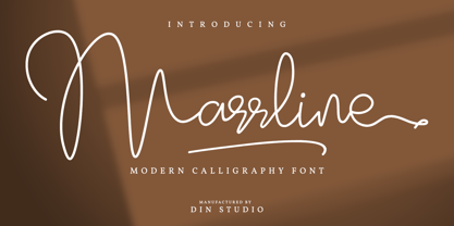 Marrline is a modern calligraphy font. It brings a beautiful and attractive typeface. Made for any professional project branding. It is the best for logos, branding, wedding and quotes. Includes: Marrline (OTF) Features: Stylistic Set Beautiful Ligatures Swashes Multilingual Support PUA Encoded Numerals and Punctuation Thank you for downloading premium fonts from Din Studio


