10,000 search results
(0.036 seconds)
- DIY Fantasy Stamp by TypoGraphicDesign,
$19.00 The typeface DIY Fantasy Stamp is designed in 2020 for the font foundry Typo Graphic Design by Manuel Viergutz. The display typeface is inspired by the crafts of 20s and 40s. The basis for this authentic stamp font was a letter case with a rubber stamp from Simplex. This analog character set of 85 stamps, was digitally extended to 500+ glyphs. 5 font-styles (Sharp, Dirty, Rough, Invert, Heavy) with 546 glyphs (Adobe Latin 3) incl. decorative extras like icons, arrows, dingbats, emojis, symbols, geometric shapes, catchwords, decorative ligatures (type the word #LOVE for ❤ or #SMILE for ☺ as OpenType-Feature dlig) and stylistic alternates (4 stylistic sets). For use in logos, magazines, posters, advertisement plus as webfont for decorative headlines. The font works best for display size. Have fun with this font & use the DEMO-FONT (with reduced glyph-set) FOR FREE! Font Specifications ■ Font Name: DIY Fantasy Stamp ■ Font Weights: Sharp, Dirty, Rough, Invert, Heavy + DEMO (with reduced glyph-set) ■ Font Category: Display for headline size ■ Glyph Set: 546 glyphs (Adobe Latin 3) ■ Specials: Decorative extras like arrows, emojis, ornaments, geometric shapes, catchwords, decorative ligatures (type the word #LOVE for ❤ or #SMILE for ☺ as OpenType Feature. dlig) and stylistic alternates (4 stylistic sets) ■ Design Date: 2020 ■ Type Designer: Manuel Viergutz
 - Poppy Spoor by Yumna Type,
$15.00 Would you like a legible, professional, prominent font? Well, if that is what you want, you will probably have trouble finding one as it is a time-wasting process and is a hard challenge. Let us introduce you to a perfect font for any project, the Poppy Spoor. Poppy Spoor, unlike the other display fonts, is a display font with rather square letters to show you fun, soft, modern impressions due to the thin line designs in low contrasts. This font type, giving you a clipart as a bonus, is legible and is better applied for big text sizes. You can maximize your designs with Poppy Spoor’s features to remain the best in every design at any time. Features: Alternates Ligatures Multilingual Supports PUA Encoded Numerals and Punctuations Poopy Spoor fits best for various design projects, such as brandings, posters, banners, headings, magazine covers, quotes, invitations, name cards, printed products, merchandise, social media, etc. Find out more ways to use this font by taking a look at the font preview. Thanks for purchasing our fonts. Hopefully, you have a great time using our font. Feel free to contact us anytime for further information or when you have trouble with the font. Thanks a lot and happy designing.
 - Palmer Lake by Jen Wagner Co.,
$13.00 Features: Palmer Lake Print: Uppercase letters, numbers, & extended punctuation Palmer Lake Script: Lowercase letters, numbers, & extended punctuation Non-English support for the international designer Same stroke thickness with each font, so you don't need to make any time-consuming adjustments to get it looking right! Palmer Lake Print (uppercase font) letters are the same height as the Script lowercase letters, so making quotes is super easy! This is such a fun new duo, perfect for creating quotes, logos, or just adding a hand-written touch to any project! While other fonts usually take some size adjusting to look just right, Palmer Lake duo has the same stroke thickness for both fonts, so you can set each font to the same size and you're done! Plus, the uppercase letters of the Print font are the same height as the lowercase letters of the Script font (see the samples), so lining them up with one another is a breeze! Each font also has alternates for each letter, so when you type uppercase or lowercase for each font, the letters will change slightly. For example, tying in all caps with the Script font will connect each letter, whereas typing all lowercase will disconnect each letter. Test it out for yourself in the box above!
 - Axeo Sans by Asritype,
$15.00 As mentioned on previous released font Axeo (freeform serif), now, the original sanserif font is released with similar name, Axeo Sans. Axeo was release first when Axeo sans is still in minimal glyphs and font weights. However, Axeo sans is released with more fonts, 7 font in roman and 7 in italic/oblique versions, instead of semi condensed. 7 fonts is in roman form of weight: Light, Regular, Medium, Semi Bold, Bold, Extra Bold and Black; and 7 fonts in italic/oblique versions of its weight, respectively. This font weight offers the user to use the best fit to the usage. Axeo sans is neutral typeface, designed for general use. This font has also more glyphs variations and OpenType features. More than 700 glyphs for each cut. While the OpenType is equipped with: Large unmarked Basic Latin caps (ss02-ss05); normal character variation for some letters (ss01); Small caps (c2sc and smcp); superscript for 1, 2, and 3; ordinals for a and o; 5 basic fractions; standard and discretionary ligature; kerning; case sensitive and ornaments. Large Caps is unique setting, additional letters for font variations lover/user, applicable for first letter of paragraph, sentences, for design mean, just for fun or other usage.
 - Zenith by Glyphobet,
$9.99 Chinese characters have simplifed and more complex, "traditional" variants. Zenith imagines what an un-simplified, traditional version of the Latin alphabet might have looked like.
 - Cabrito by insigne,
$24.00 After my son was born, I found myself reading him a lot of books. A LOT of books. Some were good, some were great, but I found myself wanting to develop something using my skills and interests to make something that only I could make. In short, I realized my son needed to be indoctrinated—I mean, introduced into the wonderfully wild world of fonts. So, I set about to make a board book to teach about typography, called “The Clothes Letters Wear.” You can learn more about the book here. I’ve made the captivating illustrations bright and colorful, and the use of different letter forms makes for a fascinating read to delight ages young and young at heart. And, as an added bonus, this children’s book has a custom designed font. I’m always looking for an excuse to design a new font, and this book created the perfect alibi. Drum roll, please. I now give you … Cabrito (“little goat” en Español). This new serif typeface incorporates the latest research on typographic legibility for children, features to make it—well, extra legible. A little background: studies show that Bookman Old Style is one of the most readable typefaces, and as a consequence or perhaps the reason why, it is used thoroughly for children’s books. This font became my initial inspiration for the typeface. Then, I found more legibility research saying that (brace yourselves) Comic Sans is also very legible for beginning readers, much due to the large x-height and softer, easily recognizable forms. In addition, forms that are closer to handwriting also seem to be more legible. Once I threw all that into my cauldron and stewed it a bit, the result was a pleasantly rounded typeface that includes not-so-strictly geometric, handwriting-inspired forms for the b, d, p, and q. Es guapo! Cabrito’s slender weights are simple and fun, with extras that turn any “bah humbug” into a smile. Add lighter touches to your project with the typeface’s included sparkles or rainbows (not included). Splash a little more color on the page with the firmer look of the thicker weights. Cabrito’s upright variations across all weights are matched by optically altered italics, too, giving you even more variety with the font family. This modern typeface’s bundle of alternates can be accessed in any OpenType-enabled software. The fashionable options involve a significant team of alternates, swashes, and meticulously refined aspects with ball terminals and alternate titling caps to decorate the font. Also bundled are swash alternates, old style figures, and small caps. Peruse the PDF brochure to check out these options in motion. OpenType-enabled applications like the Adobe suite or Quark allows comprehensive control of ligatures and alternates. This font family also provides the glyphs to aid a variety of languages. Cabrito is a welcoming, everyday font family by Jeremy Dooley. Use it to convey warmth and friendliness on anything from candy and food packages to children’s toys, company IDs or run-of-the-mill promotional material. Cabrito’s unique appearance and high legibility make it equally at home in print as it is on a screen.
 - Little Brown Frog SG by Spiece Graphics,
$39.00 Here’s a typeface that’s both primitive and playful. It could aptly be described as having a modest bounce, unusual web feet, and a slightly grotesque croak. Joking aside, this amphibious creature-font is ideally suited for funny headlines as well as other goofy stuff. Great for party announcements, cartoon lettering, or just about anything involving kids. Or even fun-crazed adults! Little Brown Frog is also available in the OpenType Std format. Some new alternate characters have been added to this OpenType version. Advanced features currently work in Adobe Creative Suite InDesign, Creative Suite Illustrator, and Quark XPress 7. Check for OpenType advanced feature support in other applications as it gradually becomes available with upgrades.
 - Chalker Dust by IbraCreative,
$23.00 Chalker Dust is a delightful and whimsical handwritten chalk font that transports you to the nostalgic world of chalkboard art. With its authentic texture and playful irregularities, Chalker Dust captures the essence of doodling and scribbling on a chalkboard. Each letter has a handmade charm, as if it was lovingly written with a piece of chalk. The dusty and smudged appearance adds a sense of authenticity, making it the perfect choice for designs that aim to evoke a sense of nostalgia and carefree creativity. Whether used for menu boards, event posters, or children's projects, Chalker Dust brings a touch of fun and whimsy, infusing your designs with a playful and vibrant atmosphere.
 - Darcy by Atlantic Fonts,
$26.00 Darcy is bold and exuberant. As an all-cap family (exception “i”), every letter has an artsy, handmade alternate. For the most joyful bounce, choose all lower or mix up the cases. For a more even baseline, go with all uppercase. Darcy Prints has gestural, organic motifs and patterns, including leaves, grasses, flowers and abstract shapes. Each playful letter has two options with different looks easily available in upper/lower places. Darcy Designs is a cheerful picture font adapted from 26 of the hand-drawings in Darcy Prints. Darcy family is based on hand-lettered cards the designer makes for friends. Darcy family lends itself to products that celebrate warmth, creativity, and a zest for humor and fun!
 - GoGipsy by Latinotype,
$32.00 GoGipsy is a script font based on Coto Mendoza's modern calligraphy works created with the technical assistance of Luciano Vergara. GoGipsy is inspired by a magical journey—full of love, art and nature—through the Mexican Caribbean. GoGipsy tries to capture such incredible blend through gestures and calligraphy strokes, conveying freedom, expressiveness, strength and spontaneity. The family consists of four versions: regular, italic, drop and italic drop plus a set of ornaments based on the visual appealing Mexican textile art and embroidery full of colour and beauty. GoGipsy's baseline emphasises movement and rhythm. Have fun with OpenType features, swashes, ligatures and a wide array of initials. Go Gipsy! Each journey, new inspiration...
 - Ride my Bike Serif by Latinotype,
$39.00 Ride my bike Serif is a new version of successful handmade typeface Ride My Bike designed by Coto Mendoza. Inspired by street style and the new culture that moves pedaling around the city. Perfect for use in headlines, brands and fashion photography compose alternative, thanks to its leading characters, terminals, alternate characters and ligatures that you can find in the Pro version. This time with serif. The ‘Ornaments’ font in this family has 121 dingbats, very fun to compliment and accentuate the handmade design. If you do not want to ride so fast, you can find a version without OpenType features - Essential. Come! Get on it and let’s go ride my bike! Photography by Nico Alari.
 - Apnea by The Type Fetish,
$25.00 Apnea is a layerable type family consisting of fifty weights. It is an all caps font with a few lowercase alternatives (a, e, i, m, n, t, w, and y) thrown in for a more casual feel. The base letterforms are inspired by a painted sign I found in the garage of an old house I moved into years ago. All the hand-drawn elements were done directly in FontLab to keep them loose and playful without getting distorted or grungy. At its core Apnea consists of eight base weights (Base, Drop Shadow, Halftone, Inline Fill, Outline, Outline 3D, Shading and Shadow) that when combined, can make up the rest of the family. Have fun, experiment and play!
 - Bromello by Alit Design,
$10.00 Introducing Bromello modern script typeface, using style hand made with brushing. Bromello is beautiful for wedding card design, logotype, blog or website header, fashion design, YouTube video thumbnails and any more. Bromello uses classic handwriting techniques to create a beautiful, modern design. Bromello is very popular at the moment and unique for so many reasons. People use the font to create and express their own style, create beautiful projects, promote their brands and projects and more. Remember, be inspired with your own styles and ideas and have fun! Product Content : • bromello typeface (OTF & TTF Format) • bromello italic typeface (OTF & TTF Format) Features : • Character Set A-Z • Numerals & Punctuations (OpenType Standard) • Accents (Multilingual characters) • Contextual Alternates • Swash • Stylistic Alternates
 - Vasetters by Ingrimayne Type,
$9.00 In Vasetters the letters are cut from the shape of a tessellating vase. To get the tessellating effect, the two sets of letters (and numbers and some symbols) must alternate, and this is done automatically in applications that support the OpenType feature of Contextual Alternatives (calt). Vasetters is monospaced and comes in two weights. The regular weight is tightly spaced, which should not be a problem at large point sizes. At small point sizes adjacent letters can be colored differently or the character spacing can be increased. The lighter weight can be used alone or layered above the regular weight to create the effect of hollow lettering. Vasetters is is fun, bizarre, weird, and obviously a decorative display font.
 - 1968 GLC Graffiti by GLC,
$38.00 This font was inspired by the paint brushed letters in use in the 60 - 70s for protest slogans tagged on the cities walls. In those days, we didn't commonly use aerosols like today, so we used paint brushes, with paint or tar cans, drew the letters, and ran away quickly ! Capitals and lower case have the same size, and a lot of alternates characters or ligatures allows the user to vary each letter (until tree alternates for single letters) in each word of a text . Likewise, the words may be easily underscored or intersected by a few stains looking like paint spots, substituted to the following standards characters: [greater], [less], [dagger], [backslash], [bullet], and [underscore].
 - Nero by Skinny Type,
$19.00 Nero is built on the Nero framework, our popular family of geometric types. Like the sans-serif Nero letterform, it has two contemporary look and feel styles. Echoing late 20th-century modernism, the Rounded's overall look is clean and sleek, more ephemeral and dynamic than pared-down bourgeois asceticism. Nero's place in font history is a complex one. Praised for their readability and also at the same time their fashionable qualities, they look very modern and nostalgic, easy to read and very stylish, authoritative and fun. Nero and Nero Rounded when combined, offer 2 styles to suit all text types and sizes. Both are excellent for short texts that require a sense of urgency or playfulness.
 - Bigday by Scoothtype,
$9.00 Bigday is a bold modern script with a bright atmosphere. It's inspired by suburban bars, winter and the city, chilly afternoons with a cocktail in your hand and the sound of crashing snow. Bigday comes with Contextual Alternatives that add variety to the text and help maintain a smooth flow. Contextual Alternative activates automatically. For extra flair, try Alternates or Swash danTails from the glyph palette. Bigday is PUA coded so you can access its alternatives in any graphic design software. This font is versatile and useful for web and print media; think websites, posters, menus, logos, cards, signs, packaging and more. Bigday is friendly, sturdy, and stands out, but most importantly, it's fun to play.
 - Deadline Remastered by Comicraft,
$29.00 The hands on the clock tick inexorably on... the numbers on the digital display roll inevitably toward zero... time is tight, the fuse is getting shorter and the beads of sweat on your forehead are glistening in the red light of the LCD... you have come to a place where the only thing you feel are loaded guns in your face... can YOU handle the DREADED DEADLINE DOOM?!? TICK TICK TICK TICK TICK TICK TICK TICK TICK THRAKAKAKATHOOM! Uh oh… you blew it. Deadline Remastered features 18 static weights, including the new nearly square "Block", each with complete Western & Central European language support. Use the Solid & Open Variable fonts to access unlimited width and angle options.
 - Navarone by Stiggy & Sands,
$24.00 A Roman Stylized Font of War. Navarone is a display sans typestyle that was inspired by the movie titling sequence from the 1962 movie "The Guns of Navarone". It's an all capitals typeface that has alternate caps in the lowercase slots to convey all of the roman stylized lettering of the original inspiration. See the 5th graphic for a comprehensive character map preview. Navarone comes with features for customisation options: - An all capitals typeface with alternate capitals in the lowercase slots - A Basic Ligatures feature that swaps out FI and FL ligatures. Approx. 386 Character Glyph Set: Navarone comes with a glyphset that includes standard & punctuation, international language support, and basic ligatures.
 - Gladick Display by Dora Typefoundry,
$17.00 Gladick is a modern take on a sans style typeface but mixes in the added contrast of serifs to make the font contemporary and memorable. Each letter is crafted with care to make your text unique yet stylish. Soft curves make for a bold type Now with the addition of italics. Great for fashion branding and editorial design. Features: All Uppercase and Lowercase Number & Symbol Supported Languages Alternates and Ligatures PUA Encoded This type of family has become the work of true love, making it as easy and fun as possible.I really hope you enjoy it! if you have any questions or problems please contact email:doratypefoundry@gmail.com Thank you and good job.
 - Pantsy Fance by melifonts,
$5.00 Pantsy Fance is a fun, yet structured typeface. It means business, but doesn't forget the frills. I use this lettering often on greeting card envelopes and the title section of my class notes. It is great for titling, labels, logos, and signs. This font fully supports the following languages: Bosnian, Bulgarian, Croatian, Czech, Danish, Dutch, English, Estonian, French, German, Hungarian, Italian, Norwegian, Polish, Portuguese, Romanian, Russian, Serbian, Spanish, Swedish, Turkish, Ukrainian. If your language is not listed, or if I've missed a character in a language I claim to support, please contact me! I will be happy to add characters as needed, and will consider supporting more languages if there is interest.
 - Sideroad by Melvastype,
$22.00 Sideroad is an intensive hand-drawn brush script font. It comes in two versions, Textured and Smooth. Textured version has this rough effect that comes when letters are drawn with pointed-brush on rugged surface. The Smooth version is, like the name says, smooth as silk with polished edges and properly drawn forms. Sideroad includes two sets of lower case letters to give variation and more imperfect hand-drawn effect. You can cycle these two sets by enabling Contextual Alternates OpenType feature. It also has set of lower cases without connector strokes. And a set of lower cases with end swashes. On top of these there are also a few underlines to give that final punch to your design.
 - Turesco by Letterhend,
$17.00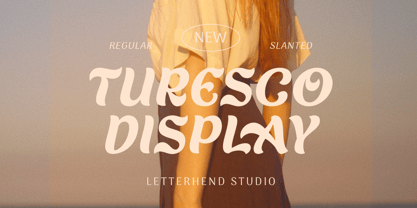 Turesco Display is a display typeface with unique letterform. It looks great to be used for modern and minimalistic yet still playful and fun theme. This font perfectly made to be applied especially in logo, and the other various formal forms such as invitations, labels, logos, magazines, books, greeting / wedding cards, packaging, fashion, make up, stationery, novels, labels or any type of advertising purpose. Features : uppercase & lowercase numbers and punctuation multilingual alternates & ligatures PUA encoded We highly recommend using a program that supports OpenType features and Glyphs panels like many of Adobe apps and Corel Draw, so you can see and access all Glyph variations. How to access opentype feature : letterhend.com/tutorials/using-opentype-feature-in-any-software/
 - Chandler Mountain by Mega Type,
$19.00 Chandler Mountain is a display font family that is simple but strong, defined by sharp edges with a modern touch. It is designed to exude a sense of strength and toughness as well as optimal readability. Chandler Mountain consists of 9 weights from Regular and Slanted: Chandler Mountain works well in branding, logos, headlines, high fashion, Magazines, Quotes and Posters. The different weights give you full range to explore a whole host of apps, from Television Shows, Youtube Podcasts, tech startups, local events to sporting events. Have fun using Chandler Mountain!!! I really hope you enjoy it! Feel free to follow, like and share. Thank you so much for checking out my shop!
 - Think by Up Up Creative,
$16.00 Meet Think, a varied-width sans serif font with fun options. At first glance, Think appears to be your standard all-caps mono weight sans. But if you look more closely, you’ll see that Think pairs wide and narrow characters to create a bold, eye-catching look that’s perfect for headlines, editorial design, monograms, branding, logos, poster design, and more. Think includes over 800 glyphs and uses 4 stylistic sets to give you lots of options in terms of the width of each letter. OpenType features include character variants, stylistic sets, and multilingual support (including multiple currency symbols). These features can be very easily accessed by using OpenType-savvy programs such as Adobe Illustrator and Adobe InDesign.
 - Happy Pink by Letterhend,
$15.00 Sweet, simple and personal with a touch of fun- Happy Pink is freshly and natural brush lettering, perfect for eye-catching branding. The bold stroke make this font looks stands out, very suitable to be applied especially to packaging, birtday card or invitations, labels, logos, magazines, books, greeting / wedding cards, fashion, make up, stationery, novels, labels or any type of advertising purpose. Features : uppercase & lowercase numbers and punctuation multilingual alternates & ligatures PUA encoded We highly recommend using a program that supports OpenType features and Glyphs panels like many of Adobe apps and Corel Draw, so you can see and access all Glyph variations. How to access opentype feature : letterhend.com/tutorials/using-opentype-feature-in-any-software/
 - Aldo New Roman by Indian Summer Studio,
$45.00 Aldo New Roman (1000+ glyphs, incl. medieval Latin, Cyrillic, some Greek, ornaments, small capitals, nut fractions...) Renaissance antiqua · Venetian types · Venetian serif · Humanist serif · Old style antiqua A modern version of the typeface cut by Francesco Griffo for Venetian printer Aldus Manutius around 1490 AD. Intentionally not the original Griffo / Aldus / Bembo — but the part of the large project on revival and further development (by drawing many additional glyphs, sometimes over 1000) of the 20th century's typewriters’ fonts. Triple pun here :: :: #1 Aldine Roman type; #2 Since it is equalized, modernized version — the parallel to the Times New Roman; #3 He called himself Aldus Pius Manutius Romanus — he was a new Roman during his Renaissance times.
 - Fizgiger by insigne,
$11.95Fizgiger is a chance to kick back and take break from designing some of insigne's more serious typefaces, like the sans serif Aberlyth. It is an extension of the ideas of Blue Goblet, but includes more frills and a more pronounced vertical stress. The name Fizgiger is derived from the English word Fizgig, which is defined as a flirty girl. Fizgiger is a fun and uplifting script that works for whenever you need a playful and exciting script. As always, Fizgiger comes with a wide range of OpenType features, including small caps, a full complement of artistic alternates (it's like getting another font free!) and old style figures to add a touch of class. - Maybeline Script by Bal Studio,
$14.00 Thank you for viewing the Maybeline Script! Maybeline Script is a modern, handwritten, modern script font with an organic base, a style that's romantic, fun, and catchy. has several alternatives with different doodles. It is more effective and efficient when used for your job design. Maybeline Script can make your text more attractive, suitable for wedding invitations, cards, letterheads, name boards, product packaging, labels, news, posters, badges, headers, signatures, t-shirt logos and so on. It features 317 glyphs, with OpenType features and style sets, as well as international support for most Western languages. Maybeline Script can be used for both Commercial and Personal projects. If you have any questions, feel free to contact me via email. Thank you!
 - Grayfel by insigne,
$- As designers, we seek perfection and originality. The more we step back and look at our work, the more changes we tend to find necessary. Drastic modifications are inevitable. The same is true of Grayfel. Grayfel began as an exercise at insigne to explore the crowded space of neutral sans. While the world of sans serifs is admittedly crowded, I still managed to find something new and different. The final Grayfel consists of 42 full-featured OpenType fonts containing three widths: Regular, Condensed, and Extended. Every width consists of 14 fonts--seven weights with matching italics, making it a good companion for setting clear text and headlines for print and screen. OpenType features are also available. There’s figure choices, such as proportional and old style figures. Additionally, Greyfel includes sophisticated typographic attributes: ligatures, fractions, alternate characters, small caps, superscripts and subscripts. Its extended character set supports Central, Western and Eastern European languages. Optical compensations also mean the outcome of this family is a hybrid of humanistic proportions. It’s a well-finished design with optimized kerning gives it a friendly look. If you like sans serifs within the tradition of Futura, Helvetica, Avant Garde and Avenir, then you’ll love Greyfel, too. Grayfel works well in a variety of applications. Subtly neutral yet fun, it’s suitable for headlines of all sizes as well as for text. Put it to the task for marketing, packaging, editorial work, branding and even on-screen projects. Try it out: it’s not just fun and playful; it’s Grayfel.
 - Bones Bummer - Unknown license

- Schmale Anzeigenschrift Zier - Unknown license

- Nagaiya by Identitype Co,
$25.00 Designed by Aulia Rahman and Hendra Maulia, Nagaiya is a versatile companion, perfectly usable for a variety of applications. But especially the areas of branding and editorial design. There in particular, the typeface impresses with its look and feel, making the design pleasant and smooth. Take a look at the wonderful lowercase letter /a, or the spiky spurs of the other lowercase letters. That's where the fun begins.
 - Corton by Greater Albion Typefounders,
$14.00 Corton was inspired by the traditional lettering on a gravestone in an English village. While that might sound a rather solemn beginning, Corton has wonderfully lively air, with distinctive lively serifs and beautifully swashed downstrokes. Eight faces are offered: regular and titular each in three weights plus regular condensed. Between them they are ideal signage and display faces, merging 'olde-worlde' charm and fun character, but remaining clear and legible.
 - Hoffers by Konstantine Studio,
$17.00 Say hello to Hoffers. A bold and casual script typeface with implementation of markers handwriting vibes. Some are connected and the others aren't. Perfectly fit for casual logotype, food and beverage branding, book covers, anytime you need to tell fun stories, Hoffers is the answer. Packed up with 30 ligatures to make it look seamlessly handwritten. Carefully crafted click by click to keep it clean in every strokes.
 - Tannen by Rafael Jordan,
$30.00 Tannen is an interpretation of the Emil Meyer’s Tannenberg, the result is a fun and cool blackletter display built without curves and casual look with a lot of personality and expressivity. It has 3 independent styles (regular, inline and shadow) that can be combined with each other, plus a stencil style. Tannen counts with 3 weights per style, OpenType features (ligatures, alternates, fractions and more) and supports dozens of latin languages.
 - Notebook BH by BluHead Studio,
$20.00Notebook BH Black was inspired by the block lettering we used to draw on our school binders. Notebook is a unicase design, with the lowercase drawn to the cap height, and each "case" having a distinctly different flavor. The fun and seemingly unlimited combinations of the upper and lowercase forms make it difficult to stop typing innocuous phrases and, if you're mobile, can even make boring lectures tolerable! - Bolton Commercial by Greater Albion Typefounders,
$14.00 Bolton Commercial revives and updates one of Greater Albion's designer's earliest typeface families, Bolton, which was recently used on the credits of a popular UK television series. The family consists of five faces- Regular and Obliqued, Blocked, Embossed and Engraved. All have a late Victorian/Edwardian feel and are ideal for posters, signage, Book covers...and of course television credits! Bolton Commercial combines the virtues of flair, fun and legibility.
 - Neue Farmero by Kaligra.co,
$19.00 Neue Farmero is an ultra condensed Type Family that includes 3 styles: Regular, Rounded & Vintage versions. This family is an All-Caps family with each version contains alternates. With 3 styles and iconic alternates, Neue Farmero can give a diverse set of aesthetics. With light giving a much more simple modern vintage look, fashionable feel and the bold giving a more rugged vibe for Simple Coffee shop logo, Brewing Company logo.
 - Urban Cowboy by Miguel Ibarra Design,
$20.00 Urban Cowboy is a western styled typeface created by Miguel Ibarra. It was designed specifically for display and headline purposes. Urban Cowboy is a fun and bold typeface, that has a combination of western slab serifs with a modern "Tuscan" form. Perfect for that western look, or for a bold logotype. A single set of stylistic alternates can also be applied under ss01 for applications that support them.

