10,000 search results
(0.016 seconds)
- Arazatí by Underground,
$9.99 Arazatí was inspired by Edward Johnston’s typefaces, although its design is not based on a literal reconstruction. It has 48 variants of 422 glyphs each. In addition, it offers two monospaced variants for free. Arazatí is the name of the place where Johnston was born in 1872, located in San José, Uruguay. This typeface is a tribute to his birthplace.
 - Catty Wumpas NF by Nick's Fonts,
$10.00Ross F. George, the lettering wizard behind many an edition of Speedball lettering books, called this quirky creation "Spatter and Spot Roman". In this version, the spatters go, but the spots remain, and a good time is had by all. Both versions of the font include the 1252 Latin and 1250 CE character sets (with localization for Romanian and Moldovan). - Mighty Courage by Zeenesia Studio,
$15.00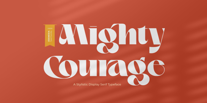 Introducing Mighty Courage Mighty Courage is a modern and elegant serif font. Mighty Courage is It's modern and classy font with a unique and deference look . Perfect if you need a dose of fun in your project. Perfect for editorial projects, Logo design, web font, clothing branding, product packaging, magazine headers, or simply as a stylish text overlay to any background image.
 - Nexomuki by Java Pep,
$17.00 Proudly present the fresh from the oven, modern bold sans serif font. Nexomuki made with rising feel modern, bold, but still looks elegant too. Perfect pairing among uppercase and lowercase characters is suitable for your project design such as logotype, branding, headline text, advertising, slogan, qoute, magazine, publishing, and more. This font is already with multilingual support more than 20 leanguanges too.
 - Janagrace by Jonahfonts,
$40.00 Janagrace is designed for birthday, holiday cards and can be used effectively in other applications for that calligraphy appearance. Regular: Contain ONLY Regular-Caps. Swash: Swash-Caps with NO Regular Caps. OT Swash: Contain BOTH Regular and Swash-Caps. Swash LIGHT: Swash-Caps with NO Regular Caps. Janagrace, Agile, Charming and Lovely.
 - Effexor - Unknown license

- Rustick by Thinkdust,
$10.00 Are you hungry for a font design that will blow you away? Do you want to invoke the rustic smell of wood smoke, the mouth-watering thought of antipasti, olive-oil, open French doors in the summer? Well before you book your ticket to Rome, check out the new font from Thinkdust, Rustick. Four weights (and italics) of indulgent, home cooked comfort, warm, earthen and familial. Before making its point, Rustick gives you a cup of deep, rich coffee and double checks you're warm enough. Just one look will start your stomach rumbling. Ideal for food packaging and warm, homey branding, Rustick will never let you go home hungry.
 - Bodoni Campanile Pro by Red Rooster Collection,
$60.00 Bodoni Campanile Pro is a font that bridges the gap between a “fat” and a compressed traditional serif typeface. It was originally designed in 1936 by Robert H. Middleton for Ludlow. International TypeFounders exclusively licensed the family from the Ludlow Collection, and Steve Jackaman (ITF) produced a digital version in 1998. Jackaman completely redrew the font for its 2017 release. Bodoni Campanile Pro, much like its transitional status as a font, is successful in both formal and casual roles. The free-flowing aspects of the family, seen especially in the lowercase ‘g’ and the leg of the uppercase ‘R,’ give the family an air of elegance.
 - Bangkokean by Cadson Demak,
$29.00 This font was originally designed side by side with my first attempt at a semi serif typeface in 1997. The design made it through to full development only a couple years ago when our studio decided to complete the regular weight for a local project here in Bangkok. The face is a traditional serif with narrow stem (somewhat like sans serif) and industrial stroke. A good mix of Bangkok character where you can find Wat (old buddhist temple) next to futuristic high rise. This font was shown in Klingspor-Museum Offenbach, Germany, at a Typographic & Type Design exhibition Schrift in Form 3-26 September 2008.
 - Throrian Formal - 100% free

- Uechi - Unknown license

- Occoluchi Minicaps - Personal use only

- XiparosLombard - Unknown license

- Campeche Variable by Latinotype,
$199.00 Campeche variable is an expressive yet functional typeface family. Seeking to express its beauty, it twists the conventions of classic typography when necessary. Campeche finds its inspiration in the grotesque typefaces of the late 19th century coupled with a typical Latin American playful sense that gives it a modern freshness. The initial form arises from the idea of expanding Seriguela, evolving along the way, becoming its own system with a unique personality. Campeche is designed according to today's visual requirements. Taking advantage of variable technology in 3 axes: width, weight and display. Campeche Variable is a typeface that provides versatility for almost any use. It can be used for packaging, editorial, branding... etc. The mixture of its possibilities can generate complex graphic parts or systems with different levels of hierarchy, without losing unity.
 - La Rosaleda by Mevstory Studio,
$15.00 La Rosaleda Font Duo is a ligature font pair with 30 amazing chic logo templates. With this open type font duo you can explore your creativity in unlimited way. To recreate your brand all you need is mix and match from the La Rosa font duo. This font duo is full of stylish ligatures, so that your writing with La Rosaleda can stand out. - Font Features: All fonts are OpenType fonts All fonts are fully vector designed Accurate kerning for all serif family Amazing ligatures to look natural in script font Alternative characters for script lowercase alphabets Multilingual Support for Both Scrip and Serif All OpenType fonts, Serif and Script. 30 Fully editable logos for Adobe Photoshop or Adobe Illustrator Font installing help file for PC and Mac Web-fonts for Script and Serif
 - Aguadija by Christian Gamba Pardo,
$12.90 This font contains plant icons from the taxonomic category Orchidaceae, inspired by the multiple specimens that can be found in Colombia that has the largest number of orchids in the world, more specifically in the specimens that have been exposed on the José Celestino Mutis botanical garden. These icons are characterized by having an organic outline; representing flowers, roots, leaves, bulbs and different supports or pots. The vast majority of icons have perfect bilateral symmetry because this is one of the differential characteristics of orchids (compared to other flowers), if they are divided by a central-vertical axis, their right and left sides are practically identical. “Aguadija” can be used in projects related to nature or similar topics, some icons (specifically the digits) are intended to form decorative ribbons or borders.
 - Sportlight by Kaer,
$19.00 Sportlight is a font, each letter connects with near one by middle-high line. This font is inspired by classic car emblems. You can use it in magazine headlines, badges, and posters. Font features: All-caps, numbers, punctuation, and multilanguage support. Please feel free to request to add characters you need: kaer.pro@gmail.com
 - La Rosa Muerta, a font created by the talented Juan Casco, is a testament to the artistry and profound emotion that typography can evoke. This font is not merely a set of characters; it's an explorat...
- Decima Mono by TipografiaRamis,
$39.00 Decima Mono – condensed geometric monospaced Sans Serif typeface, released back in 2009 and quite successful ever since (MyFonts Rising Star, February 2009). This new edition is an upgraded version of Decima Mono and Decima Mono X, combining both into one edition. New version supports more Latin languages with an extension to glyph amounts. Also, six more alternate styles have been added to the original six styles.
 - Boycott by Dharma Type,
$14.99 We are calling for a boycott against petty power struggles. Uppercase and Lowercase are slightly different from each other. This grungy font won prize at the best font 2006 and new Rising Star at MyFonts. “Boycott’s a noisy design -a little rough around the edges, but just the way we like our big grunge fonts. boycott is a perfect design for posters and large headlines.”
 - DF Staple TXT by Dutchfonts,
$33.00 StapleTXT is a transformation from the monospaced typewriter font Staple mono into a text type. The 'mono' skeleton was used as much as possible but some characters were slightly altered in order to obtain more regularity without losing its specific typewriter atmosphere: little variation in character widths. The font has lining figures and works very well as text system in combination with the Staple mono.
 - Sixties Flashback by Mysterylab,
$15.00 Here's a lettering style that just might be exactly on your wavelength. Add just the right dose of vintage freak-a-delia to your retro graphics with this original psychedelic-style design. Great for music posters, album graphics, book titles, etc. Evoke a warpy, wavy, whimsical vibe that harks back to the carefree 1960s or early 1970s era with Sixties Flashback; it's pure hippie, trippy fun!
 - Filet by Emily Lime,
$24.00 This font is big on 2 things: Class & Quirk. Inspired by hand-scripted menus. This modern hand-calligraphy font isn't just for one or two-word logos. Designed to make a statement when used in large amounts. Great in large & small doses alike. Slightly irregular texture for that perfect hand-lettering touch on the page. Beautiful Duo for your next event or project! Multilingual support.
 - Leyton by The Colour Grey,
$35.00 A bold, friendly, impactful typeface. Ideal for filling with graphics and textures and layering with other type. Named in reference to the generously proportioned Alfred Hitchcock (born in Leytonstone). Leyton was designed to be as fat and punchy as possible without losing legibility. Each character fills up the space – throwing away counters in the process. Discounts available for certain projects – particularly charities and students.
 - Foreman by Anthony Prudente,
$15.00 This typeface is inspired from the old display fonts that used to decorate the world around us, but just because we don't see such beautiful signage these days, doesn't mean we should lose the great typefaces used. Foreman is a condensed serif display typeface, with hard geometric lines inspired from fonts used in the 1930s and 1940s, and very much used by the American Art Deco movement.
 - Olaus by Monotype,
$29.99The Olaus Magnus and Olaus Bandus alphabets are inspired by the letterforms cut in the pictures and wood-cuts of Olaus Magnus great book Historia de Gentibus Septentrionalibus. This great history of the Nordic Peoples was printed in Rome in 1555 in his own printing shop there. Olaus Magnus, Catholic priest and appointed archbishop by the Pope, never returned to the now Lutheran Sweden. - Hacky Sack NF by Nick's Fonts,
$10.00Ross George in his numerous Speedball chapbooks called the pattern for this typeface Stunt Roman. A studious observer may discern that many of the wackier letterforms were tamed to produce the popular font University Roman; however, this version remains unapoligetically true to the original. All versions of this font include the Unicode 1250 Central European character set in addition to the standard Unicode 1252 Latin set. - Selma by Sea Types,
$25.00 Selma is a family of Sans Serif fonts with 492 Glyphs, 04 weight (Light, regular, medium and bold), with long stems, inspired by bar codes. Extremely condensed vertical emphasis, its bars positioned at the ends of the rods give a strong dose of personality and elegance to the design, has a height of x accented, giving strength and power of attraction for short texts and large sizes.
 - ITC Kristen by ITC,
$29.99ITC Kristen is the work of American designer George Ryan. He describes it as not your average text or display font." The inspiration for the design came from the handwritten menu at a neighborhood restaurant. With time, the forms moved away from the originals and towards something more like a child's scrawl. The result is singularly unique. ITC Kristen remains legible without losing any charm. - Folio by Linotype,
$29.99Folio was designed by Konrad F. Bauer and Walter Baum and appeared with the Bauer font foundry (Bauersche Gießerei) in 1957. The designers based their ideas on Helvetica but Folio did not turn out to pose the competition they had hoped. The font has the same applications as Helvetica and is an extremely legible font. Folio is particularly good for text and has an objective, neutral character. - Beorcana Pro by Terrestrial Design,
$40.00 Beorcana can be classified as a serifless roman, a stressed sans, a glyphic sans, or calligraphic sans. However it is classified, Beorcana derives not only from other stressed sans designs like Lydian, Amerigo and Optima, but also utilizes classic Renaissance proportions in both Roman and Italic, which facilitate extended reading. Beorcana is available in Display, regular Text and Micro styles. Beorcana’s Text styles offer comfort and liveliness in books, dictionaries, magazines and other reading-intensive settings. Display styles offer a stately and organic flavor for any application. Micro styles perform in tight and dense settings like dictionaries, bibles, maps and fine print. The name Beorcana is a variant of the Icelandic word for the Birch tree, and the related words for the Icelandic rune. Many variant spellings are used for the tree and the rune: Beorc, Berkanan, Birkana, Bercano, Bjork, Bjarka. The Birch was revered as a symbol of renewal, due to its role as a pioneer species in burned, boggy or otherwise unforested areas.
 - Beorcana Std by Terrestrial Design,
$20.00 Beorcana can be classified as a serifless roman, a stressed sans, a glyphic sans, or calligraphic sans. However it is classified, Beorcana derives not only from other stressed sans designs like Lydian, Amerigo and Optima, but also utilizes classic Renaissance proportions in both Roman and Italic, which facilitate extended reading. Beorcana is available in Display, regular Text and Micro styles. Beorcana’s Text styles offer comfort and liveliness in books, dictionaries, magazines and other reading-intensive settings. Display styles offer a stately and organic flavor for any application. Micro styles perform in tight and dense settings like dictionaries, bibles, maps and fine print. The name Beorcana is a variant of the Icelandic word for the Birch tree, and the related words for the Icelandic rune. Many variant spellings are used for the tree and the rune: Beorc, Berkanan, Birkana, Bercano, Bjork, Bjarka. The Birch was revered as a symbol of renewal, due to its role as a pioneer species in burned, boggy or otherwise unforested areas.
 - BF Konkret Grotesk Pro by BrassFonts,
$39.99 BF Konkret Grotesk Pro, designed by Guido Schneider, is a contemporary grotesque with a straightforward style – but a very individual touch. Inspired by classic grotesque typefaces, Konkret Grotesk Pro impresses with its unique character and rhythm: It’s elegant and edgy, flexible and forceful. The Pro family supports up to 220 Latin-based languages. Each of the 16 fonts contains more than 1500 glyphs, including small caps, 7 figure sets, fractions, many ligatures, currency symbols, alternates, special characters and other useful symbols. 11 style sets give you the option to individualize and adjust the typeface to the requirement of your design, without changing the general visual feeling. In this way you can also switch the simply slanted styled Italic into a “real Italic”. BF Konkret Grotesk Pro is a typeface family that can adapt to many requirements without losing its character and expression. The range of 8 weights provides all possibilities. Due to the lovingly designed details, Konkret Grotesk Pro works both in small sizes as well as in display applications. Thus, Konkret Grotesk Pro is ideally suited for contemporary and demanding typographic tasks, both in the fields of editorial design, branding, posters and advertising. (The new Pro edition is the extended and optimized version of the previous BF Konkret Grotesk.)
 - Depicto by Michael Rafailyk,
$12.00 A pixelated typeface with asymmetrical serifs intended to depict emojis in coarse mosaic shapes and represented in two styles that perfectly complement each other – Mono (casual font) and Mosaic (color font). The main font feature is a large set of pictograms, which are activated using the Stylistic Set and typed right in a text with a keywords like :smile: :happy: :sad: :pear: :rose: :horse: :bike: :house: and so on. Read more about Depicto font family concept, features, pictograms, color font, emoji skin tone, how to use it, and the applications support: https://michaelrafailyk.com/depicto See the complete list of 600+ pictograms: https://michaelrafailyk.com/typeface/specimen/Depicto.pdf Scripts: Latin, Greek, Cyrillic, Hebrew Languages: 480+ The promo image “Serpant Mosaics” used a photo of Nick Verlice from Pexels
 - Rapsodia by Andinistas,
$59.00 @andinistas presents Rapsodia, an uncommon roman caps font with serif and high contrast, designed by #carlosfabiancg. Rapsodia was inspired by Stunt Roman, Speedball Textbook for Pen & Brush Lettering by Ross F. George. Rapsodia has a high and sweetened amount of contrast between thin and thick with drop-shaped finishes, reminiscent of Didot, Baskerville and Bodoni. Its artistic accent translates into Tuscan letters drawn with a flexible tip pen. In that order, Rapsodia combines the visual theatricality of an art nouveau corset, with creative historical classics such as Liza Minnelli, Gene Simmons and Freddie Mercury. Its calligraphic curlers full of Mannerist virtuosity are unnatural in Roman caps typefaces with serif. That is why its internal vein in ascending and descending flourishes protrudes with Chicano circus details like triangular diamonds located in vertical strokes. Rapsodia serves to design words and phrases in fine publications, for this reason most of its upper and lower case letters communicate feelings with classic and luxurious sensation through substitutes, ligatures and alternatives for beginning, middle or end of word, functioning as initials and terminals.
 - Tequendama by JVB Fonts,
$30.00 A display fontface for titles inspired on Latin America, Ethnic, Native, Tribal, Mysthical, Handmade, Aboriginal, Pre-Hispanic, Pre-Columbian, Textured. By mid-1997 I was developed the early type edition was called «Muisca Sans» as my work for the degree in Graphic Design (Universidad Nacional de Colombia), based on the concept of pre-Columbian figures characteristics within some of the very few visual elements recovered from the Muisca culture, ancient pre-Columbian tribe disappeared before the arrival of the Spaniards in what is now central Colombia. In fact, the name of the capital Bogotá (the capital of Colombia) goes back to Bacatá as primary or village downtown of what was once the imperial capital of tribe Muisca. Although this unfinished early typographic project has not yet been published, Tequendama is the evolution of the first one. Tequendama reminds the myth of Muisca culture and religion of this tribe. The god Bochica, a wise old man with a white beard heard the cries of his tribe suffered against flooding of their land losing harvests before the divine punishment resulted by the offended god Chibchacun. However Bochica appeared wearing a white robe sitting on a huge rainbow and he broken the mountain towards the southwest wise old man with a golden staff broke the mountain to drain the flooded savanna. This emblematic and iconic place would later be called as «Salto de Tequendama». Tequendama name also been adopted to a nearby province to Bogotá.
 - Brandogram Monogram Typeface by Design A Lot,
$45.00 After months of testing and development, we have managed to put together the Brandogram Typeface, an ultimate tool for monogram design. With the help of this typeface you can easily create a monogram in less than a minute. Thanks to the way we have created and optimised Brandogram, the uppercase letters effortlessly fit together with the small caps that are activated by the lowercase letters. Using the Brandogram typeface you can create unlimited monogram combos with 2, 3 or even 4 letters in some cases. And these are all possible thanks to features like: Multiple letter widths, from condensed to wide; Both sans serif and slab serif letter designs; Up to 24 different designs per letter; All letter variations are available as alternates so you can easily choose your favorite; Accents are available for each letter alternate; Uppercase and lowercase activated letters are constructed to perfectly center and middle align; There are 5 solid ready-made weights; There are another 2 stencil weights that can bring a new touch to your designs. The 7 weights of Brandogram Monogram Typeface: Thin Light Regular Medium Bold Stencil One Stencil Two Each of these weights are thought to express different levels of heaviness. The thicker the weight of the font gets, the less white space will be left between the letters when they are combined, therefore your design gets heavier. The role of the stencil weights is to create depth in the monogram designs. With those you can easily delete the extra overlapping shapes of the letters and create passages between the letters and give an interlocking impression. This typeface combined with your creativity can have no limits!
 - Zega Text by Isaco Type,
$24.00 Zega Text is a top-heavy sans family, inspired in the imprecisions of letterpress printing. Zega has 14 versions that give to your text (printed or on screen) a delicious sense of old printing. Give an exclusive touch to your text with normal versions, without losing reading clarity. Try the heavier versions and add a nice impact to your titles! The family consists of 14 styles, 7 weights plus their respective italic versions. The fonts are available in OpenType PS and have extended character set to support CE, Baltic, Turkish as well as Western European languages. You can test Zega Text downloading the free trial font in Semibold version (TT only). This trial file supports only Western languages.
 - Athens by IKIIKOWRK,
$19.00 Introducing The Athens - Flowtype, created by ikiiko. The Athens is inspired by the ropes in the runner's finish line. The letters are script fonts with a flexible and wavy style. This font have a unique waveform and has a large selection of stylistic sets. This typeface is perfect for an magazine cover, flyer design, poster design, inspirational quotes, photography layout, and also good for vintage product, or simply as a stylish text overlay to any background image. What's included? Uppercase & Lowercase Number & Punctuation Alternates & Stylistic Swashes Multilingual Support Get also a good offer & FREEBIE at our site : www.ikiiko.com Enjoy our font and if you have any questions, you can contact us by email : ikiikowrk@gmail.com
 - Sztos by Borutta Group,
$39.00 Sztos (2018-2022) is a remix of one of the most famous grotesques used in Poland – Baccarat (published by Jan Idźkowski i S-ka in 1922). My version loosely refers to the original. On the one hand, I wanted to modernize the drawing and proportions, on the other hand, I did’t want to lose the historical flavour and details in which you can still feel traditional printing. In addition to the fairly wide version of the normal style, there is also a narrow version. Thanks to this contrast, Sztos gives the possibility of expressive combinations of different styles. The whole family consists of 10 weights, two widths and an additional slant version. Design Support: Małgorzata Bartosik, Karol Mularczyk


