10,000 search results
(0.184 seconds)
- TT Supermolot by TypeType,
$29.00 You are on the page of the old display version of the TT Supermolot font. In 2019, we released an entirely new, completely redesigned and significantly expanded version of the typeface called TT Supermolot Neue. In addition to 54 styles, TT Supermolot Neue has stylistic alternates, ligatures, old-style figures and many other useful OpenType features. Before you buy the old display version of the font, we suggest that you pay attention to the new superfamily TT Supermolot Neue and study it in more detail. - TT Supermolot Condensed is the narrow version of the TT Supermolot font family. Thanks to its open forms, TT Supermolot Condensed fits perfectly into any contemporary technological design and navigation systems. We've already seen this font family in the sports theme (as the main font for hockey teams branding), we've seen TT Supermolot as the main font inside the gameplay of a popular 3D-shooter. Information transfer in the high-tech areas is the ideal environment for this font family, also TT Supermolot Condensed fits well into army, space, and innovation themes. We've tried to create a maximum number of convenient weights (Thin, Light, Regular, Bold, Black) for you to be able to use this family anywhere, from mobile apps and web pages to big state fairs branding.
 - TT Supermolot Condensed by TypeType,
$29.00 You are on the page of the old display version of the TT Supermolot Condensed font. In 2019, we released an entirely new, completely redesigned, and significantly expanded version of the typeface called TT Supermolot Neue. In addition to 54 styles, TT Supermolot Neue has stylistic alternates, ligatures, old-style figures and many other useful OpenType features. Before you buy the old display version of the font, we suggest that you pay attention to the new superfamily TT Supermolot Neue and study it in more detail. - TT Supermolot Condensed is the narrow version of the TT Supermolot font family. Thanks to its open forms, TT Supermolot Condensed fits perfectly into any contemporary technological design and navigation systems. We've already seen this font family in the sports theme (as the main font for hockey teams branding), we've seen TT Supermolot as the main font inside the gameplay of a popular 3D-shooter. Information transfer in the high-tech areas is the ideal environment for this font family, also TT Supermolot Condensed fits well into army, space, and innovation themes. We've tried to create a maximum number of convenient weights (Thin, Light, Regular, Bold, Black) for you to be able to use this family anywhere, from mobile apps and web pages to big state fairs branding.
 - Clockwork Lemon by IKIIKOWRK,
$19.00 Proudly present Clockwork Lemon - Fat Type, created by ikiiko. This typeface is adapted from one of Stanley Kubrick's masterpiece films, Clockwork Orange. Clockwork Lemon has a similar character shape to the movie logo but is more raw, rougher and is a hand-drawn style font. A wilder impression is shown in the curves of the letters, with alternates in the form of a dirty texture. You can play with this font with 2 alternative styles : solid and rough. Clockwork Lemon is very suitable for making a poster or magazine layout, quotes, or simply as a stylish text overlay to any background image. What's Included? 2 Styles : Solid & Rough Uppercase & Lowercase Numbers & Punctuation Alternates Multilingual Support Works on PC & Mac Enjoy our font and if you have any questions, you can contact us by email
 - Epilepsja by Mikołaj Grabowski,
$29.00 Epilepsja is an all-caps type family perfect for display works. It has been derived from stencil-sprayed and painted letters in the city space. The glyphs are simple but unordinary. Every letter has something from 3D illusion, but is flat simultaneously. The main feature and asset of this family is the ability to create multicolor text. Epilepsja consists of three styles: Outline, Solid and Fill. Outline is the base from which the other two styles are created. When you mix Solid with Fill, you can create two-color Outline style. Solid is neat and legible in small sizes. There are alternative uppercase/lowercase characters, digits, diacritics of western, central and southeastern Europe and Africa, punctuation and symbols including currency. Use it for posters, headlines, magazines, websites or anything you like.
 - Subversia by Arterfak Project,
$12.00 Subversia is inspired by sport and Victorian style. It is designed with elegant and solid shapes to give a modern touch, and is very suitable for your designs such as posters, flyers, t-shirts, logos, signage, branding, the even body text for magazines. Subversia has all-caps characters as Stylistic set in OpenType features that gives you greater variant of typographic possibilities, especially in headlines. This set also has ligatures, stylistic alternates and swashes to make your design look more natural and elegant. 400+ glyphs total with 23 languages. This font is designed with adaptive and flexible looks that possible to apply in other styles outside vintage. With the italic style you can use this font for a sporty theme, minimalism, pop contemporary, dark theme, feminine or editorial project.
 - Azero by Mysterylab,
$15.00 Azero is a extra heavy sans serif font with four style variations. The uppercase alphabet in particular is stylized to feature a wavy baseline on many of the characters, for a unique look that's just enough to add some unusual vibe and uniqueness. When your layout calls for heavy type with a wide (but not too wide) look, Azero is a strong choice. Great for bold headlines, logos, branding, wide horizontal banners, themes with a Hispanic flair, fitness products, food packaging, or retro poster styles.
 - Pharise by Scratch Design,
$14.00 Introducing Sharine! Our font is inspired by Y2K, a memory of the millennial era. This font has bold, retro, cute and dynamic characters that are perfect for creating a retro-futuristic-experimental vibe in your design. This font will be perfect for posters, packaging, invitations, branding, social media posts, headlines, and other designs. What you'll get : All caps font in two styles (You can combine those two uppercase styles to make your design more stunning) Numbers & punctuation Multilingual support Ligatures Swashes Thank you for purchase!
 - Chups by Jafar07,
$15.00 Chups is a retro groovy font with rounded corners that is perfect for designing with a retro style. With bold style and unique shapes, Chups brings a touch of retro and grooviness to any design project. The Chups characters are carefully crafted to provide a strong and striking appearance and give a consistent and appealing look. Whether for poster designs, book titles, or product designs, Chups is the perfect choice for those seeking a retro font that will create eye-catching and memorable designs.
 - Seiston by Skinny Type,
$19.00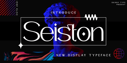 Seiston is the New Modern Typeface. This other Serif collection is perfect for your next branding project, great for your business. Gallient has smooth edges, so this font gives this style an authentically handcrafted feel. Seiston also features: - Lowercase - Uppercase - Numbers and punctuation marks - Multilingual Seiston is the perfect choice for people looking for a clean, modern, minimalist, elegant and beautiful design style. Suitable for almost any graphic design such as logos, branding materials, business cards, gift cards, t-shirts, covers, thumbnails, prints, posters, photography, quotes .etc Happy Designing
 - Random Notes by Gassstype,
$23.00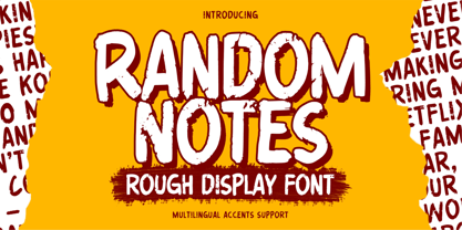 Hello Everyone,introduce our new product Random Notes is a Rough Display Font Handmade Font is a Strong Style and classy style, This font is great for your next creative project such as logos, printed quotes, invitations, cards, product packaging, headers, Logotype, Letterhead, Poster, Label, cartoon, and comic etc. This font is great for your creative projects such as watermark on photography, and perfect for logos & branding, photography, invitation. Random Notes a natural handwritten feel. This handmade font will make your design has a beautiful natural touch for each details.
 - Floz by Dominik Krotscheck,
$6.50 Floz is a simple and clean condensed all-caps sans serif font. It comes in two weights: regular (which is already pretty bold) and bold (which is even bolder). It works well for logos, headlines and other short texts. It's also quite cheap.
 - Regato by La Boîte Graphique,
$39.00 Regato is a hand made font ideal for your graphic project. Usage recommendations : Title, short text, children's book, poster, book cover, brochure, label, magazine
 - Water by La Boîte Graphique,
$25.00 Water is a rounded hand-printed font ideal for graphic project. Usage recommendations : Title, short text, children’s book, poster, book cover, brochure, label, magazine
 - Brewery No 2 Paneuropean by Linotype,
$103.99An entry in the Second Linotype Design Contest, Linotype Brewery, designed by Gustavs Andrejs Grinbergs, became part of the TakeType Collection in 1997. Brewery No 2 represents a significantly improved version of its precursor, and the typeface has been both extended and enhanced. When asked about prototypes, Grinbergs cites German typefaces of the early 20th century. It is thus not surprising that the characters of Brewery™ No 2 are based on geometrical forms. However, this is no mere synthetic Grotesque-derived typeface. It has significant contrasts in line thickness and triangular line terminals that are not unlike serifs, placing it in the middle ground somewhere between a Grotesque and serif font. The contrast between the features of a synthetic Grotesque and an Antiqua gives the characters of Brewery No 2 their distinctive charm and is the distinguishing attribute of this contemporary typeface. Additional vibrancy is provided by bevelled line endings (as in the case of the 'E' and the 'F'), the circular punctuation marks and the slight curve of the descending bar of the 'k'. Thanks to a generous x-height and its open counters, Brewery No 2 is also highly legible in small point sizes. Only in its bolder versions is another aspect of Brewery No 2 apparent; Grinbergs has here made the linking elements more rectangular and has emphasized the counters, so that the Bold variants of Brewery No 2 exhibit elements typical of a broken typeface. Brewery No 2 is available in seven finely graduated weights, ranging from Light to Black. Every variant has a corresponding, slightly narrower Italic version. In addition, the lowercase 'a' is given a closed form, the 'e' is more rounded and the 'f' has a descender. The character sets of Brewery No 2 leave nothing to be desired. In addition to small caps and ligatures, there are various numeral sets with old style and lining figures for setting proportional text and table columns. In its most extensive form (the Pan-European variant), Brewery No 2 can be used to set texts in many languages that employ the Latin alphabet and also texts in international languages that use Cyrillic or monotonic Greek orthography. Although some of the features of Brewery No 2, such as the tiny serifs, are only evident in the larger point sizes, this typeface is not just at home when used to set headlines. Brewery No 2 also cuts a good figure in short or medium length texts. This contemporary typeface with its formally elegant quality looks good, for example, on posters, in newspapers and promotional material. It can also be used for websites as it is also available as a web font. - Brewery No 2 by Linotype,
$40.99 An entry in the Second Linotype Design Contest, Linotype Brewery, designed by Gustavs Andrejs Grinbergs, became part of the TakeType Collection in 1997. Brewery No 2 represents a significantly improved version of its precursor, and the typeface has been both extended and enhanced. When asked about prototypes, Grinbergs cites German typefaces of the early 20th century. It is thus not surprising that the characters of Brewery™ No 2 are based on geometrical forms. However, this is no mere synthetic Grotesque-derived typeface. It has significant contrasts in line thickness and triangular line terminals that are not unlike serifs, placing it in the middle ground somewhere between a Grotesque and serif font. The contrast between the features of a synthetic Grotesque and an Antiqua gives the characters of Brewery No 2 their distinctive charm and is the distinguishing attribute of this contemporary typeface. Additional vibrancy is provided by bevelled line endings (as in the case of the 'E' and the 'F'), the circular punctuation marks and the slight curve of the descending bar of the 'k'. Thanks to a generous x-height and its open counters, Brewery No 2 is also highly legible in small point sizes. Only in its bolder versions is another aspect of Brewery No 2 apparent; Grinbergs has here made the linking elements more rectangular and has emphasized the counters, so that the Bold variants of Brewery No 2 exhibit elements typical of a broken typeface. Brewery No 2 is available in seven finely graduated weights, ranging from Light to Black. Every variant has a corresponding, slightly narrower Italic version. In addition, the lowercase 'a' is given a closed form, the 'e' is more rounded and the 'f' has a descender. The character sets of Brewery No 2 leave nothing to be desired. In addition to small caps and ligatures, there are various numeral sets with old style and lining figures for setting proportional text and table columns. In its most extensive form (the Pan-European variant), Brewery No 2 can be used to set texts in many languages that employ the Latin alphabet and also texts in international languages that use Cyrillic or monotonic Greek orthography. Although some of the features of Brewery No 2, such as the tiny serifs, are only evident in the larger point sizes, this typeface is not just at home when used to set headlines. Brewery No 2 also cuts a good figure in short or medium length texts. This contemporary typeface with its formally elegant quality looks good, for example, on posters, in newspapers and promotional material. It can also be used for websites as it is also available as a web font.
 - Paris Metro by Studio K,
$45.00 Nothing is more iconic of Paris than its antique Metro signs, which are the inspiration for this typeface. The signs vary from station to station, some featuring plain block capitals, others the most exquisite Art Nouveau. This example falls somewhere in between. and should inject a strong gallic flavour into any design or publishing project. To recreate the Metro effect in Photoshop, set your text white on red, then go to Layer Style> Inner Shadow. Or with Paris Metro Reverse set your text red on white, then go to Layer Style> Drop Shadow.
 - Playing Fake by Gassstype,
$23.00 Hello Everyone, Introduce our new collection,Playing Fake is Bad Display Font.this is a Strong Style and classy style, inspired by famous logos of Technology and brands that have very strong characteristics, this font is great for your creative projects such as watermark on photography, and perfect for logos & branding, invitation,advertisements,product designs, stationery, wedding designs,label ,product packaging, special events or anything that need handwritting taste. Playing Fake has charming, authentic and relaxed characteristic more natural look to your text with a more natural look to your text.
 - Something Real by Gassstype,
$25.00 Hello Everyone, introduce our new product Something Real – Pure Handmade Typeface font with a Signature Style and classy style, this font is great for your creative projects such as watermark on photography, and perfect for logos & branding, photography, invitation, watermark,advertisements,product designs, stationery, wedding designs,label ,product packaging, special events or anything that need handwritting taste. That is why Something Real has charming, authentic and relaxed characteristic more natural look to your text with a more natural look to your text. You can activate Ligature OpenType panel.
 - Journal by ParaType,
$25.00 Journal type family is a low-contrast text face of the Ionic-Legibility group. It was designed at the Polygraphmash Type Design Bureau in 3 styles in 1951–53 by Lev Malanov and Elena Tsaregorodtseva. The fonts were based on Cyrillic version of Excelsior that was developed in 1936 in Moscow by professor Michael Shchelkunov, Nikolay Kudryashev et al., that in its turn was based on Excelcior by Chauncey H. Griffith, 1931, Mergenthaler Linotype. Digital version was developed in ParaGraph (ParaType) in 1991. In 2012–13 designer Natalia Vasilyeva made some corrections in original digital data, extended character set and add bold italic style. The family was rereleased in ParaType in 2013.
 - Egon by TipografiaRamis,
$29.00 Egon is a contemporary Slab-Serif typeface family built in ten styles—extra-light, light, regular, bold and black weights in roman and italic respectably. This is a refreshed (second) edition of Egon Serif, originally designed in 2008. The typeface has been updated—four new styles in ExtraLight and Black weights were added to the family and minor adjustments to glyph shapes (mostly italics) have been made.The typeface is designed with industrial and architectural flavor, as homage to Egon Eiermann, one of Germany’s great architects of 20th century. Egon is ideal as text and display font for publication use. Egon is released as OpenType single master with a Western CP1252 character set.
 - ED Muskrat by Emyself Design,
$9.00 ED Muskrat is a display font family that looks elegant classic and modern, this font is designed from a combination of serif and semi blackletter fonts that add a unique feel to the font. ED Muskrat has 9 styles: Thin, ExtraLight, Light, Regular, Medium, SemiBold, Bold, ExtraBold, and Black. ED Muskrat is equipped with ligatures, alternative characters, and supports multiple languages. and also this font is perfect for your design needs such as branding, poster design, books, fashion, social media design, logos, etc. Features: Stylistic alternates ( C, E, F, I, J, N, Q, S, Z ) Ligatures ( fi , fj , tt ) 9 Styles ( Thin, ExtraLight, Light, Regular, Medium, SemiBold, Bold, ExtraBold, and Black ) Multi Language Support 373 Glyphs
 - Horse Pro by Studio Fat Cat,
$14.00 Horse Pro is another popular sans-serif typeface. Horse Pro was designed by Atok Khoirudin and released through the Studio Fat Cat Type foundry. It is characterized by its bold and uppercase letters, giving it a strong and impactful appearance. Horse Pro is perfectly used in various design contexts, such as headlines, posters, logos, and banners, where a bold and modern look is desired. The font family includes different weights and styles, allowing for flexibility in design projects and have become go-to choices for many designers looking for a bold and stylish sans-serif font for their projects.
 - ATF Garamond by ATF Collection,
$59.00 The Garamond family tree has many branches. There are probably more different typefaces bearing the name Garamond than the name of any other type designer. Not only did the punchcutter Claude Garamond set a standard for elegance and excellence in type founding in 16th-century Paris, but a successor, Jean Jannon, some eighty years later, cut typefaces inspired by Garamond that later came to bear Garamond’s name. Revivals of both designs have been popular and various over the course of the last 100 years. When ATF Garamond was designed in 1917, it was one of the first revivals of a truly classic typeface. Based on Jannon’s types, which had been preserved in the French Imprimerie Nationale as the “caractères de l’Université,” ATF Garamond brought distinctive elegance and liveliness to text type for books and display type for advertising. It was both the inspiration and the model for many of the later “Garamond” revivals, notably Linotype’s very popular Garamond No. 3. ATF Garamond was released ca. 1918, first in Roman and Italic, drawn by Morris Fuller Benton, the head of the American Type Founders design department. In 1922, Thomas M. Cleland designed a set of swash italics and ornaments for the typeface. The Bold and Bold Italic were released in 1920 and 1923, respectively. The new digital ATF Garamond expands upon this legacy, while bringing back some of the robustness of metal type and letterpress printing that is sometimes lost in digital adaptations. The graceful, almost lacy form of some of the letters is complemented by a solid, sturdy outline that holds up in text even at small sizes. The 18 fonts comprise three optical sizes (Subhead, Text, Micro) and three weights, including a new Medium weight that did not exist in metal. ATF Garamond also includes unusual alternates and swash characters from the original metal typeface. The character of ATF Garamond is lively, reflecting the spirit of the French Renaissance as interpreted in the 1920s. Its Roman has more verve than later old-style faces like Caslon, and its Italic is outright sprightly, yet remarkably readable.
 - Debacle by Reserves,
$39.99 Debacle is a super bold contrastive display face built upon pure geometric shapes. Sharp, angular lines are countered against obtuse rounded forms creating a striking visual discord. Select inner corners are rounded, giving characters dual attributes, while linear round-end counters simultaneously contrast and compliment the square-ended punctuation and symbols. Stylistically, Debacle’s prominent letterforms effortlessly create type-as-image text settings. Its style relates to the lush display typefaces from the seventies, yet is highly contemporary in its refinement and finish. Features include: Precision kerning Basic Ligature set including ‘f’ ligatures (ae, oe, fi, fl, ffi, ffl, ff, fh, fj, ft, tt, th, ct, st, la, aj, fa, ls, es, ev, ew, tz, lv, lw, ti, it, ea, kv, ka, ky, yx, xy, yy, km, yw, wy, yv, vy, kw) Alternate characters (O, Q, _, $, ®, •) Slashed zero Full set of numerators/denominators Automatic fraction feature (supports any fraction combination) Extended language support (Latin-1 and Latin Extended-A) *Requires an application with OpenType and/or Unicode support.
 - Epidson by Lettersams,
$16.00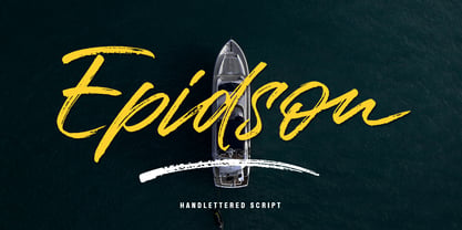 Epidson is a rough brush script font with a clear style and dramatic movement This font is great for your next creative project such as logos, printed quotes, invitations, cards, product packaging, headers, logos, letterheads, posters, clothing designs, labels, and so. Epidson has multi-language support, numbers, punctuation and also provides some extra ligature and swash. If you have questions, please contact: lettersams@gmail.com
 - Rollinkland by Almarkha Type,
$29.00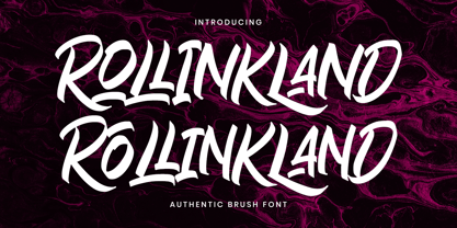 Rollinkland is a Authentic brush font with a clear style and dramatic movement this font is great for your next creative project such as logos, printed quotes, invitations, cards, product packaging, headers, Logotype, Letterhead, Poster, Apparel Design, Label, and etc. Rollinkland comes with uppercase, lowercase, numerals, accents (Multilingual characters), punctuations and so many variations on each character include OpenType alternates, swash to let you customize your design
 - Mambu Langu by Forberas Club,
$16.00 Mambu Langu font is handwritten style. Nice to application for poster, comic, cover book and tees, diary and poster.
 - Cloister Open Face LT by Linotype,
$29.99Cloister Open Face was designed in 1929 by Morris Fuller Benton as one weight of the Cloister Old Style family. Cloister itself appeared from 1897 with American Type Founders, and later for the typesetting machines of the Linotype, Intertype and Monotype companies. At that time, it was the truest modern industrial revival of the Jensonian Roman. Benton stayed close to the style of his model in both design and spacing. Cloister Open Face has an old-world elegance, and it works well for titling in books and magazines. In 1458, Charles VII sent the Frenchman Nicolas Jenson to learn the craft of movable type in Mainz, the city where Gutenberg was working. Jenson was supposed to return to France with his newly learned skills, but instead he traveled to Italy, as did other itinerant printers of the time. From 1468 on, he was in Venice, where he flourished as a punchcutter, printer and publisher. He was probably the first non-German printer of movable type, and he produced about 150 editions. Though his punches have vanished, his books have not, and those produced from about 1470 until his death in 1480 have served as a source of inspiration for type designers over centuries. His Roman type is often called the first true Roman." Notable in almost all Jensonian Romans is the angled crossbar on the lowercase e, which is known as the "Venetian Oldstyle e."" - Western Wood Type JNL by Jeff Levine,
$29.00 Inspired by a sample of a vintage wood type supplied by a fan of Jeff Levine fonts, Western Wood Type JNL is a traditional Clarendon-style condensed typeface from the era of letterpress and the Old West.
 - Westin Black by Miller Type Foundry,
$19.00 Westin Black is a great alternative to Cooper Black. Heavily influenced by clarendon typefaces, Westin Black also has a slight humanistic touch. It comes with open type features like old style figures, tabular figures and some ligatures.
 - MPI Bodoni Ultra by mpressInteractive,
$5.00 Old Style is an example of classic roman type design. It has little contrast in stroke weight, small rounded serifs, open characters, and is very easy to read. It is based on wood type of unknown origin.
 - Bebop by Présence Typo,
$36.00 Here is a sans-serif built up on an old-style design framework especially perceptible in the italic. It is the conjunction of contradictories feelings: pointed / soft, classical / modern. The smaller the typesetting, the better it works.
 - Le Bonjour by Vintage Voyage Design Supply,
$14.00 Classic retro sans with some modern looks. Contrast vertical and horizontal lines in Bold style and elegant and airy Light style. This font has no lowercase letters, only the small caps which makes it very suitable for Headers, Logotypes, sub-headers, etc. This family has a French mid-century spirit with the alternate underlined O, inherent in that time, ligatures for L-pairs and T-pairs letters and some decorative alternates for A, C, H, J, O, Q, and U letters. The Le Bonjour has three widths: Bold, Regular and Light. Four styles for Bold and Regular: Clear, Offset Decor Line, Pressed and Stroke. And two styles for Light: Clear and Stroke. (the light style is too narrow for Offset decor and Press styles)
 - Andesta by IM Studio,
$19.00 Andesta in a beautiful handwritten style with a touch of love style. Equipped with 391 glyphs Andesta is perfect for branding projects, home appliance design, product packaging, use in business cards, invitation cards, etc. Simply as a stylish text overlay onto a background image or anything else that needs a touch of elegance.
 - Altemus Cuts by Altemus Creative,
$11.00 Each style is a collection of 174 illustrative and printer cut designs.
 - Valiante by Gerald Gallo,
$20.00 Valiante is a bold contemporary sans serif font. It is ideal for headlines, titles, branding, small blocks of text or wherever a fresh new look is desired.
 - ITC Obelisk by ITC,
$29.99 ITC Obelisk is the work of British designer Phill Grimshaw. He classified his typeface as glyphic" in style, meaning chiseled rather than calligraphic in form. ITC Obelisk is a legible, elegant text typeface."
 - Kustom Culture by Scratch Design,
$10.00 Kustom Culture font was born from an inspiring vintage old paint display. This font gives a vintage, classic, and old feel, inspired by authentic old paint effects. Kustom Culture font is perfect for you looking for a vintage and logotype. Suitable for any graphic designs such as branding materials, t-shirts, badges, print, packaging, label, business cards, logos, posters, t-shirts, quotes .etc Features: Stylistic Alternates, Numerals & Punctuation Accented characters, Format File: TTF, OTF, Multiple Languages Supported
 - HandXpression by SullivanStudio,
$9.95 HandXpression was created with a stylus, imitating the experience of writing on a whiteboard with a marker. Its 646 glyphs cover from the Western to a wide part of Eastern European (Latin) alphabets. It also has all Greek letters for Math usage: yes, HandXpression makes formulas, and they look great, especially with LaTeX/XeTeX systems. The font has true italics, as well as some useful OpenType features: fractions, capital spacing, scientific superiors/inferiors, old style numbers, as well as standard ligatures and localized forms. Enjoy!
 - KG Inimitable Original by Kimberly Geswein,
$5.00 A bold kid-friendly title font in a whimsical unicase style.