10,000 search results
(0.048 seconds)
- Lemonade Soda by Gassstype,
$23.00 Hello Everyone, introduce our new product Lemonade Soda - Bold Handmade Carefully Crafted All Caps Display, inspired by the title of the sports poster and We make it very energetically. Lemonade Soda font with strong and challenging nuances. very suitable for the title, typography, Poster, magazines, brochures, packaging,Websites and much more for your design needs, making your designs more modern and professional Inspired by Logo style and combination with Cute Craft style. that will fulfill your design needs for quotes,sporty theme, logotype, wordmark, etc. This has many opentype features and support multi language.
 - Ghosty Banditto by Youngtype,
$14.00 (Halloween Font) Ghosty Banditto Script & Serif, This typeface is ideal for use in thick watercolor designs or handwriting styles, such as blog titles, posters, wedding elements, t-shirts, clothing, book covers, business cards, greeting cards, branding, merchandise etc. Contains full set: - Uppercase - Lowercase - Alternative - Ligatures - Punctuation - Number - Multilingual support. This font is ideal for use in watercolor designs or hand bold styles, such as blog headers, posters, wedding elements, t-shirts, clothing, book covers, business cards, greeting cards, branding, merchandise, invitations and handmade quotes and more. again. again. Thank you :)
 - Gradable by Ditatype,
$29.00 Introducing Gradable, a mesmerizing script font that seamlessly blends elegance with boldness. This unique typeface is characterized by its graceful, connected letters that flow effortlessly from one to the next. With a low-contrast design, this font exudes a sense of stability, What sets Gradable apart is its distinctive swinging endings on select letters, adding a touch of playful sophistication to your text. These stylish flourishes give your words an air of dynamic movement, making your message stand out with a touch of charm. Gradable fits in headlines, logos, posters, flyers, branding materials, print media, editorial layouts, and many more designs. Find out more ways to use this font by taking a look at the font preview.
 - Idealista by Suitcase Type Foundry,
$39.00 Idealista directly responds to its other members, Nudista and Kulturista. It shares the same proportions and the same set of weights, yet it enriches the expression means of the two typefaces with new themes — the character set is smooth, even round, and it boasts a number of special details and perky moves. Most of all, Idealista relishes juicy magazine titles, typographic logotypes and propagandist posters. Unlike cold, technicist typefaces, it has great zest for life, so there's no wonder that in each of the letters, intuition wins over intellect. Owing to this, the text set in Idealista has a special voluptuous quality and unmistakable temperament — in a single typeface Idealista combines the best of sans-serif, slab-serif, as well as geometric and calligraphic construction principles, coming down to one impressive, expressive cocktail. Some letters have serifs, some do not, some are sharp, some are smooth, and all this results in the nice hip-hop beat of the line of text. The typeface has five weights and ten styles in total, so it can easily accommodate to the needs of complex texts, unlike many of its display counterparts. Idealista is valuable partner for the more text-suited Nudista and, if need for tiny sizes arises, to Kulturista as well.
 - Artographie by Mans Greback,
$49.00 Artographie is a Art Deco sans-serif family. The lettering was designed by Måns Grebäck during 2019 and 2020. It gives any project a moderist appearance, as a reinvention of the hundred-year-old style of design, adapted and adjusted to fit in present-time purposes and technology. The typeface is a family containing five styles: Thin, Light, Medium, Bold and Black. The weights are top quality and created to balance perfectly against each other. It has a very extensive lingual support, covering all European Latin scripts. The font contains all characters you'll ever need, including all punctuation and numbers.
 - Lagerta by Scratch Design,
$10.00 Introducing Lagerta it's bold monoline script with vintage texture inside the shape. This font comes with a retro style for a retro design, Lagerta a combine from modern script touch with some little roughness inside the shape to make this font look more like an unfinished old style. Lagerta will be perfect for designs such as logotypes, headlines, branding, signage, clothing, label, packaging and etc. Features: Ligatures Numerals & Punctuation Accented characters Multiple Languages Supported HOW TO ACCESS ALTERNATE CHARACTERS Open glyphs panel: In Adobe Photoshop go to Window - glyphs In Adobe Illustrator go to Type - glyphs
 - Hendbras by Seniors Studio,
$15.00 Hendbras is handcrafted font duo created with a brush and ink, bold and irregular baseline. Contains a complete set of lowercase, uppercase, alternates, ligatures, punctuation, numbers, and multilingual support. This font ideal for use in watercolor design or lettering style bold hand, such as posters, wedding elements, t-shirt, apparel, cover books, business cards, greeting cards, branding, merchandise, invitations and handmade quotes and more.
 - Engage by Sohel Studio,
$14.00 "The 'Emerge Font' is a captivating typeface with a unique and bold serif display style. Featuring distinctive thick lines, each letter exudes strength and firmness. This font combines classic serif elements with modern touches, creating a visually striking and bold appearance. Emerge Font evokes elegance while maintaining a modern edge, making it ideal for graphic design projects, posters, and layouts that require unforgettable visual appeal."
 - Tallings by Grontype,
$14.00 TALLINGS is a bold modern, urban-condensed font, inspired by street urban poster that combines the classic and modern style. TALLINGS will be best suited for creating logotypes, branding, headlines, corporate identities, Invitation card, and other graphic design elements. TALLINGS Features: Bold condensed font Punctuation & Characters Ligatures and alternates Glyphs included superscript & Symbol Currencies Multilingual Thankyou for picking up this font. Happy creating! Regard, Grontype
 - Adventure Film JNL by Jeff Levine,
$29.00 In most cases, motion pictures with a Western theme have their titles and credits lettered in type styles that reflect the period of the Old West. In 1966, the titles and credits for “Texas Across the River” used casual sans serif lettering more suited to the 1960s than a Western taking place in the 1800s. Nonetheless, the lettering inspired a digital font entitled Adventure Film JNL and it is available in both regular and oblique versions.
 - ITC Bodoni Seventytwo by ITC,
$29.99Giambattista Bodoni (1740-1813) was called the King of Printers; he was a prolific type designer, a masterful engraver of punches and the most widely admired printer of his time. His books and typefaces were created during the 45 years he was the director of the fine press and publishing house of the Duke of Parma in Italy. He produced the best of what are known as modern" style types, basing them on the finest writing of his time. Modern types represented the ultimate typographic development of the late eighteenth and early nineteenth centuries. They have characteristics quite different from the types that preceded them; such as extreme vertical stress, fine hairlines contrasted by bold main strokes, and very subtle, almost non-existent bracketing of sharply defined hairline serifs. Bodoni saw this style as beautiful and harmonious-the natural result of writing done with a well-cut pen, and the look was fashionable and admired. Other punchcutters, such as the Didot family (1689-1853) in France, and J. E. Walbaum (1768-1839) in Germany made their own versions of the modern faces. Even though some nineteenth century critics turned up their noses and called such types shattering and chilly, today the Bodoni moderns are seen in much the same light as they were in his own time. When used with care, the Bodoni types are both romantic and elegant, with a presence that adds tasteful sparkle to headlines and advertising. ITC Bodoni™ was designed by a team of four Americans, after studying Bodoni's steel punches at the Museo Bodoniana in Parma, Italy. They also referred to specimens from the "Manuale Tipografico," a monumental collection of Bodoni's work published by his widow in 1818. The designers sought to do a revival that reflected the subtleties of Bodoni's actual work. They produced three size-specific versions; ITC Bodoni Six for captions and footnotes, ITC Bodoni Twelve for text settings, and ITC Bodoni Seventytwo - a display design modeled on Bodoni's 72-point Papale design. ITC Bodoni includes regular, bold, italics, Old style Figures, small caps, and italic swash fonts. Sumner Stone created the ornaments based on those found in the "Manuale Tipografico." These lovely dingbats can be used as Bodoni did, to separate sections of text or simply accent a page layout or graphic design." - ITC Bodoni Twelve by ITC,
$29.99Giambattista Bodoni (1740-1813) was called the King of Printers; he was a prolific type designer, a masterful engraver of punches and the most widely admired printer of his time. His books and typefaces were created during the 45 years he was the director of the fine press and publishing house of the Duke of Parma in Italy. He produced the best of what are known as modern" style types, basing them on the finest writing of his time. Modern types represented the ultimate typographic development of the late eighteenth and early nineteenth centuries. They have characteristics quite different from the types that preceded them; such as extreme vertical stress, fine hairlines contrasted by bold main strokes, and very subtle, almost non-existent bracketing of sharply defined hairline serifs. Bodoni saw this style as beautiful and harmonious-the natural result of writing done with a well-cut pen, and the look was fashionable and admired. Other punchcutters, such as the Didot family (1689-1853) in France, and J. E. Walbaum (1768-1839) in Germany made their own versions of the modern faces. Even though some nineteenth century critics turned up their noses and called such types shattering and chilly, today the Bodoni moderns are seen in much the same light as they were in his own time. When used with care, the Bodoni types are both romantic and elegant, with a presence that adds tasteful sparkle to headlines and advertising. ITC Bodoni™ was designed by a team of four Americans, after studying Bodoni's steel punches at the Museo Bodoniana in Parma, Italy. They also referred to specimens from the "Manuale Tipografico," a monumental collection of Bodoni's work published by his widow in 1818. The designers sought to do a revival that reflected the subtleties of Bodoni's actual work. They produced three size-specific versions; ITC Bodoni Six for captions and footnotes, ITC Bodoni Twelve for text settings, and ITC Bodoni Seventytwo - a display design modeled on Bodoni's 72-point Papale design. ITC Bodoni includes regular, bold, italics, Old style Figures, small caps, and italic swash fonts. Sumner Stone created the ornaments based on those found in the "Manuale Tipografico." These lovely dingbats can be used as Bodoni did, to separate sections of text or simply accent a page layout or graphic design." - ITC Bodoni Ornaments by ITC,
$29.99Giambattista Bodoni (1740-1813) was called the King of Printers; he was a prolific type designer, a masterful engraver of punches and the most widely admired printer of his time. His books and typefaces were created during the 45 years he was the director of the fine press and publishing house of the Duke of Parma in Italy. He produced the best of what are known as modern" style types, basing them on the finest writing of his time. Modern types represented the ultimate typographic development of the late eighteenth and early nineteenth centuries. They have characteristics quite different from the types that preceded them; such as extreme vertical stress, fine hairlines contrasted by bold main strokes, and very subtle, almost non-existent bracketing of sharply defined hairline serifs. Bodoni saw this style as beautiful and harmonious-the natural result of writing done with a well-cut pen, and the look was fashionable and admired. Other punchcutters, such as the Didot family (1689-1853) in France, and J. E. Walbaum (1768-1839) in Germany made their own versions of the modern faces. Even though some nineteenth century critics turned up their noses and called such types shattering and chilly, today the Bodoni moderns are seen in much the same light as they were in his own time. When used with care, the Bodoni types are both romantic and elegant, with a presence that adds tasteful sparkle to headlines and advertising. ITC Bodoni™ was designed by a team of four Americans, after studying Bodoni's steel punches at the Museo Bodoniana in Parma, Italy. They also referred to specimens from the "Manuale Tipografico," a monumental collection of Bodoni's work published by his widow in 1818. The designers sought to do a revival that reflected the subtleties of Bodoni's actual work. They produced three size-specific versions; ITC Bodoni Six for captions and footnotes, ITC Bodoni Twelve for text settings, and ITC Bodoni Seventytwo - a display design modeled on Bodoni's 72-point Papale design. ITC Bodoni includes regular, bold, italics, Old style Figures, small caps, and italic swash fonts. Sumner Stone created the ornaments based on those found in the "Manuale Tipografico." These lovely dingbats can be used as Bodoni did, to separate sections of text or simply accent a page layout or graphic design." - ITC Bodoni Brush by ITC,
$29.99Giambattista Bodoni (1740-1813) was called the King of Printers; he was a prolific type designer, a masterful engraver of punches and the most widely admired printer of his time. His books and typefaces were created during the 45 years he was the director of the fine press and publishing house of the Duke of Parma in Italy. He produced the best of what are known as modern" style types, basing them on the finest writing of his time. Modern types represented the ultimate typographic development of the late eighteenth and early nineteenth centuries. They have characteristics quite different from the types that preceded them; such as extreme vertical stress, fine hairlines contrasted by bold main strokes, and very subtle, almost non-existent bracketing of sharply defined hairline serifs. Bodoni saw this style as beautiful and harmonious-the natural result of writing done with a well-cut pen, and the look was fashionable and admired. Other punchcutters, such as the Didot family (1689-1853) in France, and J. E. Walbaum (1768-1839) in Germany made their own versions of the modern faces. Even though some nineteenth century critics turned up their noses and called such types shattering and chilly, today the Bodoni moderns are seen in much the same light as they were in his own time. When used with care, the Bodoni types are both romantic and elegant, with a presence that adds tasteful sparkle to headlines and advertising. ITC Bodoni™ was designed by a team of four Americans, after studying Bodoni's steel punches at the Museo Bodoniana in Parma, Italy. They also referred to specimens from the "Manuale Tipografico," a monumental collection of Bodoni's work published by his widow in 1818. The designers sought to do a revival that reflected the subtleties of Bodoni's actual work. They produced three size-specific versions; ITC Bodoni Six for captions and footnotes, ITC Bodoni Twelve for text settings, and ITC Bodoni Seventytwo - a display design modeled on Bodoni's 72-point Papale design. ITC Bodoni includes regular, bold, italics, Old style Figures, small caps, and italic swash fonts. Sumner Stone created the ornaments based on those found in the "Manuale Tipografico." These lovely dingbats can be used as Bodoni did, to separate sections of text or simply accent a page layout or graphic design." - ITC Bodoni Six by ITC,
$40.99Giambattista Bodoni (1740-1813) was called the King of Printers; he was a prolific type designer, a masterful engraver of punches and the most widely admired printer of his time. His books and typefaces were created during the 45 years he was the director of the fine press and publishing house of the Duke of Parma in Italy. He produced the best of what are known as modern" style types, basing them on the finest writing of his time. Modern types represented the ultimate typographic development of the late eighteenth and early nineteenth centuries. They have characteristics quite different from the types that preceded them; such as extreme vertical stress, fine hairlines contrasted by bold main strokes, and very subtle, almost non-existent bracketing of sharply defined hairline serifs. Bodoni saw this style as beautiful and harmonious-the natural result of writing done with a well-cut pen, and the look was fashionable and admired. Other punchcutters, such as the Didot family (1689-1853) in France, and J. E. Walbaum (1768-1839) in Germany made their own versions of the modern faces. Even though some nineteenth century critics turned up their noses and called such types shattering and chilly, today the Bodoni moderns are seen in much the same light as they were in his own time. When used with care, the Bodoni types are both romantic and elegant, with a presence that adds tasteful sparkle to headlines and advertising. ITC Bodoni™ was designed by a team of four Americans, after studying Bodoni's steel punches at the Museo Bodoniana in Parma, Italy. They also referred to specimens from the "Manuale Tipografico," a monumental collection of Bodoni's work published by his widow in 1818. The designers sought to do a revival that reflected the subtleties of Bodoni's actual work. They produced three size-specific versions; ITC Bodoni Six for captions and footnotes, ITC Bodoni Twelve for text settings, and ITC Bodoni Seventytwo - a display design modeled on Bodoni's 72-point Papale design. ITC Bodoni includes regular, bold, italics, Old style Figures, small caps, and italic swash fonts. Sumner Stone created the ornaments based on those found in the "Manuale Tipografico." These lovely dingbats can be used as Bodoni did, to separate sections of text or simply accent a page layout or graphic design." - Scala Pro by Martin Majoor,
$49.00 The award-winning Scala family (1990-1993) is a worldwide bestseller and has established itself as a ‘classic’ among digital fonts. It was one of the first serious digital text fonts to support small caps, ligatures and different set of numbers. In fact Scala and Scala Sans (1990-1993) are two different typefaces sharing a common form principle: the skeletons of both Scala and Scala Sans are identical. Scala’s dark colour and low contrast works to prevent the thin parts from breaking up. The generous length of Scala italic’s serifs gives it a strong rhythm. The bold weight has the same character widths as the normal weight, so changing a text from normal into bold does not affect the set width. Another part of Scala is very popular among its users: Scala Hands, containing more than one hundred decorative hands and pointers, is a free bonus. Scala Jewels is a set of four highly decorative typefaces, based on the bold capitals of Scala.
 - Avineo by Valentino Vergan,
$16.00 Avineo is a unique modern display typeface, which comes with a set of creative lowercase characters. The Avineo typeface has an ultra-fat look, which makes it perfect for logo and poster design. The Avineo typeface also comes in three styles, Regular, Outline and Extended, each style has an oblique version. The Avineo typeface comes with multilingual support for languages such as: Danish, English, Finnish, French, German, German (Switzerland), Norwegian Bokmål, Norwegian Nynorsk, Portuguese, Spanish, Swedish, Swiss German. The Avineo typeface has a unique design, which will make your next project standout. The Avineo typeface can cover a wide range of projects such as: brand packaging, brochures, magazines, logos, posters, flyers, book covers, quotes, branding, billboards, social media, pictograms and much more. If you are looking for something unique, bold and creative for you next project, the Avineo typeface is the font for you. WHAT YOU GET: Avineo Regular.otf Avineo Oblique.otf Avineo Outline.otf Avineo Outline oblique.otf Avineo Extended.otf Avineo Extended oblique.otf AVINEO INCLUDES A FULL SET OF: Uppercase and lowercase letters. Numbers. Punctuation. Ligatures. Alternates. Multilingual Symbols. We hope you enjoy using the Avineo typeface.
 - Fallons by Gassstype,
$25.00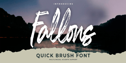 Hello Everyone, introduce our new product Font Fallons it is Quick Brush Font.This is a Textured Natural Style and classy style with a clear style and dramatic movement. This font Fallons is great for your next creative project such as logos, printed quotes, invitations, cards, product packaging, headers, Logotype, Letterhead, Poster, Design this font is great for your creative projects such as watermark on photography, and perfect for logos & branding, invitation,advertisements,product designs, stationery, wedding designs,and label. You can activate 32 Ligatures glyphs OpenType panel.
 - Undisclose by Gassstype,
$27.00 Hello Everyone, introduce our new product Font UNDISCLOSE it is Horror Display Font.This is a Textured Natural Style and Strong style with a Cool style and dramatic movement. This font UNDISCLOSE is great for your next creative project such as logos, printed quotes, invitations, cards, product packaging, headers, Logotype, Letterhead, Poster, Design this font is great for your creative projects such as watermark on photography, and perfect for logos & branding, invitation,advertisements,product designs, stationery. You can activate Ligatures and 5 Alternate glyphs OpenType panel.
 - Shrieky by Gassstype,
$27.00 Hello Everyone, introduce our new product font SHRIEKY is a Bad Brush Font.This is a Textured Natural Style and classy style with a clear style and dramatic movement. This font SHRIEKY is great for your next creative project such as logos, printed quotes, invitations, cards, product packaging, headers, Logotype, Letterhead, Poster, Design this font is great for your creative projects such as watermark on photography, and perfect for logos & branding, This font is PUA encoded which means you can access all of 16 Ligatures glyphs.
 - ITC Chino by ITC,
$40.99 ITC Chino is a type family (Display & Text) designed by Hannes von Döhren and Livius Dietzel. ITC Chino Pro brings legibility and distinction to text copy. It is also a friendly design that will invite readers into content at large or small sizes. It is a melding of soft brush stokes and crisp edges. This is readily apparent in the bolder italic weights where the straight stems provide a counterpoint to the cursive terminals. The Typefamily is highly legible in a wide range of sizes. The text side of the family contains five weights of roman, each with an italic companion. Ranging from Light to Black, ITC Chino Pro provides a rich typographic palette. The OpenType fonts have an extended character set to support Central and Eastern European as well as Western European languages. Each font includes small caps, fractions, old style-, lining-, tabular numbers, scientific superior/inferior figures and a set of arrows.
 - Linotype Textra by Linotype,
$40.99Linotype Textra is a clever twist on the sans serif genre, designed by Jochen Schuss and Jörg Herz in 2002. Schuss says this about Linotype Textra: "Two in one! The same Linotype Textra, which is so neutral and practical for long text passages turns into an eye-catching headline type when used in larger point sizes. The trick? It's all in the details. The type's clear, robust forms give it a high degree of legibility when used in smaller point sizes for texts. When used in larger sizes, the angular, slightly irregular forms that give the type its strong character become apparent. Hence the name Linotype Textra: pure text with a little something extra!" With 15 weights, the Linotype Textra family provides graphic designers with a good basis for almost any type of work. The five regular weights have matching true italics and old style figures, and the five small cap weights include tabular figures. - ITC Panache by ITC,
$29.99Typefaces, like most other works of art, provide a small window into the personalities and sensibilities of the artists who create them. ITC Panache not only provides this window, it is also aptly named. Mr. Edward Benguiat the dreator of ITC Panache, has all the dash, verve (and panache) hinted at in the design, Creative, capable and prolific, Ed Benguiat has drawn hundreds of exciting and popular typeface designs. Benguiat's design goal was to create a sans serif typestyle that is versatile, utilitarian - and distinctive. We think he has succeeded admirably. ITC Panache's three weights mix exceptionally well to complement each other or provide emphasis where necessary. Extensive testing at text sizes and design fine-tuning has produced a typeface family which is remarkably homogenous and consistent in color. Text set in ITC Panache is inviting without dissapointment. It is exceptionally easy to read, even in long text blocks of copy or small point sizes. When set in larger sizes or used for headlines, ITC Panache's character traits becomes more apparent and pronounced to the reader. They help to create graphics with distinction and style. Big or small. a little or a lot. it's hard not to use ITC Panache well. If you could pigeonhole ITC Panache, it would probably be classified as a stressed sans", but this would not completely describe, or do justiceto, the design. There is a slight contrast in stroke weight, which becomes more pronounced as the familiy weight increases; but there is a more to distinguish ITC Panache from ather sans serifs. Perhaps most obvious is its high waist and correspondingly slight condensation of the top half of the "round" capitals. Both of these traits link ITC Panache with the sensuous forms of art nouveau creations. In contrast are the typicall old style "e" found in designs like Cloister and ITC Berkeley Old Style, and the two storied "g" common to the early 20th century sans serif designs. The capital "A" even has the cupped top found in Caslon designs. Part of the beauty of ITC Panache is that all of these seemingly unrelated desig traits are melded into a design of exceptional continuity." - Fifteen36 by Grummedia,
$24.00Inspired by 16th century Venetian roman book texts, Fifteen36 has a traditional elegance and lots of character. Whether used at larger sizes for headings or at book sizes with plenty of leading Fifteen36 has a very attractive old school letterpress appearance. - 1584 Rinceau by GLC,
$20.00 This set of initial letters is an entirely original creation, inspired by French renaissance patterns used by Bordeaux printers circa 1580-1590. It contains two roman alphabets : the first of decorated letters, the second of single large capitals, all with Garamond style, and a few fleurons using the same background pattern style. Both containing Thorn, Eth, L slash and O slash. It can be used as variously as website titles, posters and flyers design, publishing texts looking like ancient ones, or greeting cards, all various sorts of presentations, as a very decorative, elegant and luxurious additional font... This font is conceived for enlargements, possibly strong ones, remaining very smart and very fine (especially decorated initials). This font may be used with all GLC Foundry blackletter fonts, but preferably with 1543 Humane Jenson, 1557 Italique, 1589 Humane Bordeaux, 1742 Civilite, 1776 Independence without any fear of anachronism.
 - Bullterrier by Beewest Studio,
$10.00 Bullterrier is a bold type of font that has a unique character than other bold fonts, Bullterrier has a strong but soft character, with an elegant and fresh theme, Bullterrier is provide your something different unique bold font . Its weight excels in logos, posters, social media, magazine titles, clothing, large print formats – and anywhere you want to see it. Inspired by the design styles that are currently popular, let’s make your imagination come true with Bullterrier.
 - Marco by TypeTogether,
$49.00 Marco is a lively text face, with an informal touch, inspired by 15th century Italian letter-forms with strong calligraphic traces and intended to be used primarily in continuous and intensive reading conditions. Marco is full of features required for high-quality book typography, including: strong language-support in extended Latin, Cyrillic and polytonic Greek, a multitude of swashes in the italic styles of Latin and Cyrillic, stylistic alternates to obtain the best possible solutions and other typographic niceties. Inspiration for Marco goes back to Italian humanist typography such as those of Nicholas Jenson or Aldus Manutius, and general influences from calligraphy. As a result, Marco has matured into a personal and unique text face where its lively and somewhat informal style is an ideal counterpart to its careful and ingenious crafting. Toshi Omagari’s Marco features a huge set of over 1900 characters per style —and almost 2600 in the italics— and is available in Regular, SemiBold, Bold with matching Italics.
 - Crubster by Joey Maul,
$12.00 Crubster is a digitally natured font with a bolder and slightly wider presence. Its Linear/rounded corner features give it a modern style which is suitable for logos, web graphics, headlines and text. Crubster works nicely with white text on a darker background.
 - Hebrew Julit by Samtype,
$39.00 Beautiful and elegant typeface, excelent using in wedding invitations, arts, posters and small texts.
 - Hebrew Provence Std by Samtype,
$39.00 Beautiful and elegant typeface, excelent using in wedding invitations, arts, posters and small texts.
 - Hebrew Juless by Samtype,
$39.00 Beautiful and elegant typeface, excelent using in wedding invitations, arts, posters and small texts.
 - Hebrew Rose Pro by Samtype,
$39.00 This beautiful hebrew swash font is for book covers, poster, titles and small texts.
 - MC Maxes by Maulana Creative,
$16.00 Maxes is a modern Bold sans Display font. Bold stroke, fun character with a bit of ligatures and alternates. To give you an extra creative work. Maxes font support multilingual more than 100+ language. This font is good for logo design, Social media, Movie Titles, Books Titles, a short text even a long text letter and good for your secondary text font with script or serif. Make a stunning work with Maxes font. Cheers, Maulana Creative
 - Hatrok by Maulana Creative,
$17.00 Hatrok is a modern bold serif display font. With bold contrast stroke, fun character with a bit of ligatures and alternates. To give you an extra creative work. Hatrok font support multilingual more than 100+ language. This font is good for logo design, Social media, Movie Titles, Books Titles, a short text even a long text letter and good for your secondary text font with sans or serif. Make a stunning work with Hatrok font. Cheers, Maulana Creative
 - Palfour by Maulana Creative,
$18.00 Palfour is a classic bold serif display font. With bold stroke, fun character with a bit of ligatures and alternates. To give you an extra creative work. Palfour font support multilingual more than 100+ language. This font is good for logo design, Social media, Movie Titles, Books Titles, a short text even a long text letter and good for your secondary text font with sans or serif. Make a stunning work with Palfour font. Cheers, Maulana Creative
 - MC Magtons by Maulana Creative,
$15.00 Magtons is a classic condensed strong bold sans display font. Bold stroke, fun character with a bit of ligatures and alternates. To give you an extra creative work. Magtons font support multilingual more than 100+ language. This font is good for logo design, Social media, Movie Titles, Books Titles, a short text even a long text letter and good for your secondary text font with script or serif. Make a stunning work with Magtons font. Cheers, Maulana Creative
 - Bitgros by Maulana Creative,
$12.00 Bitgros is a classic bold sans serif Display font. Bold stroke, fun character with a bit of ligatures and alternates. To give you an extra creative work. Bitgros font support multilingual more than 100+ language. This font is good for logo design, Social media, Movie Titles, Books Titles, a short text even a long text letter and good for your secondary text font with script or serif. Make a stunning work with Bitgros font. Cheers, Maulana Creative
 - LT Festive Medium - 100% free

- Tombstone - Unknown license

- Floki by LetterMaker,
$39.90 Floki is a contemporary condensed sans serif with sixteen styles ranging from extralight to extrabold and accompanying italics. The amount of styles, condensed proportions and large character set make Floki suitable for various uses such as infographics, packaging, branding, advertising and editorial design. Floki’s aesthetics are distinctly modern and they have a hint of softness which comes from sublty curving the diagonal strokes in letters such as A and V. This feature really shines when you set text in tightly set caps as big as possible. Stylistically Floki leans more to the humanist sans serif but it has a flavour of geometry in its shapes as well. The result of this combination of features is a highly usable typeface with a clear voice of it's own. All styles feature small caps and multiple sets on numerals including lining figures, old style figures, tabular figures, small cap figures, numerators, denominators, superiors, inferiors and fractions. Floki has latin extended character set making it well suited for multilingual typography.

