10,000 search results
(0.042 seconds)
- Ravenna by Aboutype,
$24.99A mechanically drawn felt tip pen styled font with matching common cap styles suitable for greeting cards, posters, and announcements. Ravenna requires subjective display kerning and compensation. - Hoban by District,
$40.00 The light and the bold. The thick and the thin. Laverne and the Shirley. Peanut Butter and the Jelly. Hoban is about contrast. Hoban wants to be noticed, but only after a second glance. A friend of a friend to the didones, it has smaller, tapering serifs, slightly calligraphic traits, and spindly little terminals that go where they please. It’s a headline face. Period. Set it big and bold. Or light and airy. But preferably next to something with flair. Cuff links, canapés, or corvettes–it’s up to you. Distinct ligatures, ornaments, and swashy alternates provide plenty of character to tailor your style.
 - Moyers by Areatype,
$13.00 Moyers typeface is Vintage Design, old-fashioned, elegant. This font good for vintage design, Display, t-shirt, logo, labels, posters and etc. Features: -Uppercase -Lowercase -Numerals -Basic punctuations Available in OTF formats. Thanks!
 - The British Telegraph by Vintage Voyage Design Supply,
$14.00 The British Telegraph font family was inspired by classic headers of Britain newspapers from the middle of XX century. Classic look with three width – Light, Regular and Bold. Great for headers, signs or logos. Also, working well for text blocks. - The British Telegraph Light: Use it for text blocks, or for gently light header typographic. Try to make more wide tracking with capitals, it looks good. - The British Telegraph Regular: Great for simple message, quotes, subheaders (If the header is Bold) or advert slogans. - The British Telegraph Bold: Is a killing title buddy. Massive, strong, bold and in the same time – very gentle. Perfectly for main words, headers, signs or logo's. The British Telegraph has full glyph set with standard and discretionary ligatures (Open Type Features).
 - Mogila Display by Letterfreshstudio,
$15.00 Mogila is a display font with a touch of style that's cheerful, elegant and strong. So it is suitable for use in product design and appearance, both in modern or vintage designs. OpenType feature with several alternative characters that allow you to mix and match letter pairs to suit your design. Mogila also includes 4 different styles, namely Regular,Italic, Bold and Outline which are made with different styles but still have the same characters. Mogila is included in a display font so it is very suitable for use in titles, poster products, logos, book menus, websites, books, t-shirts, posters, book covers, labels, business cards, branding, print templates and many other designs according to your needs. Mogila includes a complete set of upper and lowercase letters, as well as multi-language support, punctuation, ligatures and alternatives. Thank you very much for looking and Enjoying it!
 - Waldo by The Northern Block,
$49.95 Waldo is a bold, stencil-focused display typeface loosely based on a 1973 science fiction movie poster for "The Battle For The Planet of The Apes". Narrow rectangular slots cut into heavyweight forms create a stylish and energetic font ideal for apparel, books, film titles, packaging and posters. Included in the font are over 400 characters with four unique styles; Black, Stencil, Outline, and Shadow. Opentype features consist of digital numerals, tabular figures, numerators, denominators and fractions. Other features cover alternate lowercase f and r, with language support for Western, South and Central Europe.
 - Monotype Goudy by Monotype,
$40.99Over the course of 50 years, the charismatic and enterprising Frederic W. Goudy designed more than 100 typefaces; he was the American master of type design in the first half of the twentieth century. Goudy Old Style, designed for American Type Founders in 1915-1916, is the best known of his designs, and forms the basis for a large family of variants. Goudy said he was initially inspired by the cap lettering on a Renaissance painting, but most of the flavor of this design reflects Goudy's own individualistic style. Recognizable Goudy-isms include the upward pointing ear of the g, the diamond-shaped dots over the i and j, and the roundish upward swelling of the horizontal strokes at the base of the E and L. The italic was completed by Goudy in 1918, and is notable for its minimal slope. Goudy Bold (1916-1919) and Goudy Extra Bold (1927) were drawn not by Goudy, but by Morris Fuller Benton, who was ATF's skillful in-house designer. Goudy Catalogue was drawn by Benton in 1919-1921 and was meant to be a medium weight of Goudy Old Style. Goudy Heavyface was designed by Goudy for Monotype in 1925, and was intended to be a rival to the successful Cooper Black. Goudy Modern was designed by Goudy in 1918; its small x-height, tall ascenders and shorter caps impart a spacious and elegant feeling. Benton designed Goudy Handtooled, the shaded version that has just a hairline of white through its bold strokes. The Goudy faces, especially the bolder weights, have long been popular for display and advertising design. They continue to pop up all over the world, and still look reassuring to our modern eyes." - Goudy Ornate MT by Monotype,
$29.99Over the course of 50 years, the charismatic and enterprising Frederic W. Goudy designed more than 100 typefaces; he was the American master of type design in the first half of the twentieth century. Goudy Old Style, designed for American Type Founders in 1915-1916, is the best known of his designs, and forms the basis for a large family of variants. Goudy said he was initially inspired by the cap lettering on a Renaissance painting, but most of the flavor of this design reflects Goudy's own individualistic style. Recognizable Goudy-isms include the upward pointing ear of the g, the diamond-shaped dots over the i and j, and the roundish upward swelling of the horizontal strokes at the base of the E and L. The italic was completed by Goudy in 1918, and is notable for its minimal slope. Goudy Bold (1916-1919) and Goudy Extra Bold (1927) were drawn not by Goudy, but by Morris Fuller Benton, who was ATF's skillful in-house designer. Goudy Catalogue was drawn by Benton in 1919-1921 and was meant to be a medium weight of Goudy Old Style. Goudy Heavyface was designed by Goudy for Monotype in 1925, and was intended to be a rival to the successful Cooper Black. Goudy Modern was designed by Goudy in 1918; its small x-height, tall ascenders and shorter caps impart a spacious and elegant feeling. Benton designed Goudy Handtooled, the shaded version that has just a hairline of white through its bold strokes. The Goudy faces, especially the bolder weights, have long been popular for display and advertising design. They continue to pop up all over the world, and still look reassuring to our modern eyes." - Goudy Handtooled by Monotype,
$40.99Over the course of 50 years, the charismatic and enterprising Frederic W. Goudy designed more than 100 typefaces; he was the American master of type design in the first half of the twentieth century. Goudy Old Style, designed for American Type Founders in 1915-1916, is the best known of his designs, and forms the basis for a large family of variants. Goudy said he was initially inspired by the cap lettering on a Renaissance painting, but most of the flavor of this design reflects Goudy's own individualistic style. Recognizable Goudy-isms include the upward pointing ear of the g, the diamond-shaped dots over the i and j, and the roundish upward swelling of the horizontal strokes at the base of the E and L. The italic was completed by Goudy in 1918, and is notable for its minimal slope. Goudy Bold (1916-1919) and Goudy Extra Bold (1927) were drawn not by Goudy, but by Morris Fuller Benton, who was ATF's skillful in-house designer. Goudy Catalogue was drawn by Benton in 1919-1921 and was meant to be a medium weight of Goudy Old Style. Goudy Heavyface was designed by Goudy for Monotype in 1925, and was intended to be a rival to the successful Cooper Black. Goudy Modern was designed by Goudy in 1918; its small x-height, tall ascenders and shorter caps impart a spacious and elegant feeling. Benton designed Goudy Handtooled, the shaded version that has just a hairline of white through its bold strokes. The Goudy faces, especially the bolder weights, have long been popular for display and advertising design. They continue to pop up all over the world, and still look reassuring to our modern eyes." - Goudy by Linotype,
$39.00Over the course of 50 years, the charismatic and enterprising Frederic W. Goudy designed more than 100 typefaces; he was the American master of type design in the first half of the twentieth century. Goudy Old Style, designed for American Type Founders in 1915-1916, is the best known of his designs, and forms the basis for a large family of variants. Goudy said he was initially inspired by the cap lettering on a Renaissance painting, but most of the flavor of this design reflects Goudy's own individualistic style. Recognizable Goudy-isms include the upward pointing ear of the g, the diamond-shaped dots over the i and j, and the roundish upward swelling of the horizontal strokes at the base of the E and L. The italic was completed by Goudy in 1918, and is notable for its minimal slope. Goudy Bold (1916-1919) and Goudy Extra Bold (1927) were drawn not by Goudy, but by Morris Fuller Benton, who was ATF's skillful in-house designer. Goudy Catalogue was drawn by Benton in 1919-1921 and was meant to be a medium weight of Goudy Old Style. Goudy Heavyface was designed by Goudy for Monotype in 1925, and was intended to be a rival to the successful Cooper Black. Goudy Modern was designed by Goudy in 1918; its small x-height, tall ascenders and shorter caps impart a spacious and elegant feeling. Benton designed Goudy Handtooled, the shaded version that has just a hairline of white through its bold strokes. The Goudy faces, especially the bolder weights, have long been popular for display and advertising design. They continue to pop up all over the world, and still look reassuring to our modern eyes." - Tavern by FontMesa,
$25.00 Tavern is a super font family based on our Algerian Mesa design, with Tavern we've greatly expanded the usability by creating light and bold weights plus all new for 2020 with the introduction of extra bold and black weights Tavern is now a five weight family. The addition of the bold weight made it possible to go further with the design by adding open faced shadowed, outline and fill versions. Please note, the fill fonts are aligned to go with the open faced versions, they may work with the outline versions, however you will have to apply them one letter at a time. The Tavern Fill fonts may also be used a stand alone font, however, the spacing is much wider than the regular solid black weights of Tavern. In the old days of printing, fill fonts rarely lined up perfect with the open or outline font, this created a misprinted look that's much in style today. To create that misprinted look using two different colors, try layering the outline fonts offset over the top of the solid black versions. Next we come to the small caps and X versions, for a font that's mostly seen used in all caps we felt a small caps would come in handy. The X in Tavern X stands for higher X-height, we've taken our standard lowercase and raised it for greater visibility in small text and for signage where you want the look of a lowercase but it needs to be readable from the street. In August of 2016 I started the project of expanding this font into more weights after seeing the font in use where someone tried creating a bold version by adding a stroke fill around the letters. The result didn't look very good, the stroke fill also caused the shadow line to merge with the serifs on some letters. This lead me to experiment to see if a new bold weight was possible for this font and I'm pleased to say that it was. After the bold weight was finished I decided to type the regular and bold weights together in a first word thin second word bold combination, however the weight difference between the two wasn't enough contrast. This lead me to wonder if a lighter weight was possible for this font, as you can see yes it was, so now for the first time in the history of this old 1908 type design you can type a first word thin second word bold combination. So why the name change from Algerian to Tavern? Since the original font was designed in England by the Stephenson Blake type foundry I decided to give this font a name that reminded you of the country it came from, however, there were other more technical reasons. During the creation of the bold weight the engraved shadow line was sticking out too far horizontally on the bottom right of the serifs dramatically throwing the whole font off balance. The original font encountered this problem on the uppercase E, L and Z, their solution was a diagonal cut corner which was now needed across any glyph in the new bold weight with a serif on the bottom right side. In order to make the light and regular weights blend well with the bold weight diagonal cut offs were needed and added as well. This changed the look of the font from the original and why I decided to change the name, additional concerns were, if you're designing a period piece where the font needs to be authentic then this font would be too new. Regular vs. Alt version? The alternate version came about after seeing the regular version used as a logo and secondary text on a major product label. I felt that some of the features of the regular version didn't look good as smaller secondary text, this gave me the idea to create an alternate version that would work well for secondary text in an advertising layout. But don't stop there, the alternate version can be used as a logo too and feel free to exchange letters between both regular and alternate versions. Where are the original alternates from Algerian? Original alternates from Algerian are built into the regular versions of Tavern plus new alternates have been created. We're excited to introduce, for the first time, all new swash capitals for this classic font, you're going to love the way they look in your ad layout, sign or logo. The best way to access alternate letters in Tavern is with the glyph map in Adobe Illustrator and Adobe InDesign products, from Adobe Illustrator you can copy and paste into Photoshop as a smart object and take advantage of all the text layer style features Photoshop has to offer. There may be third party character maps available for accessing alternate glyphs but we can't advise you in that area. I know what you're thinking, will there be a Tavern Condensed? It takes a lot of hours to produce a large font family such as this, a future condensed version will depend on how popular this standard version is. If you love Tavern we're happy to introduce the first weathered edge version of this font called Bay Tavern available in February 2020.
 - NorB Sans Expanded by NorFonts,
$32.00 NorB Sans Expanded is my first sans serif font, it's a friendly smooth sans serif font with 3 weights: Regular, Medium and Bold each with italic version. It includes over 1000 glyphs + OpenType features (Access All Alternates, Small Capitals From Capitals, Case-Sensitive Forms, Discretionary Ligatures, Denominators, Fractions, Historical Ligatures, Kerning, Standard Ligatures, Localized Forms, Numerators, Ordinals, Small Capitals and Superscript.) This font would be perfect for both texts and titles, and pairs beautifully with other fonts already in your library, especially handwritten and serif fonts. The resultant texture is lively but not intrusive, and makes for a friendly and readable text. You may use it in everything from logotypes to social media posts, website and magazine layouts to poster designs.
 - Familytalk by Ditatype,
$29.00 Familytalk is a script font that exudes confidence and elegance in every character. With its thick and sturdy strokes, this font commands attention. The swinging endings on certain letters provide a delightful sense of rhythm and flow to the text. These unique design elements create a sense of movement within the text, making it visually captivating and engaging. Despite its thick weight, Familytalk maintains excellent legibility. Its ability to strike a balance between boldness and grace makes it a versatile choice for projects that demand a stylish script font. Familytalk fits in headlines, logos, posters, flyers, branding materials, print media, editorial layouts, and many more designs. Find out more ways to use this font by taking a look at the font preview.
 - Benord by Valentino Vergan,
$16.00 Benord is a bold elegant modern serif, it comes with stylistic alternates and creative ligatures. The idea behind Benord was to modernise an old style serif for today’s design industry. The main aim was too creative a serif take has a nostalgic vintage feel with a modern twist. Benord is an ideal font for graphic designs and advertising agencies who are looking to create beautiful logos and designs. Benord was designed to look great in both large and small type settings, making it perfect for cover and layouts. With its great multilingual support, Benord can produce a large number of different languages.
 - FeggoliteHatched by Ingrimayne Type,
$4.95 The name FeggoliteHatched comes from the fact that it was created with the help of an old font manipulation program called Incubator Pro. It was an attempt to create a more conventional typeface from the odd monospaced font, FeggoliteMono. As a monospaced font, FeggoliteHatched could be considered a typewriter face, but no typewriter ever produced letters like these. The original version from 1994 is now the italic style and it has a leftward or back slant. The upright or plain version was added much later, in 2018. There is also a choppy upright version included in this family.
 - HT Pavla Prospekt by Hype Type,
$34.00 A pure neo-grotesque typefamily inspired by the first typographies' old wooden characters, and by the marks soft and sometimes imprecise these left on the paper. All typographic elements are also influenced by the Cyrillic alphabet letter-form. -- HT Pavla Prospekt is inspired by ancient wooden typefaces and eastern-style letterform. This reference gives the letters unusual but characteristic proportions. The visual effect of the diffusion of the ink imprinted on the paper, which gives softness to the forms, is also very influential. The proportions of the bold and thin faces are visually balanced to ensure a more modern feeling. --
 - Million Dreams by Sansakerta,
$13.00 Million Dreams is an elegant and bold display font. Unique, playful and versatile serif Fot that you can combine to get curves and beautiful shapes just in seconds. Play with the ornaments to create a more stunning display. This font is suitable for use in many design forms, for example magazines, postcards, logos, vintage look, old classic ,60s, 70s, 80s era, wedding projects and many more. We recommend using Adobe Illustrator or Photoshop. Fall in love with its incredibly versatile style and use it to create gorgeous wedding invitations, beautiful stationary art, eye-catching social media posts, and much more! Cheers! Sansakerta
 - Intimate Summer by Get Studio,
$15.00 Introducing Intimate Summer Font Duo, featuring a strong and bold sans font alongside a casual handwriting-inspired script font. This duo is a perfect combination that brings harmony and versatility to your creative projects. The bold sans font exudes strength and confidence with its clean lines and thick letterforms. It commands attention and adds a modern and retro touch to any design. Complementing the bold sans is the casual script font, which mimics the relaxed style of handwritten text. This script font brings a unique and free-spirited atmosphere to your typographic compositions. Together, this font duo offers an ideal balance between strength and casualness, making it a versatile choice for a variety of design applications. Whether you're designing logos, branding materials, invitations, or editorial layouts, this font duo is a captivating combination that adds an irreplaceable casual touch to your projects.
 - Altemus Leaves by Altemus Creative,
$11.00 Each style is a collection of 174 leaf, illustrative and printer cut designs from the 1950s.
 - Trakya Rounded by Bülent Yüksel,
$19.00 Thrace (/θreɪs/; Greek: Θράκη, Thráki; Bulgarian: Тракия, Trakiya; Turkish: Trakya) is a geographical and historical region in Southeast Europe, now split among Bulgaria, Greece, and Turkey, which is bounded by the Balkan Mountains to the north, the Aegean Sea to the south, and the Black Sea to the east. It comprises southeastern Bulgaria (Northern Thrace), northeastern Greece (Western Thrace), and the European part of Turkey (East Thrace). Trakya Rounded is a modern sans serif with a geometric touch. It has a modern streak which is the result of a harmonization of width and height especially in the lowercase letters to support legibility. Trakya Rounded is softer and rounder than it's sibling Trakya Sans. They're both ideally suited for advertising and packaging, editorial and publishing, logos, branding and creative industries, posters and billboards, small text, way-finding and signage as well as web and screen design. Trakya Rounded provides advanced typographical support for Latin-based languages. An extended character set, supporting Central, Western and Eastern European languages, rounds up the family. The designation “Trakya Rounded 500 Regular” forms the central point. The first figure of the number describes the stroke thickness: 100 Thin to 900 Bold. "Trakya Rounded" comes in 5 weights and italics and has the company of "Trakya Rounded Alt" that also comes in 5 weights and italics for a total of 20 styles. The family contains a set of 630+ characters. Case-Sensitive Forms, Classes and Features, Small Caps from Letter Cases, Fractions, Superior, Inferior, Denominator, Numerator, Old Style Figures are easily accessible in all graphic programs. Trakya Rounded is the perfect font for web use. Enjoy using it.
 - Paladium Gothic by BA Graphics,
$45.00A next generation gothic with that clean legible corporate look, very simple yet very dignified. Great for text and head lines, just about any application. If you are tired of seeing Helvetica try Paladium Gothic. - Summerhaven JNL by Jeff Levine,
$29.00Summerhaven JNL and Summerhaven Italic JNL were partially inspired by sign lettering spotted in an old black and white movie. These fonts are somewhat reminiscent of the Art Deco style, and their casual look can be applied to both formal and informal messages. - Tiler JNL by Jeff Levine,
$29.00 Tiler JNL is a novelty font with geometric styling. Its use can be as diverse as an ad for wall or floor tile to conveying a modular feel within a futuristic setting to signage on the wall of an old-time subway station.
 - Oksana Greek by AndrijType,
$25.00 Oksana Greek has only basic Latin and monotonic Greek characters from multilingual Oksana. It has six weights with real italics, and Alt faces with Old Style figures, ampersand, alternative characters -a-g-k-y- and Greek -Ε-Ξ-β-ε-θ-φ-.
 - Oksana Cyrillic by AndrijType,
$25.00 Oksana Cyrillic has only basic Latin and european Cyrillic characters from multilingual Oksana. It has six weights with real italics, and Alt faces with Old Style figures, ampersand, alternative characters -a-g-k-y- and Cyrillic -а-в-д-з-у-ў-.
 - Celtics Modern by Dharma Type,
$14.99 Inspired from ancient Celtic lettering such like insular-half-uncial. New interpretation of Celtic letters bring a whole new feel to old letterings. At the same time, the font has handwritten-style glyphs as if they were handwritten same as the ancient letters.
 - Designal by Type-Ø-Tones,
$40.00 Designal is a Félix Rufín design based on the DIN theme. The goal was to create a suitable unicase, an old dream of typographers. The icons collection —more than 400— is a result of Rufín’s obsession with label design. OpenType, 8 styles.
 - Wavy Rounded BT by Bitstream,
$50.99Wavy Rounded is a stylized sans serif display typeface by Japanese designer Hajime Kawakami. Some of the characters possess quirky features that randomly create fun visual “waves”. There is a handful of alternate characters including an old style figure set. Catch the Wave. - Charter BT by Bitstream,
$50.99 Originally released in 1987, Charter incorporates three important features: compact set width to give economical copyfit; generous x-height to give readability at small point sizes; and sturdy open letterforms to give reliable reproduction at both typesetter and laser printer resolutions. The design brings a clarity and freshness to everyday documents, such as newsletters, textbooks, directories and technical manuals, where the reader’s concentration must not be interrupted by unfamiliar letterforms but where typographic dullness can itself impair comprehension. The Italic has cursive letterforms - so is instantly distinguishable, while being readable enough in its own right for continuous text. The Charter BT Pro Pack features 6 fonts: roman, italic, bold, bold italic, black, and black italic. The fonts include characters originally developed for expert sets, such as ligatures, ornaments, old style figures, small caps, and superiors. The Pro Pack fonts support Western, Central European, and Eastern European languages. OpenType fonts are a cross-platform font format. The same OpenType font can be installed on Mac OS X, Windows, Linux, and Unix systems. Mac OS X and Windows 2000, XP, and Vista have built-in support for OpenType. OpenType fonts also work on Linux, Unix, and earlier versions of Windows, where they are recognized as TrueType fonts. OpenType includes many more features than the standard TrueType and PostScript formats, including the ability to install the same font on different platforms, crucial for document portability. OpenType fonts boost productivity because graphic designers and business professionals do not have to wrestle with many different fonts. With OpenType, customers have larger character sets to work with and fewer font files to deal with.
 - Blocky Shape by Cititype,
$12.00 Blocky Shape is a bold script with attractive features. Get inspired by its unique style!
 - Simeon's Handwritten Blackletter by Simeon out West,
$20.00 Simeon's Handwritten Blackletter is the result of my desire to have my handwritten old English style writing available for my computer. It is a basic Gothic style font with my own touch to the lettering. Simeon's Handwritten Blackletter comes with full punctuation, a character set for most Western European based Latin alphabet languages. Being a decorative font, it works best at larger point sizes.
 - Life by Linotype,
$29.99Life was designed in 1964 by W. Bilz and marks the beginning of a new generation of newsprint fonts. The Ionic style had replaced Modern Face and was now replaced by this new innovative style, which mixed elements of Old Face, Transitional and Modern Face forms. Life’s characters are based on the forms of Times and are the result of a time of change and experimentation. - NS Gibswing by Novi Souldado,
$35.00 Gibswing born based on the reference of old fancy lettering, vintage illustration, and victorian calligraphy. The Gibswing decorative style make it as an instant time machine to the era from 1800-1900 victorian visual style of the products, printed advertising, and signs back in the day. It will be a perfect companion of your classic visual direction for decorative sign, labels, branding, logotype, you name it.
 - P22 Larkin by IHOF,
$24.95 This lettering style is unusual in that combines aspects of several lettering styles. It is essentially a Germanic Blackletter but with many romanized capital letters and also features an italic slant along with some italic lower case traits. It is evocative of “old world” craftsmanship and early 20th century romanticism. The font was developed based on the logo of the Lakin Company of Buffalo, NY circa 1900.
 - Bridgest by Attract Studio,
$20.00 Bridgest is an old and modern style serif created with a desire for quality fonts. The number of alternatives is enormous, from simple styling alternatives to swashes, fasteners and substitutes. Bridgest being a very versatile font with its classic shape and modern features, this font will be ideal for a variety of design projects from blog graphics, stylish quotes, wedding stationery, art prints and many others.
 - Geroska by Keristyper Studio,
$14.00 Geroska Is a serif contemporary inspired by combining Mid-Century, Modern & Aesthetics styles. This font is good for logo design, Social media, Movie Titles, Books Titles, short text even long text letters, and good for your secondary text font with sans or serif. **Featured:** * Standard Uppercase & Lowercase * Numeral & Punctuation * Multilingual : ä ö ü Ä Ö Ü ß ¿ ¡ * Alternate & Ligature * PUA encoded We recommend programs that support the OpenType feature and the Glyphs panel such as Adobe applications or Corel Draw. so you can use all the variations of the glyphs. Hope you enjoy our fonts!
 - Shutterlocks by Almarkha Type,
$29.00 Shutterlocks – Casual Handbrush is a best handwritten brush that is written casually and quickly. Letters are made with brushes on Ipad. Then scanned and carefully drawn into vector format. That is why Crash Soul has charming, authentic and relaxed characteristic more natural look to your text with a more natural look to your text. You can activate Ligature OpenType panel to make these two styles. It also has many alternatives and underlines that make your text and design more interesting.Crash Soul is perfect for homeware designs,branding projects, Logo design, Quotes product packaging
 - Quakerhack by Almarkha Type,
$29.00 Introducing Quakerhack is a best handwritten brush that is written casually and quickly. Letters are made with brushes on Procreate. Then scanned and carefully drawn into vector format. That is why Quakerhack has charming, authentic and relaxed characteristic more natural look to your text with a more natural look to your text. You can activate Ligature OpenType panel to make these two styles. It also has many alternatives and underlines that make your text and design more interesting. Quakerhack is perfect for homeware designs,branding projects, Logo design, Quotes product packaging.
 - Amicable by Gassstype,
$25.00 Introducing Amicable is a handwritten brush that is written casually and quickly. Letters are made with brushes on Procreate. Then crafted carefully drawn into vector format. That is why Amicable has charming, authentic and relaxed characteristic more natural look to your text with a more natural look to your text. You can activate Ligature OpenType panel to make these two styles. It also has many alternatives and underlines that make your text and design more interesting. Amicable is perfect for homeware designs,branding projects, Logo design, Quotes product packaging.
 - Lepharto by Keristyper Studio,
$14.00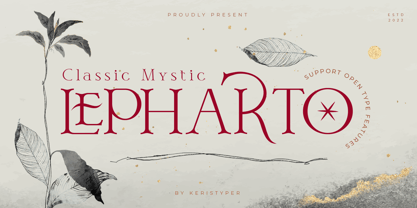 Lepharto Is a modern classic mystic with a classic serif style. This font is good for logo design, Social media, Movie Titles, Books Titles, short text even long text letters, and good for your secondary text font with sans or serif. Featured: Standard Uppercase & Lowercase Numeral & Punctuation Multilingual : ä ö ü Ä Ö Ü ß ¿ ¡ Alternate & Ligature PUA encoded We recommend programs that support the OpenType feature and the Glyphs panel such as Adobe applications or Corel Draw. so you can use all the variations of the glyphs. Hope you enjoy our fonts!