10,000 search results
(0.059 seconds)
- Burst Flower by Wasabib Type Foundry,
$10.00 BURST FLOWER is a display font that coming with 3 style ( Regular, Outline, Extrude ) every style have their own power to make your design stunning and stand out. Burst Flower create by 100% hand drawing to get the artistic look.
 - Kaldera by Letterena Studios,
$17.00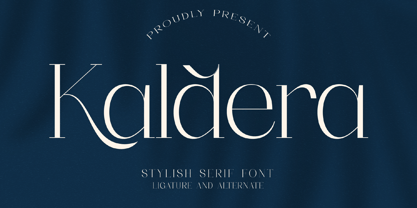 Kaldera is a modern and classic serif typeface that has its own unique style and exquisite look. This font is perfect for elegant and luxurious logos, book or movie title designs, fashion brands, magazines, clothes, lettering, quotes, and so much more.
 - Abstract by Los Andes,
$29.00 Abstract is a contemporary and eclectic serif typeface inspired by today's life and created in times of pandemic. This family includes a true italic variant —that has its own personality— alternates, lining and old style figures, numerators and denominators & Cyrillic support.
 - Tattooflash Marie by Otto Maurer,
$14.00 Tattooflash Marie is made for Tattoofans, Tattoostudios and Tattoo artists. Make your own tattoo flash with your Name or the Names of your children. The Font is made for your skin but you can also make Tattooposter, Tattooequipment and more.
 - Best Signature by Nirmalagraphics,
$14.00 Best Signature is a font in modelled after my own signature style. This font also works well when used for magazines, brochures, flyers, Instagram posts, as well as themes for women. Best Signature includes ligatures and expanded multi-lingual support.
 - Heiders by Seventh Imperium,
$20.00 Heiders is a font family including 71 fonts with 4 sub families - Heiders Script, Heiders Sans, Heiders Handmade and Heiders Extras. Heiders contains texture options and lots of extras to make it easier for you to create your own way!
 - Uplift by Fontop,
$11.00Uplift is a modern serif typeface with its own character and charisma. Works cool both when used in headlines, magazines, pull quotes and also in branding, unique logos, etc. Uplift comes with multilingual support also and also feature stylistic alternates. - Blue Ocean by Letterena Studios,
$9.00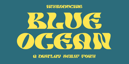 Blue Ocean is a creative slab serif font that has its own unique style and modern look. This typeface is perfect for an elegant & luxury logo, book or movie title design, fashion brand, magazine, clothes, lettering, quotes, and so much more.
 - Spring LP by LetterPerfect,
$39.00 Spring is a lively contemporary script that designer Garrett Boge modeled after his own brush lettering. It was released in 1988 at the launch of LetterPerfect's font collection, and has seen increasing use in advertising, packaging, and point-of-display promotions.
 - BLT Portage by Black Lab Type,
$12.00 PORTAGE is a slab serif that carries its own weight. Adventurous and rugged, this typeface that evokes the wild country and makes headlines stand out. The typeface was built from a land and forest journal from the mid-50's.
 - Garges by Letterena Studios,
$9.00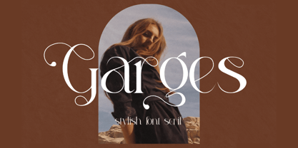 Garges is a modern and classy serif font with its own unique style and modern look. This typeface is perfect for an elegant & luxury logo, book or movie title design, fashion brand, magazine, clothes, lettering, quotes, and so much more.
 - Stencil Modernistic JNL by Jeff Levine,
$29.00Stencil Modernistic JNL was modeled directly from an early 1960s lettering stencil that favored the Art Deco style. There is minimum kerning due to the nature of this typeface, so designers should use their own judgment when working with it. - Bindweed by Solotype,
$19.95From an old wood type owned by a San Francisco printer. Wood types were customarily given somewhat generic names (Antique Tuscan) or, more frequently, numbers to identify them. Our clients liked colorful, easily-remembered names better, and so did we. - Magisho by Letterena Studios,
$17.00 Magisho is a distinct and classic serif font that has its own unique style & modern look. This typeface is perfect for an elegant & luxury logo, book or movie title design, fashion brand, magazine, clothes, lettering, quotes, and so much more.
 - Kolbano by Jehoo Creative,
$19.00 Kolbano is a visually captivating typeface that is renowned for its distinctive and expressive letterforms. Designed with meticulous attention to detail, each character in Kolbano Font possesses a unique shape, making it an exceptional choice for creative and artistic projects. The font's design philosophy centers around providing a harmonious balance between elegance and personality. The letters in Kolbano are meticulously crafted with fluid curves, sharp angles, resulting in an eye-catching and memorable visual experience. Every character stands out on its own, showcasing its own individuality and artistic flair. Whether used in headlines, logos, or other design applications, Kolbano is sure to make a lasting impression. In addition to its regular upright variant, Kolbano also offers a captivating italic style. The italics add a dynamic touch to the typeface, imbuing the text with a sense of movement and energy. The slanted letterforms maintain the unique shape of each character, preserving the font's distinctiveness while introducing a sense of flow and elegance. The italics are perfect for emphasizing words, creating emphasis, or adding a touch of sophistication to any design. Kolbano s versatile and adaptable, suitable for a wide range of creative projects. Its aesthetic appeal makes it ideal for editorial design, branding, packaging, posters, and any application where typography plays a central role. The font's versatility allows it to effortlessly adapt to various design themes and concepts, whether it be modern and sleek or vintage and nostalgic.
 - Bellissima Script Pro by Sudtipos,
$79.00 While in the same vein and spirit as Burgues and Compendium, Bellissima began from an entirely different thread from those fonts. It started with Alex Trochut generously showing me a gorgeous lettering book from his grandfather’s library: Bellezas de la Caligrafía, by Ramón Stirling, 1844. Stirling was one of the Latin calligraphy pioneers who introduced a refined version of English calligraphy in Spain and made it popular in the nineteenth century. Some scans from that book served as initial basis for the caps in my Poem Script. But it was always in the back of my mind that I should do a copperplate, and the Stirling model was the perfect source. My intention was to veer away from Stirling’s exuberant ornamentation, and work within simplified forms of his ideas. As it usually is with most of my projects, Bellissima became its own bird and shaped its own flying patterns. Suddenly there were many ligatures, multiple endings and swashed connections, hundreds of alternates for both uppercase and lowercase. Bellissima has an effusive energy that appeals much beyond its sourcing. It’s intended for these modern times of appreciation for old crafty things like stationery and letterpress, where its origins help it shine brightly. Bellissima Script Pro is a complete font with almost 2000 characters full of alternates, swashes, ligatures & ornaments covering a wide palette of latin languages and Bellissima Script Redux is a random sample of glyphs totally usable with a reduced price.
 - Sign Helpers JNL by Jeff Levine,
$29.00Sign Helpers JNL is a collection of silhouette images carefully redrawn from two distinct sources. Prior to their bankruptcy in 1984, the Holes-Webway Company of St. Cloud, MN produced thousands of their "Webway" sign kits that were utilized by merchants, libraries and schools throughout the country. At one point they included in their sales catalog a selection of die-cut images for embellishing sign work. In the late 50s and throughout the 60s, the Joseph Struhl Company (now known as Magic Master Industries) produced cling vinyl sign kits for business, and a home movie titling set for do-it-yourself film makers. This set also featured die-cut embellishments. A generous selection of designs from both kits have been faithfully re-drawn in digital form to pay tribute to two innovative companies. Other fonts based on products from these companies are Sign Kit JNL (Webway® Sign Kit), Cling Vinyl JNL, and Sign Maker JNL (Magic Master® Sign Kits). Trademarked names are used purely for reference purposes. - Flaminia by Andinistas,
$39.95 Flaminia is a typeface family of 4 members designed by Carlos Fabián Camargo G. The central idea started as Dingbats and titles labeled with fine-tipped brushes and flat tip for graphic design related restaurant menus, instructions, packaging, food containers and labels. Thus began the process of drawings and letters integrated by shapes and counterblocks that seem inaccurate yet but at the same time clean and attractive. For this reason each variable suggests fresh brushstrokes that combine ideas from Roman and italic calligraphy. Flaminia members work separately or together by solving needs in different scenarios. This will enhance its properties in order to control and diagram titles, subtitles and short paragraphs with an effusive and manuscript character. Flaminia is useful for generating a flavor of "hand lettered by skilled artists lettering." In conclusion, Flaminia Regular and Italic are used to write short paragraphs. His ascending and downs are lower that the X height. Its width is imperceptibly condensed to save horizontal space. Its smooth lines and finishes simulating a crescent moon have been made with fine-tipped brush. The contrast between thick and thin has medium intensity. Its complement is an ideal italic to emphasize words and phrases. Its conceptual characteristics are similar with foundation's handwriting, except for his companion who takes ideas from the ornamental italic calligraphy. Flaminia Black is compact and ideal for ranking information such as words and titles. Its personality is based on ornamental penmanship italics mixed with humanistic ideas outlined with contrast-type, flat-tipped brush thickness. Its overall width is slightly condensed, rising and falling are short compared to an exaggerated X height. Its smooth lines and terminations as in a crescent moon simulate the path of a broad brush. Its amount of contrast between strokes have average intensity. In brief, push to the limit parameters such as the type and amount of contrast, size, backward, forward, overall width, etc. And finally, Flaminia Dingbats offers three sets of different illustrations, a total of almost 90 drawings useful in communications related to: Food, Clothes and Sketchy. Each carefully wrought through research, testing, analytical design, visual strategy and high-definition of Bezier paths, optimizing time and work to their users. And in conclusion, I have plans to continue expanding the family with more complete versions in the future.
 - Qualitype by Bülent Yüksel,
$19.00 QUALITYPE + VARIABLE FONT FAMILY "QualiTYPE" font extends its use by providing weights from "Thin" to "Black". Natural curves, ridges, and curved bodies grow in character as the font gains weight. "Qualitype" is an exciting serif font with contemporary twists. It has a distinctive sound that preserves the simplicity and elegance of classic "serif" fonts with a fresh, stylish rework. Her personality is bold and fills the space without shouting, she looks elegant and confident. The low X-height provides a great amount of visibility at all weights and is optically corrected for better readability. In the process of working on "Qualitype" we wanted to expand the functionality of the typeface a bit more, so after a few tries two different fonts were born: "Old", "Neo" and "italics" versions. "Qualitype" is perfect for use in magazines, in the fashion industry, in the branding of premium goods and services. "Qualitype" is quite versatile and suitable for use both in headings and in text arrays. In addition, we have done manual hinting in the typeface, and now it can be used with a clear conscience in the web and applications. “Quality” typeface consists of 56 styles: 2 style, 2 Shining, 7 weights and italics. Each typeface style consists of 860+ glyphs (except for the decoratives). “Qualitype” supports over 80+ languages. A variant version of the basic styles has been prepared for the most demanding users. Using the variability slider, you can adjust and select the individual thickness regardless of the current weight distribution. An important clarification - not all programs support variable technologies yet, you can check the support status here: https://v-fonts.com/support/. OPENTYPE FEATURES aalt, dnom, onum, pnum, tnum, lnum, numr, frac, zero, sing, sups, subs, case, c2sc, smack, salt, hist, titl, holing, dig, liga, ss01, ss02, ss03, ss04, ss05, ss06, ss07, ss08, ss09, ss10, kern FEATURE SUMMARY: - 4 Axes: 2 Style: Old and Neo. 7 weights: Thin, Light, Book, Regular, Medium, Bold and Black. 2 Shining: Dark and Lamp. Matching italics (12º) for all weights and style . - Matching small caps for all weights and widths. - Lining and old style figures (proportional and tabular). - Alternate characters (a, d, g, m, n, p, q, r, u, y). - Unlimeted fractions. - 24 Dingbats. - Extended language support. - Extended currency support. You can contact me at buyuksel@hotmail.com, pre-purchase and post-purchase with questions and for technical support. You can enjoy using it.
 - Fragilita by SilverStag,
$24.00 Introducing Fragilità, a captivating serif font that embodies the delicate balance of classic elegance and modern innovation. With its exquisitely crafted characters, high contrast, and subtle ligatures, Fragilità seamlessly blends the charm of yesterday with the spirit of today. Fragilità's unique design harmoniously blends elements of both retro and modern aesthetics. Its condensed letterforms evoke a touch of nostalgia, reminiscent of classic serif fonts from the past. Yet, the font's modern sensibilities shine through in its circular O, Q, and C characters, which retain their full circularity, adding a touch of contemporary sophistication. Fragilità's high contrast between the thick and thin strokes of its characters ensures exceptional readability across various mediums. Whether gracing the pages of a book, adorning a website, or captivating viewers on a digital screen, Fragilità remains effortlessly legible. Fragilità's extensive library of ligatures adds a touch of refinement and sophistication to your text. These intricate pairings of letters flow seamlessly together, creating a sense of continuity and elegance that elevates your written expression. Fragilità's comprehensive support for over 92 languages makes it an invaluable tool for anyone seeking a versatile font that can transcend cultural boundaries. With its adaptability to a wide range of languages, Fragilità ensures that your message resonates with audiences worldwide. We understand that quality fonts shouldn't be a luxury reserved for a select few. That's why Fragilità is available for an incredibly affordable price of just $24, making it accessible to designers and creative professionals of all levels. With its exquisite design, exceptional readability, and ligature-rich character, Fragilità is a font that will elevate your creative projects to new heights. Whether you're crafting elegant body text, designing eye-catching headlines, or creating captivating marketing materials, Fragilità will add a touch of timeless elegance and modern sophistication to your work. Embrace the delicate balance of classic charm and modern innovation with Fragilità, your new go-to serif font for all your creative endeavors. Would you like to get 5 completely free fonts worth over $75? No tricks, no hidden words, terms or anything. Just subscribe to my newsletter, make sure to check your email to approve the subscription, add me to your contacts so that the emails don't end up in spam folder and you will get 5 fonts for free. The fonts are packed with alternates, ligatures and some even come with extra goodies. https://view.flodesk.com/pages/63594052b967a943dd6cc528 Happy creating everyone!
 - ITC Ellipse Neo by Typorium,
$30.00 The Typorium presents a new optimized and enriched version of ITC Ellipse which first appeared in 1996 in the International Typeface Corporation typeface library. ITC Ellipse Neo design has been lightly modified. Three weights have been added (light, Medium, Extra Bold, including Italics) to the original Regular and Bold styles. ITC Ellipse Neo is both modern and classic. Modern in the unusual shape based on the geometric ellipse form. And classic in the structure of some letters like the lower cases c, e, g, o, s. These letters alone could come from a traditional typeface, but they fit perfectly with the atypical rest of the alphabet giving it a present-day and traditional mix. Furthermore, the ellipse shape fits naturally in the italic styles, giving the font an organic and fluid feeling. ITC Ellipse Neo offers OpenType features such as alternate characters for upper and lower case, and an extended accented character set to support many languages. Five weights have been created for each style to offer a wide range of graphic possibilities in a tidy digital footprint. Designer: Jean-Renaud Cuaz Publisher: Typorium MyFonts debut: December 15, 2020 Le Typorium présente une nouvelle version optimisée et enrichie d'ITC Ellipse qui est apparue pour la première fois en 1996 dans la bibliothèque de caractères de l'International Typeface Corporation. Le design de ITC Ellipse Neo a été légèrement modifié. Trois graisses ont été ajoutées (léger, moyen, extra gras, y compris les italiques) aux styles originaux Regular et Bold. ITC Ellipse Neo est à la fois moderne et classique. Moderne dans le dessin inhabituel basé sur la forme géométrique de l’ellipse. Et classique dans la structure de certaines lettres comme les minuscules c, e, g, o, s. Ces lettres pourraient provenir d'une police de caractères traditionnelle, mais elles s'intègrent parfaitement avec le reste de l'alphabet plus insolite en lui donnant un mélange de modernité et de tradition. De plus, la forme de l'ellipse s'intègre naturellement dans les styles italiques, donnant à la police une sensation organique et fluide. ITC Ellipse Neo offre des fonctionnalités OpenType telles que des caractères alternatifs pour les capitales et les bas de casse, et un jeu de caractères accentués étendu pour prendre en charge de nombreuses langues. Cinq graisses ont été créés pour chaque style afin d'offrir un large éventail de possibilités graphiques pour une empreinte numérique rigoureuse.
 - Vianova Serif Pro by Elsner+Flake,
$59.00 The font superfamily Vianova contains each 12 weights of Sans and Slab and 8 weights of the Serif style. The design from Jürgen Adolph dates back into the 1990s, when he studied Communication Design with Werner Schneider as a professor at the Fachhochschule Stuttgart. Adolph started his carrier 1995 at Michael Conrad & Leo Burnett. He was responsible for trade marks as Adidas, BMW, Germanwings and Merz. He has been honored as a member of the Art Directors Club (ADC) with more than 100 awards. On February 26, 2014, Jürgen Adolph wrote the following: “I was already interested in typography, even when I could not yet read. Letterforms, for instance, above storefronts downtown, had an irresistible appeal for me. Therefore, it is probably not a coincidence that, after finishing high school, I began an apprenticeship with a provider of signage and neon-advertising in Saarbrücken, and – in the late 1980s – I placed highest in my field in my state. When I continued my studies in communications design in Wiesbaden, I was introduced to the highest standards in calligraphy and type design. “Typography begins with writing” my revered teacher, Professor Werner Schneider, taught me. Indefatigably, he supported me during the development of my typeface “Vianova” – which began as part of a studies program – and accompanied me on my journey even when its more austere letterforms did not necessarily conform to his own aesthetic ideals. The completely analogue development of the types – designed entirely with ink and opaque white on cardboard – covered several academic semesters. In order to find its appropriate form, writing with a flat nib was used. Once, when I showed some intermediate designs to Günter Gerhard Lange, who occasionally honored our school with a visit, he commented in his own inimitable manner: “Not bad what you are doing there. But if you want to make a living with this, you might as well order your coffin now.” At that time, I was concentrating mainly on the serif version. But things reached a different level of complexity when, during a meeting with Günther Flake which had been arranged by Professor Schneider, he suggested that I enlarge the offering with a sans and slab version of the typeface. So – a few more months went by, but at the same time, Elsner+Flake already began with the digitilization process. In order to avoid the fate predicted by Günter Gerhard Lange, I went into “servitude” in the advertising industry (Michael Conrad & Leo Burnett) and design field (Rempen& Partner, SchömanCorporate, Claus Koch) and worked for several years as the Creative Director at KW43 in Düsseldorf concerned with corporate design development and expansion (among others for A. Lange & Söhne, Deichmann, Germanwings, Langenscheidt, Montblanc.”
 - Vianova Slab Pro by Elsner+Flake,
$59.00 The font superfamily Vianova contains each 12 weights of Sans and Slab and 8 weights of the Serif style. The design from Jürgen Adolph dates back into the 1990s, when he studied Communication Design with Werner Schneider as a professor at the Fachhochschule Stuttgart. Adolph started his carrier 1995 at Michael Conrad & Leo Burnett. He was responsible for trade marks as Adidas, BMW, Germanwings and Merz. He has been honored as a member of the Art Directors Club (ADC) with more than 100 awards. On February 26, 2014, Jürgen Adolph wrote the following: “I was already interested in typography, even when I could not yet read. Letterforms, for instance, above storefronts downtown, had an irresistible appeal for me. Therefore, it is probably not a coincidence that, after finishing high school, I began an apprenticeship with a provider of signage and neon-advertising in Saarbrücken, and – in the late 1980s – I placed highest in my field in my state. When I continued my studies in communications design in Wiesbaden, I was introduced to the highest standards in calligraphy and type design. “Typography begins with writing” my revered teacher, Professor Werner Schneider, taught me. Indefatigably, he supported me during the development of my typeface “Vianova” – which began as part of a studies program – and accompanied me on my journey even when its more austere letterforms did not necessarily conform to his own aesthetic ideals. The completely analogue development of the types – designed entirely with ink and opaque white on cardboard – covered several academic semesters. In order to find its appropriate form, writing with a flat nib was used. Once, when I showed some intermediate designs to Günter Gerhard Lange, who occasionally honored our school with a visit, he commented in his own inimitable manner: “Not bad what you are doing there. But if you want to make a living with this, you might as well order your coffin now.” At that time, I was concentrating mainly on the serif version. But things reached a different level of complexity when, during a meeting with Günther Flake which had been arranged by Professor Schneider, he suggested that I enlarge the offering with a sans and slab version of the typeface. So – a few more months went by, but at the same time, Elsner+Flake already began with the digitilization process. In order to avoid the fate predicted by Günter Gerhard Lange, I went into “servitude” in the advertising industry (Michael Conrad & Leo Burnett) and design field (Rempen& Partner, SchömanCorporate, Claus Koch) and worked for several years as the Creative Director at KW43 in Düsseldorf concerned with corporate design development and expansion (among others for A. Lange & Söhne, Deichmann, Germanwings, Langenscheidt, Montblanc.”
 - Vianova Sans Pro by Elsner+Flake,
$59.00 The font superfamily Vianova contains each 12 weights of Sans and Slab and 8 weights of the Serif style. The design from Jürgen Adolph dates back into the 90th, when he studied Communication Design with Werner Schneider as a professor at the Fachhochschule Stuttgart. Adolph started his carrier 1995 at Michael Conrad & Leo Burnett. He was responsible for trade marks as Adidas, BMW, Germanwings and Merz. He has been honoured as a member of the Art Director Club (ADC) with more than 100 awards. On February 26, 2014, Jürgen Adolph wrote the following: “I was already interested in typography, even when I could not yet read. Letterforms, for instance, above storefronts downtown, had an irresistible appeal for me. Therefore, it is probably not a coincidence that, after finishing high school, I began an apprenticeship with a provider of signage and neon-advertising in Saarbrücken, and – in the late 1980s – I placed highest in my field in my state. When I continued my studies in communications design in Wiesbaden, I was introduced to the highest standards in calligraphy and type design. “Typography begins with writing” my revered teacher, Professor Werner Schneider, taught me. Indefatigably, he supported me during the development of my typeface “Vianova” – which began as part of a studies program – and accompanied me on my journey even when its more austere letterforms did not necessarily conform to his own aesthetic ideals. The completely analogue development of the types – designed entirely with ink and opaque white on cardboard – covered several academic semesters. In order to find its appropriate form, writing with a flat nib was used. Once, when I showed some intermediate designs to Günter Gerhard Lange, who occasionally honored our school with a visit, he commented in his own inimitable manner: “Not bad what you are doing there. But if you want to make a living with this, you might as well order your coffin now.” At that time, I was concentrating mainly on the serif version. But things reached a different level of complexity when, during a meeting with Günther Flake which had been arranged by Professor Schneider, he suggested that I enlarge the offering with a sans and slab version of the typeface. So – a few more months went by, but at the same time, Elsner+Flake already began with the digitilization process. In order to avoid the fate predicted by Günter Gerhard Lange, I went into “servitude” in the advertising industry (Michael Conrad & Leo Burnett) and design field (Rempen& Partner, SchömanCorporate, Claus Koch) and worked for several years as the Creative Director at KW43 in Düsseldorf concerned with corporate design development and expansion (among others for A. Lange & Söhne, Deichmann, Germanwings, Langenscheidt, Montblanc.”
 - Ames' Text by Greater Albion Typefounders,
$16.00 Ames’ text is designed for use in its own right and also as a complement to our Ames’ Roman family. Ames’ text is a ‘New-Style’ Didone family offered in three weights and three widths. It is designed to embody clarity combined with contrast between horizontal and vertical strokes, but with sufficient stroke width in both directions to display well at small point sizes. All typefaces include small capital forms, new and old style numerals (and ‘small capital’ numerals for consistency). Ames’ text is distinctive enough for use in headings and titles, but comes into it own as a text face. Keep a lookout for our forthcoming Ames Display faces…
 - Sensation is a modern and highly versatile font family that captures the essence of simplicity and elegance in typographic design. It is not associated with a specific historical font but rather embo...
- Avain, crafted by the talented designer known as junkohanhero, stands out as an exceptionally unique and versatile typeface that captivates the observer with its elegant and contemporary aesthetic. T...
- Bionic Type Italic, crafted by the creative minds at Iconian Fonts, is an emblem of innovation and precision in the world of typography. This typeface captures the essence of the future while maintai...
- The Herrliches Script font is a captivating blend of classic calligraphy and modern flair, designed to bring an air of sophistication and personal touch to any project it graces. With its smooth, flo...
- As of my last update, the Jabbie Junior font by Fontalicious is a distinctive display typeface characterized by its playful and dynamic design. This font falls within the category of fonts that are c...
- BobTag is an exemplary display font created by JOEBOB graphics that exudes creativity and brings a unique flair to the realm of typography. It embodies the perfect marriage of whimsy and practicality...
- Card Characters - Unknown license

- Yapa by TipoType,
$35.00 Yapa is a display font. Ideal for eye-catching titles, logos and labels, based on the Arya and Prevya typefaces. It is based on Roman proportions, but is accompanied by swashes and decorative ornaments.
 - Sanderyna by Sealoung,
$15.00 Sanderyna is a simple and dainty handwritten font. It looks beautiful on a variety of designs requiring a personalized style, such as wedding invitations, thank you cards, weddings, greeting cards, logos and so on.
 - Sofya by Gaslight,
$30.00 This funny script font based on the logo which we did. It will look great on the package, restaurant menus, logos and magazine headlines. A large number of ligatures help you vary your design.
 - Altra Mano by Kate Brankin,
$32.00 Altra Mano is based on the designer’s second style of handwriting, one that is more refined and controlled. Altra Mano is a decorative display typeface ideal for headlines, logotypes, magazines, posters and short text.
 - Pixapp Inter by Okaycat,
$29.50 Pixapp Inter is a pixel font optimized for display on screen. Highly suitable for small text display in apps or on web. Pixapp Inter is a multilingual font appropriate for publishing to international environments.
 - Slab Compact JNL by Jeff Levine,
$29.00 Slab Compact JNL was based on the printed title found on the box cover of a 1950s-era word games set called “Lex-O-Grams” and is available in both regular and oblique versions.
 - Los Vampiros by Comicraft,
$39.00 Wooden Stake? Check. Holy Water? Check. Gideon's Bible? Check. Crucifix? Check. One PC or Mac copy of the Los Vampiros font from the pages of Cliffhanger's CRIMSON? Check. Slayers shouldn't leave home without one.
 - Darmhagh Underwood by Evertype,
$20.00Darmhagh Underwood is a “rough” monowidth font based on the face used on the old Underwood manual typewriter. Darmhagh Underwood was first digitized in 1999 by Michael Everson and originally used the MacGaelic character set on the Macintosh platform, and ISO/IEC 8859-14 on the PC. In 2008 Darmhagh Underwood version 3 was released in OpenType format, completely compliant with Unicode encoding and with an extended character set. The particular Underwood typewriter from which samples were taken to design Darmhagh Underwood is on display in the National Library of Ireland. It belonged to Conradh na Gaeilge and was used to draft armistice documentation which led to the end of the Irish War of Independence in 1921. Darmhagh is pronounced [ˈdaɾuː].
