10,000 search results
(0.039 seconds)
- Santi by Latinotype,
$39.00 Santi, our new grotesque font offers 9 weight variants along with their corresponding italics. This typeface perfectly blends a classic character with sublime modern touches, creating a striking aesthetic without resorting to fanfare. Santi's versatility transcends current trends and gives it a timeless quality. This typeface blends effortlessly into classic or contemporary projects, offering a perfect balance between the familiar and the innovative.
 - La Bodeguita by Resistenza,
$39.00 La Bodeguita is a new calligraphic font carefully designed with walnut ink and a Spencerian feather on an oblique penholder. Bodega means "wine cellar", Bodeguita small "wine cellar"_ This font contains 2 styles, La Bodeguita Regular & La bodeguita Slanted + one Swashes and ornament. More than 400 glyphs We recommend to use La Bodeguita for Labels design, notes, cards, wedding cards etc.
 - Madibone by Gold Type,
$12.00 Madibone is my new elegant serif font that will give your projects a touch of luxury and style. It's perfect for logotypes, branding, monograms and wedding invitations, blog headlines, and more. Browse through all the previews and get as inspired as I was when creating this font. Please contact us if you have any questions, we are happy to help you!
 - Yalla Pro by Borutta Group,
$39.00 Yalla PRO was inspired during a trip Mateusz Machalski took to Cairo (Egypt). The vast array of strong Arabic headline type, geometric forms working in interesting ways and contrasting with smooth, calligraphic details fed the design. Due to the same proportions and heights, Yalla works great together with Afronaut. Yalla was extended in 2024 by Mateusz Machalski & Małgorzata Bartosik with new weights.
 - McKenna Handletter NF by Nick's Fonts,
$10.00Here’s a warm, casual text font based on an early twentieth century work by lettering artist Elizabeth Colwell, released by American Type Founders in 1923. For this update, all four fonts have been completely redrawn, and many new characters have been added. Both versions of this font contain the complete Latin A Extended character set, as well as extended ligatures and fractions. - Go Braille by Echopraxium,
$4.00 A Braille font designed with the look of the Go Game. Lowercase glyphs use black stones while uppercase use white stones. To make the text more like within a Goban, Corner and border glyphs are provided. Also the font allows a "new kind of ASCII Art" by providing the missing glyphs (black stones) which enable this usage (see "drawille" project on Github).
 - Honeybutter by Zansari,
$12.00 Honeybutter is a modern-vintage inspired hand lettered font. This refreshing take on a the vintage sans serif style is perfect just on its own or for pairing with other similar vintage inspired fonts. Highly recommended for digital lettering, logos, marketing material, print, branding material, quotes, overlaying on photography, and much more. This font was carefully designed by hand in Auckland, New Zealand
 - Callina by Jos Gandos,
$15.00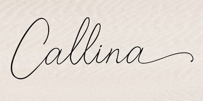 Callina is a new modern & fresh script in handwriting style. This font will make your design look elegant, natural and stylish. Callina handwritten font is perfect for any awesome projects such as photography, watermark, signature, quote design, social media posts, advertisements, logos, branding, invitation, product designs, label, stationery, wedding designs, product packaging, special events or any project that needs a handwriting taste.
 - Primordial by Hanoded,
$15.00 Primordial is a chaotic handmade script font. It is rough around the edges, glyphs are shaky and don’t follow a baseline. Yet, in all this chaos, you will find the budding of a new idea, a glimpse of hope and a glint of something beautiful. Primordial comes in a regular and italic style, plus a back slanted style called Primordial Chaos.
 - Churchward Isabella by BluHead Studio,
$25.00 Churchward Isabella is a five weight typeface family originally designed during the 1980's by the late type designer Joseph Churchward, from New Zealand. A straightforward, geometric sans serif, it is a no-nonsense, highly legible workhorse design, readable on screen as well as in print, for text, headline and display. The family includes Light, Regular, Medium, Bold and Extra Bold.
 - Somersette by The Styled Script,
$21.00 Introducing the elegant new Somersette Monoline Script Font! If you are needing a touch of casual chic calligraphy for your designs, this font was created for you! Somersette was built with OpenType features and includes beginning and ending swashes, alternate characters for both lowercase and uppercase letters, loads of different swash alternates for lowercase letters, numbers, punctuation, alternates, and ligatures. Over 500 glyphs!
 - Cosmic Miles by Four Lines Std,
$15.00 Introducing Cosmic Miles: A Captivating Handwritten Font for Inspiring Quotes. Elevate your designs to new celestial heights with Cosmic Miles, a stunning handwritten font designed specifically to breathe life into your favorite quotes. With its unique blend of thick and rounded strokes, this font encapsulates a sense of warmth and charm, adding a touch of cosmic magic to any project.
 - Raeling by Volcano Type,
$19.00Raeling is a display font inspired by a visit to Luxembourg, capturing shadows falling intricately from park railings appearing as broken-script lettering. A mixture of manmade / natural, traditional / new, ugly / beautiful reflecting the paradox and contradictions of the city. A single curve and stroke developed into a grid block from which characters emerged and broke free of their barriers and conformity. - Waddem Choo NF by Nick's Fonts,
$10.00This font clearly illustrates Jan Tschichold’s dictum that the New Typography would employ “the simplest form” and “the minimum means.” Based on his typeface Transito, the letterforms are as fresh and vibrant today as they were when introduced in 1931. All versions of this font include the Unicode 1250 Central European character set in addition to the standard Unicode 1252 Latin set. - Churchward Maori by BluHead Studio,
$25.00Churchward Maori is the second of a series of eight Maori style typefaces designed by New Zealand type designer Joseph Churchward, and released by BluHead Studio, LLC. Churchward Maori infuses standard Latin glyph forms with traditional Maori decorative elements to create a wildly organic design. BluHead Studio expanded the character set to support standard Latin character sets. BluHead previously released Churchward Ta Tiki. - Telecom by Jan Estrada-Osmycki,
$30.00 Telecom is a new, experimental typeface designed by Jan Estrada-Osmycki. Inspired by space-age, science-fiction and the work of Wim Crouwel. It's design combines mechanical, modular approach to type and elegance of letterforms. It's super-high contrast, thin hairlines and close attention to detail makes it a font to be set in greater sizes. Comes in four weights.
 - Creaty by Dilbadil,
$14.00 Hi, introduce my new font Creaty. This is a simple and sweet script font. Suitable for various designs such as t-shirt designs, quotes, weddings, business cards and more. This font supports multiple languages and also alternates. For alternates y, g, j, z you can use them easily, by typing: y2, g2, j2, z2 Hope you enjoy it Thank you
 - One Feather by Supfonts,
$15.00 Hello dears! My new font with unpredictable stroke width looks very fresh and interesting. Have fun :) Feather will look beautiful on holiday invitations, wedding invites and stationery, logos, and more. Test it out below to see how it could look for your next project! Includes: Uppercase and lowercase Numbers and punctuation Foreign language support Check out my blog: https://www.instagram.com/zloillev pinterest.com/dmitriychirkov7
 - Maas by Mike Zuidgeest,
$15.00 Introducing Maas, a new font collection designed by the passionate designer Mike Zuidgeest in Rotterdam. Each letter of the font was created in Illustrator and handcrafted to perfection. The font is named after the river de Maas, and it's perfect for advertising and branding. As the designer, I'm thrilled with the result and can't wait for you to try it out!
 - Anchor by Etewut,
$20.00 I glad to introduce to you my new display font Anchor. I was inspired by Russian fairy tales with cyrillic lettering. So I hope you'll keep a bit of fairy in you upcoming products using my font. Please, mind a spirit! It perfectly fits to making design from corporative identity to Xmas cards. And it has extra symbols for european languages.
 - Charme Script by Supfonts,
$15.00 My new font is beautiful and smooth modern calligraphy with a floating baseline. Charme Script will look beautiful on Christmas and holiday invitations, wedding invites and stationery, logos, and more. I love using it for emphasis words and pairing it with serifs Includes: Charme OTF & TTF Uppercase and lowercase Numbers and punctuation Foreign language support Check out my blog: www.instagram.com/dmitriychirkov pinterest.com/dmitriychirkov7
 - Frames And Borders by Outside the Line,
$19.0032 borders and frames, round ones, square ones, rectangles and an oval. Curly Qs, vines, flowers, dots and swirls in outline and reverse. Plz note that this is not a dingbat font and needs to be used in large sizes of 72 point or more. Don't miss Rae's other frame fonts. Frames & Borders Too and the new Frames and Banners. - Picto Handwriting by SoftMaker,
$15.99 Digitized handwriting fonts are a perfect way to give documents the “very special touch”. Invitations look simply better when handwritten than when printed in bland Arial or Times New Roman. Short handwritten notes look authentic and appealing. There are numerous occasions where handwritten text makes a better impression. “Picto Handwriting” comes with beautiful handwritten pictograms that let you quickly spruce up your designs.
 - M Curvy PRC by Monotype HK,
$523.99 M Curvy’s design breaks the mould of traditional Chinese characters to construct a brand new style. Referencing a traditional Chinese calligraphic style that is written with the brush suspended in mid-air, the flow between strokes within each character is free and smooth in this typeface. With an even stroke density. M Curvy is legible, gentle, yet stable, combining tradition and innovation.
 - ITC Esprit by ITC,
$29.99ITC Esprit is the work of designer Jovica Veljović and blends the classic proportions of a serif typeface with the grace and charm of calligraphy. Highly legible even in small point sizes, the font can also be used as an impressive display face for use with sans serif text. In 2010 Veljovic revised this family and released this as ITC New Esprit. - Signature One by Attractype,
$15.00 Signature One is new modern script font with a handwritten monoline style make this font looks elegant, natural, stylish and perfect for any awesome projects that need handwriting taste. Signature One would perfect for photography, watermark, social media posts, advertisements, logos & branding, invitation, product designs, label, stationery, visiting card, wedding designs, product packaging, special events or anything that need handwriting taste.
 - Ambrosia Demo - Personal use only

- Neue Haas Grotesk Display by Linotype,
$33.99 The first weights of Neue Haas Grotesk were designed in 1957-1958 by Max Miedinger for the Haas’sche Schriftgiesserei in Switzerland, with art direction by the company’s principal, Eduard Hoffmann. Neue Haas Grotesk was to be the answer to the British and German grotesques that had become hugely popular thanks to the success of functionalist Swiss typography. The typeface was soon revised and released as Helvetica by Linotype AG. As Neue Haas Grotesk had to be adapted to work on Linotype’s hot metal linecasters, Linotype Helvetica was in some ways a radically transformed version of the original. For instance, the matrices for Regular and Bold had to be of equal widths, and therefore the Bold was redrawn at a considerably narrower proportion. During the transition from metal to phototypesetting, Helvetica underwent additional modifications. In the 1980s Neue Helvetica was produced as a rationalized, standardized version. For Christian Schwartz, the assignment to design a digital revival of Neue Haas Grotesk was an occasion to set history straight. “Much of the warm personality of Miedinger’s shapes was lost along the way. So rather than trying to rethink Helvetica or improve on current digital versions, this was more of a restoration project: bringing Miedinger’s original Neue Haas Grotesk back to life with as much fidelity to his original shapes and spacing as possible (albeit with the addition of kerning, an expensive luxury in handset type).” Schwartz’s revival was originally commissioned in 2004 by Mark Porter for the redesign of The Guardian, but not used. Schwartz completed the family in 2010 for Richard Turley at Bloomberg Businessweek. Its thinnest weight was designed by Berton Hasebe.
 - Posterama by Monotype,
$40.99 The Posterama™ typeface family contains 63 fonts and is a true journey through space and time. Designed by Jim Ford, each Posterama family contains 7 weights from Thin to Ultra Black, in 9 distinct families. What makes Posterama so unique and versatile are the eight alternative display families. By making use of a collection of alternative glyphs, Posterama sets an evocative flavor to visualize an entire century of futuristic reference points from art, architecture, poster design and science fiction into one family. Posterama Text is the base family. It has the most robust character set including upper and lowercase glyphs and pan-European language support (including Greek and Cyrillic). Note: all the other Posterama variants described below do not have lowercase letters or Greek and Cyrillic support. Posterama 1901 recalls the decoratively geometric style of Art Nouveau from the turn of the 20th century. Letterforms such as the slender, snaking ‘S’, the high-waisted ‘E’ and the underlined ‘O’ revive the spirit of Charles Rennie Mackintosh and the designers of the Viennese Secession. Posterama 1913 pays homage to the Armory Show, or 1913 Exhibition of Modern Art, which brought the revolutionary work of European artists such as Picasso, Duchamp and Kandinsky to the US for the first time to the shock and astonishment of press and public. Near-abstract, angular characters such as the ‘A’, ‘E’ and ‘N’ hint at cubism’s jagged and clashing planes. Posterama 1919 uses a small, but important, variation to set a tone when the Bauhaus was founded, and the surge in radical European typography that followed. The straight-sided, roundheaded ‘A’ adds a flavor of 1919 – this style of ‘A’ can still be seen in the Braun logo, designed in 1934. Posterama 1927 captures the year of Metropolis, The Jazz Singer and Paul Renner’s pioneering, geometric Futura typeface from 1927, which had a profound influence on design in the US and Europe. Posterama 1933 – With its low-waisted, sinuous designs, the Posterama 1933 typeface family echoes lettering of the Art Deco period, which in turn had its roots in Art Nouveau, the key influence on Posterama 1901. The two fonts make a great team and can be used interchangeably. Posterama 1945 features a few Cyrillic characters to conjure up an era when Russian art and political posters made their mark in cold war propaganda, espionage and also giant aliens and monsters. Posterama 1984 takes its typographic influences from George Orwell’s classic novel, publicity for the dystopian action and sci-fi movies (Blade Runner, Videodrome and Terminator) and games like Space Invaders and Pac-Man that made an impact at that time. Posterama 2001 was inspired by Stanley Kubrick’s science fiction masterpiece, which made extensive use of the Futura typeface. Posterama 2001 finds its cosmic orbit with its nosecone-style ‘A’ from NASA’s much-missed ‘worm’ logotype. There’s an echo, too, in Bauhaus designs from as early as 1920, whose minimalist, geometric lettering also featured a crossbar-less ‘A’.
 - Street - Unknown license

- Cardinal by Sylvestre Studios,
$20.00 A crisp and elegant Neo-Humanistic font.
 - Arbeit by Studio Few,
$12.00 Arbeit is a functional Neo-Grotesque typeface.
 - Isento by DSType,
$40.00 We always wanted to design a gothic typeface. Our most similar typefaces are Rude and Firme, but Rude has some very delicate curves especially visible in the vertical strokes and Firme introduces a type family with reasonably big ascenders and descenders. On the other hand, Isento has a much more straightforward approach to the particular genre. Loosely inspired by Times Gothic, introduced in the American Type Founders Specimen Book and Catalogue from 1923, soon followed its very own path. Is our first typeface that clearly shows a distinct weight difference between the uppercase and the lowercase and the spacing is very open to provide a much more mechanical feeling. Isento and Isento Slab ranges from Thin to ExtraBold with perfectly matching italics. Immediately seemed very clear that a slab serif companion would follow the sans, therefore Isento Slab is the perfect companion to Isento, with very strong rectangular serifs, ideal to set short passages of text or to become the key actor in a big headline.
 - Celestina by Piñata,
$- Celestina is the lively spirit, just like drops of ink on a piece of paper or clouds in the sky. The same spirit is maintained by the rounded letters of the script and by the characters' small whorls. Celestina has come to life as a result of a peculiar game in which I tried to bring together the letters with different tempers with help of calligraphic instruments. I wanted to create a very light and playful font which would look like a quick inscription on a piece of paper, but would also be easy to read in a text array. As I was working on the font, my cat Celestina has been very interested in the brush painting process, and I had no other option but to name the font after her! Celestina works perfect for both Moomins stories and personal blogs, as well as for the design of hand-made things, and even just then when you want to put yourself into a good mood!
 - Seizieme by URW Type Foundry,
$49.99 In 1905 the Parisian typefounders Peignot & Cie. issued their Série 16. This clear roman with a large x-height and an italics soon enjoyed a great popularity. Coen Hofmann’s drawings made for the Seizième follow the original Peignot Série 16 as close as possible. The regular font has the original small caps, while all members of the family are enhanced, next to the ranging ones, with old style figures. Also superior and inferior figures are available. The original series did not have a bold version. This was, however, carefully drawn for this digital rendition. The Série 16 and its versions for the composing machines were much used for the type setting of scientific publications. That is why a comprehensive set of mathematical and sundry characters are added to the Seizième fonts. Next to the accented characters for the several West and East European languages the Seizième was also enhanced with a Cyrillic, also available in regular, italic and bold versions.
 - Isento Slab by DSType,
$40.00 We always wanted to design a gothic typeface. Our most similar typefaces are Rude and Firme, but Rude has some very delicate curves especially visible in the vertical strokes and Firme introduces a type family with reasonably big ascenders and descenders. On the other hand, Isento has a much more straightforward approach to the particular genre. Loosely inspired by Times Gothic, introduced in the American Type Founders Specimen Book and Catalogue from 1923, soon followed its very own path. Is our first typeface that clearly shows a distinct weight difference between the uppercase and the lowercase and the spacing is very open to provide a much more mechanical feeling. Isento and Isento Slab ranges from Thin to ExtraBold with perfectly matching italics. Immediately seemed very clear that a slab serif companion would follow the sans, therefore Isento Slab is the perfect companion to Isento, with very strong rectangular serifs, ideal to set short passages of text or to become the key actor in a big headline.
 - Debug by Mussett,
$11.00As as a computer programmer, it is my job to stare at screens of text all day. As soon as I learned the mechanics of font design, I boldly set out to design a typeface from my own handwriting that I could use to make my life easier. First, it had to have very distinctive numerals (trust me, it can be easy to mistake an 8 for a 3 in code), it had to have huge punctuation characters (even Perl code like '[lN*1lK[d2%Sa2/d0' looks good in Debug), and it had to be a bit friendlier than Courier (so that I don't give up hope when my code won't compile). I had so much fun designing it that I decided to give it strange lower-case 'i's and 'm's as a bonus. I also spent far too much time hinting it so that it would look as nice as possible at low resolutions. - Milescut by Tipos Pereira,
$14.00 Milescut is a display typeface inspired by some seminal covers the graphic designer and photographer Reid Miles created for the Blue Note Records between the 1950s and 1960s. Miles made almost 500 covers for Blue Note in this period, including some using the hand-cut technique that consists basically in doing vertical cuts in capital letters and numerals to create a unique style within the universe he created for Blue Note. Milescut is a tribute to this small “cut” 😬 in his trajectory within the greatest record label of all time. This idea came about while I was working on what will become soon a revival of a wood type that I fell in love with when flipping through a Specimen of the MACHINE CUT WOOD TYPE manufactured by The WM. H. Page Wood Type Co. Milescut has two extra sets of alternates that work cyclically when activated in your OpenType menu and lots of ligatures, pretty cool :)
 - Reika by Andrey Sharonov,
$20.00 Reika is a super soft and positive script inspired by the summer funny mood, simple street food and fresh drinks. It’s all about smiles, delicious, not too serious time spending with family or friends. Reika looking smooth thanks to 95 ligatures like an ak ch ck th in im ax ux and many others. Script includes Stylistic Alternates of some Uppercase and Lowercase and 12 lengths of End-Swashes (tales). You can use this font for example in logo and package design, in food business, kids and confectionery products. Reika support Western European characters and works with following languages: English, Danish, Dutch, Estonian, Faroese, Filipino, Finnish, French, German, Hungarian, Icelandic, Irish, Italian, Norwegian, Polish, Portuguese, Spanish, Swedish, Turkish. Quick combinations for Opentype features: Alternates - just add «2» End-letter - just add «underscore» End-swashes (tails) - just add -1, -2, -3…up to -12, where number is length of tail. This combinations works only with activated Standard Ligatures option in Opentype panel (Adobe Illustrator / Photoshop).
 - Royal Bavarian by Wiescher Design,
$39.50 RoyalBavarian was comissioned by King Ludwig the First of Bavaria about 1834. He was probably the greatest king Bavaria ever had, but he fell in disgrace for a short affair with the infamous Lola Montez and subsequently had to resign. He died in 1868, peaceful and happy in Nice on the French Riviera. I happened on an original etching of his type-guidelines for official writers of those days about 20 years ago. I always thought it was a very nice Fraktur (Blackletter), not a sturdy militaristic one as most of them are. Being me, I started with first tests immediately and then just forgot the font on my computer. When I was sorting out old stuff a couple of months ago I happened on the etchings once again and kept on working intermittently on the letters. The Plain cut is pretty much like the king wanted it. The Fancy cut is more to my liking and very decorative. Yours in a royal mood, Gert Wiescher.

