10,000 search results
(0.031 seconds)
- Votrag Texture by Putracetol,
$20.00 Introducing Votrag - 10 Modern Font Collection, a versatile typeface set that encompasses a spectrum of design possibilities. With five distinct weights - thin, light, regular, semibold, and bold - each accompanied by both clean and textured versions, Votrag offers a total of ten unique fonts.
 - PictiFont Symbols - On The Beach by PictiFont,
$12.00 PictiFont’s newest symbol set, intended to be used within any of the PictiFont™ typefaces, features a sampling of the seashore. From seashells to sailboats, surfboards to sunshine, here are the symbols you need to make all things summer a breeze! Sunscreen anyone?
 - Moonface Script by TypeFaith Fonts,
$6.00 Moonface Script is a flowing script with lovely swashes. It is based on the 20th Century Packaging typography. Moonface Script is a characteristic font with a retro feel. It contains a full set of ligatures, alternatives, swashes and special characters to end.
 - Heart & Salsa by Fikryal,
$15.00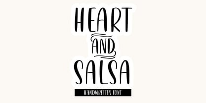 Heart & Salsa is a fancy font perfect for crafting, branding, invitation, stationery, wedding designs, social media posts, advertisements, product packaging, product designs, label, photography, watermark, special events, or anything. Heart & Salsa with a full set of uppercase letters, multilingual symbols, numerals, and punctuation.
 - Timenhor by Evertype,
$25.00Timenhor is a Latin-script font whose glyphs are based on the uncial letterforms of Coptic manuscripts. Timenhor is compliant with Unicode encoding and has an extended character set, supporting Celtic and Eastern European languages. It has both regular and italic styles. - M HG Reithic T HK by Monotype HK,
$523.99HK series fonts are in Unicode encoding and consists of BIG 5 character set and HKSCS characters. The character glyphs are based on the regular Traditional Chinese writing form and style. It is generally used in Taiwan ROC, Hong Kong and Macau. - One Good Urn NF by Nick's Fonts,
$10.00J. M. Bergling, in his 1914 masterwork Art Alphabets and Lettering, offered this face as suitable for all occasions Greek, and we couldn't agree more. Both versions of this font include the complete Unicode 1252 Latin and Unicode 1250 Central European character sets. - Levnam by ParaType,
$30.00 Levnam is a sans-serif family with quite wide proportions, slightly thickened terminals and wide sidebearings. The font is well suitable for setting text in small point sizes, similar to Bell Centennial or Verdana. Designed by Manvel Shmavonyan. Released by ParaType in 2015.
 - Olympik by The Northern Block,
$16.70 A multi-lined typeface digitally remastered from the 1970s Letraset font Optex. The font has gone through an exacting design program with over 100 hours in the production. Details include: three unique styles, a full character set, manually edited kerning and Euro symbol.
 - Rosart by ARTypes,
$35.00Rosart is a digital version of the 2-line great primer letters cut by J. F. Rosart for Izaak & Johannes Enschedé in 1759 (Enschedé no. 811). When the AR type is set at 50 pt it will match the size of the original. - Lino Cut by ITC,
$29.99Lino Cut is the work of British designer Bob Anderton, who was inspired by the strong effect of linocut images. Capitals and lowercase letters should be set closely. Lino Cut can bring its unique, eye-catching style to a variety of display applications. - Krom Mono by ATK Studio,
$15.00 Krom Mono is a modular monospaced font built with pixel shapes. Designed for headlines, posters, and small size body text. This family consist of 9 weights from thin to black plus variable font with a character set that covers over 90 languages.
 - Brandegoris by Scriptorium,
$12.00Brandegoris is a set of traditional split-pen capitals with two forms for most of the letters. It is excellent for headers and titles, especially on web pages and also works well as initial characters in combination with a serif text face. - Morpeth by G-Type,
$60.00 Hardworking and versatile condensed sans family originally designed for Morpeth Borough's wayfinding system and thus eminently usable for signage purposes. The 6 weight OpenType family includes discretionary ligatures, small caps, 5 sets of numerals plus coverage for Central European, Baltic and Turkish languages.
 - Explora by TypeSETit,
$24.95 This formal calligraphic face is light, and delicate with beautiful lines and curves. The Pro version adds extra elegance with alternate caps and beginning and ending swashes. Explora has over 600 glyphs and features international languages including the entire Cherokee Nation character set.
 - Bubbly Kids by Create Big Supply,
$15.00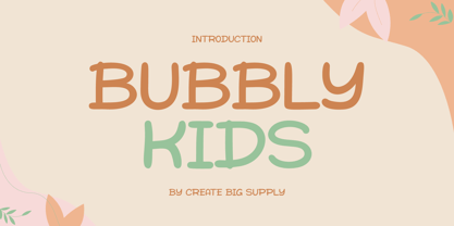 Bubbly Kids Font is a cute and fun display font. This will add a cheerful, happy touch to your design. Features: Uppercase & lowercase Numbers and punctuation Multilingual PUA Encoding Full Character Set !"#$%&()*+,-./0123456789:;?@ABCDEFGHIJKLMNOPQRSTUVWXYZ[\]^_abcdefghijklmnopqrstuvwxyz{|}~ ¡¢£¤¥§©ª«®°±²³¹º»¿ÀÂÃÄÅÆÇÈÉÊËÌÍÎÏÑÒÓÔÕÖ×ØÙÛÜÝÞßàáâãäåæçèéêëìíîïñòóôõö÷øùúûüýþÿıŒœŠšŸž–—‘’“”†‹›€−…·•/‚„
 - Astrospy JNL by Jeff Levine,
$29.00Astrospy JNL is a square-shaped, futuristic techno-style font from Jeff Levine. It is very well suited for short phrases, but caution should be used in setting too many words with it because of legibility issues. Best used in larger point sizes. - Big Tent Players NF by Nick's Fonts,
$10.00A WPA poster announcing the latest production by—guess who?—the Big Tent Players inspired this eye-catching, if somewhat unconventional, typeface. Both versions of the font include the 1252 Latin and 1250 CE character sets (with localization for Romanian and Moldovan). - Farmer by SparkyType,
$19.00The OpenType version of Farmer contains two sets of slightly different upper-case letters. The alternate version is accessible as Titling Caps in OpenType feature enabled software. Mixed and matched they create a strong and persuasive headline, logo or For Sale notice. - Beringin by Arendxstudio,
$16.00 Beringin is a signature font that is unique and elegant. It is designed with an original hand stroke so it will be very suitable for your design projects. Features : • Character Set A-Z • Numerals & Punctuations (OpenType Standard) • Accents (Multilingual characters) • Ligature • Swash
 - Foppish Birdie by Natalie Thomson,
$15.00 Foppish Birdie is a font family with character of birds that was inspired by the font Guakala by RodrigoTypo. Foppish Birdie - dynamic, cheerful, a special typeface for children's short titles and brands, containing the Cyrillic set. Take each letter and make game!
 - Woodhaven Initials JNL by Jeff Levine,
$29.00 Woodhaven Initials JNL were designed using an outline cast shadow wood type set against a rectangle with horizontal "engraving" lines to add background texture to the initials. An ampersand is on the corresponding keystroke, and a blank rectangle is on the period key.
 - Coldsmith by Aerotype,
$49.00 Coldsmith uses the OpenType ligature feature to substitute a unique pair of distressed characters when any upper or lower case letter is keyed twice in a row. Coldsmith Pro extends the character set to support Eastern European Latin, Baltic, Greek and Turkish.
 - Trade Printer JNL by Jeff Levine,
$29.00Trade Printer JNL is another font design inspired by an old rubber stamp sign printing set. In this case, the lettering has a classic "wood type" look, reminiscent of the letterheads, billheads and fliers made by local printers of the 1880s-1920s. - Thunderhouse by Aerotype,
$29.00 A tasty jambalaya of two different weights of wood type, Thunderhouse has alternates for every capital and lowercase letter, consecutive characters are controlled with the OpenType Ligature feature. Thunderhouse Pro extends the character set to support Eastern European Latin, Baltic, Greek and Turkish.
 - Diaper Money by Fonthead Design,
$19.00On October 15, 2006 we became proud parents of three babies. To commemorate (and help pay for diapers) I decided to release this baby-themed dingbat set. All proceeds for the next few years goes to pay for lots and lots of diapers. - Blok by Studio Few,
$10.00 Built on a square grid, Blok's variable axis conforms to your canvas. With pre-defined weights ranging from 2x1, through to 1x16, Blok is as flexible as it is structured. Character Set: A-Z, Period & Exclamation Mark Weights: 6 Normal & 6 Rounded
 - Wavy Rounded BT by Bitstream,
$50.99Wavy Rounded is a stylized sans serif display typeface by Japanese designer Hajime Kawakami. Some of the characters possess quirky features that randomly create fun visual “waves”. There is a handful of alternate characters including an old style figure set. Catch the Wave. - Brooklyn Samuels by Samuelstype,
$30.00 Brooklyn Samuels is a sans-serif family of fonts designed by Hans Samuelson. Based on geometrical shapes it is primarily intended for headline use but also offers excellent legibility in small sizes. Stylistic sets offer a more text-friendly alternative for some letters.
 - Fokers by Letterhend,
$14.00 Fokers, a new display typeface with classy and luxury look! Fokers' different styles works perfectly for headline, logotype, apparel, invitation, branding, packaging, advertising, and more. Fokers comes in uppercase, lowercase, with punctuation, symbols, numerals, stylistic set alternate, ligatures and also multi-lingual support.
 - LHF Spencer by Letterhead Fonts,
$42.00 LHF Spencer exemplifies the quirkiness of late 1800's lettering. Uppercase is set below the baseline, adding a hand drawn look. Curved swashes juxtaposed with traditional thick and thin strokes make Spencer's letters stand out in a design. Includes 29 OpenType alternates.
 - ANWUTOK by Twinletter,
$17.00 Say hello to summer freshness with the Anwutok font! With a cheerful Display theme, this font is the perfect solution for creating projects with a relaxed and bright feel. Anwutok comes with impressive features. With ligatures and alternates, you can easily combine interesting characters and create unique and creative typography designs. Apart from that, Anwutok also supports multilingualism, allowing you to adapt this font to different languages. This gives you flexibility and extends the reach of your project to a wider market. With a fresh and playful style, Anwutok brings a fun and uplifting touch to your designs. Each letter is designed with care to convey evocative beauty. Choose Anwutok as your constant companion in creating enthralling and relaxing projects. Get this font now and let summer inspiration decorate your creations. What’s Included : File font All glyphs Iso Latin 1 Alternate, Ligature Simple installations We highly recommend using a program that supports OpenType features and Glyphs panels like many Adobe apps and Corel Draw so that you can see and access all Glyph variations. PUA Encoded Characters – Fully accessible without additional design software. Fonts include Multilingual support
 - Daily Sans by Up Up Creative,
$15.00 Introducing Daily Sans, a complete sans serif font family with 10-weights, plus italics (20-fonts total). Daily Sans was designed to be an everyday-use geometric typeface with excellent legibility and a neutral tone. It's a perfect go-to for branding, web, and print design projects and can stand out on its own or play a supporting role in font pairings. It’s great for body/paragraph type as well as for larger display type. Because the goal was to create a font you can truly use for any project, purpose, or occasion, Daily Sans includes a wide range of weights starting from the very thin Hairline all the way through to the very bold Heavy. This means that you’re always able to find just the right weight for your needs, and it makes creating type hierarchies a breeze. Daily Sans comprises 20 fonts, each with approximately 450 glyphs - including 16 standard and discretionary ligatures, three ampersand variants, a full set of arrows, and more - and supports over 200 languages. The OpenType features can be very easily accessed by using OpenType-savvy programs such as Adobe Illustrator and Adobe InDesign. (To access these awesome features in Microsoft Word, you'll need to get comfortable with the advanced tab of Word's font menu.) PLEASE ENJOY! I can't wait to see what you make with Daily Sans. Feel free to use the #upupcreative and #dailysansfont tags to show me what you've been up to.
 - Mareline Script by Mega Type,
$10.00 Introducing Mareline Script Font Duo, a sweet handlettered font, casual and dynamic with a bold and irregular baseline. Contains a complete set of lowercase, uppercase, alternates, ligatures, punctuation, numbers, and multilingual support. And additional Mareline Sans, working in harmony with Mareline script to create awesome typographic creations. Get some inspiration from the preview above. This font ideal for use in watercolor design or bold hand lettering style, such as posters, wedding elements, t-shirt, apparel, cover books, business cards, greeting cards, branding, merchandise, invitations and handmade quotes and more. Mareline Script Font Duo features OpenType stylistic alternates, ligatures and International support for most Western Languages. To enable the OpenType Stylistic alternates, you need a program that supports OpenType features such as Adobe Illustrator CS, Adobe Indesign & CorelDraw X6-X7, Microsoft Word 2010 or later versions. How to access all alternative characters using Adobe Illustrator: https://www.youtube.com/watch?v=XzwjMkbB-wQ Mareline Script Font Duo is coded with PUA Unicode, which allows full access to all the extra characters without having special designing software. Mac users can use Font Book , and Windows users can use Character Map to view and copy any of the extra characters to paste into your favorite text editor/app. How to access all alternative characters, using Windows Character Map with Photoshop: https://www.youtube.com/watch?v=Go9vacoYmBw If you need help or have any questions, please let me know. I'm happy to help. Thanks & Happy Designing!
 - Shameless by Positype,
$79.00 I will spare you the long-winded description this time and all of the motivations and witty innuendoes. Quite frankly, I forgot about creating this typeface and it sat on my hard drive for almost a year. Luckily, my daughter Isobel saw the initial drawings one day and ask me about those pretty letters and I remembered… yep, that happened. That said, time made this a better typeface… with fresh eyes and time, much was redrawn, retooled and expanded to something I truly enjoy playing with. Shameless makes extensive use of Contextual alternates to create a proper ebb and flow from letter to letter. Interestingly, there are only a handful of ligatures… instead many special combinations are accounted for solely by relying on Contextual Alts. Mix in Stylistic Alts, Swashes, responsive Titling Alts, numerous Style Sets, etc and you can have a lot of fun. I created 2 versions. A ‘Standard’ version that has 2200+ characters and a ‘Deluxe’ version that has 2400+ characters and an interesting caveat… I plan on expanding the Deluxe version any time I have an idea to add to the typeface… and as such, buyers will receive all of those updates at no charge (with updates going directly to the distributors). You get what you pay for… no insane discounts. Oh, and if you are wondering… Shameless is based on my handwriting using Kuretake Zig CocoIro pens. I love these pens.
 - Mitigate by Typodermic,
$11.95 In the fast-paced world of journalism, time is always of the essence. That’s why we need tools that work as quickly as we do. And in the world of typography, Mitigate is the answer. Mitigate is the condensed slab-serif typeface that every designer needs in their arsenal. You see, in a world of broad and regular typewriter fonts, Mitigate stands out with its compact design that makes it perfect for fitting in more text in less space. But that’s not all. Mitigate also features two distressed styles, giving your text that authentic typewriter effect that readers love. And if you’re using OpenType-aware apps, you’ll appreciate the custom ligature combinations that make your text even more unique. So, don’t let your message get lost in a sea of words. Choose Mitigate and make your words stand out. Most Latin-based European writing systems are supported, including the following languages. Afaan Oromo, Afar, Afrikaans, Albanian, Alsatian, Aromanian, Aymara, Bashkir (Latin), Basque, Belarusian (Latin), Bemba, Bikol, Bosnian, Breton, Cape Verdean, Creole, Catalan, Cebuano, Chamorro, Chavacano, Chichewa, Crimean Tatar (Latin), Croatian, Czech, Danish, Dawan, Dholuo, Dutch, English, Estonian, Faroese, Fijian, Filipino, Finnish, French, Frisian, Friulian, Gagauz (Latin), Galician, Ganda, Genoese, German, Greenlandic, Guadeloupean Creole, Haitian Creole, Hawaiian, Hiligaynon, Hungarian, Icelandic, Ilocano, Indonesian, Irish, Italian, Jamaican, Kaqchikel, Karakalpak (Latin), Kashubian, Kikongo, Kinyarwanda, Kirundi, Kurdish (Latin), Latvian, Lithuanian, Lombard, Low Saxon, Luxembourgish, Maasai, Makhuwa, Malay, Maltese, Māori, Moldovan, Montenegrin, Ndebele, Neapolitan, Norwegian, Novial, Occitan, Ossetian (Latin), Papiamento, Piedmontese, Polish, Portuguese, Quechua, Rarotongan, Romanian, Romansh, Sami, Sango, Saramaccan, Sardinian, Scottish Gaelic, Serbian (Latin), Shona, Sicilian, Silesian, Slovak, Slovenian, Somali, Sorbian, Sotho, Spanish, Swahili, Swazi, Swedish, Tagalog, Tahitian, Tetum, Tongan, Tshiluba, Tsonga, Tswana, Tumbuka, Turkish, Turkmen (Latin), Tuvaluan, Uzbek (Latin), Venetian, Vepsian, Võro, Walloon, Waray-Waray, Wayuu, Welsh, Wolof, Xhosa, Yapese, Zapotec Zulu and Zuni.
 - SCR-N by URW Type Foundry,
$39.99 SCR fonts are screen optimized (also called 'pixel fonts'). Unlike standard fonts (and like the few well-hinted fonts like Verdana or Arial), they give a crisp look on screen at very small sizes, thus increasing legibility. The perfect applications for those fonts are web pages and software user interfaces (computer, cellular phones, console games and any other system that uses a screen interface). Unlike most pixel fonts, SCR fonts contain kerning information. Kerning is the adjustment of space between certain pairs of characters (like 'AV') to make text look more fluid, thus increasing legibility and appeal. To benefit from this feature, auto-kerning must be activated in the application. In Photoshop, kerning must be set to 'Metrics'. Although SCR fonts are optimized for screen, they can be used for print (in Illustrator or Indesign for example) for a decorative 'computer text' effect. In this case, there is no constraint: they can be used as any other font. For screen use (in Photoshop, Fireworks, Flash... ), they have to keep aligned with the screen pixel grid not to look blurred or distorted. To achieve this, here are the guidelines to follow: RESOLUTION If the application permits it (Photoshop, Fireworks), document resolution must be set to 72 pixels per inch. SIZE The font size must be set to 10 (or multiples of 10) points. POSITIONING & ALIGNMENT The reference points of text fields and text blocks (upper left corner for left aligned text, upper right for right aligned text) must be positioned at integer values of pixels. In Photoshop, text can be precisely moved with [Edit Free Transform]. In Flash, movie clips containing text fields must also be positioned at integer values on the stage. Text must be aligned to the left or right only. Center alignment can be simulated with left alignment by adding spaces at the begin of each line. To dispense with the positioning and alignment constraints, text anti-aliasing can be turned off if the application permits it (Photoshop, Flash MX 2004). OTHER SETTINGS Leading (line spacing), tracking (letter spacing), manual kerning and baseline shift must be set either to integer values of points or to multiples of 100 units (depending on the application). Vertical and horizontal scaling must be set to 100%. Faux bold or Faux italic must not be used. The document must neither be resized on export, nor allow resizing (Flash Movies).
 - SCR-I by URW Type Foundry,
$39.99 SCR fonts are screen optimized (also called 'pixel fonts'). Unlike standard fonts (and like the few well-hinted fonts like Verdana or Arial), they give a crisp look on screen at very small sizes, thus increasing legibility. The perfect applications for those fonts are web pages and software user interfaces (computer, cellular phones, console games and any other system that uses a screen interface). Unlike most pixel fonts, SCR fonts contain kerning information. Kerning is the adjustment of space between certain pairs of characters (like 'AV') to make text look more fluid, thus increasing legibility and appeal. To benefit from this feature, auto-kerning must be activated in the application. In Photoshop, kerning must be set to 'Metrics'. Although SCR fonts are optimized for screen, they can be used for print (in Illustrator or Indesign for example) for a decorative 'computer text' effect. In this case, there is no constraint: they can be used as any other font. For screen use (in Photoshop, Fireworks, Flash... ), they have to keep aligned with the screen pixel grid not to look blurred or distorted. To achieve this, here are the guidelines to follow: RESOLUTION If the application permits it (Photoshop, Fireworks), document resolution must be set to 72 pixels per inch. SIZE The font size must be set to 10 (or multiples of 10) points. POSITIONING & ALIGNMENT The reference points of text fields and text blocks (upper left corner for left aligned text, upper right for right aligned text) must be positioned at integer values of pixels. In Photoshop, text can be precisely moved with [Edit Free Transform]. In Flash, movie clips containing text fields must also be positioned at integer values on the stage. Text must be aligned to the left or right only. Center alignment can be simulated with left alignment by adding spaces at the begin of each line. To dispense with the positioning and alignment constraints, text anti-aliasing can be turned off if the application permits it (Photoshop, Flash MX 2004). OTHER SETTINGS Leading (line spacing), tracking (letter spacing), manual kerning and baseline shift must be set either to integer values of points or to multiples of 100 units (depending on the application). Vertical and horizontal scaling must be set to 100%. Faux bold or Faux italic must not be used. The document must neither be resized on export, nor allow resizing (Flash Movies).
 - Katarine by Suitcase Type Foundry,
$75.00From today's point of view Katarine has a rather unusual origin. Initially an all-caps display face, what was to become the Medium weight of the family was augmented with a lower case, then the character set was completed by adding all the missing glyphs. The next step was the creation of the Light and the Bold weights with matching Italics. This working method compromised the relationships between the characters across the different weights After some consideration the decision was made to start over and draw the complete family from scratch. This time the "conventional" process was followed — first the Light and Bold weights were designed. Those extremes were used to interpolate the Regular, Medium and Semibold weights. When compared to the original, the glyphs of the new fonts are slightly wider. The construction of the letters is sturdy, with an x-height that varies from the heaviest to the lightest weights. The relationship of the stem weight between the horizontal and vertical strokes is carefully balanced. Characters are open and firm; the italics have room to breathe. The original fonts included two sets of small caps — Small Caps and Petite Caps. However neither set were suited for emphasis, with the Small Caps being too tall and the Petite Caps too short. We decided to replace them both with one set of traditional small caps, slightly taller than the x-height, perfectly suited for emphasis in text usage. The original version of Katarine was partly incorporated into the new OpenType versions. Thus most of the original arrows, frames and boxes can be found in the new Katarine. Each individual weight now contains 830 glyphs, nine sets of numerals, small caps, numerous ligatures and fractions. An additional font named Numbers contains numerals in circles and squares, and is now augmented with accented caps and a number of terminal alternatives, which can easily be accessed through stylistic sets. We also added two extra variants, Experts Regular and Experts Black (in inverted form). Katarine Std preserves the solid construction and excellent legibility of the original family, but has now become a fully featured OpenType typeface. Katarine is suited for a broad range of applications, from simple layouts to intricate corporate systems. It is the typeface of choice where the cold, austere character of modern sans serifs are inappropriate, yet simple shapes and good legibility are required. - Oxford Street by K-Type,
$20.00 Oxford Street is a signage font that began as a redrawing of the capital letters used for street nameplates in the borough of Westminster in Central London. The nameplates were designed in 1967 by the Design Research Unit using custom lettering based on Adrian Frutiger’s Univers typeface, a curious combination of Univers 69 Bold Ultra Condensed, a weight that doesn’t seem to exist but which would flatten the long curves of glyphs such as O, C and D, and Universe 67 Bold Condensed with its more rounded lobes on glyphs like B, P and R. Letters were then remodelled to improve their use on street signs. Thin strokes like the inner diagonals of M and N were thickened to create a more monolinear alphabet; the high interior apexes were lowered and the wide joins thinned. The crossbar of the A was lowered, the K was made double junction, and the tail of the Q was given a baseline curve. K-Type Oxford Street continues the process of impertinent improvement and includes myriad minor adjustments and several more conspicuous amendments. The stroke junctions of M and N are further narrowed and their interior apexes modified. The middle apex of the W is narrowed and the glyph is a little more condensed. The C and S are drawn more open, terminals slightly shortened. The K-Type font adds a new lowercase which is also made more monolinear so better suited to signage, loosely based on Univers but also taking inspiration from the Transport typeface both in a taller x-height and character formation. The lowercase L has a curled foot, the k is double junctioned to match the uppercase, and terminals of a, c, e, g and s are drawn shorter for openness and clarity. A full repertoire of Latin Extended-A characters features low-rise diacritics that keep congestion to a minimum in multiple lines of text. The font tips the hat to signage history by including stylistic alternates for M, W and w that have the pointed middles of the earlier MOT street sign typeface. Incidentally, Alistair Hall (‘London Street Signs’, Batsford, 2020) notes that when the manufacturer of signs was changed in 2007, Helvetica Bold Condensed was substituted in place of the custom design, “an unfortunate case of an off-the-peg suit replacing a tailored one” and a blunder that has happily since been rectified, though offending nameplates can still be spotted by discerning font fans.