10,000 search results
(0.108 seconds)
- Beauty Script by Corradine Fonts,
$19.95 Beauty Script is a modern interpretation of the classic formal script style. You could notice in it a special feeling due its subtle wavy rhythm to mimic the natural movement of handwritten calligraphy. Because its strong contrast and the fluidity of its traces Beauty Script is ideal to be used as headline in any media related to fashion, beauty, nature, food, pleasure, travel, luxury or wherever you required to express formality and elegance.
 - Ramolina Script by Mega Type,
$14.00 Ramolina Script is an elegant calligraphy script font that comes with lovely alternates character. a mixture of from copperplate calligraphy with handlettering style. Designed to convey style elegance. Ramolina is attractive like a smooth, elegant, clean, feminine, sensual, glamorous, simple and highly legible typeface. Its classic style is perfect to be applied in any type of formal pieces such invitations, labels, certificate, menus, Logos, fashion, make up, stationery, letterpress, romantic novels, magazines, books, greeting / wedding cards, packaging, badges etc. Ramolina Script features 400+ glyphs and 200+ alternative characters. including multiple language support. With OpenType features with stylistic alternates, ligatures and swash characters, that allows you to mix and match pairs of letters to fit your design. To enable the OpenType Stylistic alternates, you need a program that supports OpenType features such as Adobe Illustrator CS, Adobe Indesign & CorelDraw X6-X7, Microsoft Word 2010 or later versions. (Windows), Font Book (Mac) or a software program such as PopChar (for Windows and Mac). How to access all alternative characters using Adobe Illustrator: https://www.youtube.com/watch?v=XzwjMkbB-wQ How to use stylistic sets fonts in Microsoft Word 2010 or later versions: https://www.youtube.com/watch?v=NVJlZQ3EZU0 There are additional ways to access alternates / swashes, using the Character Map (Windows), Nexus Font (Windows) Font Book (Mac) or a software program such as PopChar (for Windows and Mac). How to access all the alternative characters, using the Windows Character Map with Photoshop: https://www.youtube.com/watch?v=Go9vacoYmBw If you need help or advice, please contact me by e-mail "megatype04@gmail.com" Thank you for your purchase & Happy Designing!
 - Handmade Roman JNL by Jeff Levine,
$29.00 Handmade Roman JNL is a simple and clean serif design. Perfect for headlines or titles, this condensed serif font gets attention without being overly formal.
 - SF Mettle by Sultan Fonts,
$19.99 Mettle Bilingual Arabic font, Latin-Arabic for print and web. The Mettle font family contains four weights: thin, normal, medium, and broad. This font supports Arabic, Latin, Persian, Urdu, and Kurdish languages. The digital designer can use the variable Mettle font to access wider options in working with the text.
 - Presence by Présence Typo,
$36.00Présence is a modern sans serif with a light stroke contrast. The capitals are a bit narrow for a titling use which makes them space-economical without lack of legibility. The lower cases have a normal width for a fluid reading. Its wide range of weights allows it many uses. - Lieur by inkstypia,
$3.00 Lieur is a minimalist, geometric, sans serif font suitable for logos, label designs, or even just plain body text. It comes with 2 styles, Normal and Italic, and includes Light, Regular, Medium, Bold, and Black weights to give you great possibility to harmonize the look and feel of your text.
 - Power Display by Power Type,
$15.00 Power Display Inspired by Fun cartoon style combined with modern style. This Playful Font Comes In Three Widths; Condensed, Normal, Expanded. This Font Can Be Used For Modern And Vintage Designs, Also Can Be Easily Paired With Some Graphic Elements (Illustration, Photography) This Font Perfect For, Logotype, Branding, Title, And Packaging.
 - Amsi Pro AKS by Stawix,
$79.00 Amsi has been designed to equipped with three different widths; Normal, Narrow and Condensed, addition to expanding weights to support various usabilities ranging from Thin, XLight, Light, Regular, SemiBold, Bold, Black and Heavy. Which makes Amsi along with a numerous features support the creativities of the designer from the Font Menu.
 - Amsi Pro by Stawix,
$40.00 Amsi has been designed to equipped with three different widths; Normal, Narrow and Condensed, addition to expanding weights to support various usabilities ranging from Thin, XLight, Light, Regular, SemiBold, Bold, Black and Heavy. Which makes Amsi along with a numerous features support the creativities of the designer from the Font Menu.
 - Bosque by Latinotype,
$29.00 Bosque is a typeface designed by Paula Nazal and Daniel Hernandez. It belongs to handmade style, it's rough and raw with soft edges. It has 6 variants: Normal, Wood, Shadow, Wood Shadow, Dingbats y Shadow One, this gives great versatility. It possess a wide set of characters, ligatures and some alternates.
 - Circus Stars by Vladislav Ivanov,
$20.00 Circus stars is Vladislav Ivanov font with a retro touch, inspired by the look of old circus and movie posters. It works well with normal size text, but it works even better for large displays, short words, or even just to incorporate a few or single characters in a design.
 - Gendos by Febri Creative,
$14.00 Gendos is a sans serif condensed font family that is designed with a simple but unique shape. This font family has 10 styles consisting of 5 normal shapes and 5 italics. Gendos font can be used for logos, book or magazine cover titles, product brands, or just for writing articles.
 - Blitz Condensed by Wiescher Design,
$20.00 A very glitzy Blitz! Blitz-Condensed is an addition to my normal Blitz family. Both are topheavy fonts and are meant to be used together. The font gets a special shine because of this effect. And it stays readable despite its special design. Your designer of surprising typefaces, Gert Wiescher
 - Bunaero Pro by Buntype,
$33.50 Buntypes Bunaero™ combines classical and contemporary characteristics to a unique and distinctive font family with extravagant but also harmonious appearance. The characters are clear, open and sometimes bellied. Especially the caps have a very high waistline. Based on this, four main states with different moods have been composed: The original Bunaero™, the more conservative “Classic”, the elegant and curvy “Up” and the matching ”Italic”. All states offer weights from a considerably thin „Hair“ to a real fat „Heavy“, so the family consist of 34 Styles, all with rather narrow width and very good legibility. The font was manually hinted and contains extensive handcrafted kerning tables to ensure flawless appearance in all media. It supports at least 99 languages incl. Vietnamese and provides ligatures, alternative glyphs, special localized forms and even more enjoyable OpenType® features. This Pro version of Bunaero also includes a lot of features for sophisticated users: Lining figures for headline setting; Intermediate linings and oldstyle figures for text setting; Tabular versions of all figures; Superiors, inferiors, numerators, denominators and automated fractions; Language specialities like a capital Eszett for the german language and extra characters with a polish kreska instead an acute; And many more. Further information: Bunaero™ Pro Specimen PDF Bunaero™ Pro OpenType® Quickguide Feature Summary*: -4 Moods: Normal, Classic, Up and Italic -9 weights: Hair, Light, Thin, SemiLight, Regular, SemiBold, Bold, ExtraBold and Heavy -Supports at least 99 Languages incl. eastern european and vietnamese languages -Overall width: Narrow or Space-Saving -Advanced f- ligature set including fb -Discretionary s- and c- ligatures -Alternative Characters: a, e, f, g, i, k, l, t, v, w, y, J, K, Q, R, and more -6 sets of figures: -Capital sized figures, oldstyle figures and intermediate figures, each in proportional and carefully adjusted tabular versions -Superiors, inferiors, numerators and denominators -Circled and negative circled figures -Capital German Eszett -Extra characters with Polish Kreska -Catalan Punt Volat -Extra characters with alternate minmalistic Cedille -Arrows -Automated feature for fractions as well as extended fraction character set -More than 1000 characters per font * Some features may only be available in OpenType®-savvy applications
 - Gulim by Microsoft Corporation,
$129.00Gulim™ features plain strokes similar to sans serif designs, and works well for on-screen display such as user interfaces. This Gulim font file is 5.2 MB in size. Gulim is a trademark of Microsoft Corporation. Gulim Character Set: Latin 1, Korean code page 949 - Buffallo by Rockboys Studio,
$23.00 Buffallo is a unique and interesting handwritten font. Incredibly versatile, this font will fit a wide pool of designs. What you get: PUA encoded = Accessible in the Adobe Illustrator, Adobe Photoshop, Adobe InDesign, even work on Microsoft Word. PUA Encoded Characters - Fully accessible without additional design software.
 - Staylist by Jos Gandos,
$15.00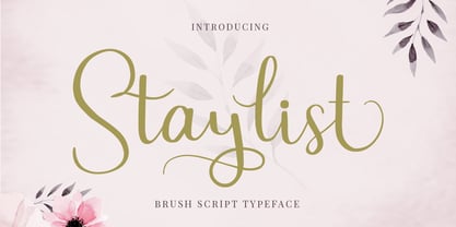 Staylist is a beautiful and cute script for any awesome projects such as wedding cards, watermarks, quotes, social media, posters, invitations, and more. This font is PUA encoded so it will be accessible in the Adobe Illustrator, Adobe Photoshop, Adobe InDesign, even work on Microsoft Word.
 - Bergsland Fashion by Hackberry Font Foundry,
$24.95 This is a stylized sans serif font family that is very high-waisted and sleek. The stroke is only slightly modulated. The letterforms are higher, with a more open aperture, and sprinkled with breaks to add light and sparkle. This an attempt at a readable sans serif for text. It has many OpenType features and 465 characters per font: Caps, lower case, small caps, old style figures, numerators, denominators, accents characters and so on.
 - Generis Slab by Linotype,
$29.00The idea for the Generis type system came to Erik Faulhaber while he was traveling in the USA. Seeing typefaces mixed together in a business district motivated him to create a new type system with interrelated forms. The first design scheme came about in 1997, following the space saving model of these American Gothics. Faulhaber then examined the demands of legibility and various communications media before finally developing the plan behind this type system. Generis’s design includes two individually designed styles; each of with is available with and without serifs, giving the type system four separate families. Each includes at least four basic weights: Light, Regular, Medium, and Bold. Further weights, small caps, old style figures, and true italics were added to each family where needed. The Generis type system is designed to meet both optical criteria and the highest possible measure of technical precision. Harmony, rhythm, legibility, and formal restraint make up the foreground. Generis combines aesthetic, technical, and economic advantages, which purposefully and efficiently cover the whole range of corporate communication needs. The unified basic form and the individual peculiarity of the styles lead to Generis’ systematic, total-package concept. The clear formal language of the Generis type system resides beneath the information, bringing appropriate typographic expression to high-level corporate identity systems, both in print and on screen. The condensed and aspiring nature of the letterforms allows for the efficient setting of body copy, and the economic use of the page. A range of accented characters allows text to be set in 48 Latin-based languages, offering maximal typographic free range. This previously unknown level of technical and design execution helps create higher quality typography in all areas of corporate communication. Optimal combinations within the type system: Generis Serif or Generis Slab with Generis Sans or Generis Simple. - Generis Serif by Linotype,
$29.00The idea for the Generis type system came to Erik Faulhaber while he was traveling in the USA. Seeing typefaces mixed together in a business district motivated him to create a new type system with interrelated forms. The first design scheme came about in 1997, following the space saving model of these American Gothics. Faulhaber then examined the demands of legibility and various communications media before finally developing the plan behind this type system. Generis’s design includes two individually designed styles; each of with is available with and without serifs, giving the type system four separate families. Each includes at least four basic weights: Light, Regular, Medium, and Bold. Further weights, small caps, old style figures, and true italics were added to each family where needed. The Generis type system is designed to meet both optical criteria and the highest possible measure of technical precision. Harmony, rhythm, legibility, and formal restraint make up the foreground. Generis combines aesthetic, technical, and economic advantages, which purposefully and efficiently cover the whole range of corporate communication needs. The unified basic form and the individual peculiarity of the styles lead to Generis’ systematic, total-package concept. The clear formal language of the Generis type system resides beneath the information, bringing appropriate typographic expression to high-level corporate identity systems, both in print and on screen. The condensed and aspiring nature of the letterforms allows for the efficient setting of body copy, and the economic use of the page. A range of accented characters allows text to be set in 48 Latin-based languages, offering maximal typographic free range. This previously unknown level of technical and design execution helps create higher quality typography in all areas of corporate communication. Optimal combinations within the type system: Generis Serif or Generis Slab with Generis Sans or Generis Simple. - Generis Simple by Linotype,
$39.00The idea for the Generis type system came to Erik Faulhaber while he was traveling in the USA. Seeing typefaces mixed together in a business district motivated him to create a new type system with interrelated forms. The first design scheme came about in 1997, following the space saving model of these American Gothics. Faulhaber then examined the demands of legibility and various communications media before finally developing the plan behind this type system. Generis’s design includes two individually designed styles; each of with is available with and without serifs, giving the type system four separate families. Each includes at least four basic weights: Light, Regular, Medium, and Bold. Further weights, small caps, old style figures, and true italics were added to each family where needed. The Generis type system is designed to meet both optical criteria and the highest possible measure of technical precision. Harmony, rhythm, legibility, and formal restraint make up the foreground. Generis combines aesthetic, technical, and economic advantages, which purposefully and efficiently cover the whole range of corporate communication needs. The unified basic form and the individual peculiarity of the styles lead to Generis’ systematic, total-package concept. The clear formal language of the Generis type system resides beneath the information, bringing appropriate typographic expression to high-level corporate identity systems, both in print and on screen. The condensed and aspiring nature of the letterforms allows for the efficient setting of body copy, and the economic use of the page. A range of accented characters allows text to be set in 48 Latin-based languages, offering maximal typographic free range. This previously unknown level of technical and design execution helps create higher quality typography in all areas of corporate communication. Optimal combinations within the type system: Generis Serif or Generis Slab with Generis Sans or Generis Simple. - Generis Sans by Linotype,
$29.00The idea for the Generis type system came to Erik Faulhaber while he was traveling in the USA. Seeing typefaces mixed together in a business district motivated him to create a new type system with interrelated forms. The first design scheme came about in 1997, following the space saving model of these American Gothics. Faulhaber then examined the demands of legibility and various communications media before finally developing the plan behind this type system. Generis’s design includes two individually designed styles; each of with is available with and without serifs, giving the type system four separate families. Each includes at least four basic weights: Light, Regular, Medium, and Bold. Further weights, small caps, old style figures, and true italics were added to each family where needed. The Generis type system is designed to meet both optical criteria and the highest possible measure of technical precision. Harmony, rhythm, legibility, and formal restraint make up the foreground. Generis combines aesthetic, technical, and economic advantages, which purposefully and efficiently cover the whole range of corporate communication needs. The unified basic form and the individual peculiarity of the styles lead to Generis’ systematic, total-package concept. The clear formal language of the Generis type system resides beneath the information, bringing appropriate typographic expression to high-level corporate identity systems, both in print and on screen. The condensed and aspiring nature of the letterforms allows for the efficient setting of body copy, and the economic use of the page. A range of accented characters allows text to be set in 48 Latin-based languages, offering maximal typographic free range. This previously unknown level of technical and design execution helps create higher quality typography in all areas of corporate communication. Optimal combinations within the type system: Generis Serif or Generis Slab with Generis Sans or Generis Simple. - Core Sans B by S-Core,
$20.00 The Core Sans B Family is a part of the Core Sans Series, such as N, NR, N SC, M, E, A, D, G, R and BR. The family has very small x-heights and large ascenders(descenders) which give an elegant feeling in body text. It is a sans-serif family but it’s structure is similar to serif fonts, so you can make paragraphs beautiful with this font family. It is very legible and readable even in small size because of its open counters and distinctive shapes. This font family consists of 7 weights (Thin, Light, Regular, Medium, Bold, Heavy, Black) and Italics for each format. Core Sans B supports complete Basic Latin, Cyrillic, Central European, Turkish, Baltic character sets. Each font includes proportional figures, tabular figures, oldstyle figures, numerators, denominators, superscript, scientific inferiors, subscript, fractions and case features. We highly recommend it for use in books, web pages, screen displays, and so on.
 - Core Serif N by S-Core,
$20.00 Core Serif N is a modern serif family with neutral design elements. Letters in the Core Serif N has designed with large x-heights and simple serifs for legibility at small sizes. The spaces between individual letter forms are precisely adjusted to create the perfect typesetting. Core Serif N Family consists of 7 weights (Thin, Light, Regular, Medium, Bold, Heavy, Black), and Italics for each format. Core Serif N Thin is designed such as a frame of Core Serif N Family, so its serif shapes are slightly different with other weights. But all weights of Core Serif N work in harmony because they are sharing same structure. It supports complete Basic Latin, Cyrillic, Central European, Turkish, Baltic character sets. Each font includes support for proportional figures, tabular figures, oldstyle figures, numerators, denominators, superscript, scientific inferiors, subscript, fractions and case features. We highly recommend it for use in books, magazines, editorial and publishing as well as logo, branding, and so on.
 - Lenga by Eurotypo,
$29.90 Lenga is a kind of beech originally from South America. The explorers who discovered this beech in Tierra del Fuego, thought it looked like a tree from their home country and named it 'Lenga'. Like many of southern hemisphere beeches, the Lenga beech is fast growing and hardy, making it an ideal timber tree. It regenerates easily after fires. The wood has good quality, moderate durable, and easy to work. The Lenga fonts were inspired in the nobility, robustness and flexibility of those trees. They have a distinctive personality within contemporary atmosphere. These fonts are quite appropriate for headlines, subheadings and with its text flow works very well for long texts. Their legibility is suitable for editorial purposes mainly in newspapers and magazines. Lenga comes in 16 styles carefully done in OpenType format. All styles contain standard and discretional ligatures, proportional lining figures, lining old style figures, scientific superior/inferior figures. The complete set supports Western European, Central and Eastern European languages.
 - Bundt Cake by Up Up Creative,
$29.00 Introducing Bundt Cake, a sweet, modern mono-line script display font with tons of OpenType features. Bundt Cake comes with more than eleven hundred glyphs! Specific OpenType features include contextual alternates, swash forms, stylistic alternates, initial and final forms, multiple alternate glyphs for each letter (accessed through the glyphs panel), multilingual support (including multiple currency symbols), two ampersands, ninety standard and discretionary ligatures, a bunch of hearts and arrows, and standard numbers, oldstyle figures, and fractions. The OpenType features can be very easily accessed by using OpenType-savvy programs such as Adobe Illustrator and Adobe InDesign. (To access these awesome features in Microsoft Word, you'll need to get comfortable with the advanced tab of Word's font menu. If you need help with this, ask me!) Perfect for: logos, wedding invitations, photo overlays, and more.
 - Aisyah by Malindo Creative,
$10.00 Aisyah is a modern hand-based typography, This font is made up of irregularly flowing letters, both between top-down and with subsequent letters,which makes it suitable for Logotype, posters, businness cards, merchandise, wedding invitations, greeting cards, banners blogs, clothing, water-based paint designs / prints, correspondence, quotes and more!. Aisyah has given PUA encoded (fonts with special code). This Font Equipped: -Uppercase -Lowercase -Figures & Punctuation -Stylistic Alternatives -Ligatures -Language Support To enable the OpenType Stylistic alternates, you need a program that supports OpenType features such as, Adobe Indesign,Adobe Illustrator CS & CorelDraw X6-X7, Microsoft Word 2010 or later versions. Files include: Aisyah otf. -If you have any questions, please contact me at. malindocreative@gmail.com. -Thanks for support -Feel free to contact me if you have any questions, I am happy to help you
 - Raffish by Wordshape,
$12.00 Raffish is a display typeface with its formal base in Dutch type designer Henk Krijger's seminal typeface Raffia - the most decorative and handsome of script typefaces.
 - Pelago by Adobe,
$35.00Pelago is a semi-formal sans-serif type family by Adobe Principal Designer Robert Slimbach. The family has a crisp contemporary appearance and an understated elegance. - Augustus - Unknown license

- Kelvinized - 100% free

- 1610_Cancellaresca_lim - Unknown license

- Encorpada Classic Condensed by dooType,
$20.00 Encorpada Classic, designed by Eduilson Coan, brings the best features of the Didone genre, but with a 21st century look and feel. With smooth details Encorpada Classic is an elegant choice for your type library. The family has three widths – compressed, condensed & normal, support for more than 40 languages and opentype features.
 - Betina Script by ParaType,
$30.00 The type family was designed at ParaType (ParaGraph) in 1992 by Alexander Tarbeev. Based on the handwriting of the German graphic artist Betina Kuntzsch. For use in advertising and display typography. Additional Latin letters (for the whole family) and Greek letters (for the normal style) were added by Gennady Fridman in 2006-2009.
 - Childwood by Arterfak Project,
$12.00 Childwood is a typeface inspired with a sense of wood and kids. Recommended for your headline such as the children book cover, coloring book, interior murals, poster, t-shirt, mug & other merchandise. Available in Normal & Rough style. The playful font that you can combine the uppercase & lowercase to get the children taste!
 - Encorpada Classic Compressed by dooType,
$20.00 Encorpada Classic, designed by Eduilson Coan, brings the best features of the Didone genre, but with a 21st century look and feel. With smooth details Encorpada Classic is an elegant choice for your type library. The family has three widths – compressed, condensed & normal, support for more than 40 languages and opentype features.
 - Suhail by GHEEN Studio,
$15.00 Multilingual font includes more than five languages, including (Arabic, Latin, Persian and Urdu) with a solid base characterized by simplicity and letters with a geometric Kufic character The line has 18 weights for both types (normal, exbanded) The font also has the properties of OpenType, variable letters, and most of the symbols
 - Hybi10 Metal by Hybi-Types,
$12.50 With its straight and clean face Hybi10 Metal can be a quite normal antique font family. But the alternates with different versions of spikes at the uppercase letters gives it an additional use. Decide for your own, how to use it. The styles with real capitals widens the range of use too.
 - Miau by Cuchi, qué tipo,
$5.95 “Miau” is a display typeface designed by “Cuchi, ¡qué Tipo”! (Hey, what a type!”). Its name comes from the onomatopoeia of "Meow" in Spanish, and it is only to be used for letters or single words. It is built from the basic skeleton of cursive script letters, and its origin and main concept is based on experimenting with shapes that play the limit of readability. Being a variable format typeface, we have from the thinnest and lightest version ("Hiss"), to the thickest, dense and compact ("Purr"), passing through the average ("meow"). The final result of this experimentation is defined into a very contemporary typeface with a geometric, modular and “no-terrestrial” flavour. It aims to be a representation of the times we live about typographic design, a whole explosion of implausible experiments and formals researches.
 - Mirabel by Canada Type,
$24.95 Mirabel is based on the handwriting of Beverly Bouwsma (Philip's mother), which she developed in the 1930s in, as she puts it, an act of teenage rebellion. In the 1960s, Philip gave her a broad-edged Osmiroid fountain pen which she took to immediately and has used ever since, along with the computer fonts he made from her script. Since Beverly Bouwsma mixed loops and straight ascenders, two interchangeable fonts have emerged, a formal package that sacrifices some flamboyance for classical balance and legibility, but retains the quality of the writing and celebrates the personality of its creator. The Mirabel fonts are available in all popular font formats, and the character sets cover a wide range of codepages, including Central and Eastern European languages, Esperanto, Turkish, Baltic, Celtic/Welsh.


