10,000 search results
(0.021 seconds)
- Aethelred NF by Nick's Fonts,
$10.00This unicase typeface, with alternate characters in several of the lowercase positions, is patterned after Mosaik, designed by Martin Kausche for Schriftgeißerei Stempel in 1954. A stencil treatment has been employed, and the outlines have been roughened to enhance its ancient feel. The typeface is named for a king of England, Æðelred the Unready, who ruled over a millenium ago. Unlike its namesake, this typeface is quite ready to do yeoman's duty on your next project. The Opentype, Truetype and Windows Postscript versions of this font contain both the Windows 1252/ANSI character set and the 1250/Central European character set. - Ammurapi by Proportional Lime,
$5.99 Ammurapi was the last king of Ugarit, which was destroyed circa 1200 B.C. Back then all writing was done by hand and all that has been preserved is on clay tablets many of which were fired in the very destruction of the cities that enabled these documents to withstand the rvages of time. Ugarit unlike the other cuneiform scripts has a very limited number of glyphs. It is somehow exotically attractive. This font has been encoded in the appropriate unicode block to permit ease of use for scholarly purposes, but would also make a fine use as a decorative element.
 - Chez Moustache by PintassilgoPrints,
$29.00 Based on Irma La Douce film opening titles, Chez Moustache is a very eye-catching display font loaded with cool special effects. It is a unicase typeface with 2 versions for each letter, each easily accessible through upper and lower case keys. To prevent double letters from displaying the same glyph, just type the alternate glyph, or use the neat OpenType feature to make things even easier: just turn on the contextual alternates in any OpenType aware program and it's all done before you can say Jack Robinson. Did you push the stylistic alternates button instead of the contextual one? Voilà, so you've got a pocketful of flowers! There's a complete set of sweet stylistic alternates to instantly flourish your way. And it's not over yet: check out the cool initial and terminal forms for that extra twist. Pick your choices with a glyphs palette or just turn on the OpenType swash feature. Now go ahead, there's a lot to do Chez Moustache. But that's another story...
 - Looking Flowers by Sudtipos,
$49.00 Lu Nolasco, also known as Lunol, is a fresh representative of a new generation of Souther American lettering artists. She was born in Lima, Peru. After learning from some of the region’s best teachers and exploring the pointed nib on her own, she became a prolific lettering workshop instructor herself. Miraflores is one of Lima’s main tourist attractions. An upscale district with a great window on the Pacific ocean, it is the place where Lu looks for inspiration. It particularly inspired this “Looking flowers” (Miranda las flores), Lunol’s first typeface, designed in collaboration with Ale Paul. It is a comprehensive informal script that comes with many alternates, swashes and ligatures, along with small cap and quite a few ornaments. The fonts cover an expansive range of Latin languages, and are intended for use in stationery, menus, packaging, and general design where the main objective is to relay a sense of fun, playfulness and sensibility.
 - Drummon 3D by GemFonts | Graham Meade stands out in the bustling city of typography like a neon sign at a Las Vegas casino, beckoning the eyes of passersby with its undeniably bold and three-dimensio...
- Sirens by Sarid Ezra,
$13.00 Introducing, Sirens - Bold Sans with Alternates! Sirens a casual and modern sans. The special things is this font comes with alternates in each lowercase! Every alphabet have alternates up to 3 kinds! This font fits in any project. Strong for your headline. You can use it for a tittle, logo, quotes, or become a pairing in any font. This font also support multi language! Also already PUA Encoded. Caps only Fonts. Foreign Languages Support: ÀÁÂÃÄÅÇÈÉÊËÌÍÎÏÑÒÓÔÕÖØÙÚÛÜÝßàáâãäåæçèéêëìíîïñòóôõöøùúûüýÿ
 - Nexgen SLD by Alphabet Agency,
$20.00 Nexgen SLD font family is a modern sans serif font. The family includes 6 fonts, 3 weights each with 2 styles; regular and italic. The fonts are designed to be clean and easy to look for readability. The straight lines and diagonal cut at the corners of each character give the fonts their solid modern tech look. The family works great in all kinds of themes especially in tech, science and sports themes.
 - Hela by Renegade Fonts,
$12.00 Hela is a high contrast rounded font with interpolation twist. I have a personal saying that fits this font: So long you drive around nice lettering, until you digitize it. Hela comes from lettering of an old Czech textile company called Helana, which does not exist anymore, but the signage is still on the building. The weird thing on this font is that it does not add weight on every stem from Light to Black as usual, but rather adds more and more black stems to the light skeleton. Another nice thing about this font is that it does not include unnecessary glyphs. So there are just 10 figures - you don't have to think which one is the correct figure kind for you. There is just one kind. No alternates, no italics, no opentype features - even no lowercase. Well, who would use it anyway, it is a display font! Try it yourself with Basic character set for free.
 - Hekba by Twinletter,
$17.00 Hekba is a graffiti font with gorgeous shapes and blends that are absolutely one-of-a-kind, as well as a distinctive theme that helps this typeface stand out and be powerful. Use this font to make your project look trendy, cool, and fun. Of course, your audience will remember your project because it looks wonderful. So, what are you waiting for? Get it right away! This graffiti font is great for product logos, poster titles, headlines, packaging, film titles, logotypes, gorgeous writing, and trendy graffiti designs, among other things. Of course, if you utilize this font in your numerous creative projects, they will be perfect and outstanding. Use this typeface right away for your one-of-a-kind and remarkable projects. What’s Included : Standard glyphs Works on PC & Mac Simple installations Accessible in Adobe Illustrator, Adobe Photoshop, Adobe InDesign, even work on Microsoft Word. PUA Encoded Characters – Fully accessible without additional design software. Fonts include multilingual support
 - Berliner Fraktur by Resistenza,
$49.00 Designed with a flat brush and inspired by the modern fraktur from Rudolf Koch, Berliner Fraktur is composed by broken strokes, adding a handmade feeling to this geometric kind of calligraphy. The font contains some interesting alternates and ligatures that make this type more real. We recommend to combine Berliner Frakture with: Turquoise Nautica
 - Simple Mints by PizzaDude.dk,
$16.00 You may already found out that "Simple Mints" is a wordplay. The font itself is playful as well - the 5 different versions of each letter makes sure that your text is lively and playful! Inspiration comes from both grafitti and comics...and my usual kind of sloppy handwriting - a mix that makes a great impression! :)
 - Samy by Soda,
$20.00 Samy is pure warm in a rational world. Yet its features cover uses of any kind. From very thin to chubby weights, this typeface offers a wide range of styles. This work is composed of two subfamilies: Samy, which gives a more conventional font looking, and the Alt version, conveying more fun and joy.
 - Blabbermouth by Hanoded,
$15.00 Don’t ask me why I called this font Blabbermouth, as I really don’t know. I guess it reminded me of a person who talks too much, as Blabbermouth is kind of in your face, uneven and slightly crazy. Blabbermouth won’t keep your secrets, but I’m sure it’ll make your designs get the attention they deserve.
 - M Comic 2 HK by Monotype HK,
$523.99 Stripy strokes with more open to curves, designed for Young Urban Professionals! HK series fonts are in Unicode encoding and consists of BIG 5 character set and HKSCS characters. The character glyphs are based on the regular Traditional Chinese writing form and style. It is generally used in Taiwan ROC, Hong Kong and Macau.
 - Air Crash by Jehansyah,
$12.00 Air Crush is a modified font of the previous design, I tried to give it a touch of brush, because it will look very strong and bold, and after finishing this boomb the result, looks very energized and very exotic, very suitable for all kinds of designs, titles, books, movies, t-shirts, and much more
 - Rosalinde by Scriptorium,
$18.00Rosalinde is an original font based on rough hand-lettering reminiscent of 1960s era protest poster lettering. It's the kind of lettering you'd expect to see used for a snippet of anti-war poetry set against a red-white-and-blue striped background, or perhaps accompanied by a fat dove with an olive-branch. - Age by Indian Summer Studio,
$35.00 The main 20-th century handwritten display font in the USSR, usually performed with a flat brush or a wide poster pen for all kinds of signage during 1920-1990s. It had also many analogues in other countries, but never was that popular as in the Soviet Union, used everywhere. The softened modern humanistic version.
 - Meltinghones by Prioritype,
$15.00 An elegant and beautiful looking font that is perfect for your project and supports multilingualism. Can be applied to various kinds of print and digital media such as boutiques and salons, women's jewelry, wedding invitations, business cards, photographer watermarks, clothing, creative posts and more. For reference, see preview. Features: -Uppercase -Lowercase -Numeral -Punctuation -Ligature -Multilingual
 - Malabar eText by Linotype,
$103.99 A clear and enjoyable reading experience hinges on the legibility of text copy, especially when reading on screen. This is why Monotype has developed the eText collection of fonts specifically tailored for the text-heavy display environments of e-readers, tablets, mobile devices, and the Web. The original Malabar was designed by Dan Reynolds.
 - Sun & Rain by Bonez Designz,
$25.00 A fun and fresh font that encapsulates both summer and winter with its tall, hand rendered style. A versatile style,the family works well for all kinds or projects from window displays to music albums The Sun and Rain family consists of three weights, light, regular and bold. The weights cover diacritic, Greek and Cyrillic.
 - Harleyquin by Letterara,
$12.00 Sweet, charming and full of authenticity: Harleyquin is a one-of-a-kind typeface with a personal feel. Use titling to give different letter effects, making your project even more elegant!
 - Mr Palker by Letterhead Studio-YG,
$35.00 A slab serif Mr Palker and grotesque Mr Palkerson build one superfamily together. These are blank types. In a way even the display ones. Typefaces for newspapers, announcements, cheap advertising and police posters. Mr Palker and Mr Palkerson will turn every language into a fence. And due to six types of faces one can choose what material should the fence be made from — from Thin steel rods to the Black stone blocks. In their simplest appearance Mrs P&P are intended for the solid blank composition in victorian or industrial style. They are quite decent, a bit old-fashioned slab serif and grotesque with closed aperture. All my types have layers. Walker and Palkerson also do. Besides the standard set of symbols, they have 4 add-ons. 1. Alternate glyphs, including unicase ones. 2. Ligatures with A letter. 3. Extra tall small caps. 4. Two-storey ligatures. All this options are intended for the complex composition. The additional letters are rather eccentric as their main function here is to imitate the victorian oddities. Imitate, parody, just not repeat. There are lower-case As and Es in the set in height of small caps and uppercases. They can turn every writing into the unicase. The lower-case A (as well as uppercase and small caps version of it) has deliberately by my taste grown a ludicrous tail. To compensate it I’ve built all the possible ligatures - ад, ал, ая. There are 35 of this ligatures all together. Take a closer look at the Russian letters D, L, K, Ya from the main set as well as their alternates. The additional glyphs are one more comic than the other — on purpose to imitate (not to repeat!) the victorian set. This sets have lowercase numbers. And small caps numbers as well. What a modern typeface without them. They also have an У-letter with a generously curvy tail. As if before the WWI. The Latin of course has alternates as well. It has letters to make the perfect French sound more like the russian provincial version of it. The tails of Js and Ts can be made a little bit more open — or a little bit closed. My favorite feature here, an invention of a kind - extra tall small caps. It allows to compose logos with the small caped uppercases directly from the keyboard. The small caps of this typefaces are usually much taller than the customary ones. This is the kind of small caps that Palker and Palkerson have. More to that, the strokes’ weight and the letters width are corresponded to the uppercases. Just a ready set for making a logo a la 1913 style. With a unicase, one has to mind! One more trick with the tall small caps is a possibility to make them work like lower uppercases. Their height is just in between of lower- and uppercases. Isn’t it great to have an additional set of uppercase working ponies in stock for the case of emergency. And finally — the trademark of Palkers family, two-storey ligatures. They are made in the height of uppercases and turn every writing into an ornament or a puzzle of a kind, while at the same time making them much shorter. Each face has 90 of them. Mainly those are twins: CC, BB, DD and so on. ll this things are for the unhasty compositing, even for lettering. Which means that for the things which are not there you always should have Command+Option+O and some patience. Also — among the two storey ligatures one also can find some belvedere villas. All my types are glasses from the one kaleidoscope. The P&Ps family was preliminary part of the victorian set, which already has 1 Cents and Clarendorf - optionally one can add Costro, Gordoni, Handy, Guardy, Surplus, Red Ring, Red Square, Babaev to the list. And also Sklad, Odessa, Dreamland, Romb, Platinum - here, at Letterhead’s, every second one is victorian. All together our typefaces can allow one to set advertisement of any kind, even the trickiest one, and compose everything, from the coffee place’s menu to the antiquarian magazine.
 - Mr Palkerson by Letterhead Studio-YG,
$35.00 A grotesque Mr Palkerson and slab serif Mr Palker build one superfamily together. These are blank types. In a way even the display ones. Typefaces for newspapers, announcements, cheap advertising and police posters. Mr Palker and Mr Palkerson will turn every language into a fence. And due to six types of faces one can choose what material should the fence be made from — from Thin steel rods to the Black stone blocks. In their simplest appearance Mrs P&P are intended for the solid blank composition in victorian or industrial style. They are quite decent, a bit old-fashioned slab serif and grotesque with closed aperture. All my types have layers. Walker and Palkerson also do. Besides the standard set of symbols, they have 4 add-ons. 1. Alternate glyphs, including unicase ones. 2. Ligatures with A letter. 3. Extra tall small caps. 4. Two-storey ligatures. All this options are intended for the complex composition. The additional letters are rather eccentric as their main function here is to imitate the victorian oddities. Imitate, parody, just not repeat. There are lower-case As and Es in the set in height of small caps and uppercases. They can turn every writing into the unicase. The lower-case A (as well as uppercase and small caps version of it) has deliberately by my taste grown a ludicrous tail. To compensate it I’ve built all the possible ligatures - ад, ал, ая. There are 35 of this ligatures all together. Take a closer look at the Russian letters D, L, K, Ya from the main set as well as their alternates. The additional glyphs are one more comic than the other — on purpose to imitate (not to repeat!) the victorian set. This sets have lowercase numbers. And small caps numbers as well. What a modern typeface without them. They also have an У-letter with a generously curvy tail. As if before the WWI. The Latin of course has alternates as well. It has letters to make the perfect French sound more like the russian provincial version of it. The tails of Js and Ts can be made a little bit more open — or a little bit closed. My favorite feature here, an invention of a kind - extra tall small caps. It allows to compose logos with the small caped uppercases directly from the keyboard. The small caps of this typefaces are usually much taller than the customary ones. This is the kind of small caps that Palker and Palkerson have. More to that, the strokes’ weight and the letters width are corresponded to the uppercases. Just a ready set for making a logo a la 1913 style. With a unicase, one has to mind! One more trick with the tall small caps is a possibility to make them work like lower uppercases. Their height is just in between of lower- and uppercases. Isn’t it great to have an additional set of uppercase working ponies in stock for the case of emergency. And finally — the trademark of Palkerson family, two-storey ligatures. They are made in the height of uppercases and turn every writing into an ornament or a puzzle of a kind, while at the same time making them much shorter. Each face has 90 of them. Mainly those are twins: CC, BB, DD and so on. ll this things are for the unhasty compositing, even for lettering. Which means that for the things which are not there you always should have Command+Option+O and some patience. Also — among the two storey ligatures one also can find some belvedere villas. All my types are glasses from the one kaleidoscope. The P&Ps family was preliminary part of the victorian set, which already has 21 Cents and Clarendorf - optionally one can add Costro, Gordoni, Handy, Guardy, Surplus, Red Ring, Red Square, Babaev to the list. And also Sklad, Odessa, Dreamland, Romb, Platinum - here, at Letterhead’s, every second one is victorian. All together our typefaces can allow one to set advertisement of any kind, even the trickiest one, and compose everything, from the coffee place’s menu to the antiquarian magazine.
 - Irish Penny by K-Type,
$20.00 Irish Penny is based on the lettering from Percy Metcalfe's beautiful and influential pre-decimal coinage of Ireland, the Barnyard Collection. The font is more monoline than is conventional for Irish insular styles, almost giving the feel of a modern soft sans, and perfect for small and large scale display purposes. Irish Penny contains a full complement of Latin Extended-A accented characters, Irish lenited consonants with the dot accent, and the tironian et which is commonly used in Ireland instead of an ampersand. Lowercase characters are provided small caps style, slightly reduced in size and subtly thickened in weight. The licensed font comes with a faux italic, and although obliques are not common among insular typefaces, Irish Penny Italic is a useful smart and sporty extra. Although the insular G/g is usually understood, Irish Penny also includes a more latinised option as an alternate G/g. The supplemental 'Irish Penny Alternate G' font places the latinised G and g characters at the normal G/g keystrokes, and makes the original insular glyphs the alternates. An alternate E/e with an angled crossbar is also included. The font contains a selection of discretionary ligatures, these include the ligatures that were used for pre-decimal coins: AC/ac, AE/ae, AL/al, AO/ao, AU/au, AT/at (halfpenny, half crown), AX/ax, AY/ay CA/ca, CC/cc, CE/ce, CO/co (half crown), CU/cu, CY/cy EA/ea (halfpenny, half crown), EC/ec, EE/ee, ET/et, EU/eu (sixpence), EY/ey FE/fe (farthing), FF/ff, FL/fl (florin) GI/gi (penny), GU/gu KA/ka, KE/ke, KI/ki, KO/ko, KT/kt, KU/ku LA/la, LE/le (halfpenny, half crown), LL/ll (shilling), LO/lo, LT/lt, LU/lu, LY/ly RA/ra, RC/rc, RE/re (three/sixpence), RH/rh, RI/ri (florin), RK/rk, RN/rn, RM/rm, RO/ro (half crown), RR/rr, RT/rt, RU/ru, RY/ry TA/ta, TE/te, TO/to, TU/tu NOTE - Irish Penny contains some characters that are not accessible directly from your keyboard, but which may be copied from a font viewer such as Character Map, Font Book or FontExplorer, and pasted into documents. They can also be accessed from the Glyphs browsers within OpenType-aware applications like Adobe InDesign and Illustrator, and Affinity Photo and Publisher.
 - Fontleroy NF Pro by CheapProFonts,
$10.00 I have completely redone the spacing in this font, making the sidebearings more conventional. And after replacing the kerning with fresh pairs working together with the new spacing the font looks like a real gem. I love it! The inline version has a wider spacing after the letters CEK = no connecting words. Otherwise just as lovely and retro! Nick Curtis says: "Here’s a strange hybrid: I took the lower case from the formal script font Stuyvesant, straightened out its rather extreme 22° slant, and combined them with caps from the font Bellevue, again making them upright, and adding an inline effect. The result is a font that flows very nicely, with a nice balance between clean lowercase characters and swashy caps. Thanks to Deb Dunbar for naming this font. Fontleroy Brown is the solid version, produced at the request of the King of Ding, Jeff Levine." ALL fonts from CheapProFonts have very extensive language support: They contain some unusual diacritic letters (some of which are contained in the Latin Extended-B Unicode block) supporting: Cornish, Filipino (Tagalog), Guarani, Luxembourgian, Malagasy, Romanian, Ulithian and Welsh. They also contain all glyphs in the Latin Extended-A Unicode block (which among others cover the Central European and Baltic areas) supporting: Afrikaans, Belarusian (Lacinka), Bosnian, Catalan, Chichewa, Croatian, Czech, Dutch, Esperanto, Greenlandic, Hungarian, Kashubian, Kurdish (Kurmanji), Latvian, Lithuanian, Maltese, Maori, Polish, Saami (Inari), Saami (North), Serbian (latin), Slovak(ian), Slovene, Sorbian (Lower), Sorbian (Upper), Turkish and Turkmen. And they of course contain all the usual “western” glyphs supporting: Albanian, Basque, Breton, Chamorro, Danish, Estonian, Faroese, Finnish, French, Frisian, Galican, German, Icelandic, Indonesian, Irish (Gaelic), Italian, Northern Sotho, Norwegian, Occitan, Portuguese, Rhaeto-Romance, Sami (Lule), Sami (South), Scots (Gaelic), Spanish, Swedish, Tswana, Walloon and Yapese.
 - Handy Snack by PizzaDude.dk,
$15.00 It's always handy with a good font that helps your design stand out. And if you have a delicious snack while designing, then everything should be in its place. This font is quite handy, and its litterally a designing snack! And it contains zero calories! :) Well, its a comic book kind of font, and comes in Regular, Black and Layer. Mix those 3 versions for great designing results!
 - Big Black Scar by Olivetype,
$18.00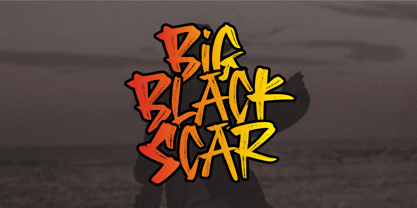 Black Big Scar is a cool hand brush font with a graffiti style. This kind of font is suitable for poster, apparel, product branding, etc. This font is also supporting multi-Languages, which include: Afrikaans Albanian Catalan Danish Dutch English Estonian Finnish French German Italian Norwegian Portuguese Spanish Swedish Zulu. So what's included: Basic Latin A-Z & a-z. Numbers, symbols, and punctuations. Multilingual Support. Accented Characters : ÀÁÂÃÄÅÆÇÈÉÊËÌÍÎÏÑÒÓÔÕÖØŒŠÙÚÛÜŸÝŽàáâãäåæçèéêëìíîïñòóôõöøœšùúûüýÿžß Thank You.
 - Astoria Titling by Nick's Fonts,
$10.00Somewhat of a mongrel, this font combines uppercase letters from an oriental font designed by Paul Carlyle and Guy Oring in 1938, and lowercase letters based on yet another variant of Joan Truchut-Blanchard’s Super Veloz system. As its name implies, it’s quite suitable for titles of all kinds. The Opentype version of this font supports Unicode 1250 (Central European) languages, as well as Unicode 1252 (Latin) languages. - Krydderi by PizzaDude.dk,
$15.00 A touch of spice is often what makes a good meal even better. In Danish, spice is called "krydderi" I chose that particular name for this font because it is the kind of brush font that most likely could spice up your next design. I've added 6 different versions of each letter, and they automatically cycle as you type, leaving the result like authentic brush written text. All Caps Fonts.
 - Christmas Doodles by Outside the Line,
$19.00 The newest addition to the Outside the Line collection of picture Doodle fonts... Christmas Doodles. The perfect font for that quickie Christmas party flyer. It includes gifts, gift tags, gingerbread man, gingerbread house, candy canes, hot cocoa, bow, crackers, 2 kinds of trees, poinsettia, jingle bell, ornaments, snowflakes and a star. This font works well with Holiday Doodles and Holiday Doodles Too which have some Christmas icons in them.
 - Majestic Wisteria by Letterhanna Studio,
$19.00 Majestic Wisteria is a a sweet handwritten font that is made with great care in order to produce the expected outcomes. This font can be used for writing various kinds of products according to their respective needs. It will add a luxury spark to any design project that you wish to create! This font is PUA encoded which means you can access all of the amazing glyphs and ligatures with ease!
 - Kentya by Twinletter,
$14.00 Introducing our newest Font, Kentya the name This font is made with elegant calligraphy nuances and there are so many kinds you can combine various kinds of font choices to get the beautiful writing you want, this font is also good for writing your name and trademarks and logos and words, sentences that beautiful of course with the right typography harmony. This font also offers the beauty of abstract typography harmony for a wide variety of design projects, including natural handwriting in digital form for designs, quote designs, for social media business designs, advertisements, trademarks, promotional banners, posts, posters, signatures, and all. the design requires handwriting or whatever design you want. This font is equipped with uppercase, lowercase, numbers, punctuation marks, swhases and several variations on each character including multi-language. ================================================== This font is best suited for open type friendly applications. How to get alternative glyphs from open type fonts: http://adobe.ly/1m1fn4Y PUA Character Code - Fully accessible without additional design software. do not hesitate anymore start using this font. and Feel free to send any message you want to convey.
 - Knife Fight - Personal use only

- Veru Serif - Unknown license

- TE Almona Dewany by Tharwat Emara,
$95.00 The DEWANY (ALMONA DEWANY ) font is a font of original Arabic fonts and is specialized in writing in the offices of the Sultan and Arab’s Kings. It is also one of the most beautiful Arabic fonts as it has the flexibility to write official graduation certificates, certificates of appreciation, scientific progress and decorations. It is also commonly used in writing posters and sequences for serials, films, medals and decorations on clothes. The ALMONA DEWANY font has its aesthetics derived from its round and interlocking letters. In this version of Dewany font ( Almona Dewany ) you will find many of Arabian names, Ayat of Holley Quran and Good names of Allah (Asmaa Allah Al-Hosnna) and all of this is ready to written quickly by one click and choose glyphs you want to add.
 - Merfidost Brush by Stripes Studio,
$20.00 Hi, Introducing the latest styles Merfidost Brush Font Duo with the kind of modern hand scratches, I hope you are interested in this font, if you want to use for your work this font can be used easily and simply because there are a lot of features in it to contain a complete set of letters lower and uppercase letters, assorted punctuation, numbers, and multilingual support. font also contains several ligatures and alternate style Stylistic.
 - Vallejo Serif by Estudio Calderon,
$35.00 A serif display type family inspired by two popular fonts: Albertus and Friz Quadrata. We made an hybridization matching those kind of fonts that have flared and oversized serifs. Vallejo Serif is a versatile font because of the shapes that are adaptable to many sort of typographic compositions, we recommend to use it in headlines. The OpenType fonts have an extended character set to support Central and Eastern European as well as Western European languages.
 - Hello Arfelina by Stripes Studio,
$20.00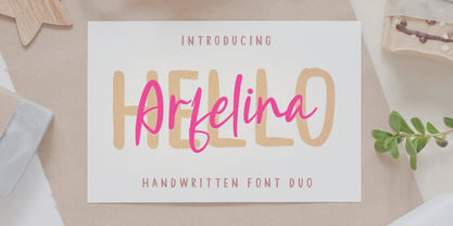 Hi, Introducing the latest styles Hello Arfelina Font Duo with the kind of modern hand scratches, I hope you are interested in this font, if you want to use for your work this font can be used easily and simply because there are a lot of features in it to contain a complete set of letters lower and uppercase letters, assorted punctuation, numbers, and multilingual support. font also contains several ligatures and alternate style Stylistic.
 - Diary Autumn by Yoga Letter,
$13.00 This font is named "Diary Autumn" with a modern calligraphy writing style. "Diary Autumn" is a font that can be used for any kind of work. This font is very beautiful and unique by combining the leaf shape in the letters. It is very easy to use and apply, because it has been specially designed. This font is equipped with basic characters, swash and titling, leaf alternates, ligatures, numerals and punctuations, and multilingual support.
 - HT Pasticceria by Dharma Type,
$19.99 HT Pasticceria is extremely eye-catching and high-contrast font. It is a chic typeface with a?sweet?and?perhaps?girly touch. HT Pasticceria is great for use in all kinds of display typography. Holiday Type Project offers retro hand drawing scripts. Inspired by retro script on shopfront lettering, wall paint advertisements in Italy around 1950s. Check out the script fonts from Holiday Type!

