5,895 search results
(0.02 seconds)
- Botanika by Suitcase Type Foundry,
$75.00The motivation behind the Botanika family was the desire to create a text version of the Magion font. Although the glyphs were originally drawn using the same proportions, they were subsequently adjusted in order to improve legibility. The font retains certain characteristics of the original, such as the top serif on the “i” and the similar bottom serif on the “l”. Lowering the x-height lent the family a new and original character. The italics are slightly more condensed than the regular weight, without losing the austere grace of the regular weight. They are distinct enough to stand out in the text. Alternative characters can be selected to spice up the setting, or conversely to subdue headlines by using more traditional letter shapes. Small caps are available as well. The monospace version is a 10 pitch font: at 10 pt type size 10 characters fit exactly into the width of one inch, meaning that individual letters Take up 60 % of an em in width. The family is provided with matching italics. The modifications made during the OpenType transition included the addition of missing glyphs to cover the Suitcase Standard set and adding relevant kerning pairs, plus redrawing the bold weight and the accents. Despite its lower x-height, the font is often used for setting medium to long texts. Its slightly archaic feel lends text set in Botanika an air of novelty, which may be the reason why it is so popular in extensive corporate identity systems. If you are looking for an alternative to the cold, neutral sans serifs which are so popular these days, Botanika is the perfect choice. - Esmeralda Pro by Sudtipos,
$59.00 From the beginning “Esmeralda” was born with a strong influence of the classical “capitalis monumentalis”, carved in stone. In the same way, the origin of this majuscule writing emerged from the brush, from a way of writing made merely by hand. For this reason, these two universes were intended to lie beneath the shape of each letter, redefining them. And this combination of styles should also be reflected in a lower case set that also allows to open up the spectrum of usage possibilities. Foundational calligraphy represented a solid base for the development of lower case glyphs, ensuring proper interaction with the upper case letters. “Esmeralda” features a great number of ligatures that mix classic structures with a more contemporary impression. With more than eleven hundred glyphs, it provides a multiplicity of uses across a wide combinatory of ligatures, alternative signs, initial caps, miscellaneous and connectors; each one of them accessible through Open Type. “Esmeralda” is perfect to speak with a classical yet fresh, modern – and a little bit bold – tone of voice. Designed by Guille Vizzari, together with the tough and remarkable work of Ale Paul, in use “Esmeralda” stands out in a subtle and unexpected way that’s almost unnoticeable. Its delicate yet solid curves, serifs and endings give each composition a fine, elegant and exquisite feeling, along with a firm and sturdy look. “Esmeralda” was initially born as a typographic project developed by Guillermo Vizzari – tutored by Ale Paul and Ana Sanfelippo – under completion of the Specialization in Typography Design at University of Buenos Aires, Argentina, during the years 2011 and 2012.
 - Kis Antiqua Now TB Pro by Elsner+Flake,
$99.00 In the course of the re-vitalization of its Typoart typeface inventory, Elsner+Flake decided in 2006 to offer the “Kis Antiqua” by Hildegard Korger, in a re-worked form and with an extended sortiment, as an OpenType Pro-version. After consultation with Hildegard Korger, Elsner+Flake tasked the Leipzig type designer Erhard Kaiser with the execution of the re-design and expansion of the sortiment. Detlef Schäfer writes in “Fotosatzschriften Type-Design+Schrifthersteller”, VEB Fachbuchverlag Leipzig, 1989: No other printing type has ever generated as far-reaching a controversy as this typeface which Jan Tschichold called the most beautiful of all the old Antiqua types. For a long time, it was thought to have been designed by Anton Janson. In 1720 a large number of the original types were displayed in the catalog of the „Ehrhardische Gycery“ (Ehrhardt Typefoundry) in Leipzig. Recently, thanks to the research performed by Beatrice Warde and especially György Haimann, it has been proven unambiguously that the originator of this typeface was Miklós (Nicholas) Tótfalusi Kis (pronounced „Kisch“) who was born in 1650 in the Hungarian town of Tótfal. His calvinistic church had sent him to the Netherlands to oversee the printing of a Hungarian language bible. He studied printing and punch cutting and earned special recognition for his Armenian and Hebrew types. Upon his return to Hungary, an emergency situation forced him to sell several of his matrice sets to the Ehrhardt Typefoundry in Leipzig. In Hungary he printed from his own typefaces, but religious tensions arose between him and one of his church elders. He died at an early age in 1702. The significant characteristics of the “Dutch Antiqua” by Kis are the larger body size, relatively small lower case letters and strong upper case letters, which show clearly defined contrasts in the stroke widths. The “Kis Antiqua” is less elegant than the Garamond, rather somewhat austere in a calvinistic way, but its expression is unique and full of tension. The upper and lower case serifs are only slightly concave, and the upper case O as well as the lower case o have, for the first time, a vertical axis. In the replica, sensitively and respectfully (responsibly) drawn by Hildegard Korger, these characteristics of this pleasantly readable and beautiful face have been well met. For Typoart it was clear that this typeface has to appear under its only true name “Kis Antiqua.” It will be used primarily in book design. Elsner+Flake added two headline weights, which are available as a separate font family Kis Antiqua Now TH Pro Designer: Miklós (Nicholas) Tótfalusi Kis, 1686 Hildegard Korger, 1986-1988 Erhard Kaiser, 2008
 - Winter Glows by Fargun Studio,
$14.00 Thanks for checking out Winter Glows! A fabulously fun yet elegant script font with tons of energy, allowing you to create beautiful hand-made typography in an instant. With extra bouncy curves & loops, Winter Glows is guaranteed to make your text stand out - perfect for logos, printed quotes, invitations, cards, product packaging, headers and whatever your imagination holds. What's really awesome is that Winter Glows comes with a complete set of lowercase alternates, which allows you to create even more authentic custom-feel text. Another great feature is the bonus ornaments font, which allows you to add some really unique and elegant finishing touches to your script text. Winter Glows Family includes 5 font files; Winter Glows • A handwritten script font containing upper & lowercase characters, numerals and a large range of punctuation. Winter Glows Alt 1 • This is a second version Winter Glows, with a completely new set of both lower and uppercase characters. this versions do not contain as many glyphs as the Regular style. If you wanted to avoid letters looking the same each time to recreate a custom-made style, or try a different word shape, simply switch to this font for an additional layout option. Winter Glows Alt 2 • This is a second version Winter Glows, with a completely new set of both lower and uppercase characters. this versions do not contain as many glyphs as the Regular style. If you wanted to avoid letters looking the same each time to recreate a custom-made style, or try a different word shape, simply switch to this font for an additional layout option. Winter Glows Alt 3 • This is a second version Winter Glows, with a completely new set of both lower and uppercase characters. this versions do not contain as many glyphs as the Regular style. If you wanted to avoid letters looking the same each time to recreate a custom-made style, or try a different word shape, simply switch to this font for an additional layout option. Winter Glows Extras • A set of hand-drawn swashes & doodles, the perfect finishing touch to underline your Winter Glows text & doodles for perfect lettering logos. Simply install this as a separate font, select it from your font menu and type any A-Z, a-z & 0-9 character to create a swash & Doodles. Standard Ligatures • Are also available for several lowercase characters (double-letters which flow more naturally). Ligatures will automatically replace the standard letter pairs whenever available, when using any OpenType capable software.
 - Medieval Borders by Aah Yes,
$5.00 This is a large group of typefaces inspired by those borders and patterns you see going across documents from the Middle Ages and Medieval times, eventually becoming this collection of fonts where you can scroll various repeating patterns across a page, for example. You can get a repeating pattern that scrolls seamlessly by repeating the same letter. The default text displaying on the web-page is bbbbbbbb, for example. There's over 2 dozen basic styles, and each style has 52 designs within it, using the characters Upper Case A - Z and lower case a - z, with the lower case being the negative/reverse colour of the Upper Case version, it will be the corresponding design just reverse coloured and with an edging strip. There's also a space - but nothing else. The styles in these fonts usually have groups of six characters (A to F, G to L, M to R, S to X), and where the second group is a variation on the first - usually thicker lines - and the third grouping is another variation on that, usually thicker lines again, making the first 24 letters. (Sometimes there's three groups of eight characters). The pattern within a group normally starts off plain then gets busier as it progresses - such as there'd be a more complex pattern of circles and diamonds as you go through the letters. Then the letters Y & Z are somewhat different to the rest. There's four versions starting with Z, and they're a little bit different, and they're grouped in fives - getting bolder as you progress through the letters, but with similar patterns within each group of 5, and that makes the first 25 characters. The letter Z character is extra busy. Again, lower case is the reverse colour of the Upper Case. Mostly you can get patterns and borders that combine seamlessly by using letters within the same group of 6 or 8 (like maybe abdcedcb). There are a few occasions when that doesn't work out, because there may be circles or diamonds at the sides of the letters that don't match up with another letter that has a different pattern at the side. But you can create a pattern with the exact level of complexity you want perfectly easily. You can see examples of this in the poster images. Neighbouring letters without embellishments at the sides of the letters will usually fit together. Have fun with it, that's what it's there for. aah yes fonts
 - Dizzy Edge by PizzaDude.dk,
$15.00 My Dizzy Edge font is really not that dizzy! Actually it's quite steady and legible - super good for packaging, greeting cards and perhaps even commercials for toys, candy, t-shirts, movieposters...yep, that list is long! What's more interesting is that the font as got 6 different versions of each letter - at first glance, the letters don't vary that much, but a closer look reveals the sometimes grungy outline of a pen! But theres more!!! Dizzy Edges comes with multi-language accents!!! What's not to like!!!
 - Indbydelse by PizzaDude.dk,
$20.00 I would like to invite you to a party, wedding, birthday, event, gameshow, baby shower, housewarming ... ehh, what I mean is: this is an invitation to (almost) anything! As you may have read, “Indbydelse” is danish and means “invitation” - why? Well, because these four fonts have enough power to create an exciting invitation! Use them as single fonts, combine one, two, three or all four - that’s totally up to you! They all got multilingual support as well as contextual alternates with several different versions of each letter!
 - Bastardre Hand by DC Design,
$32.00Bastardre Hand is a beautiful calligraphic face based on medieval miniscule script. With characters closer together yet still recognizable and easy to read, this font works well for illuminated text designs and wherever the look of a scribe's hand is desired. Bastardre Hand has punctuation and diacritics for: Afrikaans, Albanian, Bassa, Cebuano, Danish, Dutch, English, Estonian, Faeroese, Finnish, Flemish, French, Frisian, Gaelic, German, Haitian Creole, Hiligaynon, Hmong, Indonesian, Italian, Iloko, Kurmanji Kurdish (Roman script), Marshallese, Norwegian, Papiamento, Portuguese, Spanish, Swahili, Swedish, Tagalog, Trukese, Wolof, Xhosa, Zulu. - Decennie Express JY Pro by JY&A,
$45.00 JY Décennie Express was developed as a sans serif workhorse complement to JY Décennie. The basic roman design shares characteristics, and in some cases, characters (e, o, and others) with the serif version, making JY Décennie Express work particularly well with its progenitor. The design is friendly and approachable, as opposed to stark (the effect one usually has with Helvetica and other over-used typefaces). On closer inspection, straight lines blend into curves on the outlines: the characters are in fact complex but appear simple.
 - Consolas by Microsoft Corporation,
$49.00OpenType Layout features: stylistic alternates, localized forms, uppercase-sensitive forms, oldstyle figures, lining figures, arbitrary fractions, superscript, subscript. Consolas is intended for use in programming environments and other circumstances where a monospaced font is specified. All characters have the same width, like old typewriters, making it a good choice for personal and business correspondence. The improved Windows font display allowed a design with proportions closer to normal text than traditional monospaced fonts like Courier. This allows for more comfortable reading of extended text on-screen. - Domestic Script by sizimon,
$25.00 Domestic Script is a modern calligraphy font. This font is perfect for quotes, branding, ornaments, shirts, mugs, headings, blogs, logos, invitations and more! What's Include : Alternates PUA encode & Opentype ( It is full of Tails and glyphs ) Multilingual support Use the fonts for: logos, branding materials, wedding sign, wedding website card, farmhouse signs, sign bridal, shirts, pantry labels, sign bridal shower, business cards, greeting cards, wall decor, social media, planner prints and websites. If you have any question please do not hesitate to contact me. Thank You!
 - Jules by DSType,
$45.00 At first glance, Jules, appears to be just one more Didonic variation, but a closer look starts revealing all the extraordinary features of this type family, specially designed for use in extremely big sizes. Jules reflect the last of the late 18th century and was inspired by several plates from a portuguese calligrapher named Antonio Jacintho de Araujo. Available in three different optical sizes: Big, Colossal and Epic, Jules has a plethora of ligatures and stylistic alternates, plus refined Italics and a super elegant Swashes version.
 - Fleur Bleue by DM Studio,
$30.00 The Fleur Bleue Beautiful Romantic Font is a graceful and elegant typeface that encapsulates the beauty and romance of delicate flowers. With its flowing letterforms and intricate details, this font brings a touch of sophistication and romance to your designs, making it perfect for wedding invitations, love letters, branding, and other projects that require a touch of enchantment. Features: Romantic and Elegant Style: The Fleur Bleue Font exudes a romantic and enchanting aesthetic. Its graceful letterforms and delicate details create an air of elegance and beauty, making it ideal for projects that require a touch of romance and sophistication. Beautiful Floral Design: The font’s intricate details and floral elements add a touch of enchantment and whimsy to your typography. It captures the essence of delicate flowers, bringing a sense of natural beauty to your designs. Versatile Application: This font is versatile and well-suited for various design projects that aim to evoke emotions of love and romance. Use it in wedding invitations, love letters, branding, packaging, and more to add a touch of beauty and enchantment to your designs. Uppercase and Lowercase Letters: The font includes both uppercase and lowercase letters, providing flexibility and creative freedom in your designs. Mix and match the cases to create visually appealing and harmonious typography. Stylistic Alternates: The Fleur Bleue Font offers a selection of stylistic alternates that enhance the visual interest of your text. These special characters create unique connections between letters and alternate forms, allowing you to create beautiful and captivating typography. Punctuation and Symbols: In addition to the alphabet, the Fleur Bleue Font includes a comprehensive set of punctuation marks, numerals, and common symbols. This ensures consistency and ease of use when incorporating the font into your design projects. Easy to Use: Installing and utilizing the Fleur Bleue Font is hassle-free. It is compatible with both Windows and Mac operating systems and seamlessly integrates into popular design software such as Adobe Photoshop, Illustrator, and InDesign. This ensures a smooth and efficient design workflow. Infuse your designs with the grace and romance of the Fleur Bleue Beautiful Romantic Font. Let its flowing letterforms and intricate details bring a touch of sophistication and enchantment to your wedding invitations, love letters, and branding. Embrace the timeless beauty of this font and create designs that evoke feelings of love and admiration.
 - Namaste by Latinotype,
$49.00 With open palms, place your hands together at the center of your chest, close your eyes and bow the head slightly. Namaste! Welcome to a beautiful spiritual journey. Namaste is a font collection, designed by Coto Mendoza, consisting of two variants: a capital sans and a script font (based on watercolor calligraphy strokes). Each variant comes in 5 weights—Thin, Light, Regular, Bold and Black—and 2 versions: Essential and Pro. The script font, in its Pro version, provides a wide range of OpenType features such as swashes, alternates, ligatures and different stylistic sets. The Namaste family also includes a set of ornaments inspired by Hindu and Buddhist symbols—that Coto Mendoza saw virtually everywhere on her trip to India—like Mandalas and Yantras, and others found in textiles and monuments. Namaste is the perfect choice for wellness, healing and therapy oriented products. Its smooth shape and soft curves allow the user to create beautiful designs for essential oils, bath salts, quartz crystals, mindfoodness, candles, incense and aromatherapy products packaging. The font is well-suited for publishing design (short text); self-help and healing handbooks; tarot and divination cards; and women’s empowerment and spirituality publications. Namaste is an ideal typeface for yoga (and other body disciplines) center branding; holistic centers; and group meditation, womb blessing and circle of women invitations. Namaste is a beautiful journey full of love and inspiration. Namaste: a spiritual journey.
 - Rosamund Cyrillic by Ira Dvilyuk,
$17.00 Rosamund Cyrillic Script Font is an inky brush script with heavy downstrokes, and skinny loops, and upstrokes. It was made with my favorite brush pen and retains a playful handwritten look for all your designs and will be perfect for use in your projects, be it logos, signatures, labels, packaging design, or blog headlines. Also, it will look great in mugs, cards, gorgeous typographic designs, stationery, and much more. Rosamund Cyrillic Script contains a full set of uppercase letters and 2 full sets of lowercase letters, (standard and alternative), and 17 ligatures. Use alternate lowercase and double-letter ligatures to create a perfect hand-painted look in your creations. The Cyrillic part of the font includes a full set of gorgeous uppercase and lowercase letters, ligatures, numerals, a large range of punctuation. Rosamund Symbols is a font with over 50 unique, hand-drawn doodles and illustrations that can help to make your design awesome. A different symbol is assigned to every uppercase and lowercase standard character so you do not need graphics software just simply type the letter you need. Multilingual Support for 32 languages: Afrikaans, Albanian, Basque, Bosnian, Catalan, Danish, Dutch, English, Estonian, Faroese, Filipino, Finnish, French, Galician, Indonesian, Irish, Italian, Malay, Norwegian Bokmål, Portuguese, Slovenian, Spanish, Swahili, Swedish, Turkish, Welsh, Zulu And Cyrillic glyphs support for Russian, Belorussian, Bulgarian, Ukrainian, and Kazakh languages. Works perfectly on the Canva platform. For Cricut & Silhouette recommended. Thanks!
 - Ongunkan South Picene by Runic World Tamgacı,
$50.00 South Picene (also known as Paleo-Sabellic, Mid-Adriatic or Eastern Italic) is an extinct Italic language belonging to the Sabellic subfamily. It is apparently unrelated to the North Picene language, which is not understood and therefore unclassified. South Picene texts were at first relatively inscrutable even though some words were clearly Indo-European. The discovery in 1983 that two of the apparently redundant punctuation marks were in reality simplified letters led to an incremental improvement in their understanding and a first translation in 1985. Difficulties remain. It may represent a third branch of Sabellic, along with Oscan and Umbrian (and their dialects), or the whole Sabellic linguistic area may be best regarded as a linguistic continuum. The paucity of evidence from most of the 'minor dialects' contributes to these difficulties. The corpus of South Picene inscriptions consists of 23 inscriptions on stone or bronze dating from as early as the 6th century BC to as late as the 4th century BC. The dating is estimated according to the features of the letters and in some cases the archaeological context. As the known history of the Picentes does not begin until their subjugation by Rome in the 3rd century, the inscriptions open an earlier window onto their culture as far back as the late Roman Kingdom. Most are stelai or cippi of sandstone or limestone in whole or fragmentary condition sculpted for funerary contexts, but some are monumental statues.
 - Ongunkan Lycian by Runic World Tamgacı,
$50.00 Lycia (Lycian: 𐊗𐊕𐊐𐊎𐊆𐊖 Trm̃mis; Greek: Λυκία, Lykia; Turkish: Likya) was a geopolitical region in Anatolia in what are now the provinces of Antalya and Muğla on the southern coast of Turkey, bordering the Mediterranean Sea, and Burdur Province inland. Known to history since the records of ancient Egypt and the Hittite Empire in the Late Bronze Age, it was populated by speakers of the Luwian language group. Written records began to be inscribed in stone in the Lycian language (a later form of Luwian) after Lycia's involuntary incorporation into the Achaemenid Empire in the Iron Age. At that time (546 BC) the Luwian speakers were decimated, and Lycia received an influx of Persian speakers. Ancient sources seem to indicate that an older name of the region was Alope (Ancient Greek: Ἀλόπη, Alópē). Lycia fought for the Persians in the Persian Wars, but on the defeat of the Achaemenid Empire by the Greeks, it became intermittently a free agent. After a brief membership in the Athenian Empire, it seceded and became independent (its treaty with Athens had omitted the usual non-secession clause), was under the Persians again, revolted again, was conquered by Mausolus of Caria, returned to the Persians, and finally fell under Macedonian hegemony upon the defeat of the Persians by Alexander the Great. Due to the influx of Greek speakers and the sparsity of the remaining Lycian speakers, Lycia was rapidly Hellenized under the Macedonians, and the Lycian language disappeared from inscriptions and coinage.
 - Distefano Slab by Tipo,
$60.00 Designed from the perspective of a multi-purpose font family, comprehending the slab-serif and humanist-sans subtypes, the Distéfano typefaces were specifically developed and subsequently tested considering the needs of editorial products, for both print and digital media. Includes a comprehensive program where formal, style, thickness and slant attributes are especially indicated for the composition of text and headings in newspapers, journals and magazines. For that reason, in addition to the more traditional weights, others, ranging from Light to Black were added. The identity and systemic criteria of this font family doesn’t fall short on diversity of specific solutions, flair and quirks for each variant, especially noticeable in the contrast of the italics to the roman styles. The original drawings of Distéfano date back to 1983; embodied in pencil on paper, provided only the alphabetical characters and punctuation signs for Spanish, and the Sans Serif family. By digitalizing them, their possibilities of use were widened, the set of characters of each typeface were considerably completed considering the current requirements for the majority of the latin and germanic languages, and the slab-serif family was developed. This type family bears the name of the most notable argentinian designer, and it is a homage to his work, that influenced the youth of the 50’s decade of the 20th century, and especially to him, whom I have always recognized as a friend, and a teacher.
 - Distefano Sans by Tipo,
$60.00 Designed from the perspective of a multi-purpose font family, comprehending the slab-serif and humanist-sans subtypes, the Distéfano typefaces were specifically developed and subsequently tested considering the needs of editorial products, for both print and digital media. Includes a comprehensive program where formal, style, thickness and slant attributes are especially indicated for the composition of text and headings in newspapers, journals and magazines. For that reason, in addition to the more traditional weights, others, ranging from Light to Black were added. The identity and systemic criteria of this font family doesn’t fall short on diversity of specific solutions, flair and quirks for each variant, especially noticeable in the contrast of the italics to the roman styles. The original drawings of Distéfano date back to 1983; embodied in pencil on paper, provided only the alphabetical characters and punctuation signs for Spanish, and the Sans Serif family. By digitalizing them, their possibilities of use were widened, the set of characters of each typeface were considerably completed considering the current requirements for the majority of the latin and germanic languages, and the slab-serif family was developed. This type family bears the name of the most notable argentinian designer, and it is a homage to his work, that influenced the youth of the 50’s decade of the 20th century, and especially to him, whom I have always recognized as a friend, and a teacher.
 - Heavyrust by Invasi Studio,
$12.00 Heavyrust is All Aggressive with Brush style font special for your Display Design, which puts a bold on your projects and will inspire you to create something strong and aggressive. Heavyrust will help you to create special and touching typographical designs for bold or strong projects, It is perfect for headings, flyers, greeting cards, product packaging, book cover, printed quotes, logotype, apparel design, album covers. Features: Multilanguage Ligatures Alternates Punctuation
 - Claycozoa by Zealab Fonts Division,
$10.00 Claycozoa is a versatile, bold and unique display font. Was inspired by Psychedelic and Art Nouveau style, Claycozoa has a unique style with stylistic, alternates, ligatures and supports multilingual languages. The organic feel of Claycozoa evokes a psychedelic vibe which you can use to take your designs to a new level. The font is great for posters, flyers, apparel, quotes, greeting cards, product packaging, album covers, movies, and more.
 - Bazoka by Juncreative,
$15.00 Bazoka font is a display style that mimics the look of hand-drawn graffiti lettering. The letters are rounded and bubbly in shape, with a bold appearance. This style is perfect for informal or urban-themed designs, such as posters, flyers, and street art. Overall, graffiti bubble font is a fun and energetic way to add personality to your design. and this font include 3 styles regular, outline and extrude.
 - Non Block by Liartgraphic,
$15.00 Hi guys! How are you guys? I bet it's great! Introducing our latest product, we call this product the Non Blok font Non Blok hight is a display type font With a unique and firm touch Non Blok hight font is great to use on: fashion magazines, logos, photography, landing pages, flyers, social media and so on What's included - multilingual support - alternatives - ligatures Thank you, best regards Liarttyype
 - Real Fat by vanAllerlei,
$30.00 RealFat is a typeface that has been started with the intention to create a very squared bold font with a futuristic look and feel. The squared shapes also refer to the architecture of big city buildings with small windows. This font fits perfect on modern posters, flyers and other artwork or pixel based work. Most characters have the same width and height and are perfect 'building-blocks' for typographic compositions.
 - Convero Hight Inline by Liartgraphic,
$15.00 Hi guys! How are you guys? I bet it's great! Introducing our latest product, we call this product the convero hight display font convero hight is a monoline display type font With a unique and firm touch convero hight font is great to use on: fashion magazines, logos, photography, landing pages, flyers, social media and so on What's included - multilingual support - alternatives - ligatures Thank you, best regards Liarttyype
 - Mohan by Allmo Studio,
$22.00 Mohan is a Bold Minimalist Elegant Fancy typeface font with tons of alternative characters, ornaments, multilingual support and unique ligatures. It's a very versatile font that works great in large and small sizes. Perfectly fit for your logo, headings, branding, magazine, cover album, book cover, movie, apparel design, quotes, invitations, flyer, poster, greeting cards, product packaging, printed quotes, or simply as a stylish text overlays to any background image.
 - Nistiver by Aga Silva,
$24.99 This font works beautiful for headers and signature looks. There are plenty of alternate letters to fine tune your creations. If required - there is an extra number of initial/end swashes which give that beautiful flowy look to your wording. Also please note that some of the short swashes if placed together make beautiful ornaments as well. Nistiver can write in other languages if such is your demand :)
 - Thawed by Larin Type Co,
$13.00 Thawed This is a display font of a narrow specialization, its letters seem to have melted and flowed, but at the same time it retains the shape of the letters and is well read. It is perfect for branding, logos, labels, short display inscriptions and advertising materials from flyers to billboards. This font includes drops of style, they make it possible to make the font more voluminous and give detail.
 - Liferdas by Sealoung,
$20.00 Liferdas is a mix of Old Style Roman Serif styles. The glyphs are formed in extended width, smooth strokes, moderate stem contrast, and soft edges to pursuing clarity, quick recognizable text, and a warm personality. The italics style is 13 degrees low slanted with redrawn lowercase which has shown in more organic and flowy forms. This font contains 9 weights with more than 245 glyphs that support extended multilingual.
 - Designer RD by Kostic,
$40.00 Designer RD was created in 1999, at the same time as Just Square and Why Square typefaces, and envisioned to be their rounded alternative. Zoran based the font on the logotype his son Nikola made and its primary purpose is to be used in logotypes, headlines, fliers, websites, etc. that are going for a hard geometric look. Designer RD’s character set supports Western European languages, as well as the Cyrillic script.
 - Blora by Liartgraphic,
$25.00 Hello guys! How are you guys? I bet it's great! Introducing our newest product, we call this product the Blora font. The Blora font is a serif font that has unique and interesting ligatures and alternatives With a unique and firm touch The Blora font is great for: fashion magazines, logos, photography, landing pages, flyers, What's included - multilingual support - alternative - fastener Thank you, best regards Ali Sifak Muftari
 - Vegas x by XdCreative,
$25.00 Vegas-X is a futuristic squared display font. This font is inspired by films, books, science and space technology, composed of a squared shape with smooth curves that gives a modern and futuristic impression. Vegas-X It is perfect for display, logo, icon and it will look stunning on any poster flyer or print. Use this font for your designs and explore its endless possibilities. Thank you _xd
 - Dansburg by Uncurve,
$30.00 Dansburg is an aesthetic vintage font, inspired from the past typography , elegant signage, gold leaf , sign painting and old label product. Dansburg comes with tons of alternates characters to make more eye cacthy . Dansburg Font is suitable for authentic logos, headings, sign painting, posters ,letterhead, branding, magazines, album covers, book covers, movies, apparel design, flyers, greeting cards, product packaging, and more. Finally BOOM..!! you get a great design for your project.
 - Dirty Claws by Invasi Studio,
$17.00 Dirty Claws is an all-caps aggressive dirty brush font. With a bold, aggressive style, it will add a bold and strong touch to your projects, inspiring you to create something bold as well. Besides that, this font is also equipped with Alternative Characters, Standard Ligatures, and multi-language support. Dirty Claws is ideal for headings, flyers, greeting cards, product packaging, book covers, printed quotes, logotype, and album covers.
 - Saltstar by Grontype,
$16.00 Saltstar is an modern elegant san serif font, created with care. The font is rounded point and unique shapes. It come with extra ligatures and alternative. This font is specially created for your branding need such as invitational card, flyer font, magazine heading layout and any other project. Saltstar Features: Uppercase Characters Lowercase Characters Numerals, Punctuation, Currency etc Multilingual Support Thankyou for choosing this font, Happy creating Regard, Grontype
 - Blippo by Linotype,
$40.99Blippo Black with its constructed style is a typical headline typeface. Its robust figures with their even strokes were composed using the basic forms of the circle and rectangle. Its curves are often not completely closed. The figures of Blippo Black form dark, heavy lines, making the typeface suitable only in middle and larger point sizes. Blippo Black will make an impression when used for flyers and correspondence. - Rubinetto by FallenGraphic,
$15.00 Say Hello to Rubinetto Script Font! Rubinetto is an modern handwritten script font. Very easy to access alternate . which is perfect for flyer, invitations, advertisements, banners, books, business cards, signatures, and others who want a bold script font font type. What’s Included ? -Rubinetto Font.OTF The Features of this fonts is : -Standart ligatures -Stylistic Alternate -Stylistic Set SS01-SS04 -Swash -Multilingual Support If you want something please contact me to : vavaaryanto666@gmail.com
 - Jackson Light by Supfonts,
$12.00 Jackson Light is a cute handwritten font perfect for headings, flyer, greeting cards, product packaging, book cover, printed quotes, logotype, apparel design, album covers, etc., or just adding a handwritten touch to any project! Font is an open type with clean shapes and precise kerning. It includes ligatures encoded by the PUA Language support: All European languages Don't forget to subscribe so you don't miss out on the new awesome fonts
 - Krispiest Signature by Omotu,
$19.00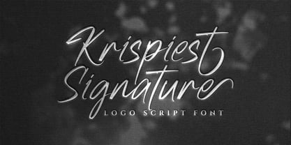 Krispiest Signature! A handwritten script brush font, all caps. Krispiest Signature font is suitable for branding, logotype, apparel, T-shirt, business card, product packaging, quotes, flyer, poster, book cover, advertising, etc. Whats Include? Opentype support Multilingual support PUA encoded Features: Uppercase, lowercase, numerals, punctuations, alternates, and ligatures Thanks for looking, and I hope you enjoy it! Please don't hesitate to drop me a message if you have any issues or queries.
 - Happy Hour Doodles by Outside the Line,
$19.00 A collection of 30 retro illustrations of cocktails, drinks, beer, champagne, appetizers, canapés, candy, corkscrew, ice bucket, decanters, and 5 background graphics. Perfect for your next party flyer or invitation. Inspiration for the font came from a set of illustrations created for a Cocktail themed fabric contest on spoonflower.com. I also made a postcard for my etsy store. Then I expanded the set and make Happy Hour Doodles.