10,000 search results
(0.02 seconds)
- Blackbone by Balpirick,
$15.00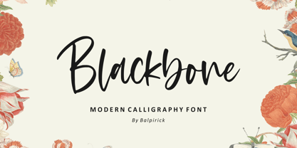 Blackbone is a Modern Calligraphy Font. Blackbone is a lovely and delicate script font that exudes elegance and class. This font was particularly crafted for those who need a beautiful and refreshing look to their designs. Blackbone also multilingual support. Enjoy the font, feel free to comment or feedback, send me PM or email. Thank you!
 - The Little Bonjour by IbraCreative,
$23.00 The Little Bonjour is natural cute and casual handwritten font. The Little Bonjour is suit best for wedding theme, playful concept, love letter, Easter gift card typeface, fashionable theme, fashion sale banner, branding projects, logo, wedding designs, social media posts, advertisements, product packaging, product designs, label, photography, watermark, invitation, stationery and any projects that need casual handwriting taste.
 - Minebold by ahweproject,
$9.00 Minebold is a retro bold handwritten font that will bring you back to the 70s. Fall in love with its unique character and use it to create gorgeous wedding invitations, beautiful stationery art, eye-catching social media posts, and much more! Minebold is PUA encoded, which means you can access all glyphs and swashes with ease!
 - La Vieste by Reyrey Blue Std,
$18.00 La Vieste is a Bold, Elegant and Modern font with beautiful ligatures, tons of special alternative glyphs, ornament and multilingual support. It is suitable for branding, signature, wedding invitation, promotion, product packaging, and other needs. Fall in love with its incredibly versatile style and use it to create spectacular designs! Includes: Uppercase and Lowercase Ligatures PUA Encode Support
 - Meteoric by Nuno Dias,
$24.00 Meteoric is a new playful three-weight typefamily, featuring a soft and rounded sans serif. The semi-stencil style gives it a distinct futuristic look and modern feeling, that is great for logo design, headlines and branding purposes. This monoline typeface, with soft terminals, is a lovely, sweet and perfect typeface for a multitude of typographic applications.
 - Girlish by Balpirick,
$15.00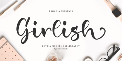 Girlish is a Lovely Modern Calligraphy Font. Girlish is perfect for product packaging, branding project, megazine, social media, wedding, or just used to express words above the background. Girlish also multilingual support. Lowercase font Stylistic Alternates Ligatures Symbols & Punctuation OpenType Features. Enjoy the font, feel free to comment or feedback, send me PM or email. Thank you!
 - Gamos by Letterara,
$12.00 Gamos comes from Greek which means marriage. Add some love in an instant. The font comes decorated with small embellishments, such as hearts. Making it the perfect font for Valentines Day designs, but also Christmas, Weddings, Anniversaries, Birthday cards, table numbers, header menus, display’s, logos, slider blogs, custom addresses, stamps, packaging, greeting cards, and much more!
 - The Saily by Stringlabs Creative Studio,
$25.00 The Saily feels equally charming and elegant. This stunning script font is a stylish homage to classic calligraphy. It features a varying baseline, smooth lines, gorgeous glyphs and stunning alternates. Fall in love with its authentic feel and use it to create gorgeous wedding invitations, beautiful stationary art, eye-catching social media posts, and cute greeting cards.
 - Fontropolis by Comicraft,
$49.00 When you're ready to leave your cozy picket fence life in Typeville, make the move to the hustle and bustle of Fontropolis! FONTROPOLIS is populated by friendly-faced characters you can always count on to help you through the thick and thin of everyday life in the Capital. Why not take a day to admire the classic arches of the ascenders, descenders and horizontals featured in Fontropolis's architecture? Indulge in a little idle chitchat with your fellow Fontropolitans! Fear not! The People of Fontropolis will stand firm beside you when the unavoidable Supervillains and Crackpots descend on the capitals, spouting Arrogant Expositions of their Nefarious Plans as they seek to usurp our great country’s democracy! FONTROPOLIS will always prevail! The Fontropolis font family includes four weights (Regular, Italic, Bold & Bold Italic) with alternate uppercase characters, Western & Central European & Vietnamese support, Manga characters and Crossbar I Technology™
 - The Sun And Flower by Tigade Std,
$15.00 The Sun and Flower is a precise display font yet a good looking crafting font. It is created by precise and combined building blocks that form a unique shape for each characters. The font is suitable for Crafting of course but as well for widely creative ideas. Add this beautiful display font to each of your creative ideas and notice how it makes them stand out! Whether it’s for web, print, moving images or anything else – The Sun and Flower will give a spectacular look to your design. Below what’s included in this product: The Sun and Flower • A unique crafting font. It contains upper & lowercase characters, all punctuation and numerals. Language Support; It does support basic International Characters That's a wrap! I do really hope you like this font, and please don't hesitate to contact me if you have any questions. Also, drop by to our instagram! Tigadestd | Doli Harahap
 - Duckie by Eclectotype,
$40.00 Eclectotype's continuing battle against whitespace continues full cream ahead with Duckie, and fat-bottomed script that packs a whole lotta weight into the softest of punches. The forms feel familiar, like they're straight from funky disco album covers, but this is a 100% original face. Don't let its retro charm dissuade you from taking it for a spin in more contemporary settings; it might just surprise you! Now for the features bit: OpenType features include ligatures, swashes, contextual alternates and stylistic sets. The stylistic sets are 1. swap the script r swap to a normal r, 2. swap the script upper case i to a more familiar seriffed version, 3. the number four changes to an open form, and lastly, 4. loopy ascenders in the lower case close in and lose the hole. You should not use this in all caps settings. Pretty please.
 - Leuk by Wilton Foundry,
$29.00 The Dutch word “leuk" translates loosely to English as pleasant, jolly, funny, witty, clever, nice, sweet, kind, nice, amusing, entertaining, and funny. Leuk, the font, is a small, highly legible font with a witty, sociable personality that engages it’s readers. My challenge in designing Leuk was to find a unique feature to set apart the font without losing the fundamentals of type design. In the process of doing so, I created a virtual font “smile and wink” in the “o” upper and lowercase with integrated stencil-connecting strokes within the “a,e, k, z, o, ß” to reveal Leuk’s calligraphic roots. Legible and friendly, Leuk is designed for use in advertising, brochures, promotion, book cover design, packaging, and the like. The Leuk family consists of Leuk Light, Leuk Light Italic, Leuk Regular, Leuk Italic, Leuk Bold, Leuk Bold Italic, Leuk Black, Leuk Black Italic in Opentype format.
 - Wood Bonnet Grotesque No.4 by astype,
$46.00 After release of Wood Bonnet Antique No.7 some of my clients asked for a sans serif version. So I printed my second batch of old wood type. I transferred these wood type into a digital font and tried to preserve the warm vintage look. » pdf specimen « The font offers up to four glyph variations of all the Latin base letters, figures and some additional letters - It has an build in letter randomizer. Please check you have turned on contextual alternates in your application. If you prefer a more common look and need more weights or to use the font in smaller text sizes I have done clean and sharp font family called Bonnet Grotesque Nr. It’s the preferred version for all the usages on websites, apps or ebooks. Have fun!
 - Satellite PT by Puckertype,
$19.00Satellite PT started out as an experiment. Wanting to explore the geometry of using angles instead of curves, I started sketching out the face using grid paper. I had seen similar fonts that tended to be completely symmetrical. My exploration tended to include what I humorously call 'faux humanist' elements, such as asymmetrical bowls, tapers and 'flare-serifs' (for lack of a better word) for select terminals. The result was a quirky and interesting face at display sizes. However, at small sizes, as ink bleed starts to take over, the angles disappear in favor of the overall forms (rounded bowls, etc.) and the 'faux-humanist' effects start to mimic modulation found in more traditional, modulated text faces. While it is hardly a true text face, the result is surprising legibility at text sizes. - Hello Kindess Brush by Lucky Type,
$18.00 Hi designer, let me introduce my newest font Hello Kindess. Hello Kindess is my newest font brush that I made using a simple brush with a modern style and irregular base line. contemporary approach to design, natural handmade, suitable for use in title designs such as clothing, invitations, book titles, stationery designs, quotes, branding, logos, greeting cards, T-shirts, packaging designs, posters, and more. Hello kindess Font consists of 2 kinds of styles namely upright and italic style so that designers are free to choose the desired style. Hello Kindess Font Also has 20 Extras made by hand which are very suitable for various purposes in design. Extras that I made with full detail so it looks very unique. Thank you for seeing I hope you like it.
 - Devin by Linotype,
$29.99Devin is designed mainly for the benefit of the advertising industry, and it surely is a nice typeface for headings, isn't it? And you should see what a nice body type it makes! I had no other typeface in mind when working with it, but I can now find several typefaces it is related to. It reminds of the egyptienne group, but I did't really plan that. The name Devin is taken from my birth region. There is a castle with that name on the northern Adriatic coast (known even from Rilke's Duino elegies - Duino is another name of the same castle). A castle ruin called Devin, too, can be found on a height above the Danube in Slovakia, not far away from its capital Bratislava. Devin was released in 1994. - Omnibus by Linotype,
$29.99Omnibus is one of my absolute favourites. My intention was to design a typeface as easy to read as Baskerville, without being a copy of it. It is easy to see that I was influenced by Baskerville, e.g. in the open lowercase g. I had in mind to design a Baskerville with the looks of the Baskervilles used in earlier typesetting. I put aside those plans for a while (but fulfilled them later on) and dedicated myself to Omnibus. In both cases my aim was to achieve a typeface with darker looks than the most used Baskerville. The name has nothing to do with buses, it is Latin with the meaning of for all". It is also in the name of Omnibus Typografi. Omnibus was released in 1993. - Doriss Girls by Open Window,
$- Dorriss girls were the dancing troop at the Moulin Rouge. I had the idea for this font while trying to come up with an alternative to beveling. I thought it would be interesting to create this sort of stepped effect as I've never really seen this treatment on a font before. Then my need to create chaos shows up again with Doriss Girls informal. A hand drawn take on the forms. This seemed like it would appear on an old art nouveau poster by the great Toulouse Lautrec, so there you have the genesis of this font. I've been somewhat compelled by the letterforms so I may expand and create a more normal version of this font someday with a range of weights. That would be the bees knees.
 - Buddy by Hackberry Font Foundry,
$24.95 Buddy is the new companion sans for Contenu, the book font family designed for my book on font design design. Originally, I called it Compagnon, but that seemed to pompous. Then I called it Aide, but that was too formal and dry. It's a loose, free, easy to read sans, so when my wife suggested Buddy, it clicked. This is the 4-font Buddy family of Regular, Italic, Bold, & Bold Italic. I made a new, more limited feature set for these fonts due to their designed usage, but there are still small caps, small cap figures, oldstyle figures, numerators, and denominators. The bold is closer to a black, and the italics are only slightly slanted obliques. If you need a strong black in caps, use the small caps of the bold.
 - Public Figure by Hanoded,
$15.00 During the Covid pandemic, I noticed that a lot of public figures (politicians, actors, influencers and even kings and princesses) had to apologise for not following the social distance rules, the lockdown rules or the 'stay at home' rules. They threw parties, went on holidays abroad and - in general - made a nuisance of themselves. When I finished this font, I decided to call it Public Figure! Public Figure is quite a neat, handmade font. It doesn't stick to the rules (but does like to keep up appearances), likes to party (but manages to stay safe) and brightens up your work (without being too gaudy). Public Figure comes with two alternate sets for the lower case glyphs (that cycle as you type) and a massive amount of diacritics, including Vietnamese.
 - Klutz AOE Pro by Astigmatic,
$19.00 The Klutz AOE Pro Family was inspired by the plethora of naive hand drawn lettering becoming commonplace in modern advertising. What I hadn't seen was a family of hand drawn typefaces, in a range of widths and weights, with both alternate capitals as well as small caps character sets...and so Klutz Pro was born. The letterforms started with a few letters my daughter had drawn which I expanded on from there. Pulling from inspirations in retro cartoon titling and modern hand lettering playfulness, the full font was born, with weights and width to follow. Quirky, eclectic, and just a bit ridiculous, it lends itself to a range of design typesetting - although I must confess, even though it all began with the Regular width, the Extra Condensed styles are my personal favorites. What's your favorite?
 - Bela Yasmine by Mytha Studio,
$17.00 Bela Yasmine Script is a modern calligraphy font that features a varying baseline, smooth line, classic and elegant touch. Can be used for various purposes.such as headings, signature, logos, wedding invitation, t-shirt, letterhead, signage, lable, news, posters, badges etc. I made this Bela Yasmine Font inspired by the concept of calligraphy classic and made it into a modern style, and I also added some ligature and alternatives that were very interesting when we applied it. I also tried to execute in a different way so as to produce this Bela Yasmine Script font. To enable the OpenType Stylistic alternates, you need a program that supports OpenType features such as Adobe Illustrator CS, Adobe Indesign & CorelDraw X6-X7, Microsoft Word 2010 or later versions. Thank You, Mytha Studio
 - Kestia by Valentino Vergan,
$17.00 Kestia is a modern and elegant typeface, which leans towards the Neue Nouveau type style. The inspiration for the Kestia typeface came from the early Art Nouveau typographic designs. I wanted to combine type styles from different eras, to create a typeface that is strong yet modern and unique. I designed the typeface with creative letters and ligatures, which makes it perfect for creating nostalgic and retro designs such as: posters, magazines, logos, wedding invitations, Instagram posts, websites, blog posts, pull quotes, social media posts and much more. If you are looking for something modern and retro for you next project, Kestia is the font for you. KESTIA INCLUDES A FULL SET OF: Uppercase and lowercase letters. Numbers. Punctuation. Ligatures. Multilingual symbols. I hope you enjoy using the Kestia typeface.
 - Mon Petit Cahier by Hanoded,
$15.00 My family and I are stuck in quarantine for a week; my eldest son tested positive for Covid19 (but everyone else tested negative), so we can’t go out. That means that the kids follow classes online. I noticed their notebooks and suddenly realised that a notebook used to be called a ‘cahier’, which is a French word meaning the exact same thing. I guess it sounded sophisticated at the time. Mon Petit Cahier (meaning: My Little Notebook) is a handmade script font. It is not meant to be awe-inspiring, nor do you want to use it for headlines or posters. It is a nice little font that feels at home wherever an unobtrusive script is needed. Comes with all the diacritics you want and a set of cool double letter ligatures.
 - Matrixoid by Haksen,
$13.00 Matrixoid come with natural taste of letters. with the real hand done I created them, also additional variation in outline font to make good sensation feel. When you type with this font, I believe you will enjoy the sensation of the natural feel of this font, equipped with ligature and outline version features make the display even stronger for your projects such as posters, logos, advertisements, book covers and all brands for your requirement. I recommend for you to use photoshop or illustrator to make design with this font and let see when you will say WOW :) So what include when You want to use them ? OTF files Ligatures Numbers + Punctuation Non-English support Ligatures Please contact me if anything question, I'm glad to help :) Happy Designing, Haksen
 - Architype Catalogue Solid by The Foundry,
$50.00 Architype Crouwel is a collection of typefaces created in collaboration with Wim Crouwel, following his agreement with The Foundry, to recreate his experimental alphabets as digital fonts. Crouwel's most recognized work was for the Van Abbe and Stedelijk museums (1954 –72) where he established his reputation for radical, grid-based design. Architype Catalogue’s soft ‘padded’ letterforms were originally created by Wim Crouwel for the Stedelijk museum’s 1970 exhibition of sculptor Claes Oldenburg.. Crouwel said, ‘When you look at Oldenburg’s work, with all those soft objects, it gets into your system, so you try to integrate that feeling in the design. Claes was very taken with the catalogue's typeface, and asked me if I would do the whole alphabet for him, so I did. I cut it all out in pink paper and pasted it together’.
 - Du by sugargliderz,
$20.00 Du is a self hommage to Uncertain Felttip. Uncertain, made in 2008, is a typeface which reproduced faithfully the style in which I am writing on copy paper, usually using the felt-tip pen. This time, I wrote the new family by the same method but using the tablet PC and the touch pen. Although, as for some characters, Uncertain differs in a form, it is the result of reflecting my hand writing. I wrote all the characters. If it is original, all the characters diverted and composed, for example, characters, such as Aacute and Agrave, are written. Different specification from Uncertain is family composition. Although Uncertain had only 3 weight, 7 weight were designed for Du. This way a user can choose his favorite weight because the variation of weights increased.
 - Like Butterflies by Bogstav,
$10.00 Now here's a font that is named Like Butterflies, but has got nothing to do with butterflies! What? Why? Well, I recently heard the song "Even flow" by Pearl Jam and took a trip down memory lane - back to my early twenties. I remember how the lyrics affected me, and had an impact on how my life changed the years to follow. Maybe the style of the font does not reflect the inner meaning of the song, but it does reflect a look back in time for me - and the change that took place. Nevertheless, I hope you enjoy the somewhat simple, handmade style of Like Butterflies and the 4 versions that works very well together! Please notice that each letter has got 5 slightly different versions to choose from!
 - Parochus by Kaer,
$24.00 Hello! Inspiration for this beautiful script font I found in “A Source of Solace in Illness” (Trost Bronn der Kranchhen) book, published in the middle of 17th century. There was an entire on the back of the top cover: Joannes Auanger Parochus Sinchingae 1808”. That's why I named my font family Parochus. In the Catholic Church, a parish is a community of the faithful within a particular church, whose pastoral care has been entrusted to a parish priest (Latin: parochus). There are original and regular style fonts. Also, I’ve added some modern symbols. With this set, you can precisely imitate medieval style text. I designed a full uppercase and lowercase set with Multilingual support and ligatures. You'll found ß, &, Š, ę and many other beautiful glyphs. Best, Roman.
 - Pseudonym by Monotype,
$20.99 Pseudonym is a low-contrast, subtly-flared serif available in four weights across three styles in both roman and italic. As with all of my typeface designs, I am creating fonts that I would use myself for branding purposes—typefaces with style and purpose that are intended for use in creating logos and distinctive branding typography. I wanted to create a typeface that had incisive flared serifs combined with the strength and solidity of modern grotesque faces. The result is Pseudonym, which I feel has great presence, style and legibility. Although I must admit, I had to tone down the flared serifs during the design process in order to achieve that :) I’m sure you will have great fun playing with some of the Open Type features that I’ve added to Pseudonym. There’s a full set of true small caps with their corresponding diacritics and figures. There are also a number of discretionary ligatures, these are chosen from the glyphs palette in your layout app to replace pairs of standard characters. You’ll also enjoy making use of the catchwords – these have been created to harmonise with each style, again, giving you more flexibility and scope to create some innovative typography. Finally, there are some alternate characters for /C/D/O/. You may wish to use these when creating logos that include standard contractions for limited, number, incorporated, etc. Key features: • Pseudonym is a low-contrast, subtly-flared serif that has great presence, style and legibility • 3 styles – Narrow, Regular and Wide • 4 weights in roman and italic: • Light | Regular | Medium | Bold • Full set of small caps with diacritics and figures • 30+ discretionary ligatures, catchwords and alternate characters • Full European character set • 600 glyphs per font
 - Clear Sans by Positype,
$29.00 Clear Sans™ is a… wait for it… rational geometric sans serif. It is intended to fill a niche… to provide an alternative to the somewhat based-on-vernacular signage, somewhat geometric sans. I hear the word vernacular thrown around too much and too loosely. If a typeface is based in the vernacular, based on hand-painted or hand-crafted signage, then it should be based on the movements of the hand, retain that warmth and not on a pretty geometric model. For me, clean, geometric and precise doesn't have to be cold and expressionless. The original skeleton was hand-painted in 2008 to help determine and inform my decisions going forward. The typeface was completed shortly afterwards at the behest of an old friend for their identity. As usual, I expanded it, but considered retiring it since there were so many things similar out there. Years later, I had a chance to rediscover it and came to the conclusion that it could be improved, expanded in a logical and useful way, and introduced. I would be lying if I didn't admit that the rise of webfonts and embedded type in applications influenced many of the decisions I made about reworking Clear Sans™. Completely new Text and Screen fonts were developed that utitlize larger x-heights, space-saving widths, logical (and simplified) weight offerings… to name a few alterations. Even the pricing of each variant was considered to produce a more reasonable and simple solution for the developer, designer, professional and novice. Clear Sans™ is a departure from my previous sans serifs, but the influences of Aaux Next, Akagi Pro and Halogen are evident. Enjoy a light-hearted mini-site devoted to Clear Sans™
 - Clear Sans Text by Positype,
$25.00 Clear Sans™ is a… wait for it… rational geometric sans serif. It is intended to fill a niche… to provide an alternative to the somewhat based-on-vernacular signage, somewhat geometric sans. I hear the word vernacular thrown around too much and too loosely. If a typeface is based in the vernacular, based on hand-painted or hand-crafted signage, then it should be based on the movements of the hand, retain that warmth and not on a pretty geometric model. For me, clean, geometric and precise doesn't have to be cold and expressionless. The original skeleton was hand-painted in 2008 to help determine and inform my decisions going forward. The typeface was completed shortly afterwards at the behest of an old friend for their identity. As usual, I expanded it, but considered retiring it since there were so many things similar out there. Years later, I had a chance to rediscover it and came to the conclusion that it could be improved, expanded in a logical and useful way, and introduced. I would be lying if I didn't admit that the rise of webfonts and embedded type in applications influenced many of the decisions I made about reworking Clear Sans™. Completely new Text and Screen fonts were developed that utitlize larger x-heights, space-saving widths, logical (and simplified) weight offerings… to name a few alterations. Even the pricing of each variant was considered to produce a more reasonable and simple solution for the developer, designer, professional and novice. Clear Sans™ is a departure from my previous sans serifs, but the influences of Aaux Next, Akagi Pro and Halogen are evident. Enjoy a light-hearted mini-site devoted to Clear Sans™
 - Clear Sans Screen by Positype,
$21.00 Clear Sans™ is a… wait for it… rational geometric sans serif. It is intended to fill a niche… to provide an alternative to the somewhat based-on-vernacular signage, somewhat geometric sans. I hear the word vernacular thrown around too much and too loosely. If a typeface is based in the vernacular, based on hand-painted or hand-crafted signage, then it should be based on the movements of the hand, retain that warmth and not on a pretty geometric model. For me, clean, geometric and precise doesn't have to be cold and expressionless. The original skeleton was hand-painted in 2008 to help determine and inform my decisions going forward. The typeface was completed shortly afterwards at the behest of an old friend for their identity. As usual, I expanded it, but considered retiring it since there were so many things similar out there. Years later, I had a chance to rediscover it and came to the conclusion that it could be improved, expanded in a logical and useful way, and introduced. I would be lying if I didn't admit that the rise of webfonts and embedded type in applications influenced many of the decisions I made about reworking Clear Sans™. Completely new Text and Screen fonts were developed that utitlize larger x-heights, space-saving widths, logical (and simplified) weight offerings… to name a few alterations. Even the pricing of each variant was considered to produce a more reasonable and simple solution for the developer, designer, professional and novice. Clear Sans™ is a departure from my previous sans serifs, but the influences of Aaux Next, Akagi Pro and Halogen are evident. Enjoy a light-hearted mini-site devoted to Clear Sans™
 - Bianca Kamelo by Ivan Rosenberg,
$16.00 Bianca Kamelo is a modern hand-lettered font with 67 standard ligatures and unique 676 "love ligatures" which connect names with style. Font includes multilingual support for Western and Central Europe. It is ideal for weddings invitations, baby showers, blogs and websites, instagram, branding, invitations, business cards, and many more. This font also include complete set of alternates for uppercase and lowercase characters and stylistic ends for lowercase characters. To activate the "love ligatures" you just need to enable "standard ligatures" and type name without separator (space). For example BiancaKamelo. If the name ending with standard ligature, you need to disable that ligature, enable ligature for last name character and first surname character. For example: ChristianKate - disable ligature for ChristianKate and enable for ChristianKate. For access to Stylistic Alternates is required software with glyphs panel like Photoshop, Illustrator etc. Ligatures shows up automatically.
 - Mikal by Eurotypo,
$88.00 David was promised Saul’s daughter in marriage after he defeated Goliath. However, while Saul procrastinated in delivering his elder daughter for marriage, David fell in love with the younger daughter Mikal (1 Samuel 18:20,28). Mikal was the only wife who was reported to have loved David. Her name, Mikal, meant brook, or stream, a symbol of the water of the word. Mikal is a versatile and elegant script font; well suited in the area of magazines, web pages, packaging, logotypes and advertising, etc. This font can be used as body text for its good legibility and accurate kerning. Mikal font has all the advantages of OpenType technology that allows a variety of combinations: Swash, old style numerals, standard and discretionary ligatures, contextual alternates, word ending and tails. Mikal supports all Central European character set as well as basic Western languages.
 - Double Back by Comicraft,
$19.00 Great Scott, Marty! This font is your density, charged up to 1.21 gigawatts through the Power of Love! Originally created by Comicraft for the official BACK TO THE FUTURE fan club, Remastered DOUBLEBACK has been rebuilt from the ground up, with a new vertical “Curve” weight, six new “Parallel” weights, stylistic alternate letters AMNUWY, and language support for Western & Central Europe and Vietnamese. And if that weren't enough, we've traveled into the future and brought back Solid & Open Variable Fonts which provide precise control of Time and Warp! We cannot be held responsible for any ruptures in the space-time continuum due to use of these fonts. SPECIAL INTRO SALE: from October 21 through November 12, get DoubleBack at half price and we will donate $20.15 of each sale to the Michael J. Fox Foundation for Parkinson's Research. We love ya, Mike.
 - Halenoir by Ckhans Fonts,
$34.00 • Composed of 3 sets: Normal, Compact, Expanded. • Consisting of 3 distinct optical sizes: Display and Text, Expanded. • Comprises 102 fonts • Support for 28 languages: Afrikaans Albanian Catalan Croatian Czech Danish Dutch English Estonian Finnish French German Hungarian Icelandic Italian Latvian Lithuanian Maltese Norwegian Polish Portugese Romanian SlovakSlovenian Spanisch Swedish Turkish Zulu Swedish Turkish Zulu • Contains OpenType features with alternates or substitutes • Tabular Figures • Ordinal numbers • 74 icons (It will keep updating.) • 72 graphic patterns for designer (It will keep updating.) • 28 brand symbols (It will keep updating.) • 27 arrows glyphs • 0-99 line circled glyphs • 0-99 solid circled glyphs • A-Z line circled glyphs • A-Z solid circled glyphs Halenoir is a modern sans serif with a geometric touch that support for 28 languages. It comes in 10 weights, 102 uprights and its matching outlines, Obliques, pattern, so you can use them to your heart’s content, in each of which there are more than 801+ glyphs. Halenoir is composed of 3 types: Original, Compact, Expanded, and each is designed to be suitable for mobile, graphic, and editorial design. Halenoir comprises 102 fonts, consisting of three distinct optical sizes: Display and Text. Each one has been carefully tailored to the demands of its size. The larger Display versions are drawn to show off the subtlety of Halenoir and spaced with headlines in mind, while the Text sizes focus on legibility, using robust strokes and comfortably loose spaces. In the typeface, each weight includes extended language support, fractions, tabular figures, arrows, ligatures and more. Perfectly suited for graphic design and any display use. It could easily work for branding, web, signage, corporate as well as for editorial design. documents and folders, mobile interface. Useful links: Gravitica PDF Type Guide and Specimen (You can know how to use icons and arrows, other glyphs.)
 - Eponymous by Monotype,
$25.99 Eponymous is an Egyptian-style typeface with chunky, scalloped serifs. It is available in five weights in both roman and italic. I have always loved slab serif type and have created Eponymous to fulfil a yearning for a versatile, stylish and contemporary slab face. A key design characteristic is the implementation of scalloped serifs which, to me, imbues the typeface with a distinctive personality. Make use of the Open Type features that are part of Eponymous. For a start, you can implement some stylistic alternates, so, if the main characters don’t quite suit your concept, try activating Stylistic Set 1. There’s also a full set of small caps included. You can mix and match these characters with regular lowercase to create some interesting unicase typography. Of course, all characters have complementing diacritics, enabling multi-language support. Key features: Eponymous is is an Egyptian-style typeface with chunky, scalloped serifs 5 weights in roman and italic: Light | Regular | Medium | Bold | Black Full set of small caps with diacritics and figures 30+ alternate characters Full European character set 650+ glyphs per font Eponymous was redrawn and re-spaced to a higher standard in April 2021 (v2.0).
 - Guanabara Sans by Plau,
$20.00 Guanabara is the third release of Plau Type Foundry. It started from the need of a wayfinding typeface that had personality enough to be the brand typeface for a city. The city of Rio de Janeiro, with its never-ending curves and all year long summer weather provided the constraints and requirements of this typeface. From there, it evolved to be a workhorse, with 8 weights from Thin to Black and matching true italics. It just had to have the features that all us designers have grown to love, such as alternate letters (a, g and r for the romans), tabular and proportional figures in lining and oldstyle set-ups as well as small caps, fractions and all that jazz (I mean, samba). And it needed to be recognizable and distinct. For that, design features like tapered R legs, capitals with classic proportions and calligraphic finishes on the terminals proved crucial. And last, but not least, like Rio, it had to welcome many cultures. We came to think of it as the “Typeface from Ipanema”, with a classic, timeless look, swinging elegance and joyful attitude.
 - Dinah by Anastasia Kuznetsova,
$24.00 I present to you the font "Dinah" - an elegant "two-faced" serif with both modern and vintage curves, which creates an incredible vintage aesthetic. Use this serif font to add that special retro touch to any design idea you can come up with! This font is able to take your every creative idea to a high level, providing you with many fascinating custom text compositions! Because of its split personality, Dinah is a very versatile font, covering a wide range of project types, from bold images in magazines to wedding invitations, branding, poster design and more. Font Features A-Z; a-z character set; ligatures 1 language (English); numbers and punctuation marks, symbols A font containing uppercase and lowercase letters, numbers, and a wide range of punctuation marks. Fonts can be opened and used in any software that can read standard fonts, even in MS Word. No special software is required, and to get started. It is recommended to use it in Adobe Illustrator or Adobe Photoshop Made with love ♡ Thanks for checking it out, and feel free to drop me a message if you had any queries! ~ Anastasia