7,827 search results
(0.026 seconds)
- Amealnia by Josstype,
$12.00 Amealnia Script is a new modern script font with an irregular baseline. Amealnia looks lovely on wedding invitations, thank you cards, quotes, greeting cards, logos, business cards and more. Perfect for using in ink or watercolor. Including initial and terminal letters, alternates, ligatures and multiple language support. To enable the OpenType Stylistic alternates, you need a program that supports OpenType features such as Adobe Illustrator CS, Adobe In design & CorelDraw X6-X7, Microsoft Word 2010 or later versions.
 - Mothman by Hanoded,
$15.00 In 1966 and 1967 a series of weird events spooked Point Pleasant, a small town in West Virginia. Townspeople described a creature that looked like a man, with red eyes and moth-like wings, which appeared at several locations around town. The Mothman myth was born. Mothman font is spooky as well. It is a very scratched and distorted typeface, completely hand drawn, using ink and various sharp utensils. Mothman font will surely leave a lasting impression!
 - Fasttelyo by Maulana Creative,
$16.00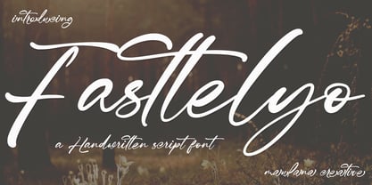 Fasttelyo is an ink-is signature script font. With light contrast stroke, fun character with a bit of ligature and alternates. To give you an extra creative work. Fasttelyo font support multilingual more than 100+ language. This font is good for logo design, Social media, Movie Titles, Books Titles, a short text even a long text letter and good for your secondary text font with sans or serif. Make a stunning work with Fasttelyo font. Cheers, Maulana Creative
 - Chalfont by Alan Meeks,
$45.00 The typeface was designed after seeing a photocopy of some News Gothic text where the ink had faded on the bottom of each character. As character recognition is generally based on the top half of a character, readability was never compromised. Rather like Antique Olive the characters have a top heavy look when viewed straight on, however, as most type is read at an angle with the top further away than the bottom this top heavy look is diminished.
 - Neonoir by phospho,
$25.00 Neonoir is an homage to neon lettering craftsmanship of the mid 20th century. The beautiful futuristic grace of wall-sized bent-glass hand-writing is distilled into a three-weight connected script that’s on the button for headlines, logotype and branding designs. Its Slim and Bold weights are formal monoline scripts, while the medium weight mimics the rough edges of ink on paper. Neonoir is available as an Open Type font that features alternate endings and lots of ligatures.
 - Gromy by Eurotypo,
$28.00 Gromy is a casual, informal and friendly calligraphic font. It come with 561 glyphs, with OpenType features, swashes for all glyphs, stylistics sets, stylistics alternates and a lot of ligatures to play with your texts. Gromy can be used in works that require an informal and original feel, children's books, wedding invitations, greeting cards, posters, labels, t-shirt design, in ink or watercolour based designs, fashion, magazines, food packaging and menus, book covers and whatever your imagination holds!
 - Scapegoat by Hanoded,
$15.00 I have been making some clean, connected fonts lately and when I was working on another one of these, I felt the need for something chaotic. So, Scapegoat was born. I used a round nibbed steel pen and Chinese ink and the result is quite a messy font. It may look chaotic, but as Nietzsche once said: ‘from chaos comes order’. Amen to that! Comes with double letter ligatures for the lower case and a whole lot of diacritics.
 - Buntaro by Hanoded,
$15.00 I am reading a great book by David Mitchell, called Number 9 Dream. One of the characters is called Buntaro, so I decided to call my new inky font after him. Like the book, Buntaro is quite unusual: it has no real baseline, comes with some strange characters, feels familiar, but surprises you nonetheless. It was made with a broken bamboo satay-skewer, Chinese ink and a lot of patience. Buntaro comes with a wealth of diacritics.
 - Message by Wire JNL by Jeff Levine,
$29.00 A Western Union telegram from 1951 provided the typographic inspiration for Message by Wire JNL, which is available in both regular and oblique versions. Unlike other available type fonts which emulate the ink ribbon-struck printed characters from the teletype machines, this version was redrawn to celebrate the actual type design itself. The typeface letter spacing has been equalized so that when in use, it looks much like the printed output of an old telegram messsage.
 - ITC Santangeli by ITC,
$29.99ITC Santangeli is based on an eighteenth century manuscript by Italian writing master Benedetto Santangeli. Giuseppe Errico's design exudes the elegance and patina of a baroque sculpture. The capitals have verve, and the richly flowing ascenders and descenders enhance the vintage panache of the design. Errico has even included alternate characters and ink splotches to enable a realistic reproduction of antique lettering. Whether for large display copy or short blocks of text, Santangeli speaks with resonance and grace. - PLatinum by Letterhead Studio-IG,
$35.00 The pLatinum family was created in 1998. Ink, scanner, Fontographer and as a result Regular and Italic styles of pLatinum typeface. Kyrillitsa'99 International type design competition Award winning typeface. The design style is “Irregular Serif”. The glyphs of pLatinum roman are reminiscent of the Russian types of early eighteenth century—especially in the smaller point sizes. An Italic, surprisingly close to the handwriting copybooks of mid-eighteenth century, is a later addition to the design.
 - Deconstructed JNL by Jeff Levine,
$29.00 Deconstructed JNL is another set of rubber stamp alphabet letters and numbers from a 1930s toy printing set. The original typeface of this set is Cheltenham Open. The stamps were printed out and scanned, creating this limited-character font with dual characteristics. At small point sizes it replicates inked rubber stamp impressions, but in larger format it shows angular lines and erratic character shapes as if made from cut paper or lettering that was intentionally made to look damaged.
 - Thourenz by Azzam Ridhamalik,
$10.00 Introducing Thourenz, a monoline vintage typeface combining with the modern typography style. Thourenz comes with 6 style (Regular, Inked, Rough, Stamp, Outline, Outline Rough). It is perfect to create a beautiful vintage typography on your any project like t-shirt, merchandise, logo, label, poster, magazine, packaging, quotation and more. Thourenz is all-caps font, has 500+ glyphs including many openType features and underlines that you can mix and match each character to get the more playful vintage design
 - Vintage Stencil Borders JNL by Jeff Levine,
$29.00 Vintage Stencil Borders JNL collects twenty-six decorative vintage and antique stencil border motifs for embellishing word copy set in stencil type or for any other decorative purpose. Please note: Commercial reproduction of these designs as stencils, stickers, decals, transfers, ink stamps or other decorative stand-alone products for resale requires a separate license. Contact Jeff Levine through the email address located in the PDF file provided with the font or from the online EULA text.
 - Beau's Varsity by Beau Williamson,
$4.99 I designed this font a few years ago to address a direct problem. My work demanded small paragraphs of text to be screenprinted in a varsity font style. The house varsity was rather uneven and created small blobs of ink at sharp angles when printed. I designed Beau's Varsity to address both of these problems. The new font eliminated the blobbing, and I like to think my original design is a step up in evenness from the other options.
 - Dear Rae, Love Dad by Outside the Line,
$19.00 Dear Rae, Love Dad is a modern calligraphy font drawn by hand using ink and a folded nib dip pen on rough watercolor paper. Best used in Open Type apps, it has automatically changing alternates. It is upright, dramatic, and personal. It is named Dear Rae, Love Dad because who wouldn't like to get a letter signed, Love Dad. There is also a freebie font of several blobs and some hearts. Because it just seems right.
 - Fustier by Nathatype,
$29.00 Fustier is a script font that captures the beauty of handwriting with a mesmerizing twist. The curves and loops dance across the page, evoking the sensation of ink flowing seamlessly from a skilled hand. With an abundance of swinging details, Fustier ensuring a harmonious flow from letter to letter. The generous spacing between letters maintains readability and legibility, You can use this font in headlines, logos, posters, flyers, invitations, name cards, branding materials, and many more.
 - Starlit Neon by Ditatype,
$29.00 Starlit Neon is a delightful display font that combines the elegance of rounded letterforms with the captivating allure of neon lights. With its bold uppercase characters and unique design, this typeface adds a touch of playfulness and charm to your projects. The defining feature of Starlit Neon lies in its rounded letterforms, which exude a sense of softness and approachability. Each letter is meticulously crafted with smooth curves, creating a harmonious and pleasing aesthetic. The rounded shapes give the font a friendly and welcoming appearance, while the neon style adds a touch of excitement and vibrancy. Inspired by the mesmerizing glow of neon signs, Starlit Neon infuses a sense of enchantment and allure into each character. The font captures the captivating charm of neon lights, casting a radiant glow that evokes a magical atmosphere. In some letters, you'll find additional subtle accent lines, which enhance the overall composition with a touch of sophistication. The uppercase letterforms of Starlit Neon are bold and assertive, commanding attention with their rounded shapes. Each letter of Starlit Neon is thoughtfully crafted to strike a balance between rounded shapes and legibility. The uppercase characters are distinct and easily recognizable, ensuring your message remains clear and impactful. The additional subtle accent lines in select letters add an extra touch of visual interest, elevating the font's overall composition. Find out more ways to use this font by taking a look at the font preview. Features: Alternates Multilingual Supports PUA Encoded Numerals and Punctuations Starlit Neon perfect for designs like headlines, logos, and eye-catching titles that seek to make a bold statement with a touch of whimsy. Whether you're creating posters, branding materials, digital artwork, or anything in between, this font will infuse your projects with a sense of joy and uniqueness. It particularly shines in applications related to entertainment, children's products, beauty, and lifestyle themes. Find out more ways to use this font by taking a look at the font preview. Thanks for purchasing our fonts. Hopefully, you have a great time using our font. Feel free to contact us anytime for further information or when you have trouble with the font. Thanks a lot and happy designing.
 - Paralucent Slab by Device,
$39.00 Paralucent Slab is an addition to the ever-popular Paralucent family. Paralucent is versatile all-purpose modern sans and slab serif design. Available in seven weights, from Thin to Heavy, with corresponding italics, it avoids some of the more eccentric calligraphic quirks of Akzidenz or Helvetica or the cool precision of Univers for an elegant, functional, yet warm design. Several core ideas inform Paralucent’s design. Prime attention has given to the negative space between characters, giving a more even “colour”, especially in text. For example, the J, L and T have shorter arms than comparable sans typefaces, while the M and W are wider. The A has a lower bar, opening up the interior counter. An unusually high lower-case x-height again helps to give a more even colour and improve legibility. Care has been taken to rationalise repeated elements like the tails on lower-case letters, or the Q and the “ear” of the g. Typographic design solutions that are consistent across all these features add more stylistic cohesion. ‘Ink traps’ are exaggerated incisions used to open up a letter's narrower internal angles, which can become clogged with ink, especially in small point sizes. Now largely redundant due to the high quality of modern print, they are still sometimes used as a stylistic quirk or design feature. Now that digital fonts are often reversed or outlined, or enlarged to enormous sizes, these can also lead to unexpected or obtrusive results. Paralucent takes these inevitable digital manipulations into account, and adds optical corrections without resort to ink traps. The family has been picked up by many UK and US publishers, featuring heavily in magazines like Loaded, Heat and TV Quick, as well as high-end coffee-table photography books and gallery websites. The addition of the Slab family adds even more options for running text and headline.
 - Lust Script by Positype,
$49.00 Boom. You asked for more, um, well just ‘more’—more swashes, more options, more weights, more of everything. I cannot give you more weights. The design just won’t allow it and anything else would be a compromise or a bastardization of the exemplars just to make money that I am unwilling to do. But, I did give you an overly indulgent, 90% cacao bar and espresso, Lust Script Fine. The ending strokes on these glyphs will literally draw blood. Enjoy it as much as I have. The Lust Collection is the culmination of 5 years of exploration and development, and I am very excited to share it with everyone. When the original Lust was first conceived in 2010 and released a year and half later, I had planned for a Script and a Sans to accompany it. The Script was released about a year later, but I paused the Sans. The primary reason was the amount of feedback and requests I was receiving for alternate versions, expansions, and ‘hey, have you considered making?’ and so on. I listen to my customers and what they are needing… and besides, I was stalling with the Sans. Like Optima and other earlier high-contrast sans, they are difficult to deliver responsibly without suffering from ill-conceived excess or timidity. The new Lust Collection aggregates all of that past customer feedback and distills it into 6 separate families, each adhering to the original Lust precept of exercises in indulgence and each based in large part on the original 2010 exemplars produced for Lust. I just hate that it took so long to deliver, but better right, than rushed, I imagine.
 - Neutraface Slab Text by House Industries,
$33.00 From fine print and red ink in corporate annual reports to huge three dimensional signage, Neutraface has become the definitive designers’ workhorse. Now this geometric juggernaut boasts even more font firepower with the addition of the Neutraface Slab family. Neutraface Slab features five display weights, four text weights with italics plus a unique stencil style that work together like a typographic symphony or can stand alone like accomplished soloists. Just like its sans-serif counterparts, Neutra Slab Text includes small caps, seven figure styles and a host of other sophisticated OpenType features that have been integrated in a single seamless package. The complementary display weights afford an uncompromising statement that can range from thin and delicate to bold and bombastic. FEATURES: MORE ALTS: Neutraface Slab comes with several alternate characters, accessed through either OpenType stylistic sets or through the Stylistic Alternates feature. TITLING ALTERNATES: The distinctive lower crossbars of the original Neutraface are included in Neutraface Slab as the Titling Alternates OpenType feature. TEXT FIGURES: All variations of Neutraface Slab Text feature seven figure styles. Included are text figures for use in running text, lining figures for use with uppercase forms and small caps figures. Each of these styles is supplemented with tabular figures for use in columnar settings. Plus, superscript and subscript figures are included for use in fractions, footnotes, etc. NEUTRAFACE SLAB CREDITS: Typeface Design: Christian Schwartz, Kai Bernau, Susana Carvalho Typeface Production: Ben Kiel, Hannes Famira Typeface Direction: Christian Schwartz, Andy Cruz, Ken Barber Like all good subversives, House Industries hides in plain sight while amplifying the look, feel and style of the world’s most interesting brands, products and people. Based in Delaware, visually influencing the world.
 - Passport48 by Coniglio Type,
$19.95 Passport48 exclusively in otf. opentype format, originally debuted in 1997 as Passport, close to the beginning of the indie typographer boom. Almost 25 years have passed since it was introduced at MyFonts as PS1 and later in 2003 in TT TrueType.** It was designed by Joseph Coniglio of Coniglio Type as a revival. Historically, Passport was digitized from a shiny black enamel 1948 Royal Silent Deluxe portable. Kept on the ship of merchant marine, Captain John O’Learn, it was a salty manual typewriter with no intrinsic value as a collectable, even though it is awash as a work horse and a fine communicator of it’s time.. **NOTE: Little Passport family leaves the nest: The old weight variations, styles and formats have been eliminated to allow the original face to be stand alone, on its own attributes. For those purchasing their first typewriter fonts and to our diehard collectors as well, Passport presents a friendly new port-of-entry. A simple set, that is freed of many of the normal distressed points and paths that had made most “typewriters” authentic looking, but difficult to print and manipulate in layouts back in the day. It’s smooth nature comes from its impressions struck directly onto a piece of carbon paper bypassing the silk ink ribbon and going directly from metal to carbon paper transferring to a piece paper with very little tooth. Examine the glyphs to be certain you have what you need from this minimalist set, Passport48 is intended for ease of use and affordability. This is a warm font in a cold cruel world and a real port in the storm! It is versatile in today’s layouts with 24 years of worldwide sales. …Please enjoy the fruits of its travels, hoping your destinations and explorations into graphic design and letter composition are happy ones. -Joe Coniglio, the Pacific Northwest (2021).
 - Baldufa by Letterjuice,
$66.00Baldufa is a charming typeface with strong personality, which looks very comfortable in text. There is a search to obtain complicated curves and detailed features, which give the typeface a touch of beauty and elegance. However, this is also a self-conscious design that claims appreciation for quirkiness and human imperfection through the rounded serifs and irregular vertical stems. The typeface family is also a multi script project, containing Latin and Arabic scripts. The Latin consists of Regular, Bold and Italic styles, including Small Caps and many other typographic features. Whereas Arabic Naskh includes Regular and Bold weights. The whole family has been designed to work harmoniously together to help to produce catalogues and small publications of cultural content. We believe that Baldufa is a tiny but nice contribution to build bridges between cultures and this make us very happy. The letterforms in the Latin are inspired by the slight distortions and idiosyncrasies that came with old printing methods. It has distinct, features such as rounded serifs, irregular vertical streams, ink traps and extremely thin junctions. In the Italic, serifs have been removed to enhance movement and expressivity. These experiments in form have not come at the cost of legibility: The typeface remains suitable for both small and display text. To certain extent, the design of the Arabic gathers the same interest for experimentation than its Latin companion. Baldufa Arabic respects the basic features of Arabic script such as thick stokes in the baseline, multiple vertical axis, genuine stem modulation and good linking between words. However, it steps away from traditional Calligraphic Style. It has rounded top terminals and the traditional contrast between curves and straight stokes has been softened. Letter shapes sometimes slightly differs from tradition in order to obtain more expressivity. Overall, Arabic has been designed to acquire the same elegant and quirky aspect of the Latin. - Neutraface Slab Display by House Industries,
$33.00 From fine print and red ink in corporate annual reports to huge three dimensional signage, Neutraface has become the definitive designers’ workhorse. Now this geometric juggernaut boasts even more font firepower with the addition of the Neutraface Slab family. Neutraface Slab features five display weights, four text weights with italics plus a unique stencil style that work together like a typographic symphony or can stand alone like accomplished soloists. Just like its sans-serif counterparts, Neutra Slab Text includes small caps, seven figure styles and a host of other sophisticated OpenType features that have been integrated in a single seamless package. The complementary display weights afford an uncompromising statement that can range from thin and delicate to bold and bombastic. FEATURES: MORE ALTS: Neutraface Slab comes with several alternate characters, accessed through either OpenType stylistic sets or through the Stylistic Alternates feature. TITLING ALTERNATES: The distinctive lower crossbars of the original Neutraface are included in Neutraface Slab as the Titling Alternates OpenType feature. TEXT FIGURES: All variations of Neutraface Slab Text feature seven figure styles. Included are text figures for use in running text, lining figures for use with uppercase forms and small caps figures. Each of these styles is supplemented with tabular figures for use in columnar settings. Plus, superscript and subscript figures are included for use in fractions, footnotes, etc. NEUTRAFACE SLAB CREDITS: Typeface Design: Christian Schwartz, Kai Bernau, Susana Carvalho Typeface Production: Ben Kiel, Hannes Famira Typeface Direction: Christian Schwartz, Andy Cruz, Ken Barber Like all good subversives, House Industries hides in plain sight while amplifying the look, feel and style of the world’s most interesting brands, products and people. Based in Delaware, visually influencing the world.
 - Ah, the Edo font by Vic Fieger, you say? Imagine if a brush, after a night out drinking with its inky pals, decided to take a stroll across the canvas, leaving behind a trail filled with personality,...
- The Powderfinger Smudged font, designed by Apostrophic Labs, embodies a unique aesthetic that captures the essence of creativity mixed with a casual, laid-back vibe. This font is part of Apostrophic ...
- Mancave SRF by Stella Roberts Fonts,
$25.00 Mancave SRF is the perfect font for the ultimate party Neanderthal. Holding court in his den with a case of beer, wide screen TV and all of his sports buddies, he is safe and secure in his lair. Bold, brash and angular, this typeface was designed for Stella Roberts fonts by Jeff Levine. The net profits from my font sales help defer medical expenses for my siblings, who both suffer with Cystic Fibrosis and diabetes. Thank you.
 - Agent by Canada Type,
$24.95 Agent was inspired by the classic fun lettering of 1930s Dutch alphabetician Martin Meijer. Casual and playful, Agent is a carefully considered amalgam of the art brush's organic forms and the easily read, ironic forms of the comic book. Ideal for signs as well as packaging of products aiming to be memorable and fun. Agent ships in all common formats, and contains plenty of alternates, as we all as support for a wide range of Latin-based languages.
 - Mauritz Caps by Mans Greback,
$59.00 Mauritz Caps is a brush script typeface. A lively uppercase graffiti-style lettering fonts, Mauritz Caps was drawn and created by Mans Greback in 2021 to be the ultimate set of wild-style handwritings for logotypes and branding. This calligraphy family consists of five high-quality fonts in a variety of weights: Mauritz Caps Thin, Light, Regular and Bold. The font is built with advanced OpenType functionality and has a guaranteed top-notch quality, containing stylistic and contextual alternates, ligatures and more features; all to give you full control and customizability. It has extensive lingual support, covering all Latin-based languages, from North Europe to South Africa, from America to South-East Asia. It contains all characters and symbols you'll ever need, including all punctuation and numbers.
 - Peach Daisy (Duplicate) by Nathatype,
$29.00 Ready to make your branding spark? If you need to create a big, bold logo for your business, work on a poster for an event, or whatever your project may be-then this is the perfect font for you. Peach Daisy-A Sans Serif Font Peach Daisy is a new modern sans serif font. This font was carefully crafted and inspired by luxury fashion in the world. It creates a luxurious, rich, exclusive and elegant look in design. It’s thin brush strokes and imperfect baseline give it a fun and stylish. So beautiful on invitation like greeting cards, branding materials, business cards, quotes, posters, lettering and more. Features: Ligatures Alternates Swashes PUA Encoded Numerals and Punctuation Thank you for downloading premium fonts from Natha Studio
 - VVDS Minorica by Vintage Voyage Design Supply,
$15.00 Hey folks! Glad to introduce you a new MINORICA handwritten collection to imitate a hand lettering style! A complete font kit with graphics give you a fantastic result. A roughen pencil written letters with the same rustic shapes and decorate doodle elements looks very authentically! Play with styles, use the stroke style with inlines, or just a regular. You'll get: Bouncing baseline spooky serif with all caps letters, stroke style and inline decoration Handwritten textured and roughen brush script Bold playful sans with inline and stroke styles. Decoration font with text shapes and doodle elements decoration. A helpful kit to create a funny stuff as greeting cards, t-shirts, advertisement content, cafe or coffee shop decoration, book covers etc. Thank you and Enjoy! VVDS
 - Sandokan by Matyas Machat,
$30.00 Sandokan is a brush script font with a character and morphology that nears Oriental calligraphy, Art Nouveau typefaces, psychedelic “flower power” fonts from the Sixties and Tuscan poster fonts from the 19th century. Its main features are the high contrast between thick and thin strokes and the extreme slanted angle in the typewriter imprints, creating inverse shadowing. The letter set is further accentuated by exotic decorative details and the often unusual connectors between small letters. The typeface supports all languages using the universal Latin character set. Sandokan is a slightly sweetened cultural cocktail. As such it looks best on everything that needs to come across as exotic and rather solid but unmistakeably eccentric - such as labels and packaging on exotic delicacies or circus posters.
 - M XiangHe Hei SC Pro Variable by Monotype,
$1,049.99The M XiangHe Hei Simplified Chinese typeface merges traditional brush strokes with modern letterforms to carefully balance traditional calligraphy with humanist design. Named for the smooth movements of a flying crane, the M XiangHe Hei typeface is designed to glide across the page, and features strokes that are partly derived from the Kaishu calligraphic style – an everyday script which dates back hundreds of years. Seol Sans features Neue Frutiger for its Latin glyphs, and works harmoniously with Neue Frutiger World and Monotype’s CJK typefaces Tazugane Info (Japanese) and Seol Sans (Korean). M XiangHe Hei is a great choice for global brands using sans serif Latin typefaces looking to maintain their visual identity, and communicate with a consistent tone of voice with Simplified Chinese. - Letteria Pro by Latinotype,
$29.00 A triple threat, Letteria Pro is a typographic trio designed for branding and packaging. With the soul of a broad nib pen and the grace of a brush, it has five weights and a lot of style. In order to achieve a pragmatic contrast between a composition’s communication levels, we have created a mechanical typeface with only capital letters in sans and slab versions that elude to a De Stijl style. Ligatures and swashes provide a plethora of options, including Thin, Light, Regular, Bold and Black weights, while its companions offer a single weight. Together, this Latinotype original covers more than 200 languages within the Latin alphabet. Yet another powerful tool for your arsenal of fonts that command consumer attention.
 - Popcorn by Fenotype,
$19.00 Popcorn is a brush script family of Regular and Bold weight and a set frisky caps, Casuals. Popcorn is a strikingly clear and smooth display face with short descenders and ascenders—it’s great for stacked layouts too. Popcorn scripts are equipped with plenty of contextual alternates and ligatures, all set in Standard Ligatures to keep the smooth flow. Besides that there’s also Swash alternates for every standard letter. Popcorn scripts are PUA encoded so you can access alternates with most design softwares. Popcorn Print is a rugged version of Popcorn with rough outlines and nice print texture. Popcorn is a great display family with roots in the past but smooth polished contemporary features. For the best price grab the whole pack!
 - Pickle Sans by Dear Alison,
$24.00Discover why Pickle Sans is the font the makers of Comic Sans don't want you to know about! Why not convey a casual professionalism that is a step above the competition? Pickle Sans is a bold, fun, attention getter of a font that is a cleanly readable brush script with a slightly imperfect hand. It speaks to children, retro enthusiasts, and too many others to list. If you've ever had anyone talk to you like a child, you'll understand how the right message can come out wrong. Avoid giving off that message to your audience and approach them in a casual, mature, yet fun manner. Respect your audience, whether younger or older, and convey your message in Pickle Sans. Try it and buy it today! - Standly by Groen Studio,
$15.00 Standly is a bold brush script that is beautiful and unique, it is a model of a calligraphy writing style. Font features included: - Contextual Alternates - Standard ligatures - Discretionary ligatures - Stylistic Alternates - Stylistic sets Font files included: - Standly OTF Languages supported: Breton, Catalan, Czech, Danish, Estonian,French, German, Hungarian, Icelandic, Italian, Romanian, Scottish Gaelic, Slovak, Latvian, Lithuanian, Norwegian, English, Finnish, Polish, Portuguese, Slovenian, Spanish, Swedish, Turkish, Welsh. Basically, all european languages that are based on latin alphabet Can be used for various purposes.such as headings, logos, wedding invitation, t-shirt, letterhead, signage, lable, news, posters, badges etc. To enable the OpenType Stylistic alternates, you need a program that supports OpenType features such as Adobe Illustrator CS, Adobe Indesign & CorelDraw X6-X7.
 - San Andre by Mans Greback,
$59.00 San Andre is a sport script font. Drawn and created by Mans Greback in 2021, this logotype lettering has a distinct retro style and a strong vintage personality, with a combination of soft brushes and strict backbones. Use multiple underscores to make swashes of different lengths. Examples: Andreas______ Athletics_______ (Download required.) San Andre is built with advanced OpenType functionality and has a guaranteed top-notch quality, containing stylistic and contextual alternates, ligatures and more features; all to give you full control and customizability. The font has extensive lingual support, covering all Latin-based languages, from North Europa to South Africa, from America to South-East Asia. It contains all characters and symbols you'll ever need, including all punctuation and numbers.
 - Fashion Country by Balpirick,
$15.00 Fashion Country is a outline style handbrushed font, meticulously crafted to deliver a distinct and captivating visual impact. With our outline style handbrushed font, each letter is carefully hand-drawn, capturing the essence of the brush strokes to create an effortlessly stylish and modern look. The outline style adds a subtle yet striking touch, making your words stand out with an air of sophistication. The unique characteristics of our handbrushed font make it ideal for a wide range of applications. Whether it's crafting eye-catching logos, designing captivating posters, or composing inspiring quotes, our font seamlessly integrates into your creative endeavors, leaving a lasting impression. This font only has allcaps letters. - also multilingual support Enjoy the font! Feel free to comment or feedback! Thank you!
 - Renata by Laura Worthington,
$25.00 Both casual and upscale, Renata features inviting. languorous letterforms, stroked by the hand of an experienced calligrapher with a small brush-tipped pen. Renata is quite readable thanks to its high x-height and spacious connecting strokes. It also looks exceptionally natural – every lowercase letter includes an alternate of each letter and a beginning, ending, and an “isolated” form (useful for settings like “mar y sol,” “o sole mio”; lettered lists; and creative uses like wordmarks). Renata features 119 swashes for a custom look and feel. See what’s included! http://bit.ly/2fQYX6B This font has been specially coded for access of all the swashes, alternates and ornaments without the need for professional design software! Info and instructions here: http://lauraworthingtontype.com/faqs/