10,000 search results
(0.035 seconds)
- Numis by Tyler Jamieson Moulton,
$11.00 Numis was born out of a coin collecting hobby. A quick survey of coins from the late medieval to modern periods to today led to this unicase design. The rounded corners and smoothed edges are meant to evoke a the slightly worn letterfaces found on old coins; a process that tends to bolden the text before being rubbed away completely.
 - Pulse JP by jpFonts,
$19.95 Pulse JP is a constructivist text and display font that differs from comparable fonts due to its special sharpness and harmonious balance. Its technical and constructed form creates a somewhat artificial impression of special appeal. It is ideal for display on the screen and is used in many projects. Pulse JP is a super family consisting of 48 weights from compressed to expanded in 6 fat gradations each. This opens up a wide range of designs and the possibility of combining typefaces of the same character in a wide variety of variants, or of being able to adapt typefaces to very different conditions. The details of the individual typefaces are coordinated with each other with great precision and perfectly implemented in terms of craftsmanship. In all variants, this leads to a well-balanced typeface with particular sharpness. The very extensive character set supports 120 Latin languages. Pulse JP meets the pulse of the times, which is in a transition away from the humanistic to the classicistic designs. jp Pulse outperforms many other fonts not only in terms of sharpness but also in terms of variety and is therefore always a good choice.
 - Choowee by Vova Egoshin,
$24.00 Funky decorative display typeface with a curvy eye catching character. Choowee can solve many graphical problems. Features and alternates add personality and let you create unique logos, rad graphic identitys and stunning headlines! Package design for food or any kind of products. Posters or music covers. Prints on sweatshirts or t-shirts. Children’s book-covers or comics. Features: ligatures, alternates, case sensitive punctuation. Support: cyrillic, cyrillic extended, latin, latin extended... 1000+ glyphs! Have fun!
 - Sports Wave by Funk King,
$10.00Sports Wave is a specialty font that can be used for sports-themed projects. Previously available as a free version with only the pictograms, Sports Wave has been a popular download. Now we offer you the added usability of a full and extended character set. Some glyphs have been provided to extend the height of the shorter “banner” glyphs. These glyphs are negatively kerned and appear near the end of the set. - Espect Retro by Mans Greback,
$59.00 Espect Retro beckons to the discerning eye with its harmonious blend of the modern and the classic. Its wide, yet hairline-thin structure gracefully extends into elongated serifs, giving it a poised and elegant stance. The extended x-height isn't just noticeable; it's a celebration of design that evokes charm and cuteness in every curve and counter. Espect Retro's lightness radiates a fashion-style sophistication, making it a go-to for classy projects.
 - Nevoa by Océane Moutot,
$32.99 Nevoa is a typeface inspired by the vernacular calligraphy from the streets of Brazil. While walking in the streets of some small towns, I felt so inspired by those rounded letters painted on the walls. That is what inspired Nevoa. Nevoa is a soft and smooth serif typeface, with dynamic curves. It is available in Condensed, Semi Condensed, Regular, Semi Extended and Extended to adapt to various uses, such as visual identity, magazine, branding, ...
 - Mittwoch by insigne,
$24.99 Mittwoch is an extended modern serif and a new companion to insigne's Montag and Dienstag extended sans serifs. Mittwoch conveys a graceful air with its high-contrast letterforms and its ball terminals, but also includes some unique touches that are unexpected for modern faces. Mittwoch includes four different weights and 50 alternate characters, including swashes, more traditional modern letterforms and simplified characters for titling or when a more unique look is needed.
 - Nafta Brush Font by WildOnes,
$4.95 Nafta Extended Font is the Pro version of the free Nafta Font. It features a huge language support, from all European languages to even Cyrillic and Vietnamese. The Font features handwritten marker shapes with natural edges. Nafta Extended is a brush font which you can use and enjoy again and again, for anything from promotional material and handwritten quotes, to product packaging, merchandise, and branding projects. Made by Krisjanis Mezulis ar Wildones Type Foundry.
 - Nadah by Nantia.co,
$12.00 Nadah Grunge Handwritten Greek font is a decorative font. Of course, the font supports Greek character set and a full extended Latin character set with diacritics. The raw, organic feeling of the font it makes it ideal for the food industry. Also, it’s ideal for creating social media content, for branding, poster design, wedding invitations, or any other packaging. So with your purchase, what is included? Extended Latin Characters Greek Characters Numerals
 - Titla Brus by ParaType,
$25.00 Font family Titla Brus was developed as an extension of Titla, released earlier in 2009. New slab serif family consists of 20 members the normal and condensed proportions that present 6 weights from Light to Ultra. The fonts can be used in combination with Titla or by itself in different display matters. Typefaces demonstrate original and catchy way of using serifs -- in some places there are traditional slab serifs, in other places -- one-sided and often there are no serifs in the places where they normally should be. This approach brings to the letter shapes an unusual appearance and peculiarity. Design was developed by Oleg Karpinsky. Released by ParaType in 2011--2013 at first as a set of ten condensed styles and later in extended version enhanced by ten normal styles.
 - Crescendo by Canada Type,
$29.95 A year after the tremendous success of Memoriam in the "Lives They Lived" issue of the New York Times magazine at the end of 2008, Patrick Griffin and Nancy Harris Rouemy teamed up once more to tackle the same project for the 2009 issue. This time the magazine's design concept revolved around a typeface they created specifically for custom vertical malleability, and that can play just as well in single- or multi-color environments. The result was another iconic commemorative issue that shows exotic tri-line letters merging, swashing, extending and flourishing in stunning gold, silver and blue on black on the cover, and in black on white on the inside pages. Just like in the previous year, the issue won multiple publication design and typography awards. Crescendo is that typeface, finally issued for retail by public demand. Just turn your setting into outlines in your favorite vector program, grab single strands and extend away, and do your best alternating colours between strands. Crescendo comes with a limited punctuation set, but accented characters for Western Latin languages are included, and there many, many alternates and ligatures in there as well. This typeface is best used in large display sizes.
 - Decavision by Swedish Columbia,
$1.99Decavision is a display font and is applicable for any type of graphic design, web & print, t-shirts, posters and logos. It’s not intended for text use or at small sizes. A font inspired by Division Of Laura Lee’s icon which was created by Shelby Cinca. The icon itself is inspired by early floppy disc copy-protection and Japanese fighting robot decals. Håkan Johansson picked up where the icon left off and created a corresponding font-family. The font focuses on simple shapes and the copy-protection tab detail to create a pleasing futurist display font. - Rhumba by Stiggy & Sands,
$24.00 A Lost Art Deco Style Reborn and Multiplied Rhumba began as a digitization of a film typeface from LetterGraphics in the early 70's known as "Barrio Lined". Originally only a single typeface, represented by our Rhumba Lined style, it was fun and offered more diversity to expand out the styles of this gem. Playing off the stylings of fonts like Prisma, Rhumba fills in gaps between the various lines of the original to offer 3 alternate looks. The Rhumba family contains 382 characters per font. A comprehensive character map preview is at the end of the poster graphics collection.
 - Green Fuz - Unknown license

- M Ying Hei HK by Monotype HK,
$523.99 M Ying Hei™ is designed by type designer Kenneth Kwok and Robin Hui. Unnecessary details have been eliminated to pursue a minimal form. The structure of characters are well balanced, neat and dignified. Different components of a character are cooperating perfectly in an appropriate proportion. Thickness of strokes are modified according to the number of strokes, thus achieving an even texture throughout the paragraphs. Therefore a perfect choice for prints, user interface and signages. M Ying Hei™ is equipped with 7 weights, which is sufficient for various occasions like matching with different Latin typefaces and handling complex information hierarchy.
 - M Ying Hei PRC by Monotype HK,
$523.99 M Ying Hei™ is designed by type designer Kenneth Kwok and Robin Hui. Unnecessary details have been eliminated to pursue a minimal form. The structure of characters are well balanced, neat and dignified. Different components of a character are cooperating perfectly in an appropriate proportion. Thickness of strokes are modified according to the number of strokes, thus achieving an even texture throughout the paragraphs. Therefore a perfect choice for prints, user interface and signages. M Ying Hei™ is equipped with 7 weights, which is sufficient for various occasions like matching with different Latin typefaces and handling complex information hierarchy.
 - M Young Hei PRC by Monotype HK,
$523.99 M Ying Hei™ is designed by type designer Kenneth Kwok and Robin Hui. Unnecessary details have been eliminated to pursue a minimal form. The structure of characters are well balanced, neat and dignified. Different components of a character are cooperating perfectly in an appropriate proportion. Thickness of strokes are modified according to the number of strokes, thus achieving an even texture throughout the paragraphs. Therefore a perfect choice for prints, user interface and signages. M Ying Hei™ is equipped with 7 weights, which is sufficient for various occasions like matching with different Latin typefaces and handling complex information hierarchy.
 - Kelpt by Typesketchbook,
$55.00 Kelpt font is an extra large super family of 54 fonts! Kelpt has such a big abundance of contrast, styles, weights, X-Hight. Typesketchbook consists of a very usable, clean and modern sans typeface with rounded corner. The font looks clean and geometric but it’s designed with unusual stylistic features to give the Kelpt font a special and unique touch. The complete Kelpt type family includes 9 weights with italic and X-Hight (A1-A3) versions for each of them all in all 54 fonts for a multifunctional usage, especially for cooperative work, such as website, magazine, editorial, publishing , as well as packaging.
 - LC Tejuela by Compañía Tipográfica de Chile,
$29.00 Tejuela (Spanish for “Wood Shingle”) is a neoclassical type inspired by the wooden architecture of the ancient churches of Chiloé, an archipelago in southern Chile; which are World Heritage Sites. This typeface has rough and broken forms but with soft strokes. The neoclassical characteristic of Tejuela is due to the architecture of these temples, which belong to this style but adapted to wood with excellent quality and ingenuity by Chiloé builders using a material available in the area. Therefore, this typeface reflects the tradition of the fonts of that period, but adapted to the coarseness and warmth of the southern wood of the world. Tejuela is useful for extensive texts in literature, history, art and heritage; as also for short and large phrases in headlines according to the occasion. Tejuela has eight variants in Roman and Italic versions, with small caps, Old Style and Lining numbers, ligatures, alternative glyphs, fractions, among other OpenType features; special mention to the capital letters Swash of the italic versions, which serve to generate delicate compositions. In addition, it has two stylistic sets to compose border ornaments inspired by the Chilota Architecture: colonnades and corners, only using the numbers on the keyboard; it is important that the line spacing has the same value as the font.
 - Vtg Stencil France No3 by astype,
$28.00 The Vtg Stencil fonts from astype are based on real world stencils from several countries. All styles offering an extended Latin character set. » pdf specimen «
 - Impuls Pro by RMU,
$35.00 Based on remnants of the Typoart, Dresden, version of Impuls, this is a carefully extended pro-version covering Europe's main languages written in Latein letters.
 - Varial Rounded by Cloud9 Type Dept,
$35.00 Varial typefaces are extra-condensed Opentype™ sans-serifs with small caps, extended character set (european languages support) and extra features (fractions, ligatures and alternatives).
 - Merry Scriptmas by Nootype,
$- Merry Scriptmas is a gift with a lot of ligatures. The font has an extended character set to support Central, Eastern and Western European languages.
 - Amudi Mutamathil by Arabetics,
$32.00 The fonts in this family support the following scripts: Arabic, Persian, Urdu, Pashtu, Kurdish, Baluchi, Kashmiri, Kazakh, Sindhi, Uyghur, Turkic, and all extended Arabic scripts.
 - Megot by Brainware Graphic,
$12.00 Megot is a modern fancy display font with playful feel. Comes with opentype features, Megot also supports multilingual covering Latin based language (Latin Extended Additional)
 - Varial by Cloud9 Type Dept,
$35.00 Varial typefaces are extra-condensed Opentype™ sans-serifs with small caps, extended character set (european languages support) and extra features (fractions, ligatures and alternatives).
 - OK Moral by Tour De Force,
$25.00 Glyphfight at the OK Moral – single weight Western style typeface. High inverted contrast, generous width, decorative serifs, extended Latin support. It is our 103rd release.
 - Azola by Okaycat,
$29.95 The Azola font family is elegant, hand lettered & charming. Azola features extended characters, and contains West European diacritics & ligatures. Highly suitable for international environments & publications.
 - Dondolare by Tour De Force,
$25.00 Dondolare is simple hand-drawn font family. Squarish looking and ready for typography cooking, comes in 2 weights with support for extended Latin character set.
 - Chitchy by Baseline Fonts,
$24.00Chitchy is a rough-hewn heavyweight display face perfect for headlines and emphasis body copy. Extended character set includes foreign language support for many countries. - Engravers Gothic by ParaType,
$30.00 An old extended Grotesque for use in advertising and display typography. Cyrillic version with adding Bold style created for ParaType in 2003 by Isabella Chaeva.
 - Vtg Stencil France No5 by astype,
$28.00 The Vtg Stencil fonts from astype are based on real world stencils from several countries. All styles offering an extended Latin character set. » pdf specimen «
 - Varius by Linotype,
$29.99The shapes of the f-holes on a violin reminded German designer André Maaßen of an italic letter "f". Maaßen used these captivating contours as the theme for his type family, Varius. The name "Varius" is an homage to the manufacturer of the violin that inspired Maaßen's project, Antonio Stradivarius, the most famous manufacturer of violins in music history. Varius has three separate styles. Varius 1 and its italic are the base style of the family, and are typefaces in the baroque serif manner. Varius 2 and its italic are slab serif egyptiennes, slightly heavier than Varius 1's more classical forms. Varius 3 and its italic are semi serif faces; their characters are serifed, but some of the serifs have been cut off. The family is rounded out with two pi faces: an ornaments font (which can be used in conjunction with the text fonts, or on its own to create beautiful borders or individual decorative elements), and a font of musical symbols and notations. Each of the six text fonts has dozens of supplemental ligatures included in their character sets. When these fonts are used in an OpenType-supporting application, such as Adobe InDesign, these ligatures automatically appear in text when the "Discretionary Ligatures" feature is activated. Additionally, the character sets include added alternate glyphs, such as a swash "m" or "n" to finish off a line of text. These can be inserted manually in applications that include glyph palettes (e.g., Adobe InDesign or Illustrator CS). All of the Varius family's letterforms appear slightly narrow, and traces of the wide-nibbed pen can be seen within their forms. Additionally, the shape of a violin's f-hole is a reminiscent element within all of the family's curves. Varius is particularly suited for use many applications, such as body text, newspaper text, display text, headlines, posters, books, screen design, and corporate identity. Use in sizes ranging from body copy text to display and poster format allow the different facets of the typeface to effectively present themselves. The effects can be as versatile as the possibilities! Due to its special character, the typeface could be used in the design of a logo, or within an appropriate corporate design context, to particularly stress individuality. - Perestroika - Unknown license

- Stubble by Aah Yes,
$12.00Stubble is a distressed grunge font with many useful variations that make things easy. It comes in both a Regular and Bold version, and a Smudged version as if the print block has slipped a little bit just at the vital moment. Also there’s 2 jumbled versions with the letters and numbers, and some punctuation, at odd angles and slightly off-whack; there’s 2 versions with little bits of overprint on most of the main characters (as if the corners of the block or stamp have just caught the paper); a couple of Caps Only versions; plus condensed and expanded versions of the main faces. The Bold version is not an exact expanded version of the Regular version, please note, the characters are different (i.e. the misprinting is different) in the two weights. Western and Central European accented characters are included, and there’s a set of replacements for double-letter combinations such as bb, dd and OO, TT, so that 2 different letters will appear - which avoids having exactly the same grunge letter appearing twice in succession (20 or more pairings for each case, all the pairings that reasonably exist) which work as ligature replacements. The whole family constitutes a comprehensive package that offers a great variety of ways of presenting a grunge typeface for display, headlines and posters, while maintaining the thread of the same sans-serif style. The zip package contains both the TTF and OTF versions of the font. Install only one version on the same machine, installing both versions may produce all sorts of erratic behavior. - LFT Etica by TypeTogether,
$35.00 LFT Etica, the-moralist-typefamily-project, was born at the end of 2000, but its development is ongoing, overcoming many hurdles and diversions. The starting point for the designers at Leftloft were the common "cold" grotesk sans serifs, ubiquitous and often badly applied in their everyday visual environment. The challenge was to obtain the same force, versatility and color, but with a much warmer feel. The resulting design has soft strokes, open counters and terminals; aesthetically resting somewhere between a grotesque and humanist sans serif. It successfully combines masculine force with female delicacy. LFT Etica’s wide range of styles, together with a large character set and OpenType features, such as 4 sets of numerals, fractions, several stylistic alternates and a set of arrows and dingbats, allows for a vast variety of applications, be they editorial or corporate.
 - Aspira by Durotype,
$49.00 Aspira: the legible geometric typeface. Aspira is a multi-purpose typeface. It is suitable for both text and display use — for graphic design, corporate identity design, magazines, newspapers, books, reports, advertising, signage, etc. Aspira is a versatile typeface. It offers 112 styles consisting of 8 weights and 7 widths. It offers 56 upright fonts and 56 italic fonts. It offers lining and oldstyle figures (proportional and tabular). It offers small caps, ligatures, arbitrary fractions, and extensive language support. Aspira is a geometric typeface. It offers a fresh geometric personality which is pleasant and not too conspicuous. Aspira is a multi-width typeface. It offers 7 widths — much more than what is currently usual. Aspira is a legible typeface. Many of its details, like its open apertures and subtle variations in stroke width, are designed to enhance its legibility. Free demo font available. Aspira in use: 1 2 3 4 5 6 7 8 9 10. For more information about Aspira, download the PDF Specimen Manual.
 - Kramps by Mvmet,
$16.00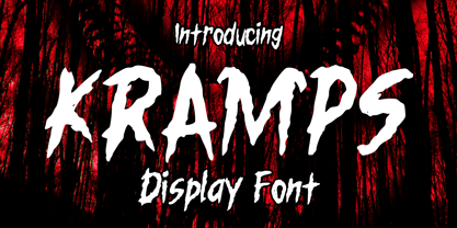 Kramps is a very cool horror display font. It will be perfect for your horror and Halloween-themed needs! You can use it for anything ranging from t-shirts and clothing, to your scary book designs, Halloween party needs, greeting cards, stickers, posters, banners, or anything that needs a horror touch. Try it to create fabulous designs and feel the horror and Halloween vibes with it!
 - Margarine Pro by Stiggy & Sands,
$29.00 Our Margarine Pro draws its roots loosely from numerous inspirations, but its unique thick marker weight and deliberate carrying of rounds into regularly straightened letterforms allows this typeface to stand on its own. The lively letterforms are legible yet slightly offbeat, while the SmallCaps and extensive figure sets expand the range of usability and appeal. Opentype features include: - SmallCaps. - Full set of Inferiors and Superiors for limitless fractions. - Tabular, Proportional, and Oldstyle figure sets (along with SmallCaps versions of the figures). - Stylistic Alternates for Caps to SmallCaps conversion.
 - Masterday by Subectype,
$17.00 Masterday Font is a retro bold script style font, come with clean and rough font version. Inspired from retro typography and lettering in the 70's and 80's combine with bold typography style. This font perfect for vintage and retro design, badge, logos,t-shirt, poster, branding, packaging, signage, book coverand so much more! it has an extensive lingual support, covering European and Asian Latin scripts. The font contains all characters you'll ever need, including all punctuation and numbers. Whats Include: Masterday Multilingual Support Alternates, ligature, Extrude/Shadow Thankyou Subectype Studio

