7,467 search results
(0.011 seconds)
- Figuratika by Studio Indigo,
$17.00 Figuratika with its cut out letters is a bold geometric Art Deco inspired stencil font with a retro 1920 1930 feeling. It was designed as a display font and is best for shorter texts, titles, logos, posters etc. Figuratika has multilingual support for most European languages.
 - Rustler Barter by Showup! Typefoundry,
$20.00 RustlerBarter is an elegant display font inspired by the Art Deco era. It perfectly represents vintage aesthetics in a modern and minimalist way. The font includes special uppercase letters, alternate characters, and beautiful ligatures. Furthermore, the font is perfect for elegant logo design, packaging or invitation cards.
 - Sweet Titling No. 22 by Sweet,
$39.00 Sweet Titling No. 22 is part of the Sweet Collection of engraved lettering styles from the 20th Century, published by MVB Fonts. This obscure, art deco design would have been used for engraved letterhead, business cards, etc., and likely first appeared in the 1920s or ’30s.
 - Great Lakes Shadow NF by Nick's Fonts,
$10.00Handlettering on a 1930s travel poster for the Canadian Pacific Railway provided the pattern for this distinctive Deco typeface. A strong dropshadow treatment has been added so you can create can't-miss headlines easily. Both versions of the font contain characters to support all major European languages. - Augusta Torino Ornaments by Intellecta Design,
$10.00 Intellecta Design, in partnership with Monocracy Types (Paulo W) launches Augusta Torino Ornaments. Classic art deco ornaments digitized from the font catalogues of "Società Augusta Torino", also Nebiolo Fundicion, one of the most important european extinct typefoundry from last century. Soon, more fonts of that collection.
 - Office Staff JNL by Jeff Levine,
$29.00 Office Staff JNL is a version [with serifs added] of Popularity JNL – a condensed Art Deco design based (for the most part) on a popular typeface known in some foundry books as ‘Radiant’ with some reinterpreted characters… and is available in both regular and oblique versions.
 - Paviljoen by Hanoded,
$15.00 Paviljoen (meaning Pavilion or Gazebo in Dutch) is an Art Deco typeface which was modeled on cast-iron lettering on some monumental buildings in Amsterdam. I only had a few glyphs to work with, so I designed the remaining ones myself. Paviljoen comes with extensive language support.
 - Monotype Broadway by Monotype,
$29.99For many type lovers, Broadway is the quintessential Art Deco typeface. Designed as an all-caps typeface in 1927 by Morris Fuller Benton for ATF, it was expanded two years later with a lower case designed by Sol Hess, who also drew the inline version, Broadway Engraved. - Showcard Multiline JNL by Jeff Levine,
$29.00 On page 45 of Samuel Welo’s 1930 instructional book “Lettering Practical and Foreign” is a multi-line alphabet of Art Deco elegance that perfectly captures the spirit of the Streamline era. The digital version is available as Showcard Multiline JNL in both regular and oblique versions.
 - Zagora by CastleType,
$19.00 Based on an art deco design, with alternate characters and numerals. Named for a little town in Morocco on the border of the Sahara desert, with a billboard at the edge of a great expanse of sand that points the way to Timbuktu (several days by camel).
 - Margate JNL by Jeff Levine,
$29.00 A set of water-applied decals manufactured in 1962 by the American Decalcomania Company for Goodyear serves as the basis for Margate JNL. This block-style letter (with a hint of the Art Deco era) is bold, uniform in weight and commands attention in any titling application.
 - Fashion Statement JNL by Jeff Levine,
$29.00 An example of hand lettering from a vintage instructional book was the basis for Fashion Statement JNL; available in both regular and oblique versions. This extra-wide "thick and thin" design is perfect for replicating the classic signage and print work of the Art Deco era.
 - JT Douro Sans by JAM Type Design,
$10.00 Inspired by the art deco movement in France at the turn of the last century and in United States in the 1930s. Boasting over 500 glyphs, with its multiple ligature sets and alternatives, this is a wonderful typeface to use on posters, magazines and on promotional collateral!
 - Reveler JNL by Jeff Levine,
$29.00 The sheet music for "Good Night Angel" from the 1937 motion picture "Radio City Revels", had the movie's title hand lettered in a free form Art Deco sans serif design. This has been recreated digitally as Reveler JNL, which is available in both regular and oblique versions.
 - Bill of Fare JNL by Jeff Levine,
$29.00 A 1942 menu cover for the restaurant at the Biltmore Hotel in Los Angeles features its name in a stylized Art Deco serif design. This is has been turned into the digital typeface Bill of Fare JNL, and is available in both regular and oblique versions.
 - Industrial Arts JNL by Jeff Levine,
$29.00 In 1935, Morris Fuller Benton designed Phenix American for American Type Founders. For 2017, the classic Art Deco design has been reinterpreted in an all-caps display version with an ever-so-slight "hand made" feel. Industrial Arts JNL is available in both regular and oblique versions.
 - Musical Prelude JNL by Jeff Levine,
$29.00 Musical Prelude JNL is a thin Art Deco typeface with some interesting character shapes, and was inspired by the hand lettering on the cover of the 1933 sheet music for "Blue Prelude" by Gordon Jenkins and Joe Bishop. It is available in both regular and oblique versions.
 - Streamlined Stencil JNL by Jeff Levine,
$29.00 Streamlined Stencil JNL is based on a photo of an Art Deco era shipping stencil saying "With Care" which was heavily influenced by the Futura Black style of lettering. The image was seen in the Steven Heller-Louise Fili book "Stencil Type" (published by Thames and Hudson).
 - Sleuth JNL by Jeff Levine,
$29.00 The movie trailer for the1936 film "After the Thin Man" is filled with text lettered in this classic Art Deco condensed typeface. Sleuth JNL seems the appropriate name for this digital revival, as the romantic comedy centers around detective Nick Charles' and his wife Nora's adventures.
 - Movie Production JNL by Jeff Levine,
$29.00 Inside the pages of the August, 1930 issue of “The New Movie Magazine” is an ad for Warner Brothers-First National Pictures – hand lettered in a bold Art Deco sans. This was the basis for Movie Production JNL, which is available in both regular and oblique versions.
 - Discotheque JNL by Jeff Levine,
$29.00 A 1930s casual Art Deco type style with as much influence in 1970s graphic design as in its day was found within the pages of the 1930s French publication L'Art du Tracé Rationnel de la Lettre. Discotheque JNL is available in both regular and oblique versions.
 - Brand X JNL by Jeff Levine,
$29.00 Brand X JNL is a retro-inspired Art Deco typeface with its name being derived from the generic label given to competitor's brands. Whenever a product wishes to extol its virtues without directly naming its competitors and thereby giving reverse publicity to them, "Brand X" is mentioned.
 - Grosin by Linecreative,
$16.00 Introducing "Grosin," a captivating typeface that seamlessly merges the timeless elegance of Art Deco with a modern, condensed form. This font embodies the essence of sophistication, offering a perfect blend of retro aesthetics and contemporary appeal. Grosin's condensed design is a nod to efficiency, allowing it to make a bold statement even in limited space. Its sleek lines and geometric precision capture the essence of Art Deco, evoking the glamour and elegance of a bygone era while maintaining a distinctly modern feel. With Grosin, each character exudes a sense of refined simplicity, making it an ideal choice for conveying a sleek and stylish impression. The font's condensed nature ensures versatility, making it well-suited for a range of applications, from titles and headlines to posters and modern art projects. The beauty of Grosin lies in its ability to transport your designs into a harmonious blend of past and present. Whether you're aiming for a retro-inspired aesthetic or a modern twist on classic design, Grosin stands as a testament to the enduring allure of Art Deco, breathing new life into your creative endeavors. Choose Grosin for a typeface that effortlessly bridges the gap between nostalgia and contemporary chic.
 - Anisette Std Petite by Typofonderie,
$59.00 Geometric font inspired by shop signs in 4 styles Anisette has sprouted as a way to test some ideas of designs. It has started with a simple line construction (not outlines as usual) that can be easily expanded and condensed in its width in Illustrator. Subsequently, this principle of multiple widths and extreme weights permitted to Jean François Porchez to have a better understanding with the limitations associated with the use of MultipleMaster to create intermediate font weights. Anisette built around the idea of two widths capitals can be described as a geometric sanserif typeface influenced by the 30s and the Art Deco movement. Its design relies on multiple sources, from Banjo through Cassandre posters, but especially lettering of Paul Iribe. In France, at that time, the Art Deco spirit is mainly capitals. Gérard Blanchard has pointed to Jean Francois that Art Nouveau typefaces designed by Bellery-Desfontaines was featured before the Banjo with this principle of two widths capitals. The complementarity between the two typefaces are these wide capitals mixed with narrow capitals for the Anisette while the Anisette Petite – in its latest version proposes capitals on a square proportions, intermediate between the two others sets. Of course, the Anisette Petite fonts also includes lowercases too. Anisette Petite, a geometric font inspired by shop signs in 4 styles So, when Jean François Porchez has decided to create lowercases the story became more complicated. His stylistic references couldn’t be restricted anymore to the French Art-déco period but to the shop signs present in our cities throughout the twentieth century. These signs, lettering pieces aren’t the typical foundry typefaces. Simply because the influences of these painted letters are different, not directly connected to foundry roots which generally follow typography history. The outcome is a palette of slightly strange shapes, without strictly not following geometrical, mechanical and historical principles such as those that typically appear in typefaces marketed by foundries. As an example, the Anisette Petite r starts with a small and visible sort of apex that no other similar glyphs such as n or m feature, but present at the end of the l and y. The famous g loop is actually inspired by Chancery scripts, which has nothing to do with the lettering. The goal is of course to mix forms without direct reports, in order to properly celebrate this lettering spirit. This is why the e almost finishes horizontally as the Rotis – and the top a which must logically follow this principle and is drawn more round-curly. This weird choice seemed so odd to its designer that he shared his doubts and asked for advise to Jeremy Tankard who immediately was reassuring: “Oddly, your new top a is fine, it brings roundness to the typeface, when the previous pushes towards Anisette Petite to unwanted austerity.” The Anisette Petite, since its early days, is a mixture of non-consistent but charming shapes. Anisette, an Art Déco typeface Anisette Petite Club des directeurs artistiques, 46e palmarès Bukva:raz 2001
 - DS Rada - Unknown license

- Pritude Radiance by Sohel Studio,
$16.00 Pritude Radiance is a Modern elegant branding serif typeface with Unique alternative , multilingual support with perfect kerning. This typeface is perfect for an elegant & luxury logo , classy editorial design, women's magazine, fashion brand , cosmetic brand, fashion promotion , modern advertising design, invitation card, art quote, home decoration , book/cover titles, special events, Tote bag, T-shirt, Advertising and much more.
 - Giliant by Sohel Studio,
$16.00 Giliant is a Modern elegant serif typeface with Unique alternative , multilingual support with perfect kerning. This typeface is perfect for an elegant & luxury logo , classy editorial design, women's magazine, fashion brand , cosmetic brand, fashion promotion , modern advertising design, invitation card, art quote, home decoration , book/cover titles, special events, Tote bag, T-shirt, Advertising and much more.
 - Unconscious by Pavel Boog,
$18.00 When we fall asleep, we become free in our thoughts, in our judgments, in our choice, we decide on bold actions and words. This font will bring all this to life. UNCONSCIOUS-This font is for brave, free and liberated creators. For people with a good sense of humor and able to derive joy even from bad things.
 - Qwatick by Ingrimayne Type,
$7.95 Qwatick is a decorative serifed family with three weights, each with an italic style. It is squarish and has small serifs. The bold style has high contrast and the regular style remains readable even at small point sizes. The family originated as a reworking of the odd display font Quidic, moving it toward normality and greater legibility.
 - Halloween Rules by AEN Creative Studio,
$15.00 Halloween Rules is a cool-lettered and spooky decorative font. It is perfectly suitable for any Halloween-related project or crafty idea! Add it confidently to your favorite creations and let yourself be amazed by the outcome generated. Halloween Rules is PUA encoded, which means you can access all of the glyphs and swashes with ease!
 - Serid by Samuel Vicente Types,
$22.00 SERID is a display font condensed and regular designed for editorial applications. Inverted contrast, features a serif hybrid that gives a decorative character and personality to the font. Being a display type, intended for use in titles or in small blocks of text, from 24pt. The name SERID comes from the combination of words “SERif” and “hybrID”, resulting SERID.
 - Lillianesque by Bean & Morris,
$35.00 A new romantic serif typeface with Baroque initial caps that can be incorporated to complement the standard set or be set together. Inspired by European architecture of the seventeenth century, the decorative initials fit comfortably with today’s illustrative typographic trends. The standard set offers classic tradition with contemporary touches that can stand alone in display or text sizes.
 - Modern Negra by Sohel Studio,
$14.00 Modern Negra is a Modern elegant serif typeface with Unique alternative , multilingual support with perfect kerning. This typeface is perfect for an elegant & luxury logo , classy editorial design, women's magazine, fashion brand , cosmetic brand, fashion promotion , modern advertising design, invitation card, art quote, home decoration , book/cover titles, special events, Tote bag, T-shirt, Advertising and much more.
 - Hambut by Gatype,
$14.00 Hambut is a handwritten font that includes lots of cute dingbats to decorate your quotes, social media posts, greeting cards, etc. Make a combination of uppercase sans and lowercase scripts and design beautiful projects! Hair is available for various uses. You can use it for commercial projects, monetized social media posts, blogs, digital publications and branding.
 - Fleurons Initials by Wiescher Design,
$39.50Fleurons Initials is a set of elegantly decorated blocked initials, reminiscent of old Jazz and Circus Posters. I have added one set of flat underlays and one of blocked underlays, so you can easily add a little colorful touch here and there. Easy because those underlays have the the same spacing! Have fun. Your elegant designer, Gert Wiescher - Fox Journey by Fox7,
$12.00 Fox Journey is your versatile companion, ready to enhance a wide range of projects. Whether you’re working on blog posts, branding materials, advertisements, invitations, greeting cards, planners, photo albums, decorations, or anything else your creative heart desires, this font has you covered. Try Fox Journey today and experience the magic of handwritten simplicity, sans serif style.
 - Swordtail by Type Innovations,
$39.00 A friend bought me a Chinese calligraphic brush set in a beautifully decorated box. I started to letter the alphabet on parchment, in my own hand, using quick strokes and found the resulting script had an interesting energy to it. After further refinement in my font application software 'Swordtail' was born. A great free-hand script.
 - Ronsley Font Duo by Attract Studio,
$14.00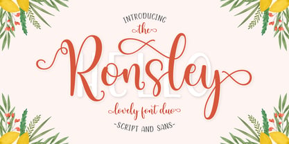 Ronsley Font Duo is a hand-drawn font with a modern look. This Ronsley Font Duo is perfect for any modern project including branding designs, logos, invitations, wedding decorations, website designs, instagram, business cards and more! You can access this easily in most programs. Please check to make sure you know how to access the alternatives. Thank you!
 - Snowmany Snowmen by Comicraft,
$19.00Snow, Snow, Thick, Thick Snow! Sweetly and simply illustrated by the lovely 'Lilou', Our Snowmany Snowmen font features fifty (count 'em) hilarious Snowmen, perfect for creating Seasonal Greetings for homemade Christmas Cards, decorating your children's 'Thank You' letters -- or just print them out for your kids to color while Uncle Frank's shovelling snow out of the driveway! - Arcuata by Eko Bimantara,
$29.00 Arcuata is a serif font family inspired by 1400 classic roman typeface with soft characteristics. It's featured with some uncial letterforms as alternates, for example in 'a' and 'd' letter, it also has a set of decorative capital letters alternates and ligatures. Arcuata complete family contains 10 styles, consisting of 5 weights from Light to ExtraBold with matching italics.
