Bleeding Freaks is a font that resonates with the essence of horror, suspense, and a touch of macabre artistry. It's a font that belongs to the decorative or display category, crafted with the intent...
Ah, Denmark—the font, not the country—is like the cozy sweater of typography: familiar yet stylish, and incredibly versatile. Imagine its letters with a streamlined form that manages to be both crisp...
Tuffy, a font designed by Thatcher Ulrich, stands as an emblem of the versatile and adaptable nature that a well-crafted typeface can embody. At its core, Tuffy is a sans-serif font, characterized by...
Prospect, as crafted by ShyFoundry, is a typeface that distinctly merges the qualities of tradition and modernity, making it versatile and adaptive to a plethora of design needs. This font is charact...
Kovacs, created by Iconian Fonts, stands as a testament to the dynamic and innovative spirit that drives modern typeface design. This font embodies a unique amalgamation of stylization and functional...
The VTCSuperMarketSaleDisplayWired font, crafted by the imaginative minds at Vigilante Typeface Corporation, is a striking display font that captures the essence of high-energy retail environments an...
The font "Pea Neffer," created by Fonts For Peas, captures a unique essence of casual, yet distinctly personal handwriting. As part of the Fonts For Peas collection, which is known for converting sub...
The Jellyka King's Hat font, crafted by the talented designer Jellyka Nerevan, is a testament to creativity and artistic flair in the realm of typography. At its core, Jellyka King's Hat is a script ...
Souplesse (flexibility in French) is a nice, uncomplicated typeface; happy beyond words, yet with a bit of a bite. The glyphs have a rough edge, yet remain very legible. Souplesse comes with a bagful of diacritics.
Reanimatic, a futuristic scifi font. This typeface is a modern display sans serif packed with a reimagination of a dark future technology. This font is perfect for a big size display or title and even logo.
Magsen by Gholib Tammami, $14.00 Magsen is a modern sans serif font that offers a perfect combination of elegance, minimalism, and a semi-technological vibe. This font has been crafted with a focus on simplicity, clean lines, and a contemporary aesthetic, making it an ideal choice for designers seeking a modern and minimalist look.
Regua by Tipos do aCASO, $2.90 Play like a child with letter forms, fill the gaps of a stencil with a ballpoint pen and work this to generate a digital type. Régua (Ruler, in Portuguese) is the result of a typographical joke with the upper cases made by Buggy, a Brazilian typographer, in 1998.
Primordial is a chaotic handmade script font. It is rough around the edges, glyphs are shaky and don’t follow a baseline. Yet, in all this chaos, you will find the budding of a new idea, a glimpse of hope and a glint of something beautiful. Primordial comes in a regular and italic style, plus a back slanted style called Primordial Chaos.
Geulwoll is a Korean word for letters. HU Geulwoll is a handwritten font that conveys a calm feeling by creating a lyrical and old atmosphere. In order to emphasize the feeling of writing with a marker, each end was made to fall diagonally, a characteristic of the marker. It is a highly readable font with a curve applied to the bent part to save the stroke order. There is 1 weight of HU Geulwoll : Medium
Hi! Introducing a vintage layered typeface set named "Pirates Rum". This is an experiment of combining pirate motives with a touch of Gothic. It is a multi-layered decorative font containing a base layer, a layer with internal decorative elements, a layer with a shadow, and a separate aged font. It contains basic uppercase and lowercase glyphs, punctuation, numbers as well as multilingual characters for all kinds of layers. Pirates font, great for labels, logos, headers, and illustrations. Thank you & have a great day!
Brakoda is a delightful sans-serif typeface that effortlessly combines playfulness with a clean and modern aesthetic. Its lively and quirky letterforms exude a sense of fun, making it a perfect choice for projects that aim to capture a youthful and dynamic spirit. With a balanced blend of rounded curves and straight lines, Brakoda maintains readability while infusing a sense of whimsy, making it a versatile choice for a wide range of design applications, from branding and headlines to digital interfaces and creative marketing materials.
Clean, elegant & flexible… Gerard Display is a beautiful rational typeface, a Scotch Roman dressed up as a high-contrasted Didot for this optical size. Its 6 weights and 6 widths made it adaptable and versatile with 36 fonts, from a solid “Compressed Regular” to a broader “ExtraExpanded Heavy” without losing a bit of grace. Gerard Display counts on an extended character set that covers a wide range of Latin languages and a lot of features (as stylistic sets, local forms, or a complete set of figures).
Jasmin by Vincenzo Crisafulli, $29.00 Jasmin is a tribute to the ancient stories of The Thousand and One Nights, in which a main story serves as a connection for a series of other stories, just like all the other glyphs are derived from one of Jasmin's letters or from a sign. A graphic path in which we tried to combine the calligraphy designed with a quill with geometric research. Among the glyphs there is one referring to a letter from a famous font by Paul Renner, made by Fonderia Bauer in 1927.
Alergia Remix, designed by Mateusz Machalski, is the younger sister of Alergia Grotesk. Remixed styles were made as a hybrid between a linear antiqua and a geometric display typeface. Alergia Remix is characterised by a lot of details, which gives it a strong character. Unpredictable construction in the letters a,s,g,e,m,h etc. in combination with a delicate contrast, makes Alergia Remix a good choice for many display purposes . The whole family has a comprehensive set of characters. In additionton to Latin letters, Alergia Remix also has a full set of characters for Vietnamese, extended Cyrillic (with Abkhasian) and Greek.
Are you looking for a font that's as delicious as your favorite food? Meet Tastykare Font! It's a playful, all caps display font that gives your designs a retro-bold, bouncy vibe. Whether you're working on a menu, a recipe book, or a food blog, this font is perfect for anything culinary. Tastykare Font is super versatile, with alternates and multilingual support. So, it doesn't matter if you're cooking up a flyer for a local event or a poster for a big campaign - this font has got you covered. So, go ahead and satisfy your hunger for design with Tastykare Font!
Brava Slab is a family of 6 weights with matching italics. Designed for editorial purposes, it has a monolinear appearance with a humanist construction, open counters and a tall “x height” that give it a right personality for use in branding. Also Brava Slab have a lot of helpful features as a wide range cover of Latin languages and lots of OpenType features that make Brava Slab a useful tool for the graphic designer. A full range of numerals (included old style figures, lining, numerators, denominators, superiors, subs, circled and black circled), small caps, forty ligatures (between standard & discretionary ligatures), a lowercase superior and inferior set and a stylistic set are some of the features that makes Brava Slab a solid choice.
Flix by BA Graphics, $45.00 A powerful yet happy look. A great headline face with a distinct look.
A great fun font a happy-go-lucky font with a loose look.
Loose Leaf JNL is a handwritten script with a disconnected, scrawled look as if either written by a child or done as a casual notation.
Présence is a modern sans serif with a light stroke contrast. The capitals are a bit narrow for a titling use which makes them space-economical without lack of legibility. The lower cases have a normal width for a fluid reading. Its wide range of weights allows it many uses.
Dickybird Doodles? A dickybird is an ordinary bird, not a raptor or game bird. This illustration font has 32 of them. Birds in a cage, on a wire, in a nest. A flamingo, toucan, sandpiper, cardinal, penguin, heron, chicken & rooster, hummingbird, swan. Some line, some reverse and one with polka dots.
Ekberg is based on a sample of poster lettering by Samuel Welo. It's got a spare but stylish and rather modern look. It's a bit of a change from our usual fare, but a gap we need to fill. Ekberg features more than one version of a lot of the characters.
Designed by José María Cerezo, with a geometric style and futuristic touches. A typeface family that offers good results in labeling, posters and big formats. Inspired by art deco with a sci-fi touch, it is a typeface with a strong character and personality. Bravo is a Trademark of BauerTypes SL
This typeface was inspired by a hand lettered sign for a German-themed attraction. A good choice when a legible blackletter face is needed, this font is useful for a variety of designs or for personalizing your Alpenhorn.
Sugo by Zetafonts, $29.00 Created for a skateboard shop logo Sugo is a headline font with a blocky shape, a freestyle finish and a street attitude. Its high readibility and contemporary feel make it the right typeface to mix personality and dynamism.
Razzle Sans | A Whimsical Sans Serif Razzle Sans is a clean sans serif typeface with a whimsical attitude. Playful yet legible letterforms that have a high x-height makes Razzle Sans an excellent choice as a display typeface.
Designed by Alfonso García and Latinotype Team. Rawson is inspired by early humanist sans-serif English typefaces. We have added a bit of Johnston, a bit of Gill and a lot of Latinotype to the font. Rawson is an elegant font—but definitely not a black tie one—with the strength of a geometric sans but as friendly as a humanist typeface. This mixture, though not capricious, gives the font a ‘classic’ personality and a modern look at the same time. Rawson is a typeface with a large x-height, open counterforms and classical ductus. The font is well-suited for branding, signage, packaging and short text. Rawson has a 778-character set that supports 219 languages and includes alternative characters, discretionary ligatures, small caps, a variety of figures and fractions—a wide range of typographic tools to meet different design needs.
Rhizo by Stiggy & Sands, $29.00 A Stylized Sans Serif with a Futuristic Flavor. The Rhizo font began as a digitization of a film typeface from LetterGraphics known simply as "Rodin". The original specimen included standard Capitals and Lowercase, Numerals and limited punctuation. We've fleshed out the original style to include alternates, ligatures and a full character set with all the trimmings. Stylish, gorgeous, a little dark, a little friendly...a variety of attitudes conveyed in this typeface. Opentype features include: Full set of Inferiors and Superiors for limitless fractions. A collection of Standard Ligatures. A small set of Stylistic Alternates Smallcaps Approx. 592 Character Glyph Set: Rhizo comes with a glyphset that includes standard & punctuation, international language support, and additional features.
Gandarita, a vintage serif typeface, exudes timeless elegance and sophistication. With its carefully crafted letterforms, inspired by classic typography, Gandarita seamlessly blends tradition with a contemporary flair. The typeface boasts distinctive serifs that evoke a sense of refinement and nostalgia, making it an ideal choice for projects that require a touch of vintage charm. Its balanced proportions and intricate details lend a sense of authenticity, capturing the essence of bygone eras while maintaining a versatile appeal for a wide range of design applications. Whether used for editorial layouts, branding, or signage, Gandarita imparts a sense of enduring style, making it a standout choice for those seeking a classic serif typeface with a hint of character and sophistication.
Sumera Dita is a contemporary serif font that seamlessly merges classic sophistication with a modern aesthetic. Its refined and elegant letterforms exude a sense of timeless grace, making it a versatile choice for a wide range of design applications. With a balanced and harmonious design, Sumera Dita strikes the perfect equilibrium between tradition and innovation. The subtly sculpted serifs and distinctive letter shapes contribute to its unique character, ensuring readability while adding a touch of personality to any project. Whether used in print or digital media, Sumera Dita brings a touch of refined professionalism to typographic compositions, making it a go-to choice for those seeking a modern serif font with a timeless appeal.
Pofukyso, a captivating monoline handwritten typeface, seamlessly blends simplicity with a touch of whimsy. Its uniform strokes and consistent line weight create a harmonious and contemporary aesthetic, making it ideal for a range of design applications. Pofukyso’s graceful letterforms evoke a sense of fluidity and friendliness, adding a personal and approachable charm to any project. Whether used in branding, invitations, or editorial design, this monoline typeface effortlessly bridges the gap between casual and refined, offering a versatile and delightful solution for those seeking a handwritten touch with a modern twist.
Twirrewyn is Frisian for ‘Whirlwind’. I have always liked the Frisian language; it’s like a crossover between English and Dutch. When I studied journalism in Zwolle (a city close to Fryslân) there were a lot of Frisian students and I did pick up a few words! Twirrewyn is a handmade font family: the fat version was made using a brush and ink; the light version was made using that same ink, but with a broken satay skewer instead of a brush. And yes, you have guessed right, we eat a lot of Satay! ;-)
My wife was watching a baking show in which a Scottish guy attempted to cook a clootie. A what?? A clootie??? Never heard of a clootie! Apparently it is a suet dumpling, containing dried fruits (like raisins) and boiled in a piece of cloth (clootie means ‘rag’ or ‘strip of cloth’ in Scottish). Clootie font is a handmade bundle of happiness. It is rounded, soft and legible and will look particularly good on book covers. And I promise you all: one day I will cook clooties to find out what they taste like!
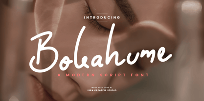
Bokahume is a captivating modern script font that effortlessly blends elegance with a contemporary edge. Its fluid and graceful letterforms flow seamlessly, creating a harmonious rhythm that captures attention. With its stylish swashes and gentle curves, Bokahume adds a touch of sophistication and versatility to any design project. From wedding invitations to fashion branding, Bokahume exudes a sense of refined beauty and modernity. Its balance between classic script elements and a contemporary twist makes it a perfect choice for those seeking a font that embodies both timeless elegance and a fresh, current aesthetic.
Introducing Goïa™, a variable sans serif typeface available in 2 styles: A first one, very readable with a touch of originality, ideal for body text and a second one "Display", more impactful with a more assertive originality. Both styles are available in a variable or static version (9 weights + italics) with many alternates divided into 3 stylistic sets. Whether you are working on a branding project, an editorial project or any other graphic project, Goïa™ is the perfect choice for a modern and elegant look with a touch of personality.