10,000 search results
(0.038 seconds)
- Cameta Cuttes by Gilar Studio,
$16.00 New Font : Cameta Cuttes - Beautiful Script Cameta Cuttes - Beautiful Script will work perfectly for fashion, e-commerce brands, trend blogs, wedding boutiques or any business that wants to appear upscale and chic. Cameta Cuttes - Beautiful Script also Suitable for Logo, greeting cards, quotes, posters, branding, name card, stationary, design title, blog header, art quote, typography, art, modern envelope lettering or book design, happening style like handdrawn design or watercolor design theme, craft design, book title, or any purpose to make your art/design project look pretty and trendy. Features : Uppercase & Lowercase Numerals & Punctuations (OpenType Standard) Accents/Multilingual characters PUA Encoded Ligature Stylistic Set Alternate Check my other Font here : https://gilarstudio.com/
 - Little Ribbon by IKIIKOWRK,
$17.00 Introducing Little Ribbon - Cutie Type, created by ikiiko. Little Ribbon is a beautiful handwritten typeface with bold shapes combining simple lines. This letter is suitable if you want to show a cheerful impression or playful design with solid color. This typeface is perfect for an kids stuff like ads, poster, flyer, or email blast. And also good for packaging product, food & beverages, quotes, or simply as a stylish text overlay to any background image. What's included? Uppercase & Lowercase Number & Punctuation Stylistic & Swashes Multilingual Support Get also a good offer & FREEBIE at our site : www.ikiiko.com Enjoy our font and if you have any questions, you can contact us by email : ikiikowrk@gmail.com
 - Garagin Rock by Rodrigo de Carvalho,
$14.50 Garagin Rock was developed from the studies for the title of a publication called Garagin in 1999. Its use is indicated for the titles on posters and stuff like that, but feel free to dare. Anyway, it really was not made for small sizes and is not a WebFont obviously, but again, feel free to dare. May you notice something odd in the baseline position, this is to keep leading with a defined size. But of course you can change it in any editing program. Being a heavy typeface, use in moderation... or not! Garagin Rock Lite is a version with a limited set of characters.
 - Stripes by profonts,
$41.99 Stripes is a caps only font and does not contain additional ligatures, because there is an easy way to create as many of them as you like. To form a ligature, convert your word or word string into vectors. Activate the corner points of the straight lines (not the round ones) of a letter and drag them over the next or the previous letter. This way you can create any ligature of your own. Beware of overkilling, it could decrease the legibility of your text. Besides the normal J, Stripes contains a stylistic alternate which should be used to avoid ugly gaps between critical letter pairs (see pdf document).
 - Rifleman by Open Window,
$19.95 What a nice tranquil feeling you get from the wide forms of this font. The air of spontaneity was the most important thing about developing Rifleman. The forms were carefully and slowly constructed and then loosely traced with a paintbrush. Maybe the original drawings will become a font someday but i like to think that they won't for some reason. Surprisingly Rifleman is left to only the bare essential elements, anything that wasn't necessary was left out or removed. The goal was to make it as lightweight as possible to make up for the intricate detail. Rifleman is a surprisingly lightweight font offering lends itself to speedy typesetting!
 - Santa Fe by ITC,
$29.99Santa Fe was created by British designer David Quay in 1983. Distinguishing are its script characters and the lower case e, which has the form of a capital E. The letters of this font emphasize the base line. Rounded corners pair with elegant forms to give Santa Fe a flowing, cheerful look. The figures are reminiscent of American advertisements of the 1960s with their light, carefree images. Like with most script fonts, the letters of Santa Fe should be set close enough together that they touch. An added bonus are the various alternative forms with which Quay provided Santa Fe and the many design possibilities which they offer. - Albia Nova by Greater Albion Typefounders,
$9.50 Albia Nova is a bit of a new departure for Greater Albion-an unashamedly futuristic typeface. It was originally developed for a friend of ours-a set designer who needed some lettering on props for a science fiction play-the brief was to evolve conventional letter forms and speculate as to what they may look like in the future. As released Albia Nova is a more refined version of this idea, placing a bit more emphasis on readability (today) over evolution of the letterforms. The result is good for giving design projects a futuristic feel, but also has something of the 1970s and 1980s about it.
 - Nova Sans by This is Not Typography,
$29.00 NovaSans is a modern geometric sans-serif font which captures the spirit of Bossa Nova, a noble Brazilian music style. Music and typography presents several things in commom, so the idea behind the font is show some of bossa nova’s characteristics, like melody, cadence, softness, metric, simplicity, waves, subtleties. Some gaps in representing the source of irregular alignment scores. NovaSans also was selected for Tipos Latinos Bienal, in the Display faces category. NovaSans was built with a modular system. Its whole set offers almost 280 glyphs with alternates, dingbats and ornaments. Conceived to be used as a display typeface, NovaSans is recommended for use at large sizes.
 - Christmas Warmth by HandletterYean,
$14.00 This font is made special for the most wonderful time of the year, Christmas. Enjoy the warmth of Christmas with your family and friends by making a simple Christmas design using this font. It's casual style suitable for your various design needs like greeting cards, posters, invitations, social media posts, advertisements, product packaging, product designs, label, photography, watermark, special event, magazine, web design, etc. To access the alternate glyph, you need a program that supports Open-type features such as Adobe Illustrator CS, Adobe Photoshop CC, Adobe Indesign, and CorelDraw. More information about how to access alternate glyph, check out this link: http://goo.gl/ZT7PqK
 - SIAS Gramma by SIAS,
$29.90 The Gramma font family provides about 240 very basic graphic structures. Compilation of of this set has been inspired not by symblic but by graphical-morphological concerns. Therefore the three fonts (A, B, C) represent the entirety of all possible and simple graphic forms. Glyphs of this kind are likely to be found anywhere: in scripts, in signage, in branding marks – and so on. So, the Gramma font package is applicable to a great variety of usage. Whenever a free choice of elemental graphic motifs is desired – be it ideographical, pictographical or for brand design, this package provides you with nearly any graphic shape imaginable.
 - Anthrope by Ilhamtaro,
$23.00 ANTHROPE is a serif font with a grunge style so it feels like a retro font, with a thick body that makes this font very manly. This font is perfect for designs related to male hobbies such as motorbikes. Besides that, this font is an all caps font, so this will add to the manly impression. All caps here still have the difference between Uppercase and Lowercase, which have different heights and different letter shapes. To enable the OpenType Stylistic alternates, you need a program that supports OpenType features such as Adobe Illustrator CS, Adobe Indesign & CorelDraw X6-X7. Guides to access all alternates glyphs : http://adobe.ly/1m1fn4Y Cheers!
 - Neotoxic by Nocturnal Workspace,
$9.00 Neotoxic Font Family has been published since 2022, and can be downloaded for free on the dafont website. This font supports interesting features such as small caps, ligatures, salts, etc. also consists of 6 font styles including thin, light, regular, bold, black, outline. WHAT YOU GET Features : Small Caps, Ligatures, Ligatures Contextual, Salt. 6 versions normal & italic (ttf + otf) 24 types of font files include Regular, Bold, Light, Hollows/Outlines, thin, Italic, light PUA Encode Characters, fully accessible without additional design software. Includes a range of multilingual characters. Neotoxic is suitable typeface for various purposes like logotype, signage, label, poster, dropcap, titles, letterhead, book cover and etc. Thank you!
 - TA Typefire by Tural Alisoy,
$- Typefire font will be known as TA Typefire from now on. Additionally, Cyrillic, Caucasian Albanian scripts and some glyphs were added. I made some slight modifications to letters. I hope you like it. Much love! TA Typefire is perfectly suited for editorial design, branding, magazines, logos, headings and more. TA Typefire OT Features: aalt, calt, case, dlig, dnom, frac, kern, liga, locl, numr, ordn, salt, sinf, ss01, ss02, ss03, subs, sups Supported Languages: Western Europe, Central/Eastern Europe, Baltic, Turkish, Romanian, Cyrillic, Caucasian Albanian Amount of glyphs included 456 Latin Plus languages supported 94% Latin Plus diacritics included 88% source: underware TA Typefire graphic presentation at Behance
 - Omaha Beach by Scratch Design,
$12.00 Introducing Omaha Beach Font! It's a modern script font with a dry ink brush style. It's highly recommended for you who want to make some designs with natural brush handwriting with signature style. Omaha Beach Font will work for the company logo, signature logo, name card design, invitation design, wedding design, poster, packaging, book cover title, quote, social media post, etc. Just open your Opentype features ( Minimum Compatible with Adobe Photoshop CS 6 and Adobe Illustrator CS 6 ) while using the script font to use the ligatures, stylistic alternates, and swashes. As you type, your text will look like a natural signature or handwriting.
 - Nouveau LX Stencil by Vanarchiv,
$31.00 The original design came from Berthold Herold typeface, designed by Hermann Hoffmann during 1913 (Art Nouveau style) in Germany. This project started from flyer printed during 1947 with movable type, the specimen was scanned as a source to development some of the uppercase letterforms. However the most unusual and tricky element from this sample is the leg from the uppercase (R) which is different from the original Herold design, until now I didn’t found where this version originally came from. This stencil typeface only contain the bold weight, but there are also available other versions without stencil cuts, like Nouveau LX and Nouveau LX Expanded.
 - Dex Gothic by Linotype,
$29.99Dex Gothic is another sort of stencil type. Instead of the "normal" routine of blocked-out horizontal or vertical areas, Dex Gothic creates its stencil appearance through the unique placement of diagonals. The result is a technical-like appearance, which bears some resemblance to 1980s technology products. Dex Gothic should be used large in headlines or logos. - Ryden by Graphicfresh,
$18.00 Ryden - A Handwriting Display Font In making this font, I spent a lot of time thinking about handwriting with a display style. Each letter is carefully made to look as natural as possible. This font is suitable for use in brands or logos with the theme of handwriting. I hope you like the font we made. Thanks
 - Tudeprins by Bogstav,
$17.00 Tudeprins is not a really positive word - the font probably did deserve another name, but I was inspired after reading a children's novel, starring a "Tudeprins" The font is dedicated to children's books, adventures, comics or something related to that - but feel free to use "Tudeprins" for anything you like! Comes with multilingual support as well as contextual alternates!
 - Petroles by Punch,
$9.50 Petroles was designed to transform from an elegant lightweight into a funky heavyweight to create a more casual attitude, giving it the ability to perform in all sorts of designs, coming with several OTF features to adjust it to your likings. Each weight has a complimenting set of almost monoweight small caps to easily bring contrast & variation.
 - Nodhe by Wontenart,
$18.00 Fonts with special characters in lowercase vowels: a, i, u, e, o Make sentences more colourful. This font is neutral for use in any product. Especially for happy things, or life motivational words. or contemporary like the teenage years, discover the beauty of harmony in your work with this font. The right choice of fonts, makes a great product.
 - Balicot Sweet by Sulthan Studio,
$12.00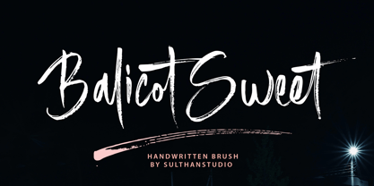 Introducing Balicot Sweet! A natural, Handwritten brush font that is written quickly like a signature . Balicot sweet is also very attractive with a fresh look; provide stylish scripts that are guaranteed to add traction to your logo designs, brand image, handwritten quotes, product packaging, merchandise & social media posts. Including alternative characters. Coded with Unicode PUA Thanks for viewing :)
 - Mercantile Display NF by Nick's Fonts,
$10.00This older, somewhat funkier relative of the classic face, Engravers Roman, made its last appearance in the 1912 ATF Specimen Book. Here, it has been revived to do yeoman-like duty in a new century. This font contains the complete Latin language character set (Unicode 1252) plus support for Central European (Unicode 1250) languages as well. - Boutiera by Melvastype,
$32.00 Boutiera is an upright and soft vintage script with a modern twist. Its main characteristics are bouncy baseline, round forms and bumpy stems. These qualities gives Boutiera its casual, friendly and handmade looks. It has three weights to give contrast and options to your typographic elements and designs. Boutiera has two sets of Upper cases; Slightly swashy and more basic one. The more basic set can be used in all caps. Boutiera has positional alternate characters; Initial forms to letters like r, s, x and z. And final forms to all lower cases. Those final forms have a shortened upstroke to give more balanced and harmonized look. You can use these easily by enabling Contextual Aternates from OpenType menu. It also has alternate versions of letters t and s. You can use Boutiera on logos, packages, on titles or wherever you need a friendly and lively font.
 - Sponger by Mans Greback,
$49.00 Spongy is a rubbery sans-serif typeface. It has round, soft shapes but a stiff and funny character. A quirky, clowny font, Spongy's highlighted cartoon letters looks like levitating balloons. Drawn and created by Mans Greback in 2021, this comic lettering has a satirical style and a light-hearted personality. It is provided as Highlighted, Bold, Light, Solid and Outlined! The combination of these jolly jelly fonts makes for the perfect set of party and birthday types. The font is built with advanced OpenType functionality and has a guaranteed top-notch quality, containing stylistic and contextual alternates, ligatures and more features; all to give you full control and customizability. It has extensive lingual support, covering all Latin-based languages, from North Europe to South Africa, from America to South-East Asia. It contains all characters and symbols you'll ever need, including all punctuation and numbers.
 - Hebden by Lewis McGuffie Type,
$34.99 Hebden is a ‘Northern’ font. Inspired by the town Hebden Bridge in Yorkshire, the family is a mix of a grotesque and an incised serif. The grot is based on Victorian train station signage and the serif is style that can be spotted in and around the Yorkshire Dales region. Hebden has a nostalgic twist and is ideal for labelling, signage and memorable messages. The grotesque face with its robust angles and warm circular curves recalls the style of traditional English sans-serifs like Caslon’s 2-Line Egyptian. The incised face has strong but sophisticated and natural forms and is based on a wood carved style popular in the early 20th century. The weight of the two faces are are drawn to complement each other creating an evenly balanced combination. Both faces come with caps, lower caps across letters and numerals, and have Western, Central and Eastern European language support.
 - Rialto Script by Zuzanna Rogatty,
$39.00 Rialto Script is inspired by old polish neon signs and their very imaginative and expressive lettering. Neon signs were designed by great Polish artists and architects during communistic times in Poland. A large number of alternates and swashes make every word unique, just like the neon signs were in this period. The typeface is designed to evolve as your type. It contains contextual alternates, basic and discretionary ligatures, initials and swashes. There are swashes for capitals, beginning and ending swashes in lowercase, plus dash swashes in lowercase. Lower and upper case contain a set of block letters which you can find by turning on Small Caps. Rialto Script is a monolinear display swashed script and came from dynamic and rhythmical handwriting. All of the glyphs sit slightly above the baseline with a slanted axis. Rialto is perfect for titles, logos, signs and of course, neon signs.
 - Testament by Canada Type,
$24.95 From the standpoint of calligraphy, a font family of capitals and uncials makes perfect sense. The Roman square capitals, the quadrata, are matched by round capitals of older Greek origin; the word "uncus" means hook-shaped like a beak or talon. Interrelated and often interchangeable, these capital letters served as book hands for both the Latin West and the Greek-speaking East before they evolved into minuscule alphabets. The Testament family is based on the few formal capital manuscripts of the Bible, Virgil and Homer that have survived from the ancient world. Throughout the Middle Ages both uncials and square capitals were used, often together, for headings and initial characters. By their nature the Roman capitals are the voice of Caesar and hold the place of authority, while the uncials speak for the Church in a balanced relationship. In ancient times church and state were not as separate as they are now, and the alphabets were not as different as typographic tradition has made them. In this calligraphic rendering it is clear that they are of the same substance and can be written in the same style, conveying even to the modern eye the eternal and classical quality of epic and scripture. Testament comes in all popular font formats, and includes support for a vaster-than-usual range of Latin-based languages.
 - P22 Operina by IHOF,
$24.95 Operina is based on a 16th-century lettering model of the scribe Ludovico degli Arrighi (Vicentino Ludovico degli Arrighi) used in his 1522 instructional lettering book, "La Operina da Imparare di scrivere littera Cancellarescha." This book contains what is considered to be the earliest printed examples of Chancery Cursive. Rather than try to reproduce a perfect, smooth, type-like version of Ludovico's hand, which has been attempted in the past, the designer opted to leave in some rough edges and, thereby, create a look that mimics the endearing artifacts of quill and ink lettering on parchment. When reviving an old style, a designer is faced with many challenging decisions, such as whether to aim for ultimate authenticity or to modify the alphabet for modern use. The decision here was to create a font that resembles the 16th-century Italian hand-lettering master's, but is also useful to the contemporary user. Because the letters U u W w J j and our modern Arabic numerals were not in use during the advent of these original letterforms, these had to be interpolated. To make a complete and useable font set, we also had to fashion many of the extra and diacritical characters to match the look of the alphabet. There are three fonts in this set: Romano(simple), Corsivo(more complex), and Fiore(swash). Romano is the most subdued, it contains Roman looking caps and has lining figures. Corsivo is more elaborate, it has more decorative capital letters and an alternate version of the lowercase with longer ascenders and descenders, and old style figures. Fiore, the swash font, is the most elaborate with the longest ascenders and descenders. You may not wish to use the Fiore version on its own, especially as all caps; it is meant to enhance the other two alphabets because it contains the most elaborate capitals and has many extra ligatures. P22 Operina Pro is an OpenType version that contains over 1200 characters. It features Small Caps, Old Style Figures, full European, Cyrillic and Greek character sets and a new OpenType first with automatic Roman Numerals. Just type any number and with the feature, it will convert to Roman Numerals!
 - Burger by Lián Types,
$25.00 Inspired in the world of the fast-food, my aim with Burger was to achieve a sexy slab serif font. Since it's not very common to see slabs with swashes I consider this project as an experiment with interesting results. In order to mantain an even weight on the written word, all the glyphs including the swashy ones had to look like compact blocks: This makes the font work much better used with almost no leading, as seen in posters above. Despite the formal look of its genre, this slab serif is also very playful and unique. (Maybe unhealthy food deserves better fonts already, right?) Taste Burger, come on, give it a try! On a more personal note: Why I made this font? Some months ago I started the gym and with it, an strict diet to see some results faster... Maybe my temptation is being, in Lacanian terms, "sublimated" by making delicious and unhealthy fonts.
 - Phone Pro Hebrew by Tamar Fonts,
$30.00 Note: the 'Phone Pro Hebrew' typeface, includes just the Hebrew characters of the comprehensive "Phone Pro" family font, sold separately [on this MyFonts site], so they are economical for those interested just in the Hebrew Characters. And regarding the “Phone Pro” project in general, this is what I wrote: 'PRISTINE'; this font is—neither beautiful nor ugly, neither vigorous nor weak, neither traditional nor modern, neither serif nor sans serif, neither script nor printable, neither a text font nor a display font—it is rather all of the above, which makes it a more versatile typographic tool—[handwritten] characters that are well-suited for a wide variety of applications—from editorial design, [friendly] greeting cards... to branding, advertising, publicity and digital. Each glyph design combines its unique shapes and stylish ink-traps with parabolic curves. Each glyph design has been treated as an 'individual character'—the way I would treat a breathing, living, vulnerable and courteous human being; looking after each and every character as if it was my only child — bringing to light the authenticity and uniqueness of each individual, as well as my objective to bring about peace and harmony between them all as a whole. Designed with the intention of harmonizing between four scripts — Latin, Cyrillic, Greek and Hebrew; the whole family has a comprehensive set of characters—in addition to the Latin letters, the Phone typeface also has a full set of characters for Vietnamese, partially extended Cyrillic, Greek and Hebrew (sold separately). The t_t ligature is something unique to Phone, as well as the t_z ligature, among others and extras. A distinctive trait of the Phone typeface, is a high x-height combined with relatively short ascenders. The Phone typeface is in a way evoking the feeling of some Gaelic font and of the [Egyptian] Papyrus font (by Chris Costello, though, not being based on neither of those), having an exotic and an exquisite look, under the category of "Soft Fonts & Friendly Faces".
 - Glance Sans by Identity Letters,
$29.00 Geometric, stylish, and not quite a stencil face: Glance Sans is the urban alter ego of Glance Slab—a strong-willed sans-serif with no frills but a few unique character traits. Glance Sans follows the design principle of nonjoining parts that made Glance Slab successful. Some strokes may not connect to their stems, creating visible gaps and thus, a dynamic impression of balance and movement. However, Glance Sans has a calmer appearance due to the lack of detached serifs. If Glance Slab’s home territory are large, crowded stadiums and massive sports events, Glance Sans prefers streetball courts, well-used skate parks, and underground clubs. It also adapts to urban work environments from finance to high-tech. Whenever a more toned-down look is called for while retaining the elegance of an athlete, Glance Sans is ready to roll. In the city environment, versatility is key. That’s why Glance Sans sports 7 weights as well as a complete set of italics. These are not just sloped romans but individually drawn letterforms, subtly referencing classic italic construction for more effective emphasis. Among the 600+ glyphs of Glance Sans, you’ll find goodies such as six sets of figures, circled numbers, circled arrows, and all kinds of currency symbols in two stylistic versions. Glance Sans is a great tool for industrial and high-tech branding, for wayfinding systems in contemporary or modernist architecture, for corporate identities in arts, crafts, medicine, culture, and education, and for all kinds of sports-themed design. Both members of the Glance superfamily are easily and effectively combinable; both are able to stand on their own feet. With its powerful italics, you might opt for Glance Sans as your text typeface and use Glance Slab for headlines. Or you set large, clean, display-sized lines in Glance Sans and spice them up with a bit of sportive Glance Slab. It’s up to you to decide how to bring out the best in both of them.
 - Ramadhan Day by Pixesia Studio,
$29.00 Introducing Ramadhan Day - Arabic Style Display Font Ramadan Day is an Arabic display font that brings a modern and elegant look to your designs. With its flowing curves and sleek lines, this font is perfect for creating striking and sophisticated headlines or logos. It is also great for invitations, greeting cards, posters, and other designs related to the holy month of Ramadan. This font is fully Unicode-compliant, making it easy to use in a wide range of design software. Whether you're a professional designer or just looking to add some flair to your personal projects, Ramadan Day is a versatile and stylish choice. FEATURES - Stylistic Alternates - Ligatures - PUA Encoded - Uppercase and Lowercase letters - Numbering and Punctuations - Multilingual Support - Works on PC or Mac - Simple Installation - Support Adobe Illustrator, Adobe Photoshop, Adobe InDesign, also works on Microsoft Word Hope you Like it. Thanks.
 - Kaboore by Twinletter,
$17.00 Introducing our newest font Kaboore, a retro condensed themed font, is a clean and modern typeface that gives off a strong, unique, and clean impression. Its thick, sturdy appearance is perfect for creating attention-grabbing titles and headlines. it is slightly compressed so it works well in medium or large font sizes while maintaining legibility. This Kaboore font is designed with 2 styles in the form of the slab and sans, also enriched with optional ligatures, so use this font immediately to get your project extraordinary. What’s Included : - All glyphs Iso Latin 1 - Alternate, Ligature - Simple installations - We highly recommend using a program that supports OpenType features and Glyphs panels like many Adobe apps and Corel Draw so that you can see and access all Glyph variations. - PUA Encoded Characters – Fully accessible without additional design software. - Fonts include Multilingual support
 - Seashore Pro by Sudtipos,
$59.00 A feminine, graceful script whose thicker horizontals create a wave-like rhythm — hence the name. Seashore is loosely based on an "eccentric" (left-leaning) penmanship style of the late 19th century. Used mainly by professional "engrossers" in certificates and tributes, or by society ladies in their stationery and invitations, it sent a message of true refinement, as the style would have been only been mastered after the more common business, Spencerian, and standard ornamental styles. In fact, unusual script styles were in such demand that type foundries of the era exploded with metal-type knockoffs of increasing fanciness. Seashore includes a wide variety of swash capitals, alternate endings, and contextual ligatures, over 900 glyphs in all. Seashore is best used in short display settings — in names and addresses on formal invitations, in menus and food packaging, or fashion and beauty contexts.
 - Fagumeh by Twinletter,
$18.00 Get ready to add a touch of vintage charm to your design projects with Fagumeh font! This retro condensed font boasts a unique and high form, making it perfect for a wide range of design themes. Its stylistic sets and alternate characters offer a playful and distinct touch, while its unique ligatures add an extra touch of character. Fagumeh is the perfect font for any project that needs a touch of vintage flair and versatility. Upgrade your designs today with Fagumeh font. What’s Included : - File font - All glyphs Iso Latin 1 - Alternate, Ligature - Simple installations - We highly recommend using a program that supports OpenType features and Glyphs panels like many Adobe apps and Corel Draw so that you can see and access all Glyph variations. - PUA Encoded Characters – Fully accessible without additional design software. - Fonts include Multilingual support
 - Naive Inline by S&C Type,
$8.00 Naïve Inline is a layered serif handwritten font designed by Fanny Coulez and Julien Saurin in Paris. Our goal was to draw a font with finely irregular lines that give a human and whimsical feeling. We designed three weights to assure a good readability whatever the size. They can be enhanced with five different interior patterns and three shadows to improve your designs and bring a charming and unusual feeling. To do so, you can simply superimpose the layers with a compatible software like Photoshop, the weight above and the pattern(s) below, then choose a color for each. This font is part of our Naïve superfamily that contains lot of variations: Line, Inline, Serif, Sans Serif, and a special Art Deco one. Just click on our foundry name to see them all! We hope you will enjoy our work. Merci beaucoup!
 - Feltro by Ndiscover,
$24.99 Feltro is a Handmade Brush Script full of personality. Because of its fast brush strokes the design looks really fresh and full of identity. It has a total of 9 variants that will give you a lot of customisation options. Outline, Shadow, 4 Textures, and also Textured Outline and Shadow. You can combine the 9 styles in different manners and create colourful typographic expressions. Feltro is loaded with features, like terminal forms, ligatures and contextual alternates, so that you have even more stylistic options. It has a large latin language support across all the 9 styles so you can use it with confidence in all styles. You can use Feltro in advertising, branding, merchandise, web headlines, and more. Make sure you buy the full family and benefit of a massive discount. You can see feltro in action on this short video.
 - Queulat Soft by Latinotype,
$- The font is the soft version of the Queulat basic and condensed families, but keeping the same features as the original typeface. Queulat Soft is a hybrid font that combines different styles, reflecting charm, freshness and, especially, a strong personality. The font is inspired by Modern and Grotesk styles. The former is shown in some characteristic features such as teardrop terminals, which give the typeface an attractive unique look, making it an ideal choice for logotypes and labelling. The latter, with its rationality, makes Queulat Soft a stable and strong face for headings and subheadings. The combination of styles can be clearly seen by comparing the Regular with the Alt version. The Regular version is more simple than the Alt one. Differently, the alternative version possesses more features of the Modern style, like teardrop terminals in ‘k’ and ‘v’.
 - BottleKaps by Type Innovations,
$39.00 Alex Kaczun, originally designed BottleKaps for Linotype-Hell, in 1992, as a QuickDraw GX multi-master font series. A few new GX applications, like 'Unicorn', where able to utilize these unique fonts. The GX application allowed the user to adjust weight and proportions, on the fly, including glyph substitution for small capitals, old style figures, swash and alternate endings. The technology was never successfully deployed by Apple, so the individual fonts, 21 styles and variations in all, where sold in the Linotype Font Library as separate Truetype fonts up until 1998. Unfortunately, the fonts collected dust for many years thereafter, but now have been reworked and rejuvenated by Alex in OpenType format for both Mac and PC. 'BottleKaps' is a 'unique', 'playful' and 'decorative' font series. Use it for those bold headlines to stimulate interest and show off your 'unique' individual style.
 - Bremer Presse by Schraube,
$29.00 As most successful German private press, «Bremer Presse» has strongly influenced German book art. It was founded 1911 in Bremen to print and produce books in perfection. The role model of the press’ typeface was the english Doves Press. Willy Wiegand drew three versions of the «Bremer Presse» antiqua font, starting with the regular weight in 16 pt and adding later the regular weights in 11 and 12 pt. The revival of this beautiful font is based on the 12 pt weight. During the design process, the focus was laid on finding the elegance and strength of original prints. As it was designed to print books, the typeface is optimally used for texts. And with the revival’s new weights «medium» and «bold» and OpenType features like ligatures or old style figures, you can design sophisticatedly typographical compositions.