10,000 search results
(0.037 seconds)
- Waltograph UI - Unknown license

- MT Bleu Feelin Mono by MametosType,
$20.00 MT Bleu Feelin — is a display font with a monospace typographic feel. Please pay attention to Small Caps, Oldstyle Figures, and Alternates. Good for music album covers, posters and magazines. Inspired by the electronic band from Bandung, Bleu House, which has a light and edgy electronic pop experimental music character, the idea emerged to create a font that changes from sound to visual language, namely font. The use of the design for this font is for Display, and while it is issued one regular weight, in the future will develop multiple masters and other experiments. The design concept of the MT Bleu Feelin Mono Regular font is to take a 45 degree diagonal and geometric cut technique. also every corner is rounded which gives a dynamic impression like electronic music. I created this font design because I like visual experiments, and applied it to the character of the font. By using monospaced font characters have an even width. This is a unique feature in that most fonts are 'proportionally' spaced with characters varying in width. While monospace is perfect in certain ways, it is a proportional font that reigns supreme. Proportional fonts are faster to read. however, the MT Bleu Feelin Mono Regular font is intended for display fonts. MT Bleu Feelin Mono Regular supports language settings - Western Europe - Central Europe - Southeastern Europe - South American - Oceania - Esperanto
 - Green Berry by Gassstype,
$28.00 Introducing of our new product Green Berry it is a unique font and also has vintage display 2 style font. Can make it easier to convey the message in your design. Use for awesome display, labeling, movie sceen, poster, movie title, gigs, album covers, logos, and much more.
 - Gokil by Eotype,
$12.00 Gokil is an unique bold display font with rounded edges. You can use this font in retro, vintage, and hipster designs. This font is perfect for a variety of projects, such as branding, poster displays, logo designs, magazines, headlines, stickers, and more.This font also has alternate and ligature features.
 - Nadsat by Typogama,
$19.00 Nadsat is a unicase display typefaces with a condensed, art deco styling. Best suited for short texts or display settings, the lowercase and capital letters can be combined to offer more layout possibilities. The typeface also includes a series of ligatures and alternate characters for even more layout options.
 - Furriatt by DVType,
$16.00 Furriatt is a heavy weight bold all caps display typeface. It’s perfect for posters, logos, merch, covers and all stuff you want to print or display in larger format. Font also contain alternative characters set, you could match it with standard glyph to get the best rhythm of letters.
 - MBF Dimension Drive by Moonbandit,
$18.00 Dimension drive is a modern wide and quirky sans serif display font. Wavy lines paired with geometric and sharp edge to emphasize dynamic in the design. This typeface design is a perfect for a modern theme. Best usage on logo, poster, display, headline, t-shirt design and many more.
 - Rachee by Studio Sun,
$18.00 Rachee Display is a modern serif typeface. Inspired by late Renaissance-era type and intended for display font, perfect for logotype, logogram, title, caption, and more. Rachee comes with 6 weights with some opentype features (Linnning figure, full 'ff' ligature, luballin avantgarde ligature, stylistic set, fraction, and more).
 - The Monokill by Eldertype Studio,
$15.00 The Monokill is modern vintage display typefaces, This font has 2 styles, namely clean - textured which will make the display look good. Choose between varying texture strength for your desired effect. Already PUA Encoded and I think this font is perfect for Logos, Advertising, Apparel Design, Labels, Signage, Etc.
 - Somaton by ParaType,
$25.00 This original display family was designed by Vladlen Erium in 2000 for advertising and display typography, especially for advertising of teenage goods and services. The caps-only face has modern letterforms, dynamic slanted styles, and stable upright ones. It is very useful for creating a memorable product image.
 - Kish by That That Creative,
$15.00 KISH is a super quirky display type with reverse contrast. Imagine if the old west and the 70s had a lovechild with a sense of humor; now imagine that that child was a display font. That's KISH. It's the perfect typeface for adding sophisticated playfulness to any design project.
 - Chilia by Craft Supply Co,
$15.00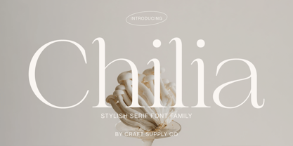 Chilia is a stylish serif font where contemporary upper serifs meet a feminine allure, making it ideal for beauty and display purposes. With its unique blend of modern and elegant features, Chilia adds a touch of sophistication with eye-catching presence that perfect for captivating displays that demand attention.
 - Wishful Gloria by Invasi Studio,
$17.00 With its loop, curly, & playful strokes, Wishful Gloria creates a display font. The font comes in uppercase all caps with OpenType features. Alternate characters and ligatures can be used to give the composition a unique feel. Suitable for display needs such as quotes, branding, logo, poster, cover design, etc
 - Bajt Rounded by Fontsphere,
$12.00 BAJT Rounded is a futuristic all-caps display font. It was created as a rounded version of the BAJT Font. Use for awesome display, illustrations, posters, logos, t-shirts, titles, and much more.. The font includes multilingual support (Latin-1), uppercase letters, numerals and a large range of punctuation.
 - Mindsight by Get Studio,
$23.00 Mindsight Funky Retro Display Font is a vibrant and energetic typeface that captures the essence of vintage aesthetics. With its playful curves and bold strokes, it adds a touch of nostalgia and creativity to any design project, making it perfect for eye-catching headlines, posters, and artistic displays.
 - MBF Mechania by Moonbandit,
$17.00 Mechania is a geometric sans serif display font. Bold and wide design gives this typeface a strong presence. Balance in the round and sharp edge to keep the clarity. Best use for a modern minimalist theme, other usage includes logo, poster, display, headline, t-shirt design and many more.
 - Coengkil Olstd by Olexstudio,
$19.00 COENGKIL Olstd Display Font will look gorgeous on all your designs, poster design, book design, branding materials, logo's, and all project design other. WHAT'S INCLUDED COENGKIL Olstd Display Font contains standard characters, All Chacacter is Uppercase, numbers, punctuation, Stalistic ALternates, ligatures and international glyphs Happy Designed.! regard olexstudio
 - Regima by Martype co,
$20.00 Regima, a minimalist display font, perfect for logotype, branding, editorial and etc. Regima is a sleek and modern minimalist display font that is tailor-made for logotypes, branding, editorial designs, and more. With its clean lines and simple yet sophisticated design, Regima exudes an air of elegance and professionalism.
 - Ultramarina by Huy!Fonts,
$24.95 Halfway between nineteenth century display wood letters and the American grotesk sans-serif of the early twentieth, we can find Ultramarina, a display font for use in large body headlines, which show its power of attraction to quality food, the country’s legume, and gentlemen with a mustache and apron.
 - Twist by Superfried,
$32.50 Twist is an experimental, curvy, display typeface designed by Superfried. As its name suggests, it features intricate twists and turns. Twist has a very retro feel and its chunky structure leads to a distinct, high-impact display font. Twist has been featured on the Behance curated typographic gallery TypographyServed.com.
 - Signboard JNL by Jeff Levine,
$29.00Signboard JNL is based on die-cut cardboard display lettering once made by the Duro Decal Company (now Duro Art Industries) of Chicago, Illinois. Available in various sizes, these letters and numbers could be affixed to a number of different surfaces to make affordable signs, displays and show cards. - Oscarios by Attractype,
$13.00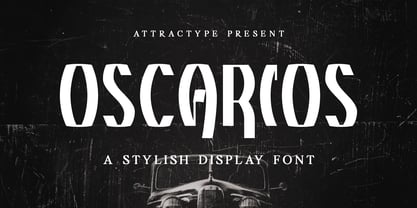 Oscarios fonts is a stylish display font. You can use it in a modern, clean and professional design. This font is perfect for your various projects such as brand identity, technology, business cards, web, stationery, displays, sports and more. Oscarios font contains uppercase, lowercase, numbers, punctuation and multilingual support.
 - Alkalis by Craft Supply Co,
$20.00 Alkalis: Modernity Meets Elegance Meet Alkalis – Modern Elegant Serif, where modern meets timeless. This serif offers the perfect contrast for versatility. It’s crafted for both text and display needs. Alkalis brings a touch of elegance to any project. Balanced Contrast With Alkalis, experience the ideal balance in font design. The contrast is just right, not too sharp, not too soft. This balance makes it perfect for an array of uses. Plus, it’s designed to be as fitting for body text as it is for headers.
 - ITC Ronda by ITC,
$29.99ITC Ronda, with its constructed forms, was designed by Herb Lubalin in 1970. Behind its figures lie the clear geometric forms of the circle, triangle, and rectangle. The typeface presents a clear, modern look in any application. Distinguishing characteristics are the shapes of the upper right third of the capital B, P and R as well as the half-circle form of the descender of the Q. ITC Ronda is similar to Michael Neugebauer's Litera; both fonts display styles characteristic of the Bauhaus' work. " - Chelsie Hilton by PeachCreme,
$19.00 We're excited to present to you our new font, "Chelsie Hilton"! A great thing about this font is that it is both chic and legible at the same time. You can confidently use it on such machines as Cricut since its edges are smooth enough and this font will fit just right. When creating this signature font, we took care to make it as crisp and modern as possible. "Chelsie Hilton" is perfect for logos, wedding designs, quotes, cards, stationery, signature, display text, and many more.
 - Asta by LLW Studio,
$16.00 Asta, named after the adorable pup in the “Thin Man” movies from the 1930‘s and early ‘40‘s, is an Art Deco / Streamline Moderne all-caps display font. Inspired by forms from the iconic machinery of the day like trains and autos, Asta has a heavy and masculine proportion, a cut-in “grille” effect and a slight slant which emphasizes its moderne roots. Fantastic for illustration or retro applications like antique product “logos,” signs and vintage packaging, or for a fun & funky ‘70‘s Disco look.
 - Black Damon by Zeptonn,
$5.00 Looking for a big, bold and curvy font? Here’s Black Damon! She is a hand-drawn typeface with explicit curves and angles that still retains softness and has a handcrafted feel. All glyphs are handcrafted by illustrative designer Zeptonn. She might not be your best friend for body text, but still, she won't hesitate to perform well under pressure. She will make an interesting yet unusual partner for headlines. Awesome and distinctive in use for titles, displays and fresh illustrations. Prepare to make a statement!
 - Royal Crescent by Sharkshock,
$100.00 Royal Crescent is an all caps display sans with an emphasis on elegance and simplicity. The uniform width is consistent throughout creating low contrast in all three weights. There are slight variations, between a few upper and lowercase characters which can be used interchangeably. Titling was its primary purpose but will prove useful in a variety of situations. Use it for web headers, a magazine, or a luxury logo. This family is equipped with Basic/Extended Latin, punctuation, symbols, diacritics, Cyrillic, kerning, and fractions.
 - Boilerplate by Wundes,
$18.00Gritty heat-forge stamped metally goodness. Can withstand up to 255 pounds of pressure psi, it even says so right on the graphic. This is a fun display font inspired by the stamped text on barbells, sewer drains, and of course boiler-plates, not that we see many of those anymore, but I digress... This font contains all the standard sub-255 unicode characters, plus a few extras for flavor. Apply this font with liberal amounts of axle grease and she should last ya a lifetime. - Sticky Toffee by Hanoded,
$15.00 I don’t have a sweet tooth myself, but I do like toffee! One of my favourite desserts is English Sticky Toffee Pudding, so I really had to name a font after this delicacy. Sticky Toffee is a bold display font. It’s all caps (in case you might have missed that), but upper and lower case differ and can be used together to create a more ‘natural’ look. Sticky Toffee comes in two great styles: Regular and Sprinkles, and has all the diacritics you’ll need.
 - Gazpacho by Monotype,
$29.00 Gazpacho is inspired by the serif typefaces used in editorial media in the 70s and 80s. The morphology of the letterforms makes this typeface ideal for display purposes like logos and big, bold headlines. Also, thanks to its large x-height it works perfectly on headlines with tight leading. On the other hand, its high contrast and very simple and recognisable shapes makes it highly readable, so it works on small, long texts as well. It comes in 7 different weights and 2 styles (Standard & Italic).
 - Capricious by Hanoded,
$15.00 I don’t think I’m a capricious person, but right now, due to the enormous amount of renovation work on our home, I do get bad moods quite often! Capricious is a hand painted all-caps font: I used my favourite Chinese ink, a brush and very rough paper to get the desired ‘eroded’ effect. It is quite a heavy display font, so I wouldn’t really set a text in it, but it works really well for headlines, catching titles and products that need some pepper!
 - Patisserie by Thinkdust,
$10.00 Patisserie is exactly the font you might expect to see on chalkboards outside Parisian cafés; tall, elegant and enticing. The lithe, thin and graceful characters of this font compliment the hand-drawn style to create a typeface that is both casual and professional. Excellent for display work and larger sizes, to really show off the slightly rough edges, Patisserie supports over 26 languages with full punctuation and character sets. Step on in for a traditional, hand-made, French fontant, or whatever else you fancy.
 - Ryno Slab by Philatype,
$32.00 Ryno Slab is a superslab that was born out of a need for an aggressive, heavy, geometric display face that did not appear clunky. Its serifs are so thick, you could create reasonably legible word shapes by using all caps and masking the words out. Ryno Slab’s tough geometric exterior and squarish forms make it suitable for tight setting in posters, t-shirts, and artwork. Also, an extended character set with support for European languages make Ryno Slab a good fit for magazine headlines.
 - Submariner by Type Fleet,
$- Submariner waterproof sans serif technology Submariner is a waterproof type family that displays the right amount of power and character on every depth level. Thanks to its strong and humanistic construction, it can endure great information pressure. It is a marvelous typographic experience. The letter construction is more open and endings are slightly wider. It is suitable for longer texts, information graphics, annual reports and signalization. The typeface’s x-height is exactly 70% of its capitals. The italics are designed at a 9° angle.
 - Upscale JNL by Jeff Levine,
$29.00 A page from an "ideas booklet" that was copyrighted in 1939 by the Sanford Ink Company displayed a hand lettered variation on the counter-less [or solid] alphabet that so typified the Art Deco style of the times. Bold, brash and beautiful, Upscale JNL evokes high-end department stores, fine millinery shops, cafeterias, night clubs and other business establishments from the Streamline era. This type of lettering style was a workhorse, and could (and still can) tackle any message with strength, clean lines and class.
 - Sekhmet by Three Islands Press,
$29.00Stylish, elegant, and alluring, Sekhmet got its name from the lion-headed war goddess of ancient Egypt. And the typeface does possess a kind of feline, forward-directed energy - a result of its calligraphic detailing combined with a very slight slope in the roman. Sekhmet is essentially a display face; still, it's as carefully crafted as any of the designer's text fonts and so also works well in reasonably large text blocks, especially at larger point sizes. Comes with a book-weight roman and calligraphic italic. - Rosales by Latinotype Mexico,
$39.00 Rosales integrates humanist style with geometry in a typography highly inspired by calligraphy. It has eight weights in round and italic variants, which also have a set of initial capital letters, small caps, Oldstyle and Lining figures, as well as two stylistic sets that allow for more humanist or more geometric versions. Basically, it covers whatever you’re going to need. The family’s extreme weights were designed for titles, while the intermediate weights are for texts. The first ones are perfect for displays and logos.
 - FiveOh by Ingrimayne Type,
$9.95 The FiveOh fonts are caps-only with extreme contrast.. They are decorative or display fonts with a carefree, wobbly look. FiveOh-One and FiveOh-Shadowed contain the same set of letters on upper and lower-case keys. FiveOh-Two, Three, and Stars contain different interior decorations on upper and lower cases. Thus there are eight different sets of letters in the five typefaces. FiveOh-One can serve as a base layer with the other four fonts layered on top of it to give letters with two colors.
 - Densa by Graviton,
$24.00 Densa font family has been designed for Graviton Font Foundry by Pablo Balcells in 2020. It is a condensed sans serif typeface with some unconventional display endings. Its condensed design makes it very effective for space economizing and its display features make it a very interesting option for display usages such as logos, packaging and posters. It has been conceived to be most suitable for headlines and short length text blocks. Densa consists of 8 styles. Each containing small caps and glyph coverage for several languages.
