5,067 search results
(0.037 seconds)
- Treves Sans by AdultHumanMale,
$15.00 Treves Sans is a scratchy, messy, hand written display font. It has the look of charcoal or a brass rubbing, reversed in lighter tones it looks like chalk. It reminds me of Edward Gorey's or Eddie Campbell's styles of sketching. It has about 200 glyphs including all those extra pesky foreign features.
 - Superstar Grotesk by Not Bad Typeface,
$30.00 Superstar Grotesk is a free interpretation of the first Cyrillic versions of Royal Grotesk and Akzidenz Grotesk, later the "Roublennaya" typeface is the same irremovable pop artist who lingered in the top of the typographic charts until the digital era, and formed the image of the Cyrillic alphabet in the 20th century.
 - Azbuka by Monotype,
$29.99 The Azbuka™ typeface family has its roots in a fairly pedestrian source. “The idea came in part from an old sign in London that read ‘SPRINKLER STOP VALVE’,” says Dave Farey, designer of the typeface. Like all good sign spotters, Farey took a photograph of the sign and filed it away for possible use in a lettering or typeface design project. In Prague a number of years later, the street signs reminded Farey of the London signage - and his camera came out again. Comparing the two back in his studio, he realized that the signs from London and Prague were not as similar as he initially thought. However, they were enough alike to serve as the foundation for a no-frills, 21st century sans serif typeface family. “I wanted to draw a wide range of weights, italic and condensed designs all in one go,” recalls Farey, “rather than add on to the family later.” His goal was to create a family that could be used for text and display copy, with sufficient weights to provide a broad typographic palette. Indeed, the completed design, created in collaboration with fellow type designer Richard Dawson, consists of twenty typefaces in eight weights ranging from extra light to extra black. The five mid-range designs have complementary italics. Seven condensed designs round out the family. Azbuka’s lighter weights perform remarkably well in blocks of text composition. “They’re clean and legible - and perhaps a little boring,” says Farey, “but they are perfect for copy with a down-to-earth, yet contemporary flavor.” The heavier weights are equally well suited for a variety of display uses. The designs are authoritative but not overbearing and will readily make a strong statement without calling attention to themselves. The condensed weights of Azbuka are ideal for those instances where you have a lot to say - and not much room to say it. The name Azbuka? It’s Russian for “alphabet.” And what more appropriate name could there be for this utilitarian, industrial-strength type family than alphabet? The Azbuka family is available as a suite of OpenType Pro fonts. Graphic communicators can now work with this versatile design while taking advantage of OpenType’s capabilities. The Azbuka Pro fonts also offer an extended character set that supports most Central European and many Eastern European languages
 - Diagond by Paragraph,
$- Sporting a uniform upward slope in the letterforms, Diagond is a contemporary decorative/display typeface with hints of the seventies and Art-Nouveau. The font contains some alternative lower-case glyphs, as well as ligatures, and East European, Turkish and Baltic languages support.
 - Thertole by Twinletter,
$16.00 Thertole is a dramatic display font with a strong background. Because of its rock-inspired design, this typeface is dashing and bold for individuals who dare to be distinctive. If you use this font for a variety of outdoor events, you will get an exquisite and unique look. Standard ligatures, character choices, and international language support are also included in this typeface. This font is perfect for games, sporting events, branding, banners, posters, movie titles, book titles, quotes, and more. of course, your various design projects will be perfect and extraordinary if you use this font because this font is equipped with a complimentary font family, both for titles and subtitles and sentence text, start using our fonts for your amazing projects.
 - ITC Johnston by ITC,
$29.00ITC Johnston is the result of the combined talents of Dave Farey and Richard Dawson, based on the work of Edward Johnston. In developing ITC Johnston, says London type designer Dave Farey, he did “lots of research on not only the face but the man.” Edward Johnston was something of an eccentric, “famous for sitting in a deck chair and carrying toast in his pockets.” (The deck chair was his preferred furniture in his own living room; the toast was so that he’d always have sustenance near at hand.) Johnston was also almost single-handedly responsible, early in this century, for the revival in Britain of the Renaissance calligraphic tradition of the chancery italic. His book Writing & Illuminating, & Lettering (with its peculiar extraneous comma in the title) is a classic on its subject, and his influence on his contemporaries was tremendous. He is perhaps best remembered, however, for the alphabet that he designed in 1916 for the London Underground Railway (now London Transport), which was based on his original “block letter” model. Johnston’s letters were constructed very carefully, based on his study of historical writing techniques at the British Museum. His capital letters took their form from the best classical Roman inscriptions. “He had serious rules for his sans serif style,” says Farey, “particularly the height-to-weight ratio of 1:7 for the construction of line weight, and therefore horizontals and verticals were to be the same thickness. Johnston’s O’s and C’s and G’s and even his S’s were constructions of perfect circles. This was a bit of a problem as far as text sizes were concerned, or in reality sizes smaller than half an inch. It also precluded any other weight but medium ‘ any weight lighter or heavier than his 1:7 relationship.” Johnston was famously slow at any project he undertook, says Farey. “He did eventually, under protest, create a bolder weight, in capitals only ‘ which took twenty years to complete.” Farey and his colleague Richard Dawson have based ITC Johnston on Edward Johnston’s original block letters, expanding them into a three-weight type family. Johnston himself never called his Underground lettering a typeface, according to Farey. It was an alphabet meant for signage and other display purposes, designed to be legible at a glance rather than readable in passages of text. Farey and Dawson’s adaptation retains the sparkling starkness of Johnston’s letters while combining comfortably into text. Johnston’s block letter bears an obvious resemblance to Gill Sans, the highly successful type family developed by Monotype in the 1920s. The young Eric Gill had studied under Johnston at the London College of Printing, worked on the Underground project with him, and followed many of the same principles in developing his own sans serif typeface. The Johnston letters gave a characteristic look to London’s transport system after the First World War, but it was Gill Sans that became the emblematic letter form of British graphic design for decades. (Johnston’s sans serif continued in use in the Underground until the early ‘80s, when a revised and modernized version, with a tighter fit and a larger x-height, was designed by the London design firm Banks and Miles.) Farey and Dawson, working from their studio in London’s Clerkenwell, wanted to create a type family that was neither a museum piece nor a bastardization, and that would “provide an alternative of the same school” to the omnipresent Gill Sans. “These alphabets,” says Farey, referring to the Johnston letters, “have never been developed as contemporary styles.” He and Dawson not only devised three weights of ITC Johnston but gave it a full set of small capitals in each weight ‘ something that neither the original Johnston face nor the Gill faces have ‘ as well as old-style figures and several alternate characters. - Manlychalk by Allouse Studio,
$16.00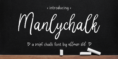 Proudly Presenting, Manlychalk A Script Chalk Font. Manlychalk is perfect for any titles, logo, product packaging, branding project, megazine, social media, wedding, or just used to express words above the background. Manlychalk also come with Multi-Lingual Support. Enjoy the font, feel free to comment or feedback, send me PM or email. Thank You!
 - Chalkvibes by Allouse Studio,
$16.00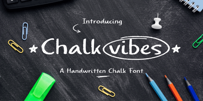 Proudly Presenting, Chalkvibes A Handwritten Chalk Font. Chalkvibes is perfect for any titles, logo, product packaging, branding project, megazine, social media, wedding, or just used to express words above the background. Chalkvibes also come with Multi-Lingual Support. Enjoy the font, feel free to comment or feedback, send me PM or email. Thank You!
 - Pennychalk by Allouse Studio,
$16.00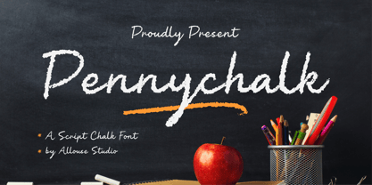 Proudly Presenting, Pennychalk A Script Chalk Font. Pennychalk is perfect for any titles, logo, product packaging, branding project, megazine, social media, wedding, or just used to express words above the background. Pennychalk also come with Multi-Lingual Support. Enjoy the font, feel free to comment or feedback, send me PM or email. Thank You!
 - Karara Shadow by Kufic Studio,
$20.00 Karara Shadow, a complete font set and additional font style of Karara. The word Karara means patience & steady. The style is achieved by practicing and studying the modern techniques to deliver high-end professional font. This specific font had a tint of wall chalking & texture. Carefully engraved and stenciled to delivery clean cuts and design.
 - Worldchalk by Allouse Studio,
$16.00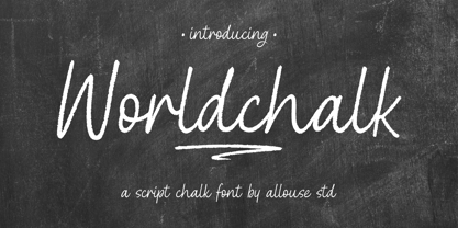 Proudly Presenting, Worldchalk A Script Chalk Font. Worldchalk is perfect for any titles, logo, product packaging, branding project, megazine, social media, wedding, or just used to express words above the background. Worldchalk also come with Multi-Lingual Support. Enjoy the font, feel free to comment or feedback, send me PM or email. Thank You!
 - Gradechalky by Allouse Studio,
$16.00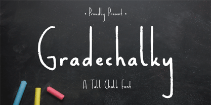 Proudly Present, Gradechalky A Tall Chalk Font. Gradechalky is perfect for any titles, logo, product packaging, branding project, megazine, social media, wedding, or just used to express words above the background. Gradechalky also come with Multi-Lingual Support. Enjoy the font, feel free to comment or feedback, send me PM or email. Thank You!
 - Onlychalk by Allouse Studio,
$16.00 Proudly Presenting, Onlychalk A Handmade Chalk Font Onlychalk is perfect for any titles, logo, product packaging, branding project, megazine, social media, wedding, or just used to express words above the background. Onlychalk also come with Multi-Lingual Support. Enjoy the font, feel free to comment or feedback, send me PM or email. Thank You!
 - ZionTrain Basic by AndrijType,
$25.00Originally ZionTrain was built as a Cyrillic typeface for public transport navigation system. We wanted comprehensible, distinctive letterforms, that can help everybody on the way from Babylon to Zion. Here, on MyFonts, we present the ZionTrain STD versions with western latin including smallcaps and oldstyle figures in some faces in TrueType format; also western, central, baltic and turkish latin charsets, smallcaps, oldstyle numerals, few alternates, some arrows and fractions in ZionTrain OT OpenType format. - Nimrod by Monotype,
$29.99 An extremely versatile, intelligently restrained design by Robin Nicholas for Monotype in 1980. It works very well at small sizes thanks to its large x-height, sturdy serifs, and lack of ornament; yet it is not characterless. Nimrod has been used successfully in national newspapers and books. (The Guardian, London, from its late-1980s redesign until it was replaced by a Carter interpretation of Miller in 1998; the Concise Oxford English Dictionary in the typographically unsurpassed 1990 edition.)
 - Silo Soft by TypeUnion,
$25.00 Designed and built in London by TypeUnion, Silo soft is a fluid sans serif typeface embodying energetic curves and a clean, functional structure. The Silo Soft Family is made up of 6 weights, which range from a delicate Extra-Light, all the way through to a punchy, loud Extra-bold and each carry a versatility for multiple applications and uses. Silo soft features open type alternate characters, and extensive language support to provide a flexible, substantial user experience.
 - Karlsen Round by TypeUnion,
$30.00 Designed and built in London by TypeUnion, Karlsen Round is a structured, functional typeface which embraces harmony, flow and versatility, but with a cheeky twist. The Karlsen Round Family is made up of 14 styles, which range from a delicate thin, all the way through to a substantial extra-bold and each carry a versatility for multiple applications and uses. Karlsen Round provides extensive language support to provide a flexible, substantial user experience. Please also see our Karlsen family.
 - Fleuron Labels by Wiescher Design,
$39.50Fleurons are embellishments and here is my seventh set. This time I give you all kind of different labels. Your labeled designer Gert Wiescher - Fat Ink by High Peak,
$20.00 This handwritten font is as juicy as the strokes from a fat marker! Unpredictable but harmonious, the lines and shapes give this font a fun, funky vibe. Perfect for creating logos, charts, pricing, and more. Full uppercase and lowercase, it supports several languages, lots of discretionary ligatures, and alternatives that combine with each other. Have fun! High Peak
 - Farmhouse Chalkboard by Allouse Studio,
$16.00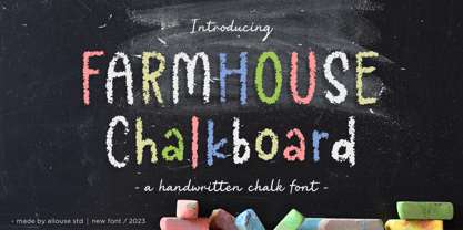 Proudly Presenting, Farmhouse Chalkboard A Decorative Chalk Font. Farmhouse Chalkboard is perfect for any titles, logo, product packaging, branding project, megazine, social media, wedding, or just used to express words above the background. Farmhouse Chalkboard also come with Multi-Lingual Support. Enjoy the font, feel free to comment or feedback, send me PM or email. Thank You!
 - Nautical Doodles by Outside the Line,
$19.00 Sail the seas with Nautical Doodles. This seaworthy font has 32 illustrations of water craft, anchors, star, compass, flags, whale, shark, birds, starfish, seahorse, rope etc. Even a mermaid... and the scripted word Ahoy! If you would like the character chart go to the Gallery Tab and print. (PDFs are no longer downloaded with the font.)
 - Uncertainty by Okaycat,
$25.50 Uncertainty 2010 Edition is an intensely textured typeface carefully rendered by hand. This font is faded with a chalk-like texture. Please be aware that working with this highly detailed font may slow some graphics software as it requires more memory. Uncertainty is extended, containing West European diacritics and ligatures, making it suitable for multilingual environments and publications.
 - P22 Hiromina 03 by IHOF,
$24.95 Hiromina03 is named after the wife of its designer, Hajime Kawakami. The three fonts in the set are based on Hiromi Kawakami's unique hand-lettering style. The distinctly feminine character of Hiromina03 is harmoniously integrated in all three writing systems, Katakana, Hiragana and Latin. The enclosed key charts give instructions for character placement in Katakana and Hiragana.
 - Okay Crayon by Okaycat,
$29.95 One waxy black crayon was used up, entirely down to the tiniest nub, by the making of this font. It’s fun! Perfect for creating crayon written text, or to get the look of chalk-board writing, conte, or charcoal. Okay Crayon is extended, containing West European diacritics & ligatures, making it also suitable for multilingual environments & publications.
 - digi - Unknown license

- Walls by Piñata,
$8.00 What do you use to write a price tag at a store or to design a wall menu in a cafe? What to choose – a marker or chalk? Now it makes no more sense to be torn apart by the choice – use both techniques for your design. Walls fontfamily allows to perfectly combine an eco-friendly style with contemporary motives. Walls fontfamily supports over 70 languages and consists of 10 typefaces in 5 popular weights (Thin, Light, Regular, Bold, Black). Initially we wanted to create a font that would imitate an inscription made by a square tip marker which is usually used to write price tags at supermarkets, shops and cafes. During the working process we've decided to extend the conceptual boundaries of the Walls fontfamily and added 5 rough typefaces that imitate the style of ecologic chalk writing
 - Nicla by madeDeduk,
$15.00 Introducing Nicla is a brand new beautiful script family with beautiful ligatures, much special alternative glyphs to get more stunning and multilingual support. Use this beautiful font for all your designs project, event and more. Feature 9 Weight UPPERCASE & Lowercase Number & Symbol International Glyphs Alternative & Ligatures Feel free to drop us a message any time and follow my shop for upcoming updates Shoot me on email at: dedukvic@gmail.com and find more previews on my Instagram here : https://www.instagram.com/acekelgondolayu/?hl=en Hope you enjoy it.
 - Serenity by Device,
$39.00 A versatile and elegant sans serif with a hint of Futura and a dash of Gill, but entirely its own design. Clear and legible in small sizes, refined and authoritative in larger sizes, Serenity is perfect for corporations, institutions, museums, galleries, editorial and publishing. Seven weights from a fine Thin to an impactful Heavy, plus italics, present a full range for all text and headline needs. Comes with full international character support, tabular and old-style numerals and alternate versions for the R, K, a and g.
 - Bogart by Zetafonts,
$39.00 All the nine weights of Bogart, as well the matching true italics forms, feature an extended charset of over 1600 glyphs, covering 219 languages using latin, cyrillic and greek alphabets, and sporting a complete set of Open type features. To add flexibility for editorial usage, a text-oriented Bogart Alternate set of nine weights was added to the family keeping the design more similar to its modern old style model and allowing for a heavy readable mid-weight range.
 - Dusky Slab by Gleb Guralnyk,
$13.00 Hello, introducing a vintage style all caps typeface "Dusky Slab". It's a seventies style font with bold serifs and reverse contrast inspired by western hippie culture. Dusky Slab supports a lot of languages, including west european and cyrillic characters (check out all available symbols on the last screenshot).
 - Gutenberg B by Alter Littera,
$25.00 A clean, smooth rendition of the magnificent B42-type used by Johann Gutenberg in his famous 42-line Bible. In addition to the usual standard characters for typesetting modern texts, the font includes a comprehensive set of special characters, alternates and ligatures, plus Opentype features, that can be used for typesetting (almost) exactly as in Gutenberg’s Bible and later incunabula. Also available as The Oldtype “Gutenberg C” Font in a slightly roughened style simulating irregularities and ink spreads associated with old metal types, papers and parchments. The main historical sources used during the font design process were high-resolution scans from several printings of Gutenberg’s Bible. Other sources were as follows: Kapr, A. (1996), Johann Gutenberg - The Man and his Invention, Aldershot: Scolar Press (ch. 7); De Hamel, C. (2001), The Book - A History of The Bible, London: Phaidon Press (ch. 8); Füssel, S. (2005), Gutenberg and the impact of printing, Burlington: Ashgate (ch. 1); and Man, J. (2009), The Gutenberg Revolution, London: Bantam (ch. 7). Specimen, detailed character map, OpenType features, and font samples available at Alter Littera’s The Oldtype “Gutenberg B” Font Page.
 - Cool Daddy by Hanoded,
$15.00 It’s a brand new year, but I have been going back in time. To the seventies to be precise. A ‘bubblegum’ font was on the top of my to-do list, so when it was finally finished, it reminded me of seventies posters. As if by magic, a catchy bassline started playing in my head and before I knew it, Boney M appeared - all dressed up in Purple and singing Daddy Cool. Cool Daddy is a fat, rounded bubblegum font, which will take you back to the decade of moustaches, afros and glitter. This ultra groovy font will funk up your designs 4-sho. So boogie on, take it back to your crib and get down with it. You diggin’?
 - Skinny Pencil by Mvmet,
$16.00 Skinny Pencil is a skinny handwritten font with pencil or chalk texture that you can use it for anything ranging from t-shirts, book designs, packaging, and greeting cards to stickers and posters, or anything that needs a casual touch, it will be your perfect font to pick. Fall in love with its incredibly versatile style, and use it to create lovely designs!
 - The PR8 London Ads font is a fascinating typeface that immediately transports one to the bustling streets and iconic advertising spaces of early 20th-century London. It encapsulates the dynamic and t...
- LC Chalk, although a fictional creation for the sake of this description, embodies the essence of nostalgia and creativity, merging the simplicity of handwritten notes with the rustic charm of chalkb...
- Dutch Mediaeval Pro ST by Canada Type,
$49.95 Dutch Mediaeval Pro ST is a special version of the popular Dutch Mediaeval Pro family, engineered specifically for science writing. It is equipped with SciType, a combination of additional characters and OpenType programming included in the fonts to help in typesetting science text. For more information about SciType, please consult the SciType FAQ available in the Gallery section of this page. The Dutch Mediaeval design is the historically renown one made in 1912 by S. H. de Roos. It stands out as one of the most classic Dutch text faces. This digital version comes in two weights and their italic counterparts. Aside from the SciType additions, all the fonts contain OpenType features for small caps and caps-to-small-caps, ligatures, ordinals, automatic fractions, seven kinds of figures, and a few ornaments. For details about the functionality of Dutch Mediaeval Pro ST, please consult its Access Chart PDF available in the Gallery section of this page.
 - Roos ST by Canada Type,
$39.95 Roos ST is a special version of the Roos family, engineered specifically for science writing. It is equipped with SciType, a combination of additional characters and OpenType programming included in the fonts to help with typesetting science text. For more information about SciType, please consult the SciType FAQ available in the Gallery section of this page. The Roos design is the Dutch classic made by S. H. de Roos during the years of the second World War, and subsequently used for a special edition of the Dutch Constitution on which Juliana took the oath during her inauguration as the Queen of the Netherlands. This design is widely regarded as de Roos's finest, and has one of the most beautiful italics ever drawn. Aside from the SciType additions, all the Roos ST fonts contain OpenType features for ligatures, ordinals, automatic fractions, and seven kinds of figures. For details about the functionality of Roos ST, please consult its Access Chart PDF available in the Gallery section of this page.
 - Resistance Is by Comicraft,
$19.00 You will not move. You will not breathe. You will not think. You WILL buy this font. You are our prisoner. There is no escape... RESISTANCE IS FUTILE! Also Useless. RESISTANCE IS… was created for the voice of the evil robot Sentinels in X-MEN: AGE OF APOCALYPSE, and later used for the friendly robot in BATTLE CHASERS and robot police in ELEPHANTMEN. A font for all your robot needs! See the families related to Resistance Is Futile and Useless: Resistance is Lowered
 - ZionTrain by AndrijType,
$33.00 Originally ZionTrain was built as a Cyrillic typeface for public transport navigation system. We wanted comprehensible, distinctive letterforms, that can help everybody on the way from Babylon to Zion. Here, on MyFonts, we present the ZionTrain STD versions with western latin including smallcaps and oldstyle figures in some faces in TrueType format; also western, central, baltic and turkish latin charsets, smallcaps, oldstyle numerals, few alternates, some arrows and fractions in ZionTrain OT OpenType format. Look how people use it: http://use.type.org.ua/tagged/ziontrain
 - Silo Slab by TypeUnion,
$25.00 Designed and built in London by TypeUnion, Silo Slab is a fluid slab serif typeface embodying energetic curves and a clean, functional structure. The Silo Slab Family is made up of 6 weights, which range from a delicate Extra-Light, all the way through to a punchy, loud Extra-bold and each carry a versatility for multiple applications and uses. Each weight has a matching italic. Silo Slab features open type alternate characters, and extensive language support to provide a flexible, substantial user experience.
