4,583 search results
(0.025 seconds)
- DS Diploma - Unknown license

- Prints Charming by TypeArt Foundry,
$45.00 Elegant script for invitations, certificates, awards.
 - ITC Elan by ITC,
$29.99 ITC Élan combines a gothic simplicity with elegance in a distinctive yet subtle typeface design. There is also a feeling of architectural strength which is derived primarily from an optically even line-weight and a sense of vertical stress. The small, almost Latin, serifs add distinction at both display and text sizes. The large x-height, minimum stroke variance, and open counters are ideal design traits for typeface legibility. Additional characteristics which distinguish ITC Élan are the splayed M" and bowls which do not quite close in the "a," "b" and several other letters. In contrast to the roman, there is almost a calligraphic playfulness to the italic. ITC Élan is the second ITC typeface from Albert Boton of France, who also designed ITC Eras. ITC Élan comes in four weights, book, medium, bold, and black, each with a corresponding italic."
 - Zagore by NoCommenType,
$30.00 Zagore (zɑːgɔːrɛ) is the name of a beautiful place in Bulgaria. There is no contrast between horizontal and vertical stems, typical for geometric fonts. The typeface is built under strict rules and logic, by using the stroke as skeleton for each glyph. Although the structure of the font remains the same, there is a noticeable visual diversity throughout different styles. Middle weights suggest paragraph use, while the ones at the extremes are more suited for display text. The typeface offers support for Basic Latin, Latin-1 Supplement, Latin Extended-A, Greek and Coptic, Cyrillic, and Cyrillic Supplement Unicode ranges. Included OpenType features are localized forms, to suit multi-language designs, tabular and proportional lining, basic ligatures, and extra symbols.
 - Altemus Web Icons by Altemus Creative,
$11.00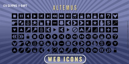 A collection of 174 website button icons and designs.
 - Century Schoolbook DT by DTP Types,
$49.00From M.F. Benton 1917 and DTP types Limited 1992. - Stonecross by Scriptorium,
$18.00People are always asking us for chiseled-stone style fonts, so we thought we'd give them what they want, but with a slightly different spin. Stonecross has the look of classic Celtic uncial lettering as it would look if it was cut in stone, with some fanciful variant character forms and the nicks and chips which give it the look of stone. - 799 Insular by GLC,
$38.00 This font was inspired from the so called "Insular Style" Latin script used in Celtic monasteries (Ireland, Scotland—with the well known Book of Kells—and England) from the late 6th to 9th, before the Carolingian "Caroline" (look at our 825 Karolus). It was a regular script, rounded, written slowly, used mainly for specially meticulous books, with a very few ligatures. The rarely-used capitals consisted of enlarged lowercases, but, on the other hand, there was numerous historical initials. The Titling style in this familly allows to two-color decorated letters to be created, using OTF Titling feature or copy and paste technique. We have created the font as to be adapted for contemporary users, differentiating between U and V, I and J, which has not any relevance for ancient Latin scribes, and naturally with Thorn, Oslash, Lslash, K,W... The specific Celtic "y" is added as an historical alternate.
 - Silk Script by Canada Type,
$29.95Silk Script is a revival and elaborate expansion of a 1956 Helmut Matheis script called Primadonna, which strangely remained a metal face and never made the leap into the film age. Silk Script has the unmistakable high contrast and elegance of formal scripts, yet both its majuscules and minuscules show much more complex and visually appealing art than traditional copperplate or Spencerian calligraphy. When set properly, it adds just the needed extra touch of artistic flair to designs that are not visually satisfying with the usual high-contrast elegant scripts. Silk Script comes in two styles, with the Alt font containing form variations on almost every letter, allowing for flexibility and precision in choice typesetting. Plenty of more alternates are available throughout the character sets of both fonts. Both styles also boast expanded character sets that include support for Central and Eastern European languages, as well as Baltic, Celtic, Esperanto, Maltese and Turkish. Silk Script Pro unifies both styles in one font, for 550 characters of sheer elegance and handy OpenType features including stylistic alternates, discretionary ligatures and class-based kerning. - 1456 Gutenberg B42 Pro by GLC,
$42.00 Is it necessary to tell the Gutenberg story? 1456 Gutenberg Pro is the second Gutenberg typeface produced by GLC foundry (look at our 1456 Gutenberg). This font was created from the so called "B42" character set used for the two Gutenberg Latin Bibles (42 and 36 lines), but with a better and finer design than in our first version, more faithful to the finest original printed books appearance. We offer also now a larger choice of the original ligatures and Latin abbreviations, as complete as possible to be usable with OTF specifications. The complete basic alphabet (with "long s" naturally)is strictly looking like the real one (including the curious twisted "X"). We have only recreated the capitals W and J, who was not existing in the time. The numerals, no more existing in the original type set, were inspired from those in use a few years later by early following printers, but matching with the Gutenberg font's pattern. The font includes West (including Celtic), East, Central European, Baltic and Turkish glyphs.
 - 1499 Alde Manuce Pro by GLC,
$42.00 This family was inspired by the beautiful roman font used by Aldus Manutius in Venice (1499) to print for the first time Hypnerotomachia Poliphili..., the well known book attributed to Francesco Colonna. Francesco Griffo was the punchcutter. The present font contains all of the specific latin abbreviations and other ligatures used in the original. The Italic style, carved by Francesco Colonna, the so called "Aldine" style, was inspired from various documents, all printed with this first Italic font. We offer the complete set of ligatures (about 60) we have been able to find, contained in the original font. In the two styles, we have made differences between I and J, V and U, to make easier a modern use. Added are the accented characters and a few others not in use in this early period of printing. The Italic style may be used as a complement to our 1470 Jenson Latin. The font contains all characters for West European (including Celtic), Baltic, East and Central European and Turkish language.
 - Quimera by PampaType,
$19.00A happy, and delicate family, available in 5 weights. Being very legible in small sizes, it pays tribute to French designer Roger Excoffon, particularly to his Antique Olive type. Antique Olive combines two features which inspired the design of Quimera: a large x-height with open counters which ensures legibility at tiny body sizes; and letterforms with a horizontal stress which contradicts the logics of calligraphic tradition (thick verticals, thin horizontals). Quimera has a typical sanserif stroke modulation, but letters have a very thin, capricious serif, which helps to keep the texline's continuity. This 'genetic' contradiction is the reason for its name: Khimera, as it would be a 'sanserif avec'! - Young Baroque by ITC,
$29.99Young Baroque was designed by Doyald Young, and the font first appeared in the ITC library in 1984. It is a delicate and elegant typeface, whose basic forms are those of baroque script. The generous spirals adorning the capital letters give the font its temperament and contrast beautifully with the small, heavily slanted lower case letters. The flowing, graceful characters create an overall image of aristocratic elegance and dignity. This font can be used advantageously for labels, invitations and certificates and its capitals as initials to contrast harmoniously with both serif and sans serif fonts. Young Baroque is best used for headlines or short texts. Featured in: Best Fonts for Tattoos - Kwodsity by Ingrimayne Type,
$12.95 The two Kwodsity fonts are derived from Kwersity, a narrow, blocky typeface with slab serifs and a high x-height. In Kwodsity Up the bottom edges and bottom serifs have been thickened, while in Kwodsity Down the top edges and serifs have been thickened.
 - New Century Schoolbook LT by Linotype,
$29.99Under the commission of the American Century Magazine"", Linn Boyd Benton designed a new text typeface in 1894 with a design typical of the Neorenaissance movement in typography. Morris Fuller Benton produced various interpretations of this font for American Typefounders and the companies Linotype, Intertype and Monotype quickly took up the typeface. New Century Schoolbook font is a very legible font, fairly narrow and with relatively little stroke contrast. This font is from Morris F. Benton and appeared in 1915. - Alternate Gothic Pro by SoftMaker,
$14.99 Alternate Gothic Pro is one of the fonts of the SoftMaker font library. Designed by Morris Fuller Benton in 1903 as a complement to his Franklin Gothic type, Alternate Gothic was created to solve a common problem: fitting headlines in narrow columns. For that purpose, it comes with three similar styles of varying widths. SoftMaker’s Alternate Gothic Pro typeface family contains OpenType layout tables for sophisticated typography. It also comes with a huge character set that covers not only Western European languages, but also includes Central European, Baltic, Croatian, Slovene, Romanian, and Turkish characters. Case-sensitive punctuation signs for all-caps titles are included as well as many fractions, an extensive set of ligatures, and separate sets of tabular and proportional digits.
 - Grafex by Mysterylab,
$22.00 Grafek is a unique reverse-contrast font with tapered vertical strokes and heavier horizontals on the top and bottom. This typeface is loaded with individual character, bolstering its excellent legibility with a moderately extended width. It’s a strong choice for large headlines, web banner graphics, and branding/logo usages. It’s got a high-end and elegant flair on shorter words, especially when choosing an all lowercase lettering design, for example on a logo treatment. It has a whiff of a nautical, antique map vibe, and even conjures up a hint of Oceania and Tiki-style graphics. Grafek will prove to be a great choice on book and magazine titles, and its width lends itself easily to wide mega-scaled outdoor marquee graphics and billboards.
 - RM Alphabox by Ray Meadows,
$19.00 Includes: Western European, Central European, Baltic, Turkish, Romanian sets
 - Meltifex by Aah Yes,
$4.95Meltifex is a heavy font with melting letters, disappearing at the bottom. - Beantown Bounce NF by Nick's Fonts,
$10.00This quirky charmer is based on a typeface originally called Century, which appeared in the Boston Type Foundry's 1898 specimen book. This version includes many of the ornaments and accents included with the original font, as well as alternate versions of lowercase e and o. The PC PostScript, TrueType and OpenType versions contain the complete Latin language character set (Unicode 1252) plus support for Central European (Unicode 1250) languages as well. - Mager - Unknown license

- 2006 - Personal use only

- Anna - Unknown license

- Porcelain - 100% free

- Lady Ice - Extra Light - Unknown license

- Fuller Sans DT by DTP Types,
$49.00An original design by Malcolm Wooden inspired by the works of Morris Fuller Benton. - Stratosphere SG by Spiece Graphics,
$39.00 Every element in this typeface shouts tall and narrow, slender and provocative. With wispy delicate serifs attached to elevator-style vertical stems, Stratosphere’s only goal seems to be getting to the top in style. And no matter how you describe it - ultra thin or ultra condensed - this typeface is best for short headlines and titles. Use only in large display sizes and use sparingly. Stratosphere Light is also available in the OpenType Std format. Some new characters have been added to this OpenType version. Advanced features currently work in Adobe Creative Suite InDesign, Creative Suite Illustrator, and Quark XPress 7. Check for OpenType advanced feature support in other applications as it gradually becomes available with upgrades.
 - Suffiya NF by Nick's Fonts,
$10.00The Boston Type Foundry called the pattern for this elegant typeface "Moslem," suggesting the exotic appeal of faraway lands. The face succeeds in fulfilling its promise, with remarkably little extraneous fussiness. The font's name suggests that it's a wise choice for headlines which tout the lure of distant charms. Both versions of the font include complete Latin 1252, Central European 1250 and Turkish 1524 character sets, with localization for Moldovan, Romanian and Turkish. - Scrapt Script by Brainware Graphic,
$12.00 ScraptScript is a classic casual script typeface inspired by signpainter and autotechno typography, developed with a little bit bold and contrast on horizontal stroke. Comes with a lot of opentype features, ScraptScript also supports multilingual covering Latin based language (Latin Extended-A & Latin Extended Additional), including Celtic, Sami, Maltese, Turkish, England, USA, Germany, France, Italy, Poland & etc. ScraptScript would be nice on logo design, posters, etc. with any design characteristic.
 - Skellingtonbats - Unknown license

- KR Keltic One is a distinctive typeface designed by Kat Rakos, encapsulating the essence of ancient Celtic culture with a modern twist. This font showcases an intricate design that mimics the traditi...
- Linotype Centennial by Linotype,
$29.99 Centennial appeared in 1986 in honor of Linotype’s 100th birthday. The roman and light cuts of the font are reminiscent of the Century typeface, particularly on that of Linn B. Benton and Morris F. Benton, designed around the turn of the 19th century for the American Type Founders. Like Century, Centennial too embodies a cool, reserved neutrality.
 - Ungap Blocks Variable by Pedro Teixeira,
$25.00 This font was designed by blocks, square glyphs. Terminals/crossbars of some glyphs can be extended in a way that you can customize the text of your design by using the selection bars in "variable font" button. That button will appear in the text editor of your program, if such option is available, like in recente illustrator and photoshop.
 - LTC Cloister by Lanston Type Co.,
$24.95Designed by Morris Fuller Benton 1913-15, this Oldstyle family was digitized by Jim Rimmer in the early 2000's. It is a roman face closely styled to that of Nicholas Jensen's with a companion italic in the style of Aldus Manutius. Benton considered Cloister the ideal typeface and it does indeed lend itself to many uses. - Guillotine by Canada Type,
$24.95 Guillotine is inspired by an uncredited early 1970s film face called Rhythm Bold. While the original film type had plenty of round forms that were uneven and somewhat badly drawn to fit within the overwhelming pop wave of the time, this digital incarnation disposes of all curves, relies on a much sharper grid, and adheres to specific parameters of stroke widths and angles. Guillotine is a thick poster classic, mechanically constructed yet clearly exhibiting the idiosyncratic traits of hand drawing. Its forms embody the amalgamation of a multitude of influences, such as woodcut letters, punch card forms, and the unique art nouveau concepts that were popular in the 1960s and 1970s. The totality of the font is a strong display aesthetic that plays very well anywhere the eye is meant to see a strong but casual, sharp but hand crafted message. This font comes in all popular formats for all common platforms, and includes expanded language support to cover Western, Eastern and Central European Latin languages, as well as Baltic, Celtic/Welsh, Esperanto, Maltese, and Turkish. A few alternate characters are sprinkled throughout the character map.
 - Chikita by Canada Type,
$24.95 Chikita greets you with big, happy eyes, and all the energy in the world. She wants to skip the talking and get to the dance floor, where she owns the beat and sways like a tongue of fire. She doesn't settle for anything less than everyone in the room fixating on her, and every pair of eyes is indeed happy to oblige. Being both the noumenon and phenomenon of the party, she remains in your mind long after closing time. And you just know the next time you see her your heart will skip a beat and a welcome wave of contentedness will wash over you. The Chikita design is rooted in the work of 1930s Dutch lettering artist Martin Meÿer, whose little-known work concerned itself with the beauty of letters mostly as individual forms, rather than part of a flowing alphabet. Chikita was reconceptualized to strike a great balance between singular and flowing beauties, resulting in a cheerful and very memorable expression. Chikita is available in all popular font formats, and the character sets cover a wide range of codepages, including Central and Eastern European languages, Esperanto, Turkish, Baltic, Celtic/Welsh and Vietnamese.
 - Mullen Hand by Canada Type,
$24.95 Mullen Hand is the fresh digitization and expansion of a Jerry Mullen metal typeface called Repro, originally published by ATF in 1953. The connectivity of certain letters in the original type was limited by metal technology, but this new digital version is updated to resolve those issues with. Two- and three-letter ligatures take care of the r, s, x and z connections. These ligatures are programmed in the 'liga' feature of the OpenType version, so they automatically activate in programs that support advanced typography. Casual, tall, and elegantly friendly, Mullen Hand's even strokes and confident connections embody the spirit of contentedness and reassurance sought by today's appeal designer. It accommodates a variety of applications, from posters and signs, to book and music covers and product packaging. Mullen Hand comes in all popular formats. The TrueType and PostScript versions come with 2 fonts, one of them containing the ligatures and some alternates. The OpenType version combines both fonts into one, and includes programmed features for localization, alternation and intelligent substitution. Language support includes Western, Central and Eastern European character sets, as well as Baltic, Esperanto, Maltese, Turkish, and Celtic/Welsh languages.
 - LHF Ambrosia by Letterhead Fonts,
$39.00 An old turn-of-the-century style commonly used on billheads, letterheads, certificates, etc.
 - VerticalFlipJJ by Ingrimayne Type,
$9.95 Many years ago I created two upside-down typefaces, UpsidedownJJ and UpsidedownTOC. They were based on monospaced or typewriter fonts, and were rotated 180 degrees, which is the same as a vertical flip followed by a horizontal flip. Recently I was reminded that this way of creating an upside-down typeface is not the only way to create an upside-down typeface--a simple vertical flip creates a different one. That is what this typeface is, a simple vertical flip. The original typeface on which this one is based is JetJaneMono.
 - VerticalFlipTOC by Ingrimayne Type,
$9.95 Many years ago I created two upside-down typefaces, UpsidedownJJ and UpsidedownTOC. They were based on monospaced or typewriter fonts, and were rotated 180 degrees, which is the same as a vertical flip followed by a horizontal flip. Recently I was reminded that this way of creating an upside-down typeface is not the only way to create an upside-down typeface--a simple vertical flip creates a different one. That is what this typeface is, a simple vertical flip. The unflipped typeface from which VerticalFlipTOC is derived is TiredOfCourier.


