6,826 search results
(0.024 seconds)
- Peleguer by Tipo Pèpel,
$22.00 Peleguer typeface is the reinterpretation of the characters that the valencias goldsmiths Peleguer Manuel, father and son had opened and merged between 1779 and 1783 on behalf of the Royal Economic Society of Friends of the Land of Valencia “in order to create a Factory letters. Then during that time, reached 6 degrees of open letters (small pica, pica, gross pica, text, great primer and double pica). It appears that the letters never were done, and were themselves Manuel Peleguer who kept the punches and dies, leading to create a foundry-printing which only came out 5 or 6 books or documents for the single year of 1784 . One of these books, “Praise in the solemn funeral service …” made with the degree of “gross pica” samples were selected to take the characters for subsequent drawings on the following parameters for the unity and a contemporary look to the source: Keep the proportions of the original source (but unifying the shapes of the serifs, as these were different according to repose at baseline or in descending order). Match the counterforms and match the fallen traces from the cursive. En short, “catch” the formal essence of the source and following update current typographic design criteria to achieve a source with good legibility and subtle personality.
 - Vacaciones - Personal use only

- Protest by Society of Fonts,
$29.00 Protest is inspired by protest posters and the power of the people! Each glyph is written by hand with a Sharpie® Magnum marker on big sheets of paper. It is designed to fit more into the poster and still be legible for the media from a block away. It's bold, slightly condensed, and neatly drawn with love and conviction, with the warm imperfection that comes from being hand drawn. Protest consists of over 1,430 glyphs. This includes 300 alphanumeric glyphs with 3 contextual alternates each, 20 stylistic alternate glyphs, and 20 protest themed dingbats. Contextual alternates will rotate through automatically when OpenType features are enabled, giving it more human irregularity. Protest supports 219 latin-based languages, using Underware’s Latin Plus glyph set.
 - Pani Sans by Alessio Laiso Type,
$19.99 Pani Sans is a contemporary type family in 18 styles designed by Alessio Laiso. It takes inspiration from Italian rationalist and art deco typefaces, bringing them into the present with the mix of its reliable geometric structure and distinctive warm personality. The italics add to the unique character of the family by featuring distinguishing calligraphic touches. Pani Sans is fully equipped for intense professional use for both print and digital applications. It supports 219 languages, covering 100% of the Latin Plus character set, and it ships with powerful OpenType features including beautiful small caps, ligatures, stylistic alternates, fractions, tabular figures, old-style figures, and more. The variable fonts included in the family package allow you to pick the perfect weight, for unlimited design freedom.
 - TwentyFourNinetyOne by steve mehallo,
$19.91 TwentyFourNinetyOne [2491] is a reinterpretation of the alphabet of 1919 by Theo van Doesburg; the original a true rendering of the thinking of the Dutch-based art movement “de Stijl.” Jump forward to 1980 and prop lettering used on the Buck Rogers in the 25th Century television series; a vernacular typeface that was a utilitarian mix of geometry and pixel-based forms, used to symbolize the futuristic universe of 2491. At times it would appear on spaceships, laser guns, signage at space ports or in one episode, a Spandex tapestry. It only seemed logical to combine and rethink the letterforms, add ligatures + other extras, and see what the results would be. Futuristic, fun and bold to read! 2491: In the future, all type will look like this.
 - Anelo by SullivanStudio,
$9.95 Anelo is about beauty with objectivity. A handmade sans serif with a humanist style. 889 Latin and Greek glyphs covering lots of Western and Eastern European alphabets. You can use Anelo from a LaTeX equation (there are 117 Greek/Coptic glyphs; please see image #6 in the gallery for an example of an Anelo/Computer Modern combination) to billboards and traffic signs. Its crisp, upright, handmade aspect takes communication to a direct and personal level. Anelo has some important OpenType features, like kerning, standard ligatures, old style/tabular/proportional figures and diagonal fractions. There are 25 currency symbols, including Euro ₠ €, Shekel ₪ and Bitcoin ₿. Each Anelo style has a condensed version, which gives room to many interesting combinations. For best results on screen, the Semibold Family is recommended.
 - Cooper BT by ParaType,
$30.00Bitstream Cooper was designed at Bitstream in 1986 by means of adding light, medium, and bold styles, with the corresponding italics, to the existing black ones. Based on Cooper Black, 1919, by Oswald Bruce Cooper, which was firstly released as a hand composition font in 1922 by Barnhart Brothers & Spindler of Chicago and later spread by ATF. Cooper Black is an extra bold face based on Cooper Old Style. Bitstream Cooper is an old style face with rounded serifs and tilted back ovals. For use both in text (normal weights) and in advertising and display typography (heavy weights). Cyrillic version was developed for ParaType in 2000 by Manvel Shmavonyan and based on TM Oswald face of TypeMarket, 1996, by Victoria Grigorenko. - PackardClipperNF - 100% free

- LittleRickeyNF - Unknown license

- IndochineNF - 100% free

- PonsonbyNF - 100% free

- DrumagStudioNF - 100% free

- PointsWest - 100% free

- BuenosAiresNF - 100% free

- MarchMadnessNF - 100% free

- Antikor by Taner Ardali,
$35.00 Antikor is "mono geometric sans" family consist of 3 styles, 55 fonts with real italics... All fonts of family contains 800+ glyphs, and equipped with many typographic features. (Styles: Mono, Text and Display) Antikor Text is designed for those who prefer to use monospaced fonts not only in coding but in many different media of graphic design. The idea came from creating a typeface with monospaced aesthetic without disturbing aspects of monospaced typefaces . Antikor text has proportional spacing and precise kerning to avoid poor rhythm and track in reading text. It also provides wide range of useful features with extended glyph sets and opentype features. Antikor Mono is geometric sans monospaced typeface with all typographic features except spacing and kerning. As other styles it has many opentype features and extended character set including SmallCaps, Stylistic Alternatives, Scientific Numbers, Fractions, Oldstyle Numbers, Case Sensitive Forms, Arrows, Circled numbers and etc... It is designed to meet all the needs of the monospaced text medias... As Antikor is a versatile family, Antikor Display is a very alternative typeface with playful calligraphic curves. It is designed with the idea of creating a contrast and eye catching touch in display use of typography. It creates tasty contrast against the serious and solid monospace look. Each style has 11 weights ranging from Hairline to ExtraBold + real italics, consist of 22 fonts.
 - Utusi Star - 100% free

- Thoroughfare JNL by Jeff Levine,
$29.00 The Art Deco style of the 1930s offers many variants of the popular "streamline" look in hand lettering found on old sheet music titles. Thoroughfare JNL is one such example of a monoline design with the interesting curves and angles that was considered so modern and up to the minute for its time.
 - Artshow by BeJota,
$24.00 Artshow is the updated and rounded version of "Galeria", a slab font inspired by monospaced typefaces, organic architecture, and contemporary art galleries. The union between pronounced curved and straight shapes results in a typography with strong character. This font family comes with 18 styles and is ideal for editorial design, branding and posters.
 - Mashiny by Multype Studio,
$23.00 Mashiny is a handwritten font with unique curves and an elegant inky flow. Features : uppercase, lowercase, symbol, number, ligature, and also support multi language. Mashiny is perfect for photography, watermark, social media posts, advertisements, logos & branding, invitation, product designs, label, stationery, wedding designs, product packaging, special events or anything that need handwriting taste.
 - Dragon Scribble by Sipanji21,
$10.00 Dragon Scribble Graffiti is a display font with Curved graffiti style. It will elevate a wide range of design projects to the highest level, be it branding, headings, wedding designs, tittle, signatures, logos, labels, movie, video, magazine, logotype, crafting, packaging, advertising and much more! thank you very much, and have a nice day.
 - Bylum by Adam B. Ford,
$16.00 Bylum is put together with a bulbous line segment that makes up the bulk of the font. The verticals bulge out in the middle, the curves vary in width along their lengths. This gives the font a relaxed sway to it even while its verticals are upright and its design is fairly regimented.
 - Shake Your Head by PizzaDude.dk,
$20.00Shake Your Head is a grafitti font which involves both smooth curves and ragged edges. Somewhat a mixture between the grungy lines of TagBoyHardcore and the more elegant swings of TagStarHardcore. Furthermore Shake Your Head is spaced very tight and kerned even tighter in order to keep my way of writing tagfonts! - Anderella by Sabrcreative,
$25.00 Unleash the beauty of flowing script with the Anderella Script Font. This typeface is a symphony of graceful curves and exquisite details, perfect for adding a touch of sophistication to your creative projects. With a harmonious blend of uppercase and lowercase characters, Anderella brings a sense of balance and versatility to your typography.
 - Barricada by Sudtipos,
$49.00 Barricada is a loud-voiced typeface with small counters that gives an interesting strong weight. Moreover, it has a solid structure providing strength. Its curved serifs and swashes give a touch of softness and make the letters a little playful. This is the right option to set a fresh and solid text.
 - Endymion by Greater Albion Typefounders,
$10.00 Endymion is a Tuscan display face that speaks of traditional fairgrounds and circuses, or 19th century poster design and even of the wild west. Its name derives from its ogee curves, which have been likened to the bluebell (Endymion) flower. Bring a sense of lively fun to your next design with Endymion.
 - Jemina by Creativemedialab,
$20.00 Jemina is a modern, unique serif font. The dynamic curve of each letter looks elegant and charismatic and will be the center of attention for the eye which sees it. The abstract feel of its characters strikes a balance between modern and classic typography. Perfect for branding, logo, and fashion-related concepts.
 - Embossanova by Emboss,
$29.00 Embossanova was initially sketched to be a monospaced typeface but quickly took on a life of its own. It developed serifs and numerous arcs and stroke weights. I wanted it to retain a pre computer/unmathematical feel so there is a slight variation on curved characters and their relationship to the X height.
 - Vivala Re by Johannes Hoffmann,
$15.00 The design of Vivala Re highlights a powerful contrast between thin curved lines and straight stems. The inline style is not limited to the inside of the strokes but is actively incorporated into the design. This font is well suited for all headlines in posters, book design, magazines, brochures and web design.
 - Hunters Think by Lettersiro,
$8,990.00 Hunters Think is modern bold script font. Made carefully to get the best curves and unique form that never exist before. Hunters Think is Suitable for any graphic designs such as branding materials, t-shirt, print, business cards, logo, poster, t-shirt, photography, quotes .etc. this font special for big company only
 - Calliform by Lemonthe,
$12.00 Calliform is a modern script calligraphy font with an elegant classical touch, featuring sharp strokes and carefully designed curves. Equipped with 70 decorative alternate characters, it is a suitable choice for various design projects such as logos, branding, greeting cards, wedding designs, printing, advertising, packaging, wall decoration, titles, web design, and more.
 - Belora Vintage by Mainelli,
$17.00 Introducing Belora Vintage, a bold serif font with soft, bold edges and curves giving it a groovy 70s feel. Belora Vintage has separate lowercase and uppercase letters, as well as numbers, punctuation, and multilingual letters. With alternates and ligatures it's perfect for fancy retro-style logos, or bold header text and much more.
 - Jilkyway by PizzaDude.dk,
$20.00Jilkyway is a truly weird font. Here and there you might spot some sanity in the weird font curves. But as you type, your text becomes more and more weird! The font is also suitable for text written in ALL CAPS! You will need to use OpenType supporting applications to use the autoligatures. - Moon Time by Supfonts,
$17.00 This modern calligraphy monoline script has been attentively written with gentle curves to produce a font that's completely distinctive and original. It contains a full set of lower & uppercase letters, a large range of punctuation, numerals, and multilingual support. Perfect for adding an elegant and unique touch to your lettering projects and branding.
 - Backslash by Silverdav,
$16.00 Backslash is a new display serif typeface with nicely balanced curves, tons of alternative characters, ornaments, multilingual support and unique ligatures. Its wide range of stylistic alternates allows for versatile design options and works perfectly for headlines, logos, posters, packaging, T-shirts, postcards, bold magazine imagery, wedding invitations, branding and so much more.
 - Risa by K-Type,
$20.00 Risa is an easygoing sans serif for display and text. With a dash of deco and a soupçon of sixties, gentle curves grace diagonal strokes bestowing a sensual tenderness that is further enhanced by subtle soft cornering throughout and a swollen fullness at the baseline, bottom-heaviness that helps make Risa highly legible.
 - Measly by Amarlettering,
$15.00 Measly Script is a delicate and elegant script font with a modern and sophisticated appearance. Its thin letterforms feature fluid strokes and subtle curves, creating a graceful and refined feel. The font is perfect for designs that require a sense of elegance and sophistication, such as wedding invitations, branding, or editorial design.
 - Mahgony by Multype Studio,
$23.00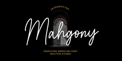 Mahgony is a signature monoline script font with unique and elegant curves. Features : uppercase, lowercase, symbol, number, ligature, and also support multi language. Mahgony is perfect for photography, watermark, social media posts, advertisements, logos & branding, invitation, product designs, label, stationery, wedding designs, product packaging, special events or anything that need handwriting taste.
 - Bellasia Hawainis by Inermedia Studio,
$15.00 Introducing the beautiful and delicate handmade Bellasia Hawainis Font. Fonts designed for your design and business needs. It has beautiful and charming letters with more than 150 characters. Subtle curves will make your business stand out even more in the market. A few Glyph and Swash will add a punch to your masterpiece.
 - Regan by The Northern Block,
$19.30 A finely crafted sans serif typeface with an uncomplicated appearance. Soft curves are mixed with minimal angles to create a readable font ideally suited for identity, editorial and online uses. Details include 10 weights with italics, 540 characters, 5 variations of numerals, small caps, stylistic alternatives, manually edited kerning and Opentype features.


