10,000 search results
(0.037 seconds)
- Monarqy by Alit Design,
$20.00 Discover Monarqy - The Funky Retro Font with Dynamic Flair Get ready to transport your projects back to the rad era of the 1980s with Monarqy, a font that encapsulates the funky, retro style of the era while adding a contemporary twist. This font will infuse your designs with a vibrant, nostalgic energy that captures the essence of the 80s like no other. Why Monarqy Stands Out: Cool Dynamic Characteristics: Monarqy oozes character with its funky, dynamic design. Each letter exudes a sense of movement and excitement, making it the perfect choice for projects that demand a playful and energetic vibe. Ligatures for That Perfect Flow: Monarqy offers an extensive range of ligatures, ensuring that your text flows seamlessly, delivering a polished and professional appearance. This feature is a game-changer for designers who demand precision in their typography. Rich Character Set: With an impressive repertoire of 610 characters, Monarqy accommodates a wide array of design applications. Whether you're crafting headlines, branding, or body text, you'll find all the characters you need to bring your vision to life. Alternatives for Creative Freedom: Monarqy doesn't hold back when it comes to creative freedom. The font provides alternative characters that let you experiment and find the perfect fit for your design. Customize your text to match your unique style and vision effortlessly. Multilingual Support: Monarqy is your passport to the global design landscape. With comprehensive multilingual support, it effortlessly adapts to various languages and ensures your message resonates across borders. PUA Unicode: Monarqy is PUA (Private Use Area) encoded, allowing you to unlock even more creative potential. Access special characters and ornaments that will set your designs apart from the rest. Monarqy is Perfect for: Retro-themed designs 80s-inspired branding Party invitations and posters Apparel design Album covers Packaging and labels Editorial layouts And so much more! Reignite the spirit of the 80s with Monarqy and let your creativity shine. Whether you're working on a fun project or a professional design, this font will add that extra touch of style and nostalgia. Get your copy of Monarqy today and embark on a typographic journey back to the funky, retro world of the 80s!
 - PF Das Grotesk Pro by Parachute,
$79.00 Das Grotesk was inspired by earlier nineteenth-century grotesques, but it is much more related to American gothic designs such as those by M.F. Benton. Due to their pure geometric structure, most grotesque typefaces tend to have a rather monotonous and lifeless appearance, thus failing to express the ideals of the modern creed. Das Grotesk on the other hand is a lively design with several distinguishable characteristics which attract attention when set at large sizes, whilst they become subtle and blend evenly at small sizes, fostering a neutral identity. This is a very legible and space-saving typeface with a narrow structure. It was designed with slanted curved ends and sheared terminals applied on several straight strokes. It has two-storey ‘a’ and ‘g’ but includes single-storey alternates. The family consists of 14 weights ranging from Extra Thin to Black (including true-italics). It provides simultaneous support for Latin, Cyrillic and Greek and is loaded with several advanced typographic features such as small caps. Download its complehensive PDF Specimen Manual for further details.
 - Flexible by Art Grootfontein,
$40.00 Inspired by late 19th century’s gothic typefaces from broadsides, Flexible uses the latest font technology to allow designers to play with each letter height and width easily. This versatile uppercase typeface is available in 8 widths and 8 heights, and as a variable font which gives you unlimited font possibilities! By using the variable version you only need to install one font file instead of the entire family and you take full advantage of the tremendous scope for design. Flexible was also developed with animation in mind to create amazing kinetic typography videos. Please have a look at this video to see animation examples. This family is a perfect choice for standout headlines, displays, packaging, flyers, logos, and works well in both print and digital environments like sophisticated web design or kinetic typography. The complete family pack includes the variable font. Language support : Afrikaans, Albanian, Azerbaijani, Basque, Bosnian, Catalan, Croatian, Czech, Danish, Dutch, English, Estonian, Faroese, Filipino, Finnish, French, Galician, German, Hungarian, Icelandic, Indonesian, Irish, Italian, Latvian, Lithuanian, Malay, Norwegian Bokmål, Polish, Portuguese, Romanian, Slovak, Slovenian, Spanish, Swahili, Swedish, Turkish, Welsh, Zulu
 - Xpress by Wiescher Design,
$12.00 »XPress« is a very distinct, expressive, typical new Sans. »XPress« is my new Sans-Serif that impresses – especially in small sizes – with its outstanding readability. Seven precisely calibrated weights from »Thin« to »Heavy« and its corresponding italics make this font-family universally usable. »XPress« got its bearings from the fabulous American »Gothic« fonts of the twenties of last century. Modern, present day elements, high lowercase letters and infinitesimal elegant slight curves in start- and end strokes make the font family not only great for body copy, but also very useful in advertising. »XPress« ist eine individuelle, expressive, typische neue Sans. »XPress« ist meine neue Serifenlose die – speziell in kleinen Schriftgraden – durch aussergewöhnliche Lesbarkeit auffällt. Sieben präzise aufeinander abgestimmte Schnitte von »Thin« bis »Heavy« und dazu passende Kursive machen die Schriftfamilie vielseitig einsatzfähig. »XPress« orientiert sich bewusst an den grossen amerikanischen Groteskschriften der zwanziger Jahre des letzten Jahrhunderts. Durch moderne Formelemente, große Mittellängen und unendlich leichte, elegante An- und Abstriche ist die Schrift jedoch nicht nur als Textschrift, sondern auch im gesamten Bereich der Werbung vielseitig einsetzbar.
 - ITC Kabel by ITC,
$40.99 The first cuts of Kabel appeared in 1927, released by the German foundry Gebr. Klingspor. Like many of the typefaces that Rudolf Koch designed for printing use, Kabel is a carefully constructed and drawn. The basic forms were influenced by the Ancient Roman stone-carved letters, which consisted of just a few pure and clear geometric forms, such as circles, squares, and triangles. Koch also infused Kabel with some elements of Art Deco, making it appear quite different from other geometric modernist typefaces from the 1920s, like Futura. Linotype has two versions of Kabel in its library. Kabel has a shorter x-height, with longer ascenders and descenders, making it a bit truer to Koch's original design than the second version, ITC Kabel, which was designed by Victor Caruso. This version, also known in the United States as Cable, has a larger x-height, shorter ascenders and descenders, more weights ,and a diamond shaped i-dot. Typefaces in the same oeuvre include Avenir Next, ITC Avant Garde Gothic, Metrolite, Metromedium, Metroblack, and Erbar, just to name just a few."
 - Bordonaro Script by Estudio Calderon,
$35.00 Bordonaro Script - Bordonaro Spur’s partner - is an interpretation of the “English Roundhand” style with a strong influence by the logos of American basketball and baseball teams. It is designed from simple shapes ideal to be used in long titles and fits perfectly into the branding design. Psss...Check out the NEW Bordonaro Script with Rounded corners , same version but soft! Bordonaro has a complete set of special and original characters: Stylistic Ligatures, Discretionary Ligatures, Swashes, Contextual Alternates, Titling, ss01,ss02, ss03 & apostrophes' ligatures that work as complements to enrich the text composition. Bordonaro Script and Bordonaro Spur are two typographic styles that were designed under the same characteristic features with the idea of combining them to obtain better results, for that reason, we recommend merging them in a creative way and you will realize everything you can design with them. The banners designs are based on old brands of beer labels, coffee packaging, sports logos and in some cases we use Copperplate Gothic but only as a complementary font in order to harmonize the layout of the elements in each banner.
 - Lotter by Kaer,
$19.00 Lotter blackletter with Drop caps One fine day I found a vintage book, it called “A treatise by the Dominican friar-writer Marcus von Weida on the Brotherhood of the Holy Rosary”. It was printed in 1515 by Melchior Lotter in Leipzig. The text was illustrated by hand-colored engravings on religious and liturgical themes and beautiful initials I like. Lotter was the last name of a family of German printers, intimately connected with the Reformation. An innovation by the elder Lotter was his use of Roman types for Latin, reserving the Gothic types for German. I'm happy to present to you my new font family. Lotter font family has Drop cap and Regular styles. It's all you need to precisely imitate medieval style text. Use Drop cap style as a decorative element at the beginning of a paragraph or section, other part of the paragraph should be in Regular style. You’ll get: * Drop cap & Regular styles * Uppercase and lowercase * Multilingual support * Numbers * Symbols * Punctuation * Ligatures Please feel free to request any help you need: kaer.pro@gmail.com Best, Roman.
 - DF Dejavu Pro by Dutchfonts,
$39.00 This font is an orphanage where all the beautiful details of classical grotesque typefaces from the early twentieth century are gathered, and thus living together, are forming a ‘new’, happy family. The aim was to collect my favorite characters in one font. The start was an eclectic collection orientated on British types from the Caslon Doric No. 4, the Monotype Grotesque, the Gill, the Franklin Gothic up to the Transport. In this amalgamation I avoided the narrow apertures in the ‘e’, ‘c’ and in the numerals ‘5’, ‘6’ and ‘9’ and enlarged the x-height dramatically. To the classical slanted form of the italics I added real italic forms for ‘a’, ‘e’ and ‘g’ in order to obtain a more distinguished italic style. DF-Dejavu Pro supports all Latin-based languages (Western, Central-European, Eastern-European, Baltic and Turkish) and includes small capitals, ligatures, inferior & superior numerals and letters, fractions, various numeral styles: proportional lining, tabular lining, proportional old-style, tabular old-style and last but not least a slashed zero.
 - Vinicius by Jehoo Creative,
$19.00 Introducing the Vinicius font, a gorgeous typeface that combines the timeless allure of gothic typefaces with a contemporary twist. Inspired by the rich heritage of medieval calligraphy, Vinicius offers beautiful forms that attract attention and inspire courage. Vinicius offers a range of Stylistic Alternate, allowing you to explore artistic possibilities and customize your typography creations. One of Vinicius' standout features is his striking collection of ligatures. These skillfully crafted letter combinations enhance the flow and coherence of your text, giving it a harmonious and seamless appearance. Whether you're crafting a headline, invitation or logo, Vinicius ligatures add a signature touch that sets your design apart. Italic variants add a touch of dynamism and flair to your text, allowing you to emphasize specific words, phrases or paragraphs with a visually appealing slant. Vinicius font is ideal for a variety of creative projects, including branding, editorial design, packaging, and more. Its ability to seamlessly blend tradition and modernity makes it a powerful tool for conveying both classic and contemporary aesthetics.
 - Trovoada Mono by SullivanStudio,
$25.00 Trovoada Mono is a monospaced font for use in print (but also looks great on display). Hand-drawing glyph by glyph, my intention was to get that old manual typewriter look, with uneven inks, but with a totally up-to-date, emotional and admittedly humorous attitude. Trovoada Mono borrows from classics like Courier and Letter Gothic, reinventing serifs here and there. The result is a font that is both familiar and unusual. As I love Greek typography, I made sure to include a full polytonic alphabet, in the same vintage spirit: the text looks very legible and matches the Latin characters. The font has no kerning, obviously, and no ligatures (this is a typewriter, my friend!), but it has important OpenType features: fractions, subscripts/superscripts, slashed zero and stylistic alternatives for some characters. The italics are 11 degrees, which brings a strong personality. Some characters have true italics, giving the text an overall texture different from the upright type. All that is missing is that nervous typewriter noise. Enjoy!
 - Ansage by Sudtipos,
$49.00 Ansage does not claim to be neutral; it escapes from the rationalist sans of closed strokes and regular forms. Meaning Announcement in German, Ansage is versatile and communicates effectively across a broad range of media and formats such as branding, posters, websites, apps, titles and compositions with little spacing). Ansage is a sans serif font with a strong personality that emerges from an interest in and the study of a wide variety of typographic specimens of Gothic fonts from the nineteenth century. The design process behind Ansage brought about constant transformations in form; the result is a compact and robust font, with a large x-height, small ascenders and descenders, and open terminals that grow in expressiveness as it increases in weight. It is available in 10 weights, ranging from Hairline to Black, and 3 widths – Condensed, Regular and Expanded – plus italics, which make a total of 60 perfect variables to combine and contrast with each other. In addition, it also includes multiple open-type functions such as alternative styles, Old Style Figures, Tabular Forms, fractions, case sensitive, ligatures and more.
 - Black Child by Blankids,
$23.00 Hello, Are you looking for a Blackletter font? Do you want of creating Something that stand out and inspire creativity, imagination, and endless fun? Wait no more, we will give you the best choice. Black Child a Natural Blackletter Font Black Child a Blackletter Font, Inspiring from gothic style typography. This font is perfect for a design that makes it more attractive and playful. made with a very good level of aesthetics making this font suitable for book cover, children book, comic, poster, packging, merchandise, logotype and much more. Black Child font includes Multilingual Support, among others : Afrikaans, Albanian, Asu, Basque, Bemba, Bena, Breton, Catalan, Chiga, Cornish, Danish, Dutch, English, Estonian, Faroese, Filipino, Finnish, French, Friulian, Galician, German, Gusii, Indonesian, Irish, Italian, Kabuverdianu, Kalenjin, Kinyarwanda, Luo, Luxembourgish, Luyia, Machame, Makhuwa, Meetto, Makonde, Malagasy, Manx, Morisyen, North Ndebele, Norwegian Bokmål, Norwegian Nynorsk, Nyankole, Oromo, Portuguese, Quechua, Romansh, Rombo, Rundi, Rwa, Samburu, Sango, Sangu, Scottish Gaelic, Sena, Shambala, Shona, Soga, Somali, Spanish, Swahili, Swedish, Swiss German, Taita, Teso, Uzbek (Latin), Volapük, Vunjo, Zulu FEATURES : Uppercase Lowercase Number Punctuation Multilingual PUA Encode Opentype
 - Seibi Isarago by Nihon Literal,
$169.00 Gothic in a contemporary style designed with a broad skeleton. Considering line alignment, we have aimed for a sense of harmony in both vertical and horizontal typesetting. フトコロ(画と画の間の空間)を広くデザインした現代的感覚のゴシック体。組み版時のライン揃えを考慮し、タテ組ヨコ組で違和感のない書体を目指しました。木版時代から手書きレタリングへと引き継がれてきた精美堂ゴシック体をデジタルフォントで再現。手書き文字を組んだ印象はそのままに、フトコロを広く現代風にアレンジしました。遠くからでも近くからでも読みやすい、目を引く見出し用ゴシックです。
 - Fairtrade by Device,
$39.00 Rough and ready artisanal lettering for your fair trade coffee shop, whiskey microbrewery or Victorian bill-poster — or, alternatively, distressed type for the cover of a hard-hitting novel set in a war zone. Fairtrade uses opentype technology to cycle through three versions of each character, giving an authentically uneven time-worn appearance.
 - Etheryna by Typehand Studio,
$16.00 Etheryna Handwriting Calligraphy Series from us. Etheryna is handwritten signature script with a natural & stylish flow. This collection of scripts is perfect for personal branding. In order to use the beautiful swashes, you need a program that supports OpenType features such as Adobe Illustrator CS, Adobe Photoshop CC, Adobe Indesign and Corel Draw.
 - Better Wednesday by Letterhend,
$14.00 Better Wednesday is a handwritten script with brush textured. This type of font perfectly made to be applied such as invitations, labels, logos, magazines, books, greeting / wedding cards, packaging, fashion, make up, stationery, novels, labels or any type of advertising purpose Features : - Uppercase & lowercase - Numbers and punctuation - Alternates & Ligatures - Multilingual - PUA encoded
 - Chica Maravilla by Artisan Studio,
$16.00 Chica Maravilla is a work that is purely a result of handwriting, and has a natural characteristic. This is perfect for invitations, signatures, blogs, social media, business cards, product brands. OpenType features can be accessed by using OpenType smart programs such as Adobe Photoshop, Adobe Illustrator, Adobe Indesign, Corel Draw and Microsoft Office.
 - Taniesha by Rillatype,
$17.00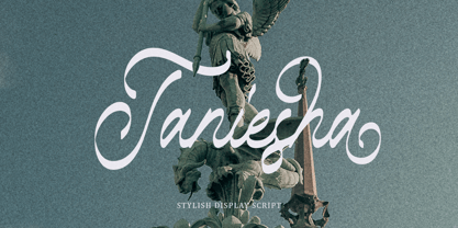 Introducing, Taniesha. Taniesha is a stylish display font with swash! This font has up to 8 alternates character set to make your design looks more eye catching! This font is perfect for logo, wedding invitation, magazines, books, packaging, stationery, novels, etc. Features : uppercase & lowercase numbers and punctuation multilingual ligatures alternates PUA encoded
 - "Quick End Jerk" is a distinctive font designed by the talented Vic Fieger, a name well-recognized in the font design industry for creating a variety of unique and eye-catching typefaces. This partic...
- Frutiger Stones by Linotype,
$29.00In Adrian Frutiger, the discipline of a mathematically exact mind is joined with an unmistakable artistic sense. His independent work possesses the controllable language of letterforms. Personal and intensive, this work is the manifestation of his expressive will. Frutiger's precise sense of outline reveals itself two- or three-dimensionally in wood, stone, or bronze, on printing plates and in the form of reliefs. However, even his independent work can be understood as objectivized signs; in their symbolism, they are embedded in the fundamental questions of human existance. They might have developed in the spirit of playfulness, but their nature is always conceptual, directed towards a complex, yet harmonic, whole. Following function, form also necessarily follows the content of the language. The entire spiritual world becomes readable through letters. Essentially, Adrian Frutiger attempts to fathom the basic, central truth which defines our lives: change, growth, division - beginning and end. In a virtual synthesis, he seems to close the circle in which the world reflects itself in symbolic forms. Frutiger Stones is for Adrian Frutiger the example of his formal artistic sensibility par excellence. Searching for the fundamental elements in nature, he has discovered the pebble, rounded and polished over innumerable years by gently flowing water. And out of this, he has created his complete system, a ruralistic typeface of letters and symbols. It depicts animals and plants, as well as astrological and mythical signs. Because of its unique aura, Frutiger Stones is particularly well-suited to different purposes - in headlines and prominent pictograms, as symbol faces, illustrations, and more. - Prillwitz Pro by preussTYPE,
$49.00 Johann Carl Ludwig Prillwitz, the German punch cutter and type founder, cut the first classic Didot letters even earlier than Walbaum. The earliest proof of so-called Prillwitz letters is dated 12 April 1790. Inspired by the big discoveries of archaeology and through the translations of classical authors, the bourgeoisie was enthused about the Greek and Roman ideal of aesthetics. The enthusiasm for the Greek and Roman experienced a revival and was also shared by Goethe and contemporaries. »Seeking the country of Greece with one’s soul«. All Literates who are considered nowadays as German Classics of that time kept coming back to the Greek topics, thinking of Schiller and Wieland. The works of Wieland were published in Leipzig by Göschen. Göschen used typefaces which had been produced by until then unknown punch cutter. This punch cutter from Jena created with these typefaces master works of classicist German typography. They can stand without any exaggeration on the same level as that of Didot and Bodoni. This unknown gentleman was known as Johann Carl Ludwig Prillwitz. Prillwitz published his typefaces on 12th April 1790 for the first time. This date is significant because this happened ten years before Walbaum. Prillwitz was an owner of a very successful foundry. When the last of his 7 children died shortly before reaching adulthood his hope of his works was destroyed, Prillwitz lost his will to live. He died six months later. His wife followed him shortly after. The typeface Prillwitz as a digital font was created in three optical styles (Normal, Book and Display). The typeface Prillwitz Press was created especially for a printing in small sizes for newspapers. »Prillwitz Press« combines aesthetic and functional attributes which make written text highly readable. It was originally designed for a newspaper with medium contrast to withstand harsh printing conditions. Its structure is quite narrow which makes this typeface ideal for body text and headlines where space is at premium. For the Normal – even more for the Book – a soft and reader-friendly outline was created through a so-called »Schmitz« and optimized in numerous test prints. The arris character and the common maximal stroke width contrast of the known classicist typefaces (Didot/Bodoni) were edited by the study of the original prints. This was also done in order to reach a very good readability in small type sizes. This typeface is perfectly suited to scientific and belletristic works. Accordingly it has three styles: Regular, Bold and Italic as Highlighting (1). The typeface Prillwitz is a complete new interpretation and continuing development of the conservated originals from 1790. They have been kept in the German Library in Leipzig. It was always given the priority to keep the strong roughness and at the same time optimizing the readability of this striking font. The type family has all important characters for an efficient and typographic high quality work. ----------- (1) Accentuation of particular words or word orders (e.g. proper names, terms etc.). Typographic means for Highlighting could be Italic, SmallCaps or semi-bold.
 - Tombstone, designed by Iconian Fonts, is a distinctive typeface that captures the essence of the Wild West and evoking the rugged aesthetics of historical tombstones. This font stands out due to its ...
- Draghile by Alfaraby Studio,
$15.00 Draghile a fonts of stylish calligraphy that have a varied base line, fine lines, classic and elegant touches. Can be used for various purposes. Such as title, signature, logo, wedding invitation, t-shirt, letterhead, nameplate, label, news, poster, badge etc. Draghile displays stylish calligraphy alternate characters. Includes initial letters and terminals, alternatives, ligatures and multiple language support. Programs that support in this font is a Adobe Photo Shop, Adobe Illustrator, Adobe Indesign, Corel Draw and Microsoft Office. OpenType features can be accessed by using open type smart programs such as adobe photo shop, adobe Illustrator, adobe indesign, corel draw and microsoft office. can also be accessed through the character map. Special greetings for all, all of us all smoothly in running the routin. Thank you for your purchase!
 - Karephia by Alfaraby Studio,
$15.00 Karephia a fonts of stylish calligraphy that have a varied base line, fine lines, classic and elegant touches. Can be used for various purposes. Such as title, signature, logo, wedding invitation, t-shirt, letterhead, nameplate, label, news, poster, badge etc. Karephia displays stylish calligraphy alternate characters. Includes initial letters and terminals, alternatives, ligatures and multiple language support. Programs that support in this font is a Adobe Photo Shop, Adobe Illustrator, Adobe Indesign, Corel Draw and Microsoft Office. OpenType features can be accessed by using open type smart programs such as adobe photo shop, adobe Illustrator, adobe indesign, corel draw and microsoft office. can also be accessed through the character map. Special greetings for all, all of us all smoothly in running the routin. Thank you for your purchase!
 - Fathan by Alfaraby Studio,
$17.00 Fathan a fonts of stylish calligraphy that have a varied base line, fine lines, classic and elegant touches. Can be used for various purposes. Such as title, signature, logo, wedding invitation, t-shirt, letterhead, nameplate, label, news, poster, badge etc. Fathan displays stylish calligraphy alternate characters. Includes initial letters and terminals, alternatives, ligatures and multiple language support. Programs that support in this font is a Adobe Photo Shop, Adobe Illustrator, Adobe Indesign, Corel Draw and Microsoft Office. OpenType features can be accessed by using open type smart programs such as adobe photo shop, adobe Illustrator, adobe indesign, corel draw and microsoft office. can also be accessed through the character map. Special greetings for all, all of us all smoothly in running the routin. Thank you for your purchase!
 - Hibagon by Hanoded,
$15.00 Hibagon is the Japanese equivalent of the Yeti from the Himalayas, or Bigfoot from North America. It is usually sighted on Mt. Hiba (Hiroshima prefecture), hence the name. I have never seen Hibagon myself, even though I have visited Hiroshima several times. Hibagon font is a nice, handpainted, all caps font with a mythical feel to it. It probably won’t scare you, but it will look good on anything that needs a bit of brushwork, or a bit of roughness.
 - Roundica by Fontease,
$20.00 Roundica is a modern geometric typeface inspired by both classic typefaces of the 20th century like Avantgarde, Bauhaus, Futura, Helvetica and some modern fonts such as Abeat By Kai, Comfortaa, Gotham. Started in 2018 Roundica is the main reason for the appearance of Fontease Type Foundry. With its 834 glyphs Roundica includes extended Latin language support, but also Cyrillic and Greek. Designed with OpenType features like ligatures, fractions, small capitals etc., Roundica is perfectly suited for graphic design and any display use.
 - Quinie SS by Sensatype Studio,
$15.00 Quinie is Modern Retro Fancy Font is a well-balanced contemporary font with a fancy, unique, and versatile vintage serif, font that you can combine to get any variations and unique shapes easily just in seconds with choose alternates of them. It is a serif display font with moderate contrast that perfect for branding projects, logo, wedding designs, social media posts, advertisements, product packaging, product designs, label, photography, watermark, invitation, stationery, and any projects, it makes with a high level of legibility. What's Included: Character set A-Z Normal & Italic Style Numerals & Punctuation Accented Characters (West Europe) Stylistic alternates Works on PC & Mac Recommended using Adobe Illustrator or Adobe Photoshop. Wish you enjoy our font. :)
 - Malnor Sans by Sikifonts,
$24.00 Malnor Sans is a normal sans serif family of 18 fonts. With modern style or neo-grotesque, Malnor sans has balanced proportions in every letter, and it's clean, minimal and cool. There are several alternative letters that can be used in both upright and oblique styles. Single story 'a' can give a more geometric impression, even though it is not purely geometric. There is also an alternative double story 'a' with a tail, a double story 'g' and an alternative 'l' that can be applied together via the 'salt' or 'stylistic sets' features for a slightly warmer feel. Malnor Sans currently has around 900 glyphs, including diacritical marks, that support a broad Latin-based language.
 - Andron 2 ABC by SIAS,
$44.90 Andron 2 ABC is a product developed especially for children’s literature. It is an ideal choice for primers and other books for the age when children are learning to read. The typeface has the same peak typographic quality as any other font of the praised Andron series—the very best is just good enough for our kids, is it not? As a difference from the normal glyph set (as in Andron 1 Latin or Andron Mega), the letters a, g and y have those simpler single-story shapes that resemble the forms usually taught in writing, which are sometimes called infant letterforms. Now, Andron 2 ABC is available in a full four-font family set.
 - NorB Type Writer Roughen by NorFonts,
$25.00 NorB TypeWriter Roughen is the roughen version of my NorB TypeWriter typeface witch's my emulation of the IBM Selectric 'Light Italic' ball witch was used by my grand-brother for his correspondance during the 70’s and 80’s. It's however a slanted mono-spaced looking typewriter font. You may want to use this font with any word processing program for text and display use, print and web projects, apps and ePub, comic books, graphic identities, branding, editorial, advertising, scrapbooking, cards and invitations and any casual lettering purpose… or even just for fun! NorB TypeWriter Roughen features 677 glyphs, OpenType features and comes in 6 weights each with their matching italics and in a Light, Normal and Bold version.
 - Aceituna by Hanoded,
$15.00 Aceituna means ‘olive’ in Spanish. It comes from the Arabic Al-Zeitoun. I am multi-tasking today: finishing this font and thinking about what to cook for my family tonight (yes, I am the one who cooks!). We normally eat Asian food, but I was toying with the idea of serving something Mediterranean and realised we had run out of olives. So there you have it: the super simple trick of naming a new font! But enough of cooking: Aceituna font was made with a Japanese brush pen. It is a very versatile font: tall and thin, elegant and a little messy. A hint of texture and, like olives, it goes with almost anything.
 - FT Massachusettz by Foxys Forest Foundry,
$9.00 FT Massachusetts is a dense, hand-drawn sans-serif typeface with uneven edges and a dancing baseline. It creates a vivid impression, feels friendly, playful, and communicative. The font is full of alternate letters, symbols, and graphics. It easily adapts, confidently engages with the customer, and transforms slightly depending on the space and purpose. Change letters to alternates for the uniqueness of spellings. For convenience, alternative characters are used when typing in lowercase, and normal letters are used when typing in uppercase. Additionally, you can always switch letters to additional alternative ones and insert symbols. Furthermore, to add visual interest, the font is equipped with auto-replacements for prepositions and word endings.
 - Roclante Display by FoxType,
$12.00 Roclante Display is a Brand New Elegant Typeface with a powerful font family. It has a dependable and uncompromising style, with controlled letterforms and modern touches. It looks amazing in logos, magazines, and movies. Roclante Font would be perfect for branding, headlines, Captions, paragraph, and posters. The various weights allow you to experiment with a wide range of applications. It's created to make an impression without sacrificing its beauty and readability. It's shown a clean, minimalist, warmth, quirky, yet still purposed to be versatile The Typeface includes Six Weights - UltraLight, Light, Normal, Medium, DemiBold, & Bold. All offer wide language support, upper and lower cases, numerals and extended punctuation. Thank you for taking the time to look into the font.
 - Sica Condensed by dooType,
$30.00 The Sica Family was designed in order to address issues related to technology, while maintaining humanistic forms. Thus, a font with square shapes emerged, but with smooth curves and slightly rounded terminals making it friendly. The family has three widths – condensed, normal and expanded – each of them with six weights and their respective italics, resulting in 36 fonts. With particular details and open shapes that increase legibility, it can be used for both text compositions as well for display sizes. It has 774 glyphs, covering more than 50 languages, as well as ligatures, lining, oldstyle, tabular and proportional figures, fractions, superiors, inferiors, and small caps, all of them accessible through OpenType features.
 - 1913 Typewriter Carbon by GLC,
$38.00 1913 Typewriter Carbon is the bold version of GLC foundry's 1913 Typewriter. It is available in two styles: Normal, and Underlined (Bold). It is a complete alphabetic font. It is used as variously as web-site titles, posters design or books editing. It may be preferable, if possible, when printing, to choose a pale color - dark grey instead of heavy black, for exemple - to give a good appearance, just like the real one, and still benefit from the full details. With inkjet printers, it may be used the economic or draft option with a good result too. The old typewriter characters size is 11 or 12 points, but this font supports easily enlargement.
 - Composer JNL by Jeff Levine,
$29.00 There are thousands of pieces of vintage sheet music available for collectors and curiosity seekers. Prior to the 1930s, a large percentage of them had wonderfully hand-lettered titles on the covers, but gradually there was a shift by music publishers to utilizing metal type for the bulk of their output. Normally set in an all-caps format, certain type faces reappeared in growing frequency and familiarity. Composer JNL is one such example of a “workhorse” font, and has been re-drawn and reinterpreted by Jeff Levine Fonts in both regular and oblique versions. It is based on the design "Glamour", released by Lanston Monotype in 1948; which in turn was based on "Corvinus", designed by Imre Reiner.
 - Skiltmaler by Imagi Type,
$15.00 Skiltmaler is the typeface that refers to the style of decorative arts during the Victorian era 1837 to 1901, the Victorian era was the period in which fly poster typography emerged. The large amount of colour in combination with large font sizes were created from movable metal type. As well as being made from wood, this was used to create the two-coloured typefaces. You would imagine this would be specific to the '3D' styled type seen on the poster to create the drop shadow. Skiltmaler works well with normal size text, but it works even better for large displays, short words, or even just to incorporate a few or single characters in a design.
 - Rachel Brown by Fargun Studio,
$25.00 Introducing Rachel Brown! A chic & modern serif font. This font is perfect for branding, logos, social media, prints, stickers, shirts, svg files and more! Rachel Brown is unique as it can be used for a variety of design styles. It fits in wonderfully for free-spirited, boho designs and also for more classy editorial looks! There are a lot of fun stylistic alternates available to use with this font. These letters are embedded into the font file and easily accessible in programs such as photoshop and illustrator. Rachel Brown comes with a wide range of OpenType -features. Keep Standard Ligatures on in normal use. Try Discretionary Ligatures, Swash, Stylistic or Titling Alternates for custom headlines or logos.
 - Zega Text by Isaco Type,
$24.00 Zega Text is a top-heavy sans family, inspired in the imprecisions of letterpress printing. Zega has 14 versions that give to your text (printed or on screen) a delicious sense of old printing. Give an exclusive touch to your text with normal versions, without losing reading clarity. Try the heavier versions and add a nice impact to your titles! The family consists of 14 styles, 7 weights plus their respective italic versions. The fonts are available in OpenType PS and have extended character set to support CE, Baltic, Turkish as well as Western European languages. You can test Zega Text downloading the free trial font in Semibold version (TT only). This trial file supports only Western languages.