10,000 search results
(0.019 seconds)
- Summer of Love by Mysterylab,
$14.00 It's the Summer of Love all over again with this groovy psychedelic font. Designed in 2019, this typeface harks back to the carefree days of the late 1960s. Whimsical and offbeat with its swaying verticals, it nonetheless remains one of the more legible reimaginings of the genre, sporting all of the handlettered vibe of posters and album covers from the original hippie era, but with polished color and weight that evens out the legibility even at relatively small point sizes. Predominantly a unicase font, with a couple of alternate glyphs from upper to lowercase, Summer of Love works best as a large headline face, and benefits greatly from twisting and morphing the type blocks as was common during the original psych era. It's a real groove machine, baby.
 - Brim Combined by Jamie Clarke Type,
$20.00 Brim Combined packs all of the character of the popular layered typeface, Brim Narrow, into three eye-catching font styles. Inspired by antique wood type from the 1800s, Brim is warm and tactile. Its innovative styles produce both striking headlines and sophisticated titles, making it perfect for posters, packaging and logotypes. Brim Combined makes it even easier to achieve punchy headlines on the web. This flattened version of Brim does not require professional design software to use and is compatible with Microsoft Word. • Combined 1 features Brim’s elegant, handmade line work • Combined 2 includes a drop shade with an outline • Combined 3 has an offset shade and a reversed-out face Brim is an all-caps typeface with Western European, Central European and South Eastern European language support.
 - Use Your Words by Joanne Marie,
$10.00 Here’s a different kind of font for the hand lettered look! Use Your Words is a catchwords font family consisting of 3 fonts: 1.) Use Your Words Circles 2.) Use Your Words Arrows 3.) Use Your Words Banners It’s all hand drawn and hand lettered in a monoline script font with a shadow effect to boot. This font will be perfect to include on designs such as mugs, t-shirts, bags, notebooks, inspirational quotes for the home and office, and more. There are 215 words (no more than 4 letters per word) in both upper and lowercase, plus numbers, ampersand, question and exclamation marks in all three styles. There are 444 glyphs per font. I love using this font in my hand lettering designs and I hope you will too!
 - Dip Pen JNL by Jeff Levine,
$29.00 Answer Songs have been around for [probably] just as long as there have been songs. 1917's "If I Catch the Guy Who Wrote Poor Butterfly" was the answer to the 1916 hit "Poor Butterfly" [by Raymond Hubbell and John Golden], which in turn was inspired by the Puccini opera "Madame Butterfly". "Poor Butterfly" was so popular that this "answer" tune had as part of its lyrics "That melody haunts me in my sleep; it seems to creep." Nonetheless, the sheet music for William Jerome and Arthur Green's comic lament had the title hand lettered with an oval nib lettering pen and is now availably as a digital type face called Dip Pen JNL.
 - Aldo New Roman by Indian Summer Studio,
$45.00 Aldo New Roman (1000+ glyphs, incl. medieval Latin, Cyrillic, some Greek, ornaments, small capitals, nut fractions...) Renaissance antiqua · Venetian types · Venetian serif · Humanist serif · Old style antiqua A modern version of the typeface cut by Francesco Griffo for Venetian printer Aldus Manutius around 1490 AD. Intentionally not the original Griffo / Aldus / Bembo — but the part of the large project on revival and further development (by drawing many additional glyphs, sometimes over 1000) of the 20th century's typewriters’ fonts. Triple pun here :: :: #1 Aldine Roman type; #2 Since it is equalized, modernized version — the parallel to the Times New Roman; #3 He called himself Aldus Pius Manutius Romanus — he was a new Roman during his Renaissance times.
 - Vanitas by Reserves,
$49.00Vanitas is an elegant high contrast contemporary sans. It is rooted in the style of a classic didone, excluding the typical serifs and ball terminals as well as being designed with a cleaner, more reductionist appearance. Strict attention was given to the cohesiveness and balance between letterforms as well as the careful refinement of all curves. Stylistically, Vanitas’ alluring, sophisticated sensibility is directly inspired by high fashion. The upright styles are complimented by a pairing of optically adjusted true italics, which were purposefully adapted to retain the sharpness of their counterparts. Abandoning traditionally executed cursive italic letterforms retains Vanitas’ sharp characteristic through each style. Features include: Precision kerning Standard Ligatures set including ‘f’ ligatures (fb, ff, fh, fi, fj, fk, fl ffb, ffh, ffi, ffj, ffk, ffl, ffy, ae, oe, AE, OE) Discretionary Ligatures set including (st, ct, No) Alternate characters (H, A, AE, Q, $, h circumflex, ¶ and numero sign) Case forms (shifts various punctuation marks up to a position that works better with all-capital sequences) Capital Spacing (globally adjusts inter-glyph spacing for all-capital text) Slashed zero Full set of numerators/denominators Tabular Lining, Proportional Lining, Tabular Oldstyle and Proportional Oldstyle Figures Automatic fraction feature (supports any fraction combination) Extended language support (Latin-1 and Latin Extended-A) *Requires an application with OpenType and/or Unicode support. - Jenson Old Style by ITC,
$29.00In 1458, Charles VII sent the Frenchman Nicolas Jenson to learn the craft of movable type in Mainz, the city where Gutenberg was working. Jenson was supposed to return to France with his newly learned skills, but instead he traveled to Italy, as did other itinerant printers of the time. From 1468 on, he was in Venice, where he flourished as a punchcutter, printer and publisher. He was probably the first non-German printer of movable type, and he produced about 150 editions. Though his punches have vanished, his books have not, and those produced from about 1470 until his death in 1480 have served as a source of inspiration for type designers over centuries. His Roman type is often called the first true Roman." Notable in almost all Jensonian Romans is the angled crossbar on the lowercase e, which is known as the "Venetian Oldstyle e." Jenson Old Style™ was designed by Freda Sack and Colin Brignall for Letraset in 1982. Because of its darkness, this version is best used for display designs that call for a sense of old-world elegance and solidity." - Maker by Wilton Foundry,
$29.00 Maker, the font, pays homage to the Maker constructivist culture. Especially the sparked community interaction, and exchange of ideas through social meetings in shared spaces. With Maker you have hints of a Gothic minuscule heritage and pixel components that is carefully constructed into a discreet stencil font. The result is a fresh, contemporary and well grounded font that will shine in any technology, or arts related environment.
 - Mukadua by Letterhend,
$10.00 Mukadua consists of two fonts: serif and script. Mukadua means "two-face", and so it can be used in a happy and fun concept, but still looks great in dark, horror, or scary concepts! The main font is a serif font type with unique bouncing baseline, includes upper and lowercase characters, punctuation, numerals, and multilingual support. It also has OpenType features like stylistic alternates and ligatures.
 - Corona LT by Linotype,
$29.99Corona was designed by C.H. Griffith and appeared with Mergenthaler Linotype in 1941. It is a part of Griffith’s Legibility Group’, on which he began working in 1922 and which contains typefaces especially well-suited to newsprint. Corona is based on forms of the Ionic type, perhaps the first style designed specifically for newspapers. The font is relatively small but gives an impression of strength and modernity. - Herbal Infusion by Supfonts,
$15.00 Herbal Infusion is a sweet, modern calligraphic font with ligatures. It is perfect for branding, wedding invitations and invitation cards and many more Font includes a full set of gorgeous uppercase and lowercase letters, numbers, a large selection of punctuation marks and ligatures. Includes: Regular Script Latin languages support Uppercase and lowercase Numbers and punctuation Ligatures Check out my blog: https://www.instagram.com/di.zigner pinterest.com/dmitriychirkov7 Enjoy
 - Quasaria by Linotype,
$29.99Linotype Quasaria is part of the Take Type Library, selected from contestants of Linotype’s International Digital Type Design Contests of 1994 and 1997. The font was designed by German artist Armin Retzko and the characters are composed of disjointed pieces. The eye tries to complete the symbols into the forms they are used to. Linotype Quasaria with its unique forms is intended exclusively for headlines and displays. - Popten Display by Saffatin.co,
$10.00 Popten is a modern minimalist design typeface with semi condensed conture and include alternative character also some ligature. It is inspired by hype and urban design, freestyle and brutalism. Popten typeface suited for anything lifestyle project with trend design. It was designed to be versatile, to blend in your design with light or dark through thin to black weights can add a lot of touch of personality.
 - Arkham by Harvester Type,
$16.00 Arkham - a font that was created from the title of the cover of the comic book "Batman Absolution". The font conveys the Gothic and darkness that is inherent in this comic. The font is perfect for headlines, texts, posters, covers, merch, prints and more. Great language support. If you find an error in the font or kerning, write to: bunineugene@gmail.com, for a quick fix!
 - Café Brasil by Sofia Mohr,
$39.00 Café Brasil is a font designed to represent coffee, especially for use in packaging, brand titles, logos and menus. Based on the shape of a coffee bean, Café Brasil has delicate details and ligatures that represent the liquid, foam and steam of a good cup of coffee. In March 2014, Café Brasil was chosen to be part of the main exhibition at the “Tipos Latinos 2014”.
 - P22 Parrish by P22 Type Foundry,
$24.95 Maxfield Parrish (1870-1966), whose career spanned nearly ninety years, holds a unique place in American art and culture. He was enormously accomplished and successful in both fine art and commercial endeavors. Parrish's hand-drawn letters were a significant part of his works, which bridged the familiar with a startling otherworldliness. P22 has created the Parrish font set in cooperation with the National Museum of American Illustration.
 - Monsieur des problemes by Woodcutter,
$55.00 The commercial typeface with its irregular appearance is an artistic expression,With uneven strokes and slightly chaotic shapes, it exudes authenticity and impression.Perfect for titles that capture attention and stand out from the crowd,Complete with accents and punctuation marks, it's ready to make your designs proud.This typography brings originality and freshness, an unmistakable style,A tribute to creativity that will make your projects worthwhile.
 - Yardbird Numerals by Coniglio Type,
$9.95Yardbird, insinuating prison numerals, was lifted from a wooden block print poster press, that would have indeed besides providing dates for the local carnival would have just as easily ink-chucked them over the backs of those denim blues. Part of Market LTD, a collection of limited faces, mostly alpha-numeric and some just plain numeric, used primarily in retail and display situations and titling. - Sixties Flashback by Mysterylab,
$15.00 Here's a lettering style that just might be exactly on your wavelength. Add just the right dose of vintage freak-a-delia to your retro graphics with this original psychedelic-style design. Great for music posters, album graphics, book titles, etc. Evoke a warpy, wavy, whimsical vibe that harks back to the carefree 1960s or early 1970s era with Sixties Flashback; it's pure hippie, trippy fun!
 - Matchstick by Fenotype,
$25.00 Matchstick is a hand drawn brush script. Matchstick is packed with loads of ligatures and alternates that help simulate a swift look of a handwriting. This feature is set in Standard Ligatures and it is normally automatically on. Matchstick is a great display brush to be used in writing headlines, packaging, posters or as a logotype. Matchstick works great when paired with strong sans serifs.
 - Bazoo Tow NF by Nick's Fonts,
$10.00Here's a faithful rendering of the slightly quirky, but thoroughly yeomanlike headline face Basuto, designed by Stanley Baxter and released by the Stephenson Blake Type Foundry in 1927. Bold, brassy and a little sassy, this one will perk up your headlines fer sure. Both versions include the complete Latin 1252, Central European 1250 and Turkish 1254 character sets, as well as localization for Moldovan and Romanian. - The Hand Wide by S&C Type,
$13.00 The Hand Wide is a handwritten font designed by Fanny Coulez and Julien Saurin in Paris. It's the extended version of The Hand, coming in 8 heights finely balanced. We wanted to create the most generic and readable handwritten font, to work well in every kind of design. We hope you will enjoy our work :) You could follow us on our Instagram: instagram.com/sc.type Merci beaucoup!
 - Monoska by ATK Studio,
$15.00 Monoska is a display monospaced font designed with classic industrial taste and rounded font style by Radinal Riki. Inspired by retro vhs font. created for electronic displays found in our modern techie world such as postal packing slips, airline tickets, informational video displays, ads, logos and more. Come in only one weight, this entire font is capitalized and with a character set that covers over 100 languages.
 - Batavia Retro by Alpha Bento,
$15.00 Introducing a new handwritten font, Batavia Retro, a modern and minimal typeface packed with handwritten ligatures. Batavia Retro adds chic elegance to websites, wedding stationery, modern logos and branding, social media quotes and more. Great for signature logos and more. Batavia Retro Features Full Set of standard alphabet and punctuation Extra set of Alternate lowercase Extra stylistic alternates and ligatures PUA Encoded Multilingual Characters
 - Cool Beans by Comicraft,
$19.00 Can you dig it, man? Comicraft's Jazzy "JG" Roshell, just swung by after playing bongos down at the coffee bar in his black turtleneck sweater, stove-pipe trousers, dark glasses and beret. Check out the rad Tiki corners on our freshest font, COOL BEANS and you'll want to snap your fingers, put on some Miles Davis and take the next train out of Squaresville, um, Daddio.
 - Proto Mono by ATK Studio,
$15.00 Proto Mono™ is a modular monospaced font built with rounded shapes, designed with tech industrial taste by Radinal Riki. Created for electronic displays found in our modern techie world such as postal packing slips, airline tickets, informational video displays, ads, and more. Come with 2 styles with 4 weights each. This entire font is capitalized and with a character set that covers over 100 languages.
 - Vermandois by Magpie Paper Works,
$68.00 Rough yet refined, kinetic and distinctive, the handdrawn Vermandois family mimics original calligraphy with exceptional accuracy. Perfect for correspondence, invitations, unique branding and display, Vermandois' connecting letters, caps and ink blots make a mark. Vermandois regular includes contextual ligatures and double-letter ligatures, alternate caps, preposition & title word glyphs, old style numerals, international support, currencies and fractions. VermandExtra includes 52 coordinating strokes, splashes and splatters.
 - Tenderly by Supfonts,
$15.00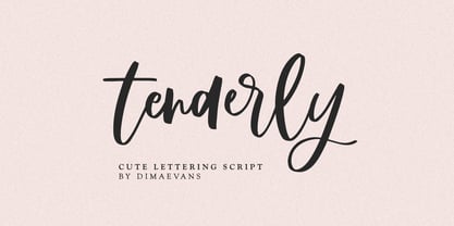 Tenderly it is a chic lettering font with exquisite accents. It is perfect for branding, wedding invitations and invitation cards and more. This font includes a full set of gorgeous uppercase and lowercase letters, numbers, a large selection of punctuation marks and ligatures. Includes: Regular Script Latin languages support Uppercase and lowercase Numbers and punctuation Ligatures Check out my blog: https://www.instagram.com/di.zigner/ pinterest.com/dmitriychirkov7 Enjoy
 - F2F Allineato by Linotype,
$29.99Allineato was part of the Face2Face project, a fontlabel created with a couple of friend in order to stimulate new ideas and forms in the typographical landscape. Most of the Typefaces were used by Alexander Branczyk in his famous techno magazine "Frontpage". About Allineato: "Al" means "Alessio Leonardi" and Lineato "lined", but if you read it as an italian world means "conformed to a given line". - Life by Linotype,
$29.99Life was designed in 1964 by W. Bilz and marks the beginning of a new generation of newsprint fonts. The Ionic style had replaced Modern Face and was now replaced by this new innovative style, which mixed elements of Old Face, Transitional and Modern Face forms. Life’s characters are based on the forms of Times and are the result of a time of change and experimentation. - Rosegold by Supfonts,
$14.00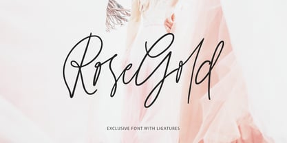 Rosegold it is a chic lettering font with exquisite accents. It is perfect for branding, wedding invitations and invitation cards and much more. This font includes a full set of gorgeous uppercase and lowercase letters, numbers, a large selection of punctuation marks & ligatures. Includes: Latin languages support Uppercase and lowercase Numbers and punctuation Ligatures Check out my blog: https://www.instagram.com/di.zigner pinterest.com/dmitriychirkov7 Enjoy
 - Swung Note by PintassilgoPrints,
$35.00 Swung Note is a groovy and dynamic font, packed with more than three hundred smart interlocking pairs that do their magic powered by OpenType programming. Since the letters assume different shapes in the many different ligatures, the compositions look truly handcrafted. Swung Note is definitely a great – and quite playful – tool for creating amazing custom-lettered looking designs, while keeping the groove going. Swing-along!
 - Sophisto by MAC Rhino Fonts,
$36.00 A successful collaboration between MRF and Psy/Ops Type Foundry. In search for a Sans Serif with a significant and strong character but still ”low-key” enough to be functional for most areas, Sophisto finally grew into an extensive family of 21 parts. Made carefully to fit both text- and display solutions. The buttons, images and patterns makes it even more complete as a family.
 - Dassitzt by Linotype,
$29.99Dassitzt is a family of two typefaces, Dassitzt LT Typos and Dassitzt LT Pictos. Dassitzt LT Typos is a heavy industrial-grunge display face, with dark, even letters that appear cut out of black paper or iron. Dassitzt LT Pictos is a whimsical collection of pictograms. The figures in this font are black silhouettes that show a minimum amount of detail, but a maximum amount of expression. - Satiata by Tour De Force,
$30.00 Satiata is fat, single, display font that's full of charm. Tightly spaced, Satiata is designed with condensed proportions which place the font in versatile position – it can be used for posters, titles, outdoor graphics, but equally the same for package, branding or websites. It is recognizable enough to lead every project. Satiata contains extended Latin character map with two stylistic sets and small pack of ligatures.
 - Eckhardt Poster Brush JNL by Jeff Levine,
$29.00Eckhardt Poster Brush JNL is part of a series of fonts emulating many of the various styles of hand lettering employed by sign painters and show card writers. The series is named in honor of the late Albert Eckhardt, Jr. - a talented sign writer and a good friend of the font's designer, Jeff Levine. Eckhardt Poster Italic JNL is an angled treatment of the font. - Squeezed by MAC Rhino Fonts,
$59.00 Squeezed is the result of exploring mid 20th Century sans serif typefaces. As the name suggest, the typeface is indeed condensed which is also a solid part of its personal and friendly charactar. It was first designed to fit for custom book cover projects, but now released for the public. Squeezed is best suited for display solutions, but could sometimes work in minor sizes.
 - Linotype Konflikt by Linotype,
$29.99Linotype Konflikt is part of the Take Type Library, which features winners of Linotype’s International Digital Type Design Contest from 1994 to 1997. Designer Stefan Pott was inspired by the conflict between the appearance of a typeface in print and on a computer screen. Out of this conflict came a font in which every character has aspects of both flowing handwriting and angular pixel-like strokes. - Anti Grotesk by 60 KILOS,
$20.00 Anti Grotesk is a personal and internal fight. It tries to build elements capable of building personality, message, and introspection through their own shapes. How to escape from trends being part of them, how to design not establishing commercial and economical interests. Why you started designing and why are you designing today, are some of the concepts that build the universe of Anti Grotesk.
 - Apres by Font Bureau,
$40.00 David Berlow and staff drew Apres as part of a series designed originally for the Palm Pre smart phone, for use both on the device and in print marketing. Simple, open letterforms and generous proportions provide a clear, comfortable, and inviting experience for navigation and readability. The plain-spoken geometry is regular and balanced, without being static or mechanical, for a friendly and forthright familiarity; FB 2008