10,000 search results
(0.071 seconds)
- MVB Fantabular Sans by MVB,
$39.00MVB Fantabular proves that monospaced faces needn’t be formal or bland. Inspired by the letterforms of older typewriters, Akemi Aoki designed a playful family of three weights with italics. With every character the same width MVB Fantabular works wherever a monospaced font is needed, but the face is so loose and carefree it hides its fixed pitch construction well, allowing it to be used in other settings too. MVB Fantabular Sans is the sans serif version of MVB Fantabular. - The Chairman by Heinzel Std,
$20.00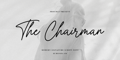 The Chairman is a flowing handwritten font, described by an elegant touch, perfect for your favorite projects. It looks stunning on wedding invitations, thank you cards, quotes, greeting cards, logos, business cards, magazine, marketing materials and every other design which needs a handwritten touch. Fall in love with its incredibly distinct and timeless style and use it to create spectacular designs! The Chairman Features : Uppercase and Lowercase Numerical and Punctuation Ligatures PUA Encoded Multilingual Language Easy To Use
 - Bryson by Valentino Vergan,
$16.00 Introducing Bryson, A bold sans serif ligature typeface. The Bryson typeface is characterized by simple but distinctive shapes. The typeface is very eye catching, its tight kerning and bold shapes makes it great for retro designs. You can use it for a wide range of projects, including print and web. If you are looking for something bold and retro for you next project, Bryson is the typeface for you. I hope you enjoy using the Bryson typeface.
 - Geometrico Slab by FSdesign-Salmina,
$39.00 GeometricoSlab. Round with strong serifs. Should it express power? Geometric and Slabserifs: a relatively rare combination. GeometricoSlab takes its cue from Herb Lubalin’s typeface family of the same name, and by using optical corrections with restraint, it looks a touch more uncompromising. The flexible, partly asymmetrical arrangement of the serifs avoids an overly heavy effect. The typeface family is suitable for both headlines and small point sizes and is related Geometrico Sans Curious? Try GeometricSlab free of charge.
 - Citadina by Graviton,
$24.00 Citadina font family has been designed for Graviton Font Foundry by Pablo Balcells in 2016. It is a sans serif typeface with a geometrical, mechanic, neutral appearence and a slightly condensed design which makes it particularly effective for space economizing. It has been conceived to be most suitable for short and middle length text blocks, as well as on all sized headlines. Citadina consists of 12 styles. Each containing small caps and glyph coverage for several languages.
 - Monotype Gallia by Monotype,
$29.99Monotype Gallia's design was initially developed by Wadsworth A. Parker for the American Type Founders (ATF) in 1927. Monotype released its own version in 1928. Its style is embodied with the spirit of the American Art Deco age and the Roaring 20s. It makes a superb headline selection, and has also been used effectively for packaging as well. Also try the typeface on signage, menus, invitations, or stationary. If you like Monotype Gallia, check out Monotype Broadway, too! - Auge Unicase by Eliezer Grawe,
$5.00 Auge Unicase is a sans serif display font, extra-condensed, with a unicase style. It is a geometric and very modular font that has a "modern-vintage" feeling. It is good for titles and short texts. Auge Unicase has a set of alternates, accessible by contextual alternates and stylistic set. It was designed following the Underware Latin Plus character set, supporting 219 Latin based languages (see https://underware.nl/latin_plus/languages/). Version 1.1 now has Cyrillic support and 757 glyphs.
 - Rutland AOE by Astigmatic,
$19.95 80’s technotronic meets out of this world style in Rutland AOE. From its beefy weight to its narrow counters, Rutland AOE started as a digitization of a film typeface called Maccaro by LetterGraphics. This bulky technotastic typeface was taken from its limited character set and fleshed out to include an expanded language glyph set. This interstellar alphabet funhouse screams electronica/house flyers, space games, alien invasions and more. Rutland AOE is ready to abduct your designs.
 - Gain And Reverb by takoliko,
$9.00 Gain and reverb is a awesome raw typeface. Basicly its a serif hand drawn typeface. Inspired by the gain and reverb sound of a guitar and a rock band. It has a little bit rebellion vibe and a handmade touch on the characters. You can add a different weight to create a variation and uniqueness on the letters, make even more look like its a raw hand made design. So enjoy and have a great project with our typeface!
 - Bloomsburg by Sharkshock,
$115.00 Bloomsburg is a sharp, modern, everyday font with a multitude of uses. This family is characterized by its high legibility, delicate curves, and vertical cuts to most lowercase terminals. Its humanist features are most evident in the lightest versions making it a versatile choice for showcasing warmth and personality. Use Bloomsburg for eye catching headlines or try the Bold version for a company logo. A wide range of languages are supported including European accents and Cyrillic characters.
 - Funky Retrovy by IbraCreative,
$17.00 Funky Retrovy is a groovy and energetic font that perfectly captures the essence of retro nostalgia. With its funky and whimsical letterforms, this typeface exudes a vibrant and carefree spirit reminiscent of the colorful era it celebrates. Each letter boasts bold and playful curves, inspired by the iconic designs of the past. Funky Retrovy adds a touch of fun and funkiness to any project, making it ideal for eye-catching posters, vibrant branding, and retro-themed party invitations.
 - Bilgosia by Subqi Studio,
$29.99 Introducing Bilgosia, a Display Family typeface. It contains a Main Serif with Sans and Script as companion. If the whole three combined, it will suitable for any your projects. Each font could be standalone font either. The main serif contains Swashes Alternates , Ligatures and Discretionary Ligatures for your display purposes. Made it from scracth node by node for the best flow. Anyhow we wouldn't talk much here. You could see our display images as references to your projects.
 - Humanism by Prominent and Affluent,
$30.00 Inspired by the urban typography, which later led to a grotesque style. It can be used for bold editorial statements graphic heavy prints or just as a simple logo. This new type will definitely make your designs stand out and unique. Its robust, strong and contemporary form makes it perfect for any project that needs the extra strength. Humanism is available from A to Z in the regular and italic style, developed in an urban style.
 - Konstanz by W Type Foundry,
$25.00 Konstanz is a sans serif font family inspired by the design of books and magazines for museums, art galleries, design biennials, architecture, and theater, among others. Its design focuses on a grotesque aesthetic but brings back certain shapes from Bauhaus and Futura. Konstanz includes 8 weights plus its matching italics, besides a stylistic set that increases its use possibilities. Konstanz ensures a graphic with a high impact and is ideal for designing editorial projects, posters, branding, and advertising.
 - Made With B - Personal use only

- Tipperary eText by Monotype,
$57.99Tipperary was designed by Steve Matteson and named for a favorite 'single track' bike trail, Tipperary is a monoline Humanist Sans Serif typeface. The clear, open, letter forms curve abruptly in an almost squarish geometry much like the sharp turns on the Tipperary trail. The clear, austere forms offer exceptional legibility for both interface designs and extended reading. Small size package labels and crisp branding programs benefit from Tipperary's emphasis on clean, readable design. eText typefaces are designed to meet the challenges of extended reading in digital environments such as mobile devices or desktop screens. Their forerunners are among the world's most popular and important book typefaces for print media. These classic designs were reinterpreted to conform to technological constraints of LCD and e-Paper while retaining the properties of proportion and form which made them favorites for print. - Magnum Sans by FontMesa,
$19.00 Magnum Sans is a strong neutral sans serif consisting of eleven weights with true Italic, Oblique and an alt upright set called Alfa. The definition of Magnum is a large wine bottle that's twice the capacity of one 750ml bottle, today the name is used in any product offering double the capacity, Magnum Sans achieves this by offering two slanted and two upright versions plus a standard and pro set. Designed to be highly readable Magnum Sans is ideal for text, signage, headlines and media broadcasting or anywhere else quick readable lettering is needed. This standard version supports characters sets for central and eastern European countries with code-pages of 1252 Latin1, 1250 Latin 2, 1257 Baltic and 1254 Turkish. Note: for additional language support, please see our Magnum Sans Pro family, which includes Vietnamese, PinYin and Greek.
 - Hanney by Prestigetype Studio,
$18.00 The signature styles are the best representation of classy and professional visual identity, hence choosing the right signature font is necessary when you come to build a professional visual brand identity. Introducing Hanney, with elegant and unique curves, this font can represent the classy and professional personality of your brand's visual identity. Hanney perfect used for branding purposes such as logo, business card, photography, headlines, titles, labels, fashion industry, social media, product packaging, and any advertising purposes. Hanney includes : numbers and punctuation multilingual ligatures alternates opentype features We highly recommend using a program that supports OpenType features and Glyphs panels like many Adobe apps and Corel Draw so you can see and access all Glyph variations. We hope you enjoy our font – please do let us know by emailing us at info@prestigetype.com or prestigetypestudio@gmail.com if you need something!
 - Wonder Melody by Supfonts,
$18.00 This font is ideal for various design applications, including branding, logos, social media, prints, stickers, shirts, and SVG files. Wonder Melody is versatile and can be suitable for both free-spirited, boho designs and more sophisticated editorial looks. Additionally, the font offers many exciting stylistic alternatives that are readily available within the font file. These alternatives can be easily accessed by adding special characters to letters. Instructions for use are in the package Wonder Melody Font Features: - Full Set of standard alphabet and punctuation - Ligatures - PUA Encoded - no special software needed to access extra characters - Language support: All European languages - Multilingual Characters AÁĂÂÄÀĀĄÅÃÆBCĆČÇĊDÐĎĐEÉĚÊËĖÈĒĘẼFGĞĢĠḠHĦIIJÍÎÏİÌĪĮĨJKĶLĹĽĻŁMNŃŇŅÑ OÓÔÖÒŐŌØÕŒPÞQRŔŘŖSŚŠŞȘẞTŤŢȚUÚÛÜÙŰŪŲŮŨVWẂŴẄẀXYÝŶŸỲỸZŹŽŻ aáăâäàāąåãæbcćčçċdðďđeéěêëėèēęẽfgğģġḡhħiıíîïìijīįĩjȷkķlĺľļłmnńňņñoóôöòőōøõœpþ qrŕřŗsśšşșßtťţțuúûüùűūųůũvwẃŵẅẁxyýŷÿỳỹzźžż Thanks so much for checking out my shop, and please get in touch if you have any questions! Don't forget to subscribe so you don't miss out on the new awesome fonts
 - Global Bikers by Din Studio,
$29.00 Would you like to have a unique, firm, energetic design? Global Bickers ensures you to deliver the clearest messages to anyone. Global Bickers a racing-themed script font made in thick displays. Unlike other useful cursive fonts looking similar to hand writings, this font really fits into bigger-sized texts. The available features in this font are: Stylistic Sets Ligatures Swashes Multilingual Supports PUA Encoded Numerals and Punctuations Global Bickers is greatly appropriate for various designs, such as posters, banners, logos, book covers, headings, printed products, merchandise, social media, and more. Find out more ways to use this font by taking a look at the font preview. Enjoy your experience with this font and feel free to contact us for further product information or trouble complaints. Thank you and wish you good luck with your designs.
 - Darkones by Alit Design,
$19.00 The “DARKONES” font is a unique combination of blackletter and dynamic serif styles, making it perfect for magazine designs, tattoo art, socoal media ads and clothing. It features a total of 756 characters, including swashes, special ligatures, and alternative characters. This font is designed to support PUA unicode and is multilingual, allowing it to be used for various projects in different languages. Its distinct and bold appearance makes it an excellent choice for designs that require a strong and edgy look. Overall, the “DARKONES” font is a versatile and expressive typeface that can add character and personality to any project it is used for. Language Support : Latin, Basic, Western European, Central European, South European,Vietnamese. In order to use the beautiful swashes, you need a program that supports OpenType features such as Adobe Illustrator CS, Adobe Photoshop CC, Adobe Indesign and Corel Draw. but if your software doesn’t have Glyphs panel, you can install additional swashes font files.
 - Noctis by Italiantype,
$39.00 Noctis was originally born as a single weight display typeface, designed by Luca Terzo who took inspiration by the unusual wedge serifs of Aldo Novarese's 1972 typeface for H. Berthold A.G., Primate. The design was developed by the Italian Type team into a full family of five weights from thin, each with its own true italic, and with a complementary set of decorative patterns. The strong Didonesque contrasts make this typeface both impressive at display sizes and easily readable in text size, while the sharp shapes of the triangular serifs and the distinctive letter shapes show their strength in logo design and impressive editorial use. Inspired by the elegant, self conscious and over-the-top aesthetics of Italian fashion scene of the eighties and nineties, Noctis finds its strength in its strong textural nature, that is explored in the Noctis Texturae subfamily, where each letter is used as a tile to produce seamless patterns that can be used to extend the branding capabilities of Noctis. Noctis features an extended latin character set of 481 glyphs covering over 190 languages, and includes advanced open type features like standard and discretionary ligatures, positional numerals, stylistic alternates and case sensitive brackets. Mixing versatility and personality, Noctis is ready to be like a top model on the design catwalk, making your projects looking classic but contemporary, finely tuned but assertive, and elegant as the best Italian luxury fashion.
 - Petrarka by HiH,
$12.00 Petrarka may be described as a Condensed, Sans-Serif, Semi-Fatface Roman. Huh? Bear with me on this. The Fatface is a name given to the popular nineteenth-century romans that where characterized by an extremity of contrast between the thick and thin stroke. The earliest example that is generally familiar is Thorowgood, believed to have been designed by Robert Thorne and released by Thorowgood Foundry in 1820 as "Five-line Pica No. 5." Copied by many foundries, it became one of the more popular advertising types of the day. Later, in the period from about 1890 to 1950, you find a number of typeface designs with the thin stroke beefed up a bit, not quite so extreme. What you might call Semi-Fatfaced Romans begin to replace the extreme Fatfaces. Serifed designs like Bauer’s Bernard Roman Extra Bold and ATF’s Bold Antique appear. In addition, we see the development of semi-fatface lineals or Sans-Serif Semi-Fatfaces. Examples include Britannic (Stephenson Blake), Chambord Bold (Olive), Koloss (Ludwig & Mayer), Matthews (ATF) and Radiant Heavy (Ludlow). Petrarka has much in common with this latter group, but is distinguished by two salient features: it is condensed and it shows a strong blackletter influence, as seen in the ‘H’ particularly. Petrark was released about 1900 by the German foundry of Schelter & Giesecke of Leipzig and is one of the designs of the period that attempts to reconcile roman and blackletter traditions. Making a cameo appearance in this Multi-Lingual font is the Anglo-Saxon letter yogh (#729), which, along with the thorn and the eth, is always useful for preparing flyers in Old English. There are still pockets of resistance to the Norman French influence that washed up on England’s shores in 1066. This font stands with King Canute, seeking to hold back the tide (ignoring the fact that Canute was a Dane). Support the fight to preserve Anglo-Saxon culture. Buy Petrarka ML today. Petrarka Initials brings together the Petrarka upper case letters with a very sympatico Art Nouveau rendering of a female face.
 - Karnac - 100% free

- HOLE 2 - Unknown license

- Poseidon - Unknown license

- SolsticeOfSuffering - Unknown license

- Fontmaker's Choice - Unknown license

- Anasthesia - Unknown license

- SpiceGrrl - Unknown license

- Merchantry by Bushwick Happy Hour,
$20.00 Merchantry is a hard-working display font inspired by vintage signage you might find in local supermarkets of days gone by.
 - Extension by Red Rooster Collection,
$45.00Designed by Les Usherwood. Digitally engineered by Steve Jackaman. Many of the weights and the italics were created after Les’ death. - Equestrienne by Red Rooster Collection,
$45.00Designed by Les Usherwood. Digitally engineered by Paul Hickson. Les never released this completed typeface before his untimely death in 1983. - C-V Dashes by ARTypes,
$10.00C-V dashes are transcribed from 72-pt ornaments designed by Enric Crous-Vidal and issued by Typefoundry Amsterdam c. 1950. - Lesmore by Red Rooster Collection,
$45.00Designed by Les Usherwood. Digitally engineered by Paul Hickson. Another typeface from Les Usherwood that was released after his 1983 death. - Cykor by K94 Studio,
$9.00 Cykor is a display typeface with reversed contrast inspired by typography of the late 70s designed in 2020 by Kacper Janusiak.
 - Graphique-AR by ARTypes,
$35.00Graphique-AR is a digital version of a type designed by Hermann Eidenbenz and issued by the Haas foundry in 1946. - Boxy Code by Just My Type,
$15.00In the late 60’s, one of the best art publications in the country was Motive magazine, published (amazingly) by the United Methodist Church. Filled to the brim with poetry, essays, line drawing and woodcuts, it also featured some cutting-edge typography. Boxy/Code is based upon my memories of woodcut typography from that great magazine. Since Boxy/Code ’s lowercase consists of the uppercase’s negative spaces, it’s easy to combine the two with Layer Styles in Photoshop in order to achieve the effect I used in one poster above. It also works great if you use a well-known text as a background. This new version is totally redrawn and features all the Latin-accented letters. Uppercase consists of black capitals in boxes; lowercase features the negative spaces of those boxed capitals. Uppercase and lowercase line up exactly for 2-color effects. - Fonteys Pro by Fando Fonts,
$5.00 FonteysPRO is the new and improve version of the Fonteys font family by Fernando Fuentes and the Eysner award nominated Albert Monteys. It is an informal font family designed to letter comics. With a unique handwritting style is also perfect when you need an informal typography. FonteysPRO has a lot of variants for each letter to enhance the handwriting feeling. It’s feels like actual hand lettering. And, if were not enough, the Fonteys supports almost all latin languages, cylliric, greek, and even vietnamese. Its early version Fonteys, available at "pay what you want" in the designer webpage, has became in a success in the Indie Comic scene from Spain. Now with the PRO version FonteysPRO will surely become in one of the most used comic books typographies in the world. (In our modest opinion, of course)
 - FP København by Fontpartners,
$35.00 Copenhagen has been in need of a typeface that unites the city’s many visual expressions. The three designers Morten Rostgaard Olsen, Henrik Birkvig and Ole Søndergaard have designed and developed the typeface FP København. Now available from MyFonts in 20 styles: Uprights & Italics, small caps, pictos-characters, stencils, sprayed style, OT-features, ligatures, contextual alternates etc. The shapes of the letters are inspired by the city’s culture and the visual environment and design in Denmark in the 20th century. It is relatively low and wide as the city itself and with rounded corners that give it a warm visual mood. “You can find examples of the use of a typeface with the same purpose in other parts of the world, for example, to identify local areas or urban tourism materials. FP København is our take on that kind of typeface” the designers add.


