10,000 search results
(0.063 seconds)
- Noad Sans by Groteskly Yours,
$60.00 Noad Sans is an experimental sans serif typeface with a strong character and some very unique visual features. At the core of Noad Sans is a sturdy sans serif with closed apertures and fairly simple letterforms. The defining feature of Noad Sans, however, is its visualised nodes: all control points of Bézier curves in each of the fonts in the family are intentionally visualised. The effect of this feature is largely defined by the usage: in titles and larger bodies of text, the visualised nodes stand out and create a rhythmic pattern of their own. In smaller sizes, the sans serif base of the font becomes more prominent and the nodes create a visual fuzz. Noad Sans comes in 6 styles and as a Variable Font with two axes–Optical Size and Slant. The size of each node can be changed from the smallest (Mini and Mini Italic) to the largest (Extra and Extra Italic). Variable Font technology allows you to fine tune the size of the nodes and the slant angle, so that your version of Noad Sans can be truly unique. Noad Sans has a large character set of 570+ glyphs, covering the vast majority of Latin based languages. In addition to that there are dozens of special characters, punctuation, numbers, and symbols. Noad Sans is equipped with a number of useful OpenType features, such as Case-Sensitive Punctuation, Stylistic Alternates, Ligatures, Fractions and many more. Noad Sans began as an experimental project, and during its development the spirit of experimentation was at the heart of the project. Thanks to the unique nature of the typeface, it can feel at home in a variety of settings: from web development, graphic and product design to more novel uses like 3D and NFTs. Noad Sans type family includes 6 static fonts (Mini, Mini Italic, Regular, Regular Italic, Extra and Extra Italic) and one variable font. Each style can be purchased separately. There is a free trial version of Noad Sans that can be downloaded free of charge on MyFonts. For more information on the typeface, feel free to download Noad Sans PDF Specimen.
 - Fino by TypeTogether,
$35.00 Tall, stately, and refined, with a showy contrast between thick and thin, a certain kind of titling Didone has become synonymous with fashion. Ermin Međedović’s latest type system amplifies the most theatrical aspects of this genre while bringing an uncommon flexibility of style and variation to any type palette — particularly those required for editorial design. Fino is a Rational (or Modern) display serif with sharp details. Its fairly Title proportions produce a regular beat of bold stems at frequent intervals. One can add an unexpected twist to this plot line by introducing the alternate ‘C, D, G, O, and Q’ (found in the uppercase); these replace the standard, Title oval shapes with big, full, show-stopping round ones. Other alternate forms, along with a grand ensemble cast of ligatures, lets the director continually flip the script. This stage is set in three acts: Fino, Fino, and Fino Stencil. Each of these offer six weights and italics, and each actor is comfortable speaking any Latin-based language, from standard Hollywood English to the many accents of Eastern Europe. Finally, every style comes in two optical sizes, with Title having the finest hairlines for the biggest parts. This lets you put Fino to work in a variety of productions, from short texts (24pt–48pt settings) to epic titles. The complete Fino family, along with our entire catalogue, has been optimised for today’s varied screen uses. All these talents let Fino perform a range of roles far broader than your typical Bodoni or Didot.
 - Fino Sans by TypeTogether,
$35.00 Tall, stately, and refined, with a showy contrast between thick and thin, a certain kind of titling Didone has become synonymous with fashion. Ermin Međedović’s latest type system amplifies the most theatrical aspects of this genre while bringing an uncommon flexibility of style and variation to any type palette — particularly those required for editorial design. Fino Sans is a Rational (or Modern) display serif with sharp details. Its fairly Title proportions produce a regular beat of bold stems at frequent intervals. One can add an unexpected twist to this plot line by introducing the alternate ‘C, D, G, O, and Q’ (found in the uppercase); these replace the standard, Title oval shapes with big, full, show-stopping round ones. Other alternate forms, along with a grand ensemble cast of ligatures, lets the director continually flip the script. This stage is set in three acts: Fino Sans, Fino Sans, and Fino Sans Stencil. Each of these offer six weights and italics, and each actor is comfortable speaking any Latin-based language, from standard Hollywood English to the many accents of Eastern Europe. Finally, every style comes in two optical sizes, with Title having the finest hairlines for the biggest parts. This lets you put Fino Sans to work in a variety of productions, from short texts (24pt–48pt settings) to epic titles. The complete Fino Sans family, along with our entire catalogue, has been optimised for today’s varied screen uses. All these talents let Fino Sans perform a range of roles far broader than your typical Bodoni or Didot.
 - Fino Stencil by TypeTogether,
$35.00 Tall, stately, and refined, with a showy contrast between thick and thin, a certain kind of titling Didone has become synonymous with fashion. Ermin Međedović’s latest type system amplifies the most theatrical aspects of this genre while bringing an uncommon flexibility of style and variation to any type palette — particularly those required for editorial design. Fino Stencil is a Rational (or Modern) display serif with sharp details. Its fairly Title proportions produce a regular beat of bold stems at frequent intervals. One can add an unexpected twist to this plot line by introducing the alternate ‘C, D, G, O, and Q’ (found in the uppercase); these replace the standard, Title oval shapes with big, full, show-stopping round ones. Other alternate forms, along with a grand ensemble cast of ligatures, lets the director continually flip the script. This stage is set in three acts: Fino Stencil, Fino Stencil, and Fino Stencil Stencil. Each of these offer six weights and italics, and each actor is comfortable speaking any Latin-based language, from standard Hollywood English to the many accents of Eastern Europe. Finally, every style comes in two optical sizes, with Title having the finest hairlines for the biggest parts. This lets you put Fino Stencil to work in a variety of productions, from short texts (24pt–48pt settings) to epic titles. The complete Fino Stencil family, along with our entire catalogue, has been optimized for today’s varied screen uses. All these talents let Fino Stencil perform a range of roles far broader than your typical Bodoni or Didot.
 - Joanna Sans Nova by Monotype,
$50.99 The Joanna® Sans Nova family is the only typeface in the Eric Gill Series that was not initially designed by Gill. Created by Monotype Studio designer Terrance Weinzierl over a three-year period with digital applications at the forefront of the design criteria, Joanna Sans Nova is a humanist sans serif based primarily on Gill’s original Joanna. The design comprises 16 fonts, from thin to black, each with a complementary italic. Joanna Sans Nova has a larger x-height to ensure high levels of legibility – even on small digital screens. Due to its inherent humanist proportions, Joanna Sans Nova is surprisingly comfortable for longer form reading. Its low contrast in character stroke weights also improves imaging in a variety of environments. In addition, the calligraphic and fluid details enable the roman and italic designs to shine in headlines and other display uses. Joanna Sans features a robust range of OpenType features for fine typography, including small caps, old style figures, proportional figures, ligatures, superscript and subscript figures and support for fractions. With over 1000 glyphs per font, Joanna Sans supports more than 50 languages – in Latin, Greek and Cyrillic scripts. “I've always been a fan of Gill’s work, explains Weinzierl, and found the simple, humanist qualities of Joanna really fitting for a sans serif design. I wanted to make something with Gill flavor, but with more harmony in the extreme weights than Gill Sans – and with my twist on it. I went through six or seven different italic designs before landing on the current direction.” “The original Joanna had a very distinct italic, Weinzierl continues. “It’s very condensed, and has a very shallow angle. I wanted to have an italic that stood out, but in a different way. I took a cursive direction for the italic details, which are wider and slanted more, both improving character legibility.” The Joanna Sans Nova typeface family is part of the new Eric Gill series, drawing on Monotype’s heritage to remaster and expand and revitalize Eric Gill’s body of work, with more weights, more characters and more languages to meet a wide range of design requirements. The series also brings to life new elements inspired by some of Gill’s unreleased work, discovered in Monotype’s archive of original typeface drawings and materials of the last century.
 - Rothek by Groteskly Yours,
$25.00 Rothek is a geometric sans serif type family with a strong and unique character. It comes in 22 weights — 11 uprights and 11 italics — and is a perfect tool for any designer who needs a versatile font for a variety of projects. While retaining its uniqueness and whimsicality, Rothek is highly legible even at smaller weights, which makes it a perfect fit for app and web design. But what’s really great about Rothek is its OpenType features, which make it really stand out. Not only does it know how to do fractions, but it also does subscript and superscript; it’s equipped with case-sensitive punctuation, which adjusts the height of your parentheses, hyphens (and many more) to the height of your capital letters. But there’s still more: Rothek is loaded with various figures — from default proportional numerals to oldstyle figures, tabular figures and tabular old style figures. Throw in a bunch of stylistic alternates and you’ve got a perfect typeface for any project. Rothek supports all European languages and Vietnamese. On top of that there’s Extended Cyrillic set for most Slavic languages. As a cherry on top, there are stylistic alternatives for selected glyphs both in Latin and Cyrillic layouts and lots of extra symbols to work and experiment with. With 900+ glyphs in each style, Rothek is a perfect workhorse font for those who need a modern sans serif font with a strong character. Two weights are free to try and use!
 - Heikudo Freedom by Hanzel Space,
$25.00 A typeface that proves its usefulness over time. Letter strokes that produce unique characters on each glyph so that they display a natural impression. This font is very suitable for branding, film titles, book titles, quotes, product names and the business you want to create. What's Included : Heikudo Freedom Standard glyphs Works on PC / Mac Simple installations Accessible in the Adobe Illustrator, Adobe Photoshop, Adobe InDesign, even work on Microsoft Word.
 - Rogshine by madjack.font,
$7.00 Rogshine is a textured brush font, a contemporary approach to design, naturally handmade with irregular base lines. Suitable for use in title design like clothing, invitations, book titles, stationery designs, quotes, branding, logos, greeting cards, t-shirts, packaging designs, posters, and more. Rogshine includes a complete set of upper and lower case letters, as well as multi-language support, numbers, punctuation, binders. Thank you very much for watching and enjoying it!
 - Bambina by Ivan Rosenberg,
$16.00 Bambina is a stylish retro font inspired by 19th century architecture and decoration. It looks amazing at display sizes and is easily readable in text size. There are two versions of this font : REGULAR and OUTLINE. Bambina Font is a display font made mainly for headlines, titles, and other short texts and is well-suited for advertising, vintage mood board, branding, logotypes, packaging, titles, editorial design and modern and vintage design.
 - Chilly Cherry by Hanoded,
$15.00 It’s cherry season, so I bought 2 kilos of cherries at the local cherry farm. The cherries I bought had been in a cooling cell, so they were quite cold. As I was eating them, the name for this new font popped up! Chilly Cherry is a handmade serif. It’s a little wobbly, a little off-center, but it will surely put a smile on the cherry lips of your customers.
 - Valibuk by Juraj Chrastina,
$39.00 Valibuk is a compact clean typeface for headlines and short text. No details are small and it’s a bunch of details that make Valibuk as it is. It’s a heavy, condensed face with a high x-height and tight spacing and that’s why Valibuk can write loud. The quality of the spacing and kerning is ensured by Igino Marini. Lomidrevo is a grunge stencil family derived from Valibuk.
 - Solantha by Attype Studio,
$14.00 Solantha is handwritting font with ligatures. This font perfect for wedding theme design. Combine it with Solantha ligatures to make perfect design for yor projects. Solantha perfect for wedding invitation, promotion, wedding invitation, branding, logo, invitation, stationery, social media post, product packaging, merchandise, blog design, game titles, cute style design, Book/Cover Title and more. What's Included : - Solantha - Ligature - Multilingual Support --- Hope you enjoy with our font! Attype Studio
 - Hard Luck by PizzaDude.dk,
$14.00 It's hard luck if you're designing a poster for a creative event, and you're looking for a good fontmatch. But it's not hard luck if you use this font for that particular purpose, because I designed it for that! How's that for good luck?! :) BTW, the font has a nice crunchy line (in all 3 versions!) and I have added 3 slightly different versions of each lowercase letter!
 - Prelom by Tour De Force,
$25.00 Prelom is modern serif family inspired by retro designed typefaces. Comes in 5 Normal weights, 5 true Italics and 5 Condensed weights. With tall x-height, sharp serifs like fishing hooks, original Italics and distinctive character overall design, Prelom is ideal family for editorial use or branding. Beside extended Latin character set, Prelom contains Cyrillic characters as well. It is equipped with Initials, Ligatures, Fractions and Tabular Numbers as OpenType features.
 - Darwin Office by Los Andes,
$16.00 We have adapted the version of our Darwin font for use in Microsoft Office. It only has 4 variants: regular, italic, bold and bold italic. Font weights have been named in a way that can be clearly shown up in the font list in Office programs for the sake of a good hierarchy (the bold variant is quite bold and does not look the same as the original font).
 - Allamare by FontaZY,
$30.00 Allamare is non connected handlettered brush script with number of alternatives, such as: Titling alternates, stylistic Variants, Initial and Final forms, some Ligatures and Underscored Titling letters with swashes of 3 different lenght. Allamare script is good for any type of advertising, package design, poster lettering and any kind of invitations and greeting cards. Allamare Script is multilingual, it covers almost all Latin-based languages and also contains Cyrillic.
 - Picturesque Stencil JNL by Jeff Levine,
$29.00 Picturesque Stencil JNL gets its name and design from the title of a circa-1920s children’s stencil activity book entitled “Dean’s Picturesque Stencil Book No. 10 - Series 75”; published by the F. Weber Company of Philadelphia and printed in England by Dean. The book’s stenciled title was hand lettered in a bold Roman design in the Art Nouveau style. Picturesque Stencil JNL is available in both regular and oblique versions.
 - Charm Mirage by Issam Type,
$22.00 CHARM Mirage is a serif typeface comes with joining ligatures that give it a fancy and unique style. This awesome font is perfect for branding, logos, invitation, watermark and so much more. CHARM Mirage typeface comes with regular, italic, Condensed and Condensed italic font styles. Uppercase & lowercase letters, numbers, punctuation, ligatures, alternates and multilingual support. If you have any questions, please feel free to get in touch. Thank you
 - Watched by Dumadi,
$25.00 Hi, I hope your project is always smooth! Watched is a new font with a unique, quirky, and relaxed style. All uppercase letters have a unique variation and are complemented by combinations of lowercase letters that create a stunning writing style. This font is very suitable for movie titles, such as famous movie titles, with this font, your project will be noticed by many people. try it and feel the difference!
 - Firelli by Typejockeys,
$60.00 Firelli is an original family of 14 styles including 7 weights and Italics. Delighting from thin to black, Italic swash caps, ligatures, and neat alternate characters. Big headlines will love Firelli’s incorruptible details. Longer texts will benefit from a wide-ranging family with its solid posture. Go, use everything Firelli has to offer, to design your contentful magazines, powerful annual reports, or even bedtime stories and fairy tales.
 - Bankster by Pelavin Fonts,
$15.00 With it’s origins in a hand-lettered headline about money managers, Bankster is an alphabet meant to evoke the feelings of currency or financial documents. Multiple styles facilitate the perfectly registered layering of components in a variety of color combinations to enhance impact and provide an enriched dimensional experience. It not be for everyone but, it's a perfect solution for the designer who has no patience for boring type treatments.
 - Basgem by Issam Type,
$23.00 Basgem is a modern classy ligature serif typeface comes with joining ligatures that give it a fancy and unique style. This awesome font is perfect for branding, logos, invitation, watermark and so much more. Basgem typeface comes with regular, italic, Condensed and Condensed italic font styles. Uppercase & lowercase letters, numbers, punctuation, ligatures, alternates and multilingual support. If you have any questions, please feel free to get in touch. Thank you
 - Bomiro by Issam Type,
$22.00 Bomiro is a modern classy ligature serif typeface comes with joining ligatures that give it a fancy and unique style. This awesome font is perfect for branding, logos, invitation, watermark and so much more. Bomiro typeface comes with regular, italic, Thin and Thin Italic font styles. Uppercase & lowercase letters, numbers, punctuation, ligatures, alternates and multilingual support. If you have any questions, please feel free to get in touch. Thank you
 - Grand Atlantic by Fenotype,
$35.00 Grand Atlantic is a powerful display package by Fenotype. It’s a genuine Brush script packed with features and Swoosh extras and it’s a striking condensed flared serif in two weights, designed with the same sharp edges on the flares as the Brush. Together they make stunning logotypes, posters or headlines. On top of that there’s a “Printed” version of each. Printed versions are the same but with rugged outlines and a print texture. Grand Atlantic is great for creating powerful identities for artisanal coffee brands, craft beer, organic juice or a sports teams. Grand Atlantic Brush is equipped with Standard Ligatures and Contextual alternates that help keeping the connections between letters smooth. They’re automatically on as you should normally keep them. On top of that Grand Atlantic Brush has Stylistic, Titling and Swash Alternates for standard characters if you need more ornamental letters and if you want to break up the rectangular word shapes. There’s even more alternates in the glyph palette, making it total more than 600 glyphs. Grand Atlantic Swoosh contains 52 shapes designed to go with the Brush. There’s many “terminal swashes” that you can put in the end of a word and it will connect to the last letter, and swirl under the word from there.
 - BF Konkret Grotesk Pro by BrassFonts,
$39.99 BF Konkret Grotesk Pro, designed by Guido Schneider, is a contemporary grotesque with a straightforward style – but a very individual touch. Inspired by classic grotesque typefaces, Konkret Grotesk Pro impresses with its unique character and rhythm: It’s elegant and edgy, flexible and forceful. The Pro family supports up to 220 Latin-based languages. Each of the 16 fonts contains more than 1500 glyphs, including small caps, 7 figure sets, fractions, many ligatures, currency symbols, alternates, special characters and other useful symbols. 11 style sets give you the option to individualize and adjust the typeface to the requirement of your design, without changing the general visual feeling. In this way you can also switch the simply slanted styled Italic into a “real Italic”. BF Konkret Grotesk Pro is a typeface family that can adapt to many requirements without losing its character and expression. The range of 8 weights provides all possibilities. Due to the lovingly designed details, Konkret Grotesk Pro works both in small sizes as well as in display applications. Thus, Konkret Grotesk Pro is ideally suited for contemporary and demanding typographic tasks, both in the fields of editorial design, branding, posters and advertising. (The new Pro edition is the extended and optimized version of the previous BF Konkret Grotesk.)
 - Caslon Black by ITC,
$29.99The Englishman William Caslon punchcut many roman, italic, and non-Latin typefaces from 1720 until his death in 1766. At that time most types were being imported to England from Dutch sources, so Caslon was influenced by the characteristics of Dutch types. He did, however, achieve a level of craft that enabled his recognition as the first great English punchcutter. Caslon's roman became so popular that it was known as the script of kings, although on the other side of the political spectrum (and the ocean), the Americans used it for their Declaration of Independence in 1776. The original Caslon specimen sheets and punches have long provided a fertile source for the range of types bearing his name. Identifying characteristics of most Caslons include a cap A with a scooped-out apex; a cap C with two full serifs; and in the italic, a swashed lowercase v and w. Caslon's types have achieved legendary status among printers and typographers, and are considered safe, solid, and dependable. A few of the many interpretations from the early twentieth century were true to the source, as well as strong enough to last into the digital era. Caslon Black was designed by Dave Farey in the ITC library. - Egiziano by Monotype,
$29.99The original design of Egiziano Black is attributed to Vincent Figgins in 1815. As its name suggests, Egiziano Black is a typical example of an Egyptian, or slab serif typeface. Use the Egiziano Black font for posters and titling. - Saga Arjuna by Saxofont,
$18.00 Saga Arjuna is a modern, elegant and luxurious font with custom alternatives and multilingual support. With a strong desire and grace, it can be used as a logo and title. Great for books, product packaging, advertisements, brands and more.
 - LD Werewolf by Illustration Ink,
$3.00Who says Werewolves don't exist? Well, they do here! LD Werewolf looks like it was clawed and scratched into the very paper it's printed on. Adds a nice touch to a spooky Halloween Party invitation or accompanying fun memories! - Befter Sans by Just in Type,
$19.00 Befter Sans is a humanist typeface for display use or short texts. Use traditional combined with contemporary design to make it looks classic, but feel new. Befter has 8 weights plus matching true italics. Download the full specimen here
 - Asmillione by Sibelumpagi,
$18.00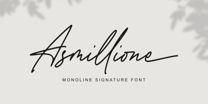 Asmillione is a monoline signature font with a handwriting feel. It comes with ligatures and alternates, also supports multiple languages. It’s perfect for logos, product packaging, wedding invitations, branding, headlines, signage, labels, signature, book covers, posters, quotes, and more.
 - Krisis Sans by ABSTRKT,
$25.00This font was originally designed for one lettering job with only one simple purpose—to be as much condensed as a font can be. Then it was developed as a font family of 4 weights with regulars and italics. - Megistica Dreams by Letterena Studios,
$9.00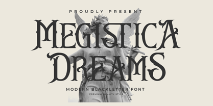 Megistica Dreams is a serif modern blackletter typeface that has its unique style & modern look. This typeface is perfect for an elegant & luxury logo, book or movie title design, fashion brand, magazine, clothes, lettering, quotes, and so much more.
 - Promo by Borutta Group,
$35.00 Promo is charming rounded sans family. This typeface is defined by multiple features, which give it a friendly feeling. Promo is perfect for branding and display purposes. Entire family consist of 9 styles with italics from Thin to Bold.
 - Curator by Etewut,
$40.00 Curator family is serif based fonts that has multi language support including all european and basic cyrillic letters. It has bold and italic styles. You may choose letters in glyph panel, because each font has alternative symbols and ligatures.
 - Marnilla Signature by AEN Creative Studio,
$15.00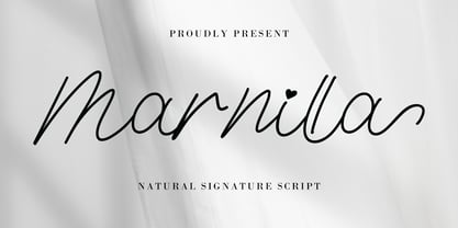 Marnilla Signature is a beautiful, elegant, yet casual and simple script font, featuring a natural look & feel. It has beautiful swashes and ligatures and it’s perfect for logos, wedding invitations, posters, social media posts, signatures, quotes, and much more!
 - Summer View by Yoga Letter,
$16.00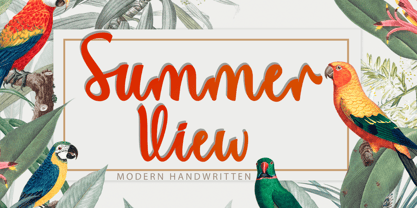 "Summer View" is a beautiful and elegant handwritten font. This font is equipped with uppercase, lowercase, numerals, punctuation, swashes, titlings, alternates, ligatures, and multilingual support. It is very suitable for weddings, engagements, Christmas, Valentine's, winter, autumn, summer, and others.
 - Engravure by Monotype,
$40.99Robert Wiebking based the Engravure face on the Engravers faces developed by American Type Founders around 1903. Engravure can be used as a titling font for magazines, brochures, and book covers. It is also suitable for packaging and stationery. - Gorthe by Letterena Studios,
$17.00 A serif modern and classic typeface that has its own unique style & modern look. This typeface is perfect for an elegant & luxury logo, book or movie title design, fashion brand, magazine, clothes, lettering, quotes, and so much more. **Uppercase
 - Ristretto Slab Pro by Mint Type,
$- Ristretto Slab Pro is a slab-serif companion to Ristretto Pro. It’s an extremely narrow display slab-serif font family with asymmetrical serifs available in 8 weights. It features rich language support, 6 sets of figures and small caps.