10,000 search results
(0.04 seconds)
- First Prize by Letterhead Studio-VG,
$45.00 First Prize typeface has simple shapes. It is a narrow, heavy sans serif typeface with geometrical logic and quite predictable constructions of characters. The idea behind it was to combine constructed structure of the skeleton and some calligraphic ideas, swashes and cursiveness. At the moment First Prize typeface consists of three narrow styles: bold, upright italic and italic. Cursive weights have beautiful ending swashes and initials. There are few alternative shapes for A&N. As a Display typeface First Prize will work very well with any other typefaces for the good of any project in print or online.
 - The overthinkers by Joanne Marie,
$26.00 The overthinkers is a semi script hand lettering font for all of your hand lettering designs! With two sets of uppercase glyphs, three sets of lowercase and over 230 ligatures no two words will be same! So your designs will truly look hand lettered. With so much choice be careful not to overthink your designs ;). This font is perfect on it’s own or you may like to use it with your existing hand lettering fonts. Go ahead and try it out - it’ll compliment any design! It’s perfect for merchandise and food packaging, book designs, logos and much more.
 - Jozef by Underscore,
$35.00 Jozef is a serif typeface family with modern character and a firm voice. It is equally suited to setting text on screen and in print. With eight weights, matching italics, and decorative capitals it offers a plentiful typographic range, and provides language support for extended latin. The sharp serifs equip this typeface with a strong tone and clear legibility, while the italics offer a softer but equally solid appearance. Opentype features, number sets and a wide range of typographic characters make this a resourceful text typeface. Jozef was designed by Johannes Neumeier and published through Underscore in 2018.
 - Andes Rounded by Latinotype,
$29.00 Andes Rounded, designed by Daniel Hernández, is a display typeface that has neo-humanist characteristics. Its different terminals, among other elements, give it a look of mixed typography. Andes is a typeface with 10 Upright weights, 10 Italics & Condensed versions, ranging from Ultra Light to Black, each of the same x-height. This typeface contains additional italic glyphs (a, y, z, g) that help to emphasise text or words. Andes is based on the design of Merced and both of them share several features. This type is well-suited for use in retail, magazines, logotypes, books, etc.
 - Urfa Rounded by Ahmet Altun,
$19.00 Urfa Rounded Font family is the rounded version of Urfa Typeface. The Urfa Rounded font family comes in nine weights of Normal and Italic. In addition, all weights contain small caps in both italic and normal. With the Urfa Rounded font family, you can create beautiful works for the web, including logos, banners, body copy, and presentations. Urfa Rounded typeface also works nicely in print formats such as posters, T-shirts, magazines, and affiches. Because of its eye-pleasing style, this font is both effective and versatile. It supports a wide range of languages, including Extended Latin and Cyrillic.
 - Dinkle by Chank,
$30.00 The Dinkle fonts are the creation of a sketchbook artist who spent years refining her craft, Diana Hollingsworth Gessler. She created the Dinkle handwriting fonts for use in her book "Very New Orleans," and now you can use it in four convenient styles: Regular, Bold, Italic and Bold Italic. Each font in this family was drawn individually, capturing nuanced differences of natural penmanship when the weights are paired together. A hand-lettered journal style, the highly legible Dinkle fonts offer tidy text and clear captions. Use it for signage, quotations, or anywhere you need a personal touch in your designs.
 - MVB Gryphius by MVB,
$39.00MVB Gryphius is a digitization of uncommon type from an era normally associated with the work of Nicolas Jenson. Produced by Otto Trace, the fonts come from types used by Sebastian Gryphius in Lyon in the early 16th century. The italic appears in a book from 1524 and the roman and small caps appear with the same italic in another book printed by Gryphius in 1541. Retaining the rough contours and uneven texture of its source, MVB Gryphius is best used at text sizes from 12- to 15-point, but its old world character can work in display settings too. - Goolavin by Attype Studio,
$25.00 Goolavin is a Modern Minimal Serif typeface This font exudes a sense of power. It is elegant but strong and confident in appearance. Each letter has been carefully designed to create the best possible impression. It looks stunning on packaging, clothing, and any industry where elegance is needed without sacrificing boldness. that suitable for strong and modern looks on your works. Goolavin is perfect for sport product, branding, logo, invitation, stationery, product packaging, merchandise, monogram, blog design, game titles, cute style design, Book/Cover Title and more. Features : - Goolavin Font - Ligatures - Multilingual, US Roman, Latin 1 Support
 - Porchlight by Ana's Fonts,
$15.00 Porchlight is a soft serif font inspired by vintage French typography. It includes three weights: regular, semi bold and bold, with matching italics. It also includes bonus ornaments that complement the font beautifully, for elegant and easy designs. Included in this trendy font family: 6 fonts: regular, semibold and bold, plus italics, with over 300 glyps each, including small caps and lots of ligatures. ornaments font with 52 ornaments (13 different designs, mirrorred horizontally and vertically). borders font, with borders with different thickness. Use Porchlight in print layouts, logotype design, social media posts, branding and packaging.
 - East Variable by Tarallo Design,
$73.99 East Variable is a condensed sans serif typeface. It is timeless, but with a subtle nostalgia of vintage jazz albums, film titles, newspapers, and signage. The light weight has excellent legibility at small sizes. The Extra Bold weight will capture attention. East is versatile, but would be a good choice for film titles, labels, publications, or any context where space is limited. It has variable axes of weight and slant. The OpenType features include stylistic sets, a one-story 'a', hooked letters, seriffed uppercase 'I' and '1', a slashed zero, raised colon and punctuation (Spanish), German eszett, ligatures, and vertical fractions.
 - Gorda by Zeptonn,
$10.00 Oh yeah! Gorda is a huge, bold and all-caps typeface. It's rounded style makes sure it's nice and friendly, even though it can be used in (very) large sizes. With Gorda you can produce a powerful and contemporary style. The smaller stroke width of the symbols and punctuation marks makes sure legibility is not an issue, as is often the case with fat type. Gorda is suitable for all sorts of uses, especially posters, headlines, artwork and logos. Use it to draw attention, in a quirky and distinctive way. Gorda has been designed and developed by Zeptonn.
 - REVOKA by Twinletter,
$15.00 Revoka is a display typeface with the notion of an Asian font with unique and modern traits. Fonts with unusual shapes will brighten up your project and give it a unique pattern, giving it an attractive, appealing, and natural feel. Logotypes, food banners, branding, brochure, posters, movie titles, book titles, quotes, and more may all benefit from this font. Of course, using this font in your various design projects will make them excellent and outstanding; many viewers are drawn to the striking and unusual graphic display. Start utilizing this typeface in your projects to make them stand out.
 - Storia Lettering by Gatype,
$10.00 he Storia Lettering Serif style is absolutely perfect for editorial headings. The full font type upright and italic makes it easy for you to use the 2 styles in many projects. This font is complete with symbols and is multilingual. This font style is bold, bold, and sleek, featuring Swash,n Ligature and Stylistic Alt & Stylistic Set features. making it perfect for editorial, web, posters, t-shirts and magazine covers. . etc. Including: Storia Lettering & Italics Uppercase Letters, Numbers, Punctuation & Symbols. Multilingual Support More about this source text Source text is needed to get additional translation information Send feedback Side panel
 - Grilldem by Jipatype,
$27.00 กริลล์เด็ม เป็นแบบอักษรลายมือให้ความรู้สึกเป็นมิตร เหมาะสำหรับงานออกแบบเกี่ยวกับเมนูอาหารหรืองานใด ๆ ที่ต้องการแบบอักษรลายมือ ด้วยความที่ กริลล์เด็ม มีความผอมเพรียวจึงเหมาะสำหรับงานที่มีพื้นที่จำกัด อีกทั้งยังรองรับหลากหลายภาษา ทำให้คุณสามารถใช้งานได้ในหลากหลายโปรเจ็ค กริลล์เด็ม มีทั้งหมด 2 ลักษณะ Regular และ Italic อีกทั้งยังมีฟีเจอร์ Samll caps และ Tabular ทำให้เป็นฟอนต์ที่ครอบคลุมทุกความต้องการในงานออกแบบของคุณ Introducing Grilldem, a hand-written typeface that exudes friendliness. Perfect for designing food menus or any writing that requires a display font, Grilldem features a condensed design that makes it a great choice for limited space. With multi-language support, this font is versatile and can be used in a variety of projects. Grilldem comes in two styles - regular and italic - and includes small caps and a tabular feature, making it a comprehensive font for all your design needs.
 - Janice by Canada Type,
$24.95 Janice is a revival and expansion of a 1960s Mecanorma film type called Putty Bold. It’s thick, flowing, happy and oozes psychedelia. Unlike many art nouveau/hippy faces of the era, this font comes with a lowercase that expands its functionality to quite a few applications, like design aimed at kids and young adults. It’s also one of those fonts that feel right at home being warped, scaled and manually squeezed for packaging and poster design. Janice comes with over 400 glyphs. It contains a few stylistic alternates and support for the majority of Latin languages.
 - Hoban by District,
$40.00 The light and the bold. The thick and the thin. Laverne and the Shirley. Peanut Butter and the Jelly. Hoban is about contrast. Hoban wants to be noticed, but only after a second glance. A friend of a friend to the didones, it has smaller, tapering serifs, slightly calligraphic traits, and spindly little terminals that go where they please. It’s a headline face. Period. Set it big and bold. Or light and airy. But preferably next to something with flair. Cuff links, canapés, or corvettes–it’s up to you. Distinct ligatures, ornaments, and swashy alternates provide plenty of character to tailor your style.
 - Bon Vivant Family by Nicky Laatz,
$20.00 If you've got style and love all the luxuries in life, you're Bon Vivant! Add a touch of luxury and style to your projects too, with the new Bon Vivant Font Collection. It's highly recommended to turn your Opentype features on while using the script font, to make use of it's best features - the multitude of OpenType ligatures. As you type, your text looks like natural handwriting, and less like a monotonous font. The handsome serif comes in 2 weights, regular and bold. Designed to be a perfect complimentary font to the script, its just as striking used on its own.
 - Gallazzi by Twinletter,
$15.00 Gallazzi is a fun display typeface with a lovely and attractive appearance. Start using this font in your project since it is smooth, cool, and cute to the eye. Then you’ll have a project that is truly distinctive and cheerful in comparison to others because the harmony and harmony will make your project bolder and bolder and look different. Let’s construct an awesome project using this typeface, and make it one of a kind. This font is perfect for games, sporting events, branding, banners, posters, movie titles, book titles, quotes, logotypes, and more. Start using our fonts for your amazing projects.
 - Nouveau Years JNL by Jeff Levine,
$29.00 Sheet music at the beginning of the 20th Century reflects both the musical and artistic tastes of the times in often colorful ways. It seemed to be a favorite thing amongst songwriters of that era to come up with very wordy song titles. The cover of the sheet music for 1907’s “Every Little Bit Added to What You’ve Got Makes Just A Little Bit More” checks in at fourteen words, but the hand lettered title (done in an Art Nouveau style) made it worthy of transposition into a digital type face. Nouveau Years JNL is available in both regular and oblique versions.
 - Suco De Laranja by Hanoded,
$20.00 I like orange juice. Come on, who doesn't? Orange juice is the drink of heroes; it's the elixir of life; it's the gods' own ambrosia. Suco De Laranja means orange juice in Portuguese and I named this font thus, just because I love the stuff! Suco De Laranja is a very narrow, very gentle typeface with a rough edge. It comes in a variety of languages and guess what? I have added Cyrillic as well. Just to be complete. So there you have it: a font named after a juice. Take a sip and enjoy! На здоровье!
 - Sui Generis by Typodermic,
$11.95 Looking for a typeface that’s as unique as your personality? Look no further than Sui Generis, the rounded square sans-serif that’s unlike any other. With its technical letterforms and boxy curves, Sui Generis has an industrial character that’s all its own. It’s the kind of typeface that demands attention, without ever feeling pushy or obnoxious. In fact, its understated charm is part of what makes it so special. But don’t let its quirky personality fool you—Sui Generis is as practical as it is unique. With four weights, two widths, italics, and an outline style, it’s incredibly versatile and perfect for any project that requires a touch of character. So if you’re tired of bland, run-of-the-mill typefaces that all look the same, give Sui Generis a try. Its square letterforms and distinctive voice will make your design stand out from the crowd, and leave a lasting impression on anyone who sees it. Most Latin-based European writing systems are supported, including the following languages. Afaan Oromo, Afar, Afrikaans, Albanian, Alsatian, Aromanian, Aymara, Bashkir (Latin), Basque, Belarusian (Latin), Bemba, Bikol, Bosnian, Breton, Cape Verdean, Creole, Catalan, Cebuano, Chamorro, Chavacano, Chichewa, Crimean Tatar (Latin), Croatian, Czech, Danish, Dawan, Dholuo, Dutch, English, Estonian, Faroese, Fijian, Filipino, Finnish, French, Frisian, Friulian, Gagauz (Latin), Galician, Ganda, Genoese, German, Greenlandic, Guadeloupean Creole, Haitian Creole, Hawaiian, Hiligaynon, Hungarian, Icelandic, Ilocano, Indonesian, Irish, Italian, Jamaican, Kaqchikel, Karakalpak (Latin), Kashubian, Kikongo, Kinyarwanda, Kirundi, Kurdish (Latin), Latvian, Lithuanian, Lombard, Low Saxon, Luxembourgish, Maasai, Makhuwa, Malay, Maltese, Māori, Moldovan, Montenegrin, Ndebele, Neapolitan, Norwegian, Novial, Occitan, Ossetian (Latin), Papiamento, Piedmontese, Polish, Portuguese, Quechua, Rarotongan, Romanian, Romansh, Sami, Sango, Saramaccan, Sardinian, Scottish Gaelic, Serbian (Latin), Shona, Sicilian, Silesian, Slovak, Slovenian, Somali, Sorbian, Sotho, Spanish, Swahili, Swazi, Swedish, Tagalog, Tahitian, Tetum, Tongan, Tshiluba, Tsonga, Tswana, Tumbuka, Turkish, Turkmen (Latin), Tuvaluan, Uzbek (Latin), Venetian, Vepsian, Võro, Walloon, Waray-Waray, Wayuu, Welsh, Wolof, Xhosa, Yapese, Zapotec Zulu and Zuni.
 - Emploi by ParaType,
$30.00 The type family includes two decorative designs that combine features of an italic typefaces and calligraphy. The elegant swashes and curls in upper case letters make the fonts rich and showy. Emploi Ingenue has rather developed decorative elements, and Emploi Travesti is more modest. Both fonts are intended for titles, display typography, especially advertising and for initials.
 - La Arista by Kaer,
$19.00 ‘La Arista Del Sol’ it's the mountains climbing route. I've created this font family to transfer adventure and romantic mood. I believe La Arista is very useful in printing and for web. * Regular, italic and pattern styles * Uppercase and lowercase * Numbers * Ligatures * Punctuation * Multilingual support Please feel free to request to add characters you need: kaer.pro@gmail.com
 - FX Neofara by Differentialtype,
$10.00 FX Neofara is a sans serif font family that comes with 9 weights, 9 italics, and an outline. It’s perfect for documents, font logos, blogs, social media, marketing campaigns, and many other projects! FX Neofara masterfully designed to become a true favorite, this font has the potential to bring each of your creative ideas to the highest level!
 - Cagile by Java Pep,
$17.00 Cagile is a family font that comes with 4 styles like regular, italic, semi-bold, and semi-bold font. Cagile presents a minimalist but classy look, all characters are can represent what a project purpose that you want. The font is also nice and standout working for wedding invitations, logo, pull quotes & monograms, headlines, title, and more.
 - Sticky Notes by Hendra Pratama,
$19.00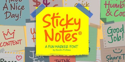 Sticky Notes is a handmade font, made from a marker pen. It's fun yet playful font for variety design graphics project. From Logotype, Poster, Quotes design, Comics book or illustration, T-shirt design, Magazine titles and many more. Sticky Notes is Good used in small or large size. Please check out all the preview images. Best!
 - Chopsee Softee by TypeUnion,
$35.00 Chopsee Softee is the marshmallowy version of our 2017 release Chopsee. It's fun and curvaceous and comes in 8 weights with matching italics. Just like Chopsee the soft version maintains the fluidity and movement with the accentuated curves and terminals, but with added fun and freedom. Chopsee Softee is perfect font for packaging to branding and everything in between.
 - Woodchip by Fontasmic,
$16.99 The Woodchip fonts are a collection of fun and edgy, worn and pitted, rough and crunchy typefaces. Styled to be comic & playful enough for children's products, yet edgy enough to advertise a dirt bike/monster truck marathon and anything in between. Sink your teeth in. It’s suitable for some interesting titling and short bits of copy.
 - Delighter Script by Uncurve,
$20.00 Delighter Script is simply perfect blended fonts with 3 style. Including 10 font and extras. Delighter is inspired from many lettering, poster, quotes, logos and brands. It's perfect for advertising, magazines, editorial, poster, branding, logo type, header, titles, packaging, display etc. A good combination for helping your design, just mix and match and you'll be very authentic.
 - Gexo Sans by Java Pep,
$19.00 Proudly present newest elegant sans serif font, Gexo Sans font is the family font that has 5 weights and 5 italics. Gexo Sans designed for elegant and outstanding purposes for your project. This font is perfect for logotype, advertising poster, title, headline, publishing, text font, and etc. Gexo Sans is supporting multilingual more than 30 languages.
 - Ignorance by Typogama,
$29.00 Ignorance is a script typeface that mimics traditional handwriting found in America in the 19th century. Full of vitality and personality, this typeface includes a wide range of Opentype ligatures, alternates and swash characters that allow multiple choices for each setting. This design is principally aimed for use in display and titling setting that will reveal it's finer details.
 - Nosta by Protimient,
$29.95Nosta is a modern text typeface. It was designed to be easily legible and therefore expressly suitable for setting sizeable lengths of continuous text such as magazine articles, books and essays. It achieves this through, amongst other things, finely balanced proportions, optimal character spacing and an adherence to predictable letter forms. Despite this, however, Nosta manages to retain a contemporary look and feel by using a variety of modern type design devices such as the efficacious wedge serif. The italic avoids using too many of the cursive elements that are often found in traditional italics and has only a modest slant, giving it a modern look that does not overly disrupt the text while still providing emphasis. While designed for continuous text, Nosta can also be used as a display face, making it a good all round typeface, suitable for many applications. - iogen by Taner Ardali,
$12.00 The current design of "iogen" is a result of years of alterations since it's original concept was born in 2010 and it needed a hallmark to make it authentic. The idea of "a typeface speaking pleasantly" is the basis on which "iogen" is constructed. Hereby, the letter forms are based on sharp directional changes and curved vertical strokes, allowing it to speak clearly and pleasantly. The sharp corners, open apertures and open counters of iogen also ensure legibility in smaller sizes. The Iogen family has 6 members with 3 basic weights with sans and serif styles. It supports the Latin extended character set and opentype features like stylistic alternates, ligatures, fractions, denominators, numerators, superscript, subscript and ordinals. Iogen is a good fit for all of design needs with it’s wide range of character sets and features.
 - Yasmine Mutamathil by Arabetics,
$32.00 The Yasmine Mutamathil type family follows the guidelines of the Mutamathil type style. It has only one glyph for every basic Arabic Unicode character or letter. The Yasmine Mutamathil family includes all required Lam-Alif ligatures and selected marks positioning so it does use limited glyph substitutions or forming. Yasmine Mutamathil employs four fixed x-height values, two above and two below the x-axis. Values are high to give a slight vertical overall look. Its design uses full curves with equally distributed weight. Text strings composed using types of this family are non-cursive with stand- alone isolated glyphs. The Yasmine Mutamathil family includes both Arabic and Arabic-Indic numerals, all required diacritic marks, Allah ligature, in addition to all standard English keyboard punctuations and major currency symbols. It is available in regular, italic, bold, and bold italic styles.
 - Tabac Big by Suitcase Type Foundry,
$39.00 Tabac Big can satisfy all expressionists desiring idiosyncratic colouring in setting because it provides black weights. But at the same time it offers solutions for orthodox environmentalists who like to save ink and toner — all the fragile hair styles are intended just for them. Less clearly-defined typographers can then choose from the six other weights, from Thin through Light, Regular, Medium, Semibold and Bold, including true italics. Tabac Big is a first and universal choice where we look for pronounced display type as a complement to text type. Its modern drawing, made up of precise arcs, sharp lines and seemingly simple segments, gives a clear and unmistakeable impression every time. And yet the typeface knows how to intrigue — especially in shaping the italics, which fully expresses the typeface’s unique details, such as its large bulbous instrokes and outstrokes and heavy wedge serifs.
 - Raniscript by Stephen Rapp,
$59.00 Raniscript started out as an idea for a bold and strongly structured ronde style script with some contemporary touches. As I tinkered with various forms it took on a life of its own. Having an old world feel, it makes me visualize faded shop signs from India written in English. The name comes from a series of colorful vintage matchbook designs advertising the Flying Rani. You'll find Raniscript ideal for packaging, book titles, brochures or anything requiring a robust display treatment. It comes fully loaded for OpenType savvy applications. Three full sets of caps are included. By clicking the Titling button in Illustrator you can type using an all caps set that includes ligatures, case sensitive punctuation and language coverage. Other features include oldstyle figures, Central European language support, fractions, contextual letter substitution, swash characters, and ornaments.
 - Brinca by In-House International,
$7.50 Brinca is an intrepid ‘full spectrum’ typeface with emotional range and a dynamic heart. Morphing sharp tight pleats that relax into office ready neutral sans, then plump into joyful bouncy letters with mesmerizing fluency, Brinca is ready to adapt to a wide variety of expressive needs. Named after its jumping extremes of the type’s styles; from coiled spring to stuffed and bouncy, Brinca is also a leap into new possibilities for display type design. Because of its chameleon-like range of styles, Brinca is a versatile workhorse. It’s a great choice for brand identities ready to embrace expressive range, and it’s perfect for fine-tuned packaging, events promotions, merch, product lines, and much more. WIth its very wide spectrum of options, It’s a single typeface that can be used to design a library’s worth of book covers. (We put it to the test!) About Brinca was designed by Alexander Wright and Rodrigo Fuenzalida with Michu Benaim Steiner for In-House Int’l foundry, the type foundry of brand consultancy In-House International. It was developed by Rodrigo Fuenzalida at FragType, and available through YouWorkForThem. In-House foundry offers bold, fearless, and expressive, display typefaces that tell a story. Its previous releases have been featured on Design Milk, DesignBoom, Slanted, PAGE. They’ve also been used to create standout work by designers around the world, and even won some awards.
 - Directa Serif Variable by Outras Fontes,
$170.00 Directa Serif Variable is a text type family in one single font file. It explores new possibilities for the original type family released by Outras Fontes some years earlier, which is designed to save space with the highest readability. The variable font is composed of two axes of variation: Weight (100–900) and Italic (0–1). It also contains 18 predefined styles between Thin and Heavy and their respective italics. So now you can adjust the weight of the type by interpolating it in real time using any variable font compatible app. There are hundreds of possibilities between the values of 100 (Thin) and 900 (Heavy). And if you're feeling adventurous, you can also use the Italic axis to interpolate instances between Roman (0) and Italic (1) and see what happens in the middle. This new technology can be very useful for web and video animations. Directa Serif Variable is also highly recommended for newspapers, magazines, corporate communication and so on. It has a large set of characters, including Western, Central European, Baltic, Scandinavian, Icelandic, Romanian and Turkish unicode ranges. The variable font also includes several ligatures, a complete set of small caps, sets of lining, old style and tabular figures, as well as fractions, superior and inferior numbers. These features can be easily accessed using any OpenType-compatible software.
 - Harri Text by Blancoletters,
$39.00 Harri Text is more than an extension of Harri. It shares its origin, a certain flavour and a great deal of its idiosyncrasies, but while Harri is an uppercase-only typeface intended for display uses, Harri Text is conceived as a text type family, including a new extra-light weight, italics, small caps and other additions that make it suitable for editorial purposes. As its predecessor Harri Text addresses several concerns regarding the dualism neutrality vs. idiosyncrasy, or in other words, how local features meet global design in the context of a modern society (as is the case in the Basque Country in recent times). The origin of Harri Text —vernacular Basque lettering for the most part— is full of idiosyncrasies and peculiarities that, while giving them its special character, may hinder readability in some cases. The default set in Harri Text tones its essence down a little bit. It is still present, although less obstrusive. Stylistic sets 1, 2 and 3 are a chance to recover gradually this essence modifying some characters —specially the characteristic design of letter A– for those who seek a more local flavour. Stylistic set 4, on the other hand, does the opposite job, this is, removes asymmetrical serifs and other small details in order to create a more neutral atmosphere. Any traces to its origin are this way diluted resulting in a crisp and clean incise variant. Stylistic set 6 is available in the italic styles. It provides a more fluid and cursive flavour to some letters in case a calligraphic mood is desired. Harri Text comes with 1054 glyphs in its character set (1078 in the italics) with support for more than 220 languages.
 - Salas by AdultHumanMale,
$20.00 Salas is a fun, chunky, slab serif omnicase display font. It's blocky and loud, so it can scream from Posters and Headlines. Think of a clown with poor hearing making a Skype call, he's shouting, but you like it. Anyway: it has over 300 glyphs, several variations on the standard alphabet and lots of those extra foreign features for sending international ransom notes. OpenType coded, it has various letter pairings that interlock automatically to create a more randomized, bespoke feel to your copy. It also has some extra characters available directly through your glyphs palette. Play around with it, I hope you like it.