10,000 search results
(0.101 seconds)
- Dingos by Antipixel,
$18.00 Dingos is a display typeface specially handcrafted for potent usage. It is compact, solid, and dense, with a heavy-built structure, tight internal space, and a versatile touch. Dingos is perfect for large settings due to its precise shapes. The 'Display' and 'Display Outline' styles have sharp and clean paths with angular ink traps, while 'Stamp' and 'Stamp Outline' have round ink traps and irregular, soft, curvy outlines optimized to ensure high-quality contours. Stamp textured styles have three sets of alphabets that slightly differ from one another. Thanks to the Contextual Alternates, these alphabets are automatically alternated to avoid repeating the same curvy textures. Some of Dingos' features are ligatures, discretionary ligatures, stylistic sets, numerators, fractions for any number combinations, arrows, special decorative characters, and a glyph coverage that ensures extended language support.
 - Halloween Pumpkins by Voysla,
$9.00 Hey! Happy Halloween Pumpkins! 🎃🎃🎃 This is a family of colored fonts "Halloween Pumpkins" in four styles (regular, glowing with and without Halloween pumpkins). PLEASE NOTE that in order to work with color fonts, you will need one of the listed applications - Photoshop CC 2017, Illustrator CC 2018, or Procreate 4.3 or later. It is also supported by some web browsers and text editors. You can read more about color fonts at the link - http://www.colorfonts.wtf The font supports Latin letters, all the necessary symbols, numbers and a set of multilingual characters. There are also additional glyphs of various pumpkins, a knife and decorative elements. They are great for Halloween designs. In addition to the color font family, the set includes a monochrome font "Halloween Carved" without Halloween pumpkins in two styles.
 - Tessie Dingies by Ingrimayne Type,
$9.95 A tessellation is a shape that can be used to completely fill the plane--simple examples are isosceles triangles, squares, and hexagons. The TessieDingie fonts contain tessellation shapes that can be used to construct tessellation patterns. The repeating unit, which may contain only one of the shapes or a several of the shapes, is on one key so making patterns is trivial with these fonts. TessieDingieAbstract contains abstract shapes that tessellate. TessieDingiePictures contains shapes that resemble real world objects, such as birds, animals, tools, and vehicles. Make sure the leading is the same as font size or the rows will not line up. Tessellation patterns are eye-catching and visually appealing, which is the reason that they have long been popular in a variety of decorative situations, such as quilting.
 - Patmos Serif by DimitriAna,
$35.00 Patmos Serif is a hand drawn serif font, inspired by the art of the cyrillic calligraphy, as well as the script of the Greek Orthodox art. The font contains Latin, Greek and Cyrillic alphabets and it is delivered in Opentype and Truetype format. It supports Central, Eastern, Western European, Baltic, Turkish, Greek and Russian languages. Patmos Serif has a variety of stylistic alternates and classes, titling altrenates, discretionary and standard ligatures and it is fully unicode-mapped (PUA encoded). The standard ligatures of the font are 4 decorative ornaments, that you may add at the end of a word and they match perfectly with the titling alternates. All you have to do is to make sure that ‘standard ligatures’ are activated in your application and then type "d" and a number from 1 to 4.
 - Yella Delisa by Aqeela Studio,
$25.00 With the help of the distinctive decorative typeface Yella Delisa, you may create the appearance of handmade lettering. Greek (of course), a Latin character set, and diacritics are all included in the multilingual lettering font Yella Delisa. Your modern graphic design requirements are best served by this distinctive style. If you want to add some flair to long text, choose this font because it has a really good flow. It can be applied to packaging, branding, and social media content. Additionally, Yella Delisa is the best typeface for branding and packaging organic products. Additionally, you can design invitations for weddings and baby showers using this typeface's romantic emotions. This typeface is perfect for you, especially if you're seeking one for Instagram quote posts or any other social media content!
 - Fieasto by Dora Typefoundry,
$23.00 Fieasto is a modern serif typeface with many styles. High contrast version of the famous Didot display that has been synonymous with fashion for decades. This font has more than 378 glyphs with multilingual letters included. Based on modern serif fonts but by rethinking the height of lowercase letters to make this font look more fun, this font is modern and nostalgic and works great for logos, mastheads, and quotations. It's a beautiful pair with minimal serifs or lightweight script fonts. Includes: - Uppercase and lowercase letters are full - Numbers, Punctuation, Multilingual Accents - Alternates Glyphs We really hope you enjoy and are interested in our offer. If you want to upgrade or need a license or ask questions, you can send me a message and you can immediately start your service doratypefoundry@gmail.com. Thank You
 - Jiho Soft by cretype,
$20.00 Jiho Soft Family is a modern & soft sans-serif typeface that is clean, simple and highly readable. It is the rounded version of Jiho Family. Letters in this type family are designed with minimal & modern shapes without any decorative distractions. The spaces between individual letter forms are precisely adjusted to create the perfect typesetting. Jiho Soft is versatile type family of 18 fonts. Jiho Soft family consists of 9 weights (Thin, ExtraLight, Light, Regular, Medium, Bold, ExtraBold, Heavy & Black) with their corresponding italics. The Open Type fonts contain complete Latin 1252, Cyrillic, Central European 1250, Turkish 1254 character sets. Each font includes proportional figures, tabular figures, numerators, denominators, superscript, scientific inferiors, subscript, fractions, old style-figures and case features. We highly recommend it for use in signage, books, web pages, screen displays, and so on.
 - Gradl Zierschriften by HiH,
$10.00 Here is another design by jewelry designer Max Joseph Gradl. Zier is a verb, meaning to decorate, adorn or ornament; zierlich means decorative, elegant, fine, neat. Schrift means type. Zierschrift, therefore, means decorative type. Gradl Zierschriften is a decorative type in the Art Nouveau style, rather than the more ornate Victorian style. Very modern, very young, with an elegant simplicity of form. Maria Makela, in her book The Munich Secession (Princeton 1990) suggests that the frequent use of simple, flowing, organic forms that was so characteristic of Art Nouveau was a reaction against the growing complexity and rapid urbanization that resulted from 19th century industrialization. In keeping with that reaction is the hand-drawn quality that intentionally rejects a mechanistic mathematic precision of line rendering. Gradl Zierschriften preserves that hand-drawn quality. Designed with upper case only, this face was obviously intended for short headlines only and is best set at 18 points or larger. However, I don't think you really get to experience the grace of this design until you get to 36 points or more. In the larger sizes, it is simply stunning. Please note that while most of the uppercase letterforms are repeated in the lower case for convenience, the ‘F’,‘L’ and ‘T’ are rendered a little narrower than in the uppercase to provide for visual variety. The font also includes a generous supply of ligatures for just the right fit ... and just for the fun of using them. Three common ways of inserting a ligature, accented letter or other special character are: 1) Key in “ALT”+“0”+[ascii #]; for example ALT+0233 for the e-acute, 2) From within your application program, go to the INSERT menu and look for something like “Insert Symbol,” (this function is NOT available in all application programs) & 3) Cut & Paste from the CHARACTER MAP display that has been supplied by every generation of Windows Operating System that I can recall (All Programs>Accessories>System Tools). Isn't it amazing what you can do? Don't be afraid to experiment. If you back up your work, you have very little to lose and a lot to gain. Not only do you acquire a new tool, but by the very process you have learned how to continually expand your knowledge and skill base.
 - Lunanic by Ingrimayne Type,
$9.00 Lunanic is a geometric novelty typeface family with a touch of graffiti. The letters are formed from a circle with a notch or nick taken out, a shape that reminds me of a partial lunar eclipse. Half of the family have the nick on the left and half on the right. The faces are monospaced and so tightly spaced that there is no space between most of the letters so the filled styles cannot be used alone without tweaking. There are several ways to tweak them to make them readable: adjacent letters can be colored differently, the characters spacing can be increased, or an outlined style can be layered on top of the filled letters. The family does not have a true lower case. Most of the characters in the lower-case slots are alternates for those on the upper-case keys and they can be mixed in whatever way the user finds best. The family has twelve members: two orientations with three weights each and each of these six has an outline style to go with it. Lunanic is fun, bizarre, weird, and obviously a decorative display font.
 - Archive Atlantique by Archive Type,
$19.95Art Deco display typeface. - DB Artsy by Illustration Ink,
$3.00DoodleBat Artsy is a collection of decorative doodles and fancy scribbles. - Gras Vibert by Intellecta Design,
$24.95a family with decorative variations of Gras Vibert, a bodonian typeface - Speedball Metropolitan Caps by Intellecta Design,
$6.00 a decorative caps font based in designs of old Speedball booklets
 - Natuxal by PizzaDude.dk,
$20.00Natuxal is my handmade idea of something elegant, decorative and romantic. - Guhly by Ingo,
$35.00 A modern Sans Serif — prosaic, designed geometrically, beautiful in large sizes All the dimensions of the font are based on Factor 10. The general principle of construction leads to slim forms and nearly equally wide characters. So the font appears very solid but is actually difficult to decipher in longer texts. Along with the ”normal“ Guhly Regular there are also the two versions Guhly Light and Guhly Bold, whereas in each only the vertical strokes [Guhly Light] or horizontal [Guhly Bold] have been changed in strength. The result is a very individual decorative effect which slightly reflects old circus and western scripts. The lower case characters in the version Guhly Book are, therefore, optimized to be suitable for longer texts in smaller font sizes — because after all, sometimes you should read a bit more than just the headline… The design of a shampoo bottle stands behind the creation of this sans serif display font. Prominent, clearly constructed forms with circular arcs define its appearance. This is a font primarily designed for use with capital letters — for all sorts of advertising purposes, headlines and titles. But lower case letters also belong to a good functional font; so, of course, Guhly includes them and ligatures for the more ”critical“ letter combinations as well as stylistic alternates for the letters K (or k), V (v) and o. As a decorative “encore”, the Guhly family also contains the “normal” weight in two variants: on the one hand the Guhly Cutout – these are letters without counter, as if the letters were cut out and the internal surfaces fell out; and on the other hand the Guhly stencil – as the name suggests, a stencil font with the typical bars that give a stencil the necessary cohesion.
 - Brass by HiH,
$8.00 The Brass Family has a lineage that extends into English history. About five hundred years ago a devout, but anonymous Englishman gave glory to the God he worshipped by designing the capital letters and decorations of these two fonts. Originally recorded in The History Of Mediaeval Alphabets And Devices by Henry Shaw (London 1853), they are described by Alexander Nesbitt in his Decorative Alphabets And Initials (Mineola, NY 1959) as “Initials and stop ornaments from brasses in Westminster Abbey.” I wish I could say I remember seeing them when I was there, but that was forty-two years ago and all I remember was seeing the tomb of Edward the Confessor. One definition of “stop” as a noun is a point of punctuation. I have heard people from the British Isles speak of a “full stop” when referring to a period. Some may remember a 19th century form of communication called a telegram being read aloud in an old movie, with the use of the word “stop” to indicate the end of a sentence or fragment. A full dozen of these stop ornaments are provided. They occupy positions 060, 062, 094, 123, 125, 126, 135, 137, 167, 172, 177 & 190. The Brass Family consists of two fonts: Brass and Brass Too. Both fonts have an identical upper case and ornaments, but paired with different lower cases. Although the typefaces from which the lower cases were drawn are both of modern design, both are interpretations of the textura style of blackletter in use in England when the upper case and ornaments were fashioned for the Abbey. Brass is paired with Morris Gothic, which matches the color of the upper case quite well. Brass Too is paired with Wedding Regular, which is distinctly lighter than the upper case. I find it very interesting how each connects differently. The resulting fonts are unusual and most useful for evoking an historic atmosphere.
 - Quijibo by Matt Frost,
$20.00 Hand-made slab serif. It’s cute, it’s versatile. It has a decorated version called Quijiboquail and a non-decorated version just called Quijibo. Each comes in three weights, plus italic. Each has 3,000+ kerning pairs. Go to http://facebook.com/frostfoundry to share this and see more!
 - Hi Lea by Zamjump,
$17.00 Hi Lea is kids and fun typefaces. It has an authentic handwritten look and bold feel which makes it perfect for digital branding and design. Use this font for logos, social media, birthday invitations, wedding decorations, invitations, home decor, websites, blogs, instagram, business cards, branding and more!
 - Scaramouche by Fenotype,
$25.00 Scaramouche is a decorative and playful connected script. Scaramouche family has three weights and matching ornament sets. For the best price, purchase the whole family. Scaramouche has plenty of alternate characters; click on Swash, Contextual or Stylistic alternates in any OpenType savvy program for decorative alternates.
 - Skull by Ake,
$18.00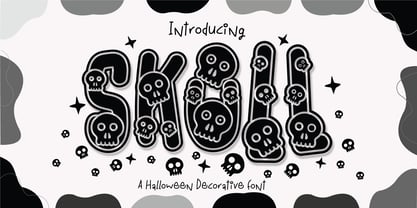 Skull Font is a captivating and Cute Halloween decorative font that adds a playful and enchanting touch to your designs. This delightful font features charmingly designed skulls with a whimsical twist, making it perfect for Halloween-themed projects, spooky invitations, eerie decorations, and so much more.
 - Between The Lines BF by Bomparte's Fonts,
$29.00 The famous Catalan architect, Antoni Gaudí, used to say “there are no straight lines or sharp corners in nature…” However, with Between The Lines that’s exactly what you’ll find: straight lines, parallel and perpendicular, all in a glorious display of Art Deco style. Here the verticals and horizontals dominate while the diagonals “sit this one out”. Curvilinear lines also run free here: they serve as refreshing counterpoints to prominent straights. These forms suggest a somewhat expressive script-like characteristic, (especially in lowercase) wherever the font’s many initials, terminals and contextual alternates are employed. Between The Lines offers many options for alternate letterforms (ligatures, stylistic alternates, contextual alternates, etc.). When these OpenType features are used judiciously and selectively, your typography will be greatly heightened. You’ll find BTL right at home in a number of environments: music album covers, snack food packaging, magazine headlines, cosmetics, signage and more. PLEASE NOTE: due to its very tall ascenders, Between The Lines benefits from generous leading (line spacing). Multilingual support included.
 - Le Havre Layers by insigne,
$19.00 With this charming new layered typeface, the possibilities are endless with your vision behind it. Accomplish the effect you've been searching for by layering these exceptional fonts and altering opacity and color, for a unique custom appearance that yells “hello there!” Play around a bit with the potential of Le Havre Layers. Build effects which include realistic 3D appearances reminiscent of the storefronts of old and adding centerlines, dotted centerlines, and shadow variations. Inspired by the affable appearance of vintage signage from the 1930s to the 1960s, Le Havre Layers spacing is altered from Le Havre Titling’s to accommodate shadows and other options properly. With its generous width it sends a message of refinement and grace. The geometric and art deco curves are a beautiful addition to your work. Mix and match with the other members of the Le Havre Hyperfamily. There are many amazing design solutions for you to discover. See what you could build with Le Havre Layers!
 - Boberia by Linotype,
$29.99Linotype Boberia is part of the Take Type Library, which features winners of Linotype’s International Digital Type Design Contest. Designed by Bo Berndal, its historical roots lie in the neoclassicism of the turn of the 20th century. The slender letters with a large x-height and marked stroke contrast give the font an elegant character. The nostalgic, flowing forms are typical of Art Deco fonts and allow designers a number of possibilities for the font’s use. Boberia includes regular, italic and bold type styles. - Performing Arts JNL by Jeff Levine,
$29.00 The sheet music for "I Used to be Color Blind" (from the 1938 Fred Astaire-Ginger Rogers movie "Carefree") had its title crafted in ornate Art Deco hand lettering. Keeping the original letter forms, the interior embellishment was simplified to a dot-and-line pattern [eliminating a secondary squiggly line] for a cleaner look. The type design is now digitally available as Performing Arts JNL, in both regular and oblique versions. For those who prefer no ornamentation, there are also regular and oblique versions in solid form.
 - Twombly by SAMUEL DESIGN,
$19.00 The name of this font is TWOMBLY, which is inspired by the abstract art master Cy Twombly. This original typeface has an Art Deco style with a firm, straightforward, confident character. Its self-respect is HEAVY, but it is very elegant and has a literary temperament. This font reveals a calm and calm temperament from Northern Europe. The details of the triangle used as a transition in the serif are full of playfulness, which makes the whole font have a youthful and cutting-edge feeling.
 - Love Song JNL by Jeff Levine,
$29.00 Love songs are the perennials of music, outlasting all other popular fads and styles that come and go. The 1920s through the 1940s is considered by some to be the Golden Age of the American love song. Thousands upon thousands of copies of popular sheet music sold, and the cover lettering and art on many titles were from some of the finest illustrators of their time. Love Song JNL recreates the Art Deco-flavored design found on one such piece of sheet music from the 1930s.
 - Impetus by Device,
$39.00 Impetus is a powerful capitals-only geometric sans in a solid and inline variant. Built around a framework of a circle and square, it echoes angular Deco or Italian Futurist "moderne” forms, and is about as heavy as it is possible for a font to be. Alternate forms are provided in the lower-case keystrokes for the S, G, J and W, and there is also an alternate 1. The two styles can be combined in one setting for effect. Use Impetus where maximum impact is required.
 - Changing Times JNL by Jeff Levine,
$29.00 Changing Times JNL was inspired by the hand lettering on the cover of the 1929 sheet music for "Wedding Bells (Are Breaking Up that Old Gang of Mine)". While the font’s name is an extremely vague reference to the subject of the song itself, it also represents the fact that the lettering style (still reflecting some Art Nouveau influence) welcomes the dawning of the Art Deco movement with the thick-and-thin line letter forms. The type design is available in both regular and oblique versions.
 - Lauderdale JNL by Jeff Levine,
$29.00 It was a series of three different forts on various spots on the New River built during the Second Seminole War [in Florida] named for Major William Lauderdale. It was launched as the college students' spring break destination for many years thanks to the film "Where the Boys Are". It's the major city 23 miles North of Miami. But wait! There's more! Now it's an eclectic Art Deco-inspired typeface. Lauderdale JNL is based on vintage source material with many unusual letter shapes and angles.
 - Moyt by Outerend,
$20.00 "Moyt" is a display slab font that has an art deco retro feel in a slanted modern design. This family is perfect not only for TV and film titles and credits but also for holiday season materials such as greeting cards, Christmas cards and many other purposes. Individual fonts - light, regular, medium and bold - are available in addition to a variable version which can be perfect if you would like to adjust its weights in detail. Hope you’ll have fun using this typeface for your projects.
 - Horse Drawn Carriage JNL by Jeff Levine,
$29.00 Picture if you will, a balmy autumn evening in Manhattan during the 1930s and a well-dressed couple out on the town. They hail one of the hansom cabs located near Central Park and climb in for an old-fashioned romantic ride around the green. Such are the type of images the stylized Art Deco hand-lettering comprising Horse Drawn Carriage JNL evokes. The inspiration for this font was the title card for a 1935 Bette Davis feature entitled "The Girl from 10th Avenue".
 - ArDeco by Bogusky 2,
$25.00Elegant Art Deco inspired font - Cabana Club JNL by Jeff Levine,
$29.00Bring back the glory of winters in Miami Beach, exotic summer vacations or Deco-era night spots with Cabana Club JNL - a retro-Deco font, complete with contour outline and solid black characters. - Gans Esquinazos by Intellecta Design,
$27.00 A decorative font design of many borders, ornaments and frame like illustrations.
 - Gotteslob by Intellecta Design,
$24.90 A blackletter with nice decorated initials, perfect to titling and fancy jobs.
 - ALT Apollo13 by ALT,
$5.00 Apollo13 is a custom decorative typeface for any type of graphic design.
 - Tuscany by Classic Font Company,
$14.95Tuscany is a decorated Lombardic font with a complimentary rotunda style lowercase. - Floralscript by Wiescher Design,
$29.00 »Floralscript« is an english copperplate script decorated with flowers and curly leaves.
 - KG Flavor And Frames Seven by Kimberly Geswein,
$5.00 Decayed and stamped highly textured frames and decorations. Perfect for chalkboard art.
 - PF DaVinci Script Pro by Parachute,
$79.00 PF DaVinci Script Pro is based on DaVinci’s own handwriting. He is considered to be one of the greatest painters of all time and perhaps the most diversely talented person ever to have lived. This great Italian artist left us with a unique writing (used to write from right to left), which we attempted to decode and simplify with PF Da Vinci Script Pro. Many of these letters are free interpretations and do not stick to the original forms. This typeface comes in 2 different styles: Regular and a more informal style called Inked. The all new “Pro” version supports all European languages including Latin, Greek, Greek Polytonic and Cyrillic. It comes loaded with many stylistic alternates in all languages.