10,000 search results
(0.018 seconds)
- Rivets by Pelavin Fonts,
$25.00 Rivets is a result of my fascination with the beauty I find in utilitarian industrial objects like the decorative ironwork in Grand Central terminal and the eloquent construction details of the urban infrastructure of the 19th and early 20th century. It began as die-raised typography for a magazine cover, developed further for a book about mid-20th century American manufacturing and evolved into a complete font plus four individual components suitable for producing multiple color variations.
 - Sejam by StudioJASO,
$56.00 ✔ Sejam means a thin binyeo, a Korean traditional ornamental hairpin ✔ Features remarkably slender horizontal stroke and graceful, decorative serif ✔ Its concise and neat shape follows modern aesthetics while the high contrast and traditional symmetry give a refined impression. ✔ Suitable for various uses including luxury brands, posters, packaging ✔ Supports a variety of OpenType Features such as Ligature, Localized forms ✔ Provides 3000+ glyphs of more than 60 Latin-based languages, including Korean
 - Keizer by Talavera,
$40.00 Keizer is a serif display typeface freely inspired by the display metal fonts of the early XXth century, reminiscent of those used in cartographic and book design. Its five versions display an open-face, an inline-flared, outline and decorated capitals, and an essential titling high-contrasted serif face. Keizer works well both on print and screen, ideal for book covers, posters and logos. Every weight includes small caps, petite caps, stylistic alternates and a neat set of ornaments.
 - Overbold by Catharsis Fonts,
$32.00 Overbold is an unapologetic display typeface inspired by an illustration in Eric Gill's Essay on Typography (p.51), in which he demonstrates �how not to make letters�. In particular, he shows that increasing the weight of the downstroke in a serif �A� without structural adjustments yields an absurd, �overbold� result. I found the letter so charming that I decided to blatantly disregard Gill's wisdom and draw an entire overbold typeface. Here is the result. I'm not sorry.
 - MC Kartoz by Maulana Creative,
$16.00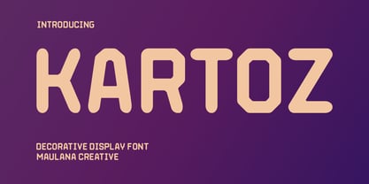 Kartoz is a modern Tech Decorative Display font. Medium stroke, fun character with a bit of ligatures and alternates. To give you an extra creative work. Kartoz font support multilingual more than 100+ language. This font is good for logo design, Social media, Movie Titles, Books Titles, a short text even a long text letter and good for your secondary text font with script or serif. Make a stunning work with Kartoz font. Caps only Fonts. Cheers, Maulana Creative
 - Buntaro by Hanoded,
$15.00 I am reading a great book by David Mitchell, called Number 9 Dream. One of the characters is called Buntaro, so I decided to call my new inky font after him. Like the book, Buntaro is quite unusual: it has no real baseline, comes with some strange characters, feels familiar, but surprises you nonetheless. It was made with a broken bamboo satay-skewer, Chinese ink and a lot of patience. Buntaro comes with a wealth of diacritics.
 - Agedage Cancelleresca by Dharma Type,
$14.99 Cancelleresca corsiva is the script developed in Vatican in 16th century, Agedage Cancelleresca is corsiva with decorative capitals. Agedage Cancelleresca is a Opentype font supporting some opentype layout features. To use these functions, you need to use an application which supports OpenType advanced features such as Adobe InDesign CS, Illustrator CS and Photoshop CS. We strongly recommend: Standard Ligatures : ON Discretionary Ligaures : ON In addition, the font includes Stylistic Alternates, Ordinal Numerators, Denominators, Fractions and a few alternates.
 - Landslide by Ana's Fonts,
$12.00 Landslide is a cute handwritten font family with: 4 fonts: regular, bold, italic and bold italic, each hand-drawn separately for a true handwritten feel a bonus set of ornaments (A-Z, a-z and 0-9) to help decorate your text Each font includes: A-Z, a-z, 0-9, accents punctuation and symbols Ligatures Landslide is perfect for any design that needs a handwritten feel, such as signatures, notes and quotes, logos and branding.
 - Briosh by Larin Type Co,
$12.00 Briosh - a hand drawn script font. Beautiful and elegant but at the same time unique thanks to its ending letters. It is stretched and not in a hurry , attracts attention and is perfect for creating logos, greeting cards, branding, book covers and many others. Alternative characters will help you create a project that is not repeatable. I decided to reflect this font in two styles, clean and rough, as you can see in the preview image. Enjoy using!
 - MC Qortilla by Maulana Creative,
$14.00 Qortilla is a Decorative flare Serif Display font. Bold stroke, fun character with a bit of ligatures and alternates. To give you an extra creative work. Qortilla font support multilingual more than 100+ language. This font is good for logo design, Social media, Movie Titles, Books Titles, a short text even a long text letter and good for your secondary text font with script or serif. Make a stunning work with Qortilla font. Cheers, Maulana Creative
 - LTC Goudy Extras by Lanston Type Co.,
$24.95 A set of over 50 ornaments, connecting borders, flourishes and decorative motifs originally designed by Frederic Goudy throughout his career. Many of these designs were used by Goudy at his Village Press and offered by his Village Foundry in the 1920s. The styles range from complex title page illustrations to simple linking borders, but all have the unique Goudy style. This set is completely different from the Goudy Ornaments found in the P22 Goudy Aries Set.
 - Highest Praise by Adam Ladd,
$25.00 Highest Praise is a bold and expressive brush script. It has condensed proportions and subtle texture on the edges, giving it a blend of modern and vintage qualities. While stylish and distinct, the typeface is very readable, making it great for branding, packaging, quotes, invitations, headlines, etc. Features include swash characters and alternate “s” to give a different look, double-letter ligatures for certain combinations, and extras (swashes, lines) built into the font to add decoration.
 - Ellabette by Bombus Hollow,
$24.00 Ellabette™ is a script font that was created by a wedding stationery designer after working in the industry for over a decade and getting request after request for script fonts that were formal but legible. Ellabette is warm and inviting, playful but elegant. Perfect for all things weddings, branding, editorial, social media, and websites. Designed with weddings in mind with fun special ligatures like "RSVP" "and" and "to" and works beautifully for legible address lists and envelope printing.
 - Opposition by Rita Bernardo,
$15.00 Opposition is a serif typeface that contain reverse contrast and has a decorative character. Taking into account its specific design, which gives rise to its unique personality. Contain ligatures and is a multi-lingual typeface which is adapt to different Latin alphabet languages. This font contain two weights: regular and bold. It's an ideal typeface for many types of applications in graphic design and beyond, such as websites, packaging, editorial design, titles, small texts and much more.
 - Radicals by ITC,
$29.99Calligrapher Margaret Layson works in partnership with Australian typographer Harry Pears, bringing designs such as the wonderful Lindisfarne Nova family to life. They both work on the digital incarnation in a true collaboration. Originally from the UK, Margaret began her professional career as a geophysicist. After arriving in Australia in 1968, she began to work as a freelance calligrapher. Over the years she has maintained an interest in the history of writing, particularly the scripts and decorations in manuscripts. - Clockwise by Ana's Fonts,
$14.00 Clockwise is a friendly sans serif font with 4 weights and italics. It includes over 315 glyphs, including: Small caps Ligatures And a bonus set of dashes and borders to help accent and decorate your text. Clockwise is perfect for both texts and titles, and pairs beautifully with other fonts already in your library, especially handwritten and serif fonts. Use it in everything from logotypes to social media posts, website and magazine layouts to poster designs.
 - Moka Natives by Maulana Creative,
$17.00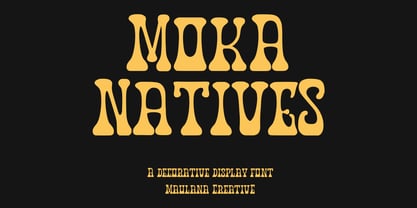 Moka Natives is a decorative display font. With high contrast stroke, fun character with a bit of ligatures and alternates. To give you an extra creative work. Moka Natives font support multilingual more than 100+ language. This font is good for logo design, Social media, Movie Titles, Books Titles, a short text even a long text letter and good for your secondary text font with sans or serif. Make a stunning work with Moka Natives font. Cheers, Maulana Creative
 - MC Blood Slime by Maulana Creative,
$17.00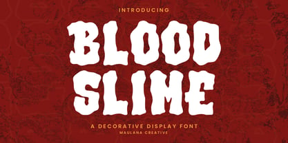 Blood Slime decorative display font. Bold contrast stroke, fun character with a bit of ligatures and alternates. To give you an extra creative work. Blood Slime font support multilingual more than 100+ language. This font is good for logo design, Social media, Movie Titles, Books Titles, a short text even a long text letter and good for your secondary text font with script or serif. Make a stunning work with Blood Slime font. Cheers, Maulana Creative
 - MC Riyollo by Maulana Creative,
$17.00 Riyollo is a modern clean contemporary decorative font. Bold stroke, fun character with a bit of ligatures and alternates. To give you an extra creative work. Riyollo font support multilingual more than 100+ language. This font is good for logo design, Social media, Movie Titles, Books Titles, a short text even a long text letter and good for your secondary text font with script or serif. Make a stunning work with Riyollo font. Cheers, Maulana Creative
 - Glowing Brush by FadeLine Studio,
$15.00 Glowing Brush is a natural and beautiful brush-lettered font, a calligraphy style with decorative end characters and a dancing baseline! This font is perfect for use in ink or watercolor based designs that produce natural handwriting. With a style like this, this font will be suitable in use for logos, branding projects, homeware designs, product packaging, mugs, quotes, posters, shopping bags, t-shirts, book covers, name cards, invitations, greeting cards, and all your other lovely projects.
 - So Far So Good by Papermode Co,
$20.00 So Far So Good is a Decorative display font. So Far So Good come with ROUGH style, it will make this typeface can be used in all design projects and works perfectly for pairing with script typeface or handmade fonts, Headlines, Posters, Packaging, Postcards, Invitation, Wedding Sign, Sign Painting, Signboard, and much more. Try So Far So Good, and let her fun and elegant excitement make you happy and enhance your creativity! You can use this font very easily.
 - MC Scienta by Maulana Creative,
$15.00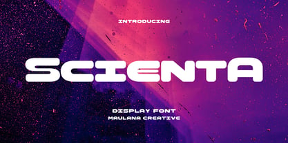 Scienta is a modern Decorative expanded sans Display font. Bold stroke, fun character with a bit of ligatures and alternates. To give you an extra creative work. Scienta font support multilingual more than 100+ language. This font is good for logo design, Social media, Movie Titles, Books Titles, a short text even a long text letter and good for your secondary text font with script or serif. Make a stunning work with Scienta font. Cheers, Maulana Creative
 - Jeigers by Maulana Creative,
$11.00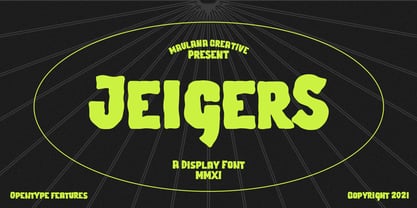 Jeigers is a Decorative Display font. With bold stroke, uprights and fun character with a bit of ligatures and lowercase alternates. To give you an extra creative work. Jeigers font support multilingual more than 100+ language. This font is good for logo design, Social media, Movie Titles, Books Titles, a short text even a long text letter and good for your secondary text font with sans or serif. Make a stunning work with Jeigers font. Cheers, MaulanaCreative
 - Java Heritages by Heybing Supply Co,
$25.00 Java Heritages Typeface is a multi-layered type family with opentype features, inspired by vintage signage that have unique decorative shapes. Comes with 4 font system that can be layered to create different effect (Regular, Drop Shadow, Inner Shadow & Inline). Java Heritages Typeface includes a full set of character A-Z, as well as multi-lingual support, currency figures, numerals, and punctuation. Java Heritages Typeface family is perfect for logotype, gig poster, letterhead, dropcap, titles, and any artworks.
 - MC Hipoxe by Maulana Creative,
$17.00 Hipoxe is a modern Decorative flared sans serif Display font. Bold stroke, fun character with a bit of ligatures and alternates. To give you an extra creative work. Hipoxe font support multilingual more than 100+ language. This font is good for logo design, Social media, Movie Titles, Books Titles, a short text even a long text letter and good for your secondary text font with script or serif. Make a stunning work with Hipoxe font. Cheers, Maulana Creative
 - Halender by Kartiny Type,
$14.00 Halender Script is an Elegant script font that comes with very beautiful character changes, a type of classic copper decorative script with a modern touch, designed with high detail to present an elegant style. Halender script is interesting because the typeface is pleasing to the eye, clean, feminine, sensual, glamorous, simple and very easy to read, because of the many luxurious letter connections. I also offer a number of decent stylistic alternatives for some of the letters. Thank You
 - Chicle Pro by Sudtipos,
$19.00 In a much needed break from complex scripts and polished packaging fonts, Koziupa and Paul decide to show their playful side. Chicle is bold, stretchable, kid-proof, pet-resistant letters. This font is made to take the abuse of software used to put together the elaborate, attention-scrambling artwork of candy, cereal, and toy packaging, or whatever boxed obscenity contains cat and dog treats. Chicle is Spanish for bubble gum. It's a definite sugar fix — no substitutes.
 - Genotics by Maulana Creative,
$14.00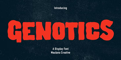 Genotics is a Decorative Display font. With bold wavy stroke, uprights and fun character with a bit of ligatures and lowercase alternates. To give you an extra creative work. Genotics font support multilingual more than 100+ language. This font is good for logo design, Social media, Movie Titles, Books Titles, a short text even a long text letter and good for your secondary text font with sans or serif. Make a stunning work with Genotics font. Cheers, Maulana Creative
 - Night Wind Sent by Ana's Fonts,
$12.00 Night Wind Sent is an elegant handwritten script font family inspired by old-fashioned handwritten postcards and letters. It includes ligatures (for a true handwritten feel), stylistic alternates, handwritten small caps, and swashes (for an extra bit of drama). Plus! Extra versions of the font: underline and strikethrough, and an ornaments font, to help decorate your text. Night Wind Sent is perfect for any design that needs a handwritten look, such as signatures, notes and quotes, logos and branding.
 - MC Sevola by Maulana Creative,
$16.00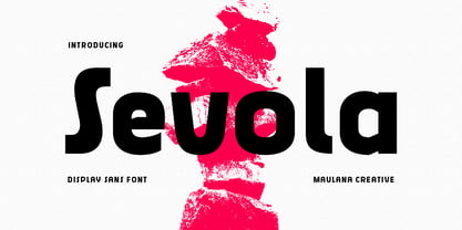 Sevola is a modern Decorative sans serif Display font. Bold stroke, fun character with a bit of ligatures and alternates. To give you an extra creative work. Sevola font support multilingual more than 100+ language. This font is good for logo design, Social media, Movie Titles, Books Titles, a short text even a long text letter and good for your secondary text font with script or serif. Make a stunning work with Sevola font. Cheers, Maulana Creative
 - MC Cyklops by Maulana Creative,
$16.00 Cyklops is a retros decorative sans display font. Bold stroke, fun character with a bit of ligatures and alternates. To give you an extra creative work. Cyklops font support multilingual more than 100+ language. This font is good for logo design, Social media, Movie Titles, Books Titles, a short text even a long text letter and good for your secondary text font with script or serif. Make a stunning work with Cyklops font. Cheers, Maulana Creative
 - Greenwich Village JNL by Jeff Levine,
$29.00 For decades, the Greenwich Village area of New York was a home for artists, poets, writers and free-thinkers of their time who were labeled "Bohemians" because of their non-conformist approach to life and the arts. Greenwich Village JNL is an Art Nouveau-influenced typeface with a Bohemian approach in its double crossbars on the A and H; all the while being a nice example of hand lettering found on a vintage piece of sheet music.
 - MFC Jewelers Monogram by Monogram Fonts Co.,
$299.00 The source of inspiration for Jewelers Monogram is a decorative alphabet designed in 1901 by Marcus Goldsmith, an inventor of elegant accessories of personal nature. Originally developed to be used as individual letters or for advertising purposes, this elegant lettering style is now digitally remastered and updated with smallcaps for modern monogram typesetting use for additional functionality beyond its original intentions. Download and view the MFC Jewelers Monogram Guidebook if you would like to learn a little more.
 - Laughs Qhuan by Namara Creative Studio,
$12.00 Decorative handwritten script font with natural touch, perfect for creating neat designs with a personal touch. It's perfect for branding projects, logo, wedding designs, social media posts, advertisements, product packaging, product designs, label, photography, watermark, invitation, stationery and any projects that need handwriting taste. Features : OTF File with Standard glyphs Alternates, Ligatures and Multilingual Support Works on PC & Mac with Simple installations PUA Encoded Characters, Fully accessible without additional design software. Hope you enjoy with our font!
 - Full Blast by Hanoded,
$15.00 I was cleaning out my pencil box and found an old marker pen. I wanted to throw it away, because it was leaking all over my stuff, but decided I could use it one more time. The result is Full Blast font: a ‘brush’ font (made with that leaking old marker pen). Use if for your fireworks packaging, fiery pepper sauce bottles and whoopee cushions (and just about anything else as well). Comes with an explosive amount of diacritics.
 - Michel Elisha Script by Fargun Studio,
$14.00 Michel Elisha Script! A new fresh and modern hand lettered font with decorative characters and a dancing baseline. So beautiful on invitation like handicraft, greeting cards, branding materials, business cards, quotes, posters, and more design concepts. Features : Unique ligatures Unique Alternates Stylistic sets Basic Latin A-Z and a-z Numbers International Symbols included Punctuation Please send a message if you have questions or problems, and don't hesitate to say hello on Instagram https://www.instagram.com/fargunstudio/ Thank you.
 - Simply Grotesk JNL by Jeff Levine,
$29.00 Up until the advent of vinyl plotters, computers and a myriad of other typesetting and printing changes the world has experienced over the past few decades, the art of hand lettering flourished. An early 1900s book on show card writing displayed a nice example of a Grotesk typeface (a popular style of sans serif of the time). This has been redrawn digitally as Simply Grotesk JNL and is available in four varieties - regular, oblique, condensed and condensed oblique.
 - Adriane Lux by Typefolio,
$49.00 Adriane Lux is the decorative, "inline" or "openface" titling companion to Marconi Lima's acclaimed Adriane Text family. This single weight offering is modeled after the Regular weight of the primary family. While Adriane Text is intended for thoroughly classical book design, Adriane Lux enters the fold as an equally traditional display face. Have it foil-stamped on your next faux-leather book cover design or embossed on your personal calling card for a touch of well-behaved, regal formalism.
 - Kreigart by Maulana Creative,
$14.00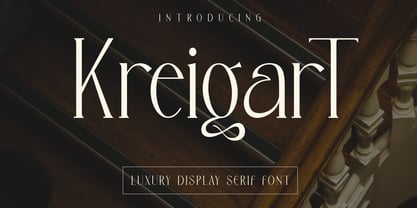 Kreigart is a modern decorative serif display font. With high contrast stroke, fun character with a bit of ligatures and alternates. To give you an extra creative work. Kreigart font support multilingual more than 100+ language. This font is good for logo design, Social media, Movie Titles, Books Titles, a short text even a long text letter and good for your secondary text font with sans or script. Make a stunning work with Kreigart font. Cheers, Maulana Creative
 - MC Goruts by Maulana Creative,
$17.00 Goruts is a modern Decorative sans serif font. Bold stroke, fun character with a bit of ligatures and alternates. To give you an extra creative work. Goruts font support multilingual more than 100+ language. This font is good for logo design, Social media, Movie Titles, Books Titles, a short text even a long text letter and good for your secondary text font with script or serif. Make a stunning work with Goruts font. Cheers, Maulana Creative