10,000 search results
(0.017 seconds)
- MC Vatteo by Maulana Creative,
$14.00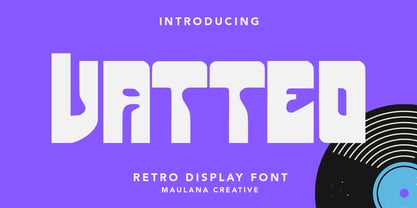 Vatteo is a retro decorative display font. Bold stroke, fun character with a bit of ligatures and alternates. To give you an extra creative work. Vatteo font support multilingual more than 100+ language. This font is good for logo design, Social media, Movie Titles, Books Titles, a short text even a long text letter and good for your secondary text font with script or serif. Make a stunning work with Vatteo font. Cheers, Maulana Creative
 - La Paloma Script by Make Media Co,
$16.00 Add a touch of elegance to your work with La Paloma Script - A clean, modern, hand-written typeface with over 170 Ligatures and Decorative End Characters to add a dash of luxury to any project. And if you're looking for a lovely logo font, you just found it! La Paloma was designed with Branding in mind! But don't stop there, use this chic type in headlines & titles, signage, greeting cards, invitations & more!
 - Chevane Dream by GuseType,
$15.00 Chevane Dream is a decorative serif font, this font is inspired by starlight. The characteristic of this font is its sharpness and light weight, which makes this font look more elegant and luxurious. Chevane Dream can be used for various projects such as branding & identity, posters, magazines, logos, albums and much more. Chevane Dream also has several features including multilingual support glyphs, alternative glyphs and ligatures, this feature can make your writing look more stylish.
 - Moldern by Arterfak Project,
$18.00 Moldern is a modern-style serif with stylish ligature explorations. Moldern combines decorative, vintage, and minimalist style with a bold weight that is suitable for display. This font has a classy impression, feminine and expensive. You can apply this font for branding, fashion, logo, magazine, books, labels, invitations, cards, and more! Here's what you'll get : Uppercase Lowercase Stylistic set Stylistic alternates Ligatures Number & symbols Multilingual support Thank you for watching. Happy designing!
 - Violethe by Letterafandi Studio,
$16.00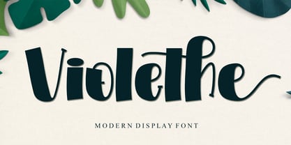 Violethe is a simple and unique-looking display font perfect for a wide variety of products. Use it on your Christmas decorations, Valentine’s Day cards, posters, wedding invitations, branding projects, social media posts, magazines, book covers, and whatever creative project you have in mind, and it will add a fun and friendly touch to your design! This font is PUA encoded, which means you can access all the glyphs and sweeps with ease!
 - Spooky Frights by Sealoung,
$15.00 Spooky Frights celebrates all things scary: It’s the ideal display typeface for any spooky Halloween-themed creative project. Add it to your most creative ideas and notice how it makes them come alive. This is an installable font that will work great with your Halloween party invitations, web graphics, and other halloween decor. This font is cuttable! what’s inside : Uppercase & Lowercase Numerals and Punctuations (OpenType Standard) Accents (Multilingual Characters) PUA encoded Ligatures
 - Rosebud by aRc,
$10.00 Rosebud is a great blend of simple yet organic rosy caps. Each big caps has a single rose while the small caps has the prickly, thorny stems. This decorative TrueType font is great for any occasion (from Wedding to Sweet 16 Party) or for surprising a rose lover with a flowery note. Plus, you can create your own border patterns or flower arrangements by using the rosy and/or the thorny punctuation marks.
 - Channel Surfing JNL by Jeff Levine,
$29.00In 1999, Jeff Levine released a freeware font called "Channel Tuning JL" scanned from drawings made with a felt tip marker and designed as if the letters were breaking up due to poor reception such as on pre-digital TV sets. Over a decade later, Jeff has totally reworked the font—giving it cleaner lines, an extended character set and renaming it Channel Surfing JNL to set it apart from the roughly-drawn original. - Goskha by Maulana Creative,
$14.00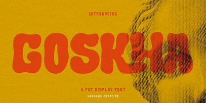 Goskha is a decorative handwritten display font. With bold stroke, fun character with a bit of ligatures. To give you an extra creative work. Goskha font support multilingual more than 100+ language. This font is good for logo design, Social media, Movie Titles, Books Titles, a short text even a long text letter and good for your secondary text font with sans or serif. Make a stunning work with Goskha font. Cheers, Maulana Creative
 - MC Karviet by Maulana Creative,
$22.00 Karviet is a decorative experimental display font. Regular stroke, fun character with a bit of ligatures and alternates. To give you an extra creative work. Karviet font support multilingual more than 100+ language. This font is good for logo design, Social media, Movie Titles, Books Titles, a short text even a long text letter and good for your secondary text font with script or serif. Make a stunning work with Karviet font. Cheers, Maulana Creative
 - Umidus Font by Softulka,
$10.00 Umidus font - Trippy wavy liquid decorative font, which works perfectly for bold titles, Festival posters, as a graphic element for bright T-shit or hoodies, or even backgrounds! This weird and ugly font likes an experiment with spacing and different deformation. Please, don't hold back on your bold modern ideas! ------------------- You will receive: - 3 OTF files (3 font styles: plane black, transparent outline, black with highlights) - ATTENTION! font comes WITHOUT any photos, textures, or effects.
 - MC Walreinn by Maulana Creative,
$14.00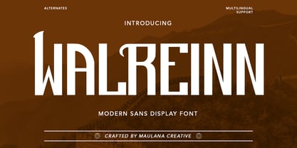 Walreinn is a modern decorative display font. Bold stroke, fun character with a bit of ligatures and alternates. To give you an extra creative work. Walreinn font support multilingual more than 100+ language. This font is good for logo design, Social media, Movie Titles, Books Titles, a short text even a long text letter and good for your secondary text font with script or serif. Make a stunning work with Walreinn font. Cheers, Maulana Creative
 - Beauty Shine by Java Pep,
$17.00 Introducing a pretty script font that comes with two styles regular and italic, As the name Beauty & Shine is a pretty calligraphy font that has a lot of alternate characters to switch it for more stunning and outstanding looks. Beauty & Shine aslo can switching into italic style based on you need or mix and match with regular style . This font is perfect for quotes, logo, branding, invitations, apparel, prints, wall decor, cricut projects, and etc.
 - ITC Ziggy by ITC,
$29.99ITC Ziggy was designed by Bob Alonso, who says it started out as phone doodles in the early 1970s." Alonso rediscovered the sketches years later, thought they revived the feel of the 70s, and decided to digitize the typeface. He liked the form of the letter Z best, so named the font Ziggy. ITC Ziggy reminds its designer of "elephant bellbottoms" and its style as a display face instantly evokes a nostalgia for the 1970s. - Joseph Sophia by Fargun Studio,
$14.00 Joseph Sophia! A new fresh ans modern hand lettered font with decorative characters and a dancing baseline. So beautiful on invitation like handicraft, greeting cards, branding materials, business cards, quotes, posters, and more design concepts. Features : Unique ligatures Stylistic sets Basic Latin A-Z and a-z Numbers International Symbols included Punctuation Please send a message if you have questions or problems, and don't hesitate to say hello on Instagram https://www.instagram.com/fargunstudio/ Thank you.
 - Fleurious by Proportional Lime,
$9.95 This font was inspired by the many changes in printing habits over the last half millennium. Every book has a story and sometimes the printing itself can be its own story. Every era has its own tendencies in decorative elements and these practices were observed and included such that the font contains over 200 hundred glyphs with which to add variety to your documents. It is provided with a complete character map.
 - Decutto by Michael Rafailyk,
$15.00 Decutto is a neo-grotesque that packs the Marionette formula and some blackletter ideas into a low-contrast sans serif design. Its name plays on the phrases “off cut” and “cut to” which express the key feature – the contemporary legible letter shape is decorated with cut carved edges and counters, giving the typeface crisp and simplistic look, like that of an old minted coin. Scripts: Latin, Greek, Cyrillic, Hebrew. Hinting: Manual PostScript.
 - Angelia Monogram by Sipanji21,
$25.00 introducing this Angelia Monogram Font. It's a sweet and Luxury hand-drawn monogram wreath with leaves. Comes in 2 styles monogram, with and without decoration space for word on each letter inside. You can simply change the case between uppercase and lowercase to feel the difference. Whether you want to create a Luxury and powerful statement or simply add a touch of attitude to your designs, "Angelia Monogram" is the font for you.
 - FE Gigant by Egor Stremousov,
$50.00 The font has a pronounced decorative effect and is suitable for the gaming, publishing and film industry. The Cyrillic alphabet conveys the spirit and atmosphere of Soviet constructivism. It is well suited for names of Soviet (or pseudo-Soviet) trademarks, large headings, signs, giant letter structures, etc. The Latin part is not tied to the Soviet period and can be applied in a wider range. Sharp angles and unnatural proportions create dynamics, strength and heaviness.
 - Megona by Cooldesignlab,
$15.00 Megona is an elegant, unique, fashionable, luxurious, modern and elegant font with lots of ties and alternatives that will make your presentation even more amazing and stand out !!! Megona also supports Multi Language. and the PUA has been coded! This font is inspired by Indonesian batik cloth patterns with its own distinctive strokes. This font is perfect for any modern project including branding designs, logos, invitations, wedding decorations, website designs, Instagram, business cards, and more!
 - Sweet Dreams by Fargun Studio,
$14.00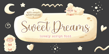 Sweet Dreams! A new fresh ans modern hand lettered font with decorative characters and a dancing baseline. So beautiful on invitation like handicraft, greeting cards, branding materials, business cards, quotes, posters, and more design concepts. Features : Unique ligatures Stylistic sets Basic Latin A-Z and a-z Numbers International Symbols included Punctuation Please send a message if you have questions or problems, and don't hesitate to say hello on Instagram https://www.instagram.com/fargunstudio Thank you.
 - Sweet Aloha by Stefani Letter,
$14.00 Sweet Aloha is a cool and fashionable handwritten font. It is defined by smooth curves and is perfect for packaging or editorial designs. but also It’s ideal for branding and decorate your projects. Add this chunky lettered font to your designs and notice how it makes them come alive!. This font is PUA encoded which means you can access all of the cute glyphs with ease! It also features a wealth of including ligatures.
 - Goudy Stout by Microsoft Corporation,
$39.00Goudy Stout was designed by Frederic W. Goudy in 1930. This version was created by Vincent Connare while at Microsoft. Goudy Stout is a decorative typeface that is quite unusual, a novelty of sorts among Goudy's many typographic achievements. The Goudy Stout font is considered a frivolous typeface. Goudy wrote In a moment of typographic weakness I attempted to produce a 'black' letter that would interest those advertisers who like the bizarre in their print." - MC Parize Display Font by Maulana Creative,
$15.00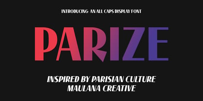 Parize is a decorative display font. Bold stroke, fun character with a bit of ligatures and alternates. To give you an extra creative work. Parize font support multilingual more than 100+ language. This font is good for logo design, Social media, Movie Titles, Books Titles, a short text even a long text letter and good for your secondary text font with script or serif. Make a stunning work with Parize font. Cheers, Maulana Creative
 - Modern Love Slanted by Resistenza,
$39.00 Modern Love has been one of our most popular fonts during last year, so we decided to create a new version of this sweet character set. Modern Love Slanted is a new casual slanted brush-handwritten family. It has the effortless hand-painted feeling and keeps a high density of contrast like Modern Love Regular and It also includes a set of ornaments, swashes and alternates accessible through Opentype features. Check out also ‘Modern Love’
 - Goversy by Maulana Creative,
$15.00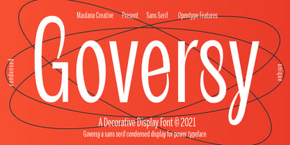 Goversy is a Decorative Condensed Display font. With Regular stroke, fun character with a bit of ligatures. To give you an extra creative work. Goversy font support multilingual more than 100+ language. This font is good for logo design, Social media, Movie Titles, Books Titles, a short text even a long text letter and good for your secondary text font with handwriting and script font. Make a stunning work with Goversy font. Cheers, Maulana Creative
 - Mahendra by BBA Key,
$12.00 Mahendra Script is a new fresh and modern font in handmade calligraphy, with decorative characters and dancing lineage! So wonderful on invitations, greeting cards, branding material, business cards, quotes, posters, and more. If you do not have programs that support OpenType features like Adobe Illustrator and CorelDraw X Versions, you can access all alternates using Font Book (Mac) or Character Map (Windows). If you have any questions, please feel free to contact me via email.
 - Catou by Maulana Creative,
$12.00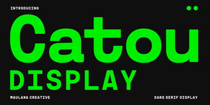 Catou is a modern decorative sans display font. With single weight bold stroke, fun character. To give you an extra creative work. Catou font support multilingual more than 100+ language. This font is good for logo design, Social media, Movie Titles, Books Titles, a short text even a long text letter and good for your secondary text font with script or serif. Make a stunning work with Catou font. Cheers, Maulana Creative
 - Walking Corps by Maulana Creative,
$22.00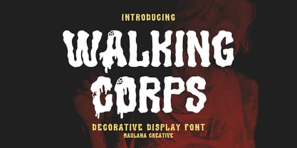 Walking Corps decorative display font, fun character with a bit of ligatures and alternates. To give you an extra creative work. Walking Corps font support multilingual more than 100+ language. This font is good for logo design, Social media, Movie Titles, Books Titles, a short text even a long text letter and good for your secondary text font with script or serif. Make a stunning work with Walking Corps font. Cheers, Maulana Creative
 - Coroner by Storm Type Foundry,
$39.00 I never needed to digitize this early design from 1988. I found it in a drawer underneath layers of dozens of other type designs. The drawings were made with ink on paper, about 15 cm high, meticulously executed and retouched separate glyphs for a primitive photo-lettering. I used a photographic magnifier to set words and lines in my darkroom. In 2018 I decided to make a font out of it just for fun...
 - Ray Harts by Maulana Creative,
$12.00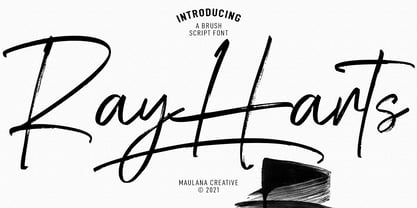 Converon is a decorative cubical display font. With bold sharp edges stroke, fun character with a bit of ligatures. To give you an extra creative work. Converon font support multilingual more than 100+ language. This font is good for logo design, Social media, Movie Titles, Books Titles, a short text even a long text letter and good for your secondary text font with sans or serif. Make a stunning work with Converon font. Cheers, MaulanaCreative
 - Sweetie Summer by Attype Studio,
$12.00 Sweetie Summer inspired by summer ice cream. perfect display font for summer business, summer flyer, summer sign & summer decor. Comes with display font, this layered font make a shiny effect for typography that you creates. Sweetie Summer is perfect for branding, logo, invitation, stationery, social media post, product packaging, merchandise, blog design, game titles, cute style design, Book/Cover Title and more. Features : - Multilingual Support --- Hope you enjoy with our font! Attype Studio
 - Fineday by Melvastype,
$29.00 Fineday is a clean and lining brush script. It is available with two different styles of uppercases: Style One and Style Two. Style One is swashy and decorative. Style Two is more plain and straightforward. Fineday is also available with connecting and non-connecting lowercases. All the Fineday versions have fancy alternate characters like ending swashes, tales and swashy ascenders. The family has an extended character set supporting most Central European and Eastern European languages.
 - Keepsake by Aerotype,
$49.00 The Keepsake™ family has five members that can be combined to provide a range of creative options. Rich with OpenType features including discretionary and contextual alternate characters and ligatures, and other stylistic alternates. Each face includes three options for every capital letter and multiple lowercase options. All five fonts support Latin, Eastern European and Baltic languages. Other features include four decorative elements, and optional old-style figures accessible by supporting application’s OpenType menu.
 - Pluckypot by Maulana Creative,
$12.00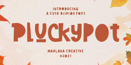 Pluckypot is a decorative handwritten display font. With pencil effect stroke, fun character with a bit of ligatures. To give you an extra creative work. Pluckypot font support multilingual more than 100+ language. This font is good for logo design, Social media, Movie Titles, Books Titles, a short text even a long text letter and good for your secondary text font with Script or Handwrittens. Make a stunning work with Pluckypot font. Cheers, MaulanaCreative
 - Fledermaus by Hanoded,
$15.00 Fledermaus (meaning 'Bat' in German) was a cabaret theater from Vienna. The original Jugendstil decor was designed by Josef Hoffman and several posters, advertising performances, were designed by other members of the Vienna Workshop. Fledermaus font was based on a 1907 poster by Bertold Löffler. Since only a few glyphs were available, I designed the missing ones myself. The lower case consists of small caps and the font comes with extensive language support.
 - Winter Beautys by IM Studio,
$19.00 Winter Beauty is a romantic and sweet calligraphic typeface with characters dancing along the baseline. This will add a spark of luxury to any design project you want to create! This font is PUA coded which means you can access all the amazing glyphs and ligatures with ease! This font is perfect for all your farmhouse designs, rustic decor, branding, logos, t-shirt designs, wedding invitations, svg designs, wall art, quotes, social media and more!
 - Annadalea by EVCco,
$12.00 This typeface pays homage to numerous Victorian and Art Nouveau predecessors, while straying somewhat beyond their usual conventions. All lowercase letters ascend in unison, whereas capitals descend below the baseline. A rigid set of uniform strokes keeps the chaos reigned in, while various calculated inconsistencies affect a vaguely hand-drawn quality to this quirky, downright decadent font. Comes packaged with the standard complement of alpha-numeric glyphs, punctuation marks, mathematical symbols, and Western European diacritics.
 - Gonspire Script by Mans Greback,
$69.00 Gonspire Script is a swirly and swashy typeface that radiates beauty. With elegant curves and swooshes, Gonspire Script is a decorative masterpiece for any creative project. Its lovely design is accentuated by intricate swashes and beautiful ornaments, making it an ideal choice for those looking to add a touch of elegance to their work. Use underscore _ anywhere in a word for swashes. Example: Love_rose Use multiple underscore for different swashes. Example: Wonder________woman
 - Junior Clerk JNL by Jeff Levine,
$29.00 Junior Clerk JNL is the plain sans serif version of the lettering found on the cover of the sheet music for 1919's "The World is Waiting for the Sunrise". The song title was originally set in a decorative sans serif with an engraved line adorning each character. This version of the more fanciful design is available as the companion font Legal Eagle JNL. Junior Clerk JNL is available in both regular and oblique versions.