6,919 search results
(0.019 seconds)
- Black Grotesk by ParaType,
$30.00 Designed at ParaType in 1997 by Tagir Safayev. Based on Gasetny Chorny (“Newspaper Black”), of Ossip Lehmann foundry, St.-Petersburg, 1874, and Kompakte Grotesk of Haas. An old-fashioned German sans serif “Grotesque”. For use in advertising and display typography.
 - Doubleganger by Struvictory.art,
$15.00 Doubleganger is a modern sans serif with contrast. The font is represented by condensed lowercace and extended uppercase. To get an elegant and contemporary design, combine them together. Doubleganger is suitable for retro and modern typographic posters and prints, feminine branding, design of books and fashion magazines. The font includes stylistic alternates for symbols: c, g, j, k, o, q, r, u, &, K, O, Q, R, W, 0, 1, 2, 3, 4, 5, 6, 7, 8, 9. There are also ligatures: sc, hg, sh, gh, ge, je, st, sp, sr, se, sa, ja, ph, qu, oo, ss, pp, ST, SS, QU, HA, SA, GA.
 - Zitkid by PizzaDude.dk,
$15.00A clumbsy font with an attitude! More adorable than grunge and trash! - KG Flavor And Frames by Kimberly Geswein,
$5.00 Adorable accents for your work including frames, labels, chevrons, mustaches, and more!
 - C-Nation by URW Type Foundry,
$39.99 Marit Otto about C-Nation: The building typeface. Although the 70ties were very liberating and progressive, still girls played mainly with dolls and sweet things and boys with all kinds of challenging stuff. They did all sorts of basic scientific experiments in mini labs and of course built cool things with Meccano building sets. As a girl I was perfectly happy with the toys I had access to. But at the same time I was very curious about all the adventure toys and discoveries my brother did. It also made me wonder why the grown up people thought that our world could be separated so easily by separating our toys in pink and blue sections. At this day of age Meccano is probably hopelessly old fashioned and far to manual. Children of today are fed by fast images and cool animations on screen, they learn, play, communicate and relax in the same space, the digital space. The special feature of Meccano was that even though it was very basic there was the promise you could create anything. It might even contribute to a logical mind. The typeface I designed refers to the Meccano feel. It is a creative typeface. A bit masculine and bold looking perhaps but after the first impression a subtle and refined female touch is revealed. It has links to architecture and associations with metal constructions like ‘The Eiffel Tower’ and (old railway) bridges. I am convinced that we all think of that as very charming man-made objects.
 - a sogra Ruth - Personal use only

- Melancholia by Barnbrook Fonts,
$75.00 Melancholia is a subtle and beautiful sans-serif inspired by calligraphic letterforms. The name describes a feeling of deep sadness, an intense sensitivity to the world. The design of Melancholia is an attempt to introduce some of that wistfulness into the sans-serif form, a typographic classification that is often characterised by an austere functionality. Melancholia includes a set of true italics influenced by old-style serif italics, such as those found in Claude Garamond’s eponymous typeface, as well as a set of stylistic alternates and calligraphic-style swash characters.
 - FF Dagny by FontFont,
$68.99 Swedish type designers Örjan Nordling and Göran Söderström created this sans FontFont in 2009. The family has 12 weights, ranging from Thin to Black (including italics) and is ideally suited for editorial and publishing, logo, branding and creative industries, poster and billboards, software and gaming as well as web and screen design. FF Dagny provides advanced typographical support with features such as small capitals, case-sensitive forms, fractions, super- and subscript characters, and stylistic alternates. It comes with proportional lining, tabular oldstyle, and tabular lining figures. In 2011, FF Dagny received the ISTD award.
 - Rahere Informal by ULGA Type,
$18.99 Rahere Informal is a slab semi-serif typeface that has a seriously charming personality and a little spring in its step. Serifs bend and flick, giving the characters a spirited, almost calligraphic feel. It's lively and friendly without being whimsical, great for messages that need a casual but credible tone with a bit of zing in the mix. Rahere Informal is suitable for a wide range of applications such as information signage, packaging, advertising, brochures, catalogues, screen text, visual identities and opera festivals. Want an annual report that pleases the board, shareholders and investors? Set it in Rahere Informal - that’ll put a smile on everyone’s face. The family comes in six weights from light to extra bold with corresponding italics. The lighter weights are more delicate, an evenly-spaced flamboyance of flamingos basking in the sun. As the weights get heavier, characters transform into a tight-knit group of line dancing rhinos. All styles contain a set of swash caps, a few ligatures and alternatives. Nice. The character set covers most European languages plus Vietnamese. Each weight contains lining & non-aligning numerals in both proportional & tabular spacing. The tabular numerals share the same width across all weights and styles (matching Rahere Sans and Rahere Slab). If a companion sans serif is needed, Rahere Sans is the ideal partner. They are both part of the extended Rahere typeface family and have been designed to complement each other. Seriously charming, charmingly serious. Seriously, what more do you want from a typeface? Rahere, founder of St Barts in London The typeface is named after Rahere, a 12th-century Anglo-Norman priest, who founded the Priory of the Hospital of St Bartholomew, London in 1123. In 2007 I was successfully treated at Barts for relapsed testicular cancer so I’m indebted to all the doctors, nurses and support staff who work there. A special shout out to Orchid Cancer – a UK charity that helps men affected by cancer – who funded the research for my treatment.
 - Hebrew Marge Tanach by Samtype,
$149.95 This is the classical font to make a Tanach, Siddur or a regular hebrew book. These fonts include all diacritic marks: Nikud, Teamim and modern pontuation. You can find in these fonts: shevana, kamats katan, cholam chasser and dagesh chazak. The best program to use these fonts is Adobe Indesign.
 - Hebrew Marge by Samtype,
$39.00 This is the classical font to make a Tanach, Siddur, or a regular Hebrew book. These fonts include all diacritic marks: Nikud, Teamim, and modern punctuation. You can find in these fonts: shevana, kamats katan, cholam chasser and dagesh chazak. The best program to use these fonts is Adobe Indesign.
 - Qobliyah by Twinletter,
$15.00 The Qobliyah font is beautiful, elegant, and luxurious – that’s what you get when you use our font set. This font is easy to install and use in programs like Adobe Photoshop, Illustrator, InDesign, and Word, among others. Each font is designed by a professional graphic designer to ensure a flawless finish.
 - Tahu Bullats by HansCo,
$15.00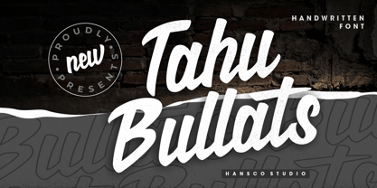 Tahu Bullats a Handwriting typeface. Tahu Bullats is a bold and fun typeface with many ligatures and alternates. Comes with a full uppercase, lowercase, numbers and punctuation + standard multilingual support. It’s great for branding, logo designs, lettering, logotype, clothing, posters, magazines, and much more. We recommend using Adobe Illustrator or Photoshop.
 - Hebrew Vilna Tanach by Samtype,
$189.00 This is the classical font to make a Tanach, Siddur or a regular hebrew book. These fonts include all diacritic marks: Nikud, Teamim and modern pontuation. You can find in these fonts: shevana, kamats katan, cholam chasser and dagesh chazak. The best program to use these fonts is Adobe Indesign.
 - Quaint Notions NF by Nick's Fonts,
$10.00This rollicking fun face is based on legendary lettering artist Alf Becker's Super Thick-and-Thin, his twenty-third offering in "Signs of the Times" magazine. The package includes two fonts: a full Adobe Standard character set, and an Alternates version, which features the more extreme elements of Becker's original design. - Illuminations Woodcut by Just My Type,
$10.00 Illuminations Woodcut is inspired by the decorated initial capitals of Medieval manuscripts… and an old book of clip art in which they were found. Try decomposing them in Adobe Illustrator and coloring the pieces or dropping color into them in Photoshop: you can get some stunning results. Caps and TrueType only.
 - Miedinger by Canada Type,
$24.95 Helvetica’s 50-year anniversary celebrations in 2007 were overwhelming and contagious. We saw the movie. Twice. We bought the shirts and the buttons. We dug out the homage books and re-read the hate articles. We mourned the fading non-color of an old black shirt proudly exclaiming that “HELVETICA IS NOT AN ADOBE FONT”. We took part in long conversations discussing the merits of the Swiss classic, that most sacred of typographic dreamboats, outlasting its builder and tenants to go on alone and saturate the world with the fundamental truth of its perfect logarithm. We swooned again over its subtleties (“Ah, that mermaid of an R!”). We rehashed decades-old debates about “Hakzidenz,” “improvement in mind” and “less is more.” We dutifully cursed every single one of Helvetica’s knockoffs. We breathed deeply and closed our eyes on perfect Shakti Gawain-style visualizations of David Carson hack'n'slashing Arial — using a Swiss Army knife, no less — with all the infernal post-brutality of his creative disturbance and disturbed creativity. We then sailed without hesitation into the absurdities of analyzing Helvetica’s role in globalization and upcoming world blandness (China beware! Helvetica will invade you as silently and transparently as a sheet of rice paper!). And at the end of a perfect celebratory day, we positively affirmed à la Shakti, and solemnly whispered the energy of our affirmation unto the universal mind: “We appreciate Helvetica for getting us this far. We are now ready for release and await the arrival of the next head snatcher.” The great hype of Swisspalooza '07 prompted a look at Max Miedinger, the designer of Neue Haas Grotesk (later renamed to Helvetica). Surprisingly, what little biographical information available about Miedinger indicates that he was a typography consultant and type sales rep for the Haas foundry until 1956, after which time he was a freelance graphic designer — rather than the full-time type designer most Helvetica enthusiasts presume him to have been. It was under that freelance capacity that he was commissioned to design the regular and bold weights of Neue Haas Grotesk typeface. His role in designing Helvetica was never really trumpeted until long after the typeface attained global popularity. And, again surprisingly, Miedinger designed two more typefaces that seem to have been lost to the dust of film type history. One is called Pro Arte (1954), a very condensed Playbill-like slab serif that is similar to many of its genre. The other, made in 1964, is much more interesting. Its original name was Horizontal. Here it is, lest it becomes a Haas-been, presented to you in digital form by Canada Type under the name of its original designer, Miedinger, the Helvetica King. The original film face was a simple set of bold, panoramically wide caps and figures that give off a first impression of being an ultra wide Gothic incarnation of Microgramma. Upon a second look, they are clearly more than that. This face is a quirky, very non-Akzidental take on the vernacular, mostly an exercise in geometric modularity, but also includes some unconventional solutions to typical problems (like thinning the midline strokes across the board to minimize clogging in three-storey forms). This digital version introduces four new weights, ranging from Thin to Medium, alongside the bold original. The Miedinger package comes in all popular font formats, and supports Western, Central and Eastern European languages, as well as Esperanto, Maltese, Turkish and Celtic/Welsh. A few counter-less alternates are included in the fonts.
 - BlincType Letterpress Fontpak by Chank,
$99.00 Add some old fashioned charm to your designs with the distressed alphabets in the new BLINCtype Letterpress Fontpak, a brand new font collection containing 8 letterpress-inspired fonts from the creative minds at Blinc Publishing in St. Paul, MN. The BLINCtype Letterpress Fontpak contains a handy concise assortment of old-school display fonts. From the old Western "WANTED" poster look of Prospect Modern, to the no-nonsense all-caps classic Goshen and its lowercase companion Gideon, these fonts are inspired by wooden letterpress blocks and other archaic technologies. It's like having your own letterpress print studio! Except it's all instantly downloadable right now as easy-to-use fonts! Designers love working with the Cheltenham-esque Gomorrah and its grittier, grungier counterpart, Sodom. The bouncy Golgotha has a rough and tumble readiness that exudes a hand-made charm, while Hamilton Offset has a cryptic, experimental look and feel that gives the impression of double-vision. You also get the newest member of the Blinc font family, Player Piano, which was based on punch-cut stencil letters on an old player piano paper song roll. Purchase the BLINCtype Letterpress Fontpak today and you'll be able to download and start using these 8 great fonts right away! The BLINCtype Letterpress Fontpak contains the fonts: Gideon, Golgotha, Gomorrah, Goshen, Hamilton Offset, Player Piano, Prospect Modern and Sodom.
 - Quant Antiqua by ParaType,
$30.00 The typeface was designed at the Polygraphmash type design bureau in 1989 by Lyubov Kuznetsova. Based on the typeface Literanutnaya (Latinskaya) of the Berthold typefoundry (St.-Petersburg, 1901), a version of Lateinisch typeface of H. Berthold (Berlin, 1899). For use in text matter.
 - Canilari by W Type Foundry,
$35.00 Canilari is a post-modern type family inspired by Diaguita pottery and contemporary serif typefaces. The Diaguita culture—developed from 10th century A.D. until 16th century A.D.—settled in the area of the present-day north Chile and northwest Argentina. Surviving cultural expressions of the Diaguita people are reduced to just a few pieces of beautifully decorated pottery of high technical quality. Canilari itself is a scream of identity with an incomparable tone that borrows elements from native America and proudly show them to the world. The intense and consistent personality of Canilari makes it a functional font for a wide range of uses: from continuous text in the most challenging environments to pithy, high-impact headlines. Canilari is well-suited for publishing: newspapers, magazines, books, etc. Its flashy look and angular shapes also make it an excellent choice for posters, logotypes, and advertising. The family consists of 2 sets: one standard and one pro, each in 4 weights plus italics. Canilari also includes a set of ornaments and illuminated caps. Together, the Std set (369 characters) and Pro (710 characters) support 219 different languages. This typeface was selected at the Bienal Tipos Latinos 2014.
 - Alio by R9 Type+Design,
$40.00 Alio™– Let Your Creativity Flow. Inspired by sleek sans serifs and flowing cursives, Alio™ features the best of both worlds. The hybrid modular design of this display type gives you tons of alternates and options to play. Just let your creativity flow and enjoy creating a broad range of styles from minimalistic modern to decorative flourish. *Alio Pro* comes loaded with extensive ligatures and alternates. When combined this display type with Alio Decor, you can let your creativity flow to the max. Together, you can create stunning flourish designs and unique type treatment to your projects. The Pro also supports most Latin-based languages. Heck, it even covers Chinese PinYin. Perfect for the logo, branding, poster, book cover, store sign, and packaging. [6 weights/12 font styles. 750+ glyphs each] *Alio Decor* is more than just an Alio Pro’s sidekick. You can enjoy creating flourish designs exclusively with Alio Decor. [6 weights/12 font styles, 300+ glyphs each] *Alio Std* features selected glyphs from Alio Pro (fewer ligatures and alternates). Perfect for web headlines and subheads, and minimalistic, modern print designs. [6 weights/12 font style, 400+ glyphs each]
 - Montana by Resistenza,
$39.00 Montana is an elegantly playful handwritten font family with separate fonts for icons and illustrations included. This font is based on tight, condensed Grotesk typefaces, combining geometry and legibility with the originality of handwritten strokes. The result is a fresh font family perfect for headlines, typographic posters, t-shirts, food packaging and other print works. Its optimized legibility, simple structure and low contrast was made to perform excellently with e-books and mobile apps in mind.
 - Stefania by insigne,
$21.99Stefania is an elegant chancery script, designed with wedding invitations specifically in mind. A contemporary take on chancery scripts, Stefania retains a traditional calligraphic feel. Its features include a more pronounced slant for an elegant and dynamic flow and plenty of swash capitals. With ample flourishes and frills, including a score of alternate characters, Stefania works well in a variety of creative uses. This formal script is perfect for projects that call for a sophisticated appearance. - MVB Greymantle by MVB,
$39.00Kanna Aoki had fairy tales in mind when she designed MVB Greymantle. She drew dots with a felt pen to build up the forms, giving them their particular rough character. The “Extras” font contains a set of whimsical illustrations, including a portrait of Greymantle—her 18-pound cat, a set of curly initial caps, and border parts. MVB Greymantle has been spotted on numerous children's books, in magazines, in salad dressing advertisements, and on food packaging. - Original Quality by Hanoded,
$15.00 Original Quality: I often see these words on various objects - from T-shirts to sprinkles and cookies. In fact, I see this term so often that I decided to name a font after it. Original Quality font is an adaptation of an older font of mine called Butterfly Ball. It is a totally different typeface, but I hope it hasn’t lost its original quality… ;-) Comes with all the diacritics you want, plus a handful of cute stylistic alternates.
 - Pistoletto by Etewut,
$22.00 Introducing Pistoletto script. I was inspired by works of Roy Lichtenstein and Michelangelo Pistoletto. There are 4 fonts that in different combinations make interesting results: Background, Black, Highlight, Regular. Each style supports European languages. Basic latin has uppercase alternates, two lowercase alternates, many ligatures and swashes. I used for display pictures following works of Roy Lichtenstein: Pistol (1964), Engagement Ring (1961), Oh, Jeff...I Love You, Too...But... (1964), Seductive Girl, Yellow Brushstroke I (1965), Brushstroke (1965).
 - Mothman by Hanoded,
$15.00 In 1966 and 1967 a series of weird events spooked Point Pleasant, a small town in West Virginia. Townspeople described a creature that looked like a man, with red eyes and moth-like wings, which appeared at several locations around town. The Mothman myth was born. Mothman font is spooky as well. It is a very scratched and distorted typeface, completely hand drawn, using ink and various sharp utensils. Mothman font will surely leave a lasting impression!
 - Forgotten Playbill by Lauren Ashpole,
$15.00 Years ago, I came across a vintage playbill and was struck by its lettering. The detailed floral pattern surrounded by thick outlines stayed in my mind even though the play's name and cast have faded. I finally tried to recreate the style from memory and Forgotten Playbill is the result. While all letters are actually capitals, the uppercase rotate slightly counterclockwise and the lowercase slightly clockwise. I suggest alternating between the two to reproduce my mystery inspiration.
 - Zennat Pro by Latinotype,
$29.00 This font is inspired by the compact, high-impact design aesthetic of the 1990s in Chile, which was defined by the use of very heavy fonts to create eye-catching graphic pieces. With this idea in mind, Zennat Pro was born, a “semi-slab serif” that takes advantage of OpenType features which rotate in alternate characters to best fit the design. Zennat pro comes in 10 weights, and is ideal for magazine design, motion graphics, trademarks, logos, posters, etc. ...
 - Spinnenkop by Hanoded,
$15.00 Spinnenkop is an old Dutch word which means both ‘spider’ and (in dialect) cobweb. The word forms the basis for that English word: cobweb. Spinnenkop is a magical font. I didn’t use witchcraft to create it, but when it was finished, it reminded me of old fairytales, spell-books and potion recipes. Use it for anything you like, but book covers, product packaging and posters come to mind. Comes with a few swashed letters and a weird alternate g.
 - Mystical Memories by Prestige Artsy Studio,
$19.99 Honoured to introduce Mystical Memories — a luxury timeless serif font. Make your work stand-out from the crowd with Mystical Memories' chic and elegant 82 Stylistic Alternates and 19 ligatures. that can be accessed automatically when using Open Type features. Mystical Memories was designed specifically for bold projects in mind — perfect for creating headlines, word mark logos, monograms, quotes, product packaging, invitations, magazines and more... I am excited to see what you can design with Mystical Memories! Happy designing!
 - Litore by Enfeeltype,
$22.00 This font represents the wonders of the sea, with an engraved design that brings waves to mind when reading. Litore is a clean and elegant font with clear strokes and a modern style. Life is just one big journey, and the path you choose has a great impact on your future and overall happiness. So if you're looking for inspiration on what represents beauty in life and love, Litore is the perfect font to spend some time with.
 - ITC Skylark by ITC,
$29.99ITC Skylark, from designer Patty King, is an alphabet with a strong handwritten character and calligraphic influences. The figures look as though they were written with a broad-tipped pen on rough paper. The result is a light stroke contrast, irregular outer contours, pointed stroke endings and a clear slant to the right. These characteristics lend the font its spontaneity and liveliness. ITC Skylark is best used for headlines and short texts in point sizes of 12 and larger. - Qanelas Soft by Radomir Tinkov,
$29.00 Qanelas Soft is a modern sans serif with a geometric touch, and a friendlier version of the original Qanelas font family. It comes in 20 weights, 10 uprights and its matching italics. Designed with powerful OpenType features in mind, each weight includes alternate characters, fractions, extended language support (+ Cyrillic), arrows, ligatures and more. Perfectly suited for graphic design and any display use. It could easily work for web, signage, or corporate use as well as for editorial design.
 - Sunday Thinker by Hanoded,
$16.00 No, no fantastic story about how I came up with the name for this font. It was a Sunday when I thought up Sunday Thinker. It seemed like the right name and it wasn’t taken yet, so there you have it! Sunday Thinker is a thoughtful font, made with creativity in mind. Personally I think it’d look great on product packaging or book covers, but the font will adapt itself to whatever you think of! Just think happy thoughts!
 - Supra Condensed by Wiescher Design,
$29.00 »Supra-condensed« – designed by Gert Wiescher in 2013 – is the condensed version to this new sans typeface family of eight weights with matching italics. The condensed version is designed for space-saving typography but with high legibility in mind. The light and normal weights and the dominant x-height with its high ascenders make for easy reading of long copy. The heavy and x-light weights are great for elegant headlines. Supra is an OpenType family.
 - LifeAfterCollege by Ingrimayne Type,
$13.95 The LifeAfterCollege family began as a set of four fonts based on two styles of Ranger, which are slab-serif, geometric fonts with no curves. Two of the four are outlines with hollow insides, and two have-filled insides. The two fonts that are outlined have been taken apart and made into three typeface that can be layered. This allows one color for the inside, another for the middle ring, and a third for the outside outline.
 - Vintage Wedding by Edyta Demurat,
$40.00 Vintage Wedding is a collection of 432 icons, divided into 4 categories. These symbols were selected and created in order to bring to mind the past times, yet at the same time, to retain the modern design. You can find here such rare and beautiful objects as phonograph or cult eyeglasses. The font includes many diverse elements, which will help you create compositions out of flowers, to choose commemorative vases, and even to dress the bride and groom!
 - Blackstripe by Mirror Types,
$15.00This font was inspired by the bricks of my wall, I stared at them all the time thinking, wouldnt be great if fonts live in cooperation with bricks, and then, it came to my mind…A font family that shows naked bricks, like it is RIGHT on the middle of design process. The main features are the informal and wired look that make it worthwhile for bands and informal invitations, flyers, for concerts or infantile designs. - Strawberry Blossom by StereoType Fonts,
$29.00 Introducing Strawberry Blossom, a smooth script font, made for your best creative typographic designs! Try it for any of your DIY projects, cards, posters, packaging, web design, photos, scrapbooking, or anything hidden in your creative mind! With this soft and rounded style, it comes with plenty of alternates characters and ligatures so that you could create a unique and personal style to your text. And you'll also find a cool sans serif handwritten font to match perfectly!
