5,350 search results
(0.008 seconds)
- Retro Smile by Mvmet,
$12.00 Retro Smile is a cool font for your fun displays. It comes with 2 versions (filler and outline). The fun and happy vibe will be there when you use it. You can use it for anything ranging from t-shirts, other merchandise, kids’ book designs, and greeting cards to stickers and posters, or anything that needs a casual touch. Fall in love with its incredibly versatile style, and use it to create lovely designs!
 - Retro Mango by Ahmad Jamaludin,
$19.00 Say hello to Retro Mango! The font that's as chunky as it is funky! Retro Mango is all about playful, bold vibes, with a dash of cuteness that's hard to resist, thanks to its soft corners. This font is like a friendly face you just want to hug, and it brings that fun-loving spirit to your designs :D Plus, you get three family styles to choose from: Regular, Bold, and Extra Bold to helps to create stunning logos, quotes, posts, blog posts, branding projects, magazine imagery, wedding invitations, and much more. What's Included? Retro Mango Main File Regular, Bold and Extra Bold version Instructions (Access special characters, even in Cricut Design) Unique Letterforms Works on PC & Mac Simple Installations Accessible in Adobe Illustrator, Adobe Photoshop, Microsoft Word even Canva! PUA Encoded Characters. Fully accessible without additional design software. Language Support: Danish, English, Estonian, Filipino, Finnish, French, Friulian, Galician, German, Gusii, Indonesian, Irish, Italian, Luxembourgish, Norwegian Bokmål, Norwegian Nynorsk, Nyankole, Oromo, Portuguese, Romansh, Rombo, Spanish, Swedish, Swiss-German, Uzbek (Latin) Thank you Dharmas Studio
 - Beauty Retro by Gloow Studio,
$16.00 Product Description Beauty Retro Font is a Retro Script Font with a Bold style. It's perfect for branding, wedding invitations, photography, Neon Sign, bloggers, logos, greeting cards, Logo, Quotes,Poster and more. Font Features : - Uppercase - Lowercase - numeric & Multilingual support - Stylistic Alternates with (Ss01, SWASH and Ligatures) All of features and special characters of this font are included in one file. So it is easy to accessed by using program or software that support the opentype like Adobe Illustrator, Adobe Photosop, and Adobe Indesign).
 - Retro One by Attype Studio,
$15.00 Retro One is a lovely mono-line font which includes 5 alternate, which you can combine to make amazing letter form! Retro One is perfect for branding, logos, invitations, stationery, wedding designs, social media posts, handwritten quotes, product packaging, merchandise, blog designs, book and cover titles and more. Thank you for your purchase! Hope you enjoy with our font! Attype Studio
 - Retro Goldy by Nirmana Visual,
$22.00 Introducing our new retro style font, designed to take you back to the good old days. With its bold and playful design, this font is perfect for creating eye-catching designs that evoke nostalgia and fun. Inspired by the groovy typography of the 60s and 70s, this font features thick and rounded letterforms, playful curves, and a distinct retro feel. Its versatility and legibility make it a great choice for a wide range of projects, from branding and packaging to posters and social media graphics.
 - Stay Retro by Din Studio,
$25.00 Have you been looking for a script font with touch of retro style? Do you dream of creating headings that stand out and inspire creativity, imagination, and endless fun? Then we’ve got just the font for you! Introducing Stay Retro-A Script Font This bubble script font can be used for a host of different content needs and projects. An excellent choice to add the right amount of street vibe and playfulness. Create gorgeous printed quotes, standout packaging, or beautiful t-shirts! You can even use it to create amazing headings, logos, menus, and social media graphics. Stay Retro includes multilingual options to make your branding reach a global audience. Features: Standard Ligatures Stylistic Sets Swashes Multilingual Support PUA Encoded Numerals and Punctuation Thank you for downloading premium fonts from Din Studio
 - Batavia Retro by Alpha Bento,
$15.00 Introducing a new handwritten font, Batavia Retro, a modern and minimal typeface packed with handwritten ligatures. Batavia Retro adds chic elegance to websites, wedding stationery, modern logos and branding, social media quotes and more. Great for signature logos and more. Batavia Retro Features Full Set of standard alphabet and punctuation Extra set of Alternate lowercase Extra stylistic alternates and ligatures PUA Encoded Multilingual Characters
 - Retro Styla by Nirmana Visual,
$15.00 Retro Styla , Inspired by 70s Design Era , With 2 Style : Regular & Shadow, Retro Styla offers beautiful typographic harmony for a diversity of design projects, including logos & branding, social media posts, advertisements & product designs.
 - Retro Bawl by Illushvara,
$14.00 Retro Bawl is a display font, inspired by retro vibes. Back in 90's themes with round line and bold concept. Will make your design projects stand out! Add this font to your most creative ideas for Retro projects, and can be used various purposes such as magazine, logos, packaging, headings, bottles drinks and so much more. If you have any question, don’t hesitate to contact me. Happy Designing !!! Thank You.
 - Retro Disco by Ahmad Jamaludin,
$15.00 Get ready to groove with our latest creation, RETRO DISCO font! RETRO DISCO brings the perfect blend of quirky boldness and unique letterforms, adding a dash of playfulness to your designs. With RETRO DISCO, the fun doesn't stop! You can easily play around with its uppercase and lowercase modes to find the perfect fit for any form you desire. But that's not all – we've taken it up a notch by offering 3 widths for each type: Narrow, Regular, and Wide! So no matter the project, this font is here to serve your creative needs. Features: Retro Disco Main File Has 3 Variable: Narrow - Regular - Wide Instructions (Access special characters, even in Cricut Design) Unique Letterforms Works on PC & Mac Simple Installations Accessible in Adobe Illustrator, Adobe Photoshop, Microsoft Word even work on Canva! PUA Encoded Characters Fully accessible without additional design software. Join the party and let RETRO DISCO be the life of your design projects. Embrace the groovy vibes and create something truly unforgettable! Enjoy Designing! Dharmas Studio
 - Retro Qalva by Nirmana Visual,
$24.00 Retro Qalva Inspired by magazine adverts from the 70'sand 80's, suitable for branding, logo, promotion, product packaging, and other needs.
 - Pixel Retro by JK Creative,
$16.00 Introducing Pixel Retro - Display Typeface Font Pixel Retro is a bitmap font base on the from Namco Arcade Games. This Font is Perfect for Movie, Game, Film, Logo Brand and T shirt Design FEATURES - Uppercase and Lowercase letters - Numbering and Punctuations and Multilingual Support - Works on PC or Mac - Simple Installation - Support Adobe Illustrator, Adobe Photoshop, Adobe InDesign, also works on Microsoft Word Hope you Like it. **Note: All images on the demo is just for preview purpose only and not actually included on the files**
 - Pradis Retro by Letterfreshstudio,
$16.00 Pradis Retro Font is an urban retro font with the style like a logotype lettering. was created to help you designing logotype or lettering style for your Brand or your clients. it has an extensive lingual support, covering European and Asian Latin scripts. The font contains all characters you'll ever need, including all punctuation and numbers. Multilingual Support Alternates, Regular/Extrude/ Thankyou
 - Vintage Retro by Nirmana Visual,
$22.00 Vintage Retro Inspired by Renaissance Design Era. Vintage Retro offers beautiful typographic harmony for a diversity of design projects, including logos & branding, social media posts, advertisements & product designs. Happy Creating!
 - Retro Vibes by Din Studio,
$20.00 Get ready to transcend to a world of magic, laughter, and butterflies. Your projects will spark delight and engage everyone who sees it! Wait no more, we will give you the best choice. Retro Vibes-A Script Font Retro Vibes is a bubble-styled, handcrafted font inspired by designs and illustrations from the 1960s. It's a fine-looking font, bought to life by a splendidly scratchy halftone gradient that aims to bring out a retro vibes. This font comes in regular and italic versions. Retro Vibes includes Multilingual Support to make your branding reach a global audience. Features: Ligatures Stylistic Set Swashes PUA Encoded Numerals and Punctuation Thank you for downloading premium fonts from Din Studio
 - Cafe Retro by GarageFonts,
$39.00 - Retro Brown by Nirmana Visual,
$22.00 Retro Brown, Inspired by 70s Design Era. Retro Brown offers beautiful typographic harmony for a diversity of design projects, including logos & branding, social media posts, advertisements & product designs.
 - Retro Bold by ITC,
$40.99Retro was designed by Colin Brignall and Andrew Smith and comes in two weights, bold and bold condensed. They are all cap, slab serif typefaces which were inspired by a number of historical artistic movements: Constructivist, Bauhaus, Art Deco and Streamline. Retro has a strong graphic appearance, a number of alternate characters, and is suitable for a wide variety of promotional applications. - Glupy Retro by HansCo,
$15.00 Glupy Retro is a display type font with the style fat below and skinny on top. Use this display font to add that special retro vintage touch to any design idea you can think of! Very suitable for logotype, Stickers, Packaging design, Cricut Project, headlines, brand identity, t shirt or apparel industry, posters, magazines, books, YouTube, Instagram, websites, or any of your creative design projects. Enjoy!
 - Retro Drink by holyline design,
$14.00 Retro Drink Groovy Typeface by holyline. Retro Drink is inspire by 80s character and come with modern, groovy, playful and bold characters. This font comes in 4 style. Which consists of Regular, Outline, ShadowUp and ShadowDown. This font very easy to use and combine them with a trending design style. Retro Drink perfect for headline, sub headline, custom logo, packaging, quote, label , merchandise and all design you need for make the vibe more retro and anything for your creativity. And Retro Drink s perfect font if you want something new with your project, you can play the 4 font style and mix with your design, its very satisfy. Happy creating!
 - Retro Star by Genetype,
$24.00 Introducing Retro Star Typeface: Unleash Nostalgia in Every Letter! Step into a time capsule with Retro Star, our latest vintage-themed font that oozes old-world charm. Radiating a sense of nostalgia, this typeface takes you back to the elegance pop from days gone by. Retro Star lends an air of authenticity to your designs. Embrace the past and craft designs that resonate with the soul of yesteryears – discover Retro Star today!
 - Retro Morely by Typeskets,
$17.00 I want to introduce this cool font, namely (Retro Morely) which is a Bold script font with a charming touch of Retro style, this font also looks interesting because I added some alternative features that you can use, don't forget to add extrude style in it to make it look more Attractive for your designs, this font is suitable for those of you who want a design that displays an old-fashioned side but is still relevant for a charming modern look. there's nothing wrong if you feel all the experience of using this font in your designs, make this font as one of the font collections on your computer what will you get : Retro Morely Retro Morely Extrude Alternates Features PUA encoded We hope you enjoy this font! please feel free to comment if you have any thoughts or feedback. Thanks for purchasing and happy creating! :)
 - Retro Child by Blankids,
$20.00 Hello, Are you looking for a retro font? Do you want of creating Something that stand out and inspire creativity, imagination, and endless fun? Wait no more, we will give you the best choice. Retro Child a Retro Bold Font Retro Child a Retro Bold Font, Inspiring from retro bold typography. This font is perfect for a design that makes it more attractive and playful. made with a very good level of aesthetics making this font suitable for book cover, poster, packging, merchandise, logotype and much more. Retro Child font includes Multilingual Support, among others : Afrikaans, Albanian, Asu, Basque, Bemba, Bena, Breton, Catalan, Chiga, Cornish, Danish, Dutch, English, Estonian, Faroese, Filipino, Finnish, French, Friulian, Galician, German, Gusii, Indonesian, Irish, Italian, Kabuverdianu, Kalenjin, Kinyarwanda, Luo, Luxembourgish, Luyia, Machame, Makhuwa, Meetto, Makonde, Malagasy, Manx, Morisyen, North Ndebele, Norwegian Bokmål, Norwegian Nynorsk, Nyankole, Oromo, Portuguese, Quechua, Romansh, Rombo, Rundi, Rwa, Samburu, Sango, Sangu, Scottish Gaelic, Sena, Shambala, Shona, Soga, Somali, Spanish, Swahili, Swedish, Swiss German, Taita, Teso, Uzbek (Latin), Volapük, Vunjo, Zulu FEATURES : Uppercase Lowercase Number Punctuation Multilingual PUA Encode Opentype
 - Retro Candy by Mvmet,
$10.00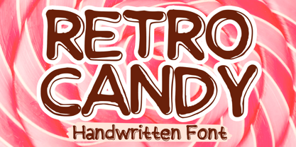 Retro Candy is a cool retro style candy display font. You can use it for anything ranging from t-shirts, kids’ book designs, greeting cards, stickers, and posters, or anything that needs a casual touch. Fall in love with its incredibly versatile style, and use it to create lovely designs!
 - Bigland Retro by Letterfreshstudio,
$21.00 Vintage Retro - Bigland is an urban retro font with the style like a logotype lettering. was created to help you designing logotype or lettering style for your Brand or your clients. it has an extensive lingual support, covering European and Asian Latin scripts. The font contains all characters you'll ever need, including all punctuation and numbers. Multilingual Support Alternates, Regular/Extrude/ Thankyou
 - Retro Voice by BlessedPrint,
$20.00 Retro Voice is variable serif font meticulously crafted by BlessedPrint to evoke the nostalgic charm of the 80's. Drawing inspiration from trendy vintage magazine headlines, this font family boasts regular and italic versions. Retro Voice's variable font format provides you with boundless opportunities to fine-tune your typography. With the ability to adjust width, weight, and contrast, you can create a wide range of visual styles that cater to various design projects. No need to fumble with glyph panels; simply type a "+" after the letter to access alternate characters. This feature extends to all characters, thanks to our PUA encoding. Each character within Retro Voice has undergone a meticulous design process. Every curve, line, and thickness was refined to perfection through a precise and rigorous mathematical verification, resulting in a font that radiates luxury and elegance.
 - Retro Magaze by Putracetol,
$20.00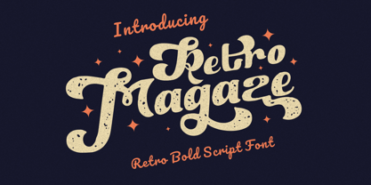 Retro Magaze is a bold vintage script font. In Retro Magaze, I try to combine vintage with luxury/aesthetics. So the Retro Magaze can be used in various projects with retro/vintage and luxury themes. Such as logos, branding, posters, packaging, book covers, clothes/apparel, quotes, titles and others. Retro Magaze come with clean and rough font version. Come with Opentype feature with a lot of alternates, its help you to make great lettering. Retro Magaze is also support multi language. To access the alternate glyphs, you need a program that supports OpenType features such as Adobe Illustrator CS, Adobe Photoshop CC, Adobe Indesign and Corel Draw.
 - Retro Summer by Putracetol,
$24.00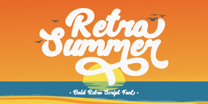 Retro Summer - Bold Retro Script Font. In this font I try to combine vintage with luxury/aesthetics. So that this font can be used in various projects with retro/vintage and luxury themes. Such as logos, branding, posters, packaging, book covers, clothes/apparel, quotes, titles and others. This font come with clean and rough font version. Come with Opentype feature with a lot of alternates, its help you to make great lettering. This font is also support multi language. To access the alternate glyphs, you need a program that supports OpenType features such as Adobe Illustrator CS, Adobe Photoshop CC, Adobe Indesign, Corel Draw, Microsoft Office.
 - Antimage Retro by Rhd Studio,
$15.00 Introducing Antimage Retro, a charming and versatile Bold Retro Script Font that easily takes your designs back in time while adding a modern twist. This typeface exudes nostalgia and is perfect for a variety of creative projects, especially those with a vintage theme. Antimage Retro's timeless elegance and lots of alternative character make it a great choice for designers who want to infuse their work with a sense of the charm of the past. Feature A set of lowercase glyphs Numbers, symbols and punctuation Multilingual Support Alternatives & Ligatures
 - Retro Spooky by Brown Cupple Typeface,
$15.00 Retro Spooky is a Halloween decorative or display font. The additional elements of blood dripping and bones-like letters make an ambiance of horror Invitations, postcards, posters, and headings for a Halloween event; this font can be used in every setting.
 - Taurus Retro by Rachel McBride Creative,
$9.00 Taurus Retro is an AWESOME swash typeface with its swashes built in as character alternates, instead of being a pesky, separate typeface. This typeface is great for any project that needs both boldness and femininity. It comes with eight font styles. Great for any projects needing a retro or throwback feel, restaurant menus, along with book, movie, and album covers. It has a feminine and juvenile feel simultaneously, and is layerable for cool effects. It has 480+ glyphs, supporting a variety of languages!
 - Chunky Retro by HansCo,
$15.00 Chunky Retro is a modern, clean and smooth retro font style. This font comes with a unique shape where every corner is smoother and more rounded. You will also get extra shadow/outline fonts in this font pack to make your design projects perfect. Use this display font to add that special retro touch to any design idea you can think of!. Equipped with all complete characters ranging from uppercase letters, lowercase letters, numbers, punctuation marks and multi-lingual support, this font is ready to be used in any project. Very suitable for logotype, Stickers, Packaging design, Cricut Project, headlines, brand identity, t shirt or apparel industry, posters, magazines, books, YouTube, Instagram, websites, or any of your creative design projects. Enjoy!
 - Retro Signature by Nirmana Visual,
$19.00 Retro Signature a classy, contemporary of script font, inspired by 1980’s and neon lights. Ideally suited for advertising and packaging, festive occasions, editorial and publishing, creative industries and posters .
 - Cosmed Retro by HansCo,
$15.00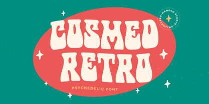 Cosmed Retro font is a retro psychedelic font style with wavy touch. Use this display font to add that special retro touch to any design idea you can think of! Very suitable for logotype, Stickers, Packaging design, Cricut Project, headlines, brand identity, t shirt or apparel industry, posters, magazines, books, YouTube, Instagram, websites, or any of your creative design projects. Enjoy!
 - Helios Retro by Flawlessandco,
$9.00 Helios Retro is a modern retro with a fun and bold style that perfect for your boho-themed projects. Try out some alternate characters for another visual result! There's some connected letters and some alternates that suitable for any graphic designs such as branding materials, t-shirt, print, business cards, logo, poster, t-shirt, photography, quotes .etc This font support for some multilingual. Also contains uppercase A-Z and lowercase a-z, alternate character, numbers 0-9, and some punctuation. If you need help, just write me! Thanks so much for checking out my shop!
 - Retro Frames by Edyta Demurat,
$28.00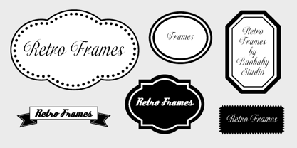
- Retro Sugar by Nirmana Visual,
$19.00 Retro Sugar Unique& playful serif family with 9 Weights Retro Sugar offers beautiful typographic harmony for a diversity of design projects, including logos & branding, social media posts, advertisements & product designs.
 - Antonia Retro by Romie Creative,
$14.00 Introducing Antonia Retro – a bold retro script font that takes you back to the ’60s. This typeface has an extruded version so you can easily create retro-effect fonts. It is suitable to be applied especially to logos, and various other formal forms such as invitations, labels, logos, magazines, books, greeting/wedding cards, packaging, fashion, make-up, stationery, novels, labels, or any advertising purposes. This font is PUA encoded, which means you can access all of the glyphs and swashes with ease!
 - Retro Rocks by Putracetol,
$20.00 Retro Rock - Classic Display Font. Retro Rock font makes for more fun, trendy and more lively. Retro Rock is inspired by the classic style and well display curves. Retro Rock has a surprise from alternate that will make your work even more beautiful. Retro Rock is perfect for a professional touch which makes it even more unique display and classic themes. But Retro Rock is also suitable for logos, branding, greeting cards, invitation cards, advertisements, titles, healines, book titles, stickers, packaging, quotes, posters, t-shirts/apparel, billboards and others. The alternative characters were divided into several Open Type features such as Swash, Stylistic Sets, Stylistic Alternates, Contextual Alternates, and Ligature. The Open Type features can be accessed by using Open Type savvy programs such as Adobe Illustrator, Adobe InDesign, Adobe Photoshop Corel Draw X version, And Microsoft Word. Retro Rock is also support multi language.
 - Brudy Retro by Letterfreshstudio,
$20.00 Vintage Retro - Brudy is an urban retro font with the style like a logotype lettering. was created to help you designing logotype or lettering style for your Brand or your clients. it has an extensive lingual support, covering European and Asian Latin scripts. The font contains all characters you'll ever need, including all punctuation and numbers. Multilingual Support Alternates, Regular/Extrude/ Thankyou