516 search results
(0.006 seconds)
- Trace by Linecreative,
$16.00 Introducing "Trace," a captivating display font that seamlessly marries the ancient mystique of Nordic symbols with a bold, futuristic modernity. This unique typeface transcends traditional boundaries, emerging as a striking fusion of historical symbolism and cutting-edge design. "Trace" is not merely a font; it's a visual journey that bridges the past and the future, offering a distinctive and versatile aesthetic. Inspired by Nordic symbols, "Trace" breathes new life into these ancient motifs, infusing them with a sleek and contemporary vibe. Each character carries the rich storytelling heritage of Nordic culture, interpreted through a lens of modern sophistication. The result is a font that is both timeless and forward-thinking, making it an ideal choice for those seeking a balance between tradition and innovation. As a display font, "Trace" commands attention with its bold and commanding presence. Its carefully crafted letterforms embody a sense of strength and purpose, while the subtle Nordic influences add an air of mystery and intrigue. Beyond its role as a traditional typeface, "Trace" transcends expectations by doubling as a symbol font. Unlock a treasure trove of symbolic possibilities, allowing you to weave intricate narratives or create visually stunning patterns that go beyond the constraints of traditional alphabets. Whether you're designing for futuristic branding, creating a visual language for a tech-forward project, or simply seeking a font that tells a story of cultural richness, "Trace" is your creative companion. Versatile and impactful, this font opens doors to a realm where ancient symbols and modern design converge, allowing you to explore uncharted territories in your creative endeavors. Embark on a design journey that spans centuries with "Trace. What you get, you will get: 1. Trace - Clean San serif font including Uppercase & Lowercase (ALL CAPS) characters, 2. Numbers and Punctuation 3. Support Multi language (Western Europe Latin)
 - Grades by Atom,
$15.00 Grades is a font with an amazing natural handwritten touch. Perfect for various design projects that need a touch of excitement! Is there any questions, don't hesitate to ask me :) Letteratom
 - Tralee by Tanincreate,
$12.00 Tralee Font family consist of 2 styles, regular with outline and bold filled with background colour. Originally designed for packaging typography, also would be suitable for titles, headlines, greeting cards, adverts, books and more.
 - Trade Stencil by Jeff Levine,
$29.00 Spotted in an online auction was a set of brass stencils (possibly handmade) of which some of the characters were individually displayed. The interesting placement of where the letters were broken into stencil parts inspired the creation of Trade Stencil JNL, which is available in both regular and oblique versions.
 - Trade Gothic by Linotype,
$42.99 The first cuts of Trade Gothic were designed by Jackson Burke in 1948. He continued to work on further weights and styles until 1960 while he was director of type development for Mergenthaler-Linotype in the USA. Trade Gothic does not display as much unifying family structure as other popular sans serif font families, but this dissonance adds a bit of earthy naturalism to its appeal. Trade Gothic is often seen in advertising and multimedia in combination with roman text fonts, and the condensed versions are popular in the newspaper industry for headlines.
 - Trad by Powerfonts,
$13.99 Trad (Träd is Swedish for tree) is inspired by viking mythology and runic alphabets. Imagine a viking warrior crudely carving a message into a tree stump with his trusty dagger, sipping on a flagon of ale and pondering a hard days slaying. Like the blade of his blood encrusted axe, Trad is ideal for projects requiring a sharp edge, such as the cover of your next thriller, zombie flick, or death metal album.
 - Trade Gothic Next by Linotype,
$97.99In 1948, Mergenthaler Linotype released the first weights of Trade Gothic, designed by Jackson Burke. Over the next 12 years Burke, who was the company’s Director of Typographic Development from 1948 through 1963, continued to expand the family. Trade Gothic Next is the 2008 revision of Jackson Burke’s design. Developed over a prolonged period of time, the original Trade Gothic showed many inconsistencies. Under the direction of Linotype’s Type Director Akira Kobayashi, American type designer Tom Grace, a graduate of the MA Typeface Design in Reading, redesigned, revised and expand the Trade Gothic family. Many details were improved, such as the terminals and stroke endings, symbols, and the spacing and kerning. Moreover, there are newly added compressed widths and heavy weights perfect for setting even more powerful headlines. Trade Gothic Next brings more features and better quality for today’s demanding typographers. Trade Gothic Next® font field guide including best practices, font pairings and alternatives. - Trade Gothic Inline by Linotype,
$29.00 Trade Gothic inline is a quirky display companion for Trade Gothic Next, offering five different voices, and a whole lot of personality. The lighter weights are graceful and elegant, embracing negative space to give the sense that the letters are halfway to disappearing. Designer Lynne Yun has incised the darker weights with a super thin inline that emphasises the heaviness of the letters, and creates a reassuring chunkiness. “If I kept the inlines the same, it created a lot of visual noise,” explains Yun. “I wanted each weight to be different enough, so in the end the weight and width of the letters was increasing and decreasing in size, and the inlines were too. The black is almost like an extra black, because the inline is smaller. It's about trying to have different voices for each weight.” Trade Gothic Inline is available in five weights, from light to black.
 - Merchant Trade JNL by Jeff Levine,
$29.00 A precursor to Art Deco headline/display sans serif typefaces with thick and thin strokes is the Matthews Series (circa 1902). It was manufactured and sold through the Inland Type Foundry of St. Louis, MO. Digitally redrawn as Merchant Trade JNL, it’s now available in both regular and oblique versions.
 - Trade Gothic Display by Monotype,
$42.99 It’s a colorful world. Don’t limit yourself to black and white. The Trade Gothic® Display designs take advantage of color to create lively and compelling statements, making the designs ideal for advertising, branding, poster and publication projects. Based on the powerful Trade Gothic Condensed Heavy typeface, Monotype Studio designer Lynne Yun, created the fonts necessary to set both “beveled” and “embossed” characters in any color. Trade Gothic Display 1 (embossed) generates striking highlighted type, while Trade Gothic Display 2 (bevel) produces powerful shadow and outline effects. The designs are natural additions to the Trade Gothic Next family, and stand on their own as formidable display typefaces.
 - Sign Trade JNL by Jeff Levine,
$29.00Sign Trade JNL is a reworking of Sign Crafter JNL. With a traditional M,N and W replacing the stylized versions of these letters in the previous font, Sign Trade JNL also offers an oblique version. - Trade Convention JNL by Jeff Levine,
$29.00 An ad for the annual Variety Club Convention appeared in the March 18, 1940 issue of "The Film Daily. The main headline was hand lettered in a classic Art Deco "solid" style of sans serif - ultra bold and with no counters - but had one additional feature: 'engraved' lines to the left of each character. This has now been expanded into the digital typeface Trade Convention JNL, which is available in both regular and oblique versions. Variety Clubs (now know as Variety - The Children's Charity) was founded in Pittsburgh, Pennsylvania in 1928 by entertainers specifically to aid children. Their history can be found at https://variety.org/who-we-are/history
 - Trade Gothic Paneuropean by Linotype,
$42.99The first cuts of Trade Gothic were designed by Jackson Burke in 1948. He continued to work on further weights and styles until 1960 while he was director of type development for Mergenthaler-Linotype in the USA. Trade Gothic does not display as much unifying family structure as other popular sans serif font families, but this dissonance adds a bit of earthy naturalism to its appeal. Trade Gothic is often seen in advertising and multimedia in combination with roman text fonts, and the condensed versions are popular in the newspaper industry for headlines. - Trading Hoss NF by Nick's Fonts,
$10.00 Speedball pen master Ross George presented this face as D-nib Display. Its wide stance and quaint attitude make for some unavoidable whimsy. Both versions of this font support the Latin 1262, Central European 1250, Turkish 1254 and Baltic 1257 codepages.
 - Trade Paper JNL by Jeff Levine,
$29.00 In the March 16, 1936 edition of “The Film Daily” (a trade publication for the film industry) the magazine ran an ad for its Year Book. The ad was set in a slab serif typeface similar to popular designs such as Karnak, Stymie, Beton and the like. Redrawn digitally as Trade Paper JNL, it is available in both regular and oblique versions.
 - Trade Journal JNL by Jeff Levine,
$29.00Trade Journal JNL and its oblique counterpart are derived from a classic grotesk sans face from the 1800s. Despite the 'Grotesk' style name, the font design is actually quite pleasing to the eye and a nice alternative to many of the sterile sans serif faces of today. - Trade Printer JNL by Jeff Levine,
$29.00Trade Printer JNL is another font design inspired by an old rubber stamp sign printing set. In this case, the lettering has a classic "wood type" look, reminiscent of the letterheads, billheads and fliers made by local printers of the 1880s-1920s. - Ams Trame - 100% free

- Lipstick Traces - Unknown license

- 1st Grade - Unknown license

- Brother Grade by Create Big Supply,
$15.00 Brother Grade clean and stamp effect. This font is PUA encoded which means you can access all the glyphs and sweeps easily Features: All Uppercase Numbers and punctuation Multilingual Alternates PUA Encoding Full Character Set !"#$%&()*+,-./0123456789:;?@ABCDEFGHIJKLMNOPQRSTUVWXYZ[\]^_abcdefghijklmnopqrstuvwxyz{|}~ ¡¢£¤¥§©ª«®°±²³¹º»¿ÀÁÂÃÄÅÆÇÈÉÊËÌÍÎÏÑÒÓÔÕÖ×ØÙÚÛÜÝÞßàáâãäåæçèéêëìíîïñòóôõö÷øùúûüýþÿıŒœŠšŸž–—‘’“”†•‹›€−
 - Fun Trace by FunFont,
$17.00 FunTrace is font prepared to make it easier to teach children to recognize letters, numbers and practice writing. Designed to consist of 6 sub-families of fonts (Regular, Bold, Dashes, Directions, Outlines, and Guide Lines) supports the child's learning process in a fun way.
 - First Grade by m u r,
$10.00Searching for a font that resembled true children's handwriting, this font's creator designed a font from his own first grade penmanship assignments. Ideal for anything related to children. - Better Grade by Heinzel Std,
$20.00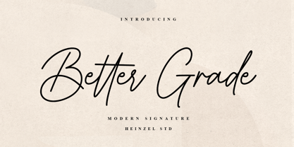 Better Grade is a flowing handwritten font, described by an elegant touch, perfect for your favorite projects. It looks stunning on wedding invitations, thank you cards, quotes, greeting cards, logos, business cards and every other design which needs a handwritten touch. Fall in love with its incredibly distinct and timeless style and use it to create spectacular designs! What's Included : Better Grade Web Font PUA Encoded Multilingual Support
 - Trade Gothic Next Rust by Linotype,
$29.00 Trade Gothic Next is Akira Kobayashi's 2008 revision of Jackson Burke's 1948 design. Developed over many years, the original Trade Gothic was filled with many inconsistencies. Under the direction of Akira Kobayashi, Linotype's Type Director, the american type designer Tom Grace, a graduate of the MA Typeface Design in Reading, was commissioned to redesign, revise, and expand the Trade Gothic family. Kobayashi and Grace refined many details such as the terminals and stroke endings, symbols, and the spacing and kerning. Moreover, there are newly added compressed widths and heavy weights perfect for setting even more powerful headlines. The Regular weight has been beefed up making it stronger and more robust in text settings. Trade Gothic is a staple of the advertising and newspaper industries, and now Trade Gothic Next brings more features and better quality for today's astute typographers. In addition several weights are available as soft rounded versions.
 - ABC Dotted Tracing by Beast Designer,
$15.99 ABC Dotted Tracing Font is a user-friendly typeface designed specifically to aid in early childhood education and handwriting practice. Featuring clear, dotted outlines of each letter, this font serves as a guide for young learners as they trace and familiarize themselves with the alphabet. The dotted lines help children develop fine motor skills and hand-eye coordination while practicing proper letter formation. This font is often utilized in educational materials, worksheets, and apps aimed at supporting kids in mastering the fundamentals of writing in a fun and engaging way.
 - Fun Trace Arabic by FunFont,
$17.00 Fun Trace Arabic is a font designed to make writing and recognizing Arabic letters, numbers easier for children. This is the sibling of Fun Trace Designed to consist of 6 sub-families of fonts; Regular, Bold, Dashes, Directions, Outlines, and Guide Lines. It supports the child's learning process in a fun way.
 - EF Gutenbergs Traces by Elsner+Flake,
$35.00 - BIG Alphabet Tracing by Beast Designer,
$15.99 Introducing the Big Alphabet Tracing Font – a font designed to help kids learn the alphabet in a fun way. The font looks friendly and playful, making learning feel like a game. It is perfect for teachers, parents, and anyone who wants to make learning the alphabet exciting and interactive.
 - Trappers And Traders by chrismetcalfe,
$25.00There is something fun about western type. And there is something fun about hand drawn type. Put them together and.... Tada. - Trade Gothic Next Soft Rounded by Linotype,
$53.99 In 1948, Mergenthaler Linotype released the first weights of Trade Gothic, designed by Jackson Burke. Over the next 12 years, Burke, who was the company’s Director of Typographic Development from 1948 through 1963, continued to expand the family. Trade Gothic Next is the 2008 revision of Jackson Burke’s design. Developed over a prolonged period of time, the original Trade Gothic showed many inconsistencies. Under the direction of Linotype’s Type Director Akira Kobayashi, American type designer Tom Grace, a graduate of the MA Typeface Design in Reading, has redesigned, revised and expanded the Trade Gothic family. Many details were improved, such as the terminals and stroke endings, symbols, and the spacing and kerning. Moreover, there are newly added compressed widths and heavy weights perfect for setting even more powerful headlines. Trade Gothic Next brings more features and better quality for today’s demanding typographers. Trade Gothic Next Soft Rounded introduces a new friendliness and warmth to the family.
 - MATILDAS GRADE SCHOOL HAND_DEMO_script - Personal use only

- Trace Font for Kids - Unknown license

- Miss Rhythm JNL by Jeff Levine,
$29.00 An early 1960s hand-lettered trade publication ad for an upcoming single 45 rpm release inspired the type design of Miss Rhythm JNL. The nickname of "Miss Rhythm" was given to Ruth Brown because of her popular "jump tunes"; that is rhythm and blues with an uptempo beat. Because the trade ad for her record was the inspiration for the font, it was only fitting to use that nickname as the font's name in honor of her.
 - Setsuko by Pelavin Fonts,
$20.00 Setsuko finds its origins on the ancient Silk Road, a network of trade routes crossing the continent of Asia, named for the Chinese silk trade which began in the Han Dynasty more than two thousand years ago. Originally designed to brand and package products celebrating the charm and mystery of the Ancient East, the characters in Setsuko are intended to express admiration and respect, not stereotyping or parody hoping to leave room for a designer's creativity and personal interpretation.
 - Yess by ParaType,
$25.00 Used in advertising posters for the Soviet state foreign trade company named 'Soyuzchimexort' in the early 1980s. Digital version was made for ParaType in 2007 with addition of light weight.
 - Frontline by TypeArt Foundry,
$45.00 Thrilling titler for grade-B movie poster.
 - Tremida by BRtype,
$21.90 Tremida is a handwritten font with irregular trace.
 - News Gothic BT by Bitstream,
$29.99 The standard American sanserif of the first two thirds of the twentieth century, prepared for ATF by Morris Fuller Benton in 1908 under the name News Gothic, with a matching lightface known as Lightline Gothic. Linotype’s Trade Gothic follows News Gothic except for its widely-spaced straight-sided boldface based on ATF Alternate Gothic No.3. Linotype matches News Gothic Bold, a boldface version that originated at Intertype, with Trade Gothic Bold No.2. Ludlow Record Gothic follows News Gothic more loosely. News Gothic BT™ font field guide including best practices, font pairings and alternatives.
 - Ongunkan Phoenician by Runic World Tamgacı,
$50.00 Phoenician/Canaanite The Phoenician alphabet developed from the Proto-Canaanite alphabet, during the 15th century BC. Before then the Phoenicians wrote with a cuneiform script. The earliest known inscriptions in the Phoenician alphabet come from Byblos and date back to 1000 BC. The Phoenician alphabet was perhaps the first alphabetic script to be widely-used - the Phoenicians traded around the Mediterraean and beyond, and set up cities and colonies in parts of southern Europe and North Africa - and the origins of most alphabetic writing systems can be traced back to the Phoenician alphabet, including Greek, Etruscan, Latin, Arabic and Hebrew, as well as the scripts of India and East Asia. Notable features Type of writing system: abjad / consonant alphabet with no vowel indication Writing direction: right to left in hortizontal lines. Sometimes boustrophedon. Script family: Proto-Sinaitic, Phoenician Number of letters: 22 - there was considerable variation in their forms in different regions and at different times. The names of the letters are acrophonic, and their names and shapes can be ultimately traced back to Egyptian Hieroglyphs. For example, the name of the first letter, 'aleph, means ox and developed from a picture of an ox's head. Some of the letter names were changed by the Phoenicians, including gimel, which meant camel in Phoenician, but was originally a picture of a throwing stick (giml).


Page 1 of 13Next page