7,853 search results
(0.016 seconds)
- Wood Type Calendar JNL by Jeff Levine,
$29.00 Wood Type Calendar JNL is a set of components for making monthly calendar pages. Based on a set of vintage wood type numbers, the dates 1 through 31 are found on the "A-Z" and "a-e" keys; the 23/30 and 24/31 ligatures are on the "f" and "g" keys. On the "h" and "i" keys are blank outline and solid blocks for balancing the calendar layout. The "j" through "u" keys have the names of the months, and the "1" through "7" keys contain the days of the week.
 - Deco Wood Type JNL by Jeff Levine,
$29.00 When people usually think of wood type, images of bold and ornate designs reminiscent of the Old West or the Victorian Era come to mind. In truth, wood type was manufactured well into the late 20th century, and only fell out of favor when the letterpress was replaced by the offset press and computerized typesetting. Although there are hard-core collectors who have started a small resurgence in the preservation and use of wood type, it's the digital interpretations of these classic faces that see the most use in today's electronic layout work. Deco Wood Type JNL reinterprets one of these later designs, a bold sans with a decidedly Art Deco influence.
 - Wood Heinz No. 2 by astype,
$50.00 Wood Heinz No.2 - the close friend of Wood Heinz No.4 The Regular font style offers up to four »printed look« variations of all the Latin base letters and figures. An OpenType letter rotator is build into the font to emulate the randomness of wood type printing. You can switch manually to the alternate letters by using the Stylistic Sets 1–4. Stylistic Set 5 will activate the more common look of the capital letter R with a straight leg. The New font style has clean outlines and of course the alternate letter R. Wood Heinz No.2 and No.4 working seamlessly with each other. You can both mix them easily. PDF Specimen
 - PR Bramble Wood 2 by PR Fonts,
$15.00 This font is a collection of spiraling vines with thorns. This set is heavier than BrambleWood 1, more like the thorns that encased Sleeping Beauty’s castle. Adjacent letters will provide left and right versions of the same design, and shift will access the inverted version. Combines well with: PR Bramble Wood 1, PR Hallow Doodles 01, PR Hallow Doodles 02, PR Cauldron, PR Swirlies 01, PR Swirlies 05.
 - Wood Heinz No. 4 by astype,
$50.00 Just Wood Heinz No.4 - the cool display font. Wood Heinz No.4 offering up to four "printed look" variations of all the Latin base letters and figures. An OpenType letter rotator is programmed into the fonts to emulate the randomness of wood type printing. You can switch manually to the alternate letters by using the Stylistic Sets 1 – 4. Stylistic Set 5 will activate the more common look of the capital letter R with a straight leg. PDF Specimen
 - Words And Music JNL by Jeff Levine,
$29.00 The 1934 sheet music for "I'll String Along with You" from the Dick Powell-Ginger Rogers musical "20 Million Sweethearts" yielded the charming Deco monoline design for Words and Music JNL.
 - Rounded Sans Wood JNL by Jeff Levine,
$29.00 Examples of a wood type alphabet for letterpress are the basis for Rounded Sans Wood JNL. Clean and bold, the rounded ends give a softer, more informal look to any display copy.
 - Page Wood Borders NF by Nick's Fonts,
$10.00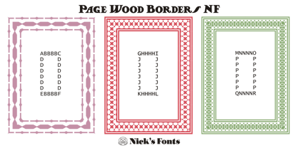
- Wood Bonnet Grotesque No.4 by astype,
$46.00 After release of Wood Bonnet Antique No.7 some of my clients asked for a sans serif version. So I printed my second batch of old wood type. I transferred these wood type into a digital font and tried to preserve the warm vintage look. » pdf specimen « The font offers up to four glyph variations of all the Latin base letters, figures and some additional letters - It has an build in letter randomizer. Please check you have turned on contextual alternates in your application. If you prefer a more common look and need more weights or to use the font in smaller text sizes I have done clean and sharp font family called Bonnet Grotesque Nr. It’s the preferred version for all the usages on websites, apps or ebooks. Have fun!
 - Wood Bonnet Antique No.7 by astype,
$41.00 Wood Bonnet Antique No.7 is based on real vintage wood type blocks from Switzerland. The very distressed letters give a warm analogue vintage charm on printing. These kind of wood type letters were very common and often named by generic names like Roman, French or Antique followed by a catalog number. But these letters have some very quirky details hard to find else were. » pdf specimen « The font offers up to five glyph variations of all the Latin base letters, figures and some additional letters. An OpenType glyph-rotator is programmed to emulate the randomness of old school printing on live typing. All dingbats of the specimen file are included in the font data too.
 - DB 'Tis The Season Words by Illustration Ink,
$3.00DoodleBat 'Tis the Season Words is a collection of Holiday themed words and phrases. - Wooden Log - Personal use only

- Rock ‘n Roller - Unknown license

- Holz Caps by Authentic,
$39.50 Holz is the German word for wood, since this font has a woodcut character, I thought that would be the right name.
 - Godzilla - Unknown license

- Skiltmaler by Imagi Type,
$15.00 Skiltmaler is the typeface that refers to the style of decorative arts during the Victorian era 1837 to 1901, the Victorian era was the period in which fly poster typography emerged. The large amount of colour in combination with large font sizes were created from movable metal type. As well as being made from wood, this was used to create the two-coloured typefaces. You would imagine this would be specific to the '3D' styled type seen on the poster to create the drop shadow. Skiltmaler works well with normal size text, but it works even better for large displays, short words, or even just to incorporate a few or single characters in a design.
 - Roughshod JNL by Jeff Levine,
$29.00Cross a Western wood type with an experimental font from the 1990s, and the most likely result would probably resemble Roughshod JNL. - HWT Catchwords by Hamilton Wood Type Collection,
$24.95 Catchwords have always been offered alongside standard alphabets in wood type catalogs and so often appear on posters as a decorative punch that they have become part of the wood type vernacular. Words like 'The', 'And', 'To', 'For', and less common abbreviations could be inserted into a design along with decorative ornaments or stars when space was tight or to add variety in the design. HWT Catchwords features over 80 words based directly on designs offered by Hamilton and other wood type manufacturers of the 19th and early 20th Century.
 - Ziboulateur by Kitchen Table Type Foundry,
$15.00 Ziboulateur is French slang for bottle opener. The word consists of two parts: Zibula (a word from Congo-Brazzaville meaning: ‘to decork’) and the French suffix -ateur. I thought this rather creative word would be a good name for this particular font! Ziboulateur is a handmade, all caps display font. It comes with extensive language support, including Sami and Vietnamese.
 - Willow by Adobe,
$29.00Willow is an Adobe Originals typeface designed in 1990 by Joy Redick for the Adobe Wood Type series. Willow is a condensed typeface modeled on nineteenth-century wood types known as Clarendons (wood type Clarendons do not resemble the English metal types of that name). Clarendon condensed faces were originally so well-designed that words or a line of display type have an even color that is remarkable for wood types. Taken from proofs of type in the Rob Roy Kelly Collection housed at the University of Texas at Austin, Willow can be used for display work such packaging, advertising, and posters. - Kloetzchen by TypoGraphicDesign,
$9.00 The typeface Klötzchen (german word for blocks) is designed from 2020 for the font foundry Typo Graphic Design by Manuel Viergutz | Typo Graphic Design × Peter Eckartz | kleinholzTYPO as a political statement #climatejustice The display font based on the original wood letter from Peter Eckartz (kleinholzTYPO). The technic is called Reifendreherei from the Erzgebirge. Craft Tools like Hobel and Fräsmaschine. The idea based from Gert Schaaf (Spielzeugproduzent in Wittlich, 1970s). The font started from 41 wood letters (analog) and was finally digitalize and extended to 374 glyphs (digital). Thanks to Alex Branczyk for the Klötzchen. 3 font-styles (Wood, Clean, Impact) + 1 icon-style with 374 glyphs (Adobe Latin 1) incl. 100+ decorative extras like icons, arrows, dingbats, emojis, symbols, geometric shapes (type the word #LOVE for ❤️or #SMILE for
 - Song Publisher JNL by Jeff Levine,
$29.00 Song Publisher JNL features a design based on the 1945 Art Deco-era hand lettered sheet music title "When the Old Gang's back on the Corner (Singin' Sweet Adeline Again)". It's a good thing sheet music wasn't sold by the word count found in song titles, because this twelve word example would have been more costly than titles such as "Nola", "Tenderly" or "Ciribiribin".
 - Gilbey by Solotype,
$19.95Although wood types are found throughout the world, most of the decorative one originated in the United States. This one would work well on theatrical playbills, and advertising for tourist railroads, wild west shows and concerts in the park. - PR Foxtail 01 by PR Fonts,
$5.00 The bushy weed commonly known as foxtail provides the inspiration for this set of ornaments, and reveals its connection to the prairies. The appearance has an affinity to cowboy themed work and would combine well with wood type decorative text.
 - Sunlight JNL by Jeff Levine,
$29.00Sunlight JNL takes the classic wood type from Jeff Levine's Twelve Oaks JNL and shatters it with bursts of light for a novelty effect. Limited to a very basic character set, it's best used for short words and phrases in headlines. - Houdini by Solotype,
$19.95Houdini was extemporized from the single word "Houdini" on a lithographed poster for the magician. The original was a shaded outline like our Houdini Shaded font, but we felt that a solid version would be worthwhile too. Like the companion font Houdini, the shaded version was created from the single word Houdini on an old lithographed poster for the famous magician. The original was hand-lettered by a litho lettering artist. - Orenji by Hanoded,
$15.00 Orenji is the Japanese word for Orange: it is a phonetic translation of the English word. I was actually looking for a certain shade of orange (the color), when I stumbled upon this fun word. I already toyed with the idea of creating a font loosely based on my son Sam's handwriting and I figured Orenji would be a good name for it. Orenji is a fun, cute and extravagant font. It has some uniquely shaped glyphs, comes with a giggle and a hug and more diacritics than you can throw a banana at.
 - Engine Company JNL by Jeff Levine,
$29.00 Engine Company JNL is a slab serif font based on a set of wood type. The design emits an image of strength and purpose, and fits well into any project where a word or phrase must be conveyed forcefully without seeming overly imposing.
 - Dragon Drop by Elemeno,
$25.00Thick, wide and medieval, Dragon Drop would feel at home in Arthurian times. The name is an obvious play on words that the designer saved for a long time before creating the right font to use with it. Looks best at larger sizes. - Equipage by Kitchen Table Type Foundry,
$16.00 Équipage is a French word meaning ‘crew’. It is used for the crew on boats, airplanes, but it also applies to horse-drawn carriages and all that goes with it. Originally the word means ‘to fit out’ and it is probably derived from the Norse word ‘skipa’, which means ‘arrange, fit out a ship’. Then, if you’re really interested, the word ‘ship’ hails from this same word, just like the Danish ‘skib’, Middle Dutch ‘ship’, Dutch ‘schip’ and German ‘Schiff’. See? You learn something every day! Équipage is a really nice, handmade serif font. It is quite elegant and would look fantastic on labels, postcards and book covers. Comes with extensive language support and a set of alternates for the lower case glyphs.
 - Urbanregent by Kenn Munk,
$26.00The font is largely undesigned, but is bound together by a thick connected band which forms the word-blocks. At the same time, parts of Urbanregent are very designed, glyphs have been re-designed to reflect changes in the way we speak and write. The exclamation mark is louder and more manic, because people tend to write two or three exclamation marks after each other anyway. The full stop is more stopping and the hyphen kicks you on to the next word. Kenn Munk's fonts are generally hard to use - Urbanregent is no exception, but a tip would be to start each word with a capital letter. Because Every Word Is Important. - Township JNL by Jeff Levine,
$29.00 Township JNL is based on French Antique Condensed [a classic wood design] and is available in both regular and oblique versions. Reminiscent of Old West wanted posters and circus broadsides, this ultra-condensed typeface allows for more word copy to fit into a single line’s space.
 - Day And Collins Logotypes by Jeremia Adatte,
$20.00 Please Note: as this is a picture-only font, there are no latin alpha/numeric glyphs. Each wood type manufacturer had their own selection of original Logotypes or Catchwords designs. These are taken right from the original source material, an extremely rare 1910 catalog of an English wood type maker called Day & Collins in London. As the name says it, these words are intended to attract attention, to spice up posters, packaging or advertisement designs. I made these available for the digital age, leaving the original texture of printed wood type at the highest detail possible.
 - Mortice by ArtyType,
$24.00 I set out to create a solid, bold, strong, rugged font, one that would lend itself to any industrial type of use, and by that I mean industry in general, but probably sectors that would still be considered male preserves such as carpentry or metalwork. I thought specifically of mortice & tenon joints, whilst toying with shape and form for this self imposed challenge. I was also visualizing a router tool used for producing most wood joints nowadays. I think the general premise worked out well; in the end I settled on the name Mortice, referring to the slots or negative spaces that the matching part, or tenon would fit into.
 - ITC Digital Woodcuts by ITC,
$29.99ITC Digital Woodcuts font is the work of Timothy Donaldson. Although made on a computer, each character has the look of a block of wood with a character cut into it. The forms are made entirely of lines, typical of how the result would be if they were truly cut into wood. ITC Digital Woodcuts is a capital letter alphabet including both white letters on a black background and black letters on a whitish background which looks as though the bark of the piece of wood was chiseled away for the effect. Donaldson suggests alternating the black version with the white to create a three dimensional effect. - High Cut by Palmer Type Company,
$30.00 High Cut came about by this found object I stumbled upon, while exploring an abandoned building, which had this word "High" cut out of it in a similar stencil design. I thought it would be a fun challenge to create an entire typeface inspired by this found object. Enjoy this new stencil typeface!
 - Octagonist JNL by Jeff Levine,
$29.00 Octagonist JNL is based on ‘Octagon’ [which was introduced in the George Nesbitt 1838 specimens of wood type] and is available in regular, oblique, solid and solid oblique versions. The font’s name is partly an homage (to the original type name) while at the same time making a pun on the word ‘Antagonist’.
 - Harman by Ahmet Altun,
$19.00 Harman Font Family includes Seven fonts and their inline forms that have different styles from each other but at the same time compatible when used together. This font collection is completely hand-made. In addition it includes very useful extra elements. The word “Harman” is a Turkish word meaning the blend in English. Harman Font Family Collection was designed carefully to create elegant typographic works. It would be a perfect choice to design posters, affiches, logos, t-shirt and magazine prints, eye-pleasing typographic designs and more.
 - Twentieth Century by Pelavin Fonts,
$20.00 Twentieth Century was designed for the cover of 20th Century French Poetry and was drawn with pure geometric shapes. It is the distillation of a broad variety of styles loosely known as Art Deco but, also categorized under such terms as Moderne, Streamline, Machine Age, Futurist, 70s Art Deco, Memphis among others. If there were a source in particular that I would cite as my inspiration, however, it would definitely be the work of Frank Lloyd Wright. I mean, look at the "W" for cryin' out loud!
 - London Doodles by Outside the Line,
$19.00 London is always hip. With William and Kate and the 2012 Summer Olympics it made sense that London Doodles would be second in the City Series following Paris Doodles. 29 illustrations and a script word London. Kate’s ring, the Queen’s carriage, crown, skyline, cityscapes, cars, double-decker bus, castles, bridge, tea items, flag and more.


