10,000 search results
(0.014 seconds)
- The Killer Way by FHFont,
$19.00 The killer way font basically form script with hand lettering brush style.
 - Ouachita Way NF by Nick's Fonts,
$10.00One in the series of fonts called Whiz-Bang Wood Type, intended to be set large and tight. Ouachita Way is an ultrabold and boxy caps and small caps font, especially well-suited for commadning headlines. Based on nineteenth-century “Grecian” fonts, the name comes from a forest and a river in Arkansas. Both versions of this font contain the Unicode 1252 Latin and Unicode 1250 Central European character sets, with localization for Romanian and Moldovan. - Capture The Waves by pentagonistudio,
$15.00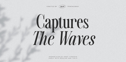 Captures The Waves Is A Modern Display Serif Fonts Inspired By Luxury and Ligature Characters. Font Features : SOFTWARE REQUIREMENTS : Fonts and alternate : No special software required they may be used in any basic program /website apps that allows standard fonts That's it folks! You can go ahead and get cracking :) Follow My Shop For Upcoming Updates Including Additional Glyphs And Language Support. And Please Message Me If You Want Your Language Included or If There Are Any Features or Glyph Requests, Feel Free to Send me A Message. Have a Good Day !
 - New Wave Soho by Inumocca,
$25.00 New Wave Soho Display Font, inspiration from punk poster, full energy, rebel, anti mainstream and dare to take something different. you will feel like you are walking in the 70s era. New Wave Soho presenting more alternates glyphs to pour your wild ideas. simplel for access of Unique Alternates Exellent typeface to use for covering your Project, like Branding, Movie Title, Headline Letter, Bookcover or Book Content, Magazine cover, Poster, Quotes Lettering, Logos, and more your project design. - Unique glyphs - Multilingual Characters Support - UPPERCASE - Lowercase - Numeric - Symbol - Punctuation Character - Stylistic Set Alternates OTF, TTF inumocca type Studi0
 - Candle Wax JNL by Jeff Levine,
$29.00 The design of Candle Wax JNL comes from an original movie poster for the movie "Bell, Book and Candle" starring James Stewart. The oddly erratic letter forms conjure up ideas of spells, witchcraft and other things found lurking on dark moonlit nights.
 - World War Warplanes by Intellecta Design,
$29.95 Fighter planes in use during World War I and II.
 - Mr Eaves Modern by Emigre,
$59.00 Mr Eaves is the often requested and finally finished sans-serif companion to Mrs Eaves, one of Emigre’s classic typeface designs. Created by Zuzana Licko, this 2009 addition to the Emigre Type Library expands the versatility of the original Mrs Eaves with two complimentary families: Mr Eaves Sans and Mr Eaves Modern. Mr Eaves was based on the proportions of Mrs Eaves, but Licko took some liberty with its design. One of the main concerns was to avoid creating a typeface that looked like it simply had its serifs cut off. And while it matches Mrs Eaves in weight, color, and armature, Mr Eaves stands as its own typeface with many unique characteristics. The Sans version relates most directly to the original serif version, noticeably in the roman lower case letters a, e, and g, as well as in subtle details such as the angled lead in strokes, the counter forms of the b, d, p, and q, and the flared leg of the capital R, the tail of the Q. The distinctly loose-fitting letter spacing of Mrs Eaves was applied also to the Sans version. This, together with generous built-in line spacing due to a small x-height and extended ascenders and descenders, renders the same kind of lightness and airiness when setting text that is so characteristic of Mrs Eaves. Deviations from the original Mrs Eaves are evident in the overall decrease of contrast, as well as in details such as the flag and tail of the f and j, and the finial of the t, which were shortened to maintain a cleaner, sans serif look. And the lower case c had to be balanced out differently after it lost its top ball terminal. And with the loss of serifs, Mr Eaves set width is slightly narrower. Mr Eaves Italic also carries over many forms from its Mrs Eaves model, most notably the v, w, and z, which are unusually flamboyant for a sans italic design. It also utilizes lead in and terminal tails that are reminiscent of the serif italic. The biggest departure here is the width of the characters. The extra narrow gauge and delicate features seemed more appropriate for the Serif than the Sans. To allow for a comfortable fit, Mr Eaves Italic has a more robust design and wider character width. Meanwhile, the Modern family provides an overall less humanistic look, with simpler and more geometric-looking shapes, most noticeably in the squared-off terminals and symmetric lower case counters. This family has moved furthest from its roots, yet still contains some of Mrs Eaves’ DNA. The Modern Italic is free of tails, and overall the Modern exhibits more repetition of forms, projecting a cleaner look. This provides stronger differentiation from the serif version whenever a more contrasting look is desired. Each version (Sans and Modern) contains its own set of alternates providing unique options for applications such as headlines, word logos, letterheads, pull quotes, and other short text settings. Both the Sans and Modern come in six weights. The simpler forms of a sans-serif provide the opportunity of more weights than do serif letter forms, which are more complex in structure, making it difficult to accommodate additional weight without distortions. Regular and Bold match the original Mrs Eaves weights, while the Heavy provides an additional weight for extra emphasis.
 - MBF Neo Wave by Moonbandit,
$19.00 Neo wave is a futuristic scifi display font. Wide and rounded typeface design with a modern minimalist approach. Perfect usage includes logo, poster, display, headline, t-shirt design and many more.
 - IA War Bot by Invisible Art Studio,
$132.00 The appearance of the 'IA War Bot' speaks for itself. It is a futuristic stenciled robotic font family that would be suitable for lettering comics, computer games, toy packaging, and the like. Many of the glyphs have alternatives. The widest set of font files, from Thin Ultra Condensed to Black Ultra Expanded, and the expanded character set (including Cyrillic) will satisfy all design needs. And the most demanding can turn their attention to the variable font.
 - Nice Wave Font by Softulka,
$22.00 Nice wave font - a fluffy fun display typeface with a wavy form. This decorative font works perfectly for bold titles, festival posters, as a graphic element for bright T-shirts or hoodies, or even backgrounds! This weird and ugly typeface likes an experiment with spacing and additional graphic elements. Please, don't hold back on your bold modern ideas!
 - LD This Way by Illustration Ink,
$3.00 - Mr Eaves Sans by Emigre,
$59.00 Mr Eaves is the sans-serif companion to Mrs Eaves, one of Emigre’s classic typeface designs. Created by Zuzana Licko, this 2009 addition to the Emigre Type Library expands the versatility of the original Mrs Eaves with two complementary families: Mr Eaves Sans and Mr Eaves Modern. Mr Eaves was based on the proportions of Mrs Eaves, but Licko took some liberty with its design. One of the main concerns was to avoid creating a typeface that looked like it simply had its serifs cut off. And while it matches Mrs Eaves in weight, color, and armature, Mr Eaves stands as its own typeface with many unique characteristics. The Sans version relates most directly to the original serif version, noticeably in the roman lower case letters a, e, and g, as well as in subtle details such as the angled lead in strokes, the counter forms of the b, d, p, and q, and the flared leg of the capital R, the tail of the Q. The distinctly loose-fitting letter spacing of Mrs Eaves was applied also to the Sans version. This, together with generous built-in line spacing due to a small x-height and extended ascenders and descenders, renders the same kind of lightness and airiness when setting text that is so characteristic of Mrs Eaves. Deviations from the original Mrs Eaves are evident in the overall decrease of contrast, as well as in details such as the flag and tail of the f and j, and the finial of the t, which were shortened to maintain a cleaner, sans serif look. And the lower case c had to be balanced out differently after it lost its top ball terminal. And with the loss of serifs, Mr Eaves set width is slightly narrower. Mr Eaves Italic also carries over many forms from its Mrs Eaves model, most notably the v, w, and z, which are unusually flamboyant for a sans italic design. It also utilizes lead in and terminal tails that are reminiscent of the serif italic. The biggest departure here is the width of the characters. The extra narrow gauge and delicate features seemed more appropriate for the Serif than the Sans. To allow for a comfortable fit, Mr Eaves Italic has a more robust design and wider character width. Meanwhile, the Modern family provides an overall less humanistic look, with simpler and more geometric-looking shapes, most noticeably in the squared-off terminals and symmetric lower case counters. This family has moved furthest from its roots, yet still contains some of Mrs Eaves' DNA. The Modern Italic is free of tails, and overall the Modern exhibits more repetition of forms, projecting a cleaner look. This provides stronger differentiation from the serif version whenever a more contrasting look is desired. Each version (Sans and Modern) contains its own set of alternates providing unique options for applications such as headlines, word logos, letterheads, pull quotes, and other short text settings. Both the Sans and Modern come in three weights. The simpler forms of a sans-serif provide the opportunity of more weights than do serif letter forms, which are more complex in structure, making it difficult to accommodate additional weight without distortions. Regular and Bold match the original Mrs Eaves weights, while the Heavy provides an additional weight for extra emphasis.
 - Wavy Rounded BT by Bitstream,
$50.99Wavy Rounded is a stylized sans serif display typeface by Japanese designer Hajime Kawakami. Some of the characters possess quirky features that randomly create fun visual “waves”. There is a handful of alternate characters including an old style figure set. Catch the Wave. - Madison Ave. by Funk King,
$10.00 The Madison Ave. family started from Madison Ave. at Fontstruct.com. As my most downloaded font, this was an easy, although not necessarily logical choice to make – regarding taking an existing free font and attempting to offer it for purchase. The font is very basic and simple in its layout, but has achieved popularity over at Dafont with almost 80,000 downloads with its cool, understated nature and inherent sophistication. The original Madison Ave. is now 95 Madison Ave. A couple of glyphs have changed from the original, but mostly the set is the same. The big news here is the availability of multiple variations on the original. Ninety-five refers to the filter settings used to achieve the faint cross lines in the font. The sequence 95-100 provides a gradual fade to solid effect when used together. The other versions use variations on the filter settings that allow each its own distinctive flavor, while at the same time maintaining inherent characteristics of the original. Ninety-five is now joined by 55, 75, 97, 99, 100, 102, 105, 155, 175, 201, 202, and 275. 100 is the solid version which doesn’t contain the trademark lines found in 95. In 95-99, the line width varies to achieve subtle effects. 50 and 85 are distorted by reducing the filter settings in a somewhat minimizing fashion. In 102-205, these are distorted by increasing the filter settings above the normal which is what 100 represents. While some of the effects are extreme and challenge the legibility of text, these can be fun or edgy. They offer a cohesion that can be used to advantage for different projects that require the use of a modern font family.
 - Ave Maria by words+pictures,
$20.00 - Alter Aves by Glen Jan,
$30.00 Alter Aves type is the first part of AlterType project – the serie of small display typefaces based on letterings, left-off types and altered foundry typefaces. Alter Aves is display condensed sans-serif typeface with couple of geometric-round letters, serif-styled elements and flat brush strokes. It supports Latin Extended-A (Western, Central Europe, Baltic, Turkish) and Cyrillic encoding languages and minimal opentype features – oldstyle digits, case sensitive punctuation, small-numeric forms and scripted fractions. Fully functional Demo style is distributed free for non-commercial using.
 - 1st Ave by Design is Culture,
$39.00 1st Ave is the most experimental of my typefaces. I took a picture of a metal and neon sign in the East Village of New York City. These signs are slowly being replaced by LED and LCD displays, but if you look hard, you can still find quite a few in the city. The signs give a mid 20th century feel to the city. To design 1st Ave, I took a picture of the sign, scanned it and increased the contrast in Photoshop so that the photographic forms became line art. There weren't enough letterforms in the sign to create the whole alphabet, so I cut up the strokes and collaged them back together to finish the entire alphabet. Important Note: 1st Ave is an experimental typeface and is not compatible with certain software such as Microsoft Word.
 - 3 theHard way RMX - Unknown license

- Three the Hard way - Unknown license

- Mrs Eaves XL Serif by Emigre,
$59.00 Originally designed in 1996, Mrs Eaves was Zuzana Licko’s first attempt at the design of a traditional typeface. It was styled after Baskerville, the famous transitional serif typeface designed in 1757 by John Baskerville in Birmingham, England. Mrs Eaves was named after Baskerville’s live in housekeeper, Sarah Eaves, whom he later married. One of Baskerville’s intents was to develop typefaces that pushed the contrast between thick and thin strokes, partially to show off the new printing and paper making techniques of his time. As a result his types were often criticized for being too perfect, stark, and difficult to read. Licko noticed that subsequent interpretations and revivals of Baskerville had continued along the same path of perfection, using as a model the qualities of the lead type itself, not the printed specimens. Upon studying books printed by Baskerville at the Bancroft Library in Berkeley, Licko decided to base her design on the printed samples which were heavier and had more character due to the imprint of lead type into paper and the resulting ink spread. She reduced the contrast while retaining the overall openness and lightness of Baskerville by giving the lower case characters a wider proportion. She then reduced the x-height relative to the cap height to avoid increasing the set width. There is something unique about Mrs Eaves and it’s difficult to define. Its individual characters are at times awkward looking—the W being narrow, the L uncommonly wide, the flare of the strokes leading into the serifs unusually pronounced. Taken individually, at first sight some of the characters don’t seem to fit together. The spacing is generally too loose for large bodies of text, it sort of rambles along. Yet when used in the right circumstance it imparts a very particular feel that sets it clearly apart from many likeminded types. It has an undefined quality that resonates with people. This paradox (imperfect yet pleasing) is perhaps best illustrated by design critic and historian Robin Kinross who has pointed out the limitation of the “loose” spacing that Licko employed, among other things, yet simultaneously designated the Mrs Eaves type specimen with an honorable mention in the 1999 American Center for Design competition. Proof, perhaps, that type is best judged in the context of its usage. Even with all its shortcomings, Mrs Eaves has outsold all Emigre fonts by twofold. On MyFonts, one of the largest on-line type sellers, Mrs Eaves has been among the 20 best selling types for years, listed among such classics as Helvetica, Univers, Bodoni and Franklin Gothic. Due to its commercial and popular success it has come to define the Emigre type foundry. While Licko initially set out to design a traditional text face, we never specified how Mrs Eaves could be best used. Typefaces will find their own way. But if there’s one particular common usage that stands out, it must be literary—Mrs Eaves loves to adorn book covers and relishes short blurbs on the flaps and backs of dust covers. Trips to bookstores are always a treat for us as we find our Mrs Eaves staring out at us from dozens of book covers in the most elegant compositions, each time surprising us with her many talents. And Mrs Eaves feels just as comfortable in a wide variety of other locales such as CD covers (Radiohead’s Hail to the Thief being our favorite), restaurant menus, logos, and poetry books, where it gives elegant presence to short texts. One area where Mrs Eaves seems less comfortable is in the setting of long texts, particularly in environments such as the interiors of books, magazines, and newspapers. It seems to handle long texts well only if there is ample space. A good example is the book /CD/DVD release The Band: A Musical History published by Capitol Records. Here, Mrs Eaves was given appropriate set width and generous line spacing. In such cases its wide proportions provide a luxurious feel which invites reading. Economy of space was not one of the goals behind the original Mrs Eaves design. With the introduction of Mrs Eaves XL, Licko addresses this issue. Since Mrs Eaves is one of our most popular typefaces, it’s not surprising that over the years we've received many suggestions for additions to the family. The predominant top three wishes are: greater space economy; the addition of a bold italic style; and the desire to pair it with a sans design. The XL series answers these requests with a comprehensive set of new fonts including a narrow, and a companion series of Mrs Eaves Sans styles to be released soon. The main distinguishing features of Mrs Eaves XL are its larger x-height with shorter ascenders and descenders and overall tighter spacing. These additional fonts expand the Mrs Eaves family for a larger variety of uses, specifically those requiring space economy. The larger x-height also allows a smaller point size to be used while maintaining readability. Mrs Eaves XL also has a narrow counterpart to the regular, with a set width of about 92 percent which fulfills even more compact uses. At first, this may not seem particularly narrow, but the goal was to provide an alternative to the regular that would work well as a compact text face while maintaining the full characteristics of the regular, rather than an extreme narrow which would be more suitable for headline use. Four years in the making, we're excited to finally let Mrs Eaves XL find its way into the world and see where and how it will pop up next.
 - P22 Way Out West by P22 Type Foundry,
$24.95 Howdy pardner! Giddy-up and lasso yerself these renegade typefaces. Created by renowned illustrator David Lyttleton , this set presents an Englishman's unique vision of the American West. Perfect for your next hoe-down, barn raising or Western-themed cricket match.
 - Mr Eaves XL Sans by Emigre,
$59.00
- Mr Eaves XL Modern by Emigre,
$59.00
- Electro Wave Vol.2 by Jamalodin,
$16.00 Electro Wave Vol.2 Comes with updated neaterglyphs, more stable kering size, new punctuation & numbes. Electro Wave Vol.2 is a brave decorative display font that is suitable for branding, wedding invitations, greeting cards, posters, name card, quotes, blog header, logo, fashion, apparel, letter, stationery and other projects. The alternative characters were divided into several Open Type features such as Swash, Stylistic Sets, Stylistic Alternates, Contextual Alternates. The Open Type features can be accessed by using Open Type programs such as Adobe Illustrator, Adobe InDesign, Adobe Photoshop Corel Draw X version, And Microsoft Word. And this Font has given PUA unicode (specially coded fonts). so that all the alternate characters can easily be accessed in full by a craftsman or designer. Electro Wave Vol.2 : Uppercase & Lowercase International Language & Symbols Support Punctuation & Number PUA Unicode. If you don't have a program that supports OpenType features such as Adobe Illustrator and CorelDraw X Versions, you can access all the alternate glyphs using Font Book (Mac) or Character Map (Windows). If you have any question, don't hesitate to contact me. Thanks for your visit.
 - Blue Jay Way NF by Nick's Fonts,
$10.00Modern Caps—and lowercase, too—was how Ross George described the pattern for this typeface in his Speedball Text Book. Not surprisingly, the design was used on the Beatles' original Magical Mystery Tour album, which suggested the current name. Art Deco meets Psychedelia! Both versions include the complete Unicode Latin 1252, Central European 1250 and Turkish 1254 character sets, with localization for Moldovan and Romanian. - M Ling Wai TC by Monotype HK,
$523.99 - M Ling Wai SC by Monotype HK,
$523.99 - American Way Of Life by Intellecta Design,
$19.90
- Kilroy Was Here - Unknown license

- Monkey Was Here by Intellecta Design,
$22.90 A collection of fonts by the type foundry Intellecta Design. Distressed and antique, use these fonts in display purposes for a stylized type design. Contains a limited amount of letter designs.
 - GS Franklin Ave. by Great Scott,
$18.00 Franklin Ave. is a condensed sans serif in the style of the classics Franklin Gothic and News Gothic. Nostalgic and gives a great vintage feel. It's bold and comes in two styles: Regular and Oblique. Franklin Ave. is best used in headlines and large formats or in logos or branding.
 - WA Flat Brush by Wing's Art Studio,
$18.00 A versatile textured font hand-made with black ink and brush. The combination of heavy black ink and a well used sable brush resulted in this versatile type, readable in sizes large and small, yet with a distinctly hand-made and textured feel. Great for posters, headers, titles and more. Features uppercase and lowercase letters with language support, numerals, punctuation and symbols.
 - KG Ways to Say Goodbye - Unknown license

- Just The Way You Are - Personal use only

- Three the Hard way shadowed - Unknown license

- M Ling Wai F HK by Monotype HK,
$523.99 M Ling Wai is a humanistic script based on a real handwritten style. It has a feminine, urban and lively character filled with literate finesse. M Ling Wai was written with a thin ball pen by a young woman in a unique, personal, running writing style, such that it is real, natural and feminine. Contrast of strokes is low and the text is visible and eye-catching. Its light to medium stems (豎) make it suitable for small text and subheading with little conglutination. All strokes are highly irregular, inconsistent, irregularly oriented and tightly coupled or connected. Spatial distribution, positioning, size and relative proportion of radicals fully reflect a natural and personal favor. It is one of the first proportional width font in a full scale. It is best suited for casual lively text, illustrations, set upright (non-slanted), non-condensed.
 - 3 The Hard Way RMX by Fenotype,
$29.95
- M Ling Wai P HK by Monotype HK,
$523.99 M Ling Wai is a humanistic script based on a real handwritten style. It has a feminine, urban and lively character filled with literate finesse. M Ling Wai was written with a thin ball pen by a young woman in a unique, personal, running writing style, such that it is real, natural and feminine. Contrast of strokes is low and the text is visible and eye-catching. Its light to medium stems (豎) make it suitable for small text and subheading with little conglutination. All strokes are highly irregular, inconsistent, irregularly oriented and tightly coupled or connected. Spatial distribution, positioning, size and relative proportion of radicals fully reflect a natural and personal favor. It is one of the first proportional width font in a full scale. It is best suited for casual lively text, illustrations, set upright (non-slanted), non-condensed.
 - 3 The Hard Way Overrun by Fenotype,
$29.95
- KG Ways To Say Goodbye by Kimberly Geswein,
$5.00 This unique handwriting font features extremely tall, loopy descenders and ascenders. The capitals, when used by themselves, offer a totally different look.


