4,000 search results
(0.019 seconds)
- Pulse JP Arabic by jpFonts,
$29.95 النبض - the Pulse Pulse JP ME is a constructivist text and display font that differs from comparable fonts due to its special sharpness and harmonious balance. Its technical and constructed form creates a somewhat artificial impression of particular appeal. It is ideal for display on the screen and can be used in many projects. Pulse JP ME is a super family consisting of 48 fonts from compressed to expanded in six weights each. This opens up a wide designspace with the possibility of combining typefaces of the same character in a wide variety of variants and being able to adapt them to very different conditions. The details of the individual fonts are coordinated with each other with great precision and perfectly implemented in terms of craftsmanship. In all variants, this leads to a very balanced design with particular sharpness. The very extensive character set supports 120 Latin + 7 Arabic languages + Hebrew. The Arabic characters were designed in close collaboration with the Iranian designer Prof. Raafat Negarandeh. Here the constructivist approach is repeated within Arabic proportions. This leads to a very reduced and clear design with high legibility. Additional typographical adjustments can be made in the variable font, which is also available. There all variants are stored in a single font and can be continuously fine-tuned between them.
 - Japanette by SoftMaker,
$9.99 Japanette is a vaguely oriental typeface published by SoftMaker.
 - Changing Times JNL by Jeff Levine,
$29.00 Changing Times JNL was inspired by the hand lettering on the cover of the 1929 sheet music for "Wedding Bells (Are Breaking Up that Old Gang of Mine)". While the font’s name is an extremely vague reference to the subject of the song itself, it also represents the fact that the lettering style (still reflecting some Art Nouveau influence) welcomes the dawning of the Art Deco movement with the thick-and-thin line letter forms. The type design is available in both regular and oblique versions.
 - Ayaha by Pedro Teixeira,
$18.00 Ayaha was inspired by brush lettering and has a friendly look. This beautiful script font is not conneted, that way you can letter spacing more or less without resulting in weird design. Ayaha, with alternate stylistic sets to add value to your projects. Good for branding, magazine, header, poster, logotype, packaging and so on.
 - VKB KonQa - Unknown license

- Kastibu by Twinletter,
$15.00 Kastibu is our newest font which has Arabic style. Do you want to add an elegant Arabic touch to your designs? There’s no need to spend a fortune on an actual antique Arabic font. You can get the same look with a sample set of values, guaranteed to work in your design software, and give the results exactly as shown.
 - Santral by Taner Ardali,
$39.00 Santral typeface has been designed with the idea of achieving the ideal balance of geometrical perfection and optical impression. The sharp and precise design of Santral leads to a clear and reliable communuciation with the reader. 12 weights and italic versions, including kerning values and Opentype layout features provide all typographic equipments to get the best result for the typographic layouts.
 - Tzur by Hacollective,
$45.00 Tzur is a Hebrew sense-serif font with a nostalgic scent. The shape of the letters has two qualities - Raw and processed - and they are combined without canceling each other out. The resulting product is a font that conveys power, stability, and prominence, and echoes typographic values that correspond with the graphic/visual language that was accepted in The early years of the State of Israel.
 - Origram Pro by Nuno Dias,
$21.00 ORIGRAM PRO is the full version of ORIGRAM Free Font, a font with over 100k downloads, and counting! This font was already featured in dozens of websites and Design Blogs. I decided to remake this font, smoothing out a few rough edges - so to speak - and adding value to the end result, with several different interesting tweaks and updates. Inspired in the Origami and Tangram tradition, the basic shape is an octagon. Geometrical and regular, resulting in a neat and captivating display font. Not particularly conceived to be used in common text, this stylized font will add value to any large scale image within the realm of logos & branding, outdoors, packaging, titles, magazines, posters, signs, shirts, scrap-booking... Your imagination is the limit. This display font comes now with Uppercases, updated Lowercases, Numbers, and a slew of new Diacritic Marks and Punctuation Marks. A large number of special characters was included in the package, enriching the font’s versatility and usability.
 - New Aster LT by Linotype,
$29.99This book and newspaper font was designed by Francesco Simoncini in 1958. After the Second World War brought type design to a standstill, the years of reconstruction meant a reconsideration of old values in the typographical world as well as in Europe in general. Aster is the result of this movement, displaying instead of Modern Face influence, a tendency toward Transitional characteristics and giving text a light feel. - Plata by 4RM Font,
$12.00 Plata font is a humanist display font with unique authentic value. available with 4 weights will add value to the authenticity of this font. generally suitable for use in logo design, packaging.
 - Yellow Magician - Unknown license

- Godysun by Twinletter,
$15.00 Godysun Arabic style font. Create the perfect Arabic and Islamic decorative design with this collection of exclusive value examples. With this stylish font, you can create all kinds of themes, from elegant to modern, and get the same result as shown. To get a variety of styles into your projects, they come in both upper and lower case, as well as several Alternates. You will be able to easily create quality designs.
 - Pagram by 4RM Font,
$15.00 Pagram fonts are fonts that have neutral and authentic values, are made without reducing the value of functionality, these fonts are easily adaptable to the use of text and displays such as logos, body text, and others.
 - Eolia A by Eurotypo,
$24.00 In ancient Greece, the inhabitants of the Aegean islands and the northwest coast of Asia Minor were called "Eolia". Eolia is a family of sans serif fonts that combine grotesque style with certain geometric characteristics. This family composed of six weights harmonically controlled, has blunt strokes, perfectly defined with subtle modulations as a result of careful optical corrections. The control of the counterforms and accurate kerning gives it great readability, personality, aesthetic value and visual impact.
 - Electroz by 4RM Font,
$30.00 Electroz font is a techno themed font made with futuristic values, made with condensed width and slanted cuts at the corners of the letters making this font look cool and have a strong futuristic value. suitable for use in futuristic-themed designs
 - Boemia by Pedro Teixeira,
$14.00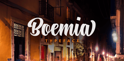 Boemia, with alternate lowercase and swashes to add value to your projects.
 - Bathur by 4RM Font,
$21.00 Inspired by Brutalism Design, this font is designed with attention to the value of authenticity and harmonious beauty. made with a wider size which will add value to the authenticity of this font. suitable for use in graphic designs such as posters, stickers, especially Retro-themed designs and Brutalism designs
 - Vaguely Repulsive is a distinctive font that lives up to its intriguing name through a design aesthetic that boldly pushes the boundaries of conventional attractiveness. At first glance, this font ch...
- Breathless by Wiescher Design,
$39.50 Breathless was inspired by movie posters of the Nouvelle Vague era when Jean Seberg and Jean-Paul Belmondo were young and films where in black and white. So I named this very spiky affair after that phantastic movie of my youth A bout des souffle or like it was called in English, Breathless. -Your breathless type designer, Gert Wiescher
 - Kontext Dot by Elster Fonts,
$20.00 Imagine a font that is easier to read the smaller it is – or the further away the text is. There are already many rasterised fonts, I wanted to take it to the extreme and use as few dots as possible. The result is a typeface that lives up to its name. Each individual circle makes no sense on its own; individual letters are only recognisable in the context of all associated circles, individual letters are most likely to be recognised in the context of whole words. Attached to a building wall, text would be readable from a great distance and become increasingly difficult to decipher the closer you get to the building. Placed on the ground or on a large flat roof, text would only be readable from a higher building, an aeroplane or - depending on the size - in Google Earth. Kontext has old style figures, superscript numerals, case-sensitive questiondown and exclamdown and an alternative ampersand, 390 glyphs at all. Use the same value for font size and line spacing to keep the lines in the grid, or change the line spacing in 10% steps. Change the spacing in 100-unit increments to keep the grid. The numbers in the family- and style-names refer to the (ca.) grey value of the respective background and the font itself. Kontext Dot 00-33 has e.g. a white background (0%) and 33% grey value. Kontext Dot 66-33 has a 66% background and 33% grey value. »Positive« styles (first number smaller than the second number) have kerning, »negative« styles (first number bigger than the second number) can have none.
 - Fonstery by Miracledsign,
$9.00 Fonstery is a font that is inspired by modern life with all the sophistication and excellence in the field of technology that makes fontstery very elegant and modern with style and full of future accents. Fonstery is formed and made by combining the contours and anatomy of a strong and sharp letter by highlighting the modern side so that it has extraordinary value when used in a template, game font, or your selling product which of course will be very interesting for those who see it and will certainly make the product. you look more elegant, modern and will add value to your product and add value to your product.
 - Stop by Linotype,
$29.99Stop is a heavy futuristic sans serif display font, designed by the famed Italian type designer Aldo Novarese. Stop's forms are vaguely stencil-like, and some of them only read as letters when used in combination with each other. Nevertheless, Stop has a real computer-technology" feel to its design. It should be used exclusively for headlines or logo work." - Bernhard Bold Condensed by Bitstream,
$29.99A freely drawn heading face prepared in 1912 by Lucian Bernhard for Bauer. The typeface enjoys a vogue in Europe. - Squoosh Gothic by Thinkdust,
$10.00 Squoosh Gothic is a serious new contender in the arena of headline fonts. Upright and condensed, Squoosh’s whimsical name belies its true nature. Though, that’s not to say it’s totally devoid of a sense of merriment – it just values a more orderly, regulated kind of tomfoolery. Mad-libs for instance, or The Times cryptic crossword. Its mature but unmistakably witty attitude can go a great distance to lending a sense of culture and an air of scintillation to your designs. Don’t miss out on this sanguine new font, Squoosh Gothic from Thinkdust, available now.
 - Qualico by Jonahfonts,
$30.00 A semi-serif font in vogue in the 1970s. Usage recommendations include captions, packaging, cards, posters, ads, book jackets, manuals, and menus.
 - Paciak by Cuda Wianki,
$20.00 Paciak is a hand-drawn dynamic font that provides you an opportunity to create fresh and intricate design projects. It is loaded with handy features including-alternate characters for all numbers and letters (it has mixed upper and lowercase characters to make it more crazy), multi-language coverage and is accompanied with vague borders and ornaments. This extraordinary mix will give you a lot of fun!
 - Bling by Hackberry Font Foundry,
$24.95 My second font for 2009, Bling is a hoot. This vaguely Deco, sparkly sans is for those heads that need bling. This is the first font released in a long time without my complete feature set. It has lining and oldstyle figures, many wild ligatures, the x-height is too high to make a small caps set worth the effort. It's just for fun. Enjoy!
 - Amateur Stencil JNL by Jeff Levine,
$29.00With all of the stencil fonts created by Jeff Levine from various vintage sources, you would think everything had already been covered. Not so. Along comes Amateur Stencil JNL. Modeled from a child's stencil set from the late 1950's or early 1960's, it vaguely resembles Futura, but its irregular widths and semi-stencil appearance sets it off greatly from that classic typeface. - Kelso by Talbot Type,
$19.50 Kelso is a highly original, outline display font. Each character is represented by a single continuous line to create a fluid and rhythmic look. This technique seems somehow to bring out the individual characteristics of each letter, resulting in a harmonious typeface that’s both easy to read and easy on the eye.
 - Flavor sans by 4RM Font,
$18.00 Suitable for use in casual themed design applications, this font is made with a unique shape and condensed width, as well as a strong authenticity value.
 - Floe by Jolicia Type,
$20.00 This is the one and only Floe designed by Jolicia Type in 2021 every single letters have been carefully crafted to make your text looks value typhography
 - Edison by HiH,
$12.00 Edison, is it Victorian or is it Art Nouveau? While this typeface may be found in Petzendorfer’s Treasury of Art Nouveau Alphabets, I believe the decorative spirals are more Victorian than “New Art.” To me, they looked tacked on, rather than organic -- with the industrial mechanics of a coiled spring, rather than the tendrils of a growing plant as the philosophical wellspring. Originally released by ATF in 1894 as Houghton, this typeface was re-released shortly thereafter by Bauer and Berthold in Germany as EDISON. Please do not make the mistake of thinking the font we offer here is no better than freeware fonts in cheap rip-off collections. This font has a set 218 characters and represents many hours manipulating the bezier curves to produce acceptable results. Available freeware fonts are often little more than raw scans with little accuracy of letterform. The muddy line intersections are a dead give-away. Frequently all you get is the alphabet itself. No numbers, no punctuation and don't even think about diacriticals. The font we offer represents a tremendous value. Considering the hours of work involved, I have no business charging so little. I could make better money cooking hamburgers or bagging groceries. But we want very much to encourage you to purchase and enjoy these fascinating historical typefaces and are making it as easy as possible for you to do so. So please encourage us and order Edison today.
 - Annadalea by EVCco,
$12.00 This typeface pays homage to numerous Victorian and Art Nouveau predecessors, while straying somewhat beyond their usual conventions. All lowercase letters ascend in unison, whereas capitals descend below the baseline. A rigid set of uniform strokes keeps the chaos reigned in, while various calculated inconsistencies affect a vaguely hand-drawn quality to this quirky, downright decadent font. Comes packaged with the standard complement of alpha-numeric glyphs, punctuation marks, mathematical symbols, and Western European diacritics.
 - Serene Textured by Pedro Teixeira,
$14.00 Serene Textured Script is informal, good for logos, headlines in magazines or titles in food recipes with a slight retro feel and textured that add value to your designs.
 - Intervogue by Miller Type Foundry,
$25.99 Released by Intertype in the 1930’s, Vogue was a geometric sans serif rival to Futura and Kabel. Vogue had many unique quirks such as its distinctive G, that striking Q with a vertical tail, and many others. Almost ninety years later there has been no decent digital revival of this wonderful typeface... until now. Intervogue brings this classic to life in the modern age. Seven weights complete with true obliques and an alternate cut give Intervogue the versatility to be a true workhorse.
 - Intervogue Soft by Miller Type Foundry,
$25.99 Released by Intertype in the 1930’s, Vogue, was a geometric sans serif rival to Futura and Kabel. Vogue had many unique quirks like its distinct G, that striking Q with a vertical tail, and many others. Almost ninety years later there has been no decent digital revival of this wonderful typeface... until now. Intervogue Soft brings this classic to life in the modern age. Seven weights complete with true obliques and an alternate cut give Intervogue Soft the versatility to be a true workhorse.
 - Blanknot by 4RM Font,
$15.00 Made in bold style and wide, as well as consistent spacing between letters, this font has a distinctive aesthetic value, suitable for graphic design use such as logos, posters, and others.
 - Margon by ParaType,
$30.00 Margon is a serif font family with a temperate design -- small serifs, moderate contrast, tiny roundings on the corners make it calm and serene. The Margon font family consists of 18 members divided into 4 groups of different proportions marked by indexes 360, 380, 400, 430. These values correspond to densities of sets -- 360 is the widest style, 430 is the most narrow one. The peculiarity of Margon family is a rather small difference in proportions of characters between neighbor groups, it’s less than 10%. Such tiny step gives possibility to select the font that gives the best result in combination of capacity and readability. Margon can be used in book, magazine and newspaper design.
 - Brillian by Fontex,
$29.00 A lot of time and effort has been put into the process of creating the Brillian Font. A careful analysis of the current font market and overly increasing customer needs have shaped Brillian’s final appearance and content. We don't have a precise target audience for Brillian, since the amazing amount and structure of the chosen characters enables a very wide utilization. Its look and feel came from a different designing approach, so that it can successfully satisfy the needs of even the neediest. Shining with calm and dignity, while in the roots being aggressive, it has successfully connected classic and modern styles - representing its largest value. A most complete set of Cyrillic, Greek and Latin characters included.

