159 search results
(0.012 seconds)
- P22 Hoy Pro by IHOF,
$39.95 Hoy is a decorative font whose name derives from one of the Orkney Islands. Inspired by the wonderful encounter between the Celtic and Norse cultures in this specific geographic location, the font has adapted some of the features of the Insular half-uncial. It is playful and relaxed, and easily recognizable by its roundness.
 - Engel Stabenschrift NF by Nick's Fonts,
$10.00This elegant unicase uncial face is based on a work by German type designer Ernst Engel from 1927.This typeface masterfully combines Art Deco sensibilities with medieval letterforms, and is suitable for both text and headline use. Both versions of the font include 1252 Latin and 1250 CE (with localization for Romanian and Moldovan) character sets. - Arcuata by Eko Bimantara,
$29.00 Arcuata is a serif font family inspired by 1400 classic roman typeface with soft characteristics. It's featured with some uncial letterforms as alternates, for example in 'a' and 'd' letter, it also has a set of decorative capital letters alternates and ligatures. Arcuata complete family contains 10 styles, consisting of 5 weights from Light to ExtraBold with matching italics.
 - Coverack by Scriptorium,
$18.00Coverack was inspired by some hand lettering spotted by Dave Nalle on a pub menu blackboard during a recent trip to England. It's in the tradition of Celtic uncial lettering, but is extra bold and has some fantastical embellishments. The name comes from a lovely little town on the Cornish coast where the designer stayed during the trip. - Carinthia by Scriptorium,
$18.00Carinthia is derived from the style of Roman calligraphy known as Rustica, but with some features of Roman uncial added to form a complete upper and lower case character set, including variant upper case characters with decorative spurs. The result is a rather vertical, but quite stylish font which has an antique calligraphic look and good readability. - Giureska by URW Type Foundry,
$39.99 I always admired the beauty of Gothic letters, but lamented their low readability. The revivals of Gothic faces are beautiful, but they revive everything, including the traits that prevent readability. Blackletters are fine in ads and titles, but can’t be used in long texts (like books on Middle Ages, Medieval romances etc) where they would be the perfect historical choice. And I wanted to change this scenario. With Giureska, instead of taking one particular face to revive, I chose the best traits from many Gothic faces, i.e. the forms that were pleasant to look and easy to read. For the ‘small caps’, I studied uncial scripts and made a similar selection, adapting everything to make a unified font. With three weights, true italics and the uncials, Giureska can endure a variety of projects, bringing the appeal of Middle Ages much beyond the cover.
 - Testament by Canada Type,
$24.95 From the standpoint of calligraphy, a font family of capitals and uncials makes perfect sense. The Roman square capitals, the quadrata, are matched by round capitals of older Greek origin; the word "uncus" means hook-shaped like a beak or talon. Interrelated and often interchangeable, these capital letters served as book hands for both the Latin West and the Greek-speaking East before they evolved into minuscule alphabets. The Testament family is based on the few formal capital manuscripts of the Bible, Virgil and Homer that have survived from the ancient world. Throughout the Middle Ages both uncials and square capitals were used, often together, for headings and initial characters. By their nature the Roman capitals are the voice of Caesar and hold the place of authority, while the uncials speak for the Church in a balanced relationship. In ancient times church and state were not as separate as they are now, and the alphabets were not as different as typographic tradition has made them. In this calligraphic rendering it is clear that they are of the same substance and can be written in the same style, conveying even to the modern eye the eternal and classical quality of epic and scripture. Testament comes in all popular font formats, and includes support for a vaster-than-usual range of Latin-based languages.
 - Cayed by Allouse Studio,
$16.00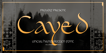 Proudly Presenting, Cayed a Uncial Handwritten Font that will bring an classic feel for your need. Cayed is perfect for any titles, logo, product packaging, branding project, megazine, social media, wedding, or just used to express words above the background. Cayed also come with Multi-Lingual Support. Enjoy the font, feel free to comment or feedback, send me PM or email. Thank You!
 - Vulgat by Typogama,
$29.00 Vulgat is a uncial inspired typeface that offers a vibrant personality while staying clear and legible in all applications, a contemporary style modeled by the past. Designed for use in editorial and branding situations, Vulgat can be used for titles but equally longer passages of text. This typeface features an extended Latin support for all European languages plus Cyrillic support.
 - CF Santiago by Contrafonts,
$28.00 This alphabet has only capital and small caps. With several alternative characters (A, R, Y) in different style groups. The capitals are even more flexible, with alternatives for Uncial inspiration. In addition to ligatures symbols and various groups of numbers. Of course we use Opentype for a expanded use in modern software for layout and graphic design. Compatible with mac and PC.
 - Stonecross by Scriptorium,
$18.00People are always asking us for chiseled-stone style fonts, so we thought we'd give them what they want, but with a slightly different spin. Stonecross has the look of classic Celtic uncial lettering as it would look if it was cut in stone, with some fanciful variant character forms and the nicks and chips which give it the look of stone. - Padraig Nua by Tony Fahy Font Foundry,
$25.00 Padraig Nua is a font conceptualized and designed by Tony Fahy. It is a European Celtic font, contemporary to many languages, not just of Europe but of the world. It’s origin is influenced by events in Ireland in the 1960s when it was decided that the uncial letterform should not be used further in Irish schools for the Irish language—Gaelic—and that it should be replaced by the Roman letterform—the Cló Romhanach as it was called afterwards. This happened overnight without any apparent discussion. It probably had a lot to do with Ireland joining the EEC, as the EU was called then. It had a massive effect on the Irish language and culture, in that the distinguishing factor that gave the language it’s identity—the half uncial/uncial fonts that were in use in all school, government and society documentation and merchandise—were lost overnight. No one said how or why. It was just done. To this day, all documentation is bi-lingual in government and Gaelic is taught in schools and universities—and decreed so by the European Union—but the presentation for both languages is the Roman letterform. Throughout the world, there are millions of Irish Americans and Irish Canadians, Irish Europeans, Australian Irish, African Irish and many living in the Middle East and Asia—and this new font—Padraig Nua, will appeal to many of them, visually recalling their roots. No one had thought, in those days, of commissioning a design that might update the Gaelic language to a more contemporary appearance that would keep the cultural nature of it intact with a revised and updated font—at one with Europe, the US and the world. Tony Fahy designed Padraig Nua (New Patrick) to address the problem. It keeps an appearance that lends towards the Gaelic language but steers it in the direction of Roman fonts. Some characters reflect letterforms from the Irish/Gaelic manuscripts and uncial fonts.
 - Gjallarhorn by Scriptorium,
$18.00Gjallarhorn is based on uncial-style lettering by artist Willy Pogany from his titles for Padraig Colum's classic collection of Scandinavian myths, The Children of Odin. It has various peculiar letter forms, and the font includes two or more different versions of many of the characters. An excellent example of stylized hand lettering by one of the great decorative artists of the Art Nouveau period. - P22 Vale by IHOF,
$24.95 The Vale Press was a contemporary of Willam Morris's Kelmscott Press. The types used by the Vale Press were designed by artist Charles Ricketts, who also supervised the design and printing of Vale Press books. The main type used, Vale, was based on the Jenson 15th century roman type style. The King's Fount was an experimental semi-uncial font based on the Vale type. The King's Fount was designed in 1903 for the Vale edition of the 15h century poem "The Kingis Quair". This semi-uncial font evokes old English and Anglo-Saxon lettering. P22 Vale Pro combines the two fonts P22 Vale Roman and P22 Vale King's Fount into one "Pro" font. This pro font also includes a Central European character set, old style figures, fractions, ornaments and a special faux "Middle English" feature to make "anee text appeer Olde." This feature is not known to exist in any other font.
 - P22 Dwiggins by IHOF,
$24.95 Dwiggins Uncial is based on calligraphy by William Addison Dwiggins that he created for a self-penned short story, which appeared as an insert in the book-arts publication The Dolphin in 1935. This self-described “experimental uncial” lettering features rather unusual treatments of letterforms which combine manuscript calligraphy with modern idiosyncrasies. Dwiggins Extras is a set of decorative extras features 62 stencil and woodblock motifs adapted from abstract and representational Dwiggins designs. Although Dwiggins illustrated a number of books using conventional media, he is best known for his method of illustration that uses a series of hand-cut celluloid stencils or what he called “machine ornaments.” With these stencils Dwiggins (and other designers who use his ornaments) build-up repeated motifs and patterns into abstract designs and/or representational images which have a look that is uniquely Dwiggins’ own. Unlike other illustrators, Dwiggins’ style has not been commonly imitated and therefore his style is as distinctive today as it was 70 years ago.
 - Shiver Me Timbers NF by Nick's Fonts,
$10.00Avast, me hearties! Here be a serious pirate font, based loosely on several of Victor Hammer’s uncial typefaces, designed between 1925 and 1953, and liberally weathered and corroded for that authentic barnacle-encrusted look. The bullet character is suitable for marking where the treasure is buried, and the section mark is a Jolly Roger. Both versions of the font include 1252 Latin, 1250 CE (with localization for Romanian and Moldovan). - Numancia NF by Nick's Fonts,
$10.00This elegant and somewhat edgy typeface is a faithful revival of Numantina, designed by Carl Winkow amd released by Madrid's Fundición Tipográfica Nacional in the 1940s. The lowercase letters take their design cues from medieval Spanish uncial lettering, making this face a natural choice for intriguing headlines and subheads. Both versions feature the complete Latin 1252, Central European 1250 and Turskish 1254 character sets, with localization for Lithuanian, Moldovan and Romanian. - Keltichi by Dima Pole,
$27.00 Keltichi typeface is based on the Book of Kells, the Irish uncial manuscript, the most beautiful European medieval style of writing. Keltichi contains many Opentype features, which make this font absolutely awesome. It looks great, specially titling uppercase sets, simulating the real Book of Kells scripts. Work on this project lasted 1 year, and now, I believe, Keltichi it is the best font simulating the Book of Kells scripts. Glory, glory to the Celts!
 - ITC Medea by ITC,
$40.99The designer of ITC Medea , Silvio Napoleone said: “I've always had an interest in early letter shapes, particularly how they influenced modern typographic designs. While I was on vacation in Greece, I had a chance to see, first-hand, examples of early letterforms and typography. They really made an impression on me.” The idea of combining the ancient and the modern to create something new was the primary inspiration behind ITC Medea. ITC Medea is essentially a careful blending of the modern sans serif with the elegant forms of the uncial. At first glance, Medea appears to be constructed of geometric shapes. However, closer inspection reveals many calligraphic subtleties. Stroke terminals are flared slightly in characters like the 'e' and 'c.' The top curve of the 'd' is more pronounced than the bottom, and characters like the 'o' are elliptical rather than round. “I gravitated towards the simplicity and legibility of the uncial and half-uncial,” Napoleone recalls. “I thought it would make a great titling font, and I was surprised at how attractive ITC Medea looked in a body text.” - Quanta by Alphabets,
$17.95Quanta was designed without reference to existing sansserif faces. As an original design, Quanta draws on principles of letterform developed during my studies of lettercarving (in Wales with Ieuan Rees) and Roman proportion. My intention was to produce a highly legible and adaptable sans-serif, initially intended to be a TrueType GX font, then as a Multiple Master font, later as a five weight range from extremely thin to extra black. A related uncial design will be released shortly. - Devil Kalligraphy by Lián Types,
$17.00Devil Kalligraphy was performed by Argentina Lián Types in 2007. The shapes of each caracter have a strong personality. It was based on antique writings. Devil Kalligraphy was inspirated in calligraphy styles. Gothic and Uncial themselves. A mix with lots of personal qualities. Devil Kalligraphy has ligatures which look evil. Ascendents and descendents were designed to look that way too. Kerning was designed taking into account the way calligraphers used (and still use) to write: Pattern looking. - Faber Sans Pro by Ingo,
$42.00 A classic-modern sans serif appearing in two forms — ”standard“ and a ”stylistic alternate“ with uncial script-orientated characters which give the font a completely different ”look.“ Faber Sans is a sans serif in the classic-modern style of type creations of the early 20th century — godfathered by Futura from Paul Renner and Gill Sans from Eric Gill. Unlike classic sans serifs, Faber Sans includes a ”true“ italic. Faber Sans Pro will perfectly pair with the accompnying Roman Faber Serif Pro.
 - Agedage Insular HU by Dharma Type,
$14.99 Insular Half Uncial was the script in use in England and Ireland from Post-Roman to the 8th century. Agedage Insular HU is a Opentype font supporting some opentype layout features. To use these functions, you need to use an application which supports OpenType advanced features such as Adobe InDesign CS, Illustrator CS and Photoshop CS. We strongly recommend: Standard Ligatures : ON Discretionary Ligaures : ON Contextual Alternates : ON Swash : ON In addition, the font includes: Ordinals, Numerators, Denominators, Fractions and a few alternates.
 - Stervella by Tatiana Nazarova,
$50.00 Elegant and prickly; smooth and sharp; beautiful, but evil - Stervella - display typeface. Its serifs resemble the twisting branches and thorny thorns of a blackthorn, trying to prick neighboring letters. This font is inspired by the forms of ancient Uncial, combining antique with pointed gothic writing. Изящная и колючая; плавная и острая; красивая, но злая - акцидентная Стервелла. Ее засечки напоминают извилистые ветви и колючие шипы терновника, стремящиеся уколоть соседние буквы. Этот шрифт вдохновлен формами старинного Унциала, совмещая в себе антикву с остроконечным готическим письмом.
 - Cringe by Aiyari,
$25.00 Introducing "Cringe": a captivating typeface that draws inspiration from the mesmerizing world of psychedelic pop culture and combining it with a uncial letter form and calligraphy approach. Each character exudes a sense of whimsy and free-spiritedness. Cringe Font Family contains 5 style regular, medium, semi bold, bold, & Expanded. It comes with Stylistic set & ligatures. Ayr Cringe Font Family is best used for headings, logotype, quotes, apparel design, invitation, poster, flyers, greeting cards, packaging, book cover, printed quotes, cover album, movie, & etc
 - Kereru by Daniel Reeve,
$20.00 Artist and calligrapher Daniel Reeve, well known for the lettering and maps in The Lord of the Rings films, is creating hand-crafted fonts of some of his writing styles - Kereru is the inaugural release, allowing users to emulate some of his much-admired calligraphy. Nominally a half-uncial style, clever arrangements of the stylistic sets allow Kereru to be set as full uncial or standard roman, as well as offering numerous alternates, ligatures, swashes and flourishes, ornaments, unlimited fractions, scientific inferiors and numeric superscript, all accessible via OpenType features. Cyrillic and Greek alphabets are included, in addition to the letters required for all the languages of Western, Central and Eastern Europe, Scandinavia and the Baltic. Kereru is very legible and easy on the eye, without sacrificing calligraphic flair. A pdf description of the Stylistic Sets and their usage is included with the font package, which comprises regular, bold and italic variations. Kereru Italic supercedes and improves upon its previous incarnation, Shire Regular. The name Kereru comes from New Zealand's Maori language - it is our native wood pigeon, a bird of generous and rounded form, like the font itself.
 - Fable by Scholtz Fonts,
$19.00 Fable is an elegant, hand-crafted typeface that evokes the magic of fantasy weddings, of castles and wizards, of dragons and dungeons. Among others it combines elements that are suggestive of Greek mythology, of runic scripts, of Scandinavian tales and of the stories of King Arthur. Difficult to categorise, Fable effectively combines features of uncial, calligraphic and script fonts. It will enhance the appearance of advertisements, wedding invitations, headlines and posters. It contains a full character set and is professionally letter-spaced and kerned.
 - Dnipro by Apostrof,
$36.00 Dnipro is a version of experience generalization of Ukrainian decorative font creation. The generalization development was initited by Georgy Narbut and Mark Kirnarsky in the 1920s and continued in 1970-80s. Latin letters of the font have half-uncial forms, which makes it appropriate for the printing of the relevant content. Besides its decorative properties the font is easy to read and quite suitable for short texts. It is well suited for folk tales, Ukrainian and Slavic in general as well as Western European.
 - Yesterday by Thomas Käding,
$5.00 This is a geometric uncial font with a retro/art-deco feel. It comes in four weights, each in upright and oblique styles. It has Unicode coverage for Latin, Greek (modern diacritics only), and Cyrillic, plus the Euro and peace signs. This font began as part of a project to design a local currency. Sadly, the municipality canceled the endeavor before the design competition had started. I'm including one of the prototypes in the gallery section as an example of this font’s many uses.
 - Dulcinea Serif by JVB Fonts,
$29.50 The aim of this typeface is to merge two historical moments in the form and style of writing, on the one hand calligraphy uncial, and on the other Roman serif was established as a universal standard for type fonts continuous text at the time. Is intended in terms of their functionality as a font for titles. The family includes some extended range glyphs as several Caps swashes and stylish alternatives for upper and lower case, standard and discretional ligatures, old numerals and other OpenType features.
 - Newgrange by Scriptorium,
$24.00Newgrange is a distinctive Celtic-style font designed as a companion to our Stonecross font. It has the same size and weight as Stonecross and the same carved/chipped style, but rather than being based on traditional insular minuscule letter forms, it's based on a squared uncial style similar to our Lindisfarne font. The result is unusual and rather more modern looking than we expected, but it's great for stylized titles. The name comes from the giant prehistoric stone tomb at Newgrange which some have called Ireland's answer to Stonehenge. - Diocletian by Type Fleet,
$12.00 Diocletian fortiter in re, suaviter in modo Diocletian typeface captures the essence and glory of the Diocletian’s palace, one of the most imposing heritages of the late Roman empire. It is designed to bring the confidence and fortune to contemporary communication in a heroic and gentle manner. Diocletian typeface is based on the Uncial script, made up of wide, rounded letters. It is desirable for cafes, restaurants, shops, hotels and apartments. The typeface’s x-height is around 76% of its capitals. The font is enriched with ligatures and special characters.
 - VTC Wanderland by Vintage Type Company,
$18.00 Wanderland Display Font is an inky, uncial display typeface with 271 characters, Adobe Latin 1 language support, and a small collection of swashes, ornaments, and alternates. As a modern take on an old style, Wanderland makes a great font choice for bold signage, branding & logo designs, cover designs, video titles, and label & packaging designs. Designed for use in large sizes with soft corners for a vintage, ink-bled aesthetic. Activate the included ornaments and swashes with the Swash OpenType feature and by using the numerals and A to I of the alphabet.
 - Initials Bergling A by Alter Littera,
$15.00 A comprehensive set of initials (usually referred to as Uncials, Lombardic Initials, or Lombards) of the French variety, adapted from Bergling, J.M. (1918), Art Alphabets and Lettering (Second Edition), Chicago: Blakely-Oswald Printing Company. The font contains over one hundred glyphs, including character outlines for two-color layering. Suitable to accompany most Gothic (especially Textura and Rotunda) and many Roman typefaces, or to be displayed as drop caps or in full titles and headings. Specimen, detailed character map, OpenType features, and font samples available at Alter Littera’s The Initials “Bergling A” Font Page.
 - Toxide by 38-lineart,
$17.00 "Toxide" is a gothic font inspired by Celtic and uncial style. We give a unique touch so that this display font is very suitable for brands, logotypes, headlines, badges, video titles as well as for book and magazine covers. This font supports Latin diacritic for basic glyph along with its 7 stylistic sets. A total of 1193 glyphs give you the flexibility to choose the right glyph in your design. Please enjoy and have fun with the stylistic set game that you like while you feel the classic feel in a modern design
 - PR Cauldron by PR Fonts,
$9.02 Whether your subject is scary, or just ancient, this font can help get the right feeling across. PR-Cauldron has capitals based on Uncials, and lowercase based on Celtic Minuscule. “Potion” has a rough finish, and “Curse” has the same letters dripping with gore, suitable for Halloween. Letters are size matched in both fonts, so you can put in as much, or as little messiness as you like. Combines well with: PR Bramble Wood 1, PR Bramble Wood 2, PR Hallow Doodles 01, PR Hallow Doodles 02, PR Swirlies 01, PR Swirlies 05
 - Human Sans by Ian Farnam,
$20.00 Human Sans is a humanist sans serif font created as an experiment. The goal, how much a simple substitution of a small set of characters could change a font's nature. In its base form, Human Sans is a humanist sans serif geared toward text. However, through stylistic sets, it can adopt a myriad of different visual styles. This includes geometric alternates, uncials alternates, contextual swash caps, and the high and low midlines, typically seen in Art Deco lettering. These features are combinable for whatever look you may need. Human Sans comes with a full set of diacritics, in 9 weights and corresponding Italics.
 - Friar by Ascender,
$29.99 Friar Pro is a revival of Frederic W. Goudy's "Friar" typeface. Goudy described this typeface design as a 'typographic solecism' as it combines a lowercase of half-uncial forms from the 4th through 7th centuries with an uppercase of square capitals from the 4th century. Steve Matteson developed the font as a tribute to Goudy and his joy of typographic exploration. Steve created a complete character set with OpenType typographic enhancements to give the font an authentic appearance to the original. Friar Pro is a beautiful design which imparts a scribal appearance to any document including greeting cards, certificates and official papers.
 - Cerulea by Cerulean Stimuli,
$36.00 Cerulea is a unicase from the world of the sky. Drawing inspirations from Art Nouveau, Classical Roman, and Uncial styles, Cerulea's wide, spacious bowls, sharp points, and subtle wandering curves evoke airiness, flight, and fantasy. Seven weights, and true italics for each, range from zephyrous to thunderous. Vary the mood every time you choose between the serious capital form of a letter, the more fanciful lowercase form, or another variant in the stylistic sets. The more than 800 glyphs cover pan-European Latin, Greek, Cyrillic, fractions, circled numbers, planet and zodiac symbols, card suits, chess pieces, ornaments, and more.
 - Brogue by The Type Fetish,
$29.00 Brogue was designed to be a display typeface, but it can be used for a small body of text. At its core it is an uncial influenced typeface that has been allowed to stray from its roots. Embracing other alphabets, Brogue mixes in some unexpected letterforms that really give it a quirky and unusual look. Because Brogue is unicase it allows the designer to mix and match the roman, italic, upper and lowercase letters together for a truly unique design. Brogue's character set will support the following languages: Azerbaijani (Latin), Belarusian (Latin), Czech, Danish, Dutch, English, Esperanto, Finnish, French, German, Hungarian, Iclandic, Italian, Polish, Portuguese, Romanian, Slovac, Spanish, Swedish, and Turkish