3,359 search results
(0.019 seconds)
- Apagah Reverse by Differentialtype,
$10.00 Apagah Reverse is a reverse contrast serif font with a contemporary concept and modern style. Equipped with an alternative with a reverse style too, you can use the uppercase with the lowercase style, and vice versa. This font also has four styles that you can mix and match, to complete the design you create. Crafted with high attention to detail, giving you the best designing experience. Most suitable for poster design, headlines, quote writing, pamphlets, greeting cards, product packaging, book covers, logo types, album covers, etc.
 - Under attack - Unknown license

- Iverse Mono by Minor Praxis,
$25.00 Iverse is a monospace font that come with 2 (two) different type of styles, Regular and Bold. The sans serif based structure is clean and versatile and perfect for body copy and display. Suitable for codings, captions, description details, layouts, and posters.
 - Down Under by BA Graphics,
$45.00Rugged distressed look, tough look good for display. - Unger Chancery by profonts,
$41.99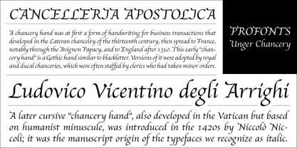
- Under Summer by Abo Daniel,
$17.00 introducing UNDER SUMMER - handwritten script - UNDER SUMMER is natural handwritten font. It is great for quotes, card, banner, book, cutting, silhouette, social media content and anything of your project. I created some ligatures to make it look so natural. Features: - Uppercase - Number & punctuations - Multilingual - PUA encoded I hope you love it... regards, Abo Daniel Studio
 - Under Terror by Sarid Ezra,
$15.00 Under Terror is a rough handwritten font with creepy vibes that will suitable for your next halloween poster. You can use this font for any project especially horror movie poster. With unique lowercase and uppercase, you can combine both to get more handwritten looks. You can access the underline from ligatures, just type underline + number(1-6) in the middle of the text. For example: TeR_2roR. This font also support multilingual.
 - Unger Script by profonts,
$39.99Unger Script is a script design which is obviously based on H. Matheis' Slogan typeface designed for Ludwig & Mayer in 1957. This very expressive script design is defined by its widely swinging upper case and its quite narrowly designed lower case characters. Ralph M. Unger redrew and digitized this font exclusively for profonts in 2001. His work is based on artwork taken from old font catalogues. - Over Under by Ingrimayne Type,
$5.00 OverUnder is a two font family that plays with the capabilities of the Opentype feature of Contextual Alternatives to alternate two sets of characters. One set is on tall vertical slabs and the other set is on wide horizontal slabs, and when the sets are alternated, the result is a pattern that has a woven appearance.
 - Unger Fraktur by RMU,
$25.00 In the wake of the Enlightenment and the French Revolution there was a desire for a clear classical blackletter font without frills. That is why in 1793 the famous printer and editor Johann Friedrich Unger and his partner Johann Christian Gubitz accomplished their own fraktur. Now you will be able to use both regular and bold styles of this highly readable blackletter font. It is recommended to activate both OT features Standard and Discretionary Ligatures to access all ligatures in both these fonts. Typing N-o-period and activating the ordinal feature gives you the numero sign.
 - Under Weak by Trustha,
$16.00 Under Weak is an amazing and bold script, suitable for a large number of designs. This font has two styles, clean and rough. With two styles, you can choose according to the project you're working on.
 - PF DIN Text Universal by Parachute,
$165.00 DIN Text Universal is the most advanced DIN superfamily ever. It combines the powerful DIN Text Pro with DIN Text Arabic bringing the number of glyphs to 3320 per font. In fact, this set of fonts contains the most complete and powerful array of arabic features commercially available. It supports all variations of the Arabic script such as Persian, Urdu and Pashto. It is also enhanced with 30 advanced opentype features and kerning for all languages. The four major scripts Latin, Arabic, Cyrillic and Greek are now matched across the design of the whole family, respecting at the same time each one's modern cultural identity. With its vast array of weights, the extended support for numerous languages, its careful and detailed design, it will prove to be extremely valuable for many complex corporate projects and corporations which operate internationally.
 - Ful • Fruitful & Universal Labels by S P I C I O,
$88.88 What is ful? ful is a useful and universal language of symbols for food products. Why use ful? ful is a simple visual system. With ful, you’ll never have to read the entire label to know the basic information. With ful, you have access to the basic information much faster. Answering the questions: • What kind of diet is it? [Diet] • How to store, prepare, and use? [Use] • Can I eat it? [Warnings] Why create ful? • To have the basic information quickly, anywhere in the world. • To create a more homogeneous design. • To solve some of the basic problems with the old designs. • To accelerate the process of consumer choice. • To provide as much information as possible in the least possible space. http://ful.graphics/
 - Dot.com Reverse Pro - Unknown license

- LED BOARD REVERSED - Unknown license

- Unanimous Inverted (BRK) - 100% free

- Unanimous Inverted BRK - 100% free

- Aquaduct Reverse Italic - Personal use only

- GF Ordner Inverted - Unknown license

- Al Manverse Norm by Aluyeah Studio,
$95.00 Hallo Aluyeaholic! Introducing Manverse, a bold manly typeface. Inspired by the things that make up the world of men. With a bold, strong, and firm vibe. Coming with 2 styles, all caps and multilingual support. Very suitable for magazine, headline, website, ads, product package and all type of design project you have. Thanks for checking out my font. I really hope you enjoy using it! If you have any questions I'd be more than happy to answer them, just send me a message!
 - Reverse Gothic JNL by Jeff Levine,
$29.00 Reverse Gothic JNL is a design based on vintage reverse letterpress type for creating interesting headlines with white-on-black text.
 - Adverse Stencil JNL by Jeff Levine,
$29.00If you're old enough to remember having a lettering stencil in school, then you might have tried to save all of the waste paper punched out of the letters and numbers; hoping to do something with them later on. Jeff Levine took his Tramp Steamer JNL stencil font and gave it the look of those waste paper pieces - lined up to form erratic characters with a personality all their own. - Verse Sans by Hubert Jocham Type,
$39.00 In 2006 the art director of Emotion, a women’s psychology magazine, asked me to design a copy typeface for them. Before I actually got the job I started to work on a serif. I wanted it to be feminine but still clear and modern. On one hand there are the floral round elements and on the other hand the angular serifs. In the composition I wanted the two extremes to work together. All the other elements had to be harmonized. The proportions needed to match the magazine’s requirements. The ascenders and descenders are short enough to work in narrow columns but long enough to work in small sizes. As you can imagine, the emotion-job never happened. In copy you should not get heavier than Heavy. Extrabold and Ultrabold work best in display.
 - Verse Serif by Hubert Jocham Type,
$39.00 In 2006 the art director of Emotion, a women’s psychology magazine, asked me to design a copy typeface for them. Before I actually got the job I started to work on a serif. I wanted it to be feminine but still clear and modern. On one hand there are the floral round elements and on the other hand the angular serifs. In the composition I wanted the two extremes to work together. All the other elements had to be harmonized. The proportions needed to match the magazine’s requirements. The ascenders and descenders are short enough to work in narrow columns but long enough to work in small sizes. As you can imagine, the emotion-job never happened. Verse is now a serif and a san-serif with 7 weights with italics and smallcaps. In copy you should not get heavier than Heavy. Extrabold and Ultrabold work best in display.
 - Labtop Down Under - Unknown license

- Under attack skew - Unknown license

- Under London NF by Nick's Fonts,
$10.00No mystery here: this typeface is based on Edward Johnston’s 1916 design for the London Underground and, more specifically, as it was employed in posters boosting The Tube. To implement “lowercase” numbers, refer to the PDF character map, or activate Stylistic Set 1 in OpenType-aware applications. Both versions include the complete Unicode Latin 1252, Central European 1250 and Turkish 1254 character sets, as well as localization for Lithuanian, Moldovan and Romanian. - Under My Umbrella by Hanoded,
$15.00
- Under Boom Graffiti by Sipanji21,
$15.00 "Under Boom" is an urban graffiti font characterized by sharp edges and a bold look. Ideal for music posters, apparel designs, shirts, and streetwear, this font brings a touch of edginess to your projects. The unique style of "Black Squad" makes it the perfect choice for death metal or urban graffiti themes. Whether you want to create a strong and powerful statement or simply add a touch of attitude to your designs, "Under Boom" is the font for you.
 - KG June Bug Reverse - Personal use only

- Reverse Calendar Blocks JNL by Jeff Levine,
$29.00 Reverse Calendar Blocks JNL is the third typeface from Jeff Levine that allows the user to create a vintage-style calendar. Other versions available are Calendar Blocks JNL and Monthly Calendar JNL. The layout for the font is as follows: Numerals for displaying a year are on the 0-9 keys The 1-31 dates are located on the A-Z and a-e keys The combination dates of 23/30 and 24/31 are located on the f and g keys Days of the week (Sunday through Saturday) are on the keys h though n Months are found on the o through z keys A blank box (for balancing out layouts) is on the period key
 - Wood Fancy Reverse JNL by Jeff Levine,
$29.00 Amongst some pages scanned and posted online of old wood type alphabets comes this lovely, ornamental design in a reversed style of white lettering on black rectangular boxes. This classic set of wood type is now available digitally as Wood Fancy Reverse JNL. There is a narrow blank box on the “less than” key for use as an end cap, and a wider blank box on the “greater than” key to use between words as a blank space if so desired.
 - MPI Norwich Aldine Reversed by mpressInteractive,
$5.00 Norwich Aldine Reverse is a font of “streamer type” (type reversed out of a solid) originally designed around 1872. Norwich Aldine is slightly lighter and more open than Aldine. It features medium stroke contrast, heavy serifs, and large rounded bracketing where the stems meet the serifs. Our version is based on wood type of unknown origin. We created dozens of special ligatures to reduce problematic kerning encountered with a monospaced reversed type.
 - KR America Under Attack - Unknown license

- Under Storm 3d Graffiti by Sipanji21,
$15.00 "Under Storm" is a graffiti font with three unique layers: regular, inner shadow, and outer shadow. This font is designed to add depth and dimension to your typography, creating a captivating and dynamic look. The regular layer provides a bold and impactful appearance, while the inner and outer shadow layers add a 3D effect, giving your designs an edgy and urban vibe. With its layered style, "Under Storm" is perfect for creating eye-catching street art, posters, and other urban-themed projects. Embrace the storm of creativity with this versatile and dynamic graffiti font.
 - Kijkwijzer - Unknown license

- Magnify PRO by XdCreative,
$32.00 About Magnify Pro Magnify Pro Geometric sans 2 Style in 1. Magnify PRO Geometric sans is the latest version of "Magnify" by. Faldykudo. Comes up with more complete language support and features, including ink-trap and reverse contrast will add more different taste & style to the art of modern typography. Magnify PRO has two style in one font, normal & inverse contrast. If you are like normal: just type with regular letters, if you are like reverse contrast: just access your opentype features to find the alternate letters. Thank You.
 - Averia Sans - Unknown license

- Alverata PanEuropean by TypeTogether,
$119.00 Gerard Unger’s new typeface Alverata is a twenty-first-century type-face inspired by the shapes of Romanesque capitals in inscriptions of the eleventh and twelfth centuries, without being a close imitation of them. It is additionally based on the early twentieth-century model, but tweaked so as to prevent blandness and monotony. Alverata performs beautifully in both screen and on paper, delivering excellent legibility. Its letters are open and friendly in small sizes and lively and attractive in large sizes. They are robust, and show refinement in their detail. Unger’s Alverata is an extensive type family, with versions for both formal and informal applications, and with Greek and Cyrillic relatives. Alverata consists of three different fonts: Alverata, Alverata Irregular and Alverata Informal, that vary in form and width, but maintain the same spirit. The Irregular version is particularly inspired by the Insular letterforms, the uncials, and their constantly changing positioning. Alverata strikes a balance among Europe’s diversity of languages, combining contemporary typographical practices with features of medieval letterforms, from the time when Europe came into being. Visually, some written languages, such as Czech and Maltese, differ quite strongly from languages like English and German, notably because of their many accented characters. While other typefaces will show this difference, Alverata removes it. As a result, Alverata enables harmonious convergence of languages. For the development of the Greek letterforms, Unger collaborated with Gerry Leonidas (University of Reading) and Irene Vlachou (Athens), and with Tom Grace on the Cyrillic letterforms.
 - Fergana by Hazztype,
$18.00 Fergana is a square display sans-serif typeface with an inverted or reverse contrast. It uses a very high contrast to be as loud, bold and noticeable as possible. Fergana is a powerful option at large sizes for use on headings, posters, billboards, magazines, advertisements, from casual to hipster.


