1,372 search results
(0.013 seconds)
- KG Turning Tables by Kimberly Geswein,
$5.00
- Tuna and Hot Dogs on Rye - Personal use only

- FATTIP - Unknown license

- Stereobytes by Stereo Type Haus,
$10.00
- Dodgenburn - Unknown license

- Byron by Red Rooster Collection,
$45.00 - DT Squished Stuff by Dragon Tongue Foundry,
$15.00
- Kids Crayon by m u r,
$12.00
- ThaiType by Oporto Design,
$39.90
- LHF Ambrosia by Letterhead Fonts,
$39.00
- Geodec by Intellecta Design,
$12.95 - SP Don Mills by Remote Inc,
$39.00 - KG Adipose Unicase by Kimberly Geswein,
$5.00
- onetrickTony by JOEBOB graphics,
$19.00
- ITC Grouch by Bitstream,
$40.99
- Whumsy by PizzaDude.dk,
$20.00 - Afterlife BB by Blambot,
$20.00 - Alchemite by Comicraft,
$19.00
- Clarista by Nissa Nana,
$21.00
- MixtapeMike by JOEBOB graphics,
$19.00
- The Aeroplane Flies High - Unknown license

- Stilda Script by Stringlabs Creative Studio,
$25.00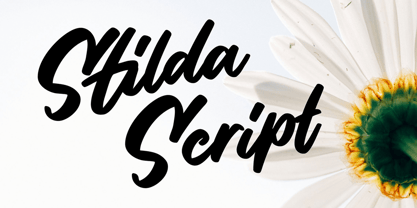
- Hoffelized by Cititype,
$12.00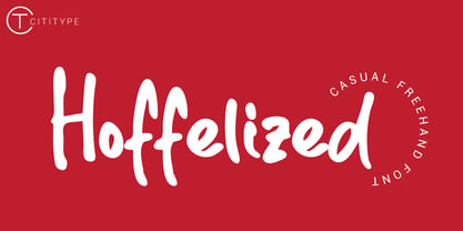
- Victoria by Balpirick,
$15.00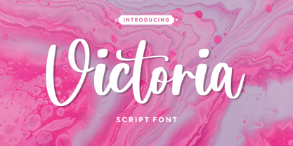
- Galavant by Atlantic Fonts,
$32.00
- DHF Quinta's Diary - Personal use only

- PixelZoo by Just in Type,
$20.00 - Comic Boys by Stringlabs Creative Studio,
$25.00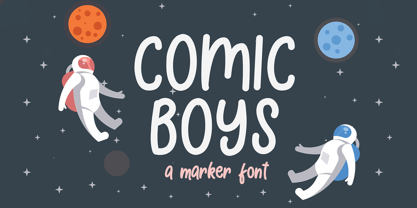
- Roman Tyres by Red Rooster Collection,
$45.00 - Bendina Sambat by Aldedesign,
$13.00
- RMU Neptun by RMU,
$25.00
- Presentation JNL by Jeff Levine,
$29.00
- Amsterdam Old Style by Red Rooster Collection,
$45.00
- Molor by Sons Of Baidlowi Typefoundry,
$8.00
- Lydstyrke by Bogstav,
$16.00
- Scratchnessism by Jesse Tilley,
$19.95 - Belista by Nissa Nana,
$23.00
- Christel Line by JOEBOB graphics,
$19.00
- Arrowman by ZetDesign,
$15.00
- Just Animals by Outside the Line,
$19.00


