36 search results
(0.005 seconds)
- Talie - Unknown license

- Tati by Wiescher Design,
$33.33I only had this bouncy curve and a photograph of a daily menu (Truite Meunière) I took outside an obscure Paris restaurant when starting the design of this font. But while working on it I suddenly started thinking about Jacques Tati the famous but almost forgotten french director of Les Vacances de Monsieur Hulot, Jour des Fêtes, Mon Oncle, Playtime, Trafic etc. I thought about his bouncy walk and his hilarious ideas. The memories never left me while working on the font, so I decided to name the font after this great French moviemaker who gave me so many happy hours. Since Tati was a very funny character, I gave my characters a funny price. Thank you Jacques Tati, yours Gert Wiescher - Talis by Eurotypo,
$25.00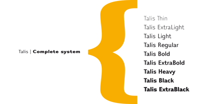
- Taffy by Monotype,
$29.99 - Tali MF by Masterfont,
$59.00 Finesse and style in this condensed hand drawn elegant type forms.
 - Rantic Kafis by Product Type,
$17.00 Introducing Rantic Kafis, a classic modern font with a bold and elegant touch. This font features thick strokes and rounded edges, giving it a distinctive and sophisticated look. With its stylistic set options for upper and lowercase letters, Rantic Kafis adds a touch of individuality and creativity to any design. Rantic Kafis is the perfect font to add a classic modern feel to your work. Its thick strokes and rounded edges make it highly legible, ensuring that your designs are easy to read and understand. So if you’re looking for a font that combines the best of classic and modern design, look no further than Rantic Kafis. Download it now and start creating stunning designs that stand out from the crowd! What’s Included : - File font - All glyphs Iso Latin 1 - We highly recommend using a program that supports OpenType features and Glyphs panels like many Adobe apps and Corel Draw, so you can see and access all Glyph variations. - PUA Encoded Characters – Fully accessible without additional design software. - Fonts include Multilingual support
 - Kikola Nafi by Javanice Studio,
$16.00 Introducing Kikola Nafi by Javanice Studio Kikola Nafi is A Urban Brush Font Kikola Nafi is perfect for branding project, apparel, labels, magazines, books, greeting / wedding cards, packaging, fashion, make up, stationery, and any type of advertising purpose or just used to express words above the background. This font includes Kikola Nafi also multilingual support. Enjoy the font, feel free to comment or feedback, send me PM or email.
 - Taxi MF by Masterfont,
$59.00 A tender serif font with a round and soft look.
 - Mai Tai - Unknown license

- Katsuji Tai by Kerry Colpus Designs,
$25.00 Katsuji tai means typeface in Japanese. The font was created by taking Japanese letters and manipulated them to look like english letters.
 - Tai Qin by ComGlyph,
$60.00 TaiQin is inspired by Chinese calligraphy to design both English and Thai typefaces. It offers 4 basic weights and a variable font. In addition, I have also designed alternatives for certain Thai glyphs.
 - The Bold Taffi by Scratch Design,
$12.00 The Bold Taffi is a bold, big, huge, geometric sans-serif with a modern style. This font is eye-catching custom-made and still has a fun and retro style. This font is perfect for headlines, logos, brandings, packaging, posters, labels, and other designs that need a high-fashion font. Includes: Two styles Numbers & punctuation Multilingual support Ligatures
 - P22 Tai Chi by IHOF,
$24.95 Experimental lettering Stephen Rapp created in 1999 became the spark that Stephen's imagination transformed into the Tai Chi design. Tai Chi is a display face but it could also be used as a textured calligraphic script. Its delightful sense of movement distinguishes it from other scripts. Individual characters stand poised in a vertical Zen-like balance while at the same time displaying an inner rhythm that makes them appear to dance along the line. Rich in texture and variation, Tai Chi works very well at medium and large point sizes. The font contains several alternate letters that help maintain a hand-lettered look. Tai Chi includes both upper and lowercase letters but works well in all uppercase settings.
 - Rival - Unknown license

- Tassista by MAC Rhino Fonts,
$59.00 Tassista means taxi in Italian. It suits this typeface well as the source of inspiration is the closing credits from the film Taxi driver, directed by Martin Scorsese in 1976. The typeface is designed to perform especially well in smaller sizes and makes it suitable for various credit copy, footnotes etcetera, nearly always presented in minor sizes. During the designs process it seemed more logical to make small caps instead of traditional lowercases.
 - Battery Park by Device,
$39.00 This stencil font, inspired by a fleeting glimpse of a Bronx plumber’s van seen through the rain-spattered window of a New York taxi, is evocative of urban grit, knock-down warehouse bargains and military supplies labeling.
 - Ink Nouveau JNL by Jeff Levine,
$29.00 Ink Nouveau JNL is loosely based on the hand lettered title from a lobby card for the 1927 film “The Taxi Dancer” and is available in both regular and oblique versions. The design emulates a hastily or sloppily drawn Art Nouveau display font.
 - Speed Test by Kaer,
$20.00 Hey! I'm happy to introduce to you my new font in fast speed style. Dry brush stroke with grunge lines and dots. Perfect for Taxi logo, Race poster, Sport identity, etc. You’ll get: * Uppercase (lowercase glyphs are the same) * Numbers * Symbols Please feel free to request any help you need: kaer.pro@gmail.com Best, Roman.
 - Moonsilver by HIRO.std,
$16.00 MOONSILVER is a Display font. This font describes about taft, funny, square, brave, vintage, retro FEATURES - Support Opentype Features - Uppercase - Numbering and Punctuations - PUA Encoded Characters - Multilingual Support - Works on PC or Mac USE MOONSILVER works great in any branding, logotype, magazines, poster, social media posts, clothing, advertisements, film title and any projects that need funny, strong, retro and vintage taste.
 - Buchmann by HIRO.std,
$14.00 Buchmann is Display Font This font describes about about fear, bold, taft, manly, hard, power, stiff, mighty, brave, gallant, rigid. FEATURES - Uppercase letters - Numbering and Punctuations - PUA Encoded Characters - Multilingual Support - Works on PC or Mac USE Buchmann works great in any branding, magazines, poster, social media posts, clothing, advertisements, product packaging, product designs, label, quotes and any projects. Enjoy using! Thanks. HIRO.std
 - Vembazax Rm by HIRO.std,
$- VEMBAZAX RM is a Display font. This font describes about strong, taft, manly, hard, power, masculine, stiff, mighty, brave, gallant, rigid. FEATURES - Support Opentype Features - Support Ligatures - Uppercase - Numbering and Punctuations - PUA Encoded Characters - Multilingual Support - Works on PC or Mac USE VEMBAZAX RM works great in any branding, logotype, magazines, poster, social media posts, clothing, advertisements, product packaging, product designs, label, company profile, quotes and any projects that need STRONG taste.
 - Rocktypes by HIRO.std,
$18.00 Rocktypes is Display Font This font describes about about strong, bold, taft, manly, hard, power, stiff, mighty, brave, gallant, rigid. FEATURES - Uppercase letters - Numbering and Punctuations - PUA Encoded Characters - Multilingual Support - Works on PC or Mac USE Rocktypes works great in any branding, logotype, magazines, poster, social media posts, clothing, advertisements, product packaging, product designs, label, company profile, quotes and any projects that need STRONG and BOLD taste. Enjoy using! Thanks. HIRO.std
 - Teksi by AdultHumanMale,
$10.00 Teksi Teksi I saw you everywhere, I just had to have you. Teksi is a marker felt style font, I’ve seen various hand drawn styles of this typeface or something similar on taxis and vans all over the island of Penang.This hand drawn style is slowly being replaced with boring Arials and other Serif printed fonts, so I wanted to capture the charm of the original. A heavily weighted font which could work for comic styles and headlines. I hope you like it.
 - Sleepy Time by Hanoded,
$15.00 Sleepy time… Ah, if only your kids would go to bed, close their eyes and drift off to sleep. This font was created when my son had some problems falling asleep: he'd cry, he wanted to sleep in a different bed, he wanted a different animal friend (he has Tij - a tiger, Meh - a sheep, Rafi - a giraffe, Moo - a cow, Woofy - a dog, Kikker - a frog). Sleepy Time font is an all caps typeface with uneven letters and a very different upper and lower case. It comes with all languages, including Cyrillic!
 - Mantequilla JNL by Jeff Levine,
$29.00 Some unusual hand lettering was found on the cover of the 1924 edition of a Spanish language novel by Joaquin Belda entitled “La Hora del Abandono” ("The Time of Abandonment"). The title was created as all lower case characters in a semi-serif style reflecting the dawn of the Art Deco movement. A new set of capital letters was created for this digital revival, along with the numbers, punctuation and other necessary glyphs. Mantequilla JNL is available in both regular and oblique versions. For those unfamiliar with the Spanish language, Mantequilla (pronounced mon-tay-key-yuh) means butter.
 - Taylor Hand by Mans Greback,
$59.00 Taylor Hand is an elegant signature font. Drawn by hand and created to be a typeface for chic and modern work in a classy setting. Use { } [ ] < > anywhere in a word where you want a swash. Example: Tay[lor The font comes in two styles, Upright and Italic, and also includes a Swash style for decorative additions to your lettering. It is completed with a full alternate alphabet and a big set of ligatures, which together give the handwriting genuine dynamics and a natural flow. It has extensive lingual support, covering all European Latin scripts. The font contains all characters you'll ever need, including all punctuation and numbers.
 - Alright! Picture this. Talie by Star Plus Multiply isn't just your everyday font; it's like the unicorn in the world of typography—a blend of creativity, elegance, and uniqueness. Imagine the letters...
- Seibi Takanawa by Nihon Literal,
$169.00 The category of font type is Kaisho-tai(square style), but it is a similar design to a textbook style with a delicate control over the sharpness of Kaisho-tai. Kanais designed somewhat larger for better line alignment in typesetting. 書体カテゴリーは楷書体ですが、楷書体のメリハリをやや押さえた教科書体に近いデザイン。仮名をやや大きめにデザインし、組み版時のライン揃えを意識しました。L(細)・M(中細)・B(太)・UB(特太)と4 つのウェイトがある楷書体シリーズですが、太さによって性格が違い、厳密にはファミリーではありません。LとMは筆のかすれなど名残を簡素にした教科書体風デザインの楷書体、Bは筆のメリハリを抑えた見出し用楷書体、UBは筆の名残を生かし、極限まで太く力強くインパクトを求めた毛筆体です。Lについては、Mに比べ若干明るく、かながやや小ぶりにデザインされています。
 - Caminito by JVB Fonts,
$15.00 This fontface is inspired on Argentinean classic and traditional art craft named as Fileteado Porteño. Caminito is available in 10 layered styles for compose with multi combinations and a extra of ornaments. Highly recommended to be used for colorized titles and display texts. Fileteado Porteño is a type of artistic drawing, with stylized lines and flowered, climbing plants, typically used in Buenos Aires, Argentina. It is used to adorn all kind of beloved objects: signs, taxis, lorries and even the old colectivos, Buenos Aires’s buses. Filetes (the lines in fileteado style) are usually full of colored ornaments and symmetries completed with poetic phrases, sayings and aphorisms, both humorous or roguish, emotional or philosophical. They have been part of the culture of the Porteños (inhabitants of Buenos Aires) since the beginnings of the 20th century. One of the most highlighted and recognized artists nowadays is Alfredo Genovese, who does a great job of teaching and claim this art and craft. The name Caminito reminds the emblematic and iconic Buenos Aires neighborhood immortalized by Carlos Gardel in music, in the tango.
 - Calaveras by Design is Culture,
$29.00 In August of 2009, I was commissioned by Zoo York, a New York City based skateboard company, to visit Buenos Aires to study and document street typography. As soon as my taxi driver took the bustling street Entre Ríos, it was clear that the city and I were going to be good friends. Many of the independently owned businesses on Entre Ríos are adorned with handmade signage. These signs are painted in a style called Fileteado which is a century-old Argentinian type of lettering and floral ornamentation. Nowadays, Fileteado is still a prominent part of the city’s landscape, coloring the façades of restaurants, bars and coffee shops. Calaveras and Diablitos are two new typefaces that were inspired by Fileteado. Stylistically, the fonts are a return to a rhythmic and playful sensibility reminiscent of Vitrina and Cuba, two fonts that I designed in 1996. Along with dynamism and dance, these new fonts incorporate a rigor and functionality essential to labelling any font a ‘workhorse.’ The names Calaveras and Diablitos, came from the name of a song by the infamous Buenos Aires rock band, Los Fabulosos Cadillacs. —Pablo A. Medina
 - Diablitos by Design is Culture,
$29.00 In August of 2009, I was commissioned by Zoo York, a New York City based skateboard company, to visit Buenos Aires to study and document street typography. As soon as my taxi driver took the bustling street Entre Ríos, it was clear that the city and I were going to be good friends. Many of the independently owned businesses on Entre Ríos are adorned with handmade signage. These signs are painted in a style called Fileteado which is a century-old Argentinian type of lettering and floral ornamentation. Nowadays, Fileteado is still a prominent part of the city’s landscape, coloring the façades of restaurants, bars and coffee shops. Calaveras and Diablitos are two new typefaces that were inspired by Fileteado. Stylistically, the fonts are a return to a rhythmic and playful sensibility reminiscent of Vitrina and Cuba, two fonts that I designed in 1996. Along with dynamism and dance, these new fonts incorporate a rigor and functionality essential to labelling any font a ‘workhorse.’ The names Calaveras and Diablitos, came from the name of a song by the infamous Buenos Aires rock band, Los Fabulosos Cadillacs. —Pablo A. Medina
 - TA Regresso PRO by Tural Alisoy,
$39.00 TA Regresso PRO graphic presentation at Behance TA Regresso PRO font is inspired by Didon and Bodoni fonts. A combination of a little Bodoni and a little Didon elements and a unique style and Text, Display, Subhead and about 80 styles, it is a font that gives the user a choice. TA Regresso font supports Greek, Hebrew, Cyrillic and Latin alphabets. After starting work on the font since February of last year, the font is ready today with constant revisions. Being open to learning, I sought help from experienced designers. I must mention that Yulia Gonina, the founder of Schrifteria Foundry, also helped me a lot to make Regresso good. With her knowledge and advice, the flaws in the font were eliminated. By the way, Viktor Baltus also helped me with his valuable advices. I did some research about the alphabets of the supported languages so that Regresso is good. I paid a lot of attention to the correct design of the letters. I will fix the problems I missed in the next updates of the font. I would be happy if you send me your work when you use my font. I'm very interested in where you use my font. TA Regresso PRO contains 200+ Latin and Cyrillic, Greek, Hebrew languages. TAFT produce retail typefaces, create custom fonts and even do Greek, Hebrew and Cyrillization. Our mission is to create and distribute only carefully drawn, thoroughly tested, and perfectly optimized typefaces which are available to a wide range of customers. If you're looking for a type or logo → t@taft.work
 - First Ladies by Celebrity Fontz,
$24.99 First Ladies is a unique collection of signatures of almost all of the First Ladies of the United States plus the First Lady of the Confederacy in a high-quality font. A must-have for autograph collectors, desktop publishers, lovers of history, or anyone who has ever dreamed of sending a letter, card, or e-mail “signed” as if by one of these famous women. This font includes 45 signatures for the following First Ladies: Martha Dandridge Custis Washington, Abigail Smith Adams, Martha Wayles Skelton Jefferson, Dolley Payne Todd Madison, Elizabeth Kortright Monroe, Louisa Catherine Johnson Adams, Rachel Donelson Jackson, Anna Tuthill Symmes Harrison, Julia Gardiner Tyler, Sarah Childress Polk, Margaret Mackall Smith Taylor, Abigail Powers Fillmore, Jane Means Appleton Pierce, Harriet Lane, Mary Todd Lincoln, Eliza McCardle Johnson, Julia Dent Grant, Lucy Ware Webb Hayes, Lucretia Rudolph Garfield, Ellen Lewis Herndon Arthur, Frances Folsom Cleveland, Caroline Lavinia Scott Harrison, Frances Folsom Cleveland, Ida Saxton McKinley, Edith Kermit Cardow Roosevelt, Helen Herron Taft, Ellen Axson Wilson, Edith Bolling Galt Wilson, Florence Kling Harding, Grace Anna Goodhue Coolidge, Lou Henry Hoover, Anna Eleanor Roosevelt, Elizabeth Virginia Wallace Truman, Mamie Geneva Doud Eisenhower, Jacqueline Lee Bouvier Kennedy, Claudia Taylor (Lady Bird) Johnson, Patricia Ryan Nixon, Elizabeth Bloomer Ford, Rosalynn Smith Carter, Nancy Davis Reagan, Barbara Pierce Bush, Hillary Rodham Clinton, Laura Welch Bush, Michelle Obama, and Varina Howell Davis (First Lady of the Confederacy). This font behaves exactly like any other font. Each signature is mapped to a regular character on your keyboard. Open any Windows application, select the installed font, and type a letter, and the signature will appear at that point on the page. Painstaking craftsmanship and an incredible collection of hard-to-find signatures go into this one-of-a-kind font. Comes with a character map.
 - TT Hoves Pro by TypeType,
$39.00 We've upgraded TT Hoves Pro with 20 new fonts and Vietnamese! TT Hoves Pro useful links: Specimen | Graphic presentation | Customization options Please note! If you need OTF versions of the fonts, just email us at commercial@typetype.org TT Hoves Pro is the studio's bestseller, one of the top three universal sans serifs along with TT Norms® Pro and TT Commons™️ Pro. TT Hoves Pro has a neutral yet recognizable character suitable for use in any modern project. The font has a large character set, including extended Cyrillic and Latin, as well as a large number of styles. TT Hoves Pro was already perfect, but we made it even more functional! Updated TT Hoves Pro: supports more than 200 languages, including Vietnamese; contains 4 widths: Compact, Normal, Condensed, Expanded; consists of 83 styles, 20 of which are new Compact fonts; includes upright and italic Outline fonts, each with 672 characters; contains an improved variable font that varies in weight, width and slope; includes 1573 characters in each style, except for Outline versions; contains 41 OpenType features, including many ligatures and stylistic alternatives. The geometry of the TT Hoves Pro has remained unchanged. The font lacks pronounced contrast, all terminals are on the same level, and there are wide horizontal strokes in triangular characters. TT Hoves Pro is ideal for web design and use in applications. Perfect for branding, packaging design and printing. TT Hoves Pro OpenType features list: aalt, ccmp, locl, subs, sinf, sups, numr, dnom, frac, ordn, tnum, onum, lnum, pnum, c2sc, smcp, dlig, liga, salt, calt, case, zero, ss01, ss02, ss03, ss04, ss05, ss06, ss07, ss08, ss09, ss10, ss11, ss12, ss13, ss14, ss15, ss16, ss17, ss18, ss19 TT Hoves Pro language support: English, Albanian, Basque, Catalan, Croatian, Czech, Danish, Dutch, Estonian, Finnish, French, German, Hungarian, Icelandic, Irish, Italian, Latvian, Lithuanian, Luxembourgish, Maltese, Moldavian (lat), Montenegrin (lat), Norwegian, Polish, Portuguese, Romanian, Serbian (lat), Slovak, Slovenian, Spanish, Swedish, Swiss German, Valencian, Azerbaijani, Kazakh (lat), Turkish, Acehnese, Banjar, Betawi, Bislama, Boholano, Cebuano, Chamorro, Fijian, Filipino, Hiri Motu, Ilocano, Indonesian, Javanese, Khasi, Malay, Marshallese, Minangkabau, Nauruan, Nias, Palauan, Rohingya, Salar, Samoan, Sasak, Sundanese, Tagalog, Tahi- tian, Tetum, Tok Pisin, Tongan, Uyghur, Afar, Afrikaans, Asu, Aymara, Bemba, Bena, Chichewa, Chiga, Embu, Gusii, Jola-Fonyi, Kabuverdianu, Kalenjin, Kinyarwanda, Kirundi, Kongo, Luba-Kasai, Luganda, Luo, Luyia, Machame, Makhuwa-Meetto, Ma- konde, Malagasy, Mauritian Creole, Morisyen, Ndebele, Nyankole, Oromo, Rombo, Rundi, Rwa, Samburu, Sango, Sangu, Sena, Seychellois Creole, Shambala, Shona, Soga, Somali, Sotho, Swahili, Swazi, Taita, Teso, Tsonga, Tswana, Vunjo, Wolof, Xhosa, Zulu, Ganda, Maori, Alsatian, Aragonese, Arumanian, Belarusian (lat), Bosnian (lat), Breton, Colognian, Cornish, Corsi- can, Esperanto, Faroese, Frisian, Friulian, Gaelic, Gagauz (lat), Galician, Interlingua, Judaeo-Spanish, Karaim (lat), Kashubian, Ladin, Leonese, Manx, Occitan, Rheto-Romance, Romansh, Scots, Silesian, Sorbian, Vastese, Volapük, Võro, Walloon, Welsh, Karakalpak (lat), Kurdish (lat), Talysh (lat), Tsakhur (Azerbaijan), Turkmen (lat), Zaza, Aleut (lat), Cree, Haitian Creole, Hawaiian, Innu-aimun, Karachay-Balkar (lat), Karelian, Livvi-Karelian, Ludic, Tatar, Vepsian, Nahuatl, Quechua,, Russian, Belarusian (cyr), Bosnian (cyr), Bulgarian (cyr), Macedonian, Serbian (cyr), Ukrainian, Gagauz (cyr), Moldavian (cyr), Kazakh (cyr), Kirghiz, Tadzhik, Turkmen (cyr), Uzbek (cyr), Azerbaijan, Lezgian, Abazin, Agul, Archi, Avar, Dargwa, Ingush, Kabardian, Kab- ardino-Cherkess, Karachay-Balkar (cyr), Khvarshi, Kumyk, Lak, Nogai, Rutul, Tabasaran, Tsakhur, Altai, Buryat, Dolgan, Enets, Evenki, Ket, Khakass, Khanty, Komi-Permyak, Komi-Yazva, Komi-Zyrian, Manci, Shor, Siberian Tatar, Tofalar, Touva, Aleut (cyr), Alyutor, Even, Koryak, Nanai, Negidal’skij, Nivkh, Udege, Ulch, Bashkir, Chechen (cyr), Chukchi, Chuvash, Erzya, Eskimo, Kryashen Tatar, Mari-high, Mari-low, Mordvin-moksha, Nenets, Nganasan, Saami Kildin, Selkup, Tatar Volgaic, Udmurt, Yakut, Uighur, Rusyn, Karaim (cyr), Montenegrin (cyr), Romani (cyr), Dungan, Karakalpak (cyr), Shughni, Mongolian, Adyghe, Kalmyk, Talysh (cyr), Russian Old, Vietnamese
 - TT Autonomous by TypeType,
$39.00 TT Autonomous useful links: Specimen PDF | History of creation | Graphic presentation | Customization options Please note! If you need OTF versions of the fonts, just email us at commercial@typetype.org About TT Autonomous: The idea was born in Amsterdam when one of our colleagues took the official electric taxi at the Schiphol airport. At the moment we were thinking about creating a new wide sans-serif, and an interesting question emerged during the trip: what font would be associated with autonomous electric transport. Then we thought it would also be nice to expand this theme visually. This is how the font family TT Autonomous came about. It is a modern brutal technological sans-serif. The basic visual characteristic of the typeface is the noticeable squareness of the characters and angular internal space. In addition, the typeface proportions tend to appear monospaced, but they are not really monospaced. The width of the characters is inspired by automobile logotype proportions, which are mostly rather wide. We could not disregard the fact that code lines in software for autonomous cars are traditionally typed using monospaced fonts and added a special monospaced subfamily to the TT Autonomous typeface. Thanks to the squareness of the characters inherited from the main family and the real monospace properties, the character forms in the subfamily turned out very specific and interesting. This is especially true for oblique monospaced fonts, which are true italics. In addition, we created a couple of outline styles which are great for use in titles and large inscriptions and perfectly match the basic family and the monospaced family. As opposed to outlines that can be created in graphic editors, in TT Autonomous Outline we worked through the narrow and questionable spots, thanks to which the font looks professionally complete and harmonious. As from the very beginning, the font was developed with tomorrow's technologies in mind, we could not miss addressing variability and creating a variable font. TT Autonomous has variable versions for both the basic and the monospaced subfamilies. TT Autonomous is a complex font family that consists of 32 fonts intended to solve a broad range of design tasks. Overall, the font family features 14 regular styles, 6 monospaced styles, 7 reversed styles, 2 outline styles and 3 variable fonts. The number of glyphs varies from 630+ in the monospaced font to 790+ in the basic styles. The basic subfamily has alternates, ligatures, old-style figures, slashed zeroes, and many other useful features. FOLLOW US: Instagram | Facebook | Website TT Autonomous language support: Acehnese, Afar, Albanian, Aleut (lat), Alsatian, Aragonese, Arumanian, Asu, Aymara, Azerbaijani, Banjar, Basque, Belarusian (cyr), Belarusian (lat), Bemba, Bena, Betawi, Bislama, Boholano, Bosnian (cyr), Bosnian (lat), Breton, Bulgarian (cyr), Catalan, Cebuano, Chamorro, Chichewa, Chiga, Colognian, Cornish, Corsican, Cree, Croatian, Czech, Danish, Dutch, Embu, English, Erzya, Esperanto, Estonian, Faroese, Fijian, Filipino, Finnish, French, Frisian, Friulian, Gaelic, Gagauz (lat), Galician, Ganda, German, Gusii, Haitian Creole, Hawaiian, Hiri Motu, Hungarian, Icelandic, Ilocano, Indonesian, Innu-aimun, Interlingua, Irish, Italian, Javanese, Jola-Fonyi, Judaeo-Spanish, Kabuverdianu, Kalenjin, Karachay-Balkar (cyr), Karachay-Balkar (lat), Karaim (lat), Karakalpak (lat), Karelian, Kashubian, Kazakh (lat), Khasi, Khvarshi, Kinyarwanda, Kirundi, Kongo, Kumyk, Kurdish (lat), Ladin, Latvian, Leonese, Lithuanian, Livvi-Karelian, Luba-Kasai, Ludic, Luganda, Luo, Luxembourgish, Luyia, Macedonian, Machame, Makhuwa-Meetto, Makonde, Malagasy, Malay, Maltese, Manx, Maori, Marshallese, Mauritian Creole, Minangkabau, Moldavian (lat), Montenegrin (cyr), Montenegrin (lat), Mordvin-moksha, Morisyen, Nahuatl, Nauruan, Ndebele, Nias, Nogai, Norwegian, Number, Nyankole, Occitan, Oromo, Palauan, Polish, Portuguese, Quechua, Rheto-Romance, Rohingya, Romanian, Romansh, Rombo, Rundi, Russian, Rusyn, Rwa, Salar, Samburu, Samoan, Sango, Sangu, Sasak, Scots, Sena, Serbian (cyr), Serbian (lat), Seychellois Creole, Shambala, Shona, Silesian, Slovak, Slovenian, Soga, Somali, Sorbian, Sotho, Spanish, Sundanese, Superscripts and Subscripts, Swahili, Swazi, Swedish, Swiss German, Tagalog, Tahitian, Taita, Talysh (lat), Tatar, Teso, Tetum, Tok Pisin, Tongan, Tsakhur (Azerbaijan), Tsonga, Tswana, Turkish, Turkmen (lat), Ukrainian, Uyghur, Valencian, Vastese, Vepsian, Volapük, Võro, Vunjo, Walloon, Welsh, Wolof, Xhosa, Zaza, Zulu.
 - Sigmund Freud Typeface by Harald Geisler,
$29.00 “For those who regret what keyboards and touch screens have done to their penmanship, typographer Harald Geisler has an answer: Sigmund Freud.” — The Wall Street Journal Sigmund Freud was a neurologist who lived from 1856 to 1939. His research and studies led to the foundation of ‘Psychoanalysis’. When I first saw Freud’s century old letters, I was fascinated by the beauty of these historic manuscripts. It made me smile to imagine a person writing his or her shrink a letter set in Freud’s handwriting. I started to plan creating a font based on his manuscripts. I contacted the Sigmund Freud Museum Vienna and Freud Museum London. To start the creation I selected eight handwritten documents from the archive in Vienna – This selection of specimen was my orientation during the design process. The Samples were created between 1883 to 1938 and are of various character such as handwritten scientific papers, personal letters, notes and a telegram. A successful Kickstarter Campaign "The Sigmund Freud Typeface - A Letter to your Shrink" with over 1400 Backers enabled me to visit the archive in Vienna and study the original manuscripts of Sigmund Freud. After a year of preparation and design work, I finished four alphabets based on Freud’s handwriting. What are the different Versions PRO, Kurrent, #1, #2, #3 and #4 about? “This project gives people the convenience afforded by the computer while maintaining the romantic nostalgia, beauty, and character of letter writing with real handwriting.” — Daniel Vahab, The Huffington Post When you write with your hand, every letter looks a little different. When you write a text on your computer every letter looks exactly the same. In order to make type look like handwriting, I chose four different variations of each letter from Freud’s manuscripts, drew and stored them in the font. The font is then programmed to exchange letters while you are typing. This makes the rendered result on your screen or print look like unique handwriting. PRO While you are typing… the PRO Version actively combines all four alphabets and exchanges them automatically. Through this mechanism never the same two o’s will stand next to each other. With every touch a unique look is generated. This works in certain applications i.e. Word 2010(or newer), Pages, TextEdit, Editor(Pre-installed on Windows 7 or newer), InDesign, Illustrator… →Here you can see an animation of what this effect looks like in action. (Please Note: some applications like LibreOffice, OpenOffice do currently not support this feature. Date: December 2013) #1 #2 #3 and #4 The Sigmund Freud Typeface #1, #2, #3 and #4 each hold one individual lowercase alphabet based on Freud’s handwriting. Kurrent Most of Freud’s correspondence was written in German. Until the 1950′s a different handwriting was taught throughout German speaking countries (Switzerland, Austria, Germany). This style is called Kurrent. The name Kurrent and Cursive derive from the Latin word currere - to run, hurry - both styles were designed to write fast. As you can see in the samples above, Freud practiced both Kurrent and when writing english Cursive (Latin script or Joined-up). Kurrent has three significantly different letters (s,h,e). Use Kurrent to render the authentic look of an historic Sigmund Freud letter in German. Bundle On the Top of this page you can get all six fonts of the Sigmund Freud Typeface Family in a bundle. International Typeface All styles of the Sigmund Freud Typeface feature a wide range of accented letters so you can write to all your friends in Sweden (Bjørn) France (Chloé & Zoë), Ireland (Dáirine), Poland (Łucja), Germany (Jörg) and almost everywhere around the globe (Find a complete list in the tech specs). Usage recommendations I hope that this design will be valuable to you and most of all that you have fun with this typeface! 1. Point Size — To reproduce the size of Sigmund Freud’s handwriting adjust the type size between 18-24 point in your word processor. If you are using an imaging software like Photoshop set the resolution to 300dpi and adjust the point size between 18-24. 2. Line Spacing — Narrow the line hight until swashes of capital letters touch the baseline above. This also happens when you write a letter and gives the document a unique handwritten look. 3. Right Aligned — Freud had the habit to write towards the right edge of the page and start loosely on the left. Set your text alignment to ‘right’ to incorporate this dramatic expression also to your documents. What do other People say about the Sigmund Freud Typeface? “Wouldn’t you love to write a letter to your shrink using the Sigmund Freud typeface?” — Dorothy Tan, Design TAXI ''“JUST DON’T WRITE A LETTER TO YOUR MOTHER WITH IT… …until the reader looks a bit closer, and they see 70+ years of modern science weighing in on turn-of-the-century pop psychology."'' — Mark Willson, Fast Company “Doctor, what does it mean if you dream of creating a font of Freud’s handwriting?” — Ayun Halliday, Open Culture “…geekily romantic, at once artistic and scientific” — Edie Jarolim, Freud’s Butcher “…sympathisch” — Jürgen Siebert, Fontblog !WOW! Thank you for reading the complete font description! You are awesome! If you still have a question please contact me through MyFonts or my website haraldgeisler.com. Credits This project was made possible by the help of 1481 Backers on Kickstarter and the kind support of the Sigmund Freud Museum Vienna and the Freud Museum London. Thank you. All of Freud’s Manuscripts shown are © Sigmund Freud Museum Vienna. Poster Image: IN17 - Sigmund Freud, Germany 1932. © Freud Museum London. Flag Image: IN19 - Sigmund Freud 1930’s. © Freud Museum London.


