10,000 search results
(0.016 seconds)
- Sweet Sans by Sweet,
$59.00 The engraver’s sans serif—strikingly similar to drafting alphabets of the early 1900s—has been one of the most widely used stationer’s lettering styles since about 1900. Its open, simple forms offer legibility at very small sizes. While there are digital fonts based on this style (such as Burin Sans™ and Sackers Gothic™, among others), few offer the range of styles and weights possible, with the versatility designers perhaps expect from digital type families. Sweet Sans fills that void. The family is based on antique engraver’s lettering templates called “masterplates.” Professional stationers use a pantograph to manually transfer letters from these masterplates to a piece of copper or steel that is then etched to serve as a plate or die. This demanding technique is rare today given that most engravers now use a photographic process to make plates, where just about any font will do. But the lettering styles engravers popularized during the first half of the twentieth century—especially the engraver’s sans—are still quite familiar and appealing. Referencing various masterplates—which typically offer the alphabet, figures, an ampersand, and little else—Mark van Bronkhorst has drawn a comprehensive toolkit of nine weights, each offering upper- and lowercase forms, small caps, true italics, arbitrary fractions, and various figure sets designed to harmonize with text, small caps, and all-caps. The fonts are available as basic, Standard character sets, and as Pro character sets offering a variety of typographic features and full support for Western and Central European languages. Though rich in history, Sweet Sans is made for contemporary use. It is a handsome and functional tribute to the spirit of unsung craftsmanship. Burin Sans and Sackers Gothic are trademarks of Monotype Imaging.
 - Sweet Sans Pro by Sweet,
$79.00 The engraver’s sans serif—strikingly similar to drafting alphabets of the early 1900s—has been one of the most widely used stationer’s lettering styles since about 1900. Its open, simple forms offer legibility at very small sizes. While there are digital fonts based on this style (such as Burin Sans™ and Sackers Gothic™, among others), few offer the range of styles and weights possible, with the versatility designers perhaps expect from digital type families. Sweet Sans fills that void. The family is based on antique engraver’s lettering templates called “masterplates.” Professional stationers use a pantograph to manually transfer letters from these masterplates to a piece of copper or steel that is then etched to serve as a plate or die. This demanding technique is rare today given that most engravers now use a photographic process to make plates, where just about any font will do. But the lettering styles engravers popularized during the first half of the twentieth century—especially the engraver’s sans—are still quite familiar and appealing. Referencing various masterplates—which typically offer the alphabet, figures, an ampersand, and little else—Mark van Bronkhorst has drawn a comprehensive toolkit of nine weights, each offering upper- and lowercase forms, small caps, true italics, arbitrary fractions, and various figure sets designed to harmonize with text, small caps, and all-caps. The fonts are available as basic, Standard character sets, and as Pro character sets offering a variety of typographic features and full support for Western and Central European languages. Though rich in history, Sweet Sans is made for contemporary use. It is a handsome and functional tribute to the spirit of unsung craftsmanship. Burin Sans and Sackers Gothic are trademarks of Monotype Imaging.
 - Free - Unknown license

- Sweets by Agnieszka Ewa Olszewska,
$29.00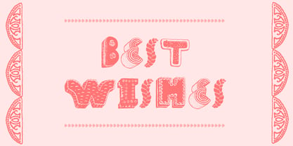 Sweets is an illustrative, hand made font.
 - Sana Sans by Latinotype,
$29.00 Sana Sans is a humanist functional typeface with a modern feel. It is intended to be a face well-suited for multiple purposes, especially in publishing. Sana Sans looks perfectly legible and clean in long texts, and neat and simple in headlines. Thanks to its versatility, this font is also ideal for both screen and print usage. Sana Sans consists of 32 styles and 8 weights—ranging from Thin to Heavy—italics, small caps and an alternative family. The alternative family offers slight variants in many glyphs, some of which include the lowercase a, e, l, q, y and uppercase G, L, and Q. Sana Sans was designed by Felipe Sanzana, under the supervision of Latinotype Team.
 - Confinental FREE - Personal use only

- Nasalization Free - Unknown license

- Network Free - Personal use only

- Negotiate Free - Unknown license

- Get Free - Unknown license

- Expressway Free - 100% free

- Eighties FREE - 100% free

- Rexlia Free - Unknown license

- Pakenham Free - Unknown license

- Zekton Free - Unknown license

- Mufferaw Free - Unknown license

- Larabiefont Free - Unknown license

- Fat Free - Unknown license

- Free Money by Jeremy Woods,
$10.00 Free money is an organic-looking display font. It was inspired by gig poster art, alternative comics and b-grade movies.
 - Sugar Free by PizzaDude.dk,
$17.00 Don't be afraid to taste something sugar free - most times you will be surprised how good it tastes! My Sugar Free font may not look as very much at first glance - but play around with the Regular and Italic versions (and notice the 4 different versions of each letter, that automatically cycles as you type!) and you will see how lively the font is!
 - Sultan Free by Linotype,
$155.99Sultan Free, designed by Sultan Maktari in 2005, is a freestyle Ruqaa and a winner in Linotype’s first Arabic Typeface Design Competition. The design is open, calligraphic, and very dynamic. This makes it suitable for large display sizes, especially in the area of advertising, while still functioning well as a text face. The font includes a matching Latin design and support for Arabic, Persian, and Urdu. It also includes proportional and tabular numerals for the supported languages. - Abdo Free by Abdo Fonts,
$49.50
- Free Zone by Aboutype,
$24.99A Sans serif design that follows a continental style with design characteristics that combine condensed and open counters. The lowercase has tall ascenders. Family includes common capitals and alternate lowercase characters. FreeZone requires subjective display kerning and compensation. - Sweety by Typofabric,
$18.00 - Sweat by words+pictures,
$20.00 - Bree - Personal use only

- Freeze! - Unknown license

- Fred by E-phemera,
$20.00The Fred family is based on the casual hand lettering of Fred G. Cooper: cover artist, cartoonist, and letterer for Life magazine in the 1920s and '30s. His relaxed style captures the flavor of the Roaring Twenties, and the digital font was developed for use in the credits and title cards for a 1920s-style silent movie, The Call of Cthulhu. In an effort to keep the hand-lettered look, the OpenType font has numerous discretionary ligatures and contextual alternates, along with fleurons and ornaments. - Dree by VP Creative Shop,
$14.00 Introducing Dree - typeface - 6 serif and display fonts Dree is creative and minimal typeface loaded with 6 fonts and multilingual support. It's a very versatile font that works great in large and small sizes. This font is perfect for branding projects, home-ware designs, product packaging, magazine headers - or simply as a stylish text overlay to any background image. FEATURES Uppercase, lowercase, numeral, punctuation & Symbol Serif and Display Alternate Italics Multilingual support No special software is required to type out the standard characters of the Typeface. Canva friendly Feel free to contact me if you have any questions! Mock ups and backgrounds used are not included. Thank you! Enjoy!
 - Bree by TypeTogether,
$37.50 The Bree font family is a spry sans serif by Veronika Burian and José Scaglione that delivers a spirited look and feel for branding and headline usage. As an upright italic, Bree shows a pleasant mix of rather unobtrusive capitals with more vivid lowercase letters, giving text a lively appearance. Bree is clearly influenced by handwriting. As such, some of its most characteristic features are the single-story ‘a’, the cursive ‘e’, the outstroke curves of ‘v’ and ‘w’, the flourished ‘Q’, and the fluid shapes of ‘g’, ‘y’, and ‘z’. Alternates of these letters are available when a more neutral look is desired. Bree has a touch of cheekiness, a wide stance for each character, and an extra-large x-height. All this adds up to a big personality, so even when set in small text there is no skimming past the words Bree voices. In 2019, the Bree font family got a huge update. A few shapes were updated or added (the ‘k’ and German capital ‘ß’), two entirely new weights were added (Book and Book Italic), and spacing was perfected. More than that, Vietnamese support was added to Bree Latin, and the Bree Greek and Bree Cyrillic scripts were designed from scratch to parallel the Latin’s tone. Additionally, Bree was designed in variable font format for those who want complete control over the font’s appearance while simultaneously saving digital weight in the form of kilobytes and megabytes. Bree is in the perfect position for the next digital revolution. The complete Bree font family, along with our entire catalogue, has been optimised for today’s varied screen uses. Bree has been chosen for such wide-ranging uses as Breast Cancer Awareness Month in the US, the branding for the country of Peru, and numerous layouts including mobile apps, magazines, newspapers, and books. Awards – Tipos Latinos exhibition 2008 – Several best-of-the-year typeface lists of 2008 MyFonts Top 10 Fonts of 2008 Smashing Magazine: 60 Brilliant Typefaces For Corporate Design https://www.smashingmagazine.com/2008/03/60-brilliant-typefaces-for-corporate-design/ Die besten Schriften 2008 http://www.fontwerk.com/619/die-besten-schriften-2008/ – Selected for Typographica’s Best Typefaces of 2008 – Won Bronze for Original Typeface in the 2009 European Design Awards
 - Xree by Katatrad,
$22.00 - Feelin Sweet - Unknown license

- Sweet Talk - Personal use only

- Sweet Doughnuts - Personal use only

- Sweet Steeffie - Personal use only

- Sweet Blur - Unknown license

- Sweet Kitten by Yumna Type,
$16.00 Sweet Kitten is a elegant handwritten font. Made for any professional project branding. It is the best for logos, branding and quotes. Every letter has a unique and beautiful touch. Features: Standard Ligatures PUA Encoded Multilingual Support Numerals and Punctuation by Yumnatype
 - Sweet Frosting by Danielle Eneh,
$18.00 Sweet Frosting is a cute script font designed to be reminiscent of a script from a handwritten menu or sign. It will add a quirky, fun but still elegant touch to your designs. The smooth edges create a clean look for your modern design projects. It’s perfect for branding projects, social media posts, product packaging, product designs, labels, and invitations. Sweet Frosting comes with 297 glyphs- including 2 uppercase sets, lowercase, numerals, punctuation and includes 16 ligatures for a more natural handwritten feel. OPENTYPE: Sweet Frosting is an opentype font and recommended for programs that support opentype features such as Adobe Illustrator, Adobe Photoshop, Adobe Indesign, Pages, Word. Please make sure you know how to access these features before purchasing. ➤ What’s Included ❤ 297 glyphs — 2 Uppercase sets, lowercase, numbers, symbols, punctuation, 16 styled ligatures ❤ Multilingual Support : AÀÁÂÃÄÅCÇDÐEÈÉÊËIÌÍÎÏNÑOØÒÓÔÕÖUÙÜÚÛWYÝŸỲŸÆŒßÞþ
 - Sweet Brownie by Yumna Type,
$16.00 Sweet Brownie is a elegant handwritten font. Made for any professional project branding. It is the best for logos, branding and quotes. Every letter has a unique and beautiful touch. Includes: Sweet Brownie (OTF) Features: Standard Ligatures PUA Encoded Multilingual Support Numerals and Punctuation by Yumnatype
 - Simply Sweet by Nicky Laatz,
$18.00 Say hello to the SIMPLY SWEET Font Duo! - Two delicious new companion fonts that go together like milk and cookies. Flamboyant and curvaceous, the playful script includes a large selection of alternate characters to choose from as well as natural looking ligatures to add to the authenticity of the lettering. A collection of whimsical end and beginning swashes are also included to add a finishing touch or fill design space in your type designs. Complimenting it, is a cute little wonky all caps serif font , with double letter ligatures for a natural look. Simply Sweet Script makes custom lettering designs a dream thanks to all the little extra decorative options you can include for a pretty and unique customisation - swashes, endings, alternate letters and ligatures, all make her the prettiest little thing since tutus and tiaras.


Page 1 of 250Next page