10,000 search results
(0.009 seconds)
- Figgins Sans by Shinntype,
$79.00 The first sans serif types were made in London in the early 19th century. They were severely modern, all caps and bold. The Figgins foundry, inventor of the term sans serif, showed a ?ne example in its specimen of 1836. The extra bold weight of Figgins Sans is a close revival of the original, with the addition of a lower case which retains its partly geometric, partly grotesque quality. The family is rounded out with other weights and an italic, and extended into Cyrillic and Greek, all executed in what is assumed to be as authentic a manner as possible, given the hypothetical nature of the exercise. Together with Scotch Modern, comprises The Modern Suite of matched fonts.
 - Radiate Sans by Studio Sun,
$20.00 Radiate Sans is a Humanist - Geometric Sans Serif fonts, Simple geometric letters shapes, medium contrast character style, It was designed lately 2018. and published on April 2020. Radiate Sans is a neutral typeface, have stroke modulation (strokes that clearly vary in width along their line) or alternating thick and thin strokes. Radiate Sans intended as a display typeface that could be used for posters and advertisements, as well as for the text of documents that need to be clearly legible at small sizes or from a distance, such as book blurbs, timetables and price lists. The family include 5 font weights, with a bonus 4 Widths in the OpenType version. It supports ISO Adobe 2, Adobe CE, Latin Extended characters, Standard Greek, and Standard Cyrillic. OpenType features include small caps, old style figures, superscript and subscript, ordinals, proportional lining figures, and case forms.
 - Gravesend Sans by Device,
$39.00 Smart, legible and elegant, Gravesend Sans is a based on the unique typeface used for the iconic grass-green signage for the Southern Railway. In existence from 1923 to 1948, when the network was nationalised, the Southern Railway linked London with the Channel ports, South West England, the South coast resorts and Kent. The same design was also used for the ‘hawkeye’ signs on the London, Midland and Scottish Railway, differentiated by black letters on a yellow background. Reference for each letter was taken from vintage ‘target’ station nameplates and other platform signage. The rarest letters were the Q, seen in Queens Road Battersea, the X, seen in East Brixton, and the Z, used in Maze Hill, site of an infamous train crash in 1958. Being hand-made, the letters often differ in width and thickness. There was no lower case. The Bluebell Railway, a heritage steam line, runs over part of the old Southern Railway network and uses a very similar type. The design of the numbers differed considerably, but here have been taken from the Device 112 Hours font Smokebox. As well identifying platforms, they were used on the front of the steam engine’s smokebox, hence the name, and stylistically are more in keeping with the letters than some of the squarer versions that can be seen in old photographs. William Caslon IV is credited with the first Latin sans-serif type, shown in a 1816 Caslon specimen book. ‘Two Lines English Egyptian’, as it was called, was caps-only, and there are several other correlations between that type design and this one. Includes a selection of authentic arrows and manicules, plus abbreviated ligatures such as ‘St.’ (Saint or Street) ‘Rd.’ (Road) and ‘Jn.’ (Junction). The Cameo version includes many graphic banner elements that can be freely combined.
 - Kana Sans by GT&CANARY,
$32.00 A new modern classic. Kana Sans is a versatile sans serif font family that’s ideal for building a contemporary yet timeless brand look. Inspired by iconic typography, Kana Sans is designed to be balanced, modern and easily adaptable to web, print, and signage applications. From fashion to corporate industry, this font gives the designer full flexibility to express his/her vision. With Six different weights and matching italics, Kana Sans is a powerful communication tool for today.
 - Gart Sans by Vitaliy Gotsanyuk,
$25.00 Gart Sans is a grotesque font that preserves the characteristics of early 20th-century grotesques, primarily used in advertising. The main features of this font include a pronounced contrast, narrow proportions, and light, smooth forms combined with modern design solutions. Compared to geometric or neo-grotesque fonts, Gart Sans distinguishes itself with its attention to detail. As the font weight increases, it acquires a more pronounced character, expanding its usability from headlines to extensive text settings. Gart Sans consists of 5 styles, 630 glyphs, encompassing an extended Latin character set, basic Cyrillic characters, ligatures, numeral sets, and much more.
 - Pacific Sans by Holland Fonts,
$30.00The Pacific Sans and the Pacific Serif originated from the Pacific Standard, a space effective type face, especially designed for poster lettering. The implementation of serif strokes in the Pacific Serif and the contrast in vertical and horizontal strokes in the Pacific Sans, gave these fonts a distinct elegance. - Pani Sans by Alessio Laiso Type,
$19.99 Pani Sans is a contemporary type family in 18 styles designed by Alessio Laiso. It takes inspiration from Italian rationalist and art deco typefaces, bringing them into the present with the mix of its reliable geometric structure and distinctive warm personality. The italics add to the unique character of the family by featuring distinguishing calligraphic touches. Pani Sans is fully equipped for intense professional use for both print and digital applications. It supports 219 languages, covering 100% of the Latin Plus character set, and it ships with powerful OpenType features including beautiful small caps, ligatures, stylistic alternates, fractions, tabular figures, old-style figures, and more. The variable fonts included in the family package allow you to pick the perfect weight, for unlimited design freedom.
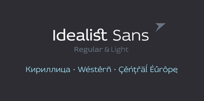
 - Idealist Sans by Glen Jan,
$-
- Supria Sans by HVD Fonts,
$50.00 Supria Sans™ and Supria Sans Condensed is an extended family of 36 fonts designed by Hannes von Döhren. It contains two widths, six weights and three styles, including the curvy, feminine Italic as well as the more conventional Oblique. Although it is inspired by the utilitarian clarity of Swiss type design, subtle curves and fine detailing impart a more playful character to the whole Supria Sans family. Supria Sans™ is equipped for complex, professional typography. As an exclusively OpenType release, these fonts feature small caps, five variations of numerals, arrows and an extended character set to support Central and Eastern European as well as Western European languages. Supria Sans™ received the “Certificate of Excellence in Type Design” at the TDC2 (2011).
 - Umba Sans by TypeThis!Studio,
$29.00 UMBA Sans is a contemporary typeface designed by Anita Jürgeleit. The wide shaped curves show a new aesthetic appeal in an unexpected pleasant way. Umba Sans fulfills your corporate design needs as well as your editorial demands and helps to push your design to the next level. Thirty styles from thin to bold and matching italics - as well as small caps and alternates - help you create a contemporary design. Umba Sans provides a wide range of variations. Your design may have many faces but it all matches together. Separate styles for alternate and small caps will show up in your font menu, making sure that you stay aware of the wide range of possibilities your new favourite typeface provides. If you like our fonts, you might want to sign up at: www.typethis.studio
 - Cosmic Sans by Zachary Mazur,
$15.00 Cosmic Sans was my first font ever created for a school project. The class I made this font for was my Advanced Typography and was a semester project. I really couldn't think of a title for this font, until one of my good friends said, "Why don't you name it Cosmic Sans?" I searched the internet for any other fonts with that name, and sure enough there wasn't. Thus the name stuck. This font is more or less a display font, thus every secondary character was not created. I hope you enjoy this font and much as I have while creating it!
 - Mundo Sans by Monotype,
$50.99 Mundo Sans, by Carl Crossgrove for the Monotype Studio, is distinctive, approachable – and ready to tackle jobs both big and small. Its open counters and large x-height, which give the design a straight-forward no-nonsense mien, are softened by inviting calligraphic undertones. With 10 weights and a complementary suite of cursive italics, there is little outside the range of the Mundo Sans family. The light weights are elegant in packaging and brochure design, the medium are easy readers in digital blogs and print periodicals and the bold command attention in banners and headlines. Mundo Sans is at home in a wide range of sizes, and comfortable in everything from wayfinding to mobile apps. Mundo Sans takes on complicated branding projects with efficient grace. The family enables companies and products to express their brand seamlessly in websites, advertising, corporate messaging, packaging – virtually everywhere visible engagement is possible. A large international character set, that includes support for most Central European and many Eastern European languages, ensures ease of localization. Mundo Sans was originally released with seven weights. The family was updated with three new roman weights and their italics in 2019 that extend and diversify its range of use: a fine hairline weight, a book weight, slightly lighter than regular, and a demi that is subtly lighter than the medium. The design is also is a good mixer. It easily pairs with everything from refined Didones to stalwart slab serif designs. And if you need a more harmonious palette, look no further than Mundo Sans’ relative, Mundo Serif. The two designs harmonize with each other perfectly in weight, typographic color and proportion. Mundo Sans’ italics are true cursive designs, with fluid strokes and obvious calligraphic overtones. The flick of the down-stroke in the ‘a,’ the descending stroke of the ‘f’ and baseline curve of the ‘z’ add grace to the design and distinguish it from more mechanistic styles. Mundo Sans is a design with deep roots. It was originally drawn to pair with classic Renaissance book typefaces like Bembo® and ITC Galliard®. With a hint of diagonal stroke contrast and gentle flaring of strokes, Mundo Sans complements these designs with warmth and grace. Crossgrove says that Mundo isn’t meant to be showy or distinctive. It is intended to follow the tradition of sans serif designs that have a wide range of uses, enabling comfortable reading and clear expression. Crossgrove has designed a variety of typefaces ranging from the futuristic and organic Biome™ to the text designs of Monotype’s elegant Walbaum™ revival. His work for Monotype also often takes Crossgrove into the realm of custom fronts for branding and non-Latin scripts.
 - Ziggy Sans by Just Jace,
$5.00 Ziggy Sans is my debut font, a straightforward headline typeface. It was devised from simple sketches and came together fairly smoothly, but very slowly. Each letterform is comprised of only two shapes for maximum consistency, and every letter combination has been painstakingly kerned by hand.
 - Just Sans by JUST Creative,
$14.97 JUST Sans is a highly versatile sans serif typeface with endearing, modernist warmth, geometric legibility, and a distinctive friendly bite. Designed as a professional modern geometric sans serif, JUST Sans is both serious and friendly, neutral but warmly expressive, technical but not overt, and familiar but unique enough to stand on its own. With open-airy characters and a generous width, JUST Sans has an elegant contemporary feel, with sharp angled terminals that give it grip and make it so expressively endearing. With a clean, simple, and minimal aesthetic, JUST Sans is a functional workhorse with 7 weights, complete Latin extended language support, precise hand-adjusted kerning, and a variable version for maximum versatility. JUST Sans includes hand-hinted web fonts optimized for clear, legible text on screens making JUST Sans perfect for the web as well as logos, branding, headlines, paragraph text, UI, signage, packaging, posters, and industries rooted in technology, new media, architecture, fashion & design. With its universal functionality & characteristic bite, the JUST Sans family is an essential addition to your type arsenal, even if just for those beautiful stylistic numbers. For lovers of modern sans serif fonts who are looking for something a tad more warm, open & expressive, JUST Sans is for you.
 - Yalta Sans by Linotype,
$29.00 Yalta Sans combines the warmth of a traditional humanist design, the clarity of a grotesque and the modernity of a square sans. Several design traits contribute to this melding of diverse typographic concepts. Characters find their foundation in stroke-based shapes rather than constructed forms. Curve stokes are also slightly squared and counters are open. Curved strokes join verticals at nearly right angles to create a strong horizontal stress, aiding the reading process. The resulting design is exceptionally legible while still inviting. Although Yalta Sans is clearly differentiated from its calligraphic ancestors, many details of the design emulate the distinctive characteristics of typefaces from the Renaissance. Tapering horizontal stokes also give Yalta Sans a dynamic relationship with linear grotesque while its angled stroke terminals echo the work of a calligraphic brush Yalta Sans italics are cursive designs that are in keeping with humanistic letterforms and are markedly narrower than the Roman characters. Lining and old style figures, small caps and a suite of ligatures also make for a remarkably versatile typeface family.
 - Dear Sans by Stiggy & Sands,
$24.00 The Dear Sans Collection is comprised of four widths ranging from Condensed, Regular, Expanded, and Wide; each of which are comprised of a three font family of weights: Book, Regular & Bold. Cleanly readable, with just a slight hint of silliness, the Dear Sans Collection brings adds the perfect level of lightheartedness to your designs. The Dear Sans Collection comes with: - Approx. 367 Character Glyph Set per font - including standard & punctuation, international language support, and basic “fi fl” ligatures per font. - 3 Weights per family including: Book, Regular, and Bold. - Loads of Personality for your designs.
 - Prose Sans by Ayca Atalay,
$29.00 Prose Sans is a wide sans serif font family that comes in 8 weights. With its slightly tilted axis and relatively high contrast strokes, it is both elegant and strong. The standard and discretionary ligatures help achieve a more tailored look, excellent for branding, logo design, poster design etc.
 - Olivia Sans by Stabenfonts,
$45.00 The rounded Sans with edges. Olivia Sans got curves on the outlines and edges on the inlines. So it can be very legible and space efficient at the same time: the curves keep the distinctions between the letters, the corners keep the influences from broadnibbed pens with a subtle horizontal stress for great legibility. Olivia has personality without being obtrusive. Three weights (light, regular, bold) are equipped with real italics, SmallCaps, different sets of figures, accents for almost every latin script, arrows, symbols. A fourth weight (black) comes without italics or SmallCaps, but all the other features. Olivia: with or without.
 - Teorema Sans by FSdesign-Salmina,
$39.00 Teorema. Well balanced Reading. Looking for a geometric yet flexible character? Teorema typeface combines different geometric shapes, according to a pragmatic approach that favors flexibility and ease of use. The font is distinguished by the contrast between perfectly circular shapes, and other, more angular ones in search of a formal balance aimed at optimizing the recognizability of the characters and finally the legibility of the text. Worthy of a geometric “theorem”? Try Teorema for free. Download a free version of Teorema Regular and Bold with a reduced character set. Check it out!
 - San Jaime by Fatchair,
$9.95A relaxed, open typeface, San Jaime is available in both serif and sans-serif versions. - Xtra Sans by Typolar,
$58.00 In its characteristics Xtra Sans is a combination of modern grotesks/grotesques and traditional calligraphy. Its upright and compact letterforms generate a sturdy effect as in the early 20th century grotesks Nobel, Kabel or Erbar. On the contrary, dynamic inside forms (counters) give the characters a fluent appearance. As a result, Xtra Sans stands out in large size, while remaining highly legible in small and long text. In 2007 Xtra Sans received a Certificate of Excellence in Type Design from Type Directors Club, New York. In 2002, still unpublished, it was awarded a bronze prize at the Morisawa Awards, Tokyo.
 - Burin Sans by Monotype,
$29.99The Burin family of typefaces consists of Roman and Sans variations. Burin Roman has very distinct lowercase characters b, c, d, g and y with a quirky use of tapered strokes and hairlines. Burin Sans is a light display face with an extended tail on the lowercase y. - Mezalia Sans by Arrière-garde,
$9.00 Mezalia Sans is a logical continuation of the Mezalia family. Its shapes are based on medieval calligraphic style: the Bastarda. This time the evolution is taken a step further, as these classic shapes are merged with the straightforwardness of a modern sans-serif. This results in an original, strong yet very much usable typeface, that can hold its own in a wide range of applications. Mezalia Sans has two distinct styles: straight and cursive (true italic if you will, although the word is not really correct here), which come in ten weights, from thin to black. This wide range ensures that whether you are looking for delicate or bold strokes (or a combination of both) you will be satisfied. Every style also contains a set of small caps (with matching punctuation). Old-style, proportional and tabular numerals are included too, along with ligatures, symbols and language support in Adobe Latin 3 range.
 - Kompot Sans by VP Creative Shop,
$20.00 Kompot typeface with 2 styles Kompot Sans is swirly, vintage typeface with 2 styles to enchant your next project. They are loaded alternate glyphs and multilingual support. Very versatile fonts that works great in large and small sizes. Basic latin, advanced latin, basic Cyrillic and advanced Cyrillic character sets are supported! Kompot Sans is perfect for branding projects, home-ware designs, product packaging, magazine headers - or simply as a stylish text overlay to any background image. Uppercase numeral, punctuation & Symbol Regular Outline Alternate glyphs Multilingual support Basic and Advanced Cyrillic support How to access alternate glyphs? To access alternate glyphs in Adobe InDesign or Illustrator, choose Window Type & Tables Glyphs In Photoshop, choose Window Glyphs. In the panel that opens, click the Show menu and choose Alternates for Selection. Double-click an alternate's thumbnail to swap them out.
 - Sun Burst by T-26,
$19.00 - Gmbh Sans by EchadType,
$9.99 GMBH SANS The architectural sans-serif in sharp junctions silhouette. Designed as a display typeface for headline sizes. Typeface maintains it's unique identity even in all lowercase letters due to 21 degrees slanted stems (vertical strokes of letters). Variable typefaces provides subtle gradation of 6 weights. Each weight retains the same character width (except character i and l). Typeface supports: Latin characters with diacritical marks; Cyrillic characters (Ukrainian, Russian); Hebrew; Contains additional monetary symbols (₿Ξ₴₹₪)
 - Yefimov Sans by ParaType,
$30.00 Yefimov Sans is a sans companion for Yefimov Serif . It is one of the last original faces by Vladimir Yefimov. It has contemporary design, squarish shapes of the round letters and legible proportions. Thanks to open aperture, it works well in small point sizes, and its distinctive letterforms make it good also for display purposes. The typeface was completed by Maria Selezeneva and Alexandra Korolkova. Released by ParaType in 2015.
 - Lippy Sans by Thinkdust,
$10.00 Lippy Sans is a brand new typeface designed to give a 100% lipstick feel. The reason the lipstick feel is so authentic is because the original sketches were actually drawn in lipstick, taken into illustrator, retraced and then edited carefully in fontlab. If you're after a lipstick typeface with an authentic feel, then Lippy Sans is the one for you.
 - Heimat Sans by Atlas Font Foundry,
$50.00 Heimat Sans is the grotesque typeface family within the Heimat Collection, also containing Heimat Didone, Heimat Display, Heimat Mono and Heimat Stencil. Heimat Sans is a legible typeface family designed for contemporary typography, especially for use in headlines and on posters, but also for reading purposes. It combines an idiosyncratic appearance with the feeling of a grid-based letter construction of the late 20s. Since the design might be too extreme for some applications, Heimat Sans character set provides two alphabets, the regular one plus an alternate design that comes across as less suspenseful. Heimat Sans [732 glyphs] comes in six weights and contains an extra set of alternate glyphs, many ligatures, lining [proportionally spaced and monospaced], hanging [proportionally spaced and monospaced], positive and negative circled for upper and lower case, superior and inferior, fractions, extensive language support and many more OpenType features.
 - Oceanside Sans by Bebop Font Foundry,
$19.00 Oceanside Sans is a display typeface produced in 2022 by Bepop Font Foundry. This typeface was born out of a month-long trip to the Bahamas. The scenery, both natural and architectural, was stunning, yet restrained. Each settlement featured its own flavor of beautiful hand-painted signs promoting local businesses - fresh fish & Conch, liquor, ice, gifts, and more. Oceanside pays homage to the visual vernacular of the islands we visited during our stay.
 - Blundell Sans by K-Type,
$20.00 Blundell Sans is a type-hybrid that combines the precision and power of a sans serif with the elegance and humanism of a script. A resolutely upright font with a strong diagonal thrust.
 - Mentor Sans by Monotype,
$29.00Mentor Sans is a sans serif font. - Profont Sans by Logofonts,
$10.00 Pro Font is Sans Serif fonts great for product logo, poster, headline, card logo, web, magazine, packaging, stationery and much more. Easily creates your own logo type with fonts. Pro Font Sans has an Open Type feature to access a large selection of unique alternative letters and many ligatures to make it easier for you to create. Pro Font Sans can be accessed perfectly on design applications such as Adobe Illustrator, Adobe Photoshop, Corel Draw, Affinity Designer but does not rule out the possibility that it can also be accessed using web-based applications such as kittl, canva, artboard studio and others.
 - Yoshida Sans by TypeUnion,
$29.00 Yoshida is a modern sans serif made up of 2 widths, 8 weights and their matching italics offering an array of uses and applications with it’s 32 styles. The weights range from a delicate Thin, to a punchy Black that is perfect for branding or headlines. The curvaceous characters create a fun, fluid feel whilst keeping a modern, balanced look and structure. The font has extensive language support making it perfect for large corporations or small start ups. Yoshida also has several ligatures to enhance it’s visual appeal. Yoshida is a versatile font suitable for many applications such as web, print, branding and anything else that takes your fancy.
 - Rum Sans by Trine Rask,
$30.00 Rum Sans is designed inside out based on modular counters. Rum Sans is a text & display family suitable for any purpose, any media, any size. A humanistic modular sans serif in five weights containing small caps, italic, swashes, alternative characters, old style, lining, tabular & proportional figures. Design date: 2001-2014 The complete family consists of Sans Serif & Serif in both sharp and soft version + the display fonts Rum Plakat & Rum Silhouette.
 - Recobant sans by Sulthan Studio,
$12.00 Recobant is a very charming and stylish font, and is designed to resemble engraving. It also features ligatures and multi-language support. I have made this font as smooth as possible, reducing the number of nodes in each glyph to ensure optimal cutting with Circut, Silhouette or other craft machines.
 - Crotona Sans by Jonahfonts,
$35.00
- Polli Sans by Will Albin-Clark,
$- Polli Sans is a sans serif geometric font, designed with both proportional and fixed-width styles in mind. Polli is great for large scale display purposes and small scale copy. The proportional’s curvy form makes it super useful for title type, and the detailed technical fixed-width sub-family is perfect for any informative body of text. Polli is designed as an homage to common type practices of the early 21st centric corporate America. Borrowing from friendly styles you’ve seen before but with contemporary challenging elements.
 - Tabac Sans by Suitcase Type Foundry,
$75.00 Tabac Sans is a linear, dynamic sans serif type that blurs the lines between text and title typefaces. Drawing on the rich tradition of European lettering, the humanist basis supports excellent readability even at the smallest letter sizes, while unique details and a wide array of alternative glyphs prove highly effectual in titles and headlines. The broad variety of types and weights make this font family a versatile aid when composing complex magazine and newspaper layouts.
 - Belle Sans by Park Street Studio,
$25.00 Belle Sans is a clean, straightforward sans serif typeface family, and a very large family at that! It has seven widths, from Ultra Condensed to Extra Wide, and seven weights, ranging from Light to Black, all with Oblique companions. Belle Sans offers up great legibility for on-screen usage, and the breadth of width and weight make it very usable for text applications as well. The heavier weights, especially the Black, are exceptional for creating visual impact! Each font supports Western and Central European languages, ligatures, tabular figures, unlimited fractions, superiors & inferiors, and ordinals.