17 search results
(0.012 seconds)
- Homeboy - Unknown license

- KG Love Somebody by Kimberly Geswein,
$5.00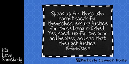 Upright, neat, and legible teen handwriting.
 - KG Somebody That I Used to Know - Personal use only

- KG Somebody That I Used To Know by Kimberly Geswein,
$5.00 Narrow, playful, jaggedy letters inspired by a typewriter.
 - Casting Call JNL by Jeff Levine,
$29.00 Casting Call JNL is a simple condensed sans modeled from the hand-lettered title of a piece of vintage sheet music entitled "Somebody Else is Taking My Place"; a 1940s song co-authored and made famous by bandleader Russ Morgan.
 - Roulletes Handrawn by Siwox Studios,
$11.00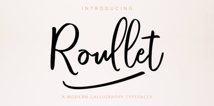 Roullet Fonts is a handwriting style. For designers, Instagrammers, bloggers, YouTubers, fashion lovers or somebody who Loves Fresh design. Roullet Fonts are suitable for any modern-design such as ad banner, modern card, invitation, announcement, seasonal design, social media promotion, web design, branding and logo stylist and many more.
 - Nouveau Standard JNL by Jeff Levine,
$29.00 The hand lettering found on the cover of the 1912 sheet music for "Somebody Else is Getting It" featured a blockish Art Nouveau style with rounded corners and a very lurid title [although it likely had a more innocent meaning in those days than the casual observer might interpret today]. Now available as Nouveau Standard JNL, it is available in both regular and oblique versions.
 - The Quiz Script by Siwox Studios,
$95.00 The Quiz Script is an handwriting typeface. For designers, instagramers, bloggers, youtubers, fashion lovers or somebody who loves fresh design. Every creative loves something new. Thats why we love handmade and freestyle designs, because it will make something unique, fresh and natural. So here we are, The Quiz Script fonts are ready to work with your creativity. The Quiz Script is suitable for any modern design such as for ad banner, modern card, invitation, announcement, seasonal design, social media promotion, web design, branding and logo stylist and many more.
 - Donna Bodoni by Wiescher Design,
$39.50 DonnaBodoni was inspired by David Farey. He once wrote, somebody should honor the widow of Giambattista Bodoni the brave Signora Paola Margherita Dall 'Aglio for her effort to have the Manuale tipografico di Giambattista Bodoni published after his death. Since I have redesigned a good deal of Bodoni’s work and added some of my own, I thought it was my duty to do at least this for Bodoni’s unknown widow. Here is my 3-cut script in her honor. The design is remotely based on Bodoni’s English-Initials. Your honorable Gert Wiescher
 - Waste Of Time by PizzaDude.dk,
$16.00Waste Of Time 1: The base version. Waste Of Time 2: The champagne bubble version! Waste Of Time 3: The alien version! Waste Of Time 4: The homeboy version! Waste Of Time 5: The shadow version! Waste Of Time 6: The zit version! Waste Of Time 7: The speedline version! - Nouveau Handlettered JNL by Jeff Levine,
$29.00 The roots of Nouveau Handlettered JNL go back to the sheet music cover for the 1917 song "(Someday) Somebody's Gonna Get You". This simple style of sans serif titling has the casual, imperfect charm of the pen and ink lettering so prevalent in the decades before metal type and other technical advancements made the craft almost obsolete. The typeface is available in both regular and oblique versions.
 - Blueberry Spot by Kaer,
$14.00 I’m glad to present my new hand-drawn typeface Blueberry Spot. The clearances in some letters are filled as if somebody put a blueberry blot in them. Also, I created the second style of this font. If you don’t want blots use a clear style. This font is perfect for making your project look pleasantly scruffy, handmade. Use it for nice identity, funny craft package, blog posts, holidays poster, etc. What's included? Regular and Clean styles Uppercase and lowercase Multilingual support Numbers Symbols Punctuation I hope you enjoy this font. Follow my shop to receive updates of products and the very hottest news! If you have any question or issue, please contact me: kaer.pro@gmail.com Please request to add additional characters and glyphs if you need! Thank you!
 - Geis by Galapagos,
$39.00In 1978 I went to work at Mergenthaler as a letter drawer. Being an inquisitive sort I decided that I should take a stab at this type design 'stuff'. I drew 25 or 30 glyphs before the work found its way to a high shelf in a dark corner of my apartment. Just 23 years later I found the drawings on a different shelf, in a different home, in a different city and decided to finish what I had started. I'm still trying to deal with my predisposition toward procrastination but I've finished the font. The name of the font is the last name of somebody I played softball with before I moved to Beantown. Ronnie Geis was one of the courageous firefighters we lost on September 11th when the WTC collapsed. - The font "KG Somebody That I Used to Know" is designed by Kimberly Geswein, a renowned typeface designer known for her extensive collection of fonts that span a wide range of styles, from whimsical a...
- Loraine by Homelessfonts,
$49.00 Homelessfonts is an initiative by the Arrels foundation to support, raise awareness and bring some dignity to the life of homeless people in Barcelona Spain. Each of the fonts was carefully digitized from the handwriting of different homeless people who agreed to participate in this initiative. MyFonts is pleased to donate all revenue from the sales of Homelessfonts to the Arrels foundation in support of their mission to provide the homeless people in Barcelona with a path to independence with accommodations, food, social and health care. Loraine was born in London. She was an ordinary, hardworking family person, with nothing to worry about beyond paying the rent at the end of the month or keeping the fridge full. Until in 2009 she came to Barcelona on holiday. Soon after she arrived her passport was stolen from her and she had a series of problems with the British embassy. Somebody had made illegal use of her passport. So Loraine found herself in a strange place, unable to get home. She didn’t know anyone there and her circumstances meant she couldn’t ask for help from England, either. She had to sell all her possessions and, in time, learn to speak Spanish. “Living in the street is a wonderful adventure,” she says. In the street she discovered a new city, a new country and a new culture. “There are lots of people who prefer to sleep under the stars.” She also made lots of friends who helped her in a completely unfamiliar world.
 - Voluptate by Fontscafe,
$39.00 The "Voluptate Pack" font is a smart sophisticated handwriting pack that includes ‘Voluptate’, ‘Voluptate Classic’ and ‘Voluptate Elements.’ Every single character in our ‘Voluptate’ font distinct and given every letter a unique identity – very much like a person’s handwriting. Of course the characters are similar enough to work hand in hand, but not so similar as to appear as an obviously computer generated type set. The ‘Voluptate Classic’ is very similar in design and ever so slightly informal in its appearance. A thoughtful mix-and-match of both these fonts can give a delightful appearance to your designs. You could use the Voluptate on most areas of the text for example, and the ‘classic’ to emphasize a more personal touch to certain areas, say for example where you may be quoting somebody’s word. When you get the pack you also get a handy ‘Voluptate Elements’ set of designs that can enhance your creations in so many ways. All 3 are available individually, but it's like getting the elements for free when you buy the pack.
 - Chalk Hand Lettering by Fontscafe,
$39.00 If you are into the vintage feel, you will love this one. This is as vintage as it probably gets. There are probably only a handful of places in the world where schools still use blackboards and chalk – they’ve given way to their white board and marker counterparts for decades now. White boards are definitely more practical and less messy when compared to chalk, but then if you are creatively inclined you will agree that a little bit of mess is worth it if you are going to get the effects that you desired! Well, we can give you the effects minus the mess with our chalk hand lettering fonts! As the name suggests, this font gives you that distinctly unique chalk on slate feel, and if you are wondering what’s distinct about it; writing on slate or blackboard was a slow process which required deliberated and concentrated efforts resulting in a handwriting which was usually quite different to a person’s handwriting on paper. Typography of chalk on slate was an everyday event in the classrooms of yesterday, and today we hardly ever get to see one of these if it all. Writing on a black board with chalk was quite an interesting achievement in its own right, if you ended up with anything legible and if your writing remained focused and ‘in-line’! But of course like everything else, his took time to master and when you did get it right, chalk hand lettering was quite an enjoyable experience! For semi-permanent designs, say for example an eventful day at school; students of the day would create beautiful typography on the boards, and add a solidarity to it sometimes by shading one side of the lettering – usual y the right side towards which the lettering leaned. This is the effect our chalk hands lettering shaded variation gives you. You could get this font individually, but we strongly advise you check out the “chalk hand lettering pack” font. It includes the simple “chalk hand lettering” (minus the shading effect) and also a “chalk hand elements” bag of tricks. The elements is a collection of graphic art which resemble shapes and designs that used to be added to chalk art, to beautify the typography. If you enjoyed seeing the effects of our Chalk Hands font, and the shaded variant – you are simply going to go gaga over Chalk Hand Elements! The chalk hand font of course enables you to make typographic art similar to the effect of chalks on slates and black boards. This was quite the art form in the days gone by! The shaded variation added a bit of solidarity and the technique was commonly used to make semi-permanent designs say for example a welcome note when somebody important was to visit. Classic chalk hand designs, especially the semi permanent ones often had little pieces of art to help beautify the creation as a whole. It could simply be symmetrical graphics appearing before and after the title and headings, maybe just an interesting shape to fill in an empty area on the board, and such…our Chalk Hand Elements offers you a ton of such graphics. The two chalk hand variations and the elements are all included in the Chalk Hand Family, and this is strongly recommended if you want to make designs that are truly reminiscent of the days of chalk on slate.

